
How to Build a Brand for Your Startup, From Positioning to Printed Assets


Marcus is our print marketing voice, built from the knowledge of our production team, with over 20 years in printing.
A brand is four decisions and one file set. Here is the order to make them in, the gate that stops a full reprint, and the print kit a new company actually needs: business cards, a short run presentation folder, stickers and a retractable banner stand.
Build a startup brand in this order: write who it is for and what you do differently, clear the name legally, produce a vector logo master, fix the color as a CMYK build with a Pantone reference, and only then print. Everything before the print stage is free to change. Everything after it costs the price of a run, and that price rises with the format, from business cards at $17.57 to a retractable banner stand at $139.
Quick answer
Cheap decisions first, printed decisions last
A startup brand is built by settling the free decisions before the paid ones. Positioning and the name live in a document and change for nothing. The logo files and the color spec are the handover point. Print is where a change stops being an afternoon and starts being a reorder, so it comes last, smallest format first. That single sequence prevents the most expensive branding mistake a founder makes, which is discovering a trademark conflict or a color that does not reproduce after the cards, the folders and the banner have all been produced.
Before you print
The file, stock and size choices for a first print run
Hand the printer one file set: the vector logo, the CMYK values with a Pantone for the color that matters, and the two typefaces. Every piece below prints from it.
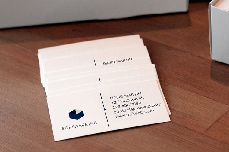
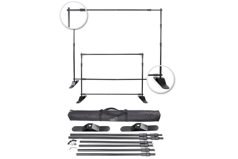
Cards first, at 3.5 by 2 inches. Pick 14pt or 16pt gloss for strong color or 14pt to 18pt uncoated if people will write on the card, from 100 cards. Then a 9 by 12 inch folder on 14pt gloss, from 10, with optional card slits on both pockets. Stickers test a phrase from 25 pieces on paper, white vinyl or clear. The banner stand comes last, sized from 24 by 79 up to 59 by 85 inches, because a late color change on it costs the most.
What a Brand Actually Is, and What It Is Not

A brand is the answer a stranger gives when someone asks what your company does. The logo, the palette and the typeface are how that answer gets carried around. They are not the answer itself. On paper, the answer first travels on a 3.5 by 2 inch business card, then on a 9 by 12 inch folder and a banner stand at a booth.
This distinction has a practical consequence for founders. If you commission a logo before you can write down who the product is for and what it does differently, the designer is guessing, and you will pay for the guessing in revision rounds. Give a designer two clear sentences and you usually get something workable in the first round. Give them a mood board of companies you admire and you get four rounds and a result that looks like the mood board.
So a startup brand is really three layers stacked in order. The strategy layer is what you sell, to whom, and why they should pick you. The verbal layer is the name, the tagline and the way you write. The visual layer is the logo, the color, the type and the paper it all lands on. Each layer feeds the one below it, and skipping upward is how brands end up looking expensive and saying nothing. Our guide to designing a logo covers the visual layer in detail once the first two are settled.
Lock the Decisions in Order, or Pay for Them Twice
Brand decisions are cheap to change until they are printed, at which point they cost the price of the run. The whole discipline of building a startup brand well is keeping the expensive decisions behind the cheap ones.
The order that works: positioning, then the name, then the logo files, then the color specification, then print. Positioning and the name are free to change because they only exist in a document. The name is the hard gate, because a trademark conflict discovered after launch forces every single asset to be reprinted at once. Search the USPTO database for the exact name and its close phonetic cousins inside your class, check the domain, check the handles, and only then brief a designer. Our guide on how to trademark a logo and protect your brand covers the filing that follows.
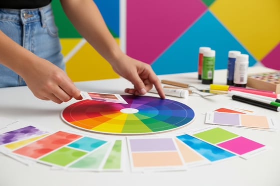
Color is the stage founders skip most often. A hex value chosen on a monitor is a light measurement, not an ink recipe, and a bright screen color usually lands duller on paper. Convert it to a CMYK build, tie the logo color to a Pantone reference, and approve the result on a printed piece rather than a display. Our guide to choosing a brand color palette walks through the conversion, and choosing the right paper stock matters just as much, because the same ink reads warmer on uncoated sheets than on gloss.
One more thing about that gate: the file set you hand a printer is part of the brand. A vector master, a one-color version for embroidery and stamps, and a written color spec should live in one folder that any new supplier can open. If you are still starting layouts from scratch, our blank template library gives you correctly sized files for every product we print.
Write Down Who It Is For, in One Uncomfortable Sentence
Most startup audience definitions are useless because they are too generous. "Small business owners" describes thirty million people with nothing in common. The sentence that helps is narrow enough to exclude someone.
Try this shape: a specific person, in a specific situation, with a specific frustration. "Independent dental practices with one location, who lose new patients because their referral paperwork looks photocopied." That sentence tells a designer what to make, tells a copywriter what to say, and tells you what to print. It also tells you what not to print, which is where the money is saved.
The test is whether the sentence changes a decision. If knowing your audience does not change your paper choice, your tone, or the format you order, you have not defined an audience, you have written a compliment about your market. A brand aimed at contractors ends up on thick, scuff-resistant cards that live in a truck. A brand aimed at boutique retail ends up on uncoated stock with a lot of white space. Same budget, opposite results, and the audience sentence is what decided it.
Differentiate on Something a Competitor Cannot Copy by Friday
Every founder has heard that they need to be different. The useful version of the advice is narrower: pick a difference your competitor cannot copy in a week, then say it everywhere.
Features are copied in weeks. Prices are matched in days. What holds up is a difference rooted in how you work, who you serve, or what you refuse to do. Being the only supplier in your category that quotes in under an hour is defensible because it is an operating choice, not a line on a website. Being "customer focused" is not a difference, it is a sentence every competitor also has.
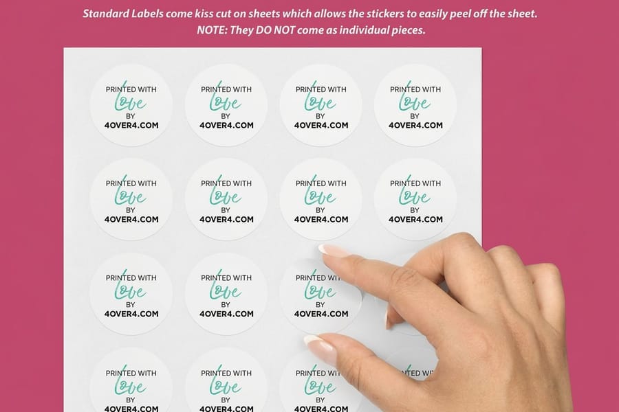
Once you have the difference, put it in the same three words on every surface: the card, the folder, the banner, the site. Repetition across formats is what turns a claim into a reputation. This is also the cheapest place to be brave, because a sticker run is small. Standard stickers start at $23.88, which makes them the low-risk way to test whether a phrase actually lands before it goes on a banner. Our sticker marketing campaign guide covers where to place them so they do more than sit in a drawer.
Audit the Brand on a Table, Not in a Slide Deck
A brand audit sounds like a consultancy exercise. Done properly it takes an hour and needs a table, a window and a box of everything you have printed.
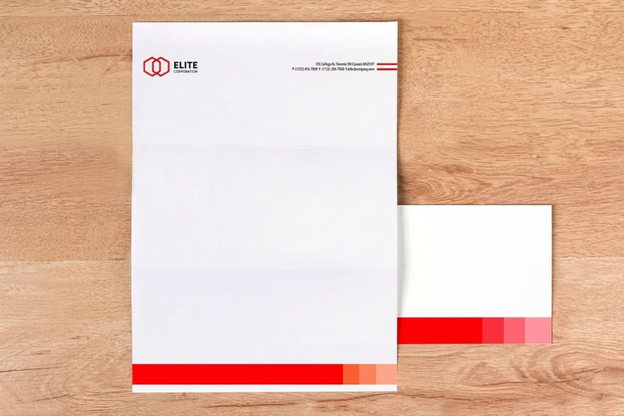
Lay it all out at once: cards, letterhead, envelopes, folder, flyer, sticker, banner, packaging insert. Look at it in one light source. Three things surface immediately on paper that never surface on screen. Whites drift, because the same design printed on two different stocks gives you two different backgrounds. Logo versions multiply, because someone used the old file. Type sneaks in, because a supplier substituted a font they had a license for.
Then ask three questions of the pile. Would a stranger say these came from one company? Does the difference you chose appear on at least half of them? Is anything here still carrying a claim, a price or an address that is no longer true? Write the fixes as a reprint list with dates, and treat it as a schedule rather than a wish. Do this twice a year, and again after any funding round or product change. If the audit ends with more red than black, you are looking at a rebrand rather than a cleanup, and our rebranding process guide lays out how to sequence that without running two identities at once.
Connect the Brand to the Marketing You Are Already Doing
A brand that only exists in a guidelines document is an expense. It becomes an asset the moment every campaign inherits from it, so nobody has to invent a headline style or pick a color under deadline.
The practical mechanism is a short list of defaults. One headline voice, one accent color, one photography treatment, one call to action format. When a campaign starts, the team changes the offer and the imagery and leaves the rest alone. That is why a well-branded company can produce a trade show setup, a mailer and a follow-up card in a week that all look related, while an unbranded one holds a meeting about each of them.
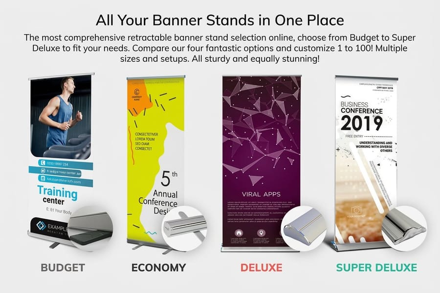
Print is where this shows most, because printed pieces sit next to each other in the real world. A retractable banner stand from $139 and a stack of matching cards read as one company at a booth. Mismatched ones read as a table someone else rented. If your marketing runs through the mail, the same rule applies to postcards and envelopes, and our branded stationery guide shows how to keep the set consistent across formats that print on very different papers.
Bring the Brand to Print: The Launch Checklist
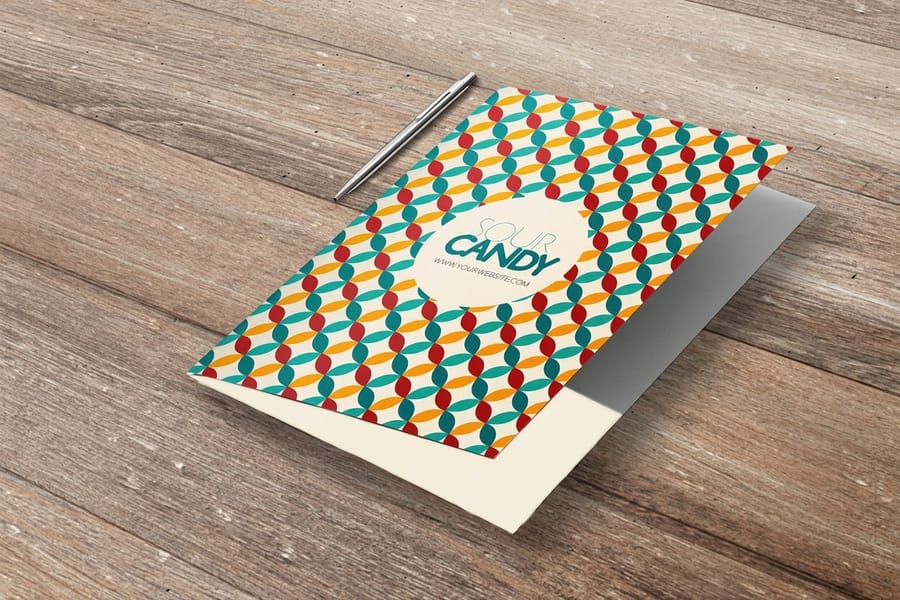
Here is the practical end of the whole exercise. Once the files are locked, a startup launch kit is a short list of formats, ordered in the sequence a stranger meets you.
| Asset | Starts at | Order it when | The catch |
|---|---|---|---|
| Standard business cards | $17.57 | The vector logo master exists and the name is cleared. | Cheapest to reprint, so treat the first run as a field test rather than a lifetime supply. |
| Short run presentation folders | $108.75 | You have a proposal, price list or onboarding pack to hand over. | Short run exists so you do not buy a thousand. Standard pocket folder runs cost several times more per order. |
| Standard stickers | $23.88 | You want to test a phrase or a mark in the wild. | Low cost makes them easy to over-order. Decide where they will be applied before you pick a quantity. |
| Standard letterheads | $99.95 | You send quotes, contracts or invoices on paper. | Check the stock feeds your office printer before ordering a large run. |
| Retractable banner stands | $139 | The first event, market or open day is booked. | Largest format and the least forgiving. Leave it until the brand has stopped moving. |
Read the last column before the second. The pattern is that the cost of a mistake rises with the format, which is exactly why the order matters. Cards absorb a late change. A banner does not.
Two habits keep the kit tidy after launch. Keep one printed copy of every job as a physical reference, so the next order can be matched against paper rather than a memory. And send every job with the same color spec attached, not just the artwork. If you would rather not build the layouts yourself, our online design templates start you from a correct file, and the presentation folder range and the business card range list every stock and finish we print, with live pricing on each.
Wally explains the branding order
Free decisions first, printed decisions last
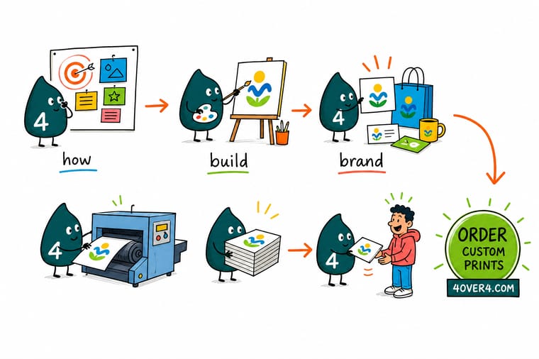
Wally lines the whole thing up on the counter. First the sentence about who it is for. Then the name, checked against the trademark register before anyone draws anything. Then the vector logo and a one-color version of it. Then the color, written as a CMYK build and not as a hex code from a monitor. Only after all four does he pick up the cards. Move any of those first four after the printing starts and you are not editing a document, you are buying the run again.
Order standard business cards →%22%2F%3E%3Ccircle%20cx%3D%2236%22%20cy%3D%2220%22%20r%3D%2231%22%20fill%3D%22%23a78bfa%22%20opacity%3D%220.15%22%2F%3E%3Ccircle%20cx%3D%2233%22%20cy%3D%2229%22%20r%3D%2210%22%20fill%3D%22%23a78bfa%22%20opacity%3D%220.1%22%2F%3E%3Crect%20x%3D%2276%22%20y%3D%2210%22%20width%3D%2221%22%20height%3D%2220%22%20rx%3D%224%22%20fill%3D%22%23a78bfa%22%20opacity%3D%220.08%22%20transform%3D%22rotate(16%2080%2030)%22%2F%3E%3C%2Fsvg%3E)
Specs and pricing
The launch kit, with sizes and starting prices
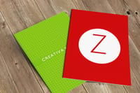
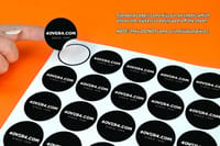
Cards, a short run folder and a sticker run cover the first three things a stranger will hold. Business cards start at 100 on 14pt to 24pt cover, short run folders at 10 on 14pt gloss at 9 by 12 inches, and standard stickers at 25 in 53 sizes on paper, white vinyl or clear label stock. Configure each one below with live options and starting prices from the 4OVER4.COM configurator.

Print it
Turn the brand into something people can hold
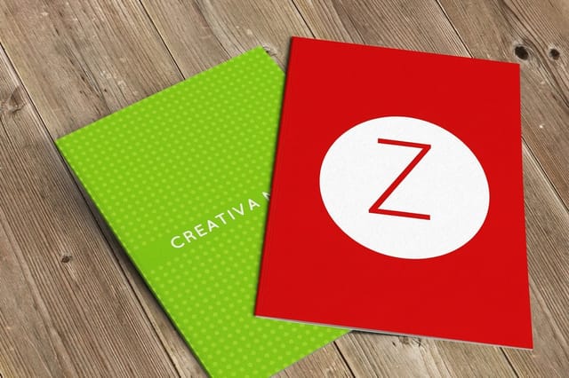
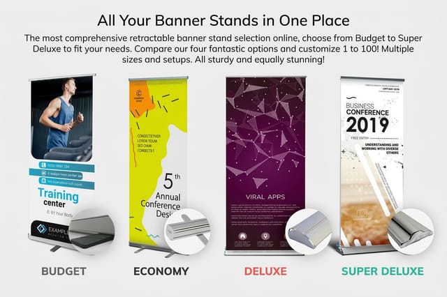
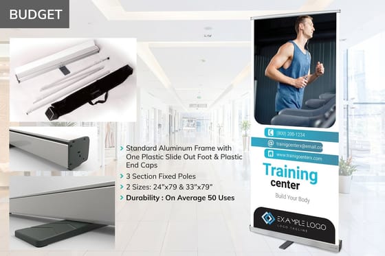
Cards, folders and stickers each print in 3 business days, so the first handout set can arrive the same week the files are final. A retractable banner stand in one of 13 sizes on 13 oz blockout vinyl comes last, once the color has passed on paper.

Explore more
Where to go next
Design the logo through to vector files, pick a palette that holds on paper, build a matching stationery set, plan a rebrand in the right order, shop business cards, and browse the rest of the branding library.



By the numbers
The printer behind a lot of first launches
Common Questions
Your startup branding questions, answered
What does a startup actually need to build a brand?
Four written decisions and one file set. The decisions are who it is for, what you do differently, what it looks like and what it sounds like. The file set is a vector logo master, a one-color version of that logo, a CMYK color build with a Pantone reference, and one or two typefaces you have a license for. Everything else, including the printed pieces, is produced from that file set. If you cannot hand a new supplier those files in a single folder, the brand is not finished yet.
Should I print business cards before the logo is final?
No, but the temptation is understandable, because cards are cheap. Standard business cards start at $17.57 at 4OVER4.COM, so a founder who reprints twice has still spent less than a dinner. The real cost is not the reprint, it is handing out two different versions of your company at the same event. Wait for the vector master, then order the smallest run you are comfortable with and treat it as a field test.
Do I need a trademark search before I print anything?
Yes, and do it before you brief a designer, not after. Search the USPTO database for your exact name and for close phonetic variants inside your class of goods and services, then check the domain and the main social handles. A name that survives all three is worth building on. This is the single decision that, when skipped, forces a full reprint of every asset you own, from cards to signage.
How do I keep brand colors consistent between screen and print?
Stop treating the hex code as the source of truth. Screens emit light and printing presses reflect it, so a saturated on-screen teal has no exact CMYK equivalent and will land duller on paper. Define the color once as a CMYK build, add a Pantone reference for anything critical like a logo, and specify both on every job. Then approve the first job on an actual printed piece and keep that piece as your physical reference.
What print assets should a new business order first?
Business cards, then a leave-behind, then signage, in that order, because that is the order a stranger meets you. Cards come first because they are handed over one to one. A short run presentation folder holds a proposal or a price list and starts at $108.75, which is what makes it viable before you have a warehouse. Signage comes last because it is the largest format and the least forgiving of a late brand change.
When is it worth rebranding a startup?
When the name blocks you legally, when the positioning has genuinely changed, or when the brand is unreadable at the size customers actually see it. Growing to like a different color is not a reason. A rebrand replaces every printed asset at once, so plan it as a print project with a cutover date rather than a rolling change, or you will spend months handing out two identities.
Get Started
Print 100 startup business cards from $17.57
Send us the locked logo files and the color spec, pick your stock, and we print a launch kit that reads as one company from the card to the banner.
Legal Disclaimer
Gold Standard guarantees apply to all standard orders placed through 4over4.com. Price match requires verifiable proof of a competitor's published price for an equivalent product with matching specifications and turnaround time. Satisfaction guarantee covers manufacturing defects and print quality issues. Contact support with order number and documentation.
