
Best Postcard Fonts and How to Choose Them


Nadia is our customer education voice, built from the knowledge of our production team, with over 20 years in printing.
Pick type by the job of the card, test it at real size, and set it up for the press. Below: the seven steps, the point sizes that read on a 4x6 card, and how the classic "Greetings From" lettering is built.
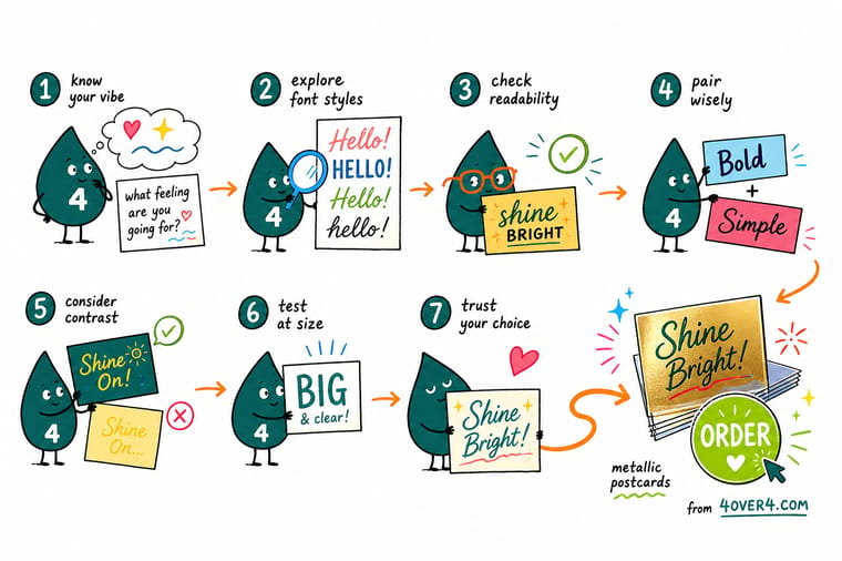
To choose a postcard font, work in seven steps: the card’s purpose, your brand, the font family (serif, sans-serif, script or display), the mood, legibility at real 4x6 size, a headline and body pairing, and print prep. The best postcard font is the one that reads at a glance from arm’s length.
Quick tips
Quick tips for choosing a postcard font
If you are short on time, start from a shortlist. Our roundup of the ten best fonts for postcards gives you named faces to test; pick one for the headline and run it through the steps below.
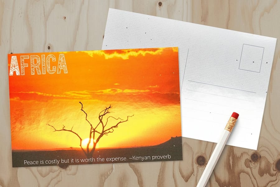
The Greetings From postcard font and the sizes behind it
The "Greetings From" postcard font is a two-font build, so you will not find it as one download. A script line reading "Greetings from" sits above the place name, and the place name is set in oversized block capitals with a photo inside each letter and an outline or drop shadow behind it. On a 4x6 card the block word takes as much of the top as the card allows, the script line runs at about a third of its height, and the address, date and offer stay in a plain body face.
Photo-filled letters need a stock that holds detail and contrast. Metallic Postcards add a foil accent on the front, so you can run the foil along the outline of each block letter and keep the photos in full color. The larger 6x9 and 6x11 sizes give every photo-filled letter more room to read from across a room.
Why your postcard font is doing more work than you think
A postcard is judged on the walk from the mailbox to the kitchen counter. Long before anyone reads the words, the shape of the letters tells them whether the sender is a boutique or a bargain bin, a hospital or a haunted house. The font is the first impression, and on a card this small there is nowhere for a weak one to hide.
That is why choosing type deserves more than scrolling a dropdown until something looks nice. The right face makes a coupon feel worth keeping and a save-the-date feel like an event. The wrong one buries a great offer under letters nobody can read. This guide walks you through a repeatable seven-step method, and it ends where every good card ends, at the print stage, with a font that reads at a glance. If you want the bigger design picture first, our guide on how to design a postcard covers the ten elements that make one convert.
Fonts are only one lever, but a weak one undoes the rest. Get it right and everything else on the card, the image, the offer, the QR code, has a fighting chance of being seen.
Postcard font terminology, minus the jargon
Six terms cover every type decision on a 4x6 postcard, four families and two measurements, and knowing them saves you a guess you pay for on press. Typefaces fall into four working families. Serif faces have little feet on the letters and read as classic and trustworthy, think Georgia or Garamond. Sans-serif faces drop the feet for a clean, modern look, think Helvetica or Montserrat. Script faces mimic handwriting and add romance or celebration. Display faces are the loud, characterful headliners built to be big and used sparingly.
Two more terms decide legibility. x-height is the height of a lowercase letter such as x, and a taller x-height reads better at small sizes. Weight is how thick the strokes are, from hairline to black, and it is your main tool for building contrast between a headline and body copy. Get comfortable with those four families and two measurements and you can judge any typeface in seconds.
The same vocabulary carries across every small-format print job. If you have ever wrestled with type on a business card, our note on what size font on a business card uses the exact same ideas at an even tighter scale.
The 7-step method to choose a postcard font
The whole method sits in one place. Run through it in order for any postcard project, whether you are laying it out yourself or briefing a designer. Each step below gets its own deeper section further down the page.
- Outline the purpose. Write the single action you want the reader to take, then choose type that serves it. A promo screams, an invitation whispers, a reminder card just needs to be legible.
- Establish your brand identity. Pull the fonts, weights, and feel from your logo, website, and other print so the postcard looks like it came from you and not a stock template.
- Learn the four font families. Serif, sans-serif, script, and display each behave differently in print. Knowing which is which stops you from picking a pretty face that fails at small sizes.
- Judge how the font communicates. Every typeface has a mood. Test whether the letters feel trustworthy, playful, luxe, or urgent, and whether that mood matches the message.
- Test legibility at postcard size. Set your real copy at the real point sizes, export a proof, and read it at arm’s length. If you squint, size up or swap the face.
- Pair a headline with a body font. Combine one characterful display or serif for the headline with one clean, quiet font for the details. Contrast in weight beats a fistful of fonts.
- Prep the type for print. Convert fonts to outlines or embed them, set body copy to a dark, high-contrast color, and keep it clear of the bleed and any reflective finish.
None of these steps takes long on its own. The value is in the order: purpose and brand come before aesthetics, and legibility is tested before you commit, not discovered on the printed card. Our design templates already respect this hierarchy, so if you are short on time they are a reliable shortcut to a well-set card.
Step 1: start with purpose and audience
Before you audition a single typeface, write down the one action this card has to produce. A discount promo, an appointment reminder, a grand-opening invite, and a real estate just-listed card all pull the eye in different directions. Name the action, and the tone and size of the type follow. A promo can shout its offer in a heavy display face. A reminder puts the date and time in a large subhead so nobody has to hunt for them. An invitation earns a touch of script, kept to the headline.
Then picture the person holding it. A font that delights a wedding guest will feel out of place on a plumber’s service card, and vice versa. Match the letters to the audience’s expectations, not to your personal favorite. Your existing brand is the shortcut here, which is exactly why step two is to establish your identity before you shop for type.
Match the typeface to your brand identity
Your postcard joins a system that already includes your logo, your website, your marketing materials, and everything else a customer has seen from you. The fastest way to a font decision is to open those pieces and pull the two faces that already live there, one for the headline and one for the body. Consistency is what makes a small card feel like it came from a real, recognizable brand.
If your logo uses a distinctive display face, borrow it for the postcard headline and pair it with the clean body font from your website. That single move ties the card to everything else you print. The same discipline is why letterhead has such tight rules, and our letterhead design tips on font size, style, and format translate almost directly to postcards.
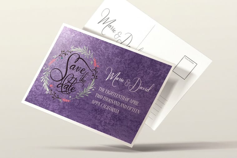
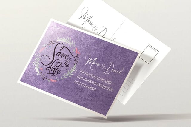
When your identity leans elegant, a premium stock reinforces it. A velvet postcard or a suede postcard gives serif and script type a soft, tactile backdrop that a plain uncoated card never will.
Legibility at a glance: sizing type for postcard reading distance
This is the step that separates a card that gets read from one that gets tossed. A postcard is not viewed at reading distance. It is scanned from a pile at arm’s length. Type that looks perfectly sharp zoomed in on your monitor can collapse into gray fuzz at true 4x6. The fix is to design at real size and test at real size.
Use the hierarchy above as a starting point. Set the headline somewhere around 30 to 60 pt so it lands from across a room, subheads around 18 to 24 pt, and body copy no smaller than 9 to 11 pt. Favor faces with an open, generous x-height, keep strong contrast between ink and stock, and never trust the screen. Export a proof, print it, and read it standing up. For a fuller size discussion, our postcard sizes and dimensions guide shows how the format itself changes how much type you can fit.
Contrast matters as much as size. Dark type on a light stock, or crisp light type on a rich dark card, will always beat a mid-tone that fights the background. When in doubt, add weight before you add size.
How different fonts communicate

Every typeface has a personality, and readers feel it before they read a word. A rounded sans-serif feels friendly and approachable. A high-contrast serif feels editorial and refined. A condensed slab feels rugged and confident. A flowing script feels celebratory or romantic. The mood shows most at headline size and fades in body copy, so pick the headline face for tone and the body face for legibility.
- Trust and expertise: classic serifs and steady humanist sans-serifs. Good for legal, medical, and financial cards.
- Modern and clean: geometric sans-serifs. Good for tech, real estate, and product launches.
- Warm and personal: scripts and hand-lettered faces. Good for invitations, salons, and thank-you cards.
- Bold and urgent: heavy display and condensed faces. Good for sales, events, and grand openings.
Weddings are the clearest case of mood driving the whole card, which is why we keep a dedicated roundup of the best wedding fonts for invitations and designs. Borrow the pairing logic there for any celebratory postcard.
Vintage and "Greetings From" postcard lettering
Some of the most recognizable postcard fonts are the retro ones. Diner menus, roadside attractions, and throwback promos lean on the same nostalgic display lettering as the "Greetings From" card above, and used well it signals fun and personality in an instant.
The rule is restraint. Keep the vintage or hand-lettered face for the headline only, and set every practical detail, the address, the offer, the date, in a clean, quiet body font. Nostalgia should decorate the message, never obstruct it. For a library of period-correct references, browse our 15 retro fonts collection and pull one display face to anchor the card.
Retro lettering earns its keep on a finish that plays along. A spot UV postcard can gloss just the headline so the vintage type catches the light while the matte body copy stays perfectly readable.
Set your type up to print clean
A font that looks perfect in your design app can still break at the printer. Two things go wrong most often: the font does not travel with the file, and small type collides with a special finish. Both are avoidable in a couple of minutes.
- Outline or embed your fonts before you export, so the press renders the exact letters you chose instead of substituting a default.
- Keep type inside the safe zone and out of the bleed, so no letter gets clipped when the card is trimmed.
- Set body copy dark and high-contrast against the stock.
Finishes are where type and paper meet. On a metallic postcard, a fine script can wash out against the foil, so a slightly heavier weight keeps it legible while the metallic accent still does its job.
When the file is ready, the online designer lets you lock the layout in the browser and send it to print, and free paper samples, which ship free, let you feel how your chosen stock holds ink before you commit to the run.
Wally explains postcard fonts
The best font is the one you can read from across the room
Wally reads a postcard the way the mailbox does, fast and from a distance. If the headline lands in two seconds, the font is working. If you have to lean in and squint, no clever typeface will save it. Pick two fonts, size the headline big, keep the body clean, and test it on a real printed proof. Then set that type on a stock that makes it pop and let 4OVER4 print it sharp.
Order metallic postcards →%22%2F%3E%3Ccircle%20cx%3D%2247%22%20cy%3D%2220%22%20r%3D%2222%22%20fill%3D%22%23a78bfa%22%20opacity%3D%220.15%22%2F%3E%3Ccircle%20cx%3D%2254%22%20cy%3D%2227%22%20r%3D%22-3%22%20fill%3D%22%23a78bfa%22%20opacity%3D%220.1%22%2F%3E%3Crect%20x%3D%2277%22%20y%3D%22-9%22%20width%3D%2232%22%20height%3D%2220%22%20rx%3D%224%22%20fill%3D%22%23a78bfa%22%20opacity%3D%220.08%22%20transform%3D%22rotate(42%2080%2030)%22%2F%3E%3C%2Fsvg%3E)
Specs and pricing
Metallic postcard specs and live pricing
Metallic postcards print on 16pt Gloss Cover with a foil accent on the front, with High Gloss UV or Spot UV on the front as coating options. The panels below show the live specs and the price at each quantity. For silver or gold ink instead of foil, metallic ink postcards use the same stock and sizes.

| Quantity | Price Per Unit | Total |
|---|---|---|
| 500 | 63.5¢ | $317.44 |
| 1,000 | 41.6¢ | $416.28 |
| 2,500 | 25.9¢ | $646.94 |
| 5,000 | 18.2¢ | $910.55 |
| 10,000 | 15.7¢ | $1,569.59 |
| 15,000 | 14.9¢ | $2,228.61 |
| 20,000 | 14.4¢ | $2,887.64 |
| 25,000 | 13.7¢ | $3,436.82 |
Print it
Premium postcards worth setting good type on


See it in use
Postcard work printed in-house in Queens


Explore more
Where to go next


By the numbers
The plant that prints your type
Common Questions
Common questions about postcard fonts
What is a postcard font?
There is no single official "postcard font." The term describes any typeface chosen to read well on a small, glanceable card that is skimmed from a mail pile or a countertop display. In practice that means a clear, high-contrast face for the message and, often, a warmer display or script face for the headline, while a direct mail coupon leans on a plain, no-nonsense sans-serif.
How small can body type go on a mailed card?
9 pt is the floor for body copy on a 4x6 card, and the address block should stay at least that size. Light and thin weights need a point or two more than a regular weight to read as clearly.
What does a postcard cost and how is the price set?
Size, stock, quantity and finish set it. Of the postcards on this page, suede and velvet start at 250 for $87.15, spot UV at 1,000 for $190.02, and metallic at 500 for $317.44 with a 7 business day standard turnaround. Each product page lists the price at every tier.
What sizes are the postcards on this page?
Metallic postcards come in nine sizes from 4x6 to 6x11. Suede and velvet postcards come in 19 sizes from 2 x 3 to 6 x 11 inches, and spot UV postcards in 27 sizes up to 9 x 12, all on 16pt stock. A bigger card gives display lettering more room.
How many fonts should a postcard use?
Two is the sweet spot: one display or serif for the headline and one quiet face for the body. If you need more variety, get it from weight, size, and color within those two families rather than by adding a third typeface. More than two fonts on a card the size of a postcard reads as noise and pulls the eye away from your call to action.
Get Started
Set your two fonts and print
Pick your size and stock, drop in your two chosen fonts, and we print a crisp, high-contrast card.
Legal Disclaimer
Gold Standard guarantees apply to all standard orders placed through 4over4.com. Price match requires verifiable proof of a competitor's published price for an equivalent product with matching specifications and turnaround time. Satisfaction guarantee covers manufacturing defects and print quality issues. Contact support with order number and documentation.
