
How to Build a Memorable Architecture Firm Brand


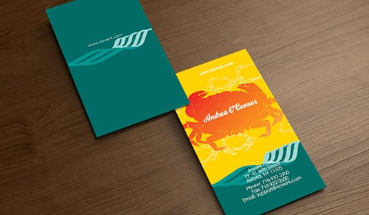
Your brand is your practice made visible. Three printed pieces carry it: the card, the letterhead and the folder you leave behind. The last section of this guide gives the size, stock and finish to order for each one.
Build an architecture firm brand in four steps: define who you are, name your ideal client, design a restrained visual system, and blueprint the identity so it stays consistent. Then make the brand physical with heavy-stock business cards, foil or embossed letterhead, and presentation folders that carry it into every pitch.
Start here
The four-step brand blueprint
A strong architecture brand moves from strategy to substance in four steps: who you are, your ideal client, the visual system, and the printed identity. The printed identity is three orders: business cards from $17.57 for 100, 8.5 x 11 letterhead from $99.95 for 50, and 9 x 12 presentation folders from $844.54 for 250. The diagram below maps the whole path so you can see how positioning becomes a tactile stationery suite clients hold.
Why an architecture firm needs a deliberate brand
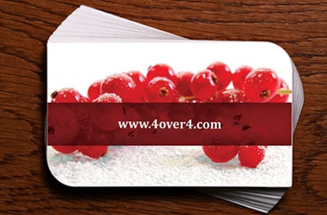
Architecture is a high-trust business. A client is not buying a product off a shelf; they are hiring a practice to shape a major, long-lived investment. Everything they can see before the drawings exist, your website, a 2 x 3.5 inch card, the 9 x 12 folder you leave on the table, is standing in for the quality of the work itself. That is what your brand is: a promise about how you think.
A deliberate brand does three things for a firm. It signals discipline, which is exactly the trait a client wants in the people designing their building. It makes you memorable in a field where too many firms look interchangeable. And it gives every touchpoint a coherent feel, so a proposal, a business card, and a sign all read as the same considered practice.
This guide walks the brand-building process in order, from positioning to a printed identity. The last step matters more than it looks: a brand that only lives on a screen breaks the moment a client holds a mismatched business card. We will end by making the brand tactile with cards, letterhead, and presentation folders.
Step 1: Define who you are

Before a single design decision, write your firm down in one honest sentence. Not a mission statement full of adjectives, but a clear claim: what you specialize in, what you believe about design, and the one idea a client should walk away remembering. A restoration studio, a sustainable residential practice, and a large commercial firm are three different sentences, and they lead to three different brands. The same sentence later settles the paper: a warm residential practice might hand out cards on 18pt Cream Uncoated Cover, a minimal commercial firm on 16pt Uncoated with Soft Touch.
This positioning is the foundation everything sits on. It decides your tone, your palette, even the weight of your card stock. A firm built on warm, human-scaled homes will feel different from one built on precise, minimal commercial towers, and that difference should be visible in every piece long before anyone reads your name.
Spend real time here. The firms with the strongest brands are almost never the ones with the flashiest logos; they are the ones that know exactly what they stand for and let that clarity guide every choice that follows, right down to which finish lands on the card.
Step 2: Name your ideal client

A brand that speaks to everyone speaks to no one. The second step is to name the specific client you most want to win, because their expectations shape the entire identity. A private homeowner commissioning a custom house wants warmth, trust, and a sense of personal attention. A commercial developer wants efficiency, scale, and confidence. A public agency wants credibility and rigor.
Picture that client holding your materials. What would make them feel they are in expert hands? The answer guides your tone of voice, your imagery, and the physical quality of what you hand them. A developer reassured by precision responds to a crisp, gridded card, while a homeowner responds to a warmer, more tactile piece.
You are not excluding other clients by choosing one. You are giving the brand a center of gravity, which paradoxically makes it more attractive to everyone. Once you know who you are designing for, the visual system almost designs itself.
Step 3: Design the visual system
Now the visible brand takes shape, and the guiding principle is restraint. Architects, and the clients who hire them, read layout instinctively. A clean grid, generous white space, and one strong typeface communicate discipline far better than a busy composition ever could. Your visual system should feel as considered as a well-resolved floor plan.
Build it from a few decisions. Design a simple, scalable logo, ideally a clean wordmark or a restrained geometric mark that holds up equally on a sign, a card, and a title block. Choose one or two typefaces and commit to them. Set a disciplined grid. And pick a neutral, architectural palette lifted by a single accent color so the system stays calm and premium.
Test every element at the scale it will actually appear. A mark that looks elegant on a large screen can turn muddy on a letterhead footer or a small card. Designing for the smallest, most demanding surface first keeps the whole system honest. If minimalism is your direction, our guide on minimal brand identity goes deeper.
Step 4: Blueprint the brand identity
A brand is only as strong as its consistency, so the fourth step is to document it like a set of construction drawings. Write down how the logo is used and how much space it needs, the exact typefaces and their sizes, the spacing rules, and where the accent color is allowed to appear. This is your brand blueprint, and it keeps the identity intact as your firm grows and more hands touch it.
Without this step, a brand drifts. One proposal uses a slightly different blue, another stretches the logo, a third swaps in whatever font was handy, and within a year the coherence is gone. Architects would never let a project run without documented standards; your brand deserves the same rigor.
The blueprint also makes production effortless. When it is time to print, you already know the stock, the color, and the layout, so ordering a presentation folder or a fresh run of cards is a matter of following your own specs rather than reinventing them each time.
What not to do when branding your firm
A few missteps undo otherwise good work. The first is starting with the logo before the strategy. A mark designed with no clear positioning behind it is just decoration, and it rarely survives contact with real projects. Do the thinking first, then design.
The second is overcomplication. Too many typefaces, too many colors, and too many effects read as amateurish to a design-literate audience. Architects trust restraint. If you are unsure whether an element earns its place, it probably does not. Strip back until only the essentials remain.
The third is letting the brand live only on a screen. A polished website means little if the card a client pockets or the folder they carry home looks nothing like it. The physical pieces are where the impression sets, which is exactly why the final step is to make the brand tangible in print.
Make it real: print the brand with 4OVER4

Clients remember how your card felt in the hand and how your proposal folder looked on the conference table long after they forget a web page. Print is where an architecture brand becomes physical, so give it the same care as a drawing set.
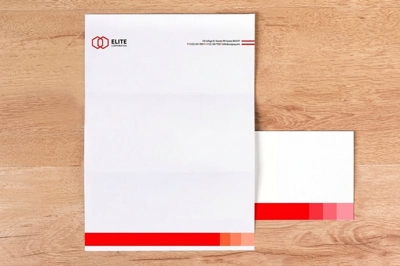
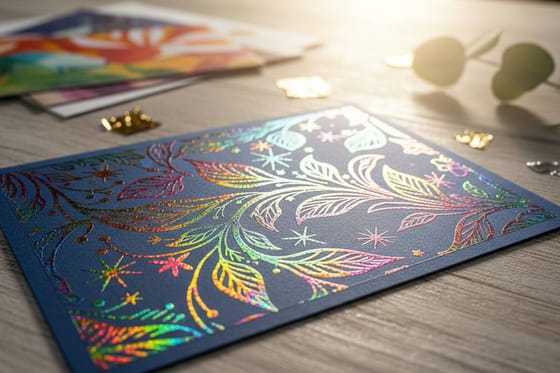
Build the core suite around three pieces. Business cards on a heavy stock make the first tactile impression. Letterhead carries proposals and correspondence, and a subtle foil-stamped or embossed mark lifts every document. And presentation folders turn a stack of drawings and spec sheets into a branded package you leave behind after a pitch. For a raised foil mark on the cover, the embossed presentation folders story shows the 9 x 12 folder finished. Our guide to letterhead layouts shows which leave-behind letterhead sample suits a proposal.
Pick the stock and finish in the live specs and pricing panel below, and the price moves as you change them. Order the three pieces in one sitting from one set of files, so the card, the letterhead and the folder carry the same color and the same mark.
Choosing Size, Stock and Finish for Each Piece
Each piece of the suite has a few real choices. Settle them against your positioning from Step 1, then order all three from one set of files.
- Business cards, 2 x 3.5 inches. 16pt Uncoated with Soft Touch, 18pt Cream Uncoated Cover or 14pt White Linen, from $17.57 for 100 in 3 business days.
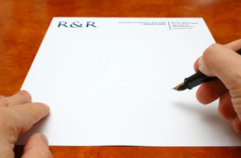
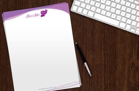
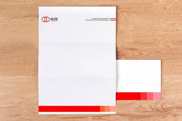
- Letterhead, 8.5 x 11 inches. 24# Royal Laid in bright white, natural white or gray, or 28# Royal Linen, from $99.95 for 50 in 5 business days.
- Presentation folders, 9 x 12 or 9 x 14.5 inches. 14pt or 16pt Gloss Cover, 14pt Uncoated Cover or 14pt White Linen, from $844.54 for 250 in 7 business days.
Match the textures across the suite. A linen card pairs with 28# Royal Linen letterhead and a 14pt White Linen folder, and an uncoated card pairs with laid letterhead and an uncoated folder. Choose the 9 x 14.5 inch folder when proposals run thick, and add business card slits to the right or left pocket so the card travels with the drawings.
Build each file at its finished size with bleed, keep the logo in the same position on all three, and pick the free online proof or the next day hardcopy proof to check the color before the full run.
Wally drafts the brand like a building
Strategy first, then a system, then something you can hold
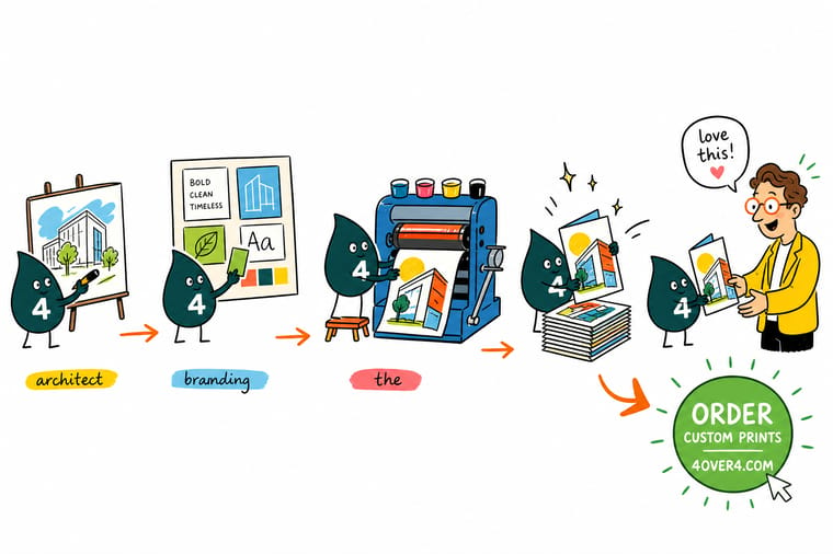
Wally treats a firm's brand like a project: start with who you are and who you serve, set a clean grid and one strong typeface, then document it so nothing drifts. The last drawing is the one clients touch, a heavy card, a presentation folder. Build it clean, and 4OVER4 prints the identity that makes your practice feel as considered as your work.
Print your brand stationery →Quick reference
The architecture brand system, at a glance
Six decisions turn a firm into a recognizable brand: a one line position, one named client, a simple mark, one or two typefaces on a strict grid, a neutral palette with one accent, and three printed pieces. Set each one and the identity holds together from the first card to the final proposal.
| Element | Aim for | Why it matters |
|---|---|---|
| Positioning | Who you are, in one line | A clear point of view (residential, commercial, sustainable, restoration) that separates your firm from every other practice. |
| Ideal client | A specific person, not everyone | Developers, homeowners, and public agencies each respond to a different tone, so name the client the whole brand speaks to. |
| Logo and mark | Simple, scalable, timeless | A clean wordmark or geometric mark that holds up on a sign, a card, and a drawing set alike. |
| Type and grid | One or two typefaces, strong grid | Architects read layout instinctively. A disciplined grid and restrained type read as competence. |
| Palette | Neutral base, one accent | Muted, architectural tones with a single accent keep the system calm and premium rather than loud. |
| Printed identity | Cards, letterhead, folders | The tactile pieces clients actually hold: heavy stock cards, letterheads, and presentation folders for proposals. |
Step by step
Build and print your brand in 7 steps
- Define who you are Write your firm in one honest sentence. Name your specialty, your design values, and the single idea a client should remember. Everything visual grows from this line.
- Name your ideal client Pick the client you most want to win, whether a developer, a private homeowner, or a public agency, and let their expectations shape the tone of the brand.
- Build the visual system Design a simple, scalable logo, choose one or two typefaces, set a disciplined grid, and pick a neutral palette with a single accent color.
- Blueprint the identity Document the rules so the brand stays consistent: how the logo is used, the type sizes, the spacing, and where the accent appears. Treat it like a set of construction documents.
- Choose your stationery Decide which printed pieces carry the brand into the room: business cards for introductions, letterhead for proposals, and presentation folders for full pitches.
- Upgrade the finish Select the stock and finish that match your positioning. A heavier card, a foil-stamped mark, or a soft-touch coating tells clients the firm sweats the details.
- Print and roll it out Order the full stationery suite, apply the brand across your site and drawings, and use it consistently on every project from the first handshake onward.
%22%2F%3E%3Ccircle%20cx%3D%2240%22%20cy%3D%2249%22%20r%3D%2225%22%20fill%3D%22%232dd4bf%22%20opacity%3D%220.15%22%2F%3E%3Ccircle%20cx%3D%2278%22%20cy%3D%2258%22%20r%3D%2214%22%20fill%3D%22%232dd4bf%22%20opacity%3D%220.1%22%2F%3E%3Crect%20x%3D%2270%22%20y%3D%2228%22%20width%3D%2225%22%20height%3D%2234%22%20rx%3D%224%22%20fill%3D%22%232dd4bf%22%20opacity%3D%220.08%22%20transform%3D%22rotate(35%2080%2030)%22%2F%3E%3C%2Fsvg%3E)
Specs and pricing
Business card specs and live pricing
The card is where your brand first becomes tactile, at 100 for $17.57, which is $0.18 each. It prints at 2 x 3.5 inches on 73 stocks from 13pt to 80pt, including 14pt White Linen and 110# Strathmore Bright White Wove, with 1/8 or 3/8 inch rounded corners as an option and 3 business days of production.

| Quantity | Price Per Unit | Total |
|---|---|---|
| 100 | 17.6¢ | $17.57 |
| 200 | 11.5¢ | $23.07 |
| 300 | 9.15¢ | $27.46 |
| 400 | 7.96¢ | $31.86 |
| 500 | 7.25¢ | $36.26 |
| 600 | 6.77¢ | $40.64 |
| 700 | 6.43¢ | $45.04 |
| 800 | 6.18¢ | $49.43 |
Print it
Print your architecture stationery suite
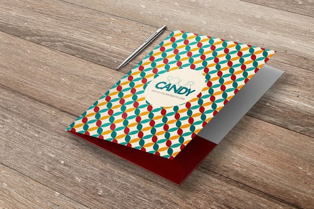
Letterhead prints at 8.5 x 11 inches on 24# Royal Laid or 28# Royal Linen from $99.95 for 50 in 5 business days, and pocket folders come in 9 x 12 or 9 x 14.5 inches with business card slits on either pocket from $844.54 for 250.

See it in use
Firm identities we printed on heavy stock








Explore more
Where to go next


By the numbers
The press behind the stationery suite
Common Questions
Common questions about architecture branding
What are the 4 steps to building a great brand for your architecture firm?
The four steps are: define who you are, name your ideal client, design the visual system, and blueprint the identity so it stays consistent. First, write your firm in a single sentence that captures your specialty and design values. Second, choose the specific client you want to win, since a developer and a private homeowner respond to different tones. Third, build the visual system: a simple scalable logo, one or two typefaces, a disciplined grid, and a restrained palette. Fourth, document the rules like a set of construction drawings so every card, proposal, and folder looks like the same firm made it.
What should you not do when creating an architecture firm brand?
Avoid three common mistakes. Do not start with the logo before you have decided who you are and who you serve, because a mark with no strategy behind it is just decoration. Do not overcomplicate the system with too many fonts, colors, and effects, since architects read restraint as confidence and clutter as amateurism. And do not let the brand live only on a screen. If your card, letterhead, and folders do not match your identity, the impression breaks the moment a client holds something physical.
Why does an architecture firm need a strong brand?
Architecture is a high-trust, high-value service, and clients are choosing a firm to shape a major investment. A strong brand signals that your practice is disciplined, consistent, and detail-oriented, the exact qualities a client wants in the people designing their building. It also makes your firm memorable in a crowded field and gives every touchpoint, from your website to the folder you leave behind after a pitch, a coherent, professional feel that reinforces why you are worth hiring.
What printed materials should an architecture firm brand include?
The core suite is business cards, letterhead, and presentation folders. Business cards make the first tactile impression, so they benefit from a heavier stock and a refined finish. Letterhead carries proposals, invoices, and correspondence, and a subtle foil or embossed mark lifts every document. Presentation folders hold the drawings, spec sheets, and proposals you leave with a client, turning a stack of paper into a branded package. Together these pieces make the brand physical at exactly the moments a client is deciding whether to hire you.
How do I make my architecture firm brand look premium?
Premium comes from restraint plus material quality. Keep the visual system clean, with one strong typeface, a disciplined grid, and a neutral palette lifted by a single accent. Then let the print do the rest: choose a heavier card stock, add a foil-stamped or embossed logo, and consider a soft-touch or matte finish that feels substantial in the hand. The combination of a calm, confident design and a tactile, well-made object is what reads as high-end to the developers and homeowners you want to work with.
What does an architecture firm stationery suite cost and how are prices set?
Pricing scales with the pieces you order and the specs you choose. For each item, the levers are quantity, size, paper stock, and finish, so a run of standard cards costs less than foil-stamped cards on a heavy stock, and a small letterhead run costs less than a large one. You configure each product separately and the price updates live as you adjust stock and finish, which lets you build a suite that fits your budget while still feeling considered. Ordering cards, letterhead, and folders together keeps the whole brand consistent.
Get Started
Start the suite with 100 cards for $17.57
Choose the stock and finish that match your positioning at 4OVER4.COM and watch the price update live. Order cards, letterhead, and folders together so the whole brand reads as one considered practice.
Legal Disclaimer
Gold Standard guarantees apply to all standard orders placed through 4over4.com. Price match requires verifiable proof of a competitor's published price for an equivalent product with matching specifications and turnaround time. Satisfaction guarantee covers manufacturing defects and print quality issues. Contact support with order number and documentation.
