
Letterhead Samples and Layouts That Print Sharp


Five proven letterhead layouts, the exact margins that keep them printable, and the stock and finish choices that decide how the sheet feels in someone's hand. Copy an arrangement, drop in your logo, and send a press-ready file.
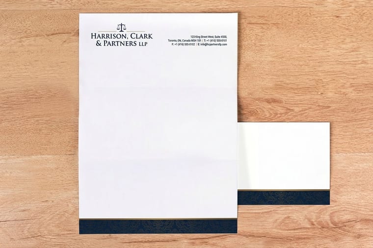
A letterhead sample is a finished layout you can copy or a printed sheet you can hold. The layouts that work are classic top band, split header, side rail, minimal top mark with a strong footer, and centered monogram. All five sit on an 8.5 by 11 inch sheet with a half inch clear margin, an eighth of an inch of bleed on anything that runs off the edge, a header no deeper than two inches, and the typing area left open in the middle.
Start here
Letterhead layout in one paragraph
A letterhead layout arranges identity around a letter without ever crowding it. Put the logo and name in a header zone 1.5 to 2 inches deep, push address, phone and website into a footer zone under an inch tall, keep half an inch of clear margin on all four sides, and extend any edge-to-edge color an eighth of an inch past the trim as bleed. What is left in the middle is the typing area, and protecting it is the whole job.
Why a letterhead layout is judged before a single word is read
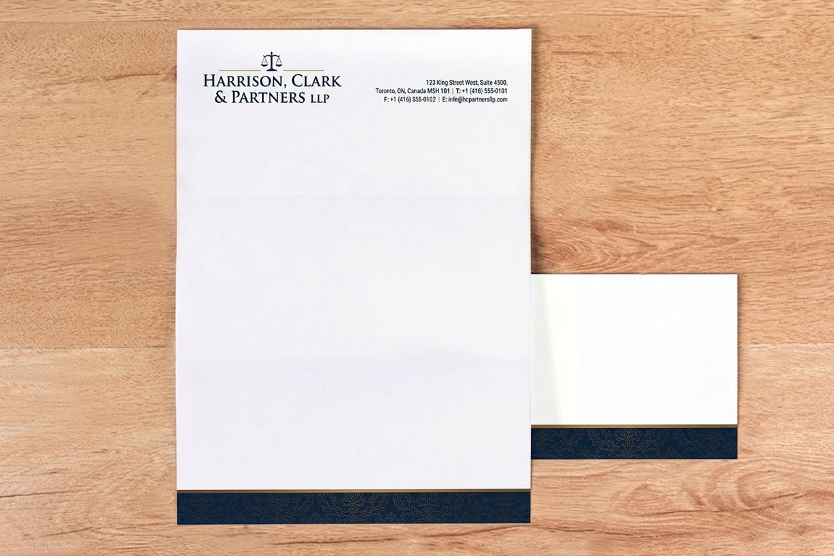
A letter gets handled before it gets read. Someone pulls the sheet from an envelope, and in that second the paper weight, the position of the logo and the amount of clear space around the text all report on how the business runs. A crooked, crowded header says the same thing to a client that a stained tie says in a meeting.
That is the whole case for working from real sample layouts instead of improvising. A layout that has already been proven on press gives you known margins, a header depth that will not collide with your typing area, and a footer that survives the trim. Our guide to creating a letterhead covers the build order, and this page gives you the finished arrangements to copy.
The layouts below are the ones that keep showing up in professional stationery because they solve the same three problems: identify the sender instantly, keep the reading area open, and stay printable at production tolerances. Everything after that is taste.
The five zones every letterhead layout is built from

Divide the sheet before you design anything. A standard 8.5 by 11 inch letterhead has a header zone at the top, a typing area in the middle, a footer zone at the bottom, a margin ring around all four edges, and an optional accent zone such as a side rail or a color band.
The header zone is where the logo and the primary name live, and it usually runs 1.5 to 2 inches deep. Go deeper than that and a two-page letter becomes a three-page letter. The footer zone carries address, phone, website and any legal line, and it works best between 0.75 and 1 inch tall so it reads as a signature rather than a second header.
The typing area is the part people forget to protect. Your word processor or letter template has to start below the header and end above the footer without any manual nudging. If a colleague has to drag margins every time they write, the layout has failed, no matter how good it looks empty. The MS Word setup guide walks through locking those boundaries in place.
Five sample letterhead layouts that print cleanly

Classic top band. A solid color band across the top, logo on the left, one line of identity on the right, and a thin rule above the footer. It is the most forgiving layout because the band hides small alignment differences and the body area stays wide open.
Split header. Logo left, contact stack right-aligned on the opposite corner, separated by a hairline rule. This is the layout for organizations with several addresses or a long credential line, because the right column absorbs detail without pushing the header deeper.
Side rail. A vertical band down the left edge, roughly 1.25 inches wide, carrying the logo at the top and secondary detail at the bottom. It frees the top of the page entirely, which suits long correspondence, and it looks distinctive without any extra ink coverage in the reading area.
Minimal top mark with a strong footer. One small logo at the top left, everything else pushed to a dense footer. It is the quietest of the five and the one that reads most expensive, which is why consultancies and studios keep choosing it.
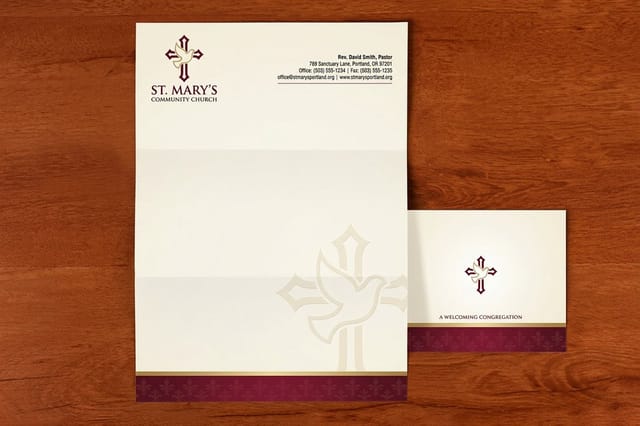
Centered monogram. A centered mark with the name beneath it, and a centered footer to match. It suits institutions, congregations and formal announcements, and it is the layout you see most often on a church letterhead where symmetry is part of the tone.
Logo placement and sizing that survive real correspondence
The top left corner remains the default because that is where the eye lands on a page of Latin script, and because it leaves the right side of the header free for contact detail. Centered logos work when the whole layout is symmetrical, and they look wrong the moment anything else on the sheet is left-aligned.
Scale the mark to its readable minimum rather than its impressive maximum. A wordmark that sits between 1.5 and 2.5 inches wide is legible at arm's length and still leaves the header shallow. Oversized logos are the single most common reason a letterhead feels amateur, and they eat the space your letter needs.
Supply the logo as vector artwork whenever you can, so the edges stay crisp at print resolution rather than softening the way a small raster file does. If your only asset is a photograph or a scanned mark, place it at full size and check it at 100 percent before you send the file. A logo built for a screen signature is rarely dense enough for paper.
Print-ready margins, bleed and safe zones for an 8.5 by 11 sheet
Set the document at 8.5 by 11 inches, which is the trim size, then add an eighth of an inch of bleed on all four sides for any element that runs off the edge. A color band across the top has to extend into that bleed, otherwise a fraction of a millimeter of drift at the cutter leaves a white line along the edge.
Keep a clear margin of at least half an inch on every side, and pull text and logos a further eighth of an inch inside that for the safe zone. Nothing you care about should sit within a quarter inch of the trim. Rules, borders and thin frames that hug the edge are the riskiest elements on any layout, because any shift shows as an uneven border.
Build the file in CMYK, place images at 300 dpi at final size, and convert type to outlines or embed the fonts before you export. Export a press-ready PDF with bleed included and marks off. If you want the arrangement confirmed on paper before you commit, see how to get free printing samples first.
Paper stock, weight and finish for stationery that gets handled
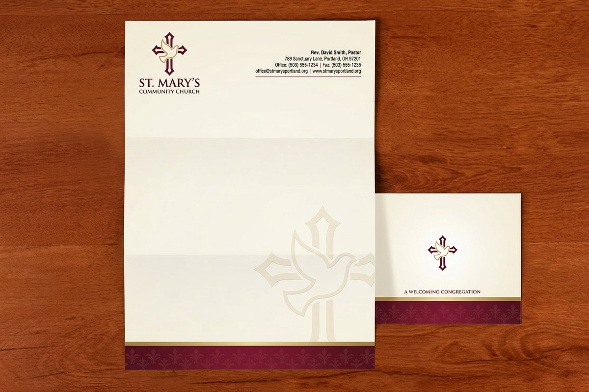
Letterhead is one of the few printed pieces that has to work in a machine after it leaves ours. Uncoated text weight around 70 lb is the standard because it feeds through office printers and copiers, takes toner and ballpoint ink without smearing, and still feels like a real sheet rather than copy paper.
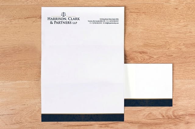
Move heavier when the sheet is presentation material rather than daily correspondence. A thicker opaque stock stops show-through on two-sided letters and gives formal documents a firmer snap when they are picked up. Linen and laid textures add a tactile signal that suits legal and financial practices, which is why a law firm letterhead so often lands on a textured uncoated sheet.
Avoid gloss coating for anything people will write on. A coated surface repels fountain pen and gel ink and makes handwritten notes smudge, which defeats the point of stationery. If you want sheen, put it in a spot treatment on the logo rather than across the whole page.
Foil, embossing and the finishes worth paying for
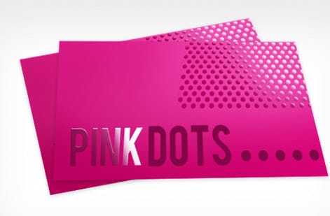
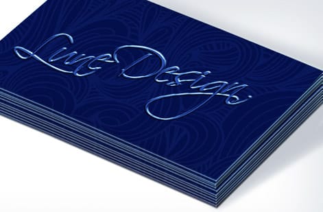
Foil stamping presses a metallic film into the sheet with heat and pressure, so the mark sits slightly below the surface and catches light as the page moves. On letterhead it belongs on the logo alone. A foiled header band swallows the budget and fights every line of type underneath it.
Blind embossing raises the paper without any ink at all, which reads as confidence rather than decoration. It is the most understated upgrade available and it photographs poorly, which tells you it is meant to be felt in the hand. Pair it with a heavier uncoated stock so the raised area holds its shape.
One rule governs all of these treatments: keep them out of the typing area. Foil and embossing change the surface, and a printer that has to pull the sheet across a raised area can jam or leave marks. Header and footer only, and always order a sample of the finish before a large run.
Match the letterhead to the rest of the stationery set
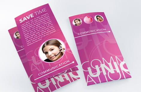
A letterhead almost never travels alone. It shares an envelope, a business card and often a compliment slip, and the set only works when the same margin logic, the same type sizes and the same logo scale repeat across all of them. Design the letterhead first, because it has the most constraints, then derive the smaller pieces from it.
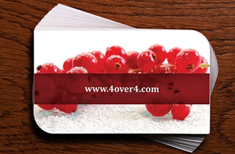
Check the card against the sheet in person rather than on screen. Our guide to using business card samples covers how to compare stocks side by side, and the same method applies to invitation suites in the wedding stationery samples guide.
The system extends past paper. When the same identity has to hold up at trade show scale, the header treatment you chose here becomes the anchor for large format work such as 2 sided blockout banners, and the layout logic carries into environmental pieces the way it does in this look at poster printing for MUPIs.
What letterhead printing costs and how to order it right
Custom letterhead printing starts at $99.95, and the live price responds to quantity, stock, sides printed, ink coverage and any specialty finish. Quantity is the strongest lever, because setup is spread across the run. If you know you will use the sheets over a year, ordering once at a higher count almost always beats three small reprints.
Order the sheet you will actually use. Print a real letter onto a sample before scaling up, because that is the only test that catches a header too deep, a footer that sits under the fold, or a logo that thickens on absorbent stock. If you are weighing suppliers, this letterhead alternative comparison and the related free samples comparison lay out the differences plainly.
When the layout is settled, configure the run on the product page, upload your press-ready PDF with bleed, and request free paper samples if you are still deciding between stocks.
Wally explains letterhead layouts
Protect the middle of the page and everything else falls into place
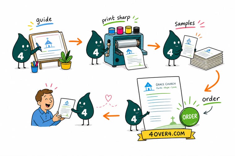
Wally starts every letterhead by drawing three boxes: a shallow header, a wide open middle, and a short footer. The logo goes in the top box, the contact details go in the bottom box, and nothing at all goes in the middle, because that is where the letter lives. Then he pulls everything a half inch away from the edges so the trim never clips a word.
Design and print letterhead →Layout template
Three sample letterhead layouts with print-ready margins
One frame, three arrangements, and the measurements that keep all of them printable. Save it and hold your own draft against it before you export the file.
Each layout keeps the same margin ring and the same open middle. Change the header arrangement, never the safe zone, and the sheet will trim clean every time.
Specs and pricing
Letterhead specs and live pricing
When the layout is settled, the rest is stock, quantity and finish. These are the live specs and price tiers for custom letterhead printing at 4OVER4.COM.
| Quantity | Price Per Unit | Total |
|---|---|---|
| 50 | $2.00 | $99.95 |
| 100 | $1.05 | $105.44 |
| 200 | 58.2¢ | $116.43 |
| 300 | 43.6¢ | $130.72 |
| 400 | 34.9¢ | $139.49 |
| 500 | 29.4¢ | $147.18 |
| 600 | 25.4¢ | $152.68 |
| 700 | 22.6¢ | $158.17 |
Print it
Put your letterhead layout into print at 4OVER4
See it in use
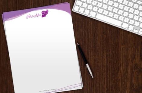
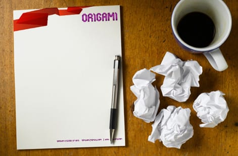
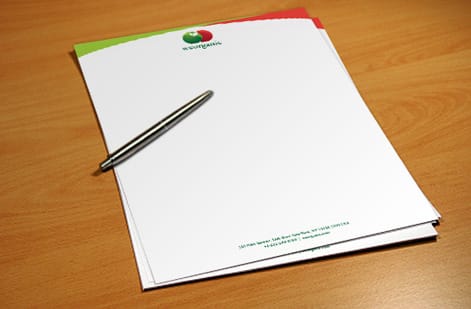
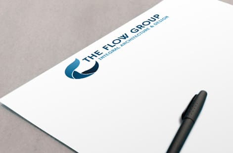
Real stationery work, printed in-house
Explore more
Where to go next




By the numbers
Stationery printing you can count on at 4OVER4.COM
Common Questions
Common questions about letterhead samples and layouts
What is a letterhead sample?
A letterhead sample is a finished example of a stationery sheet you can study or hold before you commit to a print run. Two kinds matter. A layout sample shows how the logo, contact block, margins and footer are arranged on a standard 8.5 by 11 inch page. A printed sample is the physical sheet, which tells you how a stock feels, how opaque it is, and how ink or foil sits on the surface.
How do I choose the right letterhead layout?
Start from how the sheet gets used. If most letters run long, choose a shallow top band and a quiet footer so the typing area stays generous. If the contact details are the point, such as a firm with several offices, a split header or a side rail carries them without stealing body space. Then check the layout against your envelope and business card so the three pieces share one visual system.
What does letterhead printing cost and how are prices set?
Custom letterhead printing at 4OVER4.COM starts at $99.95, and the live price moves with quantity, paper stock, ink coverage, sides printed, and any specialty finish such as foil. Quantity is the biggest lever, because plate and setup work is spread across the run. Doubling the count almost never doubles the price.
What sizes, stocks and finishes are available for letterhead?
The standard is 8.5 by 11 inches, sized to fit a number 10 envelope with a standard tri-fold. Uncoated text weights around 70 lb are the workhorse because they take toner and fountain pen ink well. Heavier opaque stocks suit presentation letters and legal correspondence. Finishes range from plain uncoated through smooth and linen textures, with foil and embossing available where you want the sheet to feel like an announcement.
How long does letterhead take to print and ship?
Turnaround is quoted live inside the product configurator, because it depends on the stock, the finish and the quantity you select. Plain uncoated runs move fastest. Specialty finishes such as foil add a production step, so build a few extra days into your plan. Shipping time is separate from production time and is calculated from your delivery address at checkout.
Should I order a printed sample before a full letterhead run?
Yes, especially if you are choosing between stocks or printing a logo with a specific brand color. Screens flatter paper. A sheet that looks bright white on a monitor can read warm in daylight, and a logo that reads crisp at screen size can thicken on an absorbent uncoated surface. Handling the stock first removes the guesswork from a run you will live with for a year.
What margins should a letterhead layout use?
Keep at least half an inch of clear margin on all four sides, and pull anything critical a further eighth of an inch away from the trim line. If a color band, rule or image runs to the edge, extend it an eighth of an inch past the trim as bleed so the cut never exposes a white sliver. Leave the typing area starting about two inches down from the top so your letter never collides with the header.
Get Started
Ready to put your letterhead on real paper?
Pick a layout, upload your press-ready file with bleed, and choose the stock that suits how the sheet will be used. Custom letterhead printing starts at $99.95.
Legal Disclaimer
Gold Standard guarantees apply to all standard orders placed through 4over4.com. Price match requires verifiable proof of a competitor's published price for an equivalent product with matching specifications and turnaround time. Satisfaction guarantee covers manufacturing defects and print quality issues. Contact support with order number and documentation. On-time delivery rate based on tracked orders 1999 to 2026. Individual results may vary based on shipping carrier performance.
