
Why Business Cards Are Cool Again and What the Squid Game Card Got Right


Emma is our prepress and print production voice, built from the knowledge of our production team, with over 20 years in printing.
The card the recruiter hands out in Squid Game carries three shapes on one side and a phone number on the other, and that emptiness is the entire trick. Business cards came back into fashion because a stripped down piece of board is the one thing in a networking pile that nobody scrolls past, and the cheapest way to copy the look is a 16pt kraft or uncoated card printed in a single dark ink. That is why business cards are cool again, and what the Squid Game card got right is the part you can copy for $24.75.
Five minimalist card looks and where each one fails
| The look | Stock and finish | Starting price at 4OVER4 | Where it fails |
|---|---|---|---|
| Shapes only, no name | Kraft or uncoated, 16pt, one ink | Kraft business cards from $24.75 | A stranger cannot work out who you are or why they should call |
| One ink on brown board | Kraft, 14pt or 16pt, CMYK | Kraft business cards from $24.75 | White type vanishes and photographs go muddy on a brown ground |
| Bone white, one typeface | Premium 16pt, matte or uncoated | Premium business cards from $17.57 | Every fingerprint and bent corner shows on a near empty field |
| Matte black, one gloss detail | Matte laminate plus spot gloss | Spot UV business cards from $76.88 | Dark matte holds fingerprints, so keep the hand area free of solid black |
| Foil rule on plain white | Raised foil on 16pt board | Raised foil business cards from $86.78 | The per card cost only makes sense once you are handing out hundreds |
Each price is the entry configuration: $17.57 for premium 16pt, $24.75 for kraft on 14pt or 16pt, $76.88 for 500 spot UV cards in 5 business days and $86.78 for 100 raised foil cards in 7. The first two looks cost under $25 to test on real board, so read the failure column first and carry the cheapest version of a look for a week before you pay for foil. You can configure kraft business cards at any of our standard sizes.
The card everyone is copying has almost nothing on it
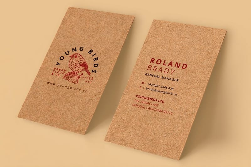
The recruiter in Squid Game hands over a small card with a circle, a triangle and a square on one face and a phone number on the other. That is the entire design. No name, no company, no address, no tagline, and it is the reason people remember it well enough to print their own.
Designers have been arguing for the same thing for decades and losing the argument to whoever wants a QR code, a second phone number and a list of services on a piece of board the size of a credit card. A television show made the case in eight seconds, which is why the trend spread the way it did.
What the show got right is that a card is not a brochure. It is a physical object that has to survive a pocket and then produce one action. Strip it to the shape, the phone number and the stock, and every one of those three has to be good, because there is nothing else to hide behind. Our gallery of minimalist business cards shows how far that idea can be pushed before a card stops working.
Why brown board reads as deliberate
Kraft is unbleached, uncoated board. It arrives brown because nobody spent money making it white, and that is exactly what the eye reads: a choice rather than a default. Put it in a stack of glossy white cards and it is the one that gets picked up, not because it is prettier but because it is the odd one out.
The texture does work too. Uncoated stock has a slight tooth, so the card feels like paper rather than plastic, and ink sits in the surface instead of on top of it. That is why the same logo can look flat on gloss and considered on kraft. Our comparison of kraft and standard business cards puts the two side by side on the same artwork.
The limit nobody mentions
A card with no name is a trick that only works when the person holding it out is the message. In the show, the man handing it over has just beaten you at a game in a train station. In real life, the card lands in a pocket with four others and by Thursday nobody can remember which conversation it came from.
Keep the restraint, keep the name. One name, one line saying what you do, one way to reach you. That is still three fewer elements than the average card carries, and it survives the pocket test the empty card fails.
Why the plainest card in the stack is the one people keep
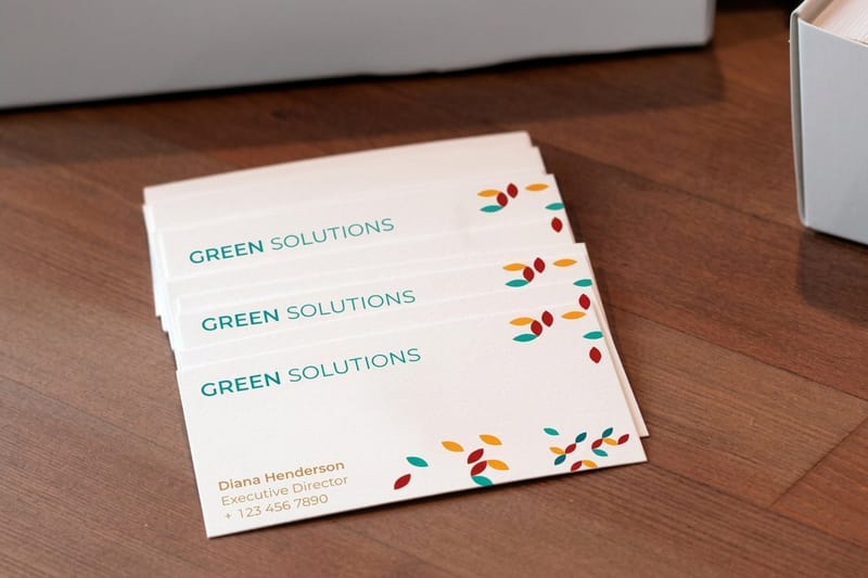
Minimal cards win on contrast, not on beauty. A networking pile is mostly full bleed color, gloss and small type, so a card with a lot of empty space and one strong mark is the visual break. That is a simple mechanical advantage, and it costs nothing to take.
The second advantage is legibility at arm’s length. When you cut a card down to a name, a role and a number, all three can sit at 9 or 10pt with real space around them instead of 6pt crammed into a corner. People read what they can read without lifting the card to their face.
The third is that plain cards age well. A card built around a photograph or a trend typeface looks dated in two years and you reprint. A card built from one typeface and one rule does not, so the same file survives three rounds of reordering. Standard business cards start at $17.57, and the reason to reprint should be a new phone number, not a new fashion.
Empty space is not wasted space
The usual objection is that you are paying for a card and half of it is blank. You are paying for attention, and empty space is what buys it. A single mark centered on an otherwise clear field reads as confidence, and a field packed to the trim reads as anxiety.
There is a practical floor though. Keep at least 0.125 inches of clearance between any type and the trim line, and set your bleed at 0.125 inches beyond it. Cards are cut in stacks, and the blade moves. Our business card layout guide covers the safe area, the bleed and the fold of a folded card in detail.
One typeface, two weights, done
Most minimal cards that fail do so because they use three typefaces to look simple. Pick one family, use a regular for the detail and a medium or bold for the name, and let size do the rest of the work. Grotesque sans faces suit the geometric look the Squid Game card triggered. A quiet serif suits anything that wants to feel older than it is.
Whatever you pick, convert the type to outlines before you send the file, or supply the fonts. A missing font substitutes silently at the press and you find out when the box arrives.
American Psycho did this in 2000, and the rules have not changed
The other business card scene everybody quotes is the boardroom in American Psycho, where four men compare cards that are almost identical. Bone with Silian Rail lettering. Eggshell with Romalian type. Tasteful thickness. It even has a watermark. The joke lands because the differences are microscopic and the men care enormously.
The joke is also completely accurate about print. Those are the variables that actually separate one plain card from another: the white of the stock, the letterforms, the thickness, and whether the surface has anything going on. Take the color and the pictures away and thickness and paper are all that is left, so they carry the whole impression.
It is the same lesson as the shapes card, arriving from the opposite direction. One is minimal because it is cheap looking and mysterious, the other is minimal because it is expensive and smug, and both work because they removed everything that was not load bearing. We pulled the scene apart properly in our breakdown of the American Psycho business cards, from Bateman to Paul Allen, and in a separate piece on why the American Psycho business card still works as a design brief.
Thickness is the cheapest luxury signal you can buy
14pt board is the everyday business card weight and it is perfectly good. 16pt is a step up you can feel the moment the card leaves your fingers, and on a card with almost nothing printed on it, that difference is most of the impression. The 14pt versus 16pt comparison spells out where the extra thickness earns its price.
Above that you get into duplex and triplex constructions, where two or three sheets are laminated together and the edge becomes part of the design. That is a bigger jump in cost than in perceived value for most people, so try 16pt first.
Surface tells people what kind of business you are
Gloss lifts photography and color and reads commercial. Matte reads calm and modern and cuts glare under office lighting. Uncoated reads honest and takes a pen. Soft touch laminate feels like suede and is the one people cannot stop rubbing, which is a real advantage at a trade show and a real cost per card.
None of these is the correct answer. They are four different signals and you pick the one that matches the business. Business card stock explained runs through the weights and coatings we run, and the paper stock guide covers linen and kraft alongside them.
How to design a minimalist kraft card
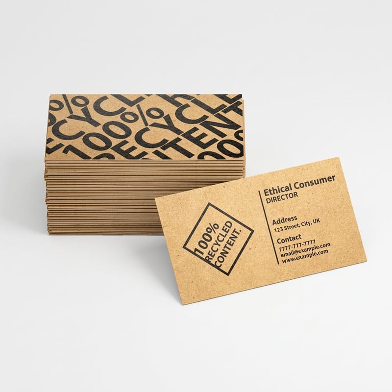
Kraft is the stock most people reach for after seeing the Squid Game card, and it has one rule that ruins first orders. Kraft prints in CMYK on brown board, and CMYK has no white. Every white area in your file, including a white knockout logo, prints as bare kraft. Build the artwork the other way around: let the board be the light tone and put the ink in the dark shapes.
Colors also shift. The brown ground pulls everything warmer and duller, so a bright cyan lands closer to a dusty teal and a clean lime turns olive. Black, deep navy, oxblood and forest green survive it best, which is why almost every good kraft card is one dark ink. How color prints on kraft paper shows which hues hold and which collapse.
Set the file at 300 DPI in CMYK, add 0.125 inches of bleed on all four sides, and keep every element 0.125 inches inside the trim. If you want the shapes look, draw them as vector paths rather than placing a screenshot, and convert your type to outlines. Then order the smallest run, carry it for a week, and look at it again before you commit a box.
Kraft and standard card pricing at 4OVER4.COM
A Squid Game style card on kraft starts at $24.75, only $7.18 more than the $17.57 entry price of standard business cards, so the brown board is the cheapest upgrade on this page. The table below pulls both from the live configurator at every quantity, which shows where a first run of the shapes card stops being a test and becomes your everyday stock.
Quantity and price
Kraft business card pricing and specs
Real configurator numbers on kraft board, where the more you order the lower the per card cost drops.
| Quantity | Price Per Unit | Total |
|---|---|---|
| 100 | 24.8¢ | $24.75 |
| 250 | 14.2¢ | $35.57 |
| 500 | 13.1¢ | $65.60 |
| 1,000 | 13.3¢ | $132.55 |
You can also earn coins on every order and redeem them against future printing, which takes the sting out of reprinting once your details change.
Are business cards still relevant in 2026
Yes, and the reason is unglamorous: a card is the only part of a conversation that stays in someone’s pocket. A phone number typed into a contacts app is faster and it is also gone from memory by the time you reach the door, because nothing physical marked the exchange. A card sits on a desk for a fortnight and gets looked at four more times.
The honest limit is volume. Ordering five hundred cards and handing out nine is money in a drawer. Order to the number you will genuinely give away before your title, your number or your brand changes, then reorder. Why business cards still matter makes the longer argument, and the psychology of business cards covers what actually happens in the moment of the handover.
Print it
Standard business cards, ready to hand over
14pt and 16pt board in every standard size, the fastest route from a minimal layout to a printed box.

Finish decides the last part of the impression. Gloss lifts color and shrugs off moisture, matte reads calm and cuts glare, and uncoated stays writable, which is why a bartender or a stylist can turn a card into a booking note and a laminated card cannot. Compare the options in matte versus uncoated paper before you choose, because the coating is harder to change later than the artwork.
Who the stripped back look actually suits
Restraint is not a universal answer. Here is where it earns its place, and where it needs a name on it to work. Every stock mentioned below runs through the same business card printing catalog, so you can switch board without redrawing the file.
- Founders and freelancers. Name, role, one contact method, on 16pt uncoated. The card is a memory aid for a conversation you already had, not an advert for one you have not.
- Studios and agencies. A single mark on kraft or bone board says more about your taste than a portfolio URL nobody types in. Keep a QR on the reverse if you need the link.
- Bars, cafés and shops. Kraft takes a pen, so the card doubles as a loyalty stamp or a booking note. That is a use no laminated card can offer.
- Anyone rebranding. Print a short run first. Minimal designs are unforgiving and the mistakes only show on the real stock, never on the screen.
- Event and pop up teams. One shape, one number, printed cheap and handed out in volume. This is the one case where the near empty card genuinely works, because you are standing right there.
Blanks that fix the bleed before you start
If you are not starting from a blank artboard, a correctly sized template removes the two mistakes that cost the most: wrong bleed and type too close to the trim. 4OVER4.COM sizes its blanks to the exact product specs, so your artwork lands inside the cut line the first time. Pull one from the blank template library with bleed and trim already marked, or build the whole card in our free business card design tool.
Start fast
Blanks that fix the bleed before you start
Card blanks at 3.5 by 2 inches, so a stripped back layout still clears the trim.






Wally strips a card down to what actually matters
Three shapes taught the internet what printers have said for years
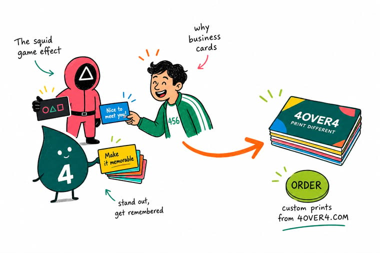
Design kraft cards in dark inks only, because CMYK has no white and every white area prints as bare brown board. Set the file at 300 DPI in CMYK, add 0.125 inch bleed on all four sides, keep type 0.125 inch inside the trim, and pick 16pt over 14pt when the card carries almost nothing. Then order a short run and carry it for a week before you commit a box.
Order kraft business cards →What to remember about the minimalist card trend
Design tips for a card with nothing to hide behind
- Remember there is no white ink. CMYK cannot print white. On kraft, anything white in your file comes out as bare brown board, so design in dark inks and let the stock be the light tone.
- Expect colors to darken on kraft. Brown board absorbs ink and shifts everything warmer and duller. Bright blues and clean greens are the worst affected. Test before you commit a large run.
- Keep type off the trim. Set 0.125 inches of bleed and keep all type 0.125 inches inside the cut line. On an almost empty card, a crooked trim is the only thing anyone will look at.
- Set black properly. Use a rich black build for large solid areas and 100% K for small type. A single plate black on a big field looks washed out, and a rich black under 8pt type looks fuzzy.
- Print one before you print a thousand. Order the smallest run, carry it for a week, and see whether it still looks right after a pocket. Minimal designs pass or fail on the physical object, not the proof.
Explore more
More ways to print and promote
Raised foil cards run 100 for $86.78 in 7 business days and spot UV 500 for $76.88 in 5.
Product Kraft Business Cards Unbleached brown board that takes a pen and stands out in a stack.  Product Standard Business Cards The everyday 14pt and 16pt card, from $17.57.
 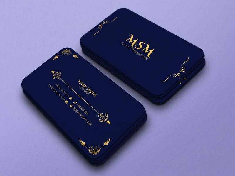 Product Premium Business Cards Heavier board and finishes for a card that carries no color.
 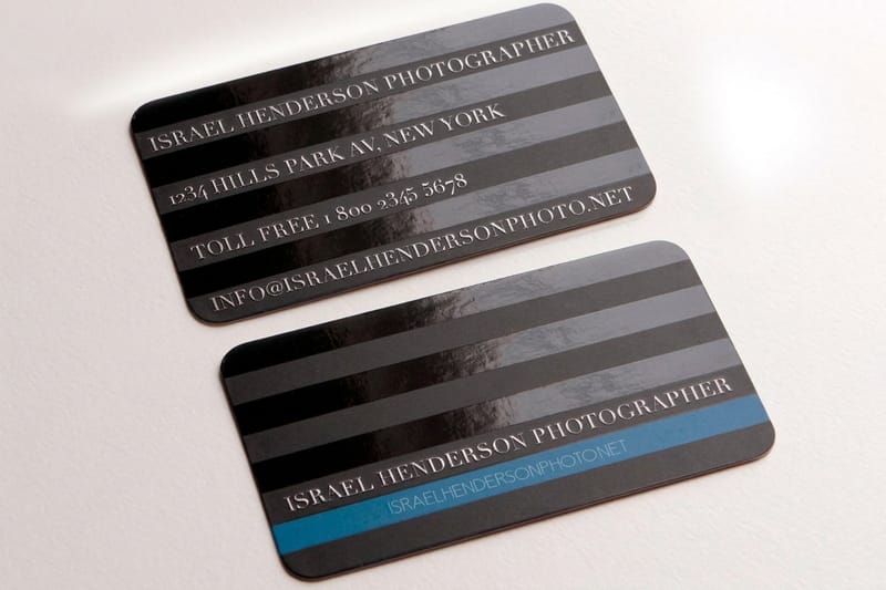 Product Spot UV Business Cards One glossy detail on a matte field, which is all a minimal card needs.
 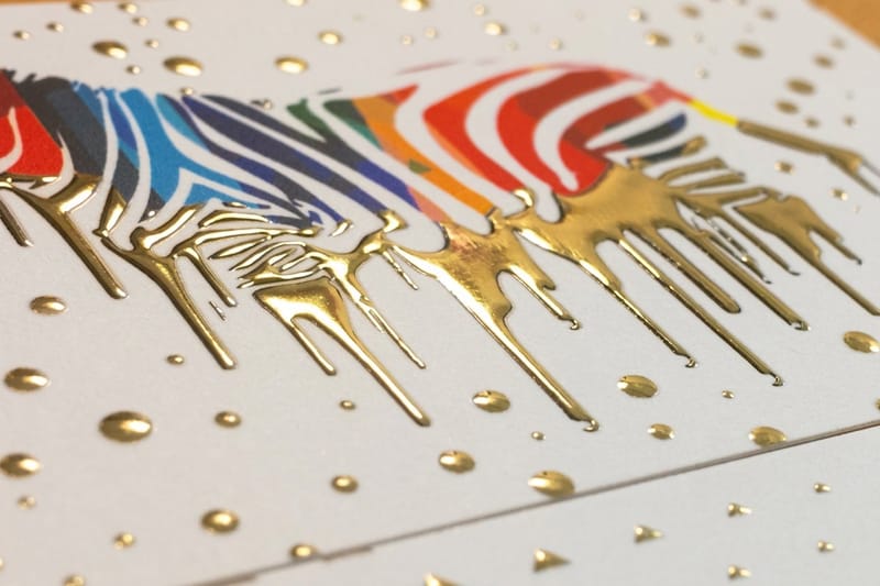 Product Raised Foil Business Cards A foil rule or mark that sits above the surface of the board.
  Category Business Card Printing Every stock, size and finish we run, in one place.
 Ready to print your own?
Pick the stock, drop in your design or start from a free template, and 4OVER4.COM prints it sharp on kraft, uncoated or premium board, as fast as your deadline needs.
Common questions about minimalist business cards
What is the card handed out in Squid Game?
It is a small plain card with a circle, a triangle and a square printed on one side and a phone number on the other. There is no name, no logo and no address on it. The design reads as deliberate because it removed everything a normal business card carries, and because the shapes are already the show’s identity. If you want to print something in the same spirit, the closest match in our catalog is a kraft or uncoated card at 16pt with a single dark ink, which starts at $24.75 for kraft business cards.
Can I print white ink on kraft business cards?
No. Kraft cards are printed in CMYK and there is no white ink in a CMYK build, so anything white in your file comes out as bare brown board. This catches out a lot of first time kraft orders, because a logo that was drawn as white knockout on a dark background simply disappears. Redraw the artwork so the brown board plays the role of the light tone and the ink does the dark work. Our guide on how color prints on kraft paper covers which colors shift and by how much.
Are business cards still worth printing in 2026?
Yes, for the same reason they came back into fashion: they are the only part of a conversation that stays in someone’s pocket. A digital contact card is faster and it is also instantly forgotten, because nothing physical came out of the exchange. The honest limit is volume. Printing five hundred cards and handing out nine of them is a waste, and printing fifty good ones you actually give away is not. Order to the number you will genuinely hand over before your details change.
What makes a plain card feel expensive?
Thickness first, then surface, then how clean the trim is. A 16pt card is noticeably stiffer in the hand than a 14pt one, and on a card with almost nothing printed on it that stiffness carries most of the impression. After that it is the finish, whether that is an uncoated tooth, a soft touch laminate or a single spot gloss detail on a matte field. Color and imagery contribute almost nothing here, which is why the plainest cards can also be the most expensive feeling.
How few words can a business card carry and still work?
Three lines is the practical floor for most businesses: your name, what you do in three or four words, and one way to reach you. Below that you are relying on the recipient remembering the conversation, which works at a table where you are standing in front of them and fails a week later. If you want the near empty look, put the three lines on the back and leave the front as one mark. You get the drama and the recipient still knows who called.
