
The Psychology of Business Cards and the Impression They Make


A Business Card Is a Two-Second Judgment
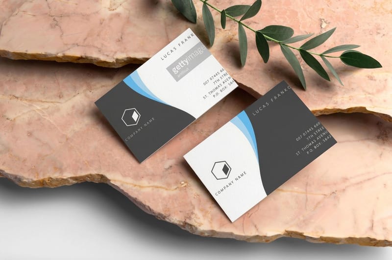
Before a person reads your name, they have already decided how they feel about you. A business card is judged in about two seconds, on weight, texture, color, and first glance, long before the eye finds a single word. That judgment is not rational and it is not fair, but it is real, and it colors everything that comes next in the conversation.
The good news is that the same psychology that judges you can be engineered in your favor. Every choice on a card, the font, the color, the white space, the shape, and the finish, sends a specific signal to the person holding it. Line those signals up behind one clear message and the card does quiet persuasion for you. Let them fight and even a good card reads as generic. If you want the design fundamentals first, the guide to logo design best practices pairs well with what follows.
4OVER4.COM has printed cards for 150,000+ businesses on 60+ stocks and finishes since 1999, which means every one of these psychological levers has a tangible print option behind it. This piece walks the eight levers in order, then maps each to the stock or finish that triggers the impression you are after.
Shop the range
Business cards printing
Every stock and finish behind these psychological levers, from classic to cotton to foil.
The 8 Psychological Levers of a Business Card
A card persuades through eight levers. Most people obsess over one, the logo, and ignore the seven that carry just as much weight. Here they are in the order a person actually experiences them, from the feel in the hand to the last thing they read.
- 1. Font choice. Type has a voice. A serif reads established and trustworthy, a clean sans reads modern and efficient, and a script reads personal or luxurious. The typeface sets the tone before the words register.
- 2. White space. Empty space signals confidence. A crowded card reads anxious and cheap, while generous margins read premium, because only a brand sure of itself leaves room to breathe.
- 3. Color. Color is emotion on paper. Blue reads calm and dependable, black reads serious and premium, red reads energetic and urgent. One dominant color says more than five competing ones.
- 4. Shape. A standard rectangle reads safe. A rounded corner reads friendly and modern. A die-cut shape reads creative and unafraid, and it gets kept longer because it feels like an object, not a card.
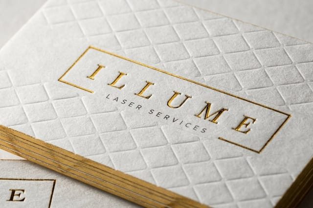
- 5. Material and finish. This is the loudest lever and the one people forget. Thickness reads value, soft-touch reads refined, gloss reads bold, and a foil or raised accent reads luxury. The hand believes what the eye cannot see.
- 6. Logo placement. Where the mark sits guides the eye and sets the hierarchy. A logo given room and a clear anchor reads intentional. A logo crammed into a corner reads like an afterthought.
- 7. Layout and flow. The order the eye travels tells a story. Name, then role, then how to reach you, in a clean path, reads organized. A scattered layout makes a person work, and work erodes trust.
- 8. The call to action. The best cards give one clear next step, a website, a booking link, a QR code. A card with a job outperforms a card that is only a name tag.
Read the levers back and notice how many are physical. Feel, weight, and finish do the heavy lifting before a word is read, which is exactly why the stock you print on matters as much as the design you put on it.
Print picks
Four cards, four impressions
Live prices, ready to customize with your logo, color, and finish.
Classic Business Cards From $17.57 The clean, reliable card that reads professional and lets your layout do the talking. 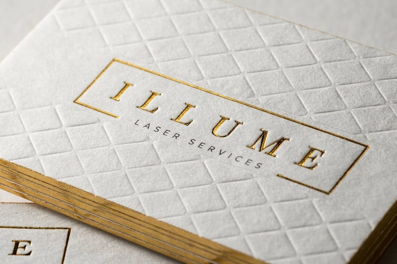 Cotton Business Cards From $328.42 A soft, thick cotton stock that feels expensive the second it lands in a hand.
 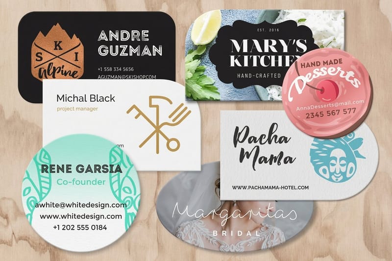 Die-Cut Business Cards From $26.37 Break the rectangle and the card reads creative, memorable, and unafraid.
 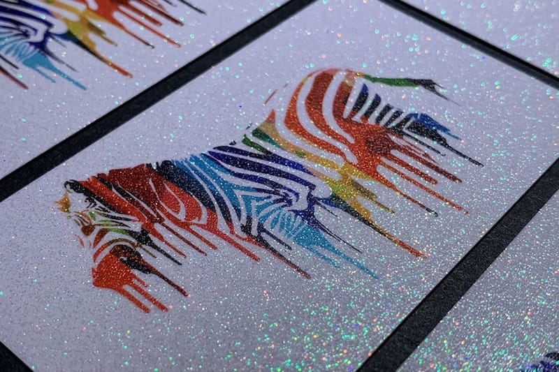 Diamond Glitter Business Cards From $31.84 A sparkle finish that signals glamour, celebration, and a brand that stands out.
 How Each Lever Maps to a Finish
A signal only lands if the print delivers it. This is where the psychology gets practical, because every impression on the list has a stock or finish that produces it. Pick the finish for the feeling, not the other way around.
- Premium and serious. Reach for an ultra-thick or cotton stock. Weight equals value in the hand, and a soft, heavy card reads expensive before it is examined.
- Calm and refined. A matte or soft-touch finish reads quiet and confident, ideal for a lawyer, a consultant, or a luxury brand that does not need to shout.
- Bold and energetic. A gloss finish reads vivid and alive, right for a brand that wants color to pop and attention to come fast.
- Creative and memorable. A die-cut shape or a rounded corner breaks the grid and reads inventive, and it survives the wallet longer than a plain rectangle.
- Glamour and celebration. A glitter or foil accent reads special and high-end, and it suits beauty, events, and any brand that trades on a little sparkle.
The cotton and ultra-thick options are the fastest way to buy the premium impression, because the message is delivered by touch before the design is even seen. Here is the card that does that job best.
The premium signal
Cotton business cards
A soft, thick cotton stock that reads expensive before the design is even seen.
Engineer the Right Impression
Engineering a card is not about stacking every luxury option. It is about choosing the two or three signals that match who you want to be and letting the rest stay quiet. A calm brand should not glitter. A bold brand should not whisper. The card that persuades is the one whose signals all agree.
Start from the impression, then work backward. Decide the one word you want a stranger to feel, trustworthy, creative, premium, approachable, then pick the font, color, shape, and finish that all point at that word. When every lever leans the same direction, the card reads as one confident idea instead of a committee of choices. Compare the popular card options side by side below so you can pick the finish that fits the feeling.
Compare finishes
Popular business cards, side by side
Classic cards print in 3 business days. Cotton takes 15, because 45pt stock runs slower through the press.
 free business cards |  Standard Business Cards |  3D Lenticular Business Cards |  Metallic Foil Business Cards | |
|---|---|---|---|---|
| Min price | Free | $17.57 | $690.88 | $222.13 |
| Paper / stock | 14pt Gloss Cover | 14pt Gloss Cover | 31pt Lenticular Lens | 16 Point Silk Laminated |
| Finish | - | Standard Finish | - | - |
| Size | 2" x 3.5" | 2" x 3.5" | 2" x 3.5" - Vertical | 2" x 3.5" |
| Default qty | 200 | 100 | 500 | 500 |
| Turnaround | 5 business days | 3 business days | 22 business days | 7 business days |
| Rating | ||||
| View & customize | View & customize | View & customize | View & customize |
Print the Impression You Want
A business card is the cheapest brand ambassador you will ever hire, and it works for months on a desk or in a wallet after the meeting ends. That makes the small upgrade, a heavier stock, a better finish, a cleaner layout, one of the highest-return decisions a small business makes, because the cost is a few cents and the payoff is a first impression that opens doors.
When you are ready, lay out the card inside the cut and bleed lines with the online design templates, choose the stock that carries your intended feeling, and let 4OVER4.COM print it sharp. To browse the full range of stocks and finishes, the business cards category has every option in one place, and the premium card case study shows the impression paying off.
The reliable choice
Classic business cards
The clean, professional card that lets a confident layout do the persuading.
Wally engineers the two-second impression
Point every lever at one feeling
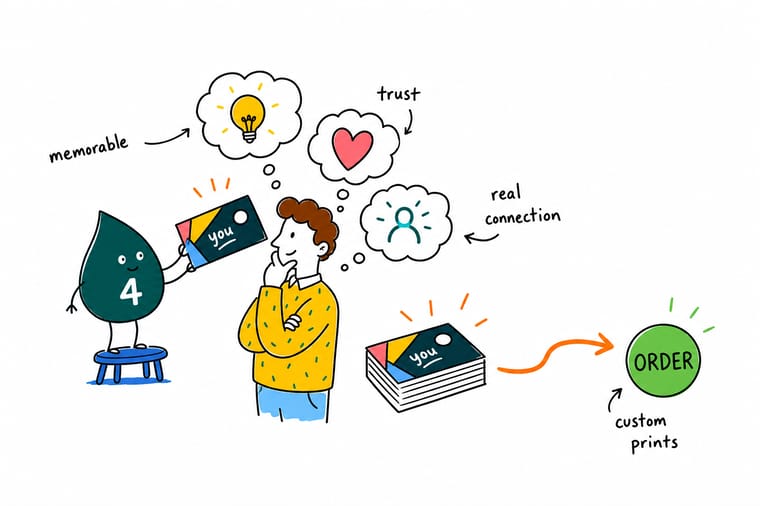
A card is judged in two seconds on feel and first glance. Wally picks the one word he wants a stranger to feel, then points the font, color, white space, shape, and finish all at that word. The finish carries the most weight, so a heavier stock reads premium before the design is even seen. 4OVER4.COM prints on 60+ stocks so your card sends the exact signal you choose.
Print the impression you want →The signals a card sends before you speak
Explore more
More ways to make a card work harder
Every signal on this list has a stock behind it, from 45pt cotton at 250 for $328.42 down to 14pt gloss at 100 for $17.57.
 Category Business Cards Printing Every stock and finish, from classic to cotton to foil. Product Cotton Business Cards A soft, thick stock that reads premium in the hand. Product Die-Cut Business Cards Break the rectangle for a card people keep.
  Guide Logo Design Best Practices A print-ready mark that survives a tiny card.
  Guides Printing Guides Step-by-step guides across every print product.
 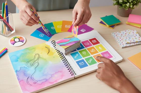 Article What Your Card Says About You The signals your card sends without a word.
  Case study Premium Cards Case Study How a salon launched with a premium first impression.
  Showcase Card Styles Gallery A gallery of business card styles and finishes.
  Statistics Business Card Data The trends and numbers behind the humble card.
  Benefit Free Proofs See the exact colors and finish before you print.
  Collection Business Basics Collection The core print pieces every new business needs.
  Kit Salon Launch Suite A ready-made print set built around premium cards.
 Ready to hand over a card that makes the right first impression?
Pick the feeling, choose the stock and finish that sends it, and let 4OVER4.COM print it sharp. The upgrade costs a few cents and opens doors.
How a card shapes perception, explained
What does font choice signal on a business card?
Type has a voice that lands before the words register. A serif font reads established, traditional, and trustworthy, which is why law firms and financial brands lean on it. A clean sans-serif reads modern, efficient, and approachable, the default for tech and startups. A script reads personal, elegant, or luxurious, ideal for beauty, events, and boutiques. The typeface sets the emotional tone of the whole card, so pick one that matches the impression you want and use it consistently rather than mixing three that fight each other.
How does white space change the impression a card makes?
White space, the empty area around your content, signals confidence and value. A crowded card that fills every millimeter reads anxious and cheap, as if the brand is afraid to leave anything out. Generous margins read premium and self-assured, because only a business sure of itself leaves room to breathe. White space also guides the eye, giving your name and logo a clear anchor instead of forcing the reader to hunt. When in doubt, cut a line of text rather than shrink the margins, and let the card feel calm.
What is business card psychology?
Business card psychology is the study of how the physical and visual choices on a card shape the impression it makes before a word is read. A card is judged in about two seconds on weight, texture, color, and first glance, and eight levers drive that judgment: font, white space, color, shape, material and finish, logo placement, layout and flow, and the call to action. Each lever sends a specific signal, and when they all point at one message the card persuades quietly. The finish and stock are the loudest levers, because feel is believed before the eye even focuses.
How do I choose the right business card for the impression I want?
Start from the feeling, not the features. Decide the one word you want a stranger to feel when they take your card, trustworthy, creative, premium, or approachable, then pick the font, color, shape, and finish that all point at that word. A calm brand wants a matte or soft-touch stock and a serif or clean sans, while a bold brand wants gloss and vivid color. For premium, reach for an ultra-thick or cotton stock, because weight reads as value in the hand. When every lever agrees, the card reads as one confident idea.
What do business cards cost and how are prices set?
Business cards are affordable to start and easy to upgrade. At 4OVER4.COM classic business cards start at $17.57, die-cut cards at $26.37, and glitter finishes at $31.84, while premium cotton cards run higher because of the specialty stock. Price depends on the stock, the finish, the shape, and the quantity, and ordering more brings the per-card cost down quickly. The premium upgrade, a heavier stock or a special finish, adds only a few cents per card but changes the whole impression, which is why it is one of the highest-return choices a small business makes.
