
The American Psycho Business Cards, From Bateman to Paul Allen


Emma is our prepress and print production voice, built from the knowledge of our production team, with over 20 years in printing.
The four cards in the American Psycho scene differ by three things only: paper colour, lettering method and caliper. Bateman has bone stock with flat lettering, Van Patten has eggshell, Bryce has raised lettering on white, and Paul Allen has an off-white sheet that is thicker than all of them and carries a watermark, which is the one specification a printer cannot supply because it is made at the paper mill.
The four cards, decoded
| Card | What is said on screen | What that means at a press | Closest stock at 4OVER4 | From |
|---|---|---|---|---|
| Patrick Bateman | That is bone, and the lettering is something called Silian Rail | Warm off-white uncoated sheet, flat litho or digital, letterspaced serif caps | Premium Business Cards, uncoated | $17.57 |
| David Van Patten | Eggshell with Romalian type | Cooler off-white with a lightly dimpled surface that scatters glare | Premium Business Cards, uncoated | $17.57 |
| Timothy Bryce | Raised lettering, pale nimbus, white | Type you can feel: thermography, raised foil or an emboss on a white sheet | Raised Foil Business Cards, 16pt velvet laminated | $86.78 |
| Paul Allen | Subtle off-white colouring, tasteful thickness, and it even has a watermark | Heavier caliper plus an impression in the sheet you can feel with a thumb | Ultra Thick 32pt to 80pt, or Letterpress | $36.62 |
Prices are the live starting price for a set at 4OVER4.COM: Bateman's bone and Van Patten's eggshell both start at $17.57 on an uncoated premium stock, Allen's thick card at $36.62 on ultra thick board, and Bryce's raised lettering at $86.78 with raised foil on 16pt velvet laminate. The layout is identical across all four rows, so every dollar of difference in that last column is paper and process. You can configure premium business cards and compare stocks side by side.
Why the card scene still gets quoted
Four men, four cards, one employer. Every card on that boardroom table reads Vice President, Pierce & Pierce, Mergers and Acquisitions, so the words carry no information at all and the men are left grading paper. That is the joke in Mary Harron's 2000 film, and it is also the most accurate piece of print criticism anyone has put on screen.
Listen to what the dialogue actually measures. Colour, lettering, thickness, watermark. Those are four of the five decisions a print buyer makes on any card order, and the fifth, the layout, is identical on all four cards so nobody mentions it. Strip the satire away and the scene is a competent spec sheet.
The reason Bateman comes apart at Paul Allen's card is the one item on that list he cannot simply order. A watermark is made at the paper mill, not at the printer, so Allen's card implies a supply chain the others do not have. If you want to compare the finishes yourself, the whole range sits on our business card printing page, and business card stock explained covers what each sheet actually does.
Look at that subtle off-white colouring. The tasteful thickness of it. Oh my God, it even has a watermark.
Patrick Bateman, American Psycho (2000)
What every card in the scene actually says
The layout never changes. Name centred at the top, job title under it, firm and division below that, address and phone at the base, all in letterspaced serif capitals with no logo and no colour. It is the house style of an era when a card announced which building you worked in and nothing else.
Setting type that way is harder than it looks. All-caps serif at six or seven points closes up without generous tracking, and a centred block needs optical centring rather than mathematical centring, because a line ending in a period sits visually left of one ending in a numeral. Get either wrong and the card reads as a copy of the look instead of the look.
Why nobody in the scene talks about design
When the layout is fixed by convention, the only remaining variables are the substrate and the finish. That is exactly the position most professional service firms are in today, and it is why finishes exist as a product category at all. Nobody buys a soft-touch laminate because it communicates something. They buy it because the words on every competitor card are the same words.
The Bateman card, bone with Silian Rail
Bateman announces two things about his new card: the colour is bone, and the lettering is Silian Rail. The first is a real print decision. The second is a name Bret Easton Ellis made up for the 1991 novel, and no foundry sells it.
Bone is a warm off-white that leans yellow. Here is the part most people miss: you cannot print bone. There is no cream ink in a standard four-colour process, and if you flood a white sheet with a beige tint you get a printed rectangle with a white line showing at every trimmed edge. The colour has to be in the paper. That means an uncoated natural sheet, and the closest thing we stock is cotton business cards on 45pt uncoated cotton stock, from $328.42.
The trade-off is real and worth stating. A warm sheet shifts every colour you print on it. A cool blue goes greener, a grey goes muddy, and a photograph loses its highlights because there is no white left to fall back on. Bateman gets away with it because his card is black type on nothing. Yours probably has a logo.
How to tell a bone sheet from a printed one
Look at the cut edge. A card printed cream shows a white core the moment it is trimmed, and the effect is obvious under a desk lamp. A card made from a bone sheet is the same colour all the way through, edge included. This is the single check that separates the two, and it takes a second.
If you want the warmth without the cotton price, ask for an uncoated cover stock rather than a coated one. Uncoated paper already reads warmer than a bright white gloss, because the surface scatters light instead of bouncing it back at you.
The Van Patten card, eggshell with Romalian type
Van Patten's card is eggshell with Romalian type, and Bateman's internal reaction is a flat "nice". Romalian is invented too. Eggshell, though, has two meanings in a print shop, and the more useful one is not the colour.
To a paper merchant, eggshell is a surface: a lightly dimpled uncoated finish, named for the texture rather than the shade. That texture is why the sheet kills glare, and it is also why fine serifs suffer on it. Hairlines break up when they land in the dimples, so type below about seven points loses its thin strokes and a delicate logo goes soft. Uncoated stock also absorbs ink, which means solids dry back lighter than they look on your monitor.
If your card is text only, that softness reads as expensive restraint, and premium business cards from $17.57 for a set of 100 will get you there. If your card carries a photograph or a fine gradient, the eggshell route fights you the whole way, and a coated stock is the honest answer. Our note on fonts for business cards covers which faces hold up at small sizes.
Eggshell against bone, side by side
Put the two next to each other and eggshell reads cooler and slightly greener, bone reads warmer and slightly yellower. Apart, almost nobody can tell them apart, which is why the scene is funny and why swatch books exist. Order a paper sample before you commit a run, because a monitor will never show you the difference between two off-whites.
The Bryce card, raised lettering in pale nimbus
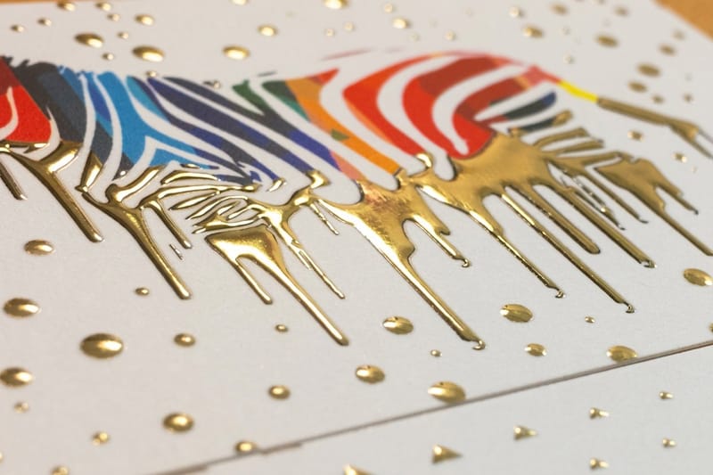
Bryce's card is the only one described by a process rather than a colour. Raised lettering. That is thermography, and it is the one spec in the scene you can walk into a print shop and order by name today.
Thermography works by dusting a resin powder onto wet ink, blowing off the excess and passing the sheet under a heater so the powder swells and hardens. The type ends up standing above the surface with a slight gloss. It costs a fraction of engraving and it looks close enough at arm's length that stationery buyers used it for decades. The modern equivalent on our press is raised foil business cards, from $86.78, which raises a foil rather than the ink itself over a smooth 16pt velvet laminated stock.
Now the limit nobody mentions. Thermographed type softens under the fuser of a laser printer, so a card or letterhead that you plan to run back through an office printer is the wrong place for it. Raised areas also scuff against each other in a stack, and a raised rule near the trim can show cracking if the card gets flexed. For a raised look that survives handling, an embossed card on the right stock and coating holds up better.
Pale nimbus is not a typeface either
The nearest real thing is Nimbus, the URW family of Times and Helvetica clones that shipped with early PostScript systems. Pale Nimbus, like Silian Rail and Romalian, exists only in the novel. The names work in the scene precisely because they sound like something a printer would say and mean nothing at all.
Raised, embossed and engraved are three different things
Thermography raises the ink and leaves the back of the card flat. Embossing pushes the sheet itself from behind, so the reverse shows a matching dent. Engraving cuts the image into a plate, forces ink into the recess and presses the paper into it, which raises the ink and leaves a faint bruise on the back. On genuine 1980s Wall Street stationery, engraving was the status finish, and the bruise on the reverse is how you spot an original.
The Paul Allen card, off-white, thick and watermarked
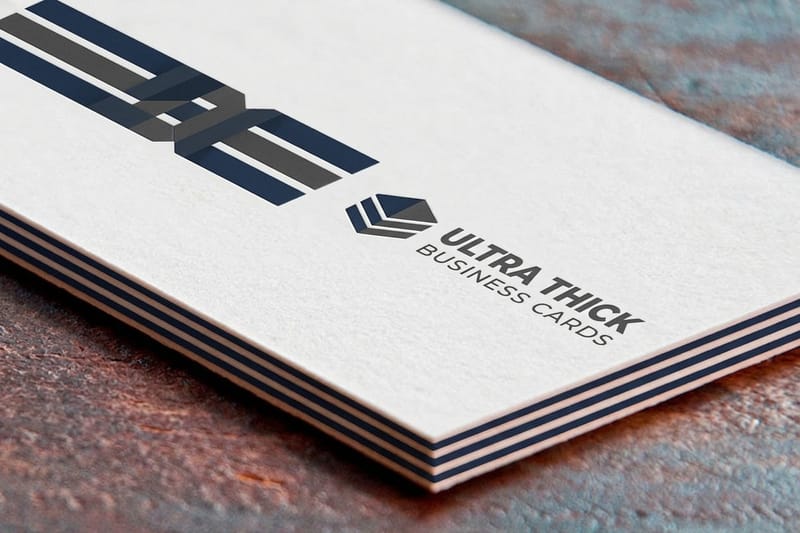
Three specs, delivered in one breath, and the third is the one that ends the scene. Subtle off-white colouring, tasteful thickness, and a watermark.
Thickness is measured in points of caliper, where one point is one thousandth of an inch. A normal card is 14pt or 16pt. Our ultra thick business cards start at $36.62 and run 32pt, 48pt, 64pt and 80pt on UltraWhite uncoated cover, with 30mil sitting at roughly credit card thickness. Doubling caliper is the cheapest way to change how a card feels, and it is why thickness got its own line of dialogue.
The catch is practical. A 64pt card does not sit in a wallet slot, will not feed through a desktop printer, and costs more to ship because a box of them weighs like a box of tiles. There is also a design trap on heavy stock: a thin even border is the riskiest thing you can put on a thick card, because cutting heavy sheets allows a hair of movement and a border shows it as one side thicker than the other. Our note on how thick a business card should be walks through the calipers in order.
The watermark is the part you cannot order
A genuine watermark is formed while the paper is still wet pulp on the machine. A dandy roll, a wire cylinder carrying a raised design, presses the fibres thinner where the design sits, and the thin area shows as a lighter image when you hold the sheet to a light. It happens at the mill, before the paper is a sheet, and a custom one is a mill order measured in tonnes. No commercial printer can add a watermark to stock that already exists.
So Paul Allen either bought a house-watermarked stationery sheet or had a mill run made, and either way it is a different league from picking a finish in a configurator. That is the joke landing: Bateman has been beaten by a decision made months earlier and one step further up the supply chain.
What you can order instead
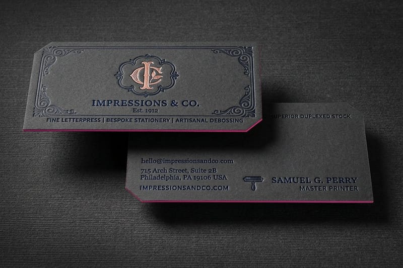
A blind emboss, which is an emboss with no ink, gives you a raised or recessed mark you can feel and barely see. A deep letterpress impression does the same in reverse. Our letterpress business cards run on 32pt and 48pt stocks from $251.36, and the impression is the point of the process rather than a side effect of it. On cotton stock the configurator also offers debossing and painted edges, which is the closest thing to a watermark that a print shop can actually deliver.
What the film got right and what it invented
The scene gets the vocabulary right in a way that most film props do not bother with. Colour, lettering method, caliper and watermark are the real levers, they are named in the order a print buyer actually decides them, and the identical layouts are historically accurate for a firm of that type in that decade.
What is invented is the typography. All three named faces are fiction. Watch the props closely and the cards are near identical, the differences are barely visible on screen, and that is deliberate: the audience is being asked to see a distinction the characters insist is enormous.
One real detail the film skips. On stationery of this class, engraving rather than thermography was the finish that signalled money, and it leaves that faint bruise on the reverse. A card described only as having raised lettering is, in period terms, the cheaper cousin. Bryce may not know that. Bateman certainly would.
How to recreate each card at a real print shop
Work in this order and you will get there in one round of proofs instead of three. The sheet decides the colour, the process decides the lettering, and the caliper decides the handshake. Artwork is last, not first.
The five decisions, in order
1. Pick the sheet before the artwork. Warm uncoated for bone, cooler uncoated for eggshell, bright white laminated if you want raised foil to pop. Everything downstream depends on this and nothing upstream of it matters.
2. Set the type as capitals, centred, tracked out. One serif family, name largest, everything else a point or two smaller, no logo, no second colour. Optically centre each line rather than trusting the alignment button.
3. Choose one raised element, or none. Raised foil, an emboss or a letterpress impression on the name only. Two raised treatments on one card reads as a sample, not as stationery.
4. Decide the caliper honestly. 16pt is a normal card. 32pt is noticeably heavier in the hand. 64pt and above is a statement that will not fit in a cardholder, so choose it knowing that.
5. Order a printed proof, not a screen proof. Off-whites, tracking and impression depth are all things a monitor lies about. Hold the card, then commit the run.
What each version costs to start
The layout is free and identical across all of these. The money is in the sheet and the process, which is precisely the scene's argument. A set of 100 premium business cards starts at $17.57. Ultra thick starts at $36.62, raised foil at $86.78, letterpress at $251.36 and 45pt cotton at $328.42.
If you want to set the type before you order, pull a correctly sized blank with bleed and trim already marked from the blank template library, or start from a layout in the design template library and strip it back to type.
Why letterpress suits a card with no logo on it
Letterpress presses inked type into the sheet instead of laying ink on top of it, so the decoration is the depth rather than anything added. On a card carrying nothing but a name, a title and a firm, that impression is the only thing there is to look at, which is exactly the trade the scene is arguing about.
It asks for a soft, thick sheet, because the press needs somewhere to push. That is why letterpress sits at the 32pt and 48pt end of the range rather than on a 16pt card, and why cotton takes it best. It is also the reason for the price. A set of 100 letterpress cards starts at $251.36 against $17.57 for premium stock, and each color is a separate pass through the press, so keep it to one ink and one impression. Two colors doubles the work and rarely improves the card.
Business cards in pop culture
The scene has outlived the film it came from. It gets reshot as a meme every time a new phone or a new logo lands, and the reason it keeps working is that it names a thing people feel and rarely say out loud: a card is judged by touch before it is read.
That instinct is why soft-touch and tactile finishes have grown while card volumes have not. A suede business card on 16pt suede lamination, from $87.15, is the modern bone: nothing about the words changes, and the hand of the card does all the talking. If you want to see how far that idea has been pushed, our roundups of the most amazing business card designs and stylish business card examples are full of cards doing exactly this.
Business card pricing and specs at 4OVER4.COM
A Bateman card is a premium business card at 3.5" x 2" on an uncoated stock such as 14pt cream uncoated or 110# Strathmore bright white wove, from 100 cards, in 3 business days by default. The table below steps the price down run by run from the live configurator, so you can size the budget for the whole boardroom before the artwork exists.
Quantity and price
Premium business card pricing and specs
Live configurator numbers, where the more you order the lower the per card cost drops.
| Quantity | Price Per Unit | Total |
|---|---|---|
| 100 | 17.6¢ | $17.57 |
| 200 | 11.5¢ | $23.07 |
| 300 | 9.15¢ | $27.46 |
| 400 | 7.96¢ | $31.86 |
| 500 | 7.25¢ | $36.26 |
| 600 | 6.77¢ | $40.64 |
You can also earn coins on every order and redeem them against future printing, which takes some of the sting out of testing two stocks instead of one.
Stock and finish decide the scene, not the layout
The whole argument in that boardroom is about substrate. Coated stock bounces light and holds photographic detail, which is why it wins for anything with an image on it. Uncoated stock absorbs ink, prints softer, and reads warmer and quieter, which is why it wins for type-only cards like these. A lamination sits on top of either one and changes the hand: gloss for punch, velvet for a smooth matte, suede for the soft-touch effect that people notice without being able to name.
Print it
Premium cards, ready to configure
Set the type, pick the stock, and hold a proof before the run.
Caliper is the third axis and the one the scene fixates on. 14pt and 16pt are the working calipers for almost every card printed. 32pt is where a card starts to feel deliberate, and 48pt upward is where it becomes the whole point of the object. Read how cotton and linen stocks behave if you are heading toward the natural sheet end of the range, because those papers take ink differently from anything coated.
Who this look actually suits
The period card works beautifully for some businesses and fights others. Here is the honest split.
- Finance and advisory. The original use case, and still the strongest. A text-only card on a warm uncoated sheet with a blind emboss on the name says the thing the copy is not allowed to say.
- Law firms. Engraved or letterpress on a heavy uncoated stock. Keep the layout period correct: name, title, firm, address, phone, nothing else on the face.
- Architects and designers. Where the ultra thick route earns its keep. 48pt or 64pt with painted edges makes the caliper the whole design.
- Luxury and hospitality. Suede or soft-touch lamination with a raised foil name. The card is handed over in low light, so the tactile finish outperforms anything printed.
- Anyone with a photographic logo. Do not chase the bone look. An uncoated warm sheet flattens photography and drags your brand colours off spec, and a coated premium card will serve you better.
Templates and print-ready blanks
You do not need to build the file from nothing. 4OVER4.COM sizes its blanks to exact product specs, so bleed and trim are already marked and your type stays clear of the cut. Start from a blank, set your capitals, and you have the layout in an afternoon.
Start fast
Templates and print-ready blanks
Business card templates and exact size blanks so your artwork lands inside the cut line.






Wally reads the four cards like a printer
Colour, lettering, caliper, watermark
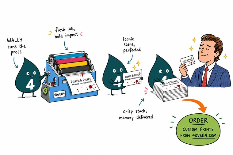
Bone and eggshell live in the paper, so buy the sheet instead of printing a tint that shows white at the trimmed edge. Raised lettering means thermography, raised foil or an emboss, and thermography softens under a laser fuser. Thickness is caliper, where 16pt is normal and 32pt is the weight people notice. The watermark is made in wet pulp at the mill, so ask for a blind emboss or a letterpress impression instead.
Order premium business cards →What to remember about the American Psycho cards
Design notes for recreating the look
- Buy the sheet, do not print it. Bone and eggshell live in the paper. A printed cream tint gives itself away at the trimmed edge under any decent light.
- Track the capitals out. All-caps serif at seven points closes up without generous letterspacing. This one setting is the difference between period correct and merely small.
- One raised treatment, not two. Foil, emboss or letterpress on the name alone. A card carrying two raised processes reads as a print sample rather than as stationery.
- Skip the thin border on thick stock. Heavy sheets shift a hair during cutting, and an even hairline frame shows that shift as one side visibly fatter than the other.
- Proof it in the hand. Off-white shade, tracking and impression depth are the three things a screen cannot show you. Order the printed proof before the run.
Explore more
Every rung of the card ladder
The products behind each spec in the scene, one card each, so you can price the look you want.
 Product Premium Business Cards The base of the ladder, from $17.57 for a set of 100. Product Ultra Thick Business Cards 32pt to 80pt uncoated cover for tasteful thickness. Product Raised Foil Business Cards Lettering you can feel, over 16pt velvet lamination. Product Letterpress Business Cards A real impression in 32pt and 48pt stock. Product Cotton Business Cards 45pt uncoated cotton, the closest sheet to bone.
  Category Business Card Printing Every stock, caliper and finish in one place.
 Ready to print a card worth staring at?
Pick the sheet, set your capitals, and 4OVER4.COM prints it on premium stock with a proof before the run, as fast as your deadline needs.
Common questions about the American Psycho cards
What did Patrick Bateman say about Paul Allen's card?
He says it in narration rather than out loud. Look at that subtle off-white colouring. The tasteful thickness of it. Oh my God, it even has a watermark. Every word of it is a paper specification, which is the joke, and the watermark is the one item on that list no printer can supply, because it is formed at the mill.
What is the full quote from the Let's see Paul Allen's card scene?
The scene runs as a series of card descriptions. Bateman presents his own as bone with lettering called Silian Rail, Van Patten's is eggshell with Romalian type, Bryce answers with raised lettering in pale nimbus, and Paul Allen's is the off-white watermarked sheet that ends the argument. The words printed on all four cards are identical, so the whole exchange is about paper.
What is Paul Allen's business card made of in American Psycho?
The film never names a stock. Bateman describes it as subtle off-white colouring, tasteful thickness and a watermark, which in print terms means an off-white sheet at a heavier than normal caliper, carrying a mill watermark. The off-white and the thickness are both orderable today: an uncoated natural sheet gives the colour, and 32pt or heavier gives the weight. The watermark is not orderable at a print shop, because it is formed in wet pulp on the paper machine before the sheet exists. That is why it is the detail that finishes the scene.
Is Silian Rail a real typeface?
No. Silian Rail was invented by Bret Easton Ellis for the 1991 novel, along with Romalian type and Pale Nimbus, and no foundry has ever released a face by any of those names. The nearest real family is URW Nimbus, a set of Times and Helvetica clones that shipped with early PostScript devices. If you want the look, what you are actually after is a letterspaced serif capital, and the prop cards read as a classical serif set in small caps rather than anything exotic.
Can I get a watermark printed on my business cards?
Not in the true sense. A watermark is pressed into wet pulp by a dandy roll at the paper mill, so it exists before the sheet is finished and a custom one is a mill order measured in tonnes rather than in packs. What a printer can do instead is a blind emboss, which raises a mark with no ink at all, or a deep letterpress impression, both of which you can feel with a thumb and barely see straight on. On cotton stock, debossing and painted edges are available in the configurator and give a similar quiet, expensive effect.
How thick does a card need to be to feel like the ones in the scene?
A standard card is 14pt or 16pt, and the jump most people register as tasteful thickness is 32pt, which is around credit card weight. Ultra thick business cards at 4OVER4.COM start at $36.62 and run 32pt, 48pt, 64pt and 80pt on UltraWhite uncoated cover. Go above 48pt and you are trading practicality for impact: the card will not sit in a wallet slot, will not feed through a desktop printer, and ships heavier. Order one set at 32pt and one at 48pt before you commit a large run, because the difference is entirely in the hand.
What would the American Psycho cards cost to print now?
The layout costs nothing, because it is type on paper with no logo and no second colour. The cost sits entirely in the sheet and the finish. A set of 100 premium business cards starts at $17.57, ultra thick at $36.62, raised foil at $86.78, letterpress at $251.36 and 45pt cotton at $328.42. So the Bateman end of the scene is a cheap card and the Paul Allen end is roughly the cotton or letterpress tier, which is the point the film is making about the men holding them.
