
Plumbing Logo Ideas to Build a Trusted Plumbing Brand


Sofia is our design and templates voice, built from the knowledge of our production team, with over 20 years in printing.
A plumbing logo works when the same drawing holds at one inch on a business card and at eighteen inches on a truck door, in flat color, in vector. Everything below is judged by that test, and every idea ends in something you can print: plumbing business cards from $17.57, 18 by 24 inch yard signs from $25.00, car magnets from $47.50 and car decals from $93.37. For the larger placements, flip through the Plumbing Signs story.
Where a plumbing logo has to work
| Placement | Typical size | Reading distance | What the logo has to do there | Product at 4OVER4 |
|---|---|---|---|---|
| Business card | 3.5 x 2 in | In the hand | Icon stays legible at about 0.4 in tall, phone number reads at a glance | Plumbing business cards |
| Truck door magnet | 12 x 18 or 18 x 24 in | 20 to 40 ft | Company name first, service second, phone third, on a flat steel door | Car magnets |
| Cut or printed decal | Sized to the panel | 20 to 40 ft | One or two flat colors, no gradients if the vinyl is cut rather than printed | Car decals |
| Yard sign | 18 x 24 in coroplast | 30 to 60 ft | Phone number about 3 in tall, logo reduced to a mark plus the name | Yard signs |
| Job site banner | 2 x 4 ft and up | 50 ft and beyond | Horizontal lockup only, high contrast, nothing inside the hem | Vinyl banners |
Design for the smallest and the largest placement first: the icon at 0.4 inches on the corner of a 3.5 by 2 inch card, and the full lockup at eighteen inches on a truck door. The middle sizes look after themselves, and the two extremes are where a logo either survives or gets redrawn. Start the print side with plumbing business cards, the cheapest way to see the mark at real size.
What makes a plumbing logo work
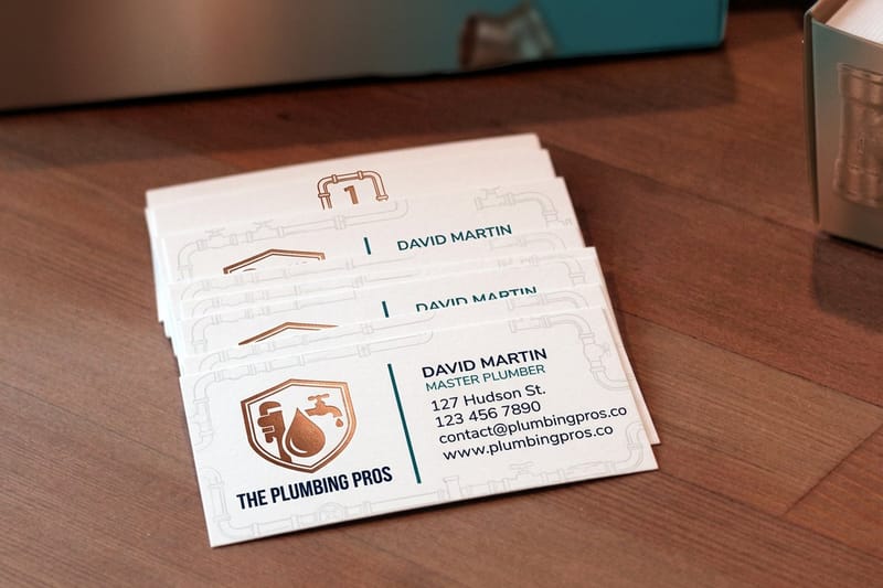
A plumbing logo earns its keep when it survives two sizes: about one inch wide on a business card, and eighteen inches wide on a truck door read from across a parking lot. Most logos that fail do not fail on the screen. They fail when a designer hands over a 900 pixel PNG, the sign shop asks for vector, and the whole mark has to be redrawn before a single decal gets cut.
Ask for the artwork in vector, as an .ai, .eps or layered .pdf with the type converted to outlines, and ask for a one color version and a reversed white version in the same file. Those three files cover every surface a plumbing business prints on. Our guide to preparing a logo for printing walks through the handover in detail.
The second test is stroke weight. Pipe outlines, water droplets and hairline circles look sharp on a 27 inch monitor and close up on press: strokes under about half a point fill in with ink, and a knockout line thinner than that closes shut on coated stock. Draw the icon, print it at one inch on a laser printer, and look at it on the desk before anyone builds a stationery set around it.
One drawing, two lockups
Build a horizontal lockup and a stacked lockup from the same drawing. Horizontal fits a truck door, a banner hem and the top of an invoice. Stacked fits a yard sign, a van rear window and a square social avatar. Trying to force one lockup into both jobs is why so many plumbing trucks carry a logo that is either tiny or cropped.
Keep the icon separable. A mark that works alone gives you something to put on a hard hat sticker, a truck fuel door, and the corner of a yard sign where the full name would be unreadable anyway.
Leave the phone number out of the logo
Phone numbers change, service areas expand, and a number baked into the logo file means new artwork every time. Lock the number to the piece, not to the mark. On a card it sits in the contact block, on a magnet it sits under the name at twice the size of anything else, and on a sign it is usually the biggest thing on the panel.
This also keeps the logo usable on merchandise and on a supplier listing, where a phone number would look like a fault rather than a feature.
The icons every plumbing logo reaches for
Four marks do most of the work in this trade: the pipe wrench, a length of pipe bent into a letter, a water drop, and a faucet. All four are instantly readable at any size, and all four are everywhere, which is exactly the problem. A homeowner comparing three vans sees the same wrench three times.
What still reads fresh is a mark taken from the job rather than the toolbox. A threaded joint, the wheel of a shut-off valve, a flame for gas work, a shield for emergency call-outs. None of them are clever, and that is the point, because a plumbing mark has about half a second to say what the van does.
Judge whichever you choose as a silhouette. Fill it solid black and look again. If the shape stops being recognizable without its internal lines, it will not survive a truck door at forty miles an hour or an icon at half an inch on a card.
Plumbing logo styles, and where each one breaks

Four styles cover almost every plumbing logo on the road: the wordmark, the pipe and wrench icon, the mascot, and the badge or crest. Each one has a size at which it stops working, and that size is the thing worth knowing before you commission it.
The wordmark is the safest. Set the company name in a heavy grotesque or a solid slab, tighten the spacing, and let one letter carry a small detail. It reduces to nothing, cuts in vinyl without argument, and never turns into mush on a decal. Its weakness is that it needs a genuinely good name, because there is nothing else to look at.
The pipe and wrench icon is the category default, which is both its strength and its problem. A buyer recognises the trade in half a second. A buyer also cannot tell you apart from the other four trucks in the neighbourhood. If you use one, make the wordmark do the differentiating and keep the icon simple enough to survive at 0.4 inches.
Mascots and badges: charming, and expensive to print
A mascot builds recall faster than anything else in this trade. It is also the style that costs the most across a print run, because a friendly plumber with four skin tones, a highlight and an outline is a full color image on every surface. On a printed car magnet that is fine. On cut vinyl lettering it is impossible, so you end up printing and contour cutting instead, which changes the price of every vehicle.
Badges and crests carry the same tax in a different currency. Fine internal type inside a circle disappears at small size, and the outer ring is usually the first thing a printer asks you to thicken. If you love the badge, commission a simplified version at the same time, with the internal type removed, and use it anywhere under two inches.
The minimal route
A flat two color mark with a strong wordmark is what most established plumbing brands settle on after their second rebrand, because it is the cheapest thing to own across cards, trucks, signs, invoices and uniforms. The minimal brand identity guide covers how far to strip a mark before it stops saying anything, and the six principles of logo design is the checklist to hold a draft against.
Your company name is half the logo
Most plumbing marks are read as a name first and a symbol second, because the person reading is usually checking whether the van outside matches the number they called. That makes the typesetting at least as important as the icon.
Long names are where it breaks. A surname plus and Sons plus Plumbing and Heating is three lines, and three lines will not hold at one inch on a card or eighteen inches on a door without one of them going unreadable. Pick the two words customers actually say on the phone, set those large, and let the full trading name live on the invoice.
Choose a face with thick, even strokes that a vinyl cutter can follow, avoid script anywhere near a vehicle, and lock the letter spacing in the artwork. If the spacing is not locked, a sign shop will re-type the name in whatever face it has open and your lockup quietly stops being yours.
Colors that signal trust, and what they do on press

Blue dominates plumbing for an obvious reason, and it is also the color most likely to disappoint you on the first proof. A saturated Pantone blue converted to CMYK typically returns with a purple cast, and the deeper the blue the further it moves. If a specific blue matters to your brand, either pick one that converts cleanly or budget for a spot color on the pieces that carry the logo largest. Our note on which Pantone colors shift most in CMYK is the short version of that conversation.
Pair the blue with something that does work on a truck at distance. Red reads as emergency and is the reason so many 24 hour plumbers use it for the phone line rather than the logo. Orange and yellow hold their brightness on coroplast and vinyl and separate you from every navy competitor on the block. Grey and black are what stop a two color logo from looking like a clip art file.
Contrast beats palette at every distance over ten feet. Dark type on white, or white knocked out of a solid field, is legible from a moving car. Mid blue type on a mid grey background is not, no matter how good it looks in the brand deck. Check the color mode before the file leaves the studio; CMYK versus RGB for printing explains why the screen version always looks brighter than the sheet.
Build the reversed version now, not later
Half of everything a plumbing company prints has a dark background: a navy truck door, a black polo, a solid banner field. A logo drawn only in positive gets rebuilt badly at that moment, usually by whoever is setting up the file that day. Draw the white knockout version yourself, check that the icon still reads with its internal detail removed, and put both versions in the same folder as the vector master.
Plumbing logo ideas by service
The right direction depends on who signs the cheque. A homeowner at a front door and a construction buyer reading a bid are not looking for the same thing, and a logo that tries to please both usually pleases neither.
- Residential service. Warm and domestic. A rounded wordmark, one friendly accent color, and an icon a homeowner recognises in a second at the door. This is the one place a mascot genuinely pays back, because the customer meets the person as well as the brand.
- Commercial and new build. Flatter and quieter. A wordmark with a small geometric mark, navy or charcoal, no mascot. It has to sit on a bid document next to a general contractor logo without looking like a van wrap.
- 24 hour emergency. The phone number is the design. Keep the logo compact in one corner, put the number at the largest size the panel allows, and use a red or orange accent that nothing else in the palette competes with.
- Drain and sewer specialists. Lean on the specialism rather than a generic pipe. A single strong word plus the trade descriptor beats a crest, because your customer is searching for one job and needs to see that word first.
- Water heater and HVAC crossover. Design the mark so a second service line can be added under it later. A lockup with room for a descriptor line survives the day you add heating; a lockup with the word plumbing drawn into the icon does not.
If cards are the first piece you print, the layout ideas in plumbing business card ideas pair directly with these directions, and where to look for logo design inspiration is a useful place to gather references before briefing a designer. Everything the trade prints sits together in the plumbing printing collection.
From logo to print: cards, signs and truck decals
A logo becomes a brand at the moment it is on something. The order most plumbing businesses follow is cards first, because they are cheap and they test the mark at its smallest size, then vehicle branding, then site signage. Prices below come from the live configurator, so you can plan the sequence against a real budget.
Quantity and price
Plumbing business card pricing and specs
Live configurator numbers on our standard stocks, where the per unit cost drops as the run grows.
| Quantity | Price Per Unit | Total |
|---|---|---|
| 100 | 17.6¢ | $17.57 |
| 200 | 11.5¢ | $23.07 |
| 300 | 9.15¢ | $27.46 |
| 400 | 7.96¢ | $31.86 |
| 500 | 7.25¢ | $36.26 |
| 600 | 6.77¢ | $40.64 |

For the truck, the choice is magnet or decal, and the vehicle decides it rather than the design. Car magnets at $47.50 come off for a weekend and need a flat steel door to hold at highway speed; the practical detail is that they have to be taken off and cleaned periodically or moisture trapped underneath marks the paint. Car decals at $93.37 stay put through weather and car washes, and cut vinyl demands the flat two color version of your mark. The car magnet design guide covers layout for a moving vehicle, and the full range sits under decal printing.
Print it
Plumbing business cards
The smallest test of a new logo, and the cheapest one to run.
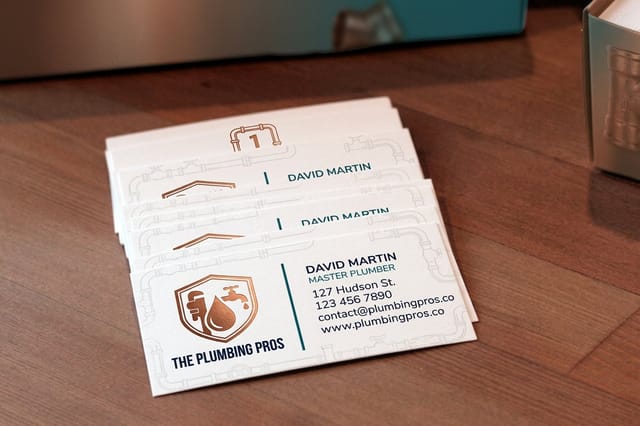
Site signage is where the logo shrinks and the phone number grows. On an 18 by 24 inch yard sign at $25.00 read from a moving car, the number wants roughly three inch letters and the logo drops back to the icon plus the company name. A vinyl banner at $79.00 takes the horizontal lockup and keeps every element clear of the hem, because anything inside it disappears into the fold. You can also earn coins on each order and put them against the next run, which matters when you are printing a card order, a truck set and a batch of signs in the same month.
Common plumbing logo mistakes to avoid
Six faults account for most of the logos that get redrawn within two years. None of them are matters of taste.
- Supplying raster only. A PNG or JPG cannot be enlarged to a truck door or cut in vinyl. Get the .ai or .eps with outlined type, and keep it somewhere that is not one designer’s laptop.
- Hairline strokes and tiny internal type. Anything under about half a point fills in on press and closes up entirely on coroplast. Thicken it before the first proof rather than after the reprint.
- A gradient in a logo that has to be cut. Cut vinyl is flat color by definition. A gradient forces print and contour cut on every vehicle, which is a real cost per truck, not a rounding error.
- Stock art everyone else is using. Marketplace pipe and wrench icons appear on hundreds of trucks. If you buy one, redraw it enough to own it, and check the licence before it goes on a vehicle.
- No clear space rule. Without a stated margin the logo gets crowded against a phone number on the first sign, and it never recovers. Set the clear space as a fraction of the icon height and write it down.
- Designing at the wrong distance. A logo judged at 100 percent zoom on a monitor is being judged at roughly poster size. Zoom to actual print size, or print it, before signing it off.
Hold the draft against logo design best practices before it goes anywhere near a press. A twenty minute review at that point is worth more than any amount of correction afterwards.
Templates and print-ready blanks
If you are placing a finished logo rather than designing from zero, start on a template that already carries the trim and a 1/8 inch bleed. 4OVER4.COM sizes its blanks to exact product specs, from a 3.5 by 2 inch card to an 18 by 24 inch yard sign, so the artwork lands inside the cut line the first time. Browse the design template library or grab a press ready blank from the blank template library.
Start fast
Templates and print-ready blanks
Card design templates and exact size blanks with bleed and trim already marked.














Wally sizes the logo three ways before anything prints
One drawing, a horizontal lockup and a stacked lockup
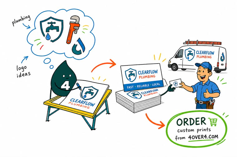
Keep the icon readable at 0.4 inches for a card, build the horizontal lockup for a truck door read at 30 feet, and let the phone number grow to about three inch letters on an 18 by 24 inch yard sign. Supply vector with outlined type, add a reversed white version, and 4OVER4.COM prints the card, the magnet and the sign from the same file.
Order plumbing business cards →What to remember about plumbing logos
Explore more
Print the logo on something
The pieces a plumbing brand runs, in the order most shops buy them: cards from $17.57, yard signs from $25.00, car magnets from $47.50.
Product Plumbing Business Cards The first place a new logo gets judged, from $17.57. Product Car Magnets Full color truck branding you can take off at the weekend. 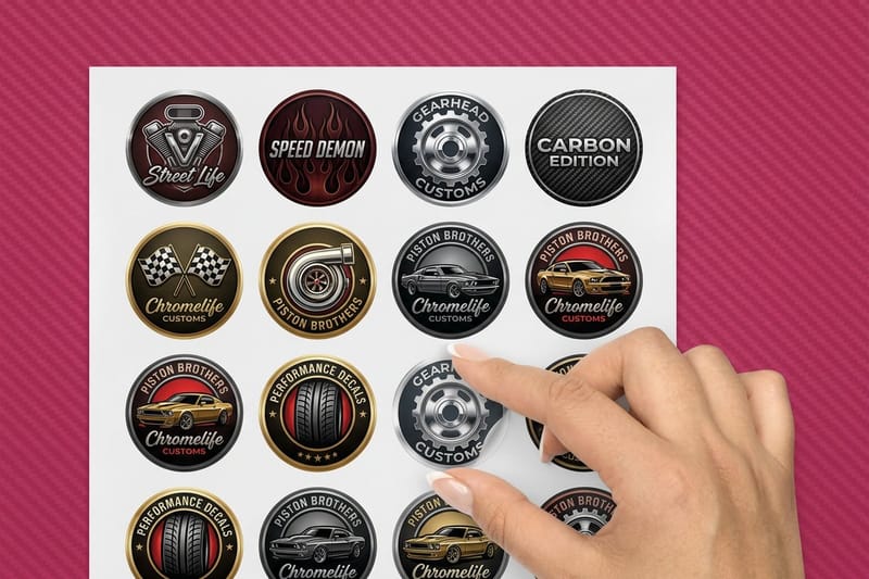 Product Custom Car Decals Permanent vehicle graphics cut or printed to your panel. Product Yard Signs Coroplast job site signs that read from the street.
  Product Vinyl Banners Site and event banners in the horizontal lockup.
  Category Business Card Printing Every stock, finish and shape in one place.
 Put the logo on 100 cards for $17.57, then on the truck
Upload the vector, or start from a free template, and 4OVER4.COM prints it sharp on cards, magnets, decals and signs, as fast as your schedule needs.
Common questions about plumbing logos
Where can I get a free plumbing logo?
Free generators will hand you something usable on a screen in minutes, and most of them hand back a PNG. That is the catch, because a vinyl cutter cannot follow a PNG and the free logo costs you a redraw the first time you brand a truck. If you go that route, pay the small upgrade for the vector files, or brief a designer using the generated version as a reference rather than as the finished mark.
Should a plumbing logo include a wrench?
It can, and plenty of good ones do, but the wrench is the most used symbol in the trade so it will not make you memorable on its own. If you use one, do something specific with it, a distinctive angle, a lockup where the handle becomes a letter, or a shape that still reads filled solid black. If the mark works without the wrench, it will work better with the name set large instead.
Can I use a stock plumbing logo from a template site?
You can, and it is cheap, but you get no exclusivity. A stock mark is licensed to everyone who buys it, so another plumber two towns over may be driving the same van. It is also difficult to trademark later. If the logo is going on vehicles and yard signs the same neighbours see every week, paying once for something you own is the better trade.
What file format should I give a printer for my plumbing logo?
Vector, as an .ai, .eps or press ready .pdf with the type converted to outlines. Vector art scales from a 0.4 inch card icon to an 18 inch truck door with no loss, and it is the only format a vinyl cutter can follow. Ask the designer for three versions in the same handover: full color, one color, and a reversed white version for dark backgrounds. Keep a high resolution PNG alongside them for screens, but treat it as a by product rather than the master. If all you have is a JPG, a redraw is cheaper than living with a soft logo on every vehicle.
How many colors should a plumbing logo have?
Two, plus white as a knockout. Two flat colors cut cleanly in vinyl, embroider without a surcharge, print consistently across cards, magnets and coroplast, and still leave you an accent for the phone number. A third color is affordable on anything digitally printed and starts costing money the moment the mark has to be cut, embroidered or screen printed. Gradients look fine on a printed magnet and cannot be cut at all, so if vehicle lettering is in your plan, keep the mark flat from the beginning.
Will my brand blue look the same on a business card and on a truck magnet?
Close, but not identical, and deep blues drift the most. Card stock is coated and takes ink tightly, while magnet and coroplast surfaces sit under a different ink set, so the same CMYK build reads slightly different on each. The practical fix is to pick a blue that converts predictably rather than a hot Pantone that only exists as a spot color, then order one of each piece before the full run and compare them side by side in daylight. 4OVER4.COM includes a proof before print so you see the build before the run commits.
How big should the logo be on a yard sign?
Smaller than most people expect. On a standard 18 by 24 inch coroplast sign read from 30 to 60 feet, the phone number does the selling and wants to be around three inches tall, following the sign trade rule of thumb of roughly one inch of letter height per ten feet of reading distance. The logo sits above or beside it at whatever size is left, usually as the icon plus the company name rather than the full lockup. Our guide on how to make yard signs covers layout and material choices.
Should I put my logo on magnets or on decals?
Magnets if the vehicle is leased, shared, or used personally at weekends, and if the doors are flat steel. Decals if the vehicle is dedicated to the business and you want the graphic to stay put through weather and car washes. The catch with magnets is the door itself: many modern vans have aluminium or heavily ribbed doors that will not hold one, and a magnet left on for months without being removed and cleaned can mark the paint underneath. Car magnets start at $47.50 and car decals at $93.37, so the decision is about the vehicle rather than the budget.
