
12 Free Handwritten and Curly Fonts That Print Beautifully


What Free Actually Means Before You Download Anything
Start here, because it is the part that causes real problems later. Free fonts fall into two very different categories, and the download button looks identical for both.
Openly licensed fonts, most commonly those released under the SIL Open Font License, can be used freely including for commercial work, embedded in documents, and sent to a printer. Nearly everything hosted on Google Fonts falls into this group, which is why the list below draws from it. The other category is personal use only, which is extremely common on free font aggregator sites, and it means exactly what it says. Using one on invitations you sell, packaging, a logo, or a client project is a licensing breach, and the fact that it was free to download changes nothing.
The practical rule is to check the license file that comes with the download, once, before you build a design around the face. It takes two minutes and it saves the specific misery of discovering the problem after a client has approved artwork. If a font is going into a logo that will be registered and used for years, be stricter still, because a logo is the one place where a licensing question becomes permanent. Our guide to choosing logo fonts covers what else changes at that level of commitment.
Six Flowing Scripts for Formal and Romantic Work
These are the connected, calligraphic faces. They suit names, short phrases, and anything meant to feel ceremonial, and they all share the same weakness, which is that their thin strokes are the first casualty of ink meeting absorbent paper.
- 1. Great Vibes. A generous formal script with long, confident flourishes. The best free stand in for a traditional engraved invitation face, and it wants to be set large enough for the flourishes to resolve.
- 2. Allura. Lighter and more delicate than Great Vibes, with fine hairlines and a strong slant. Beautiful at display size on smooth coated stock, and the first face on this list to disappear if you set it small on uncoated paper.
- 3. Sacramento. A single weight monoline script, meaning the stroke stays roughly even rather than swelling and thinning. That even stroke is exactly why it survives small sizes and cheaper stock far better than the hairline faces.
- 4. Parisienne. A slightly irregular script with visible pen character and a lighter formality than Great Vibes. It works well when a piece should feel elegant without feeling like a state occasion.
- 5. Dancing Script. Bouncy, casual, and noticeably sturdier than most of this group. The letterforms rise and fall along the baseline, which reads as friendly rather than formal, and the weight means it holds up in more situations.
- 6. Satisfy. A relaxed brush script with a thicker stroke and a hand painted feel. Its weight makes it one of the more forgiving choices here for small sizes and textured papers.
If you are choosing between these for an invitation suite, the deciding factor is usually the stock rather than taste. A fine hairline face on a soft uncoated sheet is asking for trouble, and the monoline and brush options are the safer bet.
Print picks
Four formats where a good script earns its keep
Live starting prices from the configurator, for the pieces script type was made for.
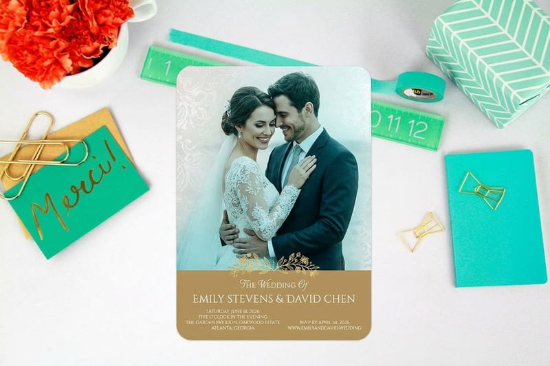
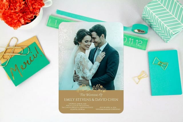 Wedding Invitations From $19.77 The classic home for a formal script, where the type is doing most of the design work.
 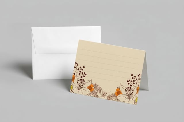 Folded Notecards From $38.22 A short handwritten line on a folded card reads as personal in a way a printed block never does.
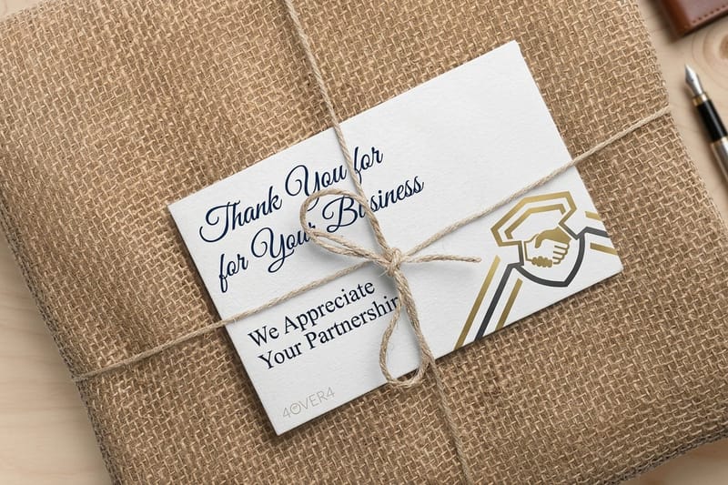
 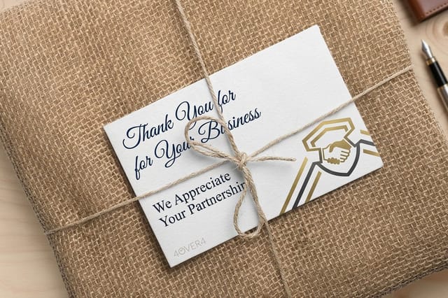 Business Thank You Cards From $19.77 A warmer face makes a business thank you feel written rather than processed.
 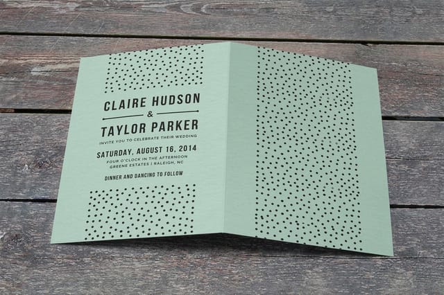 Folded Invitations From $38.22 More room for a display script to breathe, with the details set in something plainer inside.
 Six Handwritten Faces for Casual and Personal Work
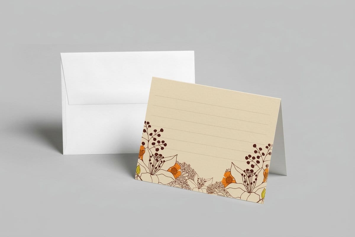
This second group imitates everyday handwriting and marker lettering rather than calligraphy. Most are unconnected or only loosely connected, which makes them considerably more reliable in print, and they suit anything meant to feel personal, informal, or handmade.
- 7. Caveat. A natural, slightly hurried hand that reads like a real note rather than a designed typeface. It stays legible at surprisingly small sizes, which makes it one of the most useful faces on this list.
- 8. Indie Flower. Rounded, bubbly, and unmistakably informal. Good for craft businesses, children's events, and anything cheerful, and quite wrong for anything that needs to be taken seriously.
- 9. Kalam. A handwriting face with genuine pen character and, usefully, multiple weights plus broad language coverage. The extra weights make hierarchy possible without switching to another family.
- 10. Amatic SC. Tall, narrow, and hand drawn in capitals. It is the odd one out here, and it fits a lot of words into a small width, which suits headings on packaging and chalkboard style layouts.
- 11. Courgette. A rounded semi connected script with even weight and a friendly tone. It sits neatly between the formal group above and the casual hands, and it prints reliably.
- 12. Pacifico. A thick surf inspired brush script with heavy strokes. The weight makes it one of the most print resilient faces here, and it has been used enough that it now reads as a specific era, which is either the point or the problem depending on your brief.
For most business uses that need warmth rather than ceremony, one of these six is the safer choice, because they carry more weight and demand less from the printing process. On business thank you cards in particular, a casual hand does the job a formal script cannot, which is to feel written rather than issued.
Why Scripts Fail in Print When They Looked Fine on Screen
The gap between a script on a monitor and the same script on paper catches out experienced designers, and it rests on three physical facts about ink and paper.
The three failure modes
- Hairlines vanish or clog. The thin strokes that give a calligraphic face its elegance can fall below what the press can reliably hold. On coated stock they may print faintly, and on uncoated stock ink spreads into the fiber and thickens them unevenly.
- Letterforms blur together. Connected scripts rely on the reader distinguishing similar shapes. Shrink them and a lowercase a, o, and e begin to look alike, especially in names the reader cannot guess from context.
- Joins break under tracking. Adding letter spacing to a connecting script pulls the joins apart, leaving a row of shapes with visible gaps where the strokes were meant to meet.
The fix for all three is the same, and it is a hierarchy decision rather than a font decision. Use the script for the few words that carry the feeling, such as a name, a greeting, or a title, at a size where the strokes have room to resolve. Set everything a reader must actually use, dates, addresses, times, prices, in a plain face at a comfortable size. Our guide to font sizes on business cards gives the practical floor for small formats.
One rule has no exceptions worth arguing about. Do not set a connecting script in all capitals. The joins are drawn to link lowercase letters, so capitals produce a row of disconnected forms with awkward spacing, and it reads as a mistake because it is one.
Where scripts get risky
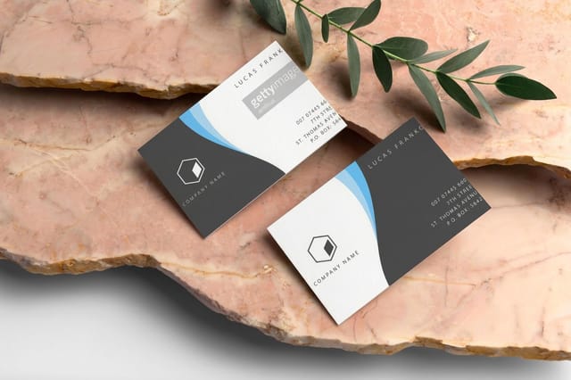
A script on a business card is the hardest test
A card is read at arm's length and printed small, which is exactly where fine connecting strokes and ambiguous letterforms fall apart.
Pairing a Script With Something That Does the Work
Almost every good piece of script driven design is really two typefaces. The expressive face sets the tone and the plain face carries the information, and the pairing succeeds when the two are clearly different rather than nearly the same.
Contrast is the whole principle. A flowing script alongside a quiet, well proportioned sans or a clean serif produces an obvious division of labor that the reader processes without effort. Two decorative faces together compete, and two similar faces look like an accident. If in doubt, pick the plainest possible partner, because the script is already providing all the personality the piece needs.
Keep the number of styles small. One script, one plain family at two or three sizes, is enough for an invitation suite, a card, and a menu. The moment a third expressive face appears, the piece stops reading as designed and starts reading as accumulated. Our comparison of serif versus sans serif is a sensible way to choose the partner, and the same restraint applies across brochure typography.
Stock, Ink, and the Proof That Saves the Run
The single biggest variable in how a script reproduces is not the font, it is the paper. This surprises people who spent hours choosing the face and thirty seconds choosing the stock.
Coated stocks hold ink on the surface, so fine strokes stay sharp and a delicate hairline script can survive at a smaller size than you would expect. Uncoated stocks absorb ink into the fiber, which spreads every stroke slightly and thickens hairlines unevenly. That absorption is also exactly what gives uncoated paper the warm, tactile quality people choose it for, so it is a tradeoff rather than a fault. Textured and laid papers push further in the same direction, breaking up fine detail in a way that suits some pieces beautifully and ruins others.
This is why proofing matters more than usual with script type. Judge the face on the paper you are actually ordering, at the actual size, not on screen and not on office paper. Order free paper samples before committing a full run, and export the file with fonts properly embedded using our guide to exporting a print ready PDF, since a missing font substitution turns a careful script into a default serif somewhere between your desk and the press.
Quantity and price
Invitation pricing and specs, straight from the configurator
Real numbers on wedding invitations, including the stocks that keep a fine script crisp instead of letting it bleed.
| Quantity | Price Per Unit | Total |
|---|---|---|
| 25 | 79.1¢ | $19.77 |
| 50 | 50.5¢ | $25.27 |
| 100 | 42.8¢ | $42.84 |
| 200 | 25.8¢ | $51.62 |
| 300 | 20.1¢ | $60.42 |
| 400 | 17.3¢ | $69.20 |

Where These Faces Belong, and Where They Do Not
Script and handwritten type is a tool with a narrow but genuine range, and most of the bad uses come from applying it outside that range rather than from choosing a bad font.
It belongs where the piece is personal, ceremonial, or handmade. Wedding invitations and folded invitations are the obvious home, since the type is doing most of the design work and the reader is paying attention. Folded notecards and thank you cards benefit enormously, because a handwritten face makes a printed message feel written. Craft businesses, bakeries, florists, and event work all trade on exactly the warmth these faces provide, and our customer print showcase shows the range.
It does not belong on anything a reader must use under pressure or at speed. Directional signage, price lists, safety information, forms, and dense body copy all need a plain face, because a script slows reading measurably and that cost is only worth paying when the slowing down is the point. It is also a poor fit for professional services that trade on precision, where a flowing script tends to undercut the message rather than warm it up.
The last consideration is longevity. Several faces in this list are used widely enough that they carry a strong sense of period. For a one off invitation that does not matter at all. For a logo intended to last a decade it matters a great deal, which is the argument for a plainer face and, if the budget allows, custom lettering. Build the layout in the online designer or start from a print ready file in the design templates library.
Wally picks a script that survives the press
Beautiful on screen is not the same as legible on paper
Script faces fail in print for two boring reasons. The hairlines get too thin for ink on absorbent paper, and the letterforms get too similar to tell apart at small sizes. So use the script for the few words that carry the feeling, set everything a reader actually needs in something plain, never set a script in capitals, and check it on the real stock before the whole run goes through. 4OVER4 prints on 60+ stocks, and the paper matters as much as the font.
Print your invitations →Using handwritten and curly type without regret
Explore more
More on type, invitations, and printed cards
Folded notecards run 25 for $38.22 in 5 business days, flat thank you cards 25 for $19.77 in 3.
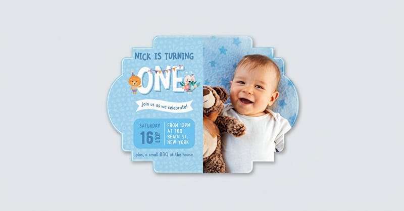 Article Best Wedding Fonts Pairings that hold up across a whole invitation suite.
 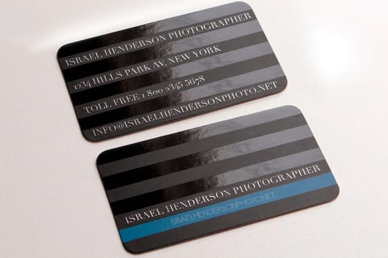 Article Free Business Card Fonts Faces that make a card look more expensive than it was.
 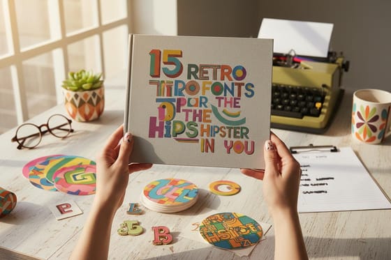 Article Retro Fonts Vintage faces with the character scripts lack.
 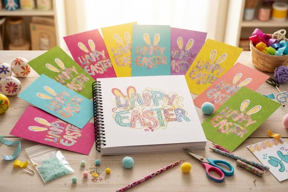 Article Easter Inspired Free Fonts Seasonal type for spring print projects.
  Guide Serif vs Sans Serif Choosing the plain face that carries your script.
  Article Business Card Font Size The sizes that stay legible once printed small.
  Guide Choosing Logo Fonts When a script belongs in a logo and when it does not. Guide Finding Your Type Four practical tests before you commit to a face. Guide Export a Print Ready PDF Embedding fonts so your script survives the handoff.
  Guide Best Postcard Fonts Type that stays readable in a stack of mail.
  Showcase Customer Print Showcase Real printed work from customer orders.
  Product Folded Notecards The format a handwritten face was made for.
 Ready to print something with a script worth reading?
Pick one expressive face, set the details in something plain, choose a stock that keeps the hairlines crisp, and 4OVER4.COM prints the run.
Handwritten and script font questions
Are free handwritten fonts safe to use commercially?
Some are and some are not, and the download button looks the same either way. Fonts released under an open license such as the SIL Open Font License, which covers nearly everything on Google Fonts, can be used commercially, embedded in files, and sent to a printer. Personal use only fonts are very common on free font aggregator sites, and using one on invitations you sell, on packaging, in a logo, or in client work is a licensing breach regardless of the fact that it cost nothing. Check the license file included in the download before you build a design around the face.
Why does my script font look bad when printed?
Usually one of three physical problems rather than a bad font. The thin hairline strokes that make a calligraphic face elegant can fall below what the press reliably holds, so they either print faintly on coated stock or spread and thicken unevenly on uncoated stock. Second, connected letterforms blur together at small sizes, so similar shapes become hard to distinguish, especially in names a reader cannot guess from context. Third, adding letter spacing pulls the joins apart and leaves visible gaps. Set the script larger, choose a monoline or brush face with even stroke weight, and proof on the actual paper.
Can I set a script font in all capitals?
No, and this is one of the few rules in typography with no useful exceptions. Connecting scripts are drawn so that lowercase letters join to each other, with entry and exit strokes drawn to meet. Capitals are not built to connect, so setting a script in all caps produces a row of disconnected shapes separated by awkward gaps where the joins were supposed to be. It reads as a mistake because it is one. If you need a capitalized display line with handwritten character, use a hand drawn capital face such as Amatic SC, which was designed for exactly that.
What font should I pair with a handwritten script?
The plainest thing you can find. Almost every successful script design is really two typefaces, with the expressive face setting the tone and a quiet face carrying the information the reader has to act on, such as dates, addresses, times, and prices. The pairing works when the two are obviously different, so a flowing script with a clean sans or a simple serif reads effortlessly. Two decorative faces compete, and two similar faces look accidental. Keep the total small, since one script plus one plain family at a few sizes covers an entire invitation suite.
Which paper works best for fine script type?
Coated stocks, if legibility at small sizes is the priority. Coated paper holds ink on the surface, so fine strokes stay sharp and a delicate hairline face can survive smaller than expected. Uncoated stock absorbs ink into the fiber, which spreads strokes slightly and thickens hairlines unevenly, though that same absorption is what gives uncoated paper the warm tactile quality people choose it for. Textured and laid papers push further in that direction. The reliable approach is to order free paper samples and judge the face on the actual stock at the actual size before committing to a full run.
