
Bad Logo Design Mistakes That Show Up on Press


Sofia is our design and templates voice, built from the knowledge of our production team, with over 20 years in printing.
What Actually Makes a Logo Bad
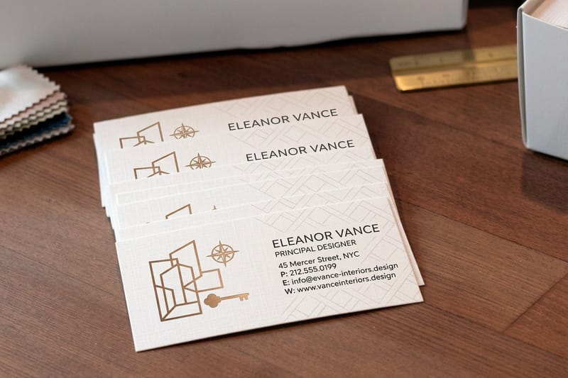
Bad logo design mistakes rarely show on the screen where the logo was born. It looks confident at twelve hundred pixels wide, sitting on a dark mockup with a soft glow behind it. The trouble starts the moment that same file gets shrunk into the corner of a business card, printed in one ink on uncoated stock, and asked to still say your company name from three feet away. Picture it on cleaning services business cards, where the mark shares a small card with a phone number.
An overetched logo is the same failure in metal or on a plate: when a mark is etched into a foil die, an engraving or a printing plate, lines finer than the process can hold get eaten away or widen into blobs. The fix is the one this page gives for ink on paper. Keep positive strokes at a quarter point or heavier, give reversed lines more weight than positive ones, open the counters, and outline every stroke before the file goes out.
Print is unforgiving in ways a browser never is. Ink spreads a little into paper fiber, narrow gaps close up, pale tints drop out entirely, and the backlit glow that made a gradient sing simply does not exist on paper. Any logo that quietly depends on screen conditions will look broken the second it becomes physical.
4OVER4.COM has been putting brand marks on paper, vinyl, and promo products since 1999, and the same short list of failures comes through prepress every week. None of them are taste problems. They are structural problems, which is good news, because structural problems have exact fixes. Before you judge whether a logo is good, run it through four tests that have nothing to do with whether you like it.
The one inch test
Place the logo at one inch wide and print it on your office printer. If a stroke vanishes, if two letters merge, if the icon becomes a smudge, the mark is too detailed for its most common real world size.
The one color test
Convert everything to solid black on white. Gradients, drop shadows, and color-only separations are the usual casualties. A logo that only works in full color cannot be embroidered, foil stamped, etched, or faxed, and you will need at least one of those eventually.
The one background test
Drop the mark on white, on black, on a photograph, and on your brand color. If you need a white box behind it to survive, you do not have a logo yet, you have an image that happens to contain a logo.
The one substrate test
Uncoated paper, kraft, matte vinyl, and plastic all absorb and reflect differently. A mark built with tight counters and fine lines will hold on gloss and close up on uncoated. Design for the roughest surface you plan to use, not the smoothest.
Test it small
Put the logo on a business card first
The cheapest, fastest way to see whether your mark survives real ink on real stock.

The Logo Design Mistakes That Show Up Most Often
Across thousands of uploaded files, the failures cluster. Almost none of them come from bad taste and almost all of them come from designing inside a single context, usually a website header, and never testing the mark anywhere else. Learn the cluster and you can audit any logo in about five minutes.
The fastest way to find out where a mark stands is to put it on something small and hold it in your hand. Interior Design Business Cards start at $17.57 and put your logo at roughly its worst case size, on real stock, in real light. If it survives that, most other formats are easier.
- Too many ideas in one mark. A house, a leaf, a swoosh, and a monogram fighting for the same square inch. Every element you add costs legibility at small sizes.
- Raster instead of vector. A PNG exported at web size gets stretched for a banner and turns into soft, stair-stepped edges no printer can rescue.
- Effects that only exist on screen. Drop shadows, outer glows, transparency, and blend modes are unpredictable in CMYK separation and often flatten into a gray halo.
- Trendy type with no staying power. Ultra-thin geometric sans faces look sharp on a retina display and disappear on absorbent paper at small point sizes.
- No clear space rule. Without a defined margin, the mark ends up jammed against a trim edge, a fold, or a photo, and it reads as clutter instead of a brand.
If you are still shaping the concept rather than fixing a file, work the fundamentals first. The 6 key principles of logo design and our logo design best practices cover simplicity, balance, and versatility, which are exactly the traits that decide whether a mark prints cleanly later.
Print picks
Three formats that stress test a logo
Live prices, each one exposing a different weakness in the file.
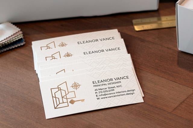 Interior Design Business Cards 100 for $17.57 The hardest test your logo will face, printed small and held at arm length.
 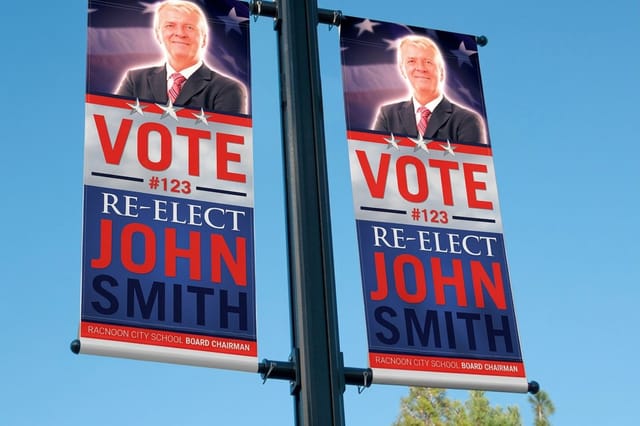 2 Sided Blockout Banners $108.75 each Large format shows every soft edge, so only a clean vector file survives here.
 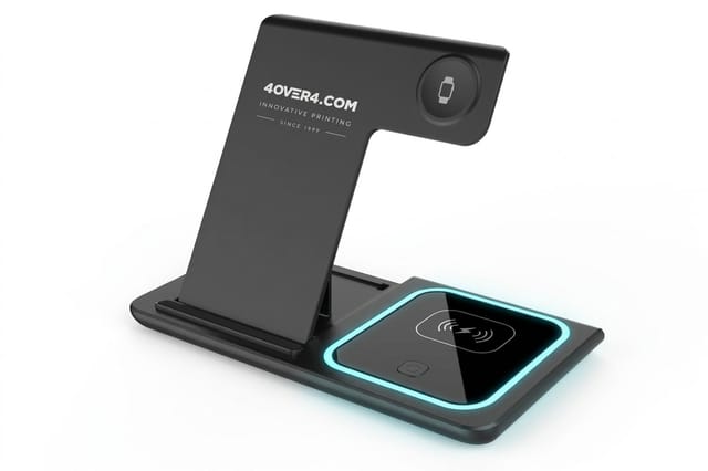 3 in 1 Foldable Wireless Charger $15.00 each A ready-made desk gift, sold with no logo, to send beside your printed pieces.
 Why Hairline Strokes and Fine Detail Break on Press
Ink is a liquid and paper is a sponge. When the two meet, the ink spreads slightly past the edge of the dot that placed it, which prepress people call dot gain. That spread is small, but a logo built from hairlines is measured in exactly that range, so the spread is the whole line.
The result is one of two failures. Positive hairlines, meaning a thin dark line on light paper, thicken and lose their crispness. Reverse hairlines, meaning a thin light line knocked out of a dark field, fill in and disappear. Same file, opposite outcomes, and both look like a printing defect to the client even though the file caused it.
- Set a minimum stroke weight. Keep positive lines at a quarter point or heavier, and give reverse lines noticeably more weight than positive ones in the same mark.
- Expand strokes before you send. Live strokes can rescale unpredictably. Outline them so the shape is fixed no matter what size the file is placed at.
- Open the counters. The enclosed spaces inside letters like a, e, and g are the first thing to fill on uncoated stock. Widen them if the logotype was drawn tight.
- Kill decorative detail that only reads at poster size. If a texture, an engraved line pattern, or a fine outline is invisible at one inch, it is only adding risk.
- Build a small size variant. Many strong brands keep a simplified mark for anything under an inch, with fewer elements and heavier weights.
None of this is a compromise. It is the same discipline that produced every logo you can recall from memory. Our ultimate guide to designing a logo walks the full construction process if you want to rebuild rather than patch.
Color That Looks Right on Screen and Muddy on Paper
Screens make color with light and presses make color with ink. Those are different physics, and the gap is widest exactly where brands like to live: electric blues, vivid oranges, hot pinks, and bright greens. Send an RGB-only logo to a CMYK press and the automatic conversion will pick something duller than you approved, without asking.
The second color failure is inconsistency. A file with one blue in the icon, a slightly different blue in the wordmark, and a third blue in the tagline is common when a logo has passed through several hands. On screen the difference is invisible. Printed side by side on one sheet, it looks like a mistake, because it is one.
- Define the CMYK build yourself. Pick the values you want rather than letting a converter guess, then keep those numbers in your brand file.
- Name a spot color if the brand depends on it. A specific ink is the only way to hold an exact hue across different jobs, stocks, and dates.
- Consolidate to one swatch per color. Every element that should be the same blue must reference the same global swatch, not a hand-mixed near match.
- Watch total ink coverage. Rich blacks and deep navies built from four heavy channels can go glossy, offset onto the next sheet, or dry slowly.
- Check the light tints. Anything under about five percent of a channel may not print at all, so pale accents can quietly vanish.
Once the color is defined properly, price out the real job. The table below pulls live configurator numbers so you can see how quantity moves the unit cost before you commit to a run.
Quantity and price
Business card pricing and specs
Real configurator numbers. The more you print, the lower the unit cost falls.
| Quantity | Price Per Unit | Total |
|---|---|---|
| 100 | 17.6¢ | $17.57 |
| 200 | 11.5¢ | $23.07 |
| 300 | 9.15¢ | $27.46 |
| 400 | 7.96¢ | $31.86 |
| 500 | 7.25¢ | $36.26 |
| 600 | 6.77¢ | $40.64 |

Type That Is Too Small, Too Tight, or Too Trendy
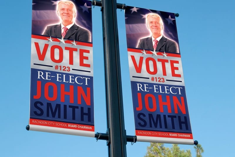
Most logo lockups carry a tagline, an established date, or a location line, and that secondary type is where legibility dies first. It was set at a comfortable size on a large screen, then the whole lockup was scaled down as one unit, and nobody checked what happened to the smallest element.
Large format has the opposite trap. On a banner, letterspacing that felt elegant on a card opens into gaps you can drive through, and a delicate hairline underline becomes a visible seam. Type needs to be checked at both ends of your size range, not just at the size you designed in.
- Set a floor for secondary type. Below roughly six points, taglines lose their thin strokes and read as a gray band instead of words.
- Lock a minimum reproduction width. Publish it in your brand rules so nobody scales the full lockup past the point where the tagline fails.
- Tighten spacing as size grows. Wide tracking that looks refined at card size looks accidental at banner size, so build a large format variant.
- Outline the type before sending. Converting to curves removes any chance of a font substitution turning your wordmark into a default face on press.
- Avoid faces with extreme thick to thin contrast. The thin parts are the first casualty on both absorbent paper and textured vinyl.
If your mark includes a slogan, treat the two as a system rather than one glued unit. Our walkthrough on designing a logo with a tagline or slogan covers stacking, spacing, and when to drop the tagline entirely.
Large format check
2 sided blockout banners
Enlargement is the honest test of vector art, letterspacing, and stroke weight.

Logos That Fall Apart on Merch and Large Format
Paper is polite compared with everything else a logo has to live on. Promotional products, apparel, signage, and vehicle graphics each apply a different pressure to the same file, and every one of them punishes a mark that was only ever tested in a website header.
Small hard goods are the sharpest test. A pen or a bottle gives you a tiny print area, often a single ink, and frequently a curved or textured surface. Whatever survives that will survive anything, which is why smart brands audit merch early instead of treating it as an afterthought.
- Have a one color version ready. Engraving, embroidery, foil, and pad printing usually cannot reproduce gradients or tonal separations at all.
- Provide a knockout version. A logo that only exists as dark art cannot go on a dark garment or a black anodized surface without looking patched in.
- Simplify for tiny imprint areas. Drop the tagline and any inner detail, and lead with the icon or the monogram.
- Keep the master in vector. Large format enlarges every flaw, and a raster master is the single most common reason a banner ships soft.
- Respect the substrate color. Ink on colored vinyl or fabric shifts, so a light brand tint on a dark base may need to be swapped for white.
One color test
Wireless charger
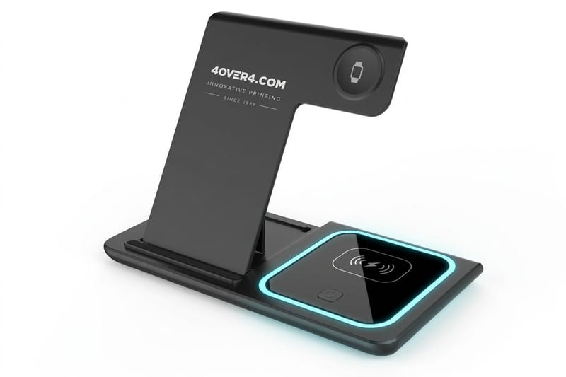
A small hard surface imprint proves whether your simplified mark still reads at tiny size in a single ink.
The Prepress Checklist for Fixing a Bad Logo
Work this list top to bottom before any job goes to print. It takes about fifteen minutes on a logo you already own, and it catches nearly every failure described above while the file is still cheap to change.
File and structure
- Master art is vector, not a placed image inside a vector wrapper, and the layers are named and organized.
- All type is outlined, all strokes are expanded, and there are no live effects left in the file.
- Stray points, hidden objects, and empty clipping paths are deleted so the bounding box is exactly the logo.
- Clear space is drawn as a guide, so anyone placing the mark knows how much room it needs.
Color and reproduction
- One global swatch per brand color, with defined CMYK values and a spot equivalent where it matters.
- Overprint is off unless you deliberately want it, since a stray overprint setting can erase a white element.
- Full color, one color black, one color white, and grayscale versions all exist and all match in weight.
- Minimum stroke weight verified at your smallest planned reproduction size, in both positive and reverse.
Comparing formats side by side helps you pick where to prove the fix first. The table below lines up popular options by stock, finish, quantity, and turnaround.
Compare formats
Popular business cards, side by side
Interior design cards start at 100 for $17.57 and lenticular at 500 for $690.88, the full spread a logo gets printed across.
 free business cards |  Standard Business Cards |  3D Lenticular Business Cards |  Metallic Foil Business Cards | |
|---|---|---|---|---|
| Min price | Free | $17.57 | $690.88 | $222.13 |
| Paper / stock | 14pt Gloss Cover | 14pt Gloss Cover | 31pt Lenticular Lens | 16 Point Silk Laminated |
| Finish | - | Standard Finish | - | - |
| Size | 2" x 3.5" | 2" x 3.5" | 2" x 3.5" - Vertical | 2" x 3.5" |
| Default qty | 200 | 100 | 500 | 500 |
| Turnaround | 5 business days | 3 business days | 22 business days | 7 business days |
| Rating | ||||
| View & customize | View & customize | View & customize | View & customize |
Rebuild the File, Then Prove It on Paper
A checklist that only lives on screen has not proved anything. The last step is physical. Print the corrected logo at real size, on the real stock, and look at it in daylight rather than under a monitor. Problems that were invisible at four hundred percent zoom become obvious in about two seconds on paper.
Start from a print-ready layout so bleed, safe margins, and resolution are handled for you, drop in the corrected vector, and order the smallest sensible quantity as a proof run. Once the mark holds up in your hand, roll it out everywhere else with confidence instead of hope.
Where to prove each fix
- Small size legibility. Print business cards and read them at arm length in normal room light.
- Vector integrity. Order a large format piece, because enlargement exposes any raster source instantly.
- One color survival. Put the simplified mark on a promo item with a single ink imprint.
- Color accuracy. Compare the printed piece against your defined CMYK build before you approve the full run.
Start fast
Templates and print ready blanks
Free layouts plus exact size blanks so bleed, trim, and safe margins are handled before you place the logo.






Wally checks your logo before the press does
A five minute file audit that saves a whole print run
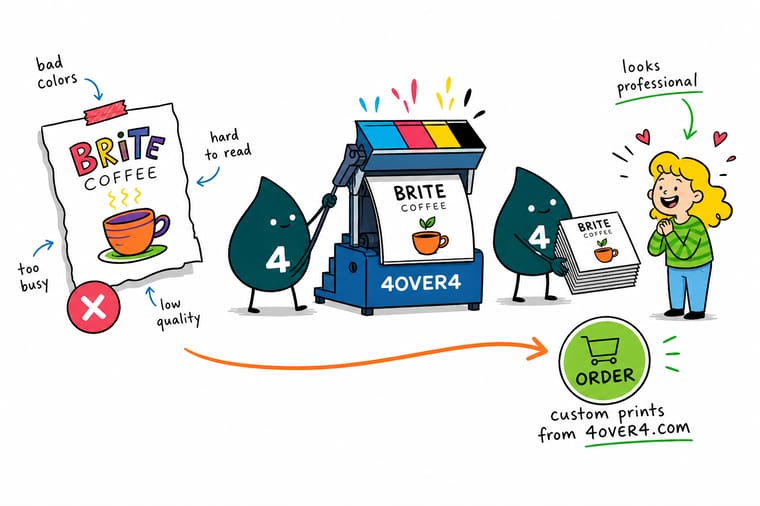
Open your logo at one inch wide and squint at it. If a stroke disappears, a letter fills in, or the tagline turns into gray fuzz, the file is not ready yet. Wally works the fixes in this order: rebuild in vector, thicken anything under a quarter point, set a real CMYK build for every brand color, raise the tagline size, then order one small run and look at it in daylight.
Order business cards with your logo →Fix These Before Your Logo Goes to Print
Logo design guides
Build the mark properly the next time
The six principles before you sketch, the best practices that keep a mark simple, the step by step build for stroke weights and counters, and the tagline lockup for when the name needs a line under it.
 Guide 6 Key Principles of Logo Design The fundamentals that decide whether a mark prints cleanly.
  Guide Best Practices for Logo Design Working habits that keep a logo versatile across formats.
  Guide How to Design a Logo The full construction process from concept to final file.
  Guide Logo With a Tagline or Slogan Stacking, spacing, and when to drop the tagline entirely.
 Explore more
More on logos, branding, and printing them well
Metallic foil cards run 500 for $222.13 and blockout banners start at $108.75, the small end and the large end a mark has to survive.
Product Interior Design Business Cards The small format test that exposes a weak logo fast. Product 2 Sided Blockout Banners Large format that only forgives true vector artwork. Product 3 in 1 Foldable Wireless Charger A ready-made desk gift that ships as it comes.  Article Custom Logo Design for Your Brand How a custom mark is built for a company from scratch.
  Article Where to Find Logo Inspiration Places to look when the first ten concepts fall flat.
  Article 10 Ways to Use Logo Stickers Put a corrected logo to work on low cost promo pieces.
  Article 15 Cool Facts About Logos Origin stories and design decisions behind famous marks.
 Ready to see whether your logo actually survives ink?
Fix the file, then prove it on paper. Print a small run of cards, hold them in daylight, and you will know in seconds what no amount of zooming on a screen can tell you.
Bad Logo Design FAQ
What makes a logo bad?
A bad logo is one that stops working outside the conditions it was designed in. The usual causes are structural rather than aesthetic: too many competing elements, a raster file instead of vector art, hairline strokes that cannot survive ink spread, screen-only effects like glows and transparency, and secondary type set too small to read once the lockup is scaled down. Run the mark at one inch wide, in solid black, on four different backgrounds. Whatever breaks in those three tests is the actual problem. For the design fundamentals behind each fix, see the 6 key principles of logo design.
How do I know if my logo is ready to print?
Open the master file and confirm five things. The artwork is vector with no placed images inside it, all type is outlined, all strokes are expanded, every brand color uses one global swatch with a defined CMYK build, and a one color version exists alongside the full color version. Then print it at your smallest planned size on plain paper. If the tagline is legible and no stroke has vanished or filled in, the file is ready. If anything fails, fix it in the master rather than in the job file, so the correction travels to every future order.
What does it cost to print with a corrected logo?
It depends entirely on format and quantity, and print pricing drops sharply as the run grows. Interior Design Business Cards start at $17.57, which makes them the cheapest way to see your logo on real stock at its hardest size. A 2 Sided Blockout Banner starts at $108.75 and is the honest test of whether your file is genuinely vector. A 3 in 1 Foldable Wireless Charger starts at $15.00 if you want to check how the simplified one color mark holds up on a hard surface. Before you test, read what makes a good logo, and how it holds up in print. Configure any of them to see live quantity pricing before you order.
What sizes, stocks, and finishes work best for a logo heavy design?
Gloss and coated stocks hold fine detail best because the ink sits on the surface instead of soaking in, so they are the safer choice for a mark with tight counters or delicate lines. Uncoated and kraft stocks absorb more, which softens edges and closes gaps, so give your logo heavier strokes and wider spacing if that is the look you want. Matte and soft touch finishes sit in between. For large format, vinyl and blockout banner material both reproduce solid vector shapes cleanly, but neither will rescue a low resolution raster file.
How long does printing and shipping take once the file is fixed?
Turnaround depends on the product, the quantity, and the finish you choose, and every option shows its production time on the product page before you check out. Small format work such as business cards moves fastest, large format banners take a little longer because of finishing and hemming, and promotional products carry the longest lead time since they are decorated rather than printed. Production time is separate from shipping transit, so order the proof run first, confirm the corrected logo looks right in hand, then schedule the full quantity around your deadline.
