
Bad Advertising Examples and the Print Mistakes They Teach You to Avoid


Marcus is our print marketing voice, built from the knowledge of our production team, with over 20 years in printing.
Bad print ads, poorly designed advertisements and bad flyer examples almost always share one cause: the idea was fine and the execution failed, whether that was an offer with no cap, a number nobody double checked, or a concept nobody read cold. In print the same errors are permanent, because the piece is finished the moment it leaves the press, so the checks that matter are the offer terms at the brief stage and the proof before the run.
What makes a print ad bad
A bad print ad fails one of four checks you can run before the press: the offer has no cap or end date, a number or an address is wrong, the type is too small for the distance the piece is read from, or the artwork runs short of the 0.125 inch bleed or crosses the safe area and gets trimmed. Every one of them shows on the proof, and none of them can be fixed after the run.
Poorly designed advertisements, the layout faults
Poorly designed advertisements usually fail on layout rather than taste: three messages fighting for one headline, a phone number set below 8pt, light type over a busy photo, and a logo that is the largest thing on the page. On a 3.5" x 2" card or a 4" x 6" postcard those faults show first, because the small format leaves nowhere to hide them.
Bad flyer examples and the fix for each
- The flyer that lists every service. Pick one offer for the front and move the rest to the back.
- The flyer with no date on the deal. Print the end date beside the offer, or the offer never ends and the margin goes with it.
- The 8.5" x 11" flyer read from across a room. Size the headline for the distance and cut the body copy to three lines.
- The flyer printed on an office printer. Flyers print from 50 copies on 100# gloss text in 3 business days, so the thin, streaked sheet is avoidable.
Print mistakes and where they get caught
| Mistake | What it looks like on paper | Where it gets caught | What it costs afterwards |
|---|---|---|---|
| No bleed on the artwork | A thin white sliver along one edge where the cut drifted | On the PDF proof, by looking at the crop marks | Full reprint of the run |
| RGB file sent to press | Brand blue reads purple, neon green goes olive | Converting to CMYK before you approve | Full reprint, plus a brand that looks off everywhere else |
| Low resolution logo | Soft, furry edges that get worse as the piece gets bigger | Zoom to 100% at final size, not at fit-to-window | Reprint, or living with a blurred logo |
| Wrong phone number, URL or date | Perfect print of the wrong information | Reading the contact block out loud, digit by digit | Reprint plus every response you never received |
| Offer with no limit printed on it | A clean piece that promises more than you can deliver | Before design, when the offer is written | Honouring it, or an angry audience |
| Dated piece ordered in bulk | Thousands of flyers for an event that already happened | At the quantity decision, not at the design stage | The whole unused run |
Every row in that table is caught at the proof or earlier, and none of them are caught after delivery. That is the whole argument for slowing down for ten minutes before you approve. You can see how proofs work at 4OVER4.COM before you place an order.
Why the famous flops still repay attention

The advertising failures people still talk about were almost never bad ideas. They were ordinary ideas that went out with something unchecked in them: an offer written without a limit, a number printed on a million bottle caps, a headline that read differently outside the room it was written in.
That is why they are useful to a small business owner ordering a few thousand flyers. You will never spend what Hoover spent. You can still make the identical error at your own scale, and print is unforgiving about it, because a printed piece is finished the moment it leaves the press. There is no edit button and no quiet delete.
The pattern repeats. Somebody approved a thing that had not been read carefully by a person whose job it was to find the problem. Our breakdown of print ads that convert looks at the other side of the same coin, and it is the same discipline in reverse.
The three failure types worth naming
Failures cluster into three groups. Offer failures, where the promise was bigger than the business could honor. Reading failures, where the message meant something different to the audience than it did to the team. Production failures, where the idea was fine and the file, the number or the scale was wrong.
Only the third is really a printing problem. The first two are decided before anyone opens a design file, which is why the useful checks happen at the brief stage and again at the proof, and almost never in between.
Print does not forgive, but it is cheap to test
A digital ad can be pulled in an hour. A printed run stays exactly as it was made. That sounds like a reason to be nervous, and instead it is a reason to print small first: order a short run, put it in front of real people, then reorder once the piece has survived contact with them.
Short runs make this affordable. Standard postcards start at $16.48 and standard flyers at $39.54, which is less than most businesses spend testing a week of social ads.
Nine advertising failures and the lesson each one leaves

These are nine campaigns that went wrong in public, each paired with the specific thing it teaches anyone printing marketing material. None of the lessons are about creativity. All of them are about what got checked and what did not.
Offer and promise failures
1. Hoover free flights, 1992. Buy more than a set amount of Hoover product in the UK and get two free return flights. The offer went out without a cap and without terms tight enough to control it. Demand overwhelmed the company, the flights could not be honored on time, and Hoover Europe was eventually sold to Candy. The lesson: the terms are part of the artwork. Print the end date, the quantity limit and the exclusions on the piece itself, not just on a web page.
2. Pepsi Number Fever, Philippines, 1992. Bottle caps carried printed numbers, and one number was announced as a winner in error. Thousands of people held a cap they believed was worth a fortune. Litigation and unrest followed for years. The lesson: when a printed piece carries a number, a code or a price, one named person signs off the numbers separately from the layout. The designer proofs the design. Somebody else proofs the data.
3. Bloomingdale’s holiday catalog, 2015. A catalog page paired a photograph with a line about spiking a friend’s eggnog while she was not looking. It was apologised for and withdrawn. The pages were already in millions of homes. The lesson: a printed ad cannot be recalled, so the read-it-cold review has to happen before the press, by somebody who was not in the concept meeting.
Reading and audience failures
4. New Coke, 1985. Coca-Cola tested the new formula in blind taste tests, and it won them. What the tests did not measure was what people felt about the old one. The original returned as Coca-Cola Classic within months. The lesson: test the thing you are actually changing. A taste test cannot tell you about attachment, and a design mockup on a screen cannot tell you how a piece feels in a hand.
5. Tropicana packaging redesign, 2009. A cleaner, more modern carton replaced the orange with the straw in it. Shoppers stopped recognising the product on the shelf and the old design came back within about two months. The lesson: recognition lives in the printed asset, not in the brand guidelines. Before you redesign, ask what customers actually use to find you, then protect that.
6. Gap logo, 2010. A new logo appeared, the reaction was immediate, and the company reverted within roughly a week. The lesson: settle the mark before you commit it to print. A logo change reaches business cards, signage, packaging and vehicle graphics, and each one is a separate print bill.
7. Pepsi protest advertisement, 2017. The film was pulled inside a day after it was read as trivialising protest movements. The lesson: what the room finds charming is not what the street finds charming. Show the concept to people with no stake in it, and take the flat reaction seriously rather than explaining it away.
Production and scale failures
8. Snapple ice pop, New York, 2005. A giant frozen pop was trucked into Union Square for a stunt. It melted faster than the crew could raise it, streets were closed, and the story became the mess rather than the product. The lesson: test at full scale. A design that reads beautifully at 100mm on a screen behaves differently at 24 by 36 inches, which is exactly why large format posters should be proofed at size before the run. Watch the short large format posters video before you pick a size.
9. Boston LED stunt, 2007. Battery-powered light boards for a cartoon were placed around Boston. They were mistaken for explosive devices, parts of the city were shut down, and the campaign ended in a settlement and resignations. The lesson: the medium carries meaning before the message does. Where a piece appears changes what it says, which is the same reason a flyer left on a windscreen reads as litter and the same flyer handed over reads as an invitation. Our print advertising design guide covers placement alongside layout.
The print mistakes that turn a good ad into a bad one

The famous flops are entertaining. The ones that quietly cost small businesses money are duller and far more common, and there are about six of them.
They are all caught in the same place, which is the proof. Not the design review, where everybody is looking at the idea. The proof, where one person is looking for defects and nothing else.
Bleed, trim and the safety margin
Any color or image meant to run off the edge has to extend 0.125 inch past the trim line, and anything you need people to read sits at least 0.125 inch inside it. Cutting is mechanical and a stack of paper shifts by a hair, so art built exactly to the trim shows a white sliver on the pieces at the bottom of the lift.
This is the most common reason a run gets rejected on arrival, and it is entirely avoidable. Our bleed and trim guide shows the measurements on a real layout, and the blank template library has the bleed and trim already marked for every size we print.
Color that changes between the screen and the sheet
Your monitor makes color with light and a press makes it with ink. Some screen colors have no CMYK equivalent at all, so the brightest blues, greens and oranges come back calmer than you approved. That is not a printing fault. It is the gamut.
Convert the file to CMYK yourself and look at it before you send, so the shift happens on your desk instead of on the press. The CMYK and RGB guide explains which colors drop and how far. For large solid black areas use a rich black build rather than 100% K, and keep small type on plain black so it stays crisp.
Resolution, and the logo pulled off a website
Artwork needs to be 300 DPI at its final printed size. A logo saved from a web page is typically 72 DPI, which looks perfectly sharp in the layout window and turns soft and furry once it is printed at 11 by 17 inches. Ask whoever owns the brand for the vector file, and if nobody has one, that is a job worth doing before the next campaign rather than after it.
Zoom the file to 100% at final size before approving, not to fit-to-window. Our print resolution guide gives the numbers per product size.
The proof is where the money is saved
A proof is not a formality and it is not the design review. The design review asks whether the idea is good. The proof asks one narrower question: is anything on this sheet wrong. Those are different jobs and they are best done by different people, because the person who wrote the headline will read the phone number they meant to type rather than the one they typed.
Three passes catch nearly everything. First, the numbers, read aloud from the proof: phone, address, price, date, promo code. Second, the edges, checking that background color runs past the crop marks and nothing you need to read sits close to the trim. Third, the file at 100% of final size, looking for soft images and hairlines that will disappear on press. Ten minutes, and it retires most of the mistakes in the table above.
Quantity and price
Flyer pricing and specs
Live configurator numbers, so you can size a test run and a reorder before you commit either.
| Quantity | Price Per Unit | Total |
|---|---|---|
| 50 | 79.1¢ | $39.54 |
| 100 | 57.1¢ | $57.11 |
| 200 | 37.3¢ | $74.69 |
| 300 | 28.6¢ | $85.68 |
| 400 | 24.4¢ | $97.76 |
| 500 | 21.8¢ | $108.75 |

Unit cost falls as the run grows, which is the trap behind the dated-piece mistake in the table. If you want the arithmetic behind print quoting in general, our explanation of print shop prices covers what actually moves the number. You can also earn coins on every order and put them toward the reprint you hope you will not need.
Which printed piece suits which fix
Different failures point at different formats. An offer that needs terms printed on it wants a piece with room for small type, so a postcard back or a brochure panel beats a poster. An idea that has to survive being seen at distance wants scale, and the scale itself has to be proofed, which is the Snapple lesson translated into paper.
Print it
Flyers, proofed before the press
Preset sizes on gloss or matte stock, with a proof to approve before anything runs.

For a campaign that has to reach a mailing list, standard postcards put the offer and the terms on one card that nobody has to open. For a longer story with prices and options, standard brochures give you panels to separate the argument from the fine print. For anything read across a room, standard posters need type sized for the viewing distance, not for the artboard. And business card printing is where a logo change gets expensive first, which is the Gap lesson at small business scale.
If you want more examples of print that earned its cost rather than examples of print that did not, our roundup of print marketing that still wins customers is the companion piece to this one.
Mistakes by business type
The error you are most likely to make depends on what you sell, because the piece that matters most differs by trade.
- Restaurants and bars. Menu prices and opening hours date faster than anything else on the piece. Print in short runs, and keep the date off anything you want to reuse next season.
- Retail and e-commerce. The offer terms belong on the printed piece, not just on the landing page. End date, quantity cap and exclusions, in type people can actually read.
- Real estate. Photography carries the whole piece, so resolution matters more here than anywhere. A 72 DPI listing photo enlarged onto a postcard is the single most common defect we see.
- Clinics and professional services. One wrong digit in a phone number kills the entire response. Read the contact block aloud from the proof before you approve it.
- Events and venues. Dates, times and door prices all need a second reader. Order to the event, not to the price break, because leftovers of a dated piece are worth nothing.
Start from a file that is already the right size
Starting from a correct file removes a whole class of mistake before design begins. 4OVER4.COM sizes its blanks to exact product specs, so the bleed, the trim and the safe area are already drawn and you cannot accidentally build to the wrong line. A 4" x 6" postcard blank, for example, is 4.25" x 6.25" with the 0.125 inch bleed on every side, and its safe area sits 0.125 inch inside the cut. Grab one from the blank template library, or start from a finished layout in the design template collection.
Start fast
Start from a file that is already the right size
Flyer design templates and exact size blanks, with bleed and trim already marked.

Wally catches the mistake while it is still free
Three passes on the proof, ten minutes, no reprint
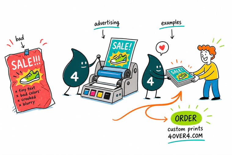
Read every number out loud from the proof: phone, address, price, date, promo code. Check that background color runs 0.125 inch past the trim and that nothing you need to read sits inside that margin. Then view the file at 100% of final size to catch soft logos and hairlines. Approve after that, and 4OVER4.COM prints it sharp on your choice of stock.
Order flyers →The checks that catch this before it prints
Habits that prevent the expensive errors
- Proof cold, not warm. The person who proofs should not be the person who designed it. Fresh eyes find the wrong year in a date. The author reads what they meant to write.
- Read the numbers out loud. Phone number, street number, price, date, digit by digit, from the proof rather than from the brief. It takes a minute and it catches the most expensive class of error.
- Print one before you print thousands. A short run tells you about the stock, the color and the fold. A PDF tells you about none of them.
- Put the limit on the piece. Every offer gets an end date and a cap in printed type. An open-ended promise on paper stays open-ended long after you wanted it closed.
- Check at final size. Zoom to 100% at the printed dimensions. Fit-to-window hides soft images, thin hairlines and type that will be too small to read.
Explore more
More ways to print and promote
Standard posters run 50 for $108.75 in 5 business days and postcards 50 for $16.48 in 3.
Product Standard Flyers Full color flyers from $39.54, proofed before the run. Product Standard Postcards Short runs from $16.48, cheap enough to test an offer. Product Standard Brochures Folded pieces from $57.11 for the longer sales story.  Product Standard Posters Large format from $108.75, proofed at full size. Category Flyer Printing Every size, stock and finish we print flyers on.
  Article Print Ads That Convert Twenty campaigns that worked, and the reason each one did.
 Ready to print the corrected version?
Pick your size, drop in your file or a free template, approve the proof, and 4OVER4.COM prints it sharp on premium stock as fast as your deadline needs.
Common questions about advertising mistakes
What is the most common mistake in print advertising?
Missing bleed. Artwork gets built exactly to the trim line, the cutting stack shifts by a fraction, and a white sliver appears along one edge of part of the run. The fix is to extend any background color or image 0.125 inch past the trim on every side and keep all live copy at least 0.125 inch inside it. Second most common is a low resolution logo pulled from a website, which looks sharp in the layout window and soft on paper. Start from a blank template with the bleed and trim already marked and both problems disappear before they reach the press.
How do I proof a flyer so a typo does not reach the press?
Give the proof to somebody who did not design the piece, and give them one job: find defects. The author reads what they intended to write, which is why designers miss their own typos consistently. Then read the numbers out loud from the proof, digit by digit: phone number, street number, price, date, promo code. Check the URL by typing it into a browser rather than by looking at it. Approve the proof only after that pass, because at 4OVER4.COM the proof is the last point where a change costs nothing.
Why do my colors look different printed than on screen?
Your screen builds color from light in RGB and a press builds it from four inks in CMYK, and some RGB colors simply have no ink equivalent. Bright blues, neon greens and vivid oranges are the usual casualties, and they come back noticeably calmer. Convert the file to CMYK before you approve it so you see the shift on your own screen rather than in the delivered box. If a specific brand color has to match exactly across every piece, ask about a spot color instead of a CMYK build.
Should I reprint if I find a small error after delivery?
It depends entirely on what is wrong. A wrong phone number, URL or date means reprint, because the piece cannot do its job at all and every hour it is out costs you responses. A slightly soft logo, a color that came back calmer than expected, or an awkward line break is usually worth living with for one run and fixing in the next. The honest test is whether a customer trying to respond can still respond. If yes, keep going. If no, reprint, and postcards at $16.48 make that a smaller decision than it feels.
How many should I print for a first campaign?
Print to the campaign, not to the price break. Unit cost falls as quantity climbs, which tempts people into ordering thousands of a piece carrying a date, a price or an offer that changes in a month. A first run large enough to reach your list once, and no larger, tells you whether the offer works. Then reorder at a bigger quantity once the piece has proven itself. Anything dated should be ordered to the event with a small margin, because leftovers of a dated flyer are worth exactly nothing the morning after.
