
8 Travel Photographers to Follow for Print Worthy Inspiration


Follow Steve McCurry for color discipline, Michael Yamashita for sequence, Chris Burkard for scale, Jimmy Chin for vantage point, Cristina Mittermeier for purpose, Reuben Wu for light you bring yourself, Elizabeth Gadd for restraint, and Alex Strohl for consistency. Each entry below names the one technique worth stealing and what that technique does once the frame leaves a screen and lands on paper, because the two are not the same problem.
The eight at a glance
| Photographer | Known for | Technique to study | What it does in print |
|---|---|---|---|
| Steve McCurry | Magnum portraiture, the June 1985 Afghan Girl cover | One subject, one color relationship, eye contact | Saturated reds and saffrons sit at the edge of CMYK, so soft proof them |
| Michael Yamashita | Decades at National Geographic, the Marco Polo route across Asia | Sequence over the single hero frame | Works as a spread or a fold, not as one poster |
| Chris Burkard | Cold water surf, Iceland, the Arctic | A tiny figure that gives a landscape its scale | That figure needs real pixels; check it at 100 percent before you order |
| Jimmy Chin | Expedition climbing, co-director of Meru and Free Solo | Vantage point as the whole idea of the picture | Verticals crop badly to landscape formats, so plan the format first |
| Cristina Mittermeier | Marine biologist, conservation photography, SeaLegacy | A frame that carries an argument, not just a view | Caption space is part of the layout, so leave room for it |
| Reuben Wu | The Lux Noctis series, landscapes lit by drone at night | Bringing your own light instead of waiting for it | Bright arcs on near black need coated stock or the contrast collapses |
| Elizabeth Gadd | Self portraits in the mountains of British Columbia | Restraint, a narrow muted palette held across a body of work | Matte suits it; a gloss coat pushes the quiet tones too far |
| Alex Strohl | Montana based outdoor and adventure work | One consistent grade across every frame | A consistent grade is what makes a set of prints read as a set |
The right hand column is the part most inspiration lists skip. A frame that reads well in a feed can lose its subject on a matte sheet, and knowing which of these techniques survives the move is what turns a saved image into a print worth keeping. Start with a cheap test set of travel postcards before you scale anything up.
Follow for the technique, not the destination
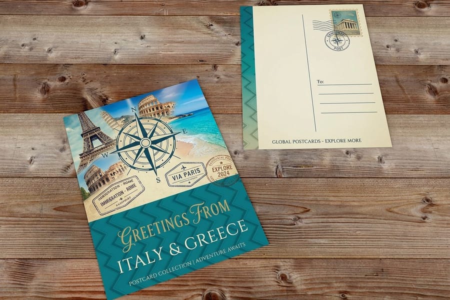
The eight below are worth following because each one solved a different problem you will hit the moment you try to print your own travel work. Steve McCurry for color, Michael Yamashita for sequence, Chris Burkard for scale, Jimmy Chin for vantage point, Cristina Mittermeier for purpose, Reuben Wu for light you supply yourself, Elizabeth Gadd for restraint, Alex Strohl for consistency.
Following a photographer for their locations is a dead end. You cannot go where they went on the budget you have, and the picture was never really about the place anyway. What travels is the decision underneath the frame: where they stood, what they left out, which single color they let dominate. That transfers to a harbour two hours from your house.
It also matters more than usual when the work is heading to paper. A frame that survives a screen at thumbnail size can fall apart at 11 by 17 inches on a matte sheet, and the photographers who print their own work compose with that in mind. Our guide to building commercial print ready files covers the mechanics; this page covers what to look at before you get there.
What print rewards that a feed does not
A phone screen is small, backlit and scrolled past in under a second, so it flatters high contrast, heavy saturation and a busy frame. Paper does the opposite. It is held still, at arm length, in ordinary room light, and it rewards a picture with one clear subject and somewhere for the eye to rest.
Look at the eight below with that filter on. The frames that would print well are the ones with an obvious entry point, a clean edge, and no more than two or three tonal areas. The rest are feed pictures, and there is no shame in that, but they are not the ones to model.
The follow list is a study list
Set a rule before you start: for every frame you save, write one sentence on why it works. Focal length, light direction, where the horizon sits, what got cut off. Twenty sentences teach more than two thousand saved images, and the discipline is what turns a feed habit into a working reference.
Then print the ones you keep coming back to. Nothing exposes a weak composition like seeing it at a fixed size on a sheet you cannot zoom into. A run of travel postcards at $16.48 is the cheapest way to run that test on your own frames.
The eight, and what each one is actually teaching
Each entry names the technique first and the person second, because the technique is the part you take away. Where the frame behaves differently on paper than on screen, that is called out too.
None of these accounts are behind a paywall, and none of them require you to buy anything to study them. What follows is a reading of the work, not a reproduction of it.
One to four: color, sequence, scale, vantage point
1. Steve McCurry, for color discipline. The Magnum photographer behind the June 1985 National Geographic cover shot Kodachrome for most of his career, and Kodak gave him the last roll it ever made in 2010. His frames almost always hang on one dominant color against a muted field. Copy the discipline, not the palette. The catch on press is that his saffrons and deep reds live near the edge of what CMYK can reach, so proof them rather than trusting the screen.
2. Michael Yamashita, for sequence. Decades of National Geographic assignments across Asia, including retracing the Marco Polo route, taught him to build a place out of many frames rather than hunting one. That is the skill a brochure or a photo book needs, and it is the one most travel shooters never practice. If you plan a set of six, you shoot differently than if you plan a hero.
3. Chris Burkard, for scale. Cold water surf and Arctic landscapes, almost always with a single human figure small enough to be missed at a glance. That figure is the entire trick: without it the cliff is a texture, with it the cliff has a size. The print warning is simple. If the figure is 30 pixels tall in your file, it will be a smudge on a sheet, so check it at 100 percent before you commit a run.
4. Jimmy Chin, for vantage point. A climber first and a photographer second, and co-director of Meru and of Free Solo, which won the Academy Award for Best Documentary Feature in 2019. He gets to positions no one else can reach, and the position is the picture. You do not need a rope to take the lesson: move fifty feet and thirty degrees before you shoot, every time. His verticals also crop badly into landscape formats, which is a reminder to pick the print format before the trip, not after.
Five to eight: purpose, light, restraint, consistency
5. Cristina Mittermeier, for purpose. A marine biologist who came to photography through conservation, founded the International League of Conservation Photographers, and co-founded SeaLegacy. Her frames are built to make an argument, which is why they hold up next to text. If you are laying out a travel brochure, this is the model: leave the caption somewhere to live, and let the picture carry a claim rather than a view.
6. Reuben Wu, for light you bring. His Lux Noctis series lights desert rock formations at night using drone mounted lights, drawing luminous arcs into landscapes that are otherwise black. The lesson is that waiting for golden hour is one option among several. The print lesson is harder: a bright arc against a near black field depends on a contrast range that uncoated stock cannot hold, so that work belongs on a coated sheet or it goes muddy.
7. Elizabeth Gadd, for restraint. The British Columbia photographer places a small figure, usually herself, into vast muted landscapes, and she resists the urge to push the file. Low contrast, narrow palette, held across years of work. That kind of image prints beautifully on matte and gets wrecked by a gloss coat, which lifts saturation and turns quiet into candy.
8. Alex Strohl, for consistency. The Montana based outdoor photographer runs one grade across everything, so any twelve frames from his archive look like a body of work rather than a folder. When you print a set, this is the difference between a collection and a pile. Pick the grade before you edit, not per image, and our notes on color pairings that survive print are a useful starting point if you have not settled on one.
Eight lessons, one press
Studying is the easy half. The moment a frame you love goes to a press, three things decide whether it survives: the color space, the resolution at final size, and the coating.
Color space is where most travel work loses. A screen makes cyan and orange out of light, and paper makes them out of ink, and the two sets do not overlap completely. The tropical water blue and the sunset orange that made you keep the frame are exactly the two hues most likely to come back a shade quieter. That is not a print defect, it is physics, and the fix is to soft proof in CMYK and adjust before you send rather than complaining after.
Resolution is arithmetic and people get it wrong in one specific way: they measure it at viewing size instead of print size. A 24 megapixel frame is roughly 6000 by 4000 pixels, which is 300 DPI at 20 by 13 inches. Blow the same file up to a 24 by 36 poster and you are at 165 DPI, which is fine at three feet and visibly soft in the hand. The bleed, cut line and safety checklist covers the rest of the file setup.
Coating, and why it is not a preference
Gloss lifts saturation and deepens blacks, which is why McCurry style color and Burkard style ocean work look right on it. Matte scatters the light, drops contrast a little and kills reflections, which is what Gadd style muted work and any frame with fine shadow detail actually needs. Choosing by habit rather than by image is the most common reason a print disappoints someone who liked the file.
There is a second reason to care. A glossy sheet under a gallery light throws a reflection straight back at the viewer, so a print destined for a wall opposite a window is usually better matte even when the image would prefer gloss. Decide with the room in mind, not just the picture.
Print small first, always
Order the frame you are unsure about at postcard size before you order it at poster size. A 4 by 6 costs almost nothing, it shows you the color shift, the shadow behavior and the coating effect honestly, and it costs a fraction of finding the same three things out on a large sheet.
This is the whole reason travel photographers who sell prints run test sets. If you want to compare an online run against a local shop before you commit, our comparison of local versus online printing lays out where each one wins.
What it costs to print your own travel work
Postcard pricing moves with size, stock, finish and quantity, and the per unit cost drops sharply as the run grows. The numbers below come straight from the live configurator, so you can size a test set before you order one.
Quantity and price
Travel postcard pricing and specs
Real configurator numbers, where a larger run drops the per unit cost enough to make a full set worth printing at once.
| Quantity | Price Per Unit | Total |
|---|---|---|
| 50 | 33.0¢ | $16.48 |
| 100 | 24.2¢ | $24.16 |
| 200 | 15.9¢ | $31.86 |
| 300 | 12.8¢ | $38.45 |
| 400 | 11.3¢ | $45.04 |
| 500 | 10.3¢ | $51.62 |
You can also earn coins on every order and redeem them against later runs, which helps when you are printing a test set and then a real one.
Stock and coating for photographic work
Stock and image work together, and the mismatch is what disappoints people. A high saturation ocean frame on an uncoated sheet loses the depth that made it worth printing, because uncoated fiber absorbs ink and drops the maximum density the black can reach. The same sheet flatters a muted mountain frame with fine shadow detail, which a gloss coat would push into candy. Match the coating to the image, then sanity check it against the room the print will live in.
Print it
Travel postcards, ready to test
Preset sizes on premium stock, the cheapest honest look at how your frames behave on paper.
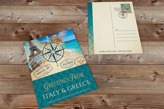
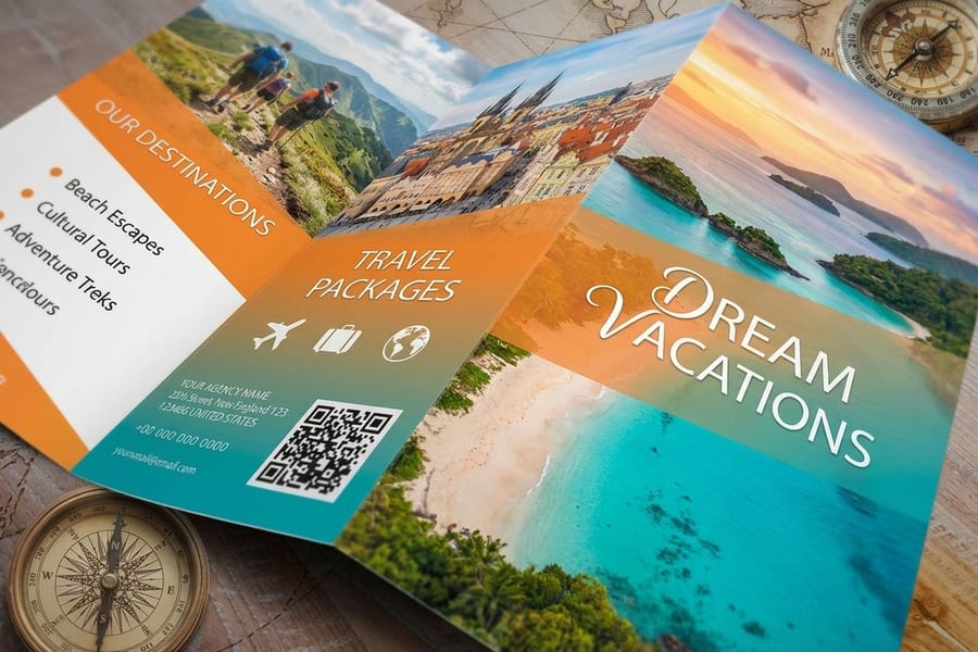
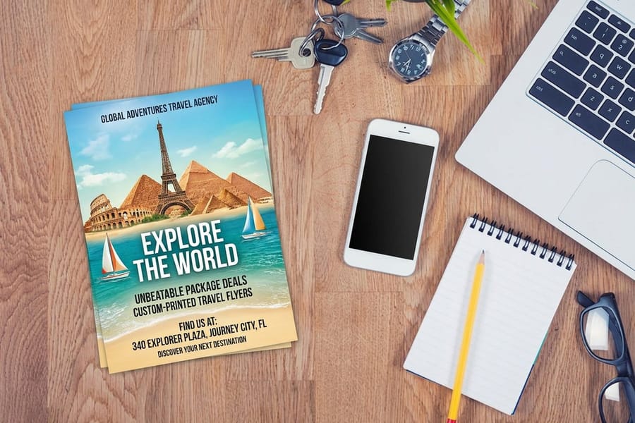
Weight matters separately from coating. A 14pt card feels like a card and a 16pt card feels like an object, and on anything larger than about 4 by 9 inches the difference in rigidity is obvious the moment someone picks it up. For a set that will be handled and passed around, the heavier stock is worth the small step in price. If the work is heading into a folded piece rather than a flat one, travel brochures at $57.11 hold a sequence far better than a stack of single sheets, and travel flyers at $39.54 are the single sheet option when one image has to do all the work.
Who to study depending on what you shoot
The eight do not all apply to everyone. Here is the shortest path from what you photograph to whose work will actually help you.
- Landscape shooters. Study Burkard and Gadd. Scale and restraint are the two levers that make an empty frame readable, and both survive the trip to paper better than heavy contrast does.
- Street and portrait shooters. Study McCurry and Mittermeier. One subject, one color relationship, and a reason for the frame to exist beyond the fact that you were there.
- Travel agencies and tour operators. Study Yamashita. A sequence sells an itinerary; a hero shot sells nothing. Build the set of six before you design the panels of a brochure.
- Photographers selling prints. Study Strohl. A consistent grade turns a folder into a collection, and a collection is what a buyer pays a second time for.
- Anyone shooting at night. Study Wu. Bring a light, plan the coating, and accept that near black frames need a coated sheet to hold their contrast.
Print blanks for a photo set
If you would rather not build the file geometry yourself, start from a blank. 4OVER4.COM sizes its blanks to exact product specs, so your image lands inside the cut line with the bleed already accounted for. Pull a print ready blank from the blank template library and drop your frame straight in.
Start fast
Print blanks for a photo set
Postcard design templates and exact size blanks so your photograph lands inside the trim.





Wally on why the print never quite matches the screen
Soft proof first, then print small, then print big
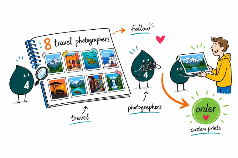
A screen builds color out of light and paper builds it out of ink, so tropical cyan and sunset orange always land a shade quieter on a sheet. Soft proof in CMYK, lift those two areas by hand, check your smallest subject at 100 percent, and order one postcard sized test before you commit to a poster. 4OVER4.COM prints the test set from $16.48.
Order travel postcards →What to remember before you print
Rules that hold at every print size
- Soft proof before you send. Convert to CMYK on screen and look at what moves. The two hues that shift most in travel work are tropical cyan and sunset orange, and seeing it early is much cheaper than seeing it on the sheet.
- Check the small figure at 100 percent. The tiny human that gives a landscape scale is the first thing to turn into a smudge. If it does not hold at full magnification, it will not hold on paper.
- Pick the format before the trip. A vertical does not become a landscape by cropping without losing the reason it was vertical. Know whether you are printing a postcard, a panel or a poster, then shoot for it.
- One grade for the whole set. Edit the set, not the image. Twelve frames with twelve different treatments look like twelve accidents.
- Leave the caption somewhere to sit. If the picture will carry text, compose with an area of low detail for it. Adding a text box over a busy corner afterwards is how good frames get ruined in layout.
Explore more
More ways to print and share the work
Travel postcards run 50 for $16.48, the cheapest way to see eight of your own frames on real stock.
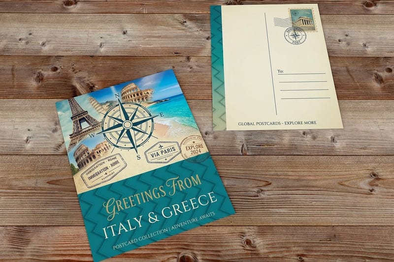 Product Travel Postcards The cheapest honest test of a frame you are unsure about.
 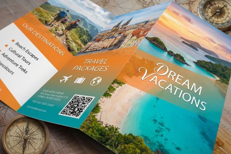 Product Travel Brochures Where a sequence of frames beats a single hero shot.
 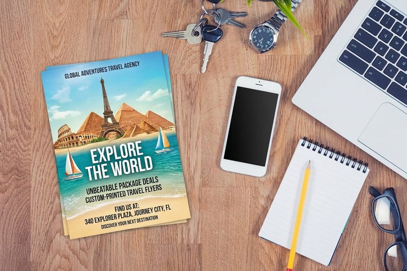 Product Travel Flyers Full bleed photography on a single sheet, printed fast.
  Product Travel Agent Business Cards A small format that still carries one strong image. Category Travel Printing Every travel print format in one place.
  Guide Print-Ready Files Color space, resolution and export settings that hold.
  Guide Color Pairings That Work Ten combinations that survive the move to ink.
  Article 12 Easy-to-Read Fonts Typefaces that stay legible over a photograph.
 Working on the business side of travel rather than the pictures? The naming exercise in 100 travel agency name ideas pairs with travel agent business cards from $17.57, and the full range sits in travel printing. For large format work from the same photographs, the banner sizing and template guide covers the resolution maths at wall scale, and these print ads are a reminder that a single image plus a single line still outperforms a busy layout.
Ready to see your frames on paper?
Pick your size, drop in your photograph or a free blank template, and 4OVER4.COM prints it sharp on premium stock, as fast as your deadline needs.
Common questions about printing travel photography
Can I print a photographer I admire as inspiration on my own wall?
Not from a file you saved. A photograph is protected the moment it is made, and downloading a frame from a feed gives you no license to reproduce it, even for personal use and even at postcard size. What you can take freely is the technique: the standing point, the focal length, the color relationship, the decision about what to leave out of the frame. Study the eight names on this page, then shoot your own version of the idea near where you live. If you genuinely want a print of someone else work, most of these photographers sell editions directly, which is the honest route.
Why do my travel photos look duller printed than they do on screen?
Because a screen makes color out of light and paper makes it out of ink. A monitor is additive and backlit, so it can produce a cyan and an orange that no combination of cyan, magenta, yellow and black pigment can match on a reflective sheet. Tropical water and sunset light are the two subjects most affected, which is unlucky for travel work specifically. The fix is to soft proof your file in CMYK before sending, then lift the affected areas slightly by hand rather than expecting the press to recover them. Ordering one postcard sized proof first will show you the exact size of the shift on your images.
What resolution do I need to print a travel photograph?
Aim for 300 DPI at the finished size, and calculate it at that size rather than at the size you are viewing. A 24 megapixel camera gives roughly 6000 by 4000 pixels, which is 300 DPI at about 20 by 13 inches. The same file on a 24 by 36 poster works out around 165 DPI, which reads acceptably from a few feet away and looks soft when held. Small figures in big landscapes are the first detail to break down, so open the file at 100 percent and look at the smallest element that matters before you order.
Should travel photography be printed on gloss or matte?
Choose by the image and the room, not by habit. Gloss increases saturation and deepens blacks, which suits high color ocean, sunset and portrait work of the kind Steve McCurry and Chris Burkard are known for. Matte scatters light, softens contrast slightly and removes reflections, which suits muted low contrast landscapes and anything with fine shadow detail. The room matters as much as the picture: a glossy print hung opposite a window throws the reflection straight back at whoever is looking at it, so matte often wins for wall work regardless of the image.
What is the cheapest way to print a set of my own travel photos?
Postcards. Travel postcards start at $16.48 at 4OVER4.COM, so a set of your best frames costs less than a single framed enlargement and tells you far more. You see the color shift, the coating effect and the shadow behavior on real stock, across several images at once, and you find out which frames actually hold up at a fixed size. Print the set, live with it for a week, then order the two or three that keep pulling you back at a larger size. It is the same test process photographers use before they commit to an edition.
