
30 Fantastic Fonts for Mother’s Day Design


How to Pick a Mother’s Day Font Without Overthinking It

The font is the first thing your eye reads on a Mother’s Day card, before a single word registers. A flowing script whispers, a fat display serif shouts, and a clean sans just gets out of the way of the photo. Pick the one that matches how you actually feel about her, and the design does half the talking for you.
Most people freeze here, scrolling a font menu with 900 options and no filter. The trick is to stop choosing a font and start choosing a mood. Decide romantic, modern, playful, classic, bold, or vintage first, and the shortlist shrinks from hundreds to five. This guide sorts thirty free, print-ready typefaces into exactly those six moods, so you can jump to the feeling you want and grab a name.
4OVER4.COM has printed 10 billion+ cards across 1,000+ product types since 1999, and greeting cards stay some of the most personal things people order. Once you have a font in mind, you can drop it into a print-ready layout in the online design templates library, set it over a photo, and send it to press on the exact stock that flatters the letterforms. Here is how to land on the right face fast.
Step 1: start with her, not the font
Is she elegant and understated, warm and funny, sentimental, or bold? The mom decides the mood, and the mood decides the typeface. A grandmother who saves every card wants something classic. A new mom who lives in group texts might love handwriting.
Step 2: pick a mood, then a name
Once the feeling is set, pull one candidate from that mood group below. Do not audition all thirty. Two or three from a single mood is plenty to compare, and it keeps the card coherent instead of confused.
Step 3: test it at real size
A font that looks gorgeous at 200 points can turn to mush at the size it actually prints. Set your real words at the real size and read them from arm’s length. If a thin script blurs, size it up or save it for a single word.
Step 4: pair, do not pile on
Two typefaces is the ceiling: one for the headline, one for the message inside. More than that and the card starts to argue with itself. There is a full pairing section further down to make that part painless.
Shop the day
Mother’s Day printing collection
Cards, invitations, postcards, bookmarks, and stickers built for Mom, all in one place.
Elegant and Romantic Scripts for a Softer Card
Scripts are the reflex choice for Mother’s Day, and for good reason. They read as handwriting turned formal, warm but polished, which is exactly the register most people want for Mom. The catch is legibility: keep scripts to the headline or a short line, never a full paragraph, and give them room to breathe.
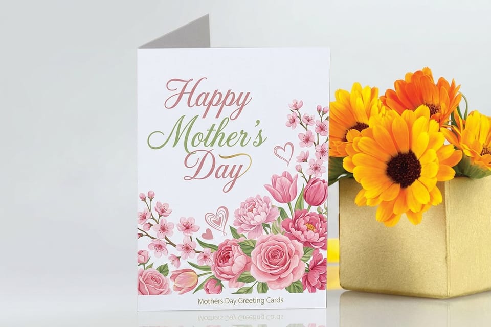
A romantic script earns a card that feels as considered as the type. Set your line in the online designer, then send it to a soft finish so the fine strokes read as intentional. Elegant scripts sit beautifully on Mother’s Day Invitations for a brunch or garden party, and on the flagship Mother’s Day Greeting Cards for the card itself.
- Great Vibes. A flowing, high-contrast script with generous loops. Formal without turning stiff, ideal stretched across the front of a folded card.
- Allura. A calligraphic script that stays readable at smaller sizes. Choose it when you want romance but still need the words to land cleanly.
- Pinyon Script. Delicate copperplate letterforms with a vintage-wedding feel. Best on a short line, not a full sentence.
- Parisienne. Casual handwriting with a gentle bounce, warmer and less buttoned-up than a wedding script. Reads like a note, not an announcement.
- Tangerine. Airy and light with long, elegant ascenders. Set it large and give it space, and one word becomes the whole design.
Print picks
Three Mother’s Day formats to set your type on
Live prices, ready to customize with your chosen font, message, and a photo.
 Mother’s Day Postcards From $16.48 A flat, full-bleed canvas where one big display font carries the whole front.
  Mother’s Day Invitations From $19.77 A brunch or garden-party invite where an elegant script sets the tone.
  Mother’s Day Stickers From $23.88 A playful handwriting font on a sticker for the gift wrap or a lunchbox note.
 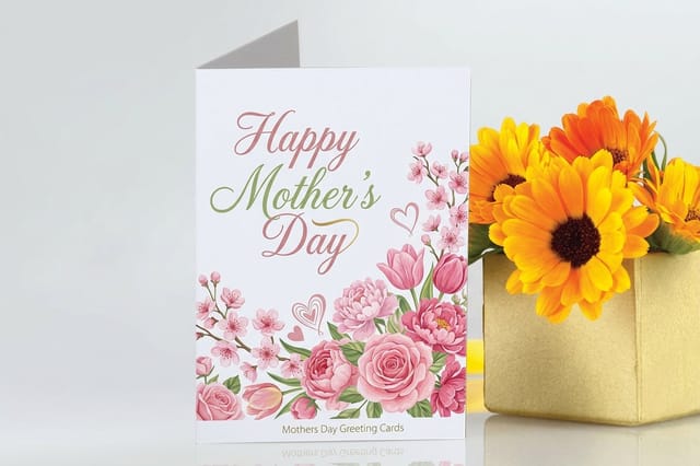 Mothers Day Greeting Cards From $56.02 Set your favorite of these fonts on a card mom will keep.
 Modern and Minimal Sans-Serifs
Not every mom wants curlicues. For the design-minded, the architect, the woman whose whole apartment is greige and good light, a clean sans-serif is the compliment. Minimal type also lets a strong photo or a single pop of color carry the emotion, which is often the more powerful move.
Sans-serifs are the most forgiving fonts to print because their even strokes stay crisp at any size or finish. They anchor a modern card where the image does the heavy lifting.
- Montserrat. Geometric and clean, drawn from old Buenos Aires signage. A modern workhorse that never competes with the photo.
- Poppins. A rounded geometric sans with even strokes. Friendly and current, great for a card that feels fresh rather than fussy.
- Raleway. An elegant thin-to-regular sans with a distinctive lowercase w. Reads upscale while staying minimal.
- Josefin Sans. Tall, vintage-flavored geometric caps. Space the letters wide for a quiet, editorial header.
- Work Sans. Optimized for screen and print alike, plain in the best way. Lets a bold color or a soft script do the emotional work.
Playful, Handmade Fonts for a Card That Feels Personal

If the card is from a kid, or from a grown-up who wants that made-with-love energy, handwriting fonts are the honest pick. They look like a real pen touched the paper, which is the whole appeal, without the risk of your actual handwriting falling apart halfway through.
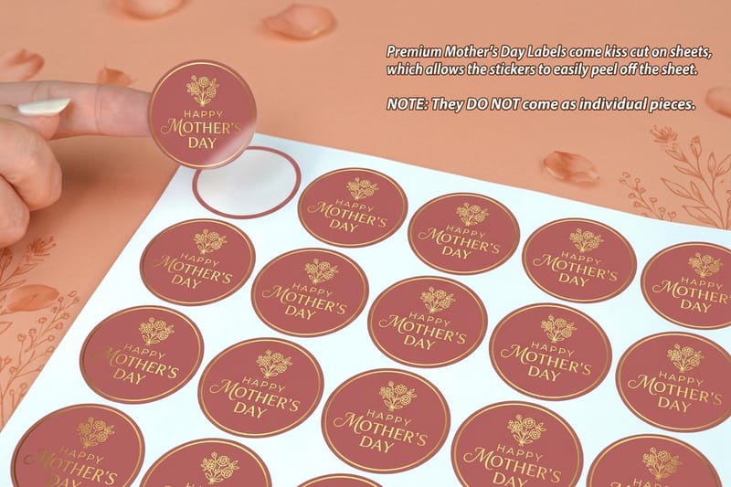
These fonts shine on small, casual pieces as much as on the card. A handwritten line on a Mother’s Day Sticker turns a plain gift bag into something she photographs, and it keeps the mood cheerful and unfussy.
- Amatic SC. Tall, thin, hand-drawn caps. Charming and casual, perfect for a kid-made-it feel that still prints crisp.
- Caveat. A natural handwriting font with real pen bounce. Looks like you wrote the card yourself, which is usually the point.
- Shadows Into Light. Light, breezy handwriting that stays legible. Great for a heartfelt line from a child to Mom.
- Kalam. Ink-pen handwriting with a slight lean. Warm and personal without tipping into messy.
- Patrick Hand. Even, friendly print handwriting. The dependable pick when you want handmade but need every word clear.
Classic Serifs That Never Look Dated
When the message runs longer than a line, or the mom in question values tradition, a serif is the grown-up choice. Serifs carry gravitas, read comfortably in paragraphs, and age well, so the card looks as good in the memory box five years from now as it does on the second Sunday in May.
Because these cards tend to get kept, the paper matters as much as the type. See how the finishes and pricing shake out below, then print the serif on a stock with a little weight to it.
- Playfair Display. A high-contrast transitional serif with real drama in the thick and thin strokes. The go-to for an elegant Mother’s Day headline.
- Cormorant Garamond. A refined, feather-light Garamond revival. Beautiful at large sizes for a single word like “Mom.”
- EB Garamond. A faithful classic book serif, warm and endlessly readable. Ideal for a longer message inside.
- Lora. A contemporary serif with brushed curves. Modern enough for 2026, traditional enough to feel timeless.
- Libre Baskerville. Built for body text, sturdy and clear. The safe choice when the note stretches to a few sentences.
Quantity and price
Mother’s Day greeting card pricing and specs
Real configurator numbers. The more you order, the lower the per-card cost drops.
| Quantity | Price Per Unit | Total |
|---|---|---|
| 50 | $1.12 | $56.02 |
| 100 | 78.0¢ | $77.99 |
| 200 | 50.0¢ | $99.95 |
| 300 | 40.6¢ | $121.92 |
| 400 | 36.0¢ | $143.89 |
| 500 | 33.2¢ | $165.86 |
Bold Display Fonts That Own the Front
Some cards should not whisper. For a mom with a big personality, or a design that leads with one word and a lot of confidence, a heavy display face fills the front and dares you to look away. Keep the word count low and let the letterforms be the art.
Bold type wants a matte or soft-touch surface so a giant letter reads as solid ink instead of a glare. An invitation is a natural home for a statement face. Check the specs and stock options before you commit.
- Abril Fatface. A fat, high-contrast display serif with old-poster energy. One word fills the front and owns it.
- Bebas Neue. Tall, tight, all-caps condensed sans. Clean and confident, great stacked over a photo.
- Anton. An ultra-heavy grotesque sans. Impossible to ignore, perfect for a modern, graphic card.
- Alfa Slab One. A chunky slab serif with rounded corners. Bold but a touch friendly, never aggressive.
- Ultra. A heavy slab with vintage advertising roots. Warm, loud, and unmistakably retro.
Statement piece
Mother’s Day invitations
A flat, generous canvas where a bold display font can fill the front and own it.
Vintage and Nostalgic Faces for a Keepsake Feel
Vintage typefaces do something no modern font can: they make a brand-new card feel like it was found in a shoebox of treasured mail. For a mom or grandmother who loves the old-world look, these faces carry instant nostalgia and pair perfectly with a sepia photo.
Lean the whole card into the era. A retro face on a keepsake card begs to hold something small, so 4OVER4.COM offers tip-on printing, a service that adheres a photo or a little gift right onto the front, so the type and the memory arrive as one piece.
- Cinzel. Roman inscriptional caps, engraved and formal. Lends a card gravitas, like it was carved rather than printed.
- Yeseva One. A curvy, feminine display serif with art-nouveau flair. Romantic and a little old-world.
- Sacramento. A thin monoline script from mid-century signage. Retro diner charm in a single elegant line.
- Cookie. A bouncy brush script that feels like a 1950s greeting card. Sweet without being saccharine.
- Marck Script. A relaxed brush-pen script. Casual, nostalgic, and easy to read across a full greeting.
Start in the designer
Design templates and the online designer
Free print-ready layouts with fonts built in, so you can set your type over a photo and send it to press.
Pairing Tips: Combining Two Fonts Without a Clash
The fastest way to make a card look designed rather than default is to pair a headline font with a separate body font. The fastest way to make it look chaotic is to pair the wrong two. The rule is simple: contrast, do not match. Two similar fonts read like a mistake. Two clearly different ones read like a choice.
Keep one font as the star and let the other stay quiet. If your display face is doing a lot, the body should be calm and readable. Compare the popular greeting card finishes below and pick the surface that suits both faces at once.
- Pair by contrast, not similarity. A script headline over a clean sans body reads clearly and looks intentional.
- One personality per card. If the display font is loud, keep the second face understated.
- Match the mood, not the shape. A tall, airy script sits best over an equally light sans, not a heavy slab.
- Give the script room. Scripts need breathing space and a larger size. Crowd them and they turn to mush.
- Test it in black first. If the pairing works without color, adding color only makes it better.
A few reliable combinations to start from:
- Playfair Display + Montserrat. Classic and modern, the safest elegant combo on this list.
- Great Vibes + Josefin Sans. A romantic script over a clean, wide-spaced cap line.
- Abril Fatface + Work Sans. A bold statement front with a calm, readable message inside.
- Caveat + Lora. Handmade warmth paired with a grown-up serif body.
Compare finishes
Popular greeting cards, side by side
Stock, finish, size, quantity, turnaround, and from-price across our most ordered greeting cards.
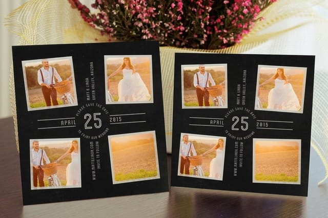 Save the Date Cards | 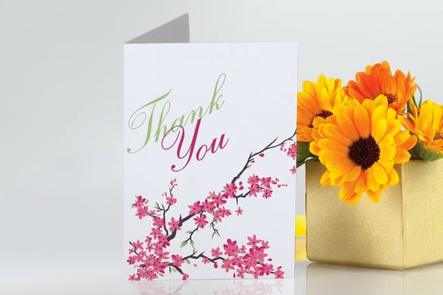 Greeting Cards | 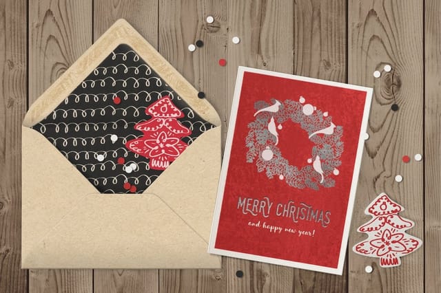 Velvet Greeting Cards | 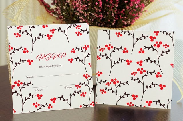 Response Cards | |
|---|---|---|---|---|
| Min price | $19.77 | $56.02 | $617.67 | $19.77 |
| Paper / stock | 14pt Gloss Cover | 14pt Gloss Cover | 16 Point Soft Velvet Laminated | 14pt Gloss Cover |
| Finish | Standard Finish | Standard Finish | - | Standard Finish |
| Size | 4.25" x 5.5" | 8.5" x 5.5" fold to 4.25" x 5.5" | 10" x 7" scored to 5" x 7" | 4.25" x 5.5" |
| Default qty | 25 | 50 | 500 | 25 |
| Turnaround | 5 business days | 5 business days | 7 business days | 3 business days |
| Rating | ||||
| View & customize | View & customize | View & customize | View & customize |
Print Finishes That Flatter Your Type
A font is only half printed until it meets a surface. The same script looks delicate on velvet and cheap on a thin gloss. The same fat display looks powerful on matte and blown-out on a shiny stock. Matching the finish to the letterform is the step most people skip, and it is the one that separates a card that feels custom from one that feels like a coupon.
Start from a print-ready layout in the design templates library, drop your font and photo in, and a blank card template lines your artwork up inside the cut and bleed lines automatically. Here is which finish loves which kind of type.
Match the finish to the font
- Thin scripts. Raised foil or spot UV traces the fine strokes and makes them catch the light.
- Heavy display. Matte or soft-touch velvet so a big letterform reads as solid ink, not a glare.
- Serif body text. Uncoated or natural kraft for a warm, readable, keepsake feel.
- Playful handwriting. Bright gloss so the color pops and the casual mood stays cheerful.
Start fast
Card templates and print-ready blanks
Free layouts plus exact-size blanks so your type and photo land inside the cut line.

Related reads
Keep going with these font and design guides
From type sizing to free seasonal fonts, here is the practical side covered.
Letterhead Font Sizing Font size, style, and format rules that apply to any printed piece. 15 Retro Fonts Vintage typefaces with charm for a nostalgic card design. 15 Easter-Inspired Free Fonts Free seasonal fonts you can download and print today.  Best Design Tools Software to set your type and lay out a card, for any skill level.
 Wally helps you match the font to the mom
Pick the mood first, then the typeface, then the finish
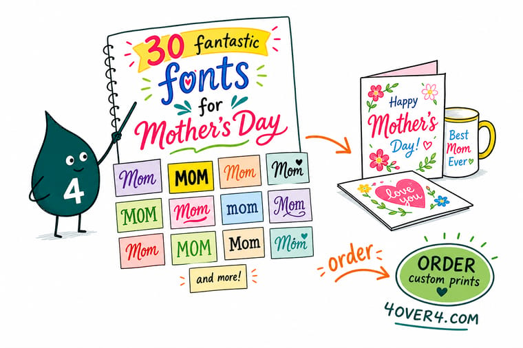
Frozen at the font menu? Decide the mood first, romantic, modern, playful, classic, bold, or vintage, and the shortlist shrinks to five. Pair a headline face with one clean body font and stop at two. Then match the finish to the type: raised foil for thin scripts, velvet for heavy display, kraft for a warm serif. 4OVER4.COM prints it sharp so the letters read as clean as you designed them, in time for the second Sunday in May.
Design your Mother’s Day cards →Setting the right tone for a Mother's Day piece
Explore more
More ways to design and print for Mom
The cards below open the greeting card products, the letterhead font sizing guide, and fifteen retro fonts.
 Collection Mother’s Day Printing Cards, postcards, invitations, bookmarks, and stickers for the day.
  Shop Greeting Cards Printing Browse 40+ greeting card formats and finishes for your font.
 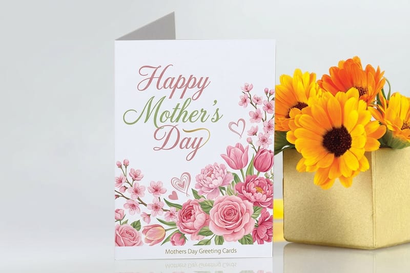 Product Mother’s Day Greeting Cards The flagship card, ready for your typeface and a photo.
  Guide Letterhead Font Sizing Size, style, and format guidance that carries to any print piece.
  Guides All Printing Guides Step-by-step how-tos for designing and printing every format.
 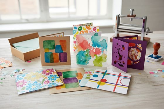 Showcase Greeting Card Showcase Real customer designs and finish ideas for typography.
  Statistics Greeting Card Statistics Industry revenue and design trends for 2026.
  Article 15 Retro Fonts Vintage typefaces with charm for a nostalgic Mother’s Day card.
  Case study Boutique Invitation Case Study From typeface to mailbox, a real print story.
  Alternative 4OVER4 vs PostcardMania How the two stack up for cards and postcards.
  Benefit Same Day Printing Order today, ship today when Mother’s Day snuck up on you.
  Location Card Printing New York Local custom card and invitation printing.
 Ready to set your font on a card Mom will keep?
Pick your typeface, choose a finish from velvet to raised foil, add a photo, and 4OVER4.COM prints it sharp, as fast as same day.
Font picks and pairings for the occasion
What is a Mother’s Day font?
A Mother’s Day font is simply a typeface that suits the tone of a card, invitation, or gift piece made for Mom, from flowing scripts and elegant serifs to clean sans-serifs, playful handwriting, and bold display faces. There is no single official font. The right one depends on the mood you want. This guide groups thirty free, print-ready options into six moods so you can pick by feeling rather than scrolling an endless menu. Once you have one, set it in the online designer and print it on a stock that flatters the letterforms.
Which mood am I actually designing for?
Start with the mom, not the font. Decide whether she is elegant, modern, playful, sentimental, or bold, and that mood points you straight to a group. Pull one or two candidates from that group, set your real words at the real print size, and read them from arm’s length to check legibility. Then pair a headline face with one clean body font and stop at two. Sincere and readable always beats clever and cramped.
Are these Mother’s Day fonts free to use?
Every font in this guide is a free, open-source typeface available through Google Fonts, which means you can download and use them for personal and commercial projects, including printed cards, at no cost. Always confirm the license on the font page before using it in something you sell, since licenses can change. For your card, you do not even have to install them separately. Many are already available inside the 4OVER4.COM design templates and online designer.
How much does it cost to print a custom Mother’s Day card?
Mother’s Day greeting cards from 4OVER4.COM start at $56.02, invitations start at $19.77, and postcards and bookmarks start at $16.48, so a full card-and-gift set stays affordable. Price depends on the paper stock, finish, and quantity. Standard options cost less, while specialty finishes like velvet, raised foil, or spot UV run a little higher. Ordering more brings the per-piece cost down fast, which helps for a whole family or a small event.
How long does printing and shipping take before Mother’s Day?
Turnaround depends on the product and finish, and 4OVER4.COM ships at 99.8% on-time so cards land before the second Sunday in May. Order with a few days of lead for the smoothest run. Left it late? Same Day Printing produces and ships qualifying orders the same day, so a last-minute card can still arrive in time. Check the exact turnaround options on each product page before you check out.
