
Types of Lettering Styles and Fonts That Print Well


Sofia is our design and templates voice, built from the knowledge of our production team, with over 20 years in printing.
Six families, the structural tell that identifies each one, and the printing limits that decide which of them you can put on a card, an invitation or a forty foot banner.
Lettering styles sort into six working families: serif, sans serif, slab serif, script, display and monospace. Every other label, humanist, grotesque, Didone, blackletter, is a subgroup inside one of those six. What separates them in print is the thinnest stroke in the letter: near-even weight survives small sizes, reversed panels and long viewing distances, while thin joining strokes need size, smooth stock and a light touch.
Quick answer
Six families, sorted by how the stroke is built
Classification is about structure, not mood. Serifs have finishing strokes and a thick to thin change, and read best at 9 to 11 point in body text. Sans serifs drop the finishing strokes and keep the weight near even, which holds down to about 6 point on coated stock. Slabs carry blunt rectangular serifs at full stem weight. Scripts join their letters and thin out at the joins, so they need roughly 12 point or more. Display faces are drawn for one size and one effect. Monospace gives every character the same width so columns align. Once you can name the family, the printing limits follow from it.
Print lettering styles
Which lettering style to print, by piece and size
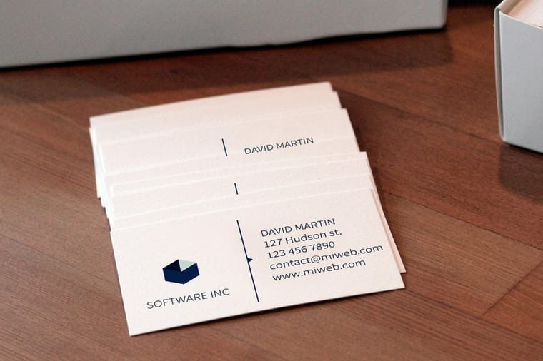
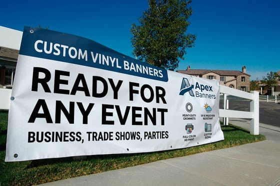
For print, choose the lettering style by the smallest size it has to run at. A plain sans holds a 7 point contact block on a 2" x 3.5" standard business card, which starts at 100 for $17.57 on 14pt Gloss Cover. A formal script needs roughly 12 point or more, so it belongs on a 4.25" x 5.5", 5" x 7" or 6" x 6" wedding invitation, 25 for $19.77. A banner read from forty feet wants letters about four inches tall in a bold sans or slab, and vinyl banners start at $79. Outline or embed the fonts before you upload the file.
The Six Lettering Families and What Each One Does on Paper

Type classification has a long history and a lot of competing schemes. For choosing something to print, six buckets are enough, and the differences between them are structural rather than decorative.
| Family | The structural tell | Where it earns its place | Where it gives you trouble |
|---|---|---|---|
| Serif | Small finishing strokes on the ends of stems, plus a visible thick to thin change across the curve. | Body text, letterheads, books, anything read in paragraphs. | The high contrast cuts, Didone style, lose their hairlines at small sizes on uncoated stock. |
| Sans serif | No finishing strokes, and stroke weight close to even all the way round. | Signs, banners, forms, small print, anything reversed out of a solid color. | Long paragraphs read flatter, and the geometric cuts make a, e and s harder to tell apart at speed. |
| Slab serif | Blunt rectangular serifs with little or no bracket, carried at roughly the weight of the stem. | Headlines, price points, packaging, small type that has to survive a rough surface. | Heavy on the page in bulk, and the wide letterforms eat horizontal space fast. |
| Script | Strokes that join, a slant, and thin exits where one letter hands off to the next. | Invitations, certificates, one line on a card, a name rather than a sentence. | Breaks below roughly 12 point, and stops working completely in all caps because the capitals do not join. |
| Display | Drawn for one size and one effect. Blackletter, stencil, western and novelty faces all live here. | A single word or a short headline that has to carry a mood on its own. | Unreadable in quantity. A blackletter paragraph is decoration, not text. |
| Monospace | Every character occupies the same width, so columns line up without tabs. | Coupon codes, order numbers, spec tables, anything that must align vertically. | Awkward spacing in running text, because narrow letters get padded to the same width as wide ones. |
Read the last column before the third. Most font regret comes from asking a family to do the job of another one: a script set as a phone number, a Didone serif dropped into 7 point legal copy, a blackletter headline nobody can read from six feet away. If you are still deciding between the two biggest families, our comparison of serif and sans serif for brand work goes deeper on tone.
Each style of printing letters has a smallest size it survives and a piece it suits best. The sizes below come from the limits in this guide; the formats, stocks and starting runs come from the 4OVER4.COM configurator.
| Style | Smallest size that prints clean | Piece to print it on | Format and starting run |
|---|---|---|---|
| Serif | 9 to 11 point for body text; about 8 point for a high contrast cut on uncoated stock | Standard letterheads and any piece read in paragraphs | From $99.95 |
| Sans serif | About 6 point on coated stock, which covers a 7 point contact block | Standard business cards | 2" x 3.5" on 14pt Gloss Cover, 100 for $17.57 |
| Script | Roughly 12 point and up, never in all caps | Wedding invitations | 4.25" x 5.5", 5" x 7" or 6" x 6", 25 for $19.77 |
| Slab serif and display | One inch of cap height for every ten feet of viewing distance | Vinyl banners | 2' x 4' to 8' x 20' on 13oz. Outdoor Vinyl, from $79 |
Outline or embed the fonts before you upload, so no face substitutes on our end. Business cards, invitations and banners run on a 3 business day default turnaround; letterpress business cards take 15 business days.
Typeface, Font and Lettering Are Three Different Things
The three words get swapped around, and the mix-up costs you in two places: the license, which prices fonts per weight, and the print file, where live type can substitute to a default face.
A typeface is the design. Someone drew the shapes, decided how much space sits between them, and built a family of weights around them. A font is the file that delivers one cut of that design to your machine. Buy a license and you are buying fonts, usually priced per weight, which is why a five weight family costs five times what one weight costs. Lettering is different in kind: letters drawn for one specific piece, by hand or in vector, never installed and never reused as type. A logo wordmark is lettering. So is the chalk on a sandwich board.
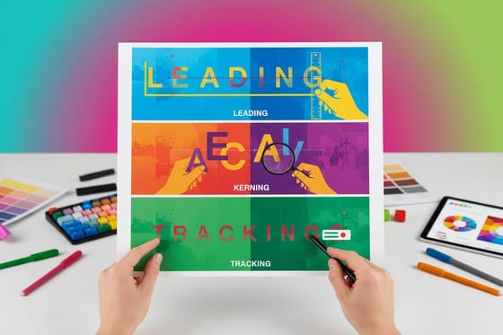
The practical consequence shows up at file handoff. Type stays live text until you outline it or embed it, and live text can substitute to something else on a machine that lacks the font. Lettering is already artwork, so it arrives exactly as drawn. If you enjoy the drawn approach, the hand lettering examples walkthrough shows what the process looks like start to finish, and leading, kerning and tracking covers the spacing controls that separate set type from typed type.
How the Press Decides Which Font You Can Actually Use
A monitor lights letters from behind and antialiases every edge. A press pushes wet ink into fiber. The gap between those two situations is where font choices fall apart, and it always turns on the thinnest stroke in the letter.
Ink spread on uncoated stock. Uncoated paper absorbs, so lines thicken slightly and enclosed spaces shrink. A high contrast serif whose hairlines look elegant at 24 point can go patchy at 7 point on the same sheet. Coated stock holds the ink on the surface and keeps more of the detail, which is one reason a spec sheet prints small type better than a kraft mailer does. The full picture is in the smallest font size you can print.
Reversed type needs weight. White letters on a solid color get squeezed from both sides as ink spreads inward, so the counters close first. Step up a weight, add a little tracking, and avoid hairline serifs entirely when type is knocked out of a dark panel.
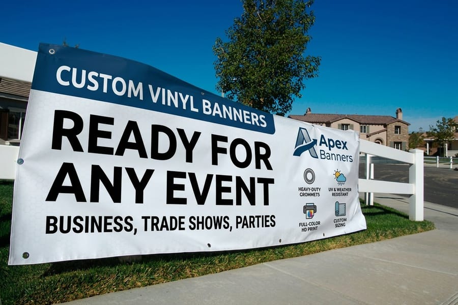
Distance sets cap height, not point size. The signage rule of thumb is roughly one inch of cap height for every ten feet of viewing distance, so a banner read from forty feet wants letters about four inches tall. Point size stops being a useful unit at that scale, which is the main point of our guide to banner fonts.
Finishes have their own minimums. Foil, raised finishes and letterpress all need something to hold on to. A hairline exit stroke on a script gives foil almost no surface to bond with, and a deep letterpress impression can crack a very thin stem in heavy cotton stock. If the design leans on a delicate face, keep the delicate part flat and put the finish on the solid elements. Color behaves differently too, and CMYK versus RGB explains why a screen accurate gray on small type often prints muddier than expected.
Pairing Two Faces and Choosing What to Print Them On
Pairing sounds like taste and is mostly arithmetic. Pick two faces that differ clearly in structure but agree on proportions: similar x-height so they sit together at the same optical size, similar width so a heading does not run twice as long as the line under it. A slab heading over a humanist sans works. Two humanist sans faces that are almost the same, but not quite, look like a mistake. Our logo font selection guide and the designer fonts worth printing are useful shortlists when you need a starting point.
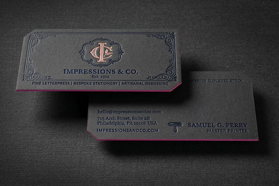
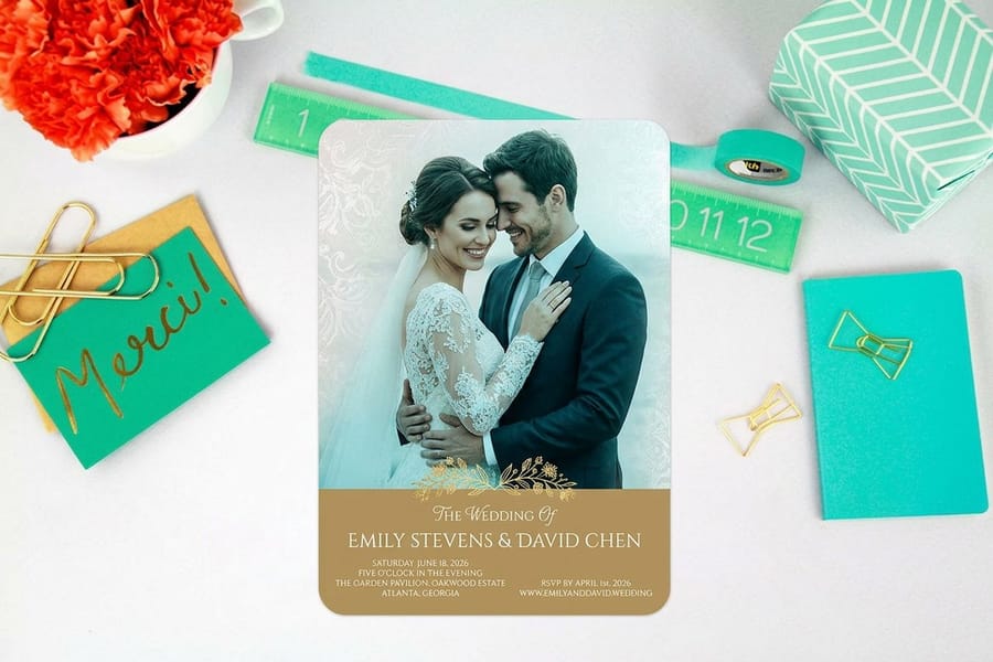
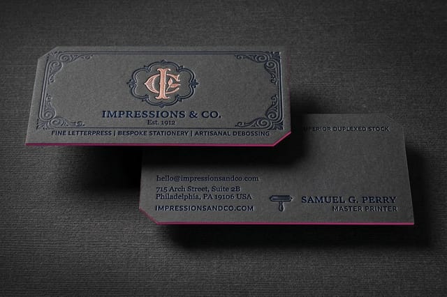
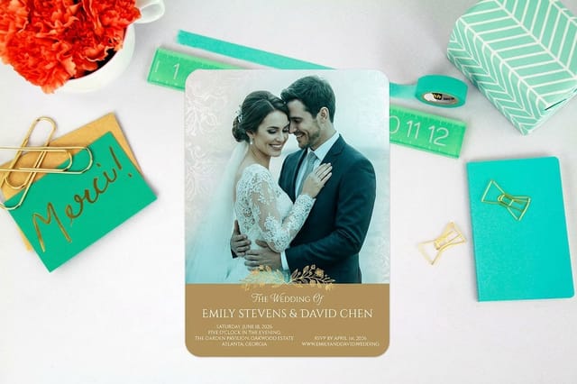
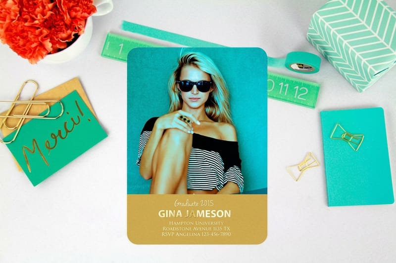
Then match the pair to the piece. Standard business cards start at $17.57 and give you a name in a display or script face plus a contact block in a plain sans that holds at 7 point. Wedding invitations from $19.77 are the one place a formal script belongs, because the type is large, the stock is smooth and the reader is not skimming. The story on letterpress wedding invitations shows the pressed version of the same piece. Letterpress business cards at $251.36 reward a sturdy face with real stroke weight, since the impression is the point and hairlines get lost in the dent.
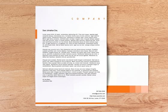
For everyday stationery, standard letterheads from $99.95 want one text face at 10 or 11 point with a raised or plain masthead, and letterhead design tips covers the margins and hierarchy. Vinyl banners from $79 flip the rules entirely: bold sans, generous tracking, no more than seven words. Set the file up in a blank template at the right trim size, keep type a safe distance from the edge, and browse business card printing or letterhead printing when you are ready to compare stocks.
Wally sorts the letters
Look at the stroke before you look at the mood
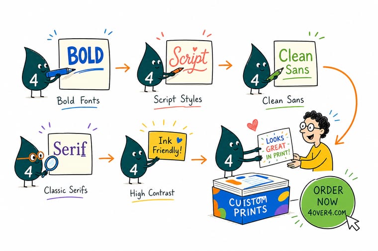
Wally lines four letters up on one baseline. The serif has little feet and goes thick then thin. The sans has no feet and stays about the same weight the whole way round. The slab has blunt square feet at full weight. The script joins to its neighbor and goes hairline thin at the handoff. That last one is the one that gets people into trouble, because the join is beautiful on an invitation and disappears in a 7 point phone number. Give Wally weight where the type has to be small, and save the delicate faces for the pieces that are read slowly.
Order business cards →
Specs and pricing
Sizes, stocks and starting prices for the pieces type lands on
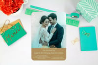
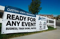
Cards for small type, invitations for script, banners for cap height. Standard business cards start at 100 for $17.57 in four sizes from 1.5" x 3.5" to 2.125" x 3.375". Wedding invitations start at 25 for $19.77 with linen and cream uncoated stocks beside 14pt Gloss Cover. Vinyl banners start at $79 on 13oz. Outdoor Vinyl, from 2' x 4' up to 8' x 20'.

Print it
Put the lettering on something people keep
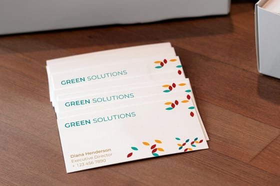
Three pieces for three kinds of type: standard business cards for a name plus a 7 point contact block, letterpress business cards at 250 for $251.36 for a sturdy face with real stroke weight, and wedding invitations for the one formal script on the page.

Explore more
Where to go next
Five guides that each settle one type decision: serif or sans for a brand, leading, kerning and tracking, the smallest size you can print, banner cap heights and logo fonts. Then the card and invitation categories where the type ends up.



By the numbers
Type printed carefully at 4OVER4
Common Questions
Your lettering and font questions, answered
What is the difference between a typeface and a font?
The typeface is the design: the shapes of the letters, drawn by a type designer. The font is the file that puts that design on your computer, at a specific weight and style. Garamond is a typeface. Garamond Bold Italic, the file sitting in your font folder, is a font. Nobody in a print shop will correct you if you mix them up, but the distinction matters when you license type, because you buy fonts, usually one per weight, and the license covers the files rather than the design.
Which lettering style is easiest to read in print?
For long blocks of text on paper, a serif at 9 to 11 point is the safe answer, and a humanist sans is a close second. The serifs give each letter a slightly different silhouette, which helps the eye tell similar shapes apart at speed. For anything read in a glance, a menu board, a sign, a headline, a clean sans wins because it stays legible when it is small, far away, or printed on a rough surface.
What is the smallest font size that still prints cleanly?
Around 6 point for a simple sans on coated stock, and closer to 8 point for a high contrast serif on uncoated. The limit is not the point size, it is the thinnest stroke in the letter. Ink spreads slightly as it soaks into an uncoated sheet, so hairlines thicken and small counters, the enclosed spaces in a, e and g, start to fill. Our guide on the smallest font size you can print walks through the tests we run before we let a job go to press.
Can I use a script font on a business card?
Yes, for the name or the logo. Not for the phone number, the address and the email, which sit at 7 or 8 point on a card and are exactly where connected hairline strokes break up. The reliable pattern is a script for one line, a plain sans for the contact block, and enough space between them that the script has room to breathe. Set script in all caps and it stops working entirely, because the capitals in a script face are drawn to start a word, not to join to each other.
How many fonts should one piece use?
Two, in almost every case. One face for headings and one for text, then lean on the weights and italics that already ship with them. A third face has to earn its place by doing a job the first two genuinely cannot do, such as a monospace for a coupon code that has to align in a column. Three unrelated faces on a postcard reads as an accident rather than a decision.
Do I have to convert fonts to outlines before sending a print file?
Convert to outlines or embed them, and outlines are the safer habit for anything with unusual type. Once type is outlined it is artwork, so it cannot substitute to a default face on our end and the letterforms are locked exactly as you drew them. The trade off is that you can no longer edit the text, so keep a live copy of the file for yourself. Starting from a correctly sized layout in our blank template library removes the other half of the problem, which is type that sits too close to the trim.
Get Started
Wedding invitations run 25 for $19.77, or 79 cents each
Pick a stock, set your headline face against a text face that holds at 7 point, and we print it clean enough to read the small print.
Legal Disclaimer
Gold Standard guarantees apply to all standard orders placed through 4over4.com. Price match requires verifiable proof of a competitor's published price for an equivalent product with matching specifications and turnaround time. Satisfaction guarantee covers manufacturing defects and print quality issues. Contact support with order number and documentation.
