
What to Check on a Packaging Proof Before You Approve the Run


Approval is where responsibility transfers, so the proof stage is worth an hour. Here is the order to check things in, and the four faults that survive a screen and only appear once the piece is folded.
Check the dieline first: cut lines, crease lines, an eighth of an inch of bleed on every edge, and a clear glue flap. Then print the proof at full size and fold it, because panel orientation is what a flat PDF hides. After that, confirm the barcode quiet zone and bar color, look at what heavy ink is doing where it crosses a crease, and give the copy to someone who has not read it before. Approve in one written message and ask for a fresh proof after any change.
Quick answer
Structure first, then the barcode, then the words
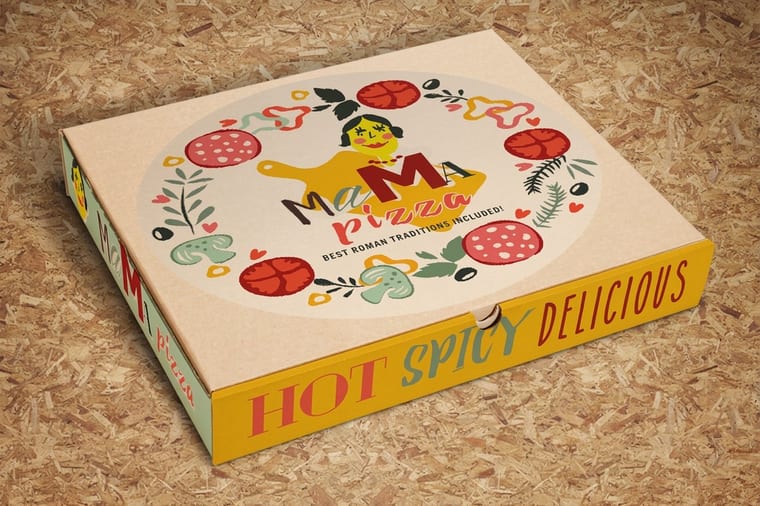
A packaging proof is checked in a fixed order because only the first stage is impossible to fix later. Dieline and bleed decide whether the piece assembles. A folded paper mock-up shows panel orientation, which no flat PDF can. The barcode fails on quiet zone or bar color far more often than on data. Heavy ink across a crease cracks and will not look like the proof. Copy is read last, cold, by fresh eyes.
Start With the Dieline, Not the Artwork

Open the proof and ignore the design for a minute. The dieline is the drawing underneath it: solid lines are cuts, dashed lines are creases, and on a good proof the whole thing sits on its own spot-color layer named something like Dieline, set to overprint, so it can be switched off before plates are made. If those lines are printed as ordinary black artwork, say so now, because they will print on the box.
Three checks cover most of the damage. First, bleed: artwork must run an eighth of an inch past every cut edge, glue flap included, since a die drifts slightly across a run and art stopping on the line leaves a white sliver. Second, safety: keep type, logos and rules an eighth of an inch inside the cut, and give a crease more room than that, because the board surface stretches where it folds. Third, the glue flap: it gets adhesive, so anything printed there is either wasted or actively harmful. Varnish and heavy ink coverage on a glue flap can stop the glue from bonding.
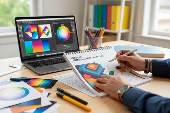
Compare the dieline against the structural drawing you were sent, panel by panel, and check the overall dimensions against the product going inside. A carton drawn a sixteenth of an inch tight will not close over a filled bottle, and nothing on the printed proof will tell you that. If you are setting up the file yourself rather than checking someone else's, our guide to creating print-ready files covers bleed, fonts and color space from the start.
Fold the Proof and Look at Panel Orientation
This is the single check that catches the most expensive errors, and almost nobody does it. Print the proof at 100 percent scale, cut around the outer line, crease the dashed lines with a ruler, and tape the thing together. Ten minutes with scissors has saved more packaging runs than any amount of on-screen zooming.
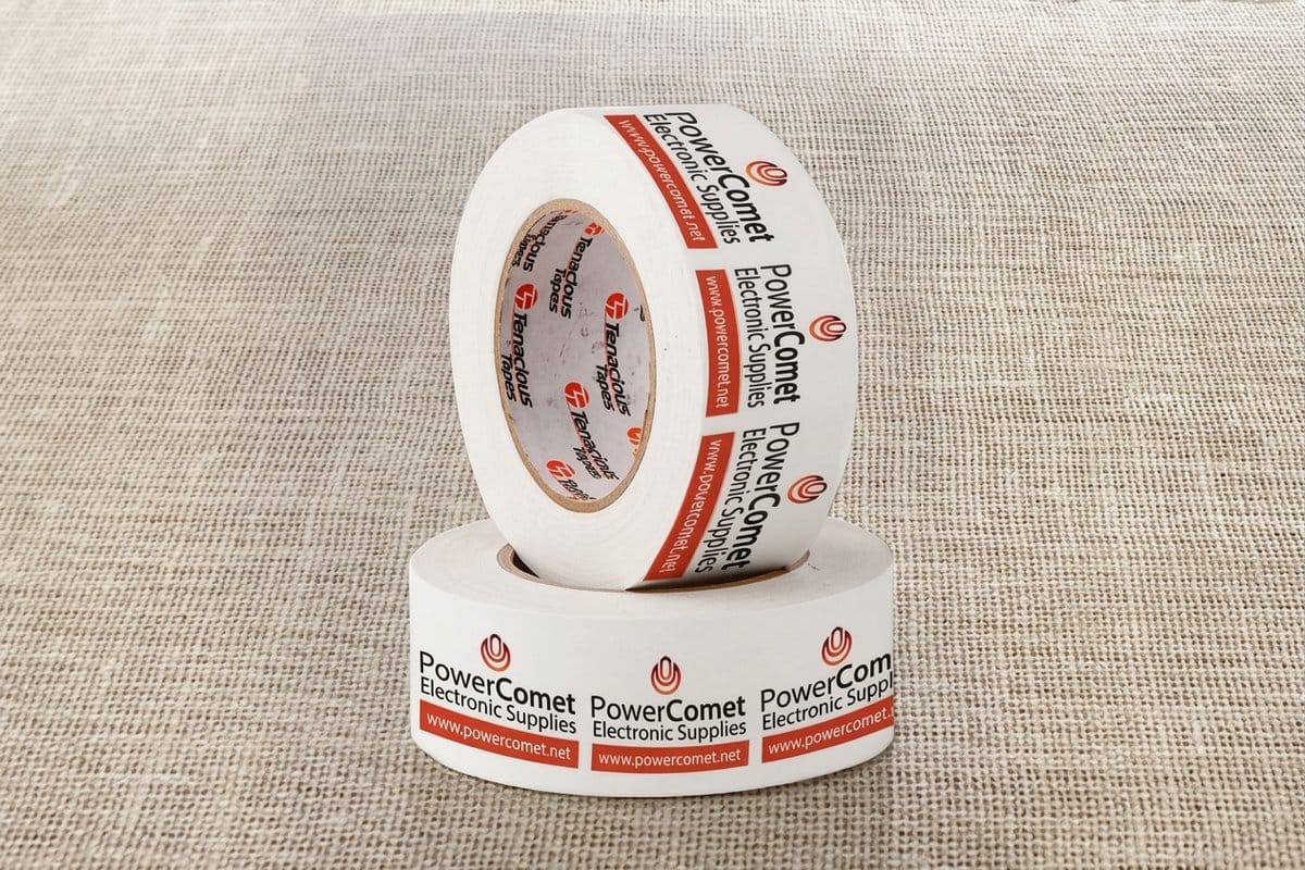
What you are looking for is orientation. Side-panel copy is normally rotated 90 degrees on the flat art so it reads bottom to top when the box stands up, which means it looks wrong flat and right assembled. Get that backwards and the text reads upside down on shelf. Tuck flaps fold inward, so anything printed there disappears. On a carton with a hang hole, the hole punches through whatever sits behind it. And on custom packaging tape the artwork repeats along the roll, so what matters is the repeat length and where the pattern gets cut, not how one tile looks in isolation.
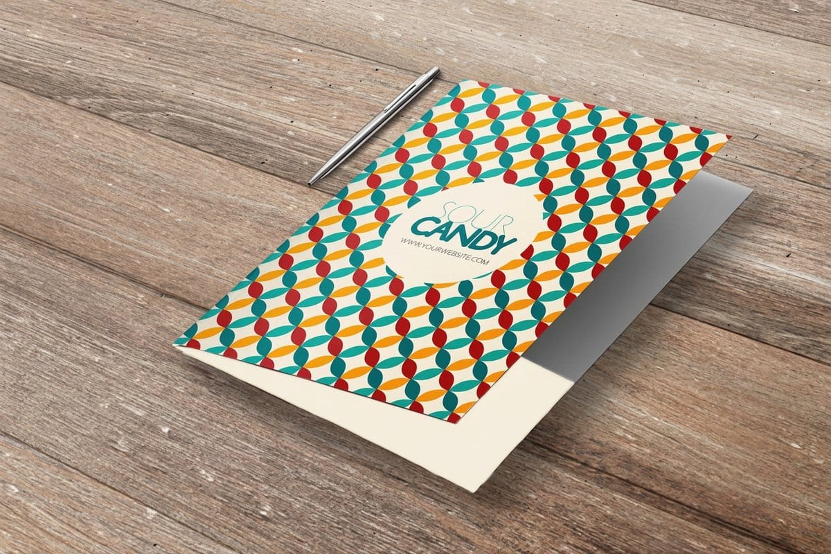
Two more things only show up on a folded mock-up: whether a design that crosses a crease lines up on both sides of the fold, and whether the piece still looks balanced when three of its five panels are hidden. Presentation folders behave the same way. A pocket covers the lower third of an inside panel, so any copy placed there is gone once the folder is glued, which is worth checking on short run presentation folders before you approve anything.
Barcodes, Quiet Zones and the Color Trap
A barcode that scans on a designer's phone can still fail at a checkout, because a phone camera and a retail laser scanner read very different things. Three properties decide whether the symbol works.
The quiet zone. A UPC-A needs clear space of nine times the narrow bar width on each side of the symbol, which is around 0.12 inch at nominal size. Nothing may sit in it: no border, no image edge, no stray period from a nearby line of copy. This is the most common failure and the easiest to spot on a proof once you know to look.
The size. Retail UPC symbols are specified between 80 and 200 percent of nominal magnification. Shrinking a barcode to fit a tight panel below 80 percent is a genuine risk, not a formality, and truncating the bar height to save space hurts the read angle at a busy till.
The color. Laser scanners read with red light, so red, orange and yellow bars appear as white to them and the symbol vanishes. Bars go down black, dark blue, dark green or dark brown, on a white, cream, light yellow or light pink background. Never reverse a barcode out of a dark panel, and never place it over a photograph. On direct thermal or flexo work, ask whether bar width reduction has already been applied to the file, because applying it twice thins the bars past tolerance.
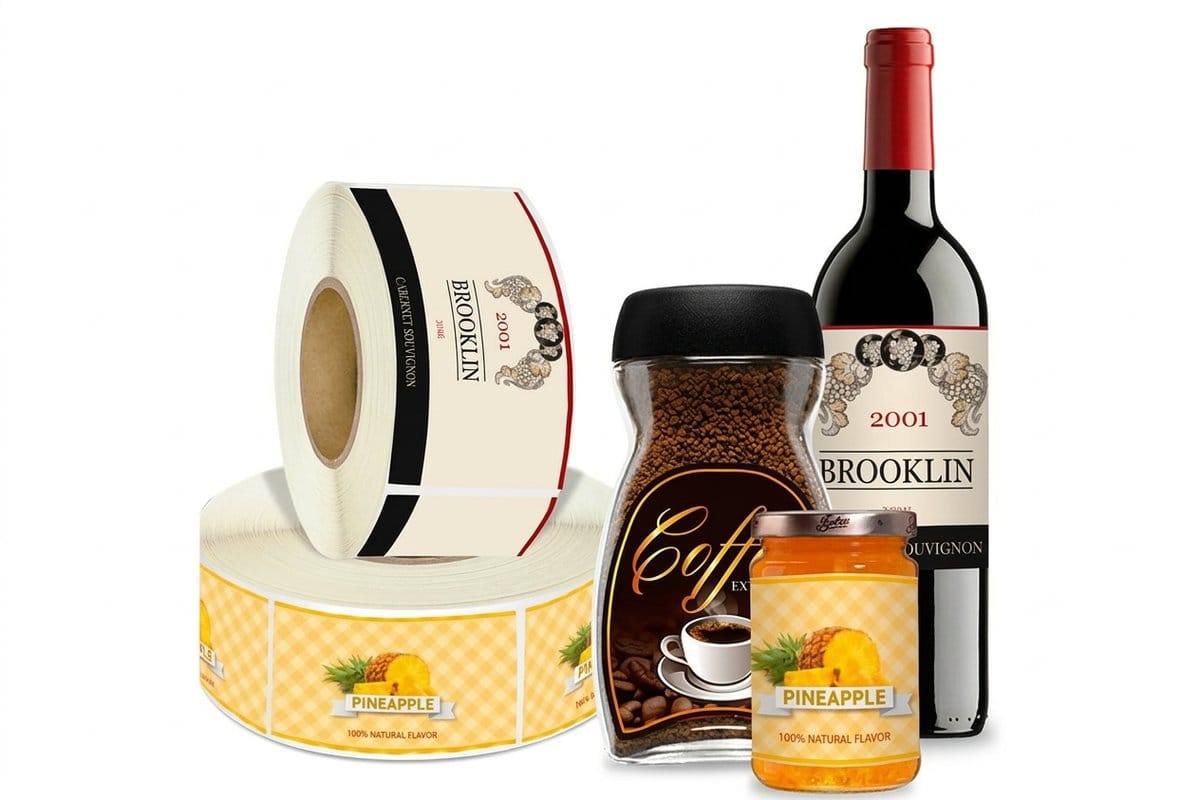
If the packaging is scanned in your own warehouse rather than at retail, the tolerance is wider but the principle holds. Roll packaging labels start at $322.98 and feed through applicators, so on those check the unwind direction on the proof as well: a label wound the wrong way out cannot be machine applied without rerolling.
Ink Coverage, Creases and What the Finish Changes
Here is what a flat proof cannot show you: a heavy solid that crosses a crease will crack. The board fibers split slightly where they fold, ink does not stretch with them, and a white hairline appears along the fold. It is worst with dark solids, worst again on uncoated and recycled board, and worst of all when the fold runs across the grain rather than with it. Nobody is doing anything wrong. It is what board does.
So look at every crease on the proof and ask what is sitting on it. If a black panel wraps a corner, your options are to move the fold, break the panel with a lighter band at the crease, or accept the line and know it is coming. Ask the printer which they recommend for that stock. Total ink coverage matters too: coated stock generally tolerates around 300 percent total area coverage, and board and uncoated stock want less, so a four-color-rich black built at 100 in every channel is a slow-drying set-off problem waiting to happen.
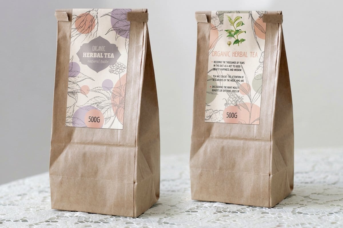
Finish changes color, and the proof usually does not include it. A matte laminate flattens and slightly darkens a design, a gloss laminate deepens it and lifts saturation, and a soft-touch coating mutes everything by a noticeable margin. If your brand color has to match across a label, a folder and a carton, the safest move is to specify a Pantone reference and accept the closest CMYK build rather than expecting three different substrates to land identically. Premium packaging labels at $29.16 sit on a heavier face stock than the $23.88 standard packaging labels, and that difference alone shifts how saturated the same file looks.
Which Proof to Ask For, and What Each One Proves
Not every job needs every proof. Matching the proof to the risk is what stops you paying for certainty you do not need, or skipping the one check that mattered.
| Proof type | What it proves | What it cannot show | Ask for it when |
|---|---|---|---|
| PDF soft proof | Layout, copy, dieline position, barcode geometry, image placement. | Color, stock feel, finish, how the piece folds. | Every job, as the first and usually the only round. |
| Folded paper mock-up | Panel orientation, what a flap covers, whether the product fits. | Color, board stiffness, how the real crease behaves. | Any carton or folder, before you approve. You make this one yourself. |
| Hard-copy color proof | Color to a measured standard, on proofing stock. | Your actual substrate, laminates, foils and varnishes. | Brand colors that must match across pieces or reorders. |
| Press check | Everything, on the real press, stock and ink. | Nothing, but it costs press time and delays the run. | Large runs where a reprint would cost far more than the check. |
Read the second column and then the third. Most packaging errors that reach production were structural or textual, which means a PDF and a taped-together mock-up would have caught them for the price of a sheet of paper. Color disputes are rarer and more expensive to prevent. Browse the full range in packaging labels printing or the wider packaging printing collection, and if you want to feel the stock before committing, the same logic as ordering samples before you print applies here.
When a Second Proof Is Worth the Delay, and When It Is Not
The table says what each proof proves. The harder call is which jobs earn the slower ones, because a hard-copy proof adds days and a press check adds press time, and neither is free. Four situations justify the wait.
- A new dieline. Any carton or folder that has never been made before gets the PDF, then a folded mock-up you make yourself, then a revised PDF after the corrections.
- A brand color that has to match across pieces. A label, a carton and a folder on three substrates will not land on the same red by accident. This is the job for a hard-copy color proof, or a Pantone reference with the closest CMYK build agreed in writing.
- Regulated copy. Net weight, ingredients, warnings and anything a regulator reads get a fresh-eyes read on every round, and a revised proof after even a one-word change, because the approved proof is the document the printer prints from.
- A run big enough that a reprint would cost more than the check. That is the only case for a press check, so ask the printer to quote the press time first.
Everything else, a reorder of an approved file, a copy change on a known structure, a label on the same stock as last time, is a PDF soft proof and one careful read. If the piece is a label rather than a carton, the roll packaging labels proof should also show the unwind direction, which no color proof will.
The Final Read and How to Sign Off
Leave the copy check for last and give it to someone who has not seen the file before. After four revisions a designer reads what they expect to be there, which is exactly how a transposed phone number survives to 10,000 boxes. Read the phone number digit by digit out loud. Type the URL into a browser. Check the net weight, the ingredient list, the country of origin, the recycling marks and any regulated claim against the source document, not against the previous proof.
Then approve in one message. List every change as a numbered instruction, mark the file version you are approving by its exact name, and ask for a revised proof if anything at all moved, including a change you think is trivial. A single word edit can reflow a paragraph across a crease or push a logo into a barcode quiet zone, and the proof you approved is the document the printer prints from.
- Dieline: cut and crease lines correct, dieline on its own layer, bleed on every edge, glue flap clear.
- Structure: mock-up folded, panels the right way up, nothing hidden under a flap, product fits.
- Barcode: quiet zone clear, magnification at 80 percent or above, dark bars on a light ground.
- Ink: nothing heavy crossing a crease unnoticed, total coverage sensible for the stock.
- Copy: read cold by someone new, every number verified against the source.
- Approval: one message, file version named, revised proof requested after any change.
Work that list in order and the proof stage stops being a formality. For the wider picture on what you are actually printing onto, the nine types of packaging explains where cartons, labels and mailers each make sense, and color combinations that work in print covers pairings that survive CMYK.
Wally checks a proof
Print it, cut it, fold it, then read it
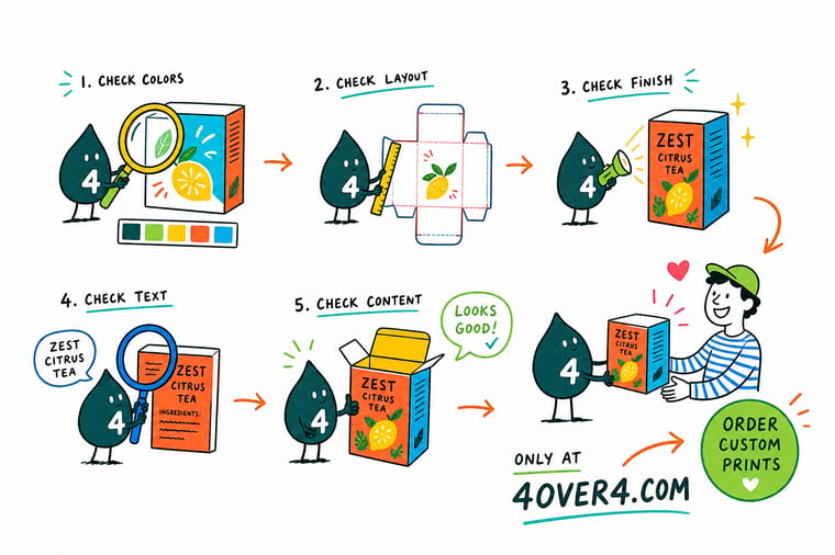
Wally never approves a packaging proof on screen. He prints it at full size, cuts around the solid lines, creases the dashed ones and tapes the box together. Then he turns it round. Side panels reading bottom to top, nothing hidden under a tuck flap, a clear margin either side of the barcode, and no heavy black sitting on a crease. Only after the box stands up does he read the words, out loud, digit by digit.
Configure premium packaging labels →Specs and pricing
Packaging label formats, sizes and starting prices
Compare the label formats side by side, with live configuration choices and starting prices straight from the 4OVER4.COM configurator.

Print it
Order packaging that survives its own proof
Explore more
Where to go next

By the numbers
Who prints the run once you approve the proof
Common Questions
Your packaging proof questions, answered
What is a blueline proof?
A blueline is the old pre-press proof made by exposing the job's film onto light-sensitive paper, which came out as blue lines on white. It showed position, imposition, folds and copy, never color, and you checked it exactly the way you check a PDF soft proof today. Some printers still call the imposition proof a blueline, so if one is offered, read it for structure and text and do not expect it to show ink.
What is QC in printing?
Quality control is the set of checks a printer runs at each stage: the prepress preflight that catches missing bleed, fonts and low resolution, the press checks that hold color and register against the approved proof, and the finishing checks on die cut, fold and glue. Your part of QC is the proof. Once you approve it, the printer's job is to match it, so the proof stage is where a customer's quality control actually happens.
Is 400 ppi good for printing?
Yes, it is more than enough. Print needs about 300 pixels per inch at the finished size for photographs and full color, and 400 gives you headroom to enlarge the image a third without going soft. Barcodes, logos and small type should be vector anyway, and a 400 ppi photo placed at half size is effectively 800 ppi, which only makes the file heavier. What matters is the ppi at the printed dimensions, not the number in the file.
What should I check first on a packaging proof?
The dieline. Confirm the solid cut lines and the dashed crease lines sit where the structure needs them, that artwork bleeds past every cut edge including the glue flap, and that live copy stays back from each crease. Structure faults are the only ones that cannot be corrected on press, so they get checked before anyone looks at color. After the dieline, work through panel orientation, barcode, legal copy, then color and finish.
How much bleed does a packaging file need?
An eighth of an inch past every cut edge, on every panel and every flap, is the working standard. The reason is mechanical: cartons and labels are die cut, and a die drifts a little across a run, so art that stops exactly on the cut line will show a white sliver on some pieces. Keep type and logos at least an eighth of an inch inside the cut, and further in on heavier board where the crease pulls the surface.
Why does my barcode fail to scan even though it looks fine on the proof?
Almost always the quiet zone or the color. A UPC-A needs a clear margin of nine times the narrow bar width on each side of the symbol, roughly 0.12 inch at nominal size, and any rule, image edge or nutrition panel that creeps into it breaks the read. Color is the second cause. Retail scanners read with red light, so red, orange and yellow bars register as background. Print the bars black or a dark blue on a white, cream or light background, and never reverse them out of a dark panel.
Does a PDF proof show me the real color?
No. A screen emits light and paper reflects it, so a PDF on a monitor is an approximation at best, and it cannot show how a coated label stock, an uncoated kraft board or a matte laminate will absorb ink. Use the PDF to approve layout, copy, dieline and barcode. If the color is critical, for example a brand color that has to match across a label, a folder and a shipping carton, ask for a hard-copy proof or supply a Pantone reference and accept the closest CMYK build.
What happens if I approve a proof with a mistake in it?
The run prints as approved and the reprint is billed. That is the honest answer at every printer, because the approval is the point where responsibility transfers. It is also why the last stage of a proof check is not a proofreading pass at all but a fresh pair of eyes on the phone number, the URL, the net weight, the ingredient list and the address, since those are the errors a designer stops seeing after the fourth revision.
How many rounds of proof should I expect?
Two is normal on a first packaging job: one to catch the structural and copy issues, one to confirm the corrections landed. Ask for a revised proof after every change, however small, because a late text edit can reflow a paragraph into a crease or push a logo into the barcode quiet zone. If a third round is only moving color a few percent, that is usually the point to stop and print.
Get Started
Ready to approve a proof with confidence?
Pick your label format or folder, upload the file, and we send a proof with the dieline on its own layer so you can check the structure before a single sheet runs.
Legal Disclaimer
Gold Standard guarantees apply to all standard orders placed through 4over4.com. Price match requires verifiable proof of a competitor's published price for an equivalent product with matching specifications and turnaround time. Satisfaction guarantee covers manufacturing defects and print quality issues. Contact support with order number and documentation. On-time delivery rate based on tracked orders 1999 to 2026. Individual results may vary based on shipping carrier performance.
