
Storefront Design Ideas That Turn Sidewalk Traffic Into Sales


Tobias is our voice for cutting, binding and large format, built from the knowledge of our production team, with over 20 years in printing.
What a Storefront Has to Do in Three Strides

The shop facade design ideas that turn sidewalk traffic into sales split the front into zones, the name on the header, one offer on the upper window, hours and proof on the lower glass, and they get judged from across the street at walking pace. Most storefront design ideas fail for one boring reason. They are judged from a laptop, straight on, at full attention, and then installed somewhere a person passes at four feet per second while checking a phone. Your shop front does not get a reading. It gets a glance, and the glance either produces a slowdown or it does not. Everything below is built around that one moment.
A storefront has three jobs and it has to do them in order. Interrupt the walk. Explain what you sell. Make the door obviously enterable. Most shop fronts do the second job beautifully, skip the first entirely, and quietly sabotage the third with a dark entry and a small handwritten sign about pushing versus pulling.
4OVER4.COM has printed 10 billion+ products since 1999 for retailers, salons, studios and cafes, and the pattern in what actually gets reordered is consistent. The winning storefronts are not the most decorated ones. They are the ones where a single large element does the interrupting, one honest line does the explaining, and the entry is bright enough that walking in feels like the default rather than a decision.
Read your sidewalk before you design anything
Stand across the street at the hour you are busiest. Note which direction most people arrive from, where they stop at the curb, and how far away your window becomes legible. That distance is your type size. A sign read from thirty feet needs roughly three inches of cap height, and no amount of clever layout rescues type that is too small for the walk.
Give the eye one message at a time
Split the front into zones and give each zone exactly one job. The header or awning carries the name. The upper window carries the offer. The lower window carries proof, hours or product. The sidewalk carries the reason to enter today. When two zones compete for the same message, both lose.
Design for movement, not for a screenshot
Motion changes what reads. Vertical elements catch people walking past sideways far better than wide horizontal ones. Contrast beats color. High contrast on a light ground survives glare, dusk and a dirty window, and a bold sans serif at a heavy weight stays readable when a bus goes by.
Make the threshold feel open
The last six feet decide it. Clear the doorway, light the entry brighter than the sidewalk, prop the door when weather allows, and never block the sightline into the room. People enter spaces they can already see into. A window covered wall to wall with graphics gets attention and then kills the conversion it earned.
Shop the storefront
Double sided storefront banners
The one element that does the interrupting, sized to your bay width and readable from both directions.

Shop Facade Design Ideas With Real Sizes
Each zone of the facade has a print piece and a size that fits it. Measure your bay width and window panes first, then match them to these.
- Header. A 2 sided blockout banner from 2 x 3 up to 4 x 10 feet on 15oz blockout vinyl, from $108.75, reads from both directions of the sidewalk.
- Upper window. A clear window cling from 11 x 17 up to 40 x 60 inches, from $30.00, carries the one offer and keeps the daylight.
- Sidewalk. An aluminum A-frame with 22 x 28 or 24 x 36 inch panels, from $146.07, catches people walking toward the door.
- Permanent sign. An aluminum sign at 12 x 18, 18 x 24 or 24 x 36 inches carries the name where a banner would look temporary.
Match Every Storefront Goal to the Right Sign
This is the part almost nobody does deliberately. Before choosing a material or a size, name the single job you need the storefront to do this quarter. A shop trying to announce a new location needs a different format than a shop trying to move seasonal stock, and buying the wrong one is why so much signage ends up in a stockroom.
Use the mapping below as a starting matrix, then adjust for your frontage width and how much of your traffic is on foot versus in cars.
- Be noticed at all from a distance. A large double sided banner above or across the frontage, sized to your bay width, in two colors maximum.
- Explain what you sell in one glance. Window graphics in the upper third with a short category line and a product silhouette, not a paragraph.
- Convert people already on your block. A sidewalk A-frame with today's reason to stop, changed often enough that regulars keep reading it.
- Announce a sale, launch or new season. A temporary banner you replace rather than a permanent panel you learn to ignore.
- Look established and permanent. Rigid aluminum or dimensional lettering that reads as investment rather than as promotion.
- Keep the visit going after they leave. A counter card, a bag insert or a branded item that carries the same type and color as the window.
Two rules keep the matrix honest. First, one permanent element plus one changeable element is the right ratio for most independent shops. Second, everything changeable should be genuinely cheap to reprint, because a storefront that never changes stops being seen by the people who walk your block daily.
Print picks
Three formats that carry a storefront
Live prices, ready to customize with your own type, color and photography.
 2 Sided Blockout Banners $108.75 each An opaque core blocks light so both printed faces stay sharp above the door.
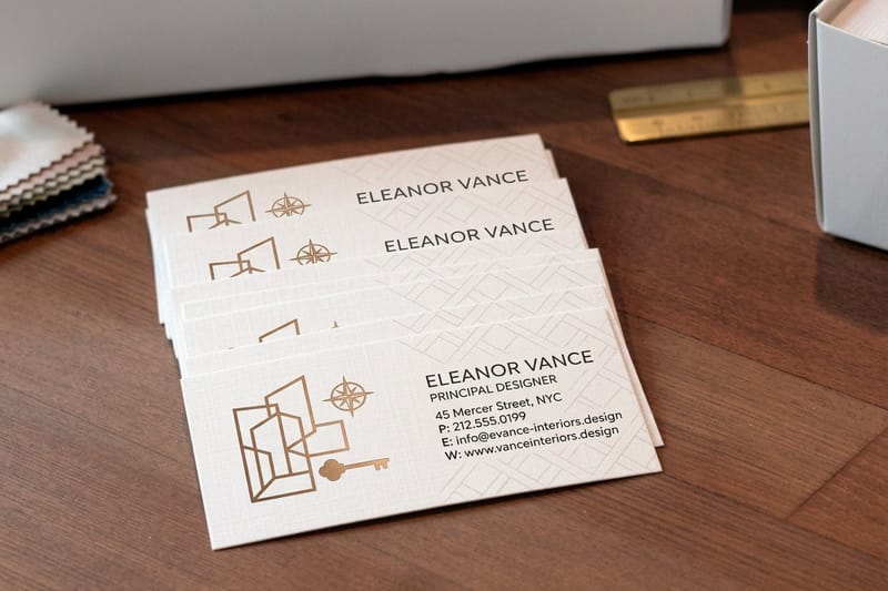
 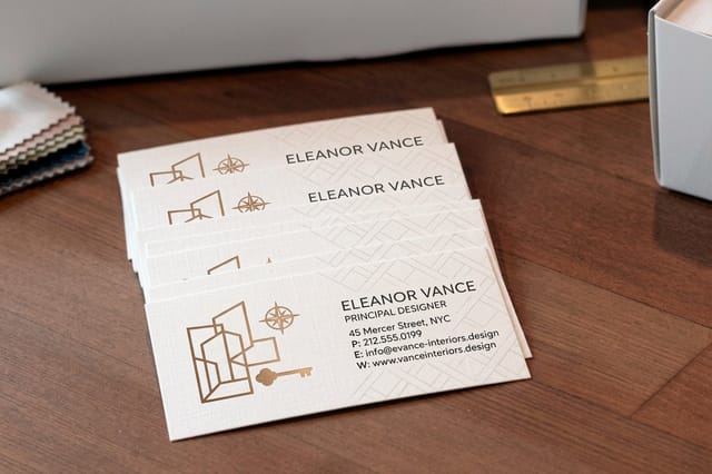 Interior Design Business Cards 100 for $17.57 A counter card that carries your storefront look home with the shopper.
 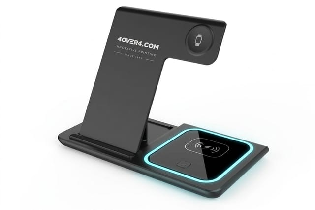 3 in 1 Foldable Wireless Charger $15.00 each A ready-made giveaway that stays on a nightstand for months.
 Window Graphic Ideas That Hold Up All Year
Windows are the largest free advertising surface most businesses own and the most commonly wasted. The instinct is to fill them. The better move is to treat the glass as three horizontal bands and only ever use two of them at once, leaving one band clear so the interior does the selling.
Keep the top band for the offer, at the biggest size the frame allows. Keep the middle band clear at eye level so passersby can see people inside, which is still the strongest social proof a physical shop has. Use the bottom band for the small permanent facts, hours, payment, delivery, that people crouch to check.
- One number, one word. A single price, percentage or year at display size out-pulls a sentence every time.
- Silhouettes over photography. Flat high contrast shapes survive reflection. Detailed photos disappear into glare after ten in the morning.
- Seasonal overlays, permanent base. Keep the logo and hours fixed, swap only the seasonal layer, which makes each refresh a small print job rather than a redesign.
- Frame the view instead of covering it. Graphics along the edges with clear glass in the middle read as intentional design, not as a papered-over vacancy.
- Night is half your exposure. Backlight or spotlight the panel. An unlit window graphic does nothing for twelve hours a day in winter.
For a worked seasonal example, walk through how to build a Valentine's Day window display, then borrow the same three-band structure for every other date on your calendar. The same logic drives holiday weekend design ideas when you need a fast one-week refresh.
Sidewalk Ideas for the Six Feet Before the Door
The strip of pavement directly in front of your entrance converts better than any other square footage you control, and it is usually empty. A person is already slowing there. Give them one specific reason and a clear path, and the walk-in happens without a decision being consciously made.
A-frames earn their keep when the message changes. A board that says the shop name is furniture. A board that says what came in this morning, what is running out, or what the staff recommends today is a conversation starter that pays for itself in a week. Write it in the voice you would use out loud.
- Angle it to the arrival direction. Face the board toward where most of your traffic comes from, not squarely at the curb.
- Keep it to seven words. People read sidewalk boards while still walking. A long board is a board nobody finishes.
- Light the entry. Warm light spilling onto the pavement pulls people in after four in the afternoon better than any graphic.
- Repeat one color everywhere. Awning, board, window and bag in the same accent makes a modest frontage read as a brand.
- Leave a clean walking lane. An obstacle course at the door quietly cancels every good thing upstream of it.
If you are pricing a folding sidewalk sign, it is worth reading the A-frame sign alternative comparison before ordering, because frame quality and reprintable inserts matter far more than the first unit price. For pop-ups and market stalls, the same thinking scales down in these vendor table display ideas.
Storefront Banner Sizes, Materials and Real Pricing
Once the plan is set, the specification is straightforward. Measure the bay width and subtract a foot at each side so the banner does not fight the frame. For a standard twelve foot shop front, a ten foot by three foot banner reads well from across a two lane street without overwhelming the facade.
Material choice turns on one question. Will light pass through it? A single layer vinyl printed on both sides will show the reverse image ghosting through in daylight. A blockout banner carries an opaque middle layer, so each face stays clean, which is what you want anywhere the banner is seen from both directions of the sidewalk.
Finishing is not an upsell here, it is the difference between one season and three. Hemmed edges stop fraying at the corners, and grommets every two to three feet spread wind load instead of concentrating it on four stress points. Coastal and high wind locations should also ask for wind slits.
Pull real quantities and finish options below rather than estimating, then configure the exact size your frontage needs.
Quantity and price
Storefront banner pricing and specifications
Real configurator numbers. Size, material and finishing drive the cost, not the design.
| Quantity | Price Per Unit | Total |
|---|---|---|
| 1 | $108.75 | $108.75 |
| 2 | $108.74 | $217.47 |
| 3 | $108.74 | $326.22 |
| 4 | $97.76 | $391.02 |
| 5 | $97.76 | $488.78 |
| 6 | $97.76 | $586.53 |

Carry the Storefront Look to the Counter
A storefront that stops at the glass leaves value on the table. The moment someone walks in, the design job changes from interruption to reassurance, and the fastest way to deliver it is consistency. Same typeface, same accent color, same tone of voice on the counter as on the window, down to a run of 100 business cards at the register, which starts at $17.57, and a 4 x 6 inch table tent beside it.
Printed cards at the register are still the cheapest brand touchpoint in retail. Give them a real job. Put the appointment link, the delivery radius, the workshop schedule or the referral offer on the back, and hand one over with every bag rather than leaving a stack to gather dust in a holder.
Heavier stock and a tactile finish do measurable work here, because the card gets handled rather than looked at. Check the stock, weight and finish options below and match them to whatever your window graphics already say about you.
Inside the door
Counter cards that match the window
Stocks and finishes chosen for pieces that get handled rather than glanced at.
Give Walk-Ins a Reason to Remember the Address
The hardest part of foot traffic is not the first visit, it is the second. Somebody discovered you on a Saturday walk, liked the place, and then simply never happened to be on that block again. A small branded item that lives in their home or bag quietly solves the recall problem that no window graphic can reach.
Pick something that gets used daily rather than something clever. Useful beats novel every time, and an item that sits on a desk or a nightstand puts your name in front of a customer hundreds of times for a one-off cost per unit. Print the shop name and the street, not a slogan, because the street is what gets them back.
Stickers work the same way at a fraction of the price if you want to test the idea before committing, and these logo sticker promotion ideas cover the formats that actually get stuck on something rather than binned.
Take the address home
Branded items that solve the second visit
Print the shop name and the street on something used daily, and recall stops depending on the block.
Compare Storefront Print Formats Side by Side
Different formats fail in different ways, and knowing the failure mode ahead of time is worth more than knowing the price. Vinyl banners, from 2 x 4 to 4 x 10 feet and from $79.00, are unbeatable for size per dollar and start looking tired after a couple of hard seasons. Rigid aluminum, at 12 x 18 to 24 x 36 inches, reads permanent and costs more to change your mind about. Window clings, from $30.00 in sizes up to 30 x 40 inches, are cheap and unforgiving of a bad install.
The practical answer for most independent storefronts is a two-tier setup. One durable permanent element that establishes who you are, plus one cheap changeable element that gives regulars something new to read. Budget roughly two thirds of the spend to the permanent tier and keep the rest liquid for refreshes.
Compare stock, size, quantity and turnaround across the popular formats below before you commit a print budget to any single approach.
Compare formats
Popular print formats, side by side
Stock, finish, size, quantity, turnaround and price in one view before you commit a budget.
 free business cards |  Standard Business Cards |  3D Lenticular Business Cards |  Metallic Foil Business Cards | |
|---|---|---|---|---|
| Min price | Free | $17.57 | $690.88 | $222.13 |
| Paper / stock | 14pt Gloss Cover | 14pt Gloss Cover | 31pt Lenticular Lens | 16 Point Silk Laminated |
| Finish | - | Standard Finish | - | - |
| Size | 2" x 3.5" | 2" x 3.5" | 2" x 3.5" - Vertical | 2" x 3.5" |
| Default qty | 200 | 100 | 500 | 500 |
| Turnaround | 5 business days | 3 business days | 22 business days | 7 business days |
| Rating | ||||
| View & customize | View & customize | View & customize | View & customize |
Planning the Install and Getting It Printed in Time
Storefront projects run late for predictable reasons. Nobody measured the bay, the artwork arrived at screen resolution, or the landlord had an opinion about the awning that surfaced two days before the launch. Handle those three in the first week and the rest is a straightforward print job.
Build artwork at the finished size wherever possible, or at a clean quarter or half scale, and keep all type as vector. Large format is unforgiving of low resolution, and a logo pulled off a website will look acceptable on a laptop and visibly soft at three feet wide. Add the bleed your printer asks for and keep critical text well inside the safe area, because grommets and hems eat the edges.
A sequence that keeps the project on schedule
- Measure and photograph. Bay width, header height, door swing and any obstruction, with a photo from across the street for scale checks.
- Check permissions early. Landlord, local sign rules and any historic district limits, before design and not after.
- Design at size. Print a letter-sized proof, tape it up and read it from the far curb to sanity check the type.
- Order the permanent tier first. Longer lead time, higher stakes, and the changeable pieces should be drawn to match it.
- Plan the install hour. Two people, dry weather and the shop closed or quiet, and never the morning of an event.
Start from a print-ready layout rather than a blank canvas, then drop in your own type and color. For more storefront-specific concepts, these storefront sign ideas to attract customers pair well with everything above.
Start fast
Templates and print-ready blanks
Free layouts plus exact-size blanks so your artwork lands inside the safe area on the first try.






Wally maps your storefront goal to the right sign
One goal, one format, one clear reason to walk in
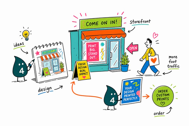
Storefronts stall when every surface shouts at once. Wally works it backwards. Name the one job the front has to do this quarter, whether that is being noticed from a distance, explaining what you sell, or converting people already on your block. Then pick the single format built for that job, keep the middle of the window clear so people can see inside, and put everything else on the sidewalk where the decision actually happens.
Design your storefront banner →A storefront checklist you can act on this week
Guides
Go deeper on the pieces that matter
A window display playbook, storefront sign ideas, vendor table displays for the market stall, and logo sticker promotions that reach past your own block.
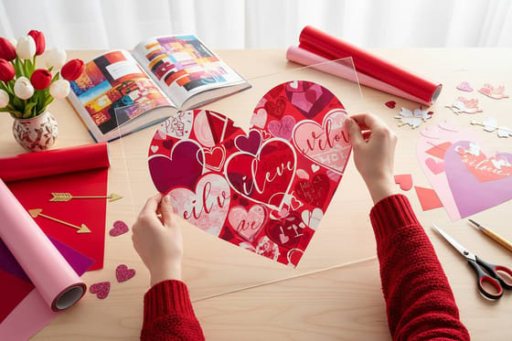 Window Display Playbook A seasonal window built step by step, reusable for any date.
 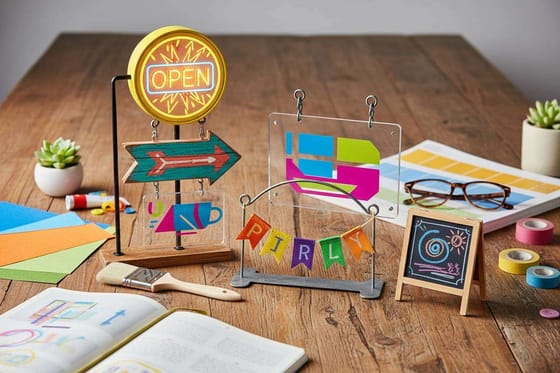 Storefront Sign Ideas Five sign concepts that pull walk-ins on a busy block.
 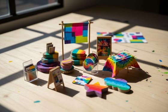 Vendor Table Displays The same storefront thinking, scaled to a market stall.
  Logo Sticker Promotions Low cost brand reach that travels off the block.
 Explore more
More ways to pull traffic through the door
The $108.75 two sided banner, counter cards from $17.57, and design ideas for flyers, wall graphics and posters that carry the storefront look inside.
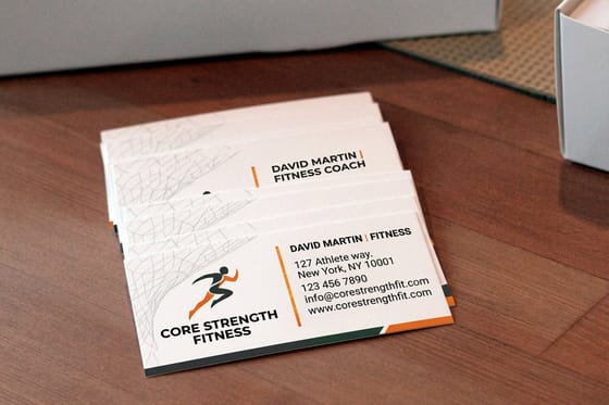 Article Fitness Flyer Ideas That Fill Classes and Memberships Fitness flyer ideas for gyms, studios, and personal trainers: layouts, offers, and paper choices that turn pas
 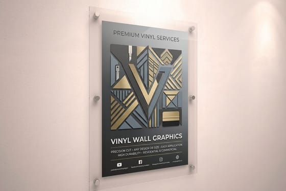 Article Pet Wall Graphics Design Tips That Pull Customers Through the Door Wall graphics design tips for groomers, vets, and pet stores. Choose sizes, wall surfaces, and artwork that ph
 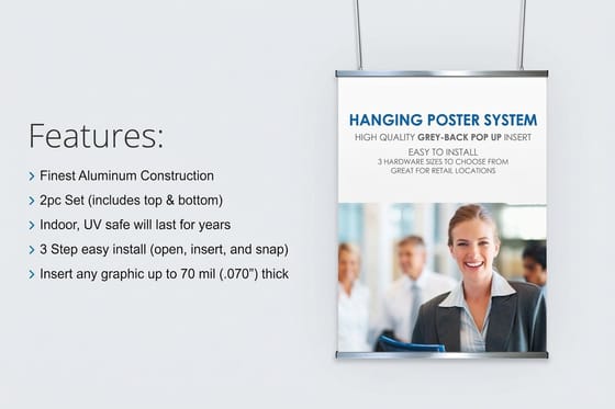 Article Health Poster Design Ideas for Clinics, Schools, and Campaigns Health poster design ideas for clinics, schools, and awareness campaigns, with layout examples, readable type Article Corporate Poster Design Ideas for Lobbies, Events, and Recruiting Wall Corporate poster design ideas for lobbies, events, and hiring walls. See layout formulas, brand color use, sta Product 2 Sided Blockout Banners Opaque core keeps both printed faces sharp above the door. Product Interior Design Business Cards Counter cards that match the window and travel home.
 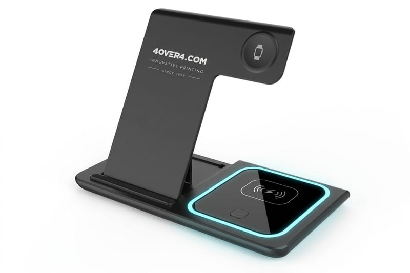 Product 3 in 1 Foldable Wireless Charger An item that keeps your address in the room. Guide Window Display Guide Build a seasonal window that still shows the room. Article Storefront Sign Ideas Five signs that turn passing traffic into walk-ins. Article Vendor Table Display Ideas Storefront rules applied to markets and pop-ups.
 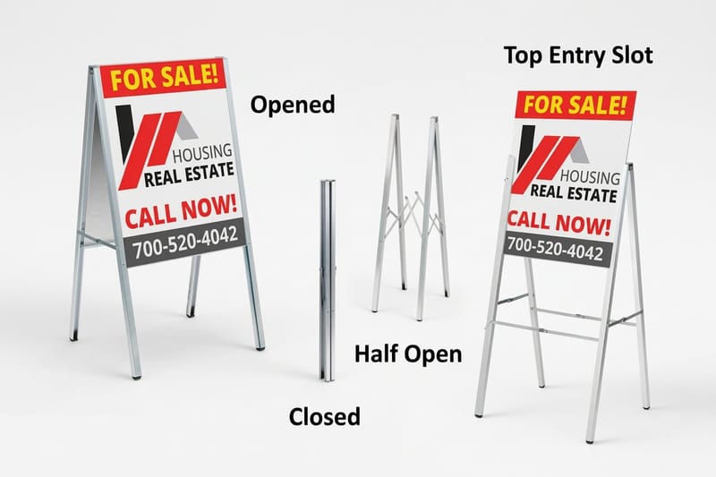 Alternative A-Frame Sign Alternative Frame quality and reprintable inserts compared. Article Logo Sticker Promotion Ten sticker ideas that leave the block with customers.
 Measure the bay, then order the header banner first
Pick the one job your storefront has to do, choose the format built for it, and get artwork print-ready at finished size. Configure a banner or a counter card and see live pricing before you commit.
Storefront design questions, answered
What is storefront design and what does it actually cover?
Storefront design is the whole exterior sales surface of a physical business, not just the sign. It covers the header or awning that carries your name, the window graphics that explain what you sell, the sidewalk element that gives a reason to stop today, and the entry itself, meaning lighting, door clearance and sightline into the room. Treated as one system, each part has a single job. Treated as separate purchases, they compete for the same three strides of attention and cancel each other out. The storefront sign ideas guide covers the sign layer in more depth.
How do I choose the right storefront signage for my shop?
Start from the goal rather than the product. If you need to be noticed from a distance, a large double sided banner sized to your bay width does it for the least money. If you need to explain what you sell, window graphics in the upper third of the glass work better. If you need to convert people already on your block, a changeable sidewalk board wins. If you need to look permanent, rigid signage is worth the extra spend. Most independent shops end up with one durable element plus one cheap changeable element, which keeps regulars reading without a redesign every season. For the ground in front of the door, read how to use sidewalk graphics that grip, survive weather and stay legal.
What does storefront signage cost and how is the price set?
Price is driven by size, material, quantity and finishing rather than by design. 2 Sided Blockout Banners start at $108.75, and the cost moves with square footage, whether the banner is single or double sided, and the finishing you add such as hemmed edges, grommet spacing and wind slits. Counter print is far cheaper per piece and drops fast with quantity, with Interior Design Business Cards starting at $17.57. Ready-made giveaway items like the 3 in 1 Foldable Wireless Charger start at $15.00 per unit. Pull live numbers from the price table on this page for the exact size and quantity you need.
What sizes, materials and finishes work best for a storefront?
For a standard twelve foot shop front, a ten foot by three foot banner reads well from across a two lane street. Use a blockout material anywhere the banner is seen from both directions, because a single layer vinyl printed on both sides will ghost in daylight. Ask for hemmed edges to stop corner fraying and grommets every two to three feet so wind load spreads instead of concentrating. For counter print, heavier stocks and tactile finishes matter more than they do on the window, because those pieces get handled rather than glanced at. Full stock and finish options are listed in the specs widget above.
How long does storefront printing and shipping take?
Large format banners and rigid signage typically move through production faster than most people plan for, and the real delay is almost always artwork or permissions rather than print time. Build your file at finished size with vector type, confirm landlord and local sign rules before design starts, and order the permanent element first because it carries the longest lead time. Plan the install for a dry, quiet hour with two people, never the morning of an opening or event. Live turnaround options for your exact configuration appear on the product page when you select size and quantity.
