
Halloween Design Trends Worth Printing and the Ones to Bury


Sofia is our design and templates voice, built from the knowledge of our production team, with over 20 years in printing.
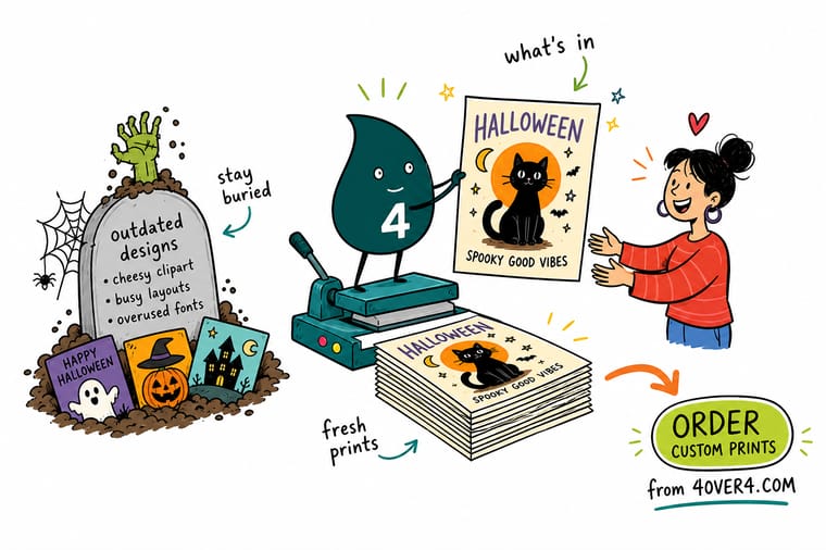
The Halloween design trends worth printing this year are flat two or three ink illustration, black plus one acid accent instead of the default orange, texture that comes from an uncoated stock, and spot gloss on matte black. The ones to bury are dripping blood fonts, cobweb corner graphics, small orange type on black, neon gradients the press cannot build, and a dark full bleed across the address side of a mailer.
Halloween pieces and what each one has to survive
| Piece | Reading distance | Stock and finish | The mistake that kills it | Product at 4OVER4 |
|---|---|---|---|---|
| Yard sign | 20 to 40 ft, often from a moving car | 4 mm coroplast, UV inks, H-stake | Hairline outlines and drips that disappear at distance | Halloween yard signs |
| Window cling | 6 to 15 ft through glass | White or clear vinyl, static or low tack | No white underprint, so daylight bleaches the art | Halloween window clings |
| Postcard mailer | Arm’s length, three seconds | 14 pt or 16 pt gloss cover | Dark full-bleed ink across the address panel | Halloween postcards |
| Party invitation | Arm’s length, read twice | 16 pt uncoated or linen | Small orange type on a solid black field | Halloween invitations |
| Wall graphic | 8 to 20 ft indoors | Removable adhesive vinyl | A texture overlay scaled past 300 dpi at final size | Halloween wall graphics |
| Greeting card | In the hand | Folded 14 pt cover, matte with spot gloss | A cracked fold because the black field crosses the score | Halloween greeting cards |
Reading distance is the number that decides the design, not the trim size. Set the yard sign first, then step the same artwork down through the smaller pieces. You can order Halloween yard signs in the stock sizes straight from the configurator.
What is actually in this year
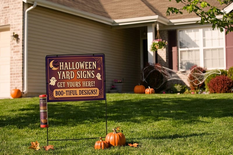
The Halloween work that is landing right now is flat, high contrast and built from two or three inks: block print illustration, bone white on black, and type large enough to read from the sidewalk. It is not a nostalgia move. Flat artwork is the only style that holds together across the whole set, because the same file has to work as a 24 by 18 inch yard sign read from a car and as a 4 by 6 inch mailer read in someone’s hand.
The second shift is the palette. Orange and black is not wrong, it is crowded. On a street where every sign is orange, black with a single acid accent, poison green, deep violet or bone, is the one that gets a second look. Pick the accent first and keep it identical across the sign, the window and the mailer, so the pieces read as one campaign instead of three. Our holiday color palettes for design has usable starting points, and the yard sign printing pages list the sizes each palette has to survive.
Third, and this is the one designers underuse: the texture is coming from the stock rather than from a filter. An uncoated or kraft sheet gives a matte, slightly toothy surface that makes a woodcut illustration look printed rather than exported. A grain filter over a gloss sheet does not do the same thing, and up close it looks exactly like what it is.
Spot gloss on matte black, instead of a glow
The premium Halloween effect that actually prints is spot gloss over a matte black field. The design is invisible straight on and appears when the card catches the light, which is the trick every glow filter is trying to fake in a flat file. It works on folded Halloween greeting cards and on invitations, and it costs a finishing pass rather than a fifth ink. Tap through the Halloween greeting cards and Halloween Invitations stories to see both.
The limit is scale. Spot gloss needs a shape with some body to it. Thin whiskers of gloss under about a point wide are hard to register cleanly against the black beneath them, so build the effect out of solid shapes: a moon, a hand, a monogram, a border.
Sizes, stocks and turnaround for this year's looks
Each of the trends above lands on a specific piece, and the piece sets the size, the stock and the lead time. Upload the artwork at final size with any texture at 300 dpi at that size, and pick the free online proof so you see the dark areas before the run.
- Flat illustration on a yard sign. 12 x 18, 12 x 24 or 18 x 24 inches on 4 mm white coroplast, printed on one side or both, with an H-stake if it goes in a lawn, in 5 business days.
- Black plus one acid accent on glass. Clear window clings from 11 x 17 up to 40 x 60 inches, with a spot white ink option behind the art and reverse printing so the design faces out from inside the glass, in 3 business days.
- Texture from the stock on cards. Halloween invitations at 4.25 x 5.5, 5 x 7 or 6 x 6 inches on 14pt Uncoated or 18pt Kraft Uncoated Cover, and postcards at 100 for $24.16 on 14pt Uncoated Cover.
- Large backgrounds indoors. Halloween wall graphics from 11 x 17 up to 48 x 96 inches on removable white adhesive vinyl, with an optional 3 mil matte lamination to kill glare.
Type that carries the whole design
Condensed vintage horror lettering, the kind on a 1960s film one sheet, is doing the heavy lifting this season, and it works because it is legible. The old signage rule of thumb still applies: roughly one inch of cap height for every ten feet of reading distance. A yard sign meant to be read at 30 feet from a moving car wants headline caps around 3 inches, which usually means the headline is four words and nothing else fits.
Write the sign copy before the artwork. Date, time, address, one instruction. Everything you cut makes the rest bigger. The same discipline applies to event posters, and the campaign posters guide works through the hierarchy at each size.
What should stay buried
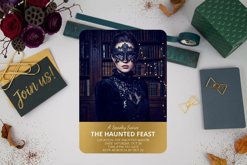
These are the ones that keep coming back into files and keep costing reprints. Every item here fails for a mechanical reason, not a taste reason, which is why arguing about them with a client is easier than it looks.
Seven Halloween habits to leave in the ground
- Dripping blood display fonts. The drips taper to a point. Anything under roughly half a point of stroke fills in on coated stock and drops out entirely on coroplast, so the word reads as a smear at the exact distance the sign was made for.
- Cobweb corner graphics. A web PNG in each corner does not add atmosphere, it adds four zones where nothing can be read. If the corner needs work, extend the illustration into it.
- Orange type on a solid black field, small. The two colors are close in luminance. Below about 12 pt the type goes muddy, and at 8 pt on a mailer it is effectively invisible in a hallway. Reverse it: black type on the orange.
- Neon gradient glow. Fluorescent orange and electric green live outside the CMYK gamut. The press builds the closest it can, which is duller than the screen, and a glow built from that gamut edge is the first thing a client complains about.
- Stock pumpkin clipart. The same three vector pumpkins are on every flyer in the neighborhood. A single hand drawn shape, even a crude one, separates the piece instantly.
- Outlining every element. A stroke around each object was a workaround for low contrast. Fix the contrast and the strokes are not needed, and the artwork stops looking like a sticker sheet.
- Full-bleed black across the address side of a mailer. It fights the mail stream and it costs you the cheap postage rates. Design the message side dark and keep the address side light.
The gradient problem, specifically
A long smooth gradient from black to orange is the most common Halloween file we see, and it is the least forgiving thing to print. Wide gradients across a large field band on any press, and they band worst in the dark end, which is exactly where a Halloween gradient spends most of its length. On coroplast the flutes add their own shadow lines on top.
If the design needs depth, get it from a halftone, a duotone, or a texture that is part of the illustration. Those reproduce the same way at every size and on every stock, and they survive a photocopy, a screenshot and a social repost without turning to mud.
The ink and stock decisions behind every trend
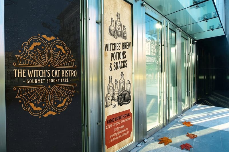
Halloween artwork is heavy ink coverage by definition, and heavy coverage is where the mechanical choices start to matter. Three of them decide whether the file you approved is the piece you get back.
The first is how the black is built. A large solid field printed as 100 percent K alone looks thin and slightly gray next to a rich black, which adds cyan, magenta and yellow underneath. Use a rich black for the big fields and plain 100 K for small type and thin rules, because a four-plate black under 10 pt type shows any registration shift as a colored fringe. Mixing the two on one page is normal and correct.
The second is the window. A cling on glass is lit from behind for half the day, and a design printed on clear vinyl with no white ink under it turns washed out and see-through as soon as the sun moves. Ask for a white underprint behind anything that needs to stay opaque, and keep genuinely clear areas as a deliberate choice rather than an accident. The window graphics measuring and template guide covers the template side, and window cling printing lists the stocks. For a fully opaque piece, order a white window cling instead.
The mailing side is not design space
The third decision is the postcard. A Halloween mailer wants to be dark, and the address side is the one place it cannot be. Postal scanning needs a clear address block and a quiet barcode zone, and a dark full-bleed there causes handling problems that cost more than any design gains. Put the moody artwork on the message side, keep the address side white or very light, and place a small illustration in the top corner if the side looks bare. The Halloween Postcards story shows the postcard builds.
The step-by-step layout, with the zones marked, is in our guide to laying out a postcard for mailing. Halloween postcards start at $16.48, and the same file works as a counter handout once the mail drop is done.
Order dates, honestly
Halloween decoration goes up around the first week of October in most neighbourhoods, and a sign that arrives on 28 October has missed most of its working life. Work backwards: pick the date you want the piece visible, subtract shipping transit, subtract production, and add a few days for one round of proof corrections, because dark artwork almost always gets one.
If that date has already gone past, the options narrow but they do not vanish. The last minute printing guide sets out what can still be produced and what has to change to make it, and the fastest printing options covers the trade-offs that come with a compressed schedule.
Halloween sign pricing and specs
Halloween yard signs come in three stock sizes, 12 x 18, 12 x 24 and 18 x 24 inches, all on 4 mm white coroplast. The price moves with size, quantity, printing on one side or both, and add-ons such as an H-stake or grommets, and the per unit cost drops as the run grows. The numbers below come from the live configurator, so you can size the budget before the artwork is finished.
Quantity and price
Halloween yard sign pricing and specs
Real configurator numbers on 4 mm coroplast, where a larger run drops the per unit cost.
| Quantity | Price Per Unit | Total |
|---|---|---|
| 1 | $25.00 | $25.00 |
You can also earn coins on every order and redeem them against later printing, which helps when a seasonal campaign runs across several pieces.
Stock and finish, by where the piece lives
Outdoors, the stock choice is made for you: 4 mm coroplast with UV inks, because it shrugs off rain and does not fade across the month. Indoors and in the hand, you have a real choice. Gloss lifts photography and deep color, matte kills glare and reads more expensive, and an uncoated sheet gives the tooth that makes a woodcut illustration look printed rather than exported. A spot gloss pass over matte black is the finish that gets picked up and turned over.
Print it
Halloween yard signs, staked and ready
Coroplast, UV inks and H-stakes, in the sizes that read from the road.
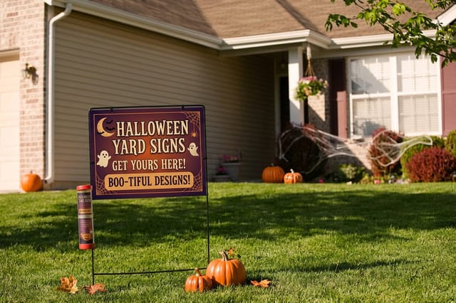
On glass, the decision is the white ink rather than the finish. A clear cling with no white underprint goes see-through the moment daylight comes from behind it, so specify the underprint for anything that must stay solid and treat genuine transparency as a design choice. For the pieces that stay indoors, Halloween wall graphics print on removable vinyl and come off without taking the paint, and sticker printing covers the giveaway shapes that go home with customers.
What to print, by business type
The right Halloween set depends on where your customers see you, so the list below goes by business type.
- Retail and storefronts. Window clings do the work of a sign without touching the frontage. One large hero shape at eye level beats six small decals scattered across the glass, and the cling comes off clean in November.
- Bars and nightclubs. One poster design, resized into a mailer and a social crop. Costume night, door time, cover charge, in that order. The nightclub flyer design guide covers the hierarchy that keeps a dark layout readable.
- Restaurants and cafes. A seasonal menu insert plus a window cling. Keep the food photography lit hard from one side so it still reads as food against a black background.
- Haunted houses and ticketed events. Yard signs on the approach roads and a postcard drop in the surrounding zip codes. Both need the same three facts: what, when, and how to buy.
- Schools, churches and trunk or treat. Volunteer-friendly artwork. Big type, two inks, no gradients, so the same file prints on a sign, a flyer and a photocopier without falling apart.
- Realtors and neighborhood businesses. A branded yard sign at a decorated house is the friendliest advertising there is. Keep the brand small and the Halloween illustration large, or it reads as an ad and gets ignored.
Bars and venues in particular should start from the nightclub flyer design guide, because a dark layout with a door time, a cover charge and a costume rule has a hierarchy problem before it has a style problem. If you are running an admission event, these event poster ideas show what a working seasonal poster looks like, and postcard printing handles the neighborhood drop. For layouts outside Halloween that you can adapt to a costume night, browse these creative poster ideas.
Blanks to swap a seasonal palette into
If you are not drawing from scratch, start from a template. Halloween postcards print in 14 sizes from 2.5 x 2.5 to 6 x 11 inches, and 4OVER4.COM sizes its blanks to the exact product specs, so the artwork lands inside the cut line with the bleed already marked. Grab a print-ready blank from the blank template library, or start from a layout in the design template library and swap the palette.
Start fast
Blanks to swap a seasonal palette into
Postcard design templates and exact size blanks, so the seasonal artwork lands inside the cut line.

Wally checks the sign from the far side of the street
Reading distance decides the design, not the trim size
Set about one inch of cap height for every ten feet of reading distance, so a sign read from a car at 30 feet wants 3 inch caps and a four word headline. Build the big black fields as a rich black and keep small type on plain 100 percent K. Then turn your screen brightness down to a quarter and look again, because whatever disappears there disappears on a porch at dusk.
Order Halloween yard signs →What to remember about Halloween design
Tips that hold at every size
- Design the yard sign first. It has the least room and the longest reading distance. Anything that survives there scales down to a postcard easily. Doing it the other way round always ends in a redraw.
- Set the accent color once. Pick black plus one accent and use the same accent across every piece. Two accents look like two campaigns, which is how a set of pieces stops feeling like a set.
- Keep the black type plain. Rich black for fields, 100 percent K for anything under about 10 pt. It is a two-minute swatch decision that prevents a colored fringe on small type.
- Check it in the dark. Halloween pieces get seen at dusk and under porch lights. Turn the screen brightness down to a quarter and look again. Whatever vanishes at that brightness will vanish outside.
- Print one before you print five hundred. Dark, heavy-coverage artwork is where proofs earn their keep. Look at a physical piece under the light it will actually live in, then release the run.
Explore more
More ways to print the season
Halloween wall graphics print in 2 business days, window clings in 3 and yard signs in 5.
Product Halloween Yard Signs Coroplast signs with stakes, built to read from the road. Product Halloween Window Clings Storefront glass without touching the frontage. 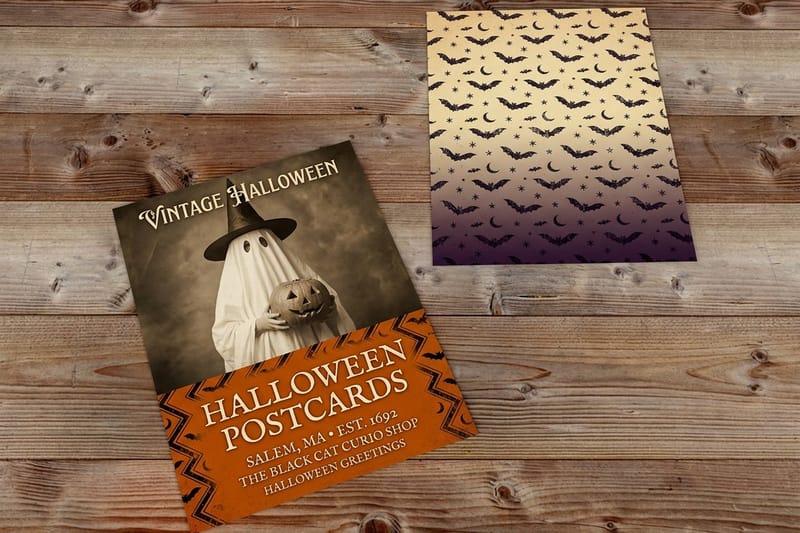 Product Halloween Postcards Mailer on one side, counter handout on the other. Product Halloween Invitations Heavy cover stock for a party that wants an RSVP.
 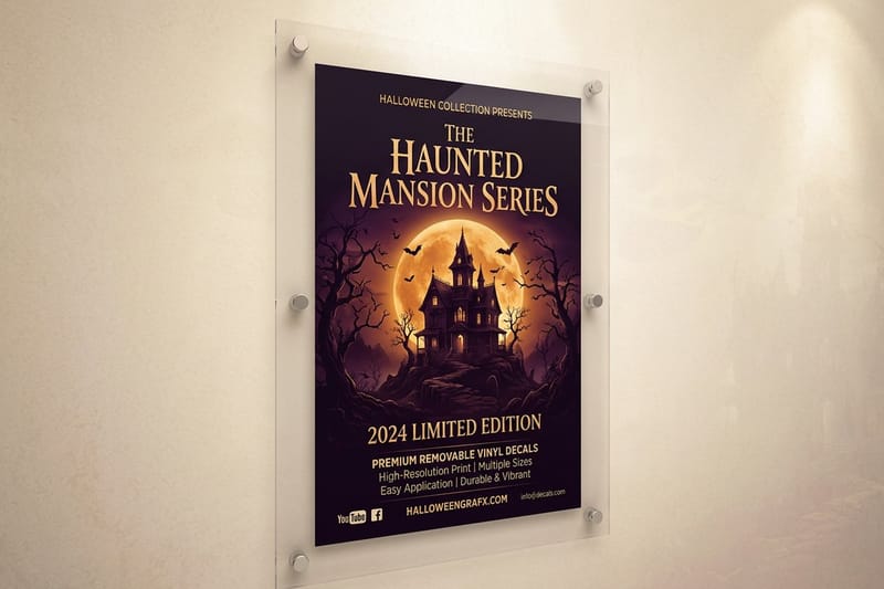 Product Halloween Wall Graphics Removable vinyl for interiors that need scale.
  Article 30 Holiday Color Palettes Palettes with hex codes, including the darker end.
 Ready to print the Halloween set?
Pick the sizes, drop in your artwork or a free template, and 4OVER4.COM prints it on coroplast, vinyl or heavy cover, in time for the first week of October.
Common questions about Halloween printing
What Halloween colors actually print the way they look on screen?
Deep blacks, bone whites, violets and muted greens reproduce closely in CMYK. Fluorescent orange and electric neon green do not, because they sit outside the process gamut, and the press builds the nearest match it can, which reads duller than the screen. If a bright orange is central to the brand, ask about it before you build the file rather than after the proof, and design the piece so it still works when that orange lands a shade flatter. Everything else about a Halloween palette is forgiving, since the style depends on contrast far more than on exact hue.
How big does the type on a Halloween yard sign need to be?
Use about one inch of capital letter height for every ten feet of reading distance. A sign on a lawn read from the pavement at 15 feet works with 1.5 inch caps. The same sign read from a car at 30 feet needs roughly 3 inch caps, and on a standard 24 by 18 inch sign that leaves room for a headline of about four words plus a date. Write the copy first and cut it hard, because every word you remove makes the remaining ones bigger. Halloween yard signs start at $25 at 4OVER4.COM.
Why did my black Halloween design come back looking gray?
The black was almost certainly built as 100 percent K on its own. A single black plate laid down over a large field looks thin and slightly washed next to a rich black, which puts cyan, magenta and yellow underneath to build density. Use a rich black for solid fields and backgrounds, and keep plain 100 percent K for small type and thin rules, because a four-plate black under about 10 pt shows any registration shift as a colored edge. Having both blacks in one document is normal, not a mistake.
When should I order Halloween printing so it arrives in time?
Decorations go up around the first week of October in most neighbourhoods, so work backwards from that date rather than from 31 October. Subtract shipping transit, subtract production time, then add a few days for one round of proof corrections, because dark heavy-coverage artwork nearly always needs one. A sign that lands on 28 October has missed most of its working life. If the calendar has already got away from you, our last minute printing guide sets out what can still be produced and what has to be simplified to make the date.
Can I use the same artwork for a yard sign, a window cling and a postcard?
Yes, and it is the cheapest way to make a campaign look like a campaign, but design the yard sign first. It has the longest reading distance and the least room, so anything that works there scales down. Going the other way, from a detailed postcard up to a sign, means redrawing, because the fine detail disappears at distance and the type ends up far too small. Keep the accent color and the illustration identical across all three, and change only the amount of copy on each.
