
Brand Refresh Lessons From Businesses That Reprinted Once


Nadia is our customer education voice, built from the knowledge of our production team, with over 20 years in printing.
A brand refresh keeps your name and updates the look, so reprint in the order pieces leave the building: business cards and letterhead first, envelopes with them, presentation folders last. Lock the logo and the CMYK color build before you order anything, then buy one proof set on the real stock, because the two failures that cost money are a mark that closes up at card size and a color that prints flat on uncoated paper.
The brand refresh checklist at a glance
| Printed piece | What changes | How urgent the reprint is | What to do with old stock | Product at 4OVER4 |
|---|---|---|---|---|
| Business cards | Logo, color, type, contact block | First. Every one you hand out carries the old mark | Keep the run small until the mark is settled | Standard Business Cards, from $17.57 |
| Letterhead | Logo, footer rule, address block | First. Contracts and invoices outlive the refresh | Order in the same week as the cards, same color build | Standard Letterheads, from $99.95 |
| Envelopes | Return address, logo, window clearance | Second. Match the letterhead run | Check the window position before artwork | Printed Envelopes, from $142.99 |
| Notepads | Header block only | Low. Internal, seen by few outsiders | Run the old stock down first | Standard Notepads, from $93.37 |
| Presentation folders | Cover art, spine, pocket copy | Last. Most expensive piece to hold | Wait until the mark is locked and proofed | Short Run Presentation Folders, from $108.75 |
Urgency is set by exposure, not by preference. A piece a customer receives gets the new mark on launch day; a piece only your team sees can wait until the box is empty. You can order standard business cards as a proof run first and scale the quantity once the mark is settled.
Brand refresh versus a full rebrand
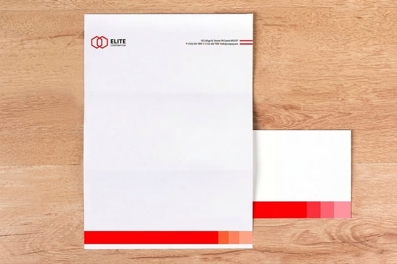
A brand refresh keeps the name and updates how it looks: the logo, the color, the type, the layout of the stationery. A rebrand changes the name itself, which drags in the legal filings, the domain, the signage, and every printed piece you own on the same day. The cost gap between the two is not close.
The test is simple. If your customers still recognize you after the change, it is a refresh. If they have to learn a new name, it is a rebrand, and you should budget for the whole print inventory rather than a phased reprint. Most small businesses that think they need a rebrand need a refresh, a fixed color build and a logo that actually reproduces at small sizes.
A refresh also lets you keep the equity in the old mark while you sharpen it. If you want the full sequencing walkthrough with the design steps spelled out, our step by step brand refresh guide covers the design side, and this page covers what it costs to put on paper.
What a refresh is allowed to touch
Logo mark, color palette, typeface, photography style, and the layout rules that hold them together. Those five decide almost everything printed. Leave the name, the tone of voice and the product line out of it unless you have a business reason, because each one you add multiplies the assets you have to redo.
Write down what is not changing before you brief a designer. A refresh with no fence around it turns into a rebrand by the third meeting, and the print bill goes with it.
When a rebrand really is the answer
A merger, a legal conflict over the name, a move into a category the old name blocks you from, or a reputation you genuinely need distance from. Those are name problems, and no amount of new color fixes them.
Everything else is usually a consistency problem. Read what a small business owner changed and kept before you commit to the expensive version.
Define what actually needs changing

Lay every printed piece you own on a table. Not the files, the printed pieces. Cards, letterhead, envelopes, folders, notepads, the flyer from last spring. You will find three or four versions of the logo, two shades of the same color, and a phone number that changed eighteen months ago.
That table is your scope. Anything on it gets reprinted, redesigned or retired, and each item goes into one of those three buckets before you spend anything. Retiring a piece is a legitimate outcome and it is the cheapest one available.
Then fix the logo before anything else, because every other piece inherits it. A mark with fine hairlines or tight counters looks sharp on screen and fills in on a printed card. Logo design best practices covers what survives at print size, and the six principles behind a working mark is worth reading before the first sketch.
Lock the color in CMYK, not just in hex
A hex value is a screen instruction. Print needs a CMYK build, and if the color has to match across coated cards and uncoated letterhead it needs a Pantone reference as well. This is where most refreshes go quietly wrong: the cards come back rich and the letterhead comes back flat, because uncoated stock absorbs ink and drops saturation.
Bright greens, oranges and deep blues shift the most on the way from screen to press. The Pantone colors that shift most in a CMYK conversion lists the specific ones to watch, and choosing brand colors for business covers picking a palette that holds up on both stocks in the first place.
Test the mark at the size it will actually print
Print the new logo at 0.4 inches wide on plain paper and look at it at arm’s length. If the counters fill in or the tagline turns to mush, it is not finished. A business card gives a logo about that much room once the contact block has taken its share.
Do the same for the typeface. A face with delicate serifs reads beautifully at 24pt on a folder cover and disappears at 7pt on a card. Easy to read fonts for brands and print is a shortlist that behaves at both ends.
Timing the refresh around your stock
The right time to refresh is when your existing stock is low, not when the idea arrives. Count what is in the cupboard. If you have four thousand folders and eight hundred cards, the cards are cheap to replace and the folders are not, so the folders set your calendar.
There is a real trade-off here and nobody enjoys it. Running mixed identity for a few months looks untidy, and scrapping usable stock costs money you already spent. The line most businesses draw: anything a customer receives gets the new mark immediately, anything internal runs down to zero first.
Pick a launch date and work backwards. Artwork sign off, one proof run of each piece on the real stock, then the full runs. Two weeks of slack between the proof and the launch is enough to catch a color that came back wrong, and not enough to lose momentum.
What to order before launch day
One box of cards, a small pack of letterhead, and a matching pack of envelopes. That is the proof set. It costs under a couple of hundred dollars and it catches the two failures that matter: a color that does not carry across stocks and a logo that closes up at small size.
Hold the folder order. Folders are the biggest single line on a stationery bill and the one you least want to repeat, which is why they belong at the end of the sequence, not the start.
Keeping your audience in the room
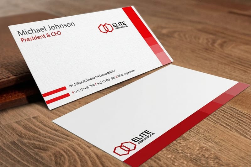
Customers do not care that your logo now has better optical spacing. They care that they can still find you, still recognize the invoice, and still trust the envelope that lands on the mat. Keep one recognisable anchor through the change, usually the color or the shape of the mark, and the refresh reads as progress rather than a different company.
Tell people before they notice on their own. A short line on the next invoice, a note on the letterhead footer for the first quarter, and the old and new marks shown side by side once on your site. That is the whole communication plan for a refresh, and skipping it is how a supplier ends up phoning to ask whether the invoice is genuine.
The message matters more than the mark here. Brand messaging for small business covers writing the line that explains the change in one sentence, which is all the room you get on a letterhead footer.
The pieces customers judge you on first
The card you hand over, the envelope on the mat, and the invoice inside it. All three are stationery, all three are cheap relative to the impression they set, and all three get looked at closely by exactly the people you cannot afford to confuse.
Finish counts on the card more than anywhere else, because it is the only piece a customer holds. Matte reads calm and takes a pen, gloss lifts photography and color, soft touch feels expensive and shows fingerprints. Matte, gloss or soft touch walks through which one suits which mark.
Updating print materials and stationery
This is where the refresh becomes an invoice. Stationery pricing moves with quantity, stock and finish, and the per unit cost falls as the run grows, which is exactly why an unproofed bulk order hurts. The numbers below come from the live configurator, so you can size the reprint before you commit to it.
Quantity and price
Business card pricing and specs
Real configurator numbers for the first piece you reprint, where a small proof run costs a fraction of a full order.
| Quantity | Price Per Unit | Total |
|---|---|---|
| 100 | 17.6¢ | $17.57 |
| 200 | 11.5¢ | $23.07 |
| 300 | 9.15¢ | $27.46 |
| 400 | 7.96¢ | $31.86 |
| 500 | 7.25¢ | $36.26 |
| 600 | 6.77¢ | $40.64 |

Letterhead and envelopes are the pair to order together. Standard letterheads start at $99.95 and printed envelopes at $142.99, and running them in the same window keeps one color build across both so the invoice and the envelope it arrives in do not disagree. You can also earn coins on every order and redeem them against the next reprint, which softens the cost of a phased rollout.
Print it
Business cards, refreshed
The piece a customer holds, and the one that decides whether the new mark reproduces.
Stock and finish carry more of the impression than most people expect. A 16pt card feels considered in the hand where a thin one feels disposable, and the finish changes how the new color reads: gloss lifts saturation, matte calms it and takes a pen, uncoated stays writable and prints lighter. Browse the full range in business card printing and pick the stock before you finalise the artwork, because the same color build behaves differently on each one.
Staying consistent across every channel
A refresh fails quietly when the printed pieces and the screen pieces drift apart. The website gets the new logo, the email signature keeps the old one, and the folder in the meeting is a third version. Write a one page rule sheet the day the mark is signed off: two color builds, two typefaces, a minimum logo size, a clear space rule. Then hand it to everyone who makes anything.
Different business types feel the drift in different places, so here is where it usually shows up first.
- Professional services. Letterhead and envelopes carry the refresh, because contracts and invoices are what clients keep. Order both in the same run so the color build matches.
- Retail and hospitality. Cards, menus and packaging move fastest, so refresh them first and let signage follow on the next maintenance window.
- Agencies and studios. Presentation folders are the pitch piece, so they get the finish budget. Order them last, once the mark has been proofed on a card.
- Trades and field services. Business cards and vehicle branding do the heavy lifting. Reprint the cards immediately, plan the vehicles around the next service.
- Nonprofits. Envelopes and letterhead matter most, because appeal mail is the main touchpoint. Keep the old color as an anchor so long-term donors still recognize the envelope.
Rolling out the new look
Launch is a sequence, not a day. Proof set first, then the customer facing runs, then the internal stock as it empties, then the expensive pieces once the mark has been in the world long enough to be sure of it. Short run presentation folders at $108.75 exist for exactly this: enough folders for the next quarter of pitches without committing to a pallet of a design you might still adjust.
Keep one line of communication running through it. A note on the invoice, a footer line on the letterhead for the first quarter, and the old and new marks shown together once. Suppliers and long-term customers notice stationery changes more than you think, and a single sentence stops the phone call asking whether the invoice is real.
Blanks sized to the real product, not a guessed artboard
If the refresh is being done in house, start from a blank sized to the real product rather than a guessed artboard. 4OVER4.COM sizes its blanks to exact product specs so the new artwork lands inside the cut line with 0.125 inch bleed on every side. Grab one from the blank template library, or start from a layout in the design template library and drop the new mark in.
Start fast
Blanks sized to the real product, not a guessed artboard
Business card templates and exact size blanks, so the refreshed artwork lands inside the cut line.














Wally proofs the refresh before the full run
One box of cards now beats five thousand folders you have to bin
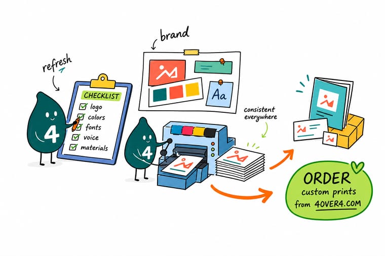
Lock the logo, build the color in CMYK with a Pantone reference, and order a proof set: one box of business cards, a pack of letterhead and matching envelopes on the real stock. Check the mark at 0.4 inches wide and compare the color on coated card against uncoated letterhead. Only then order the full runs, and leave the presentation folders until last.
Order business cards →What to remember about a brand refresh
Rules that keep a refresh from turning expensive
- Write the rules down, once. Two color builds, two typefaces, a minimum logo size and a clear space rule. One page. Anything longer will not be read and anything shorter will be argued about.
- Proof on the real stock. A color approved on screen is not approved. Ask for the proof on the paper the job will print on, coated and uncoated both if you use both.
- Set the small size first. Design the business card before the folder. If the identity works in 3.5 by 2 inches it works everywhere else. The reverse is not true.
- Keep one anchor. Hold the color or the silhouette steady through the change so customers recognize you mid-refresh. Change everything at once and you have a rebrand you did not budget for.
- Retire, do not just reprint. Every piece on the table gets reprinted, redesigned or retired. The retire pile is where a refresh budget is actually saved.
Explore more
Everything the refresh touches
Printed envelopes run 250 for $142.99 and short run folders 10 for $108.75, which is the order the reprint goes in.
 Product Standard Business Cards The first piece to reprint, from $17.57.
 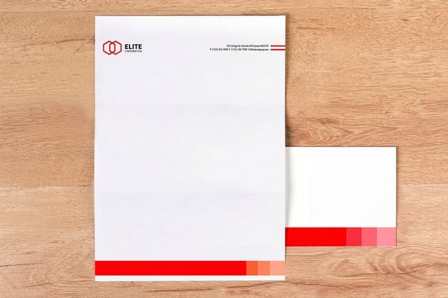 Product Letterheads Contracts and invoices carry the new mark for years.
 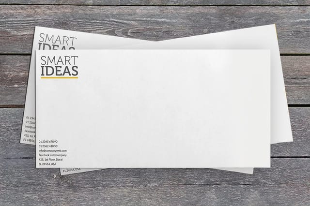 Product Printed Envelopes Match the letterhead run and the color build.
  Product Short Run Presentation Folders Order last, once the mark is locked and proofed.
  Product Notepads Internal stock, refreshed after the old pads run out.
  Category Business Card Printing Every stock, finish and size for the piece you reprint first.
  Guide Brand Refresh, Step by Step The design side of the refresh, in order.
  Article Rebranding, From a Small Business What one owner changed, kept and would redo.
 Ready to print the refreshed set?
Start with a proof run of cards, letterhead and envelopes, check the color on the real stock, then scale the quantity. 4OVER4.COM prints all three on premium stock, as fast as your launch date needs.
Common questions about a brand refresh
What is the difference between a brand refresh and a rebrand?
A refresh keeps the name and updates the look: logo, color, typeface, and the layout of the printed pieces. A rebrand changes the name, which pulls in legal filings, the domain, signage and every piece of stationery on the same day. The practical test is whether your existing customers will still recognize you after the change. If they will, it is a refresh and you can phase the reprints by how fast each piece leaves the building. If they need to learn a new name, budget to replace the whole print inventory at once, because a mixed identity is far more damaging when the name itself has moved.
Which print materials should I reprint first?
Business cards and letterhead, in the same week. Cards go out by the handful and every one carries whichever mark is on it, and letterhead ends up on contracts and invoices that sit in a client file for years. Envelopes follow immediately so they match the letterhead run and share the same color build. Notepads and internal forms can run down to zero first, because almost nobody outside the business sees them. Presentation folders come last: they are the most expensive line on a stationery bill and the piece you least want to order twice.
Do I have to throw away the old business cards?
The cards, yes, once the new ones arrive, because that is the piece a customer holds and compares. Everything else depends on who sees it. A cupboard of internal notepads with the old header costs you nothing to use up, and scrapping usable stock is real money you already spent. The line worth drawing is customer facing versus internal: anything a customer receives switches on launch day, anything internal runs down first. Keep a handful of the old cards for your own records, nothing more.
Why does my brand color look different on letterhead than on business cards?
Stock. Coated card holds ink on the surface, so color sits bright and saturated. Uncoated letterhead absorbs it, so the same CMYK build prints lighter and duller, sometimes noticeably. This is normal press behavior, not a printing error, and it catches out most first refreshes. The fix is to specify the color as a Pantone reference alongside the CMYK build and ask for a proof on both stocks before the full runs. Deep blues, bright greens and oranges shift the most, so if your palette leans that way, proof it early.
How long does a brand refresh take before everything is printed?
Plan on four to eight weeks from signing off the logo to having the full stationery set in hand, and most of that is decision time rather than print time. A workable sequence is one to two weeks for artwork and the color build, one week for a proof set of cards, letterhead and envelopes on the real stock, a week to review it and correct anything, then the full runs. Presentation folders sit at the end of that line. Rushing the proof step is the one shortcut that reliably costs more than it saves.
