
Artistic Business Card Design Ideas That Double as Art


Emma is our prepress and print production voice, built from the knowledge of our production team, with over 20 years in printing.
Artistic business card design ideas work when the material carries part of the idea: an illustration printed on uncoated stock, a suede laminate, a raised foil line, or an outline cut to a shape. Pick one of those and build the whole design around it, because two competing finishes on a 3.5 by 2 inch surface read as busy rather than considered, and they double the price while doing it. The artist business card most of these looks start on prints at 3.5" x 2", 2" x 2" or 1.5" x 3.5", on stocks from 14pt gloss to 110# Strathmore wove, from 100 cards in 3 business days; upload a print-ready file with 0.125 inch bleed, or start from our free business card templates if you want the layout set up for you.
Eight artistic card looks and what each one needs
| The look | How it is made | Stock it needs | Who it suits | Product at 4OVER4 |
|---|---|---|---|---|
| Hand-drawn illustration | Flat CMYK printing, no added finish | Uncoated or matte | Illustrators, tattooists, ceramicists | Artist business cards, from $17.57 |
| Bold color block | Full-bleed solid, four-color build | Matte, heavy coverage | Studios, galleries, stylists | Artist business cards, from $17.57 |
| Soft-touch texture | Suede laminate over the print | 16pt with suede film | Photographers, architects, brands selling calm | Suede business cards, from $87.15 |
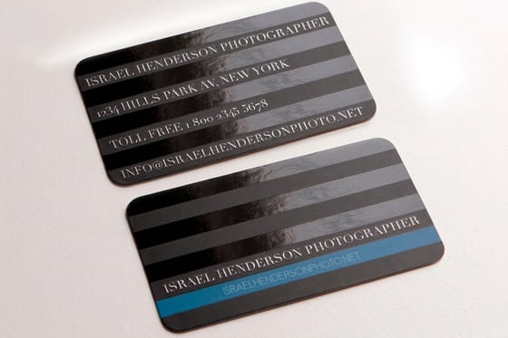
| Selective gloss | Spot UV varnish, registered to a mask | Matte laminate base | Pattern work, logos, monograms | Spot UV business cards, from $76.88 |
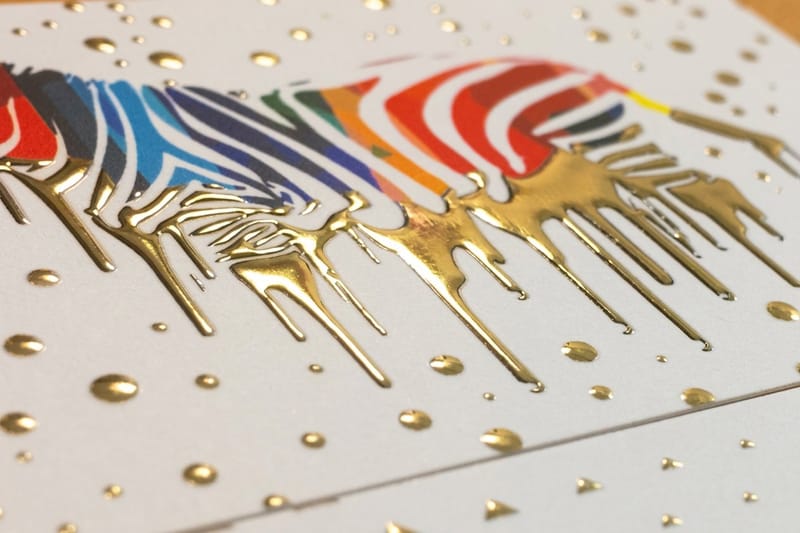
| Raised metal line | Foil laid on a raised varnish bed | Matte or suede base | Jewellers, agencies, luxury retail | Raised foil business cards, from $86.78 |
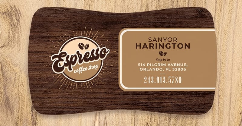
| Cut to a shape | Steel die cuts the outline | 16pt or heavier | Product brands, makers, food | Die-cut business cards, from $26.37 |
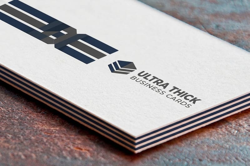
| Card as an object | Thicker board, nothing else added | Ultra thick | Anyone whose card gets kept | Ultra thick business cards, from $36.62 |
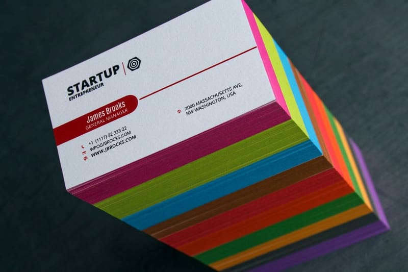
| Colored edge | Paint applied to the cut edge | Ultra thick, so the edge is visible | Design studios, architects | Edge painted business cards, from $141.70 |
Prices are the starting configurator price at the smallest quantity: the illustrated and color block looks start at $17.57 on artist business cards, a die-cut outline at $26.37, ultra thick board at $36.62, and the finish looks run from $76.88 for spot UV to $141.70 for a painted edge. The per card cost falls as the run grows. Compare the whole range on the business card printing page before you settle on a finish.
What makes a business card feel like art
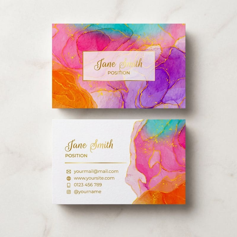
A card reads as art when the material carries part of the idea, not when the artwork alone tries to. Anyone can put a nice image on a rectangle. What makes someone turn a card over in their hand is a surface that behaves differently to the fifty other cards in the drawer: a suede laminate, a raised line of foil, an edge that is not straight, or a thickness that stops it bending.
The trap is stacking those decisions. A die-cut shape, plus foil, plus a colored edge, plus a full-bleed illustration, on a surface that measures 3.5 by 2 inches, produces a card that looks expensive and says nothing. Pick one material decision, commit the whole design to it, and let the artwork be quiet enough that the finish gets noticed.
The second thing that separates a card that works from a card that photographs well is that a business card is a functional object. It has to fit a wallet, take a pen if someone wants to write on the back, and be legible without good light. Our business card basics guide covers the constraints before the creative work starts, and it is worth reading first if this is your first run.
The four decisions, in the order they matter
Every artistic card is built from four separate choices, and each one is priced and proofed on its own. First the base stock, which decides thickness and how the ink sits. Then the surface, meaning uncoated, matte, gloss or a laminate such as suede. Then the relief, if any: spot UV or raised foil sitting proud of the card. Last the edge: a straight trim, rounded corners, a die cut shape, or paint on the cut face.
Work down that list rather than around it. A finish chosen before the stock usually has to be undone, because raised foil on an uncoated sheet behaves differently to raised foil on a matte laminate, and the proof is where you find out.
Where art cards actually fail
Three failures come back more often than the rest. Type set at 6pt inside a busy illustration, which is legible on a 27 inch screen and unreadable on a card held at arm’s length. A dark full-bleed design with no rounded corners, where every corner knock shows the white core of the board. And artwork built in RGB, where the screen greens and electric blues drop noticeably when they convert to CMYK.
None of those are printing faults, and none of them are visible in the file. Order a small run before you commit to a thousand. It is the cheapest way to find out that the color you chose looks different on paper.
Illustrated and hand-drawn card ideas
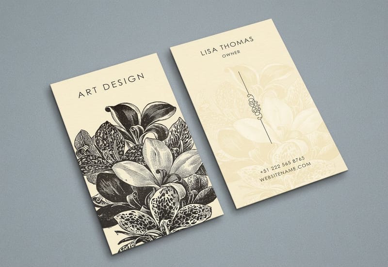
Illustration is the cheapest route to a card nobody else has, because the drawing does the differentiating and the print stays standard. Artist business cards start at $17.57, which puts an original hand-drawn card below the price of most stock-photo designs with a finish added.
The strongest versions treat the card as a small print rather than a poster shrunk down. One drawing, taken to the trim edge, with the contact details moved to the back so the front stays clean. If you have a body of work, a set of four different fronts printed in one run costs the same as four hundred of one design and turns handing out a card into a small choice for the person receiving it.
Line art on uncoated stock
A pen or pencil drawing looks most like itself on uncoated stock. Uncoated absorbs ink rather than holding it on a sealed surface, so fine lines gain a fraction of weight and the whole drawing sits in the paper instead of on it. That gain is real: expect hairlines to print slightly heavier than they measure in the file, which means a 0.25pt rule is the thinnest worth using.
The trade-off is color. Uncoated flattens saturation, so a bright red reads closer to brick and a mid gray reads darker than the swatch. If the illustration relies on punchy color, matte laminate holds it better while still avoiding shine. Our business card stock guide sets out what each stock does to ink.
Full-bleed illustration and the trim
A drawing that runs to the edge needs 0.125 in of extra artwork on every side, because cutting a stack of cards moves by a hair from top to bottom. Extend the background, not the subject. If a figure’s hand sits 2mm from the trim, the run where the blade drifts is the run where the hand loses a finger.
Keep anything you cannot afford to lose 0.125 in inside the trim line, and check it against a real template rather than eyeballing it. The bleed and trim guide shows what the three lines on a print template each control, and every blank template we publish already has them marked.
Bold color and typographic designs
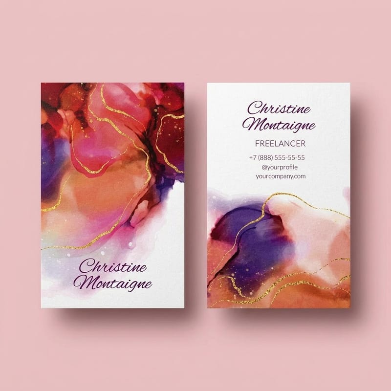
When there is no illustration, the color and the type have to be the artwork, and both have to be braver than they would be on a screen. A card that is 90 percent one saturated color with six words on it holds attention longer than a tidy layout with a logo, a name, a title, a phone number, an email, a website and a social handle.
Typographic cards are also the most forgiving to print, because there is no photographic detail to protect. That means you can spend the budget on the surface instead: matte laminate, suede, or a spot gloss over the letterforms.
Color that survives the CMYK conversion
Four-color printing cannot reach every screen color. The ones that shift most are electric blues, bright oranges and any green that looks fluorescent, all of which land duller than they appear on a backlit display. Build the artwork in CMYK from the start so you approve the achievable color rather than being disappointed by it later.
For deep blacks across a large area, a flat 100% K prints as a soft charcoal. A rich black built with cyan, magenta and yellow underneath the black is what looks properly black on a card, and it is worth asking for it specifically when the design is mostly dark.
Type as the only image
Set the name large enough to be the picture. A single word at 30pt or more, cropped by the trim, gives you a card that is recognisable across a table, which is the actual job. Everything secondary can go on the back, where it can be small and set in a plain face.
Convert type to outlines before you send the file so the printer sees exactly the letterforms you drew, particularly if you are using a display font or something you have modified. The step takes a minute and it is covered in converting text to shapes in Illustrator. If you are still choosing a face, these free fonts are a reasonable starting shelf.
Texture and special-finish cards
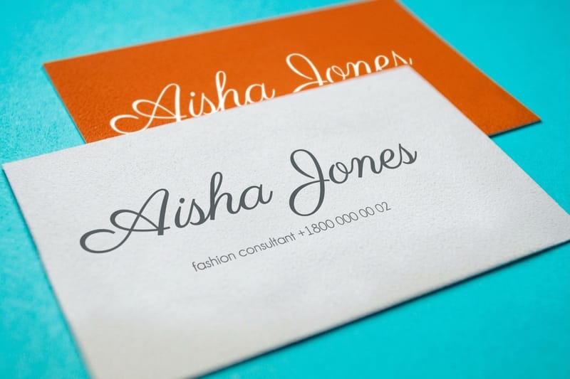
Texture is the one thing a photograph of your card cannot transmit, which is exactly why it works in the hand. Three finishes carry most of the effect: a suede laminate that feels like fine sandpaper worn smooth, spot UV gloss that catches light in specific places, and raised foil that stands proud enough to read with a thumb.
These are the expensive layer. Spot UV cards start at $76.88, raised foil at $86.78 and suede at $87.15, against $17.57 for a flat printed artist card. That is the honest trade: a finish roughly quadruples the entry price, and it is worth it only when the card is being handed to people who will keep it.
Suede, and what it does to color
Suede laminate kills shine completely and gives the card a soft dry grip. It reads as restraint, which is why architects, photographers and skincare brands use it more than anyone else. It is a surface applied over the print, so it does not change the card thickness, and pairing it with an ultra thick board is what produces the card people describe as feeling like a tile.
The cost is color depth. A suede film mutes everything under it by a noticeable degree, so photographic images and bright brand colors lose bite. Design for it rather than against it: large flat areas, high-contrast type, and a restricted palette look better under suede than a full-color photograph does.
Spot UV and raised foil need a second file
Both finishes are registered to your artwork, which means the press needs to be told exactly where they go. Supply a second file at the same trim size where the areas to be glossed or foiled are solid 100% black and everything else is white. No grays, no tints, no strokes. A gray tint does not produce a half-height varnish, it produces a rejected file.
Two practical limits. Very fine detail does not hold in raised foil, because the varnish bed spreads slightly as it cures, so hairline serifs and 6pt text come back thickened or filled in. And spot UV over a gloss laminate is close to invisible, since the gloss is already reflecting; it only reads against matte or suede. If you want the raised effect without foil, the stock and coating guide for embossed cards covers where relief works and where it flattens.
Die-cut and shaped card ideas
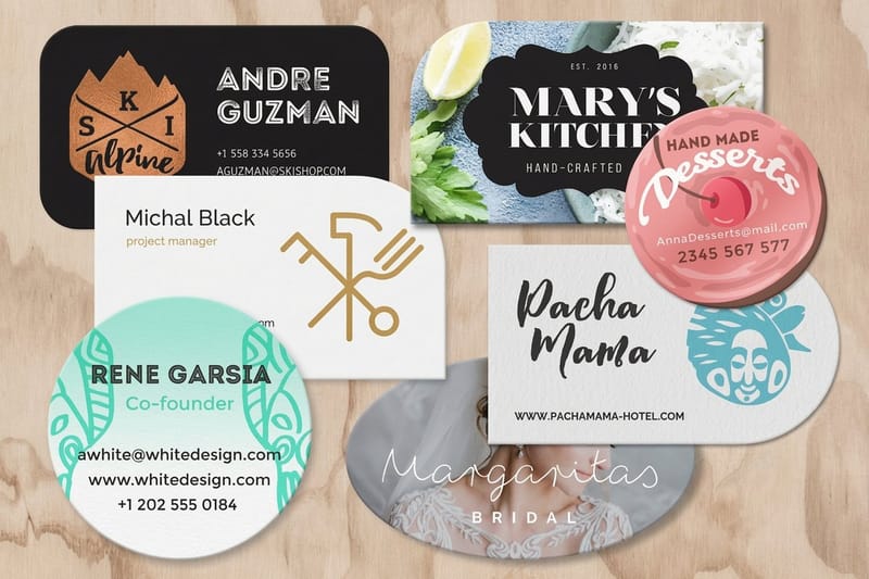
A shape is the fastest way to look unlike everyone else, and it is cheaper than most people assume. Die-cut business cards start at $26.37, which is under ten dollars above a flat card and well below any of the surface finishes.
The shape should mean something. A card cut to the silhouette of the thing you make is memorable; a card cut into a random blob is just a card that will not stack. Rounded corners are the quiet version of the same idea and they do a practical job too, since a rounded corner does not bruise in a pocket the way a sharp one does.
What a die can and cannot do
A steel die handles smooth curves and clean straight runs well. It struggles with tight interior corners, narrow spikes and any neck of card thinner than roughly an eighth of an inch, which tears when the stack is separated. Interior cutouts are possible but each enclosed hole adds cost and weakens the card around it.
File setup matters more here than anywhere else. Draw the cut path as a single closed vector on its own layer, carry the artwork 0.125 in beyond it, and hold type 0.125 in inside it. Our guide to business card shapes lists the shapes that cut cleanly, and twenty shaped card ideas shows what other brands have done with the same die.
Shapes, edges and the wallet test
Before you sign off a shape, ask whether it fits a wallet. A card that does not is a card that gets left on the desk, and for some businesses that is the point: a shaped card that lives on a fridge or a pinboard outperforms one filed away. Decide which of those two lives you want, because the shape follows from it.
A painted edge is the other way to break the rectangle without cutting it. It needs a thick board for the color to be visible at all, which is why edge painted cards start at $141.70. On standard 16pt the painted line is too thin to register from a normal viewing distance.
The stocks and finishes behind the look
Artist business cards start at $17.57 for 100 and print in 3 business days, which makes the flat illustrated or color block card the cheap way to test a look. A finish changes the math: suede starts at $87.15 and a painted edge at $141.70, five to eight times the flat price at the smallest run. The numbers below come from the live configurator for artist business cards, so you can size the budget before committing to a finish.
Quantity and price
Artist business card pricing and specs
Real configurator numbers for full-color printing of your own artwork, where ordering more drops the per card cost.
| Quantity | Price Per Unit | Total |
|---|---|---|
| 100 | 17.6¢ | $17.57 |
| 200 | 11.5¢ | $23.07 |
| 300 | 9.15¢ | $27.46 |
| 400 | 7.96¢ | $31.86 |
| 500 | 7.25¢ | $36.26 |
| 600 | 6.77¢ | $40.64 |
You can also earn coins on every order and put them toward the next run, which matters when you are printing a set of four designs rather than one.
Choosing a finish for your discipline
The right material depends on what the card is being handed to, and on whether it gets filed, pinned up or carried. Here is where each finish tends to land.
- Illustrators and tattooists. One drawing at full bleed on uncoated, contact details on the back. Artist business cards at $17.57 make a four-design set affordable in a single run.
- Photographers. Suede laminate over a restricted palette, not over a photograph. The film mutes images, so use type and a single crop rather than a portfolio grid.
- Design studios and architects. Ultra thick board with a painted edge, or spot UV on a matte laminate. The card is a work sample, so the material is the argument.
- Ceramicists, jewellers and makers. A die cut following the silhouette of what you make, or raised foil on a single mark. Both survive being pinned to a studio wall.
- Galleries and event spaces. Bold color blocking with one large word, printed in short runs per show so the card changes with the program.
Print it
Artist cards, ready for your artwork
Full-color printing on stock that suits illustration, at the same entry price as a plain card.
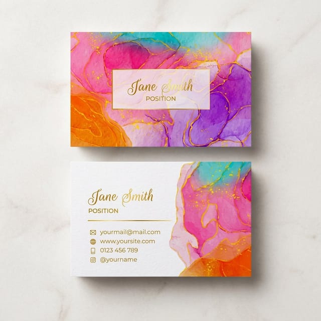
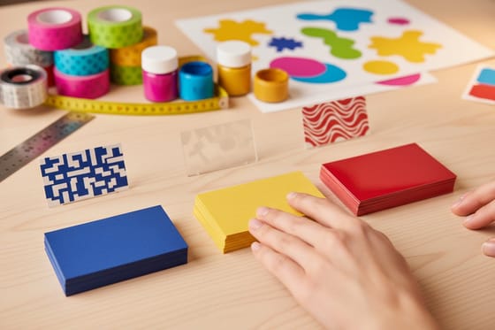
If the card is the first thing a gallery or a client sees, weight does as much work as any printed finish. An ultra thick board at $36.62 changes the moment of handing it over more than a subtle varnish does, and it costs less than half of a spot UV run. For the reverse side, back of card ideas is worth a scan, and stylish card examples covers the layouts that keep working after the finish wears off.
Design your own artistic card
Start from a template with the trim, bleed and safe area already drawn, then put your own artwork inside it. It removes the two mistakes that cause reprints, which are art that stops short of the bleed line and type that sits too near the cut.
Start fast
Templates and print-ready blanks
Business card templates and exact size blanks so your artwork lands inside the cut line the first time.






Wally shows where the art actually happens
One material decision, carried through the whole card
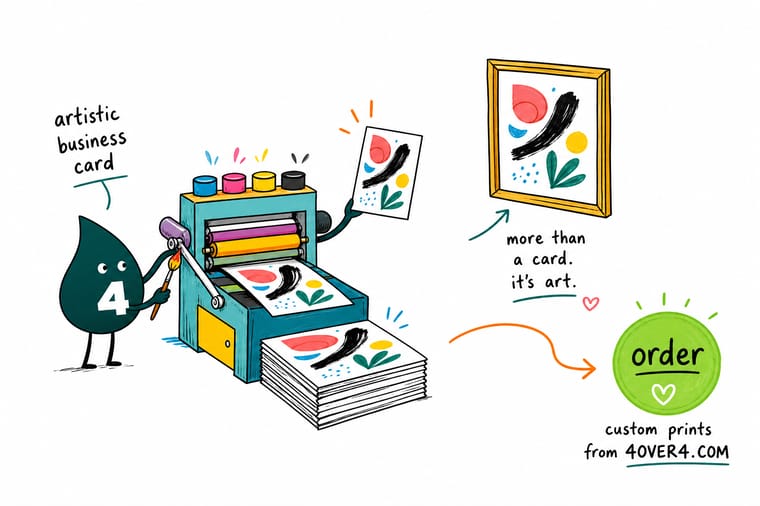
Choose the layer first: uncoated for line work, suede for feel, spot UV or raised foil for relief, a die cut for shape. Build at 300 DPI in CMYK, carry 0.125 inch of bleed on every side, hold type 0.125 inch inside the trim, and send a separate 100% black mask if anything is glossed or foiled. 4OVER4.COM proofs it before the press runs.
Order artist business cards →Where an art card earns its cost
Design tips that hold at every price
- One material idea, not four. Die cut plus foil plus painted edge plus full-bleed art on a 3.5 by 2 inch card reads as busy. Choose the layer that carries the idea and let the rest stay plain.
- Design the back deliberately. The back is half the card and most people waste it on a repeated logo. Put the contact details there so the front can be a single image.
- Check legibility at arm’s length. Print the file at 100 percent, hold it where a person actually holds a card, and read it. Anything you have to lean in for is too small.
- Build in CMYK from the first artboard. Approving an RGB design and converting later is how bright blues and greens turn dull between the screen and the proof.
- Order a small run first. Stock, finish and color all behave differently on paper than on a display. A short first run costs less than reprinting a thousand cards you do not like.
Explore more
More ways to print and promote
Edge painted cards run 250 for $141.70 on 32pt UltraWhite and custom shapes 50 for $95.56, the two routes that change the card itself.
Product Artist Business Cards Full-bleed illustration on stock that suits line work. Product Suede Business Cards A soft dry surface that kills shine completely. Product Die-Cut Business Cards Cut to your outline instead of a rectangle. 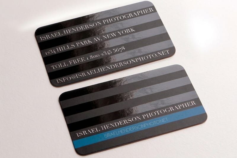 Product Spot UV Business Cards Selective gloss that only reads against matte.
  Product Raised Foil Business Cards Metal on a raised bed you can feel with a thumb.
  Product Ultra Thick Business Cards Weight as the whole idea, no finish required.
  Product Custom Shaped Business Cards A shape drawn to your own cut path.
  Product Edge Painted Business Cards Color on the cut face of a thick board.
  Category Business Card Printing Every stock, finish and shape we print, in one place.
  Article Artist Business Card Examples Real cards from working artists, picked apart.
  Article Creatives Using Spot UV How eighteen studios use selective gloss.
  Guide Choosing a Card Finish Matte, gloss or soft touch, and when each one wins.
 Ready to print a card people keep?
Pick the stock, drop in your artwork or start from a free template, and 4OVER4.COM proofs it before the press runs.
Common questions about artistic business cards
What stock should an artistic business card be printed on?
Match the stock to the artwork rather than defaulting to the heaviest option. Uncoated suits pen, pencil and line work, because it absorbs the ink and lets fine detail sit in the paper, but it mutes saturated color by a visible amount. Matte laminate is the middle choice: it holds color without shine and takes spot UV well. Suede laminate is for cards where feel matters more than color depth, since the film softens everything under it. Ultra thick board is a separate decision from all three, and it is the one people notice most when the card is handed over.
Do spot UV and raised foil need a separate file?
Yes, and it is the most common reason an artistic card gets held at prepress. Supply a second file at the same trim size as the artwork, with the areas to be glossed or foiled filled in solid 100% black and everything else left white. Grays, tints and strokes are not accepted, because the finish is either applied or it is not, and there is no halfway height on a varnish. Keep the detail reasonably chunky as well, since a raised varnish bed spreads slightly as it cures and hairline serifs come back thickened.
How much more do artistic business cards cost than plain ones?
It depends entirely on which layer you add. Artist business cards, meaning full-color printing of your own artwork, start at $17.57, which is the same entry point as a plain card. A die cut takes it to $26.37 and ultra thick board to $36.62. The surface finishes are the jump: spot UV starts at $76.88, raised foil at $86.78, suede at $87.15 and a painted edge at $141.70. Watch the Ultra Thick Suede Business Cards video to see how that finish reads before you pay for it. So the design itself is close to free, and it is the material that carries the cost.
Will a die-cut business card still fit in a wallet?
Only if you keep the outer dimensions inside a standard 3.5 by 2 inch footprint, which many die cuts do since the shape is cut inward rather than outward. A shape that extends beyond that footprint will not fit a card slot, and that is a deliberate choice rather than a mistake. Cards meant to be kept on a desk, a fridge or a pinboard benefit from being unstackable, because the whole point is that they do not disappear into a drawer. Decide which behavior you want before you draw the cut path.
Can I print several different designs in one order?
Yes, and for artists it is usually the better use of the budget. Splitting a run across four different fronts costs the same as printing one design at the same total quantity, so a set of four gives you variety without a price penalty. It works best when the backs are identical, so the contact information stays consistent and only the artwork changes. Photographers, illustrators and makers use this to hand out a card that matches the conversation they just had.
Why does my card look different in print than on screen?
A screen emits light and paper reflects it, so the two can never match exactly. The gap is widest on electric blues, fluorescent greens and bright oranges, which all sit outside what four-color printing can reach and land noticeably duller. Building the file in CMYK rather than RGB means you approve the achievable color from the start. Stock widens the gap further: the same file on uncoated prints darker and flatter than on matte laminate, which is why ordering a short run before a large one is worth the extra step.
