
How to Recreate the Paul Allen Business Card, Bone Stock and All


Subtle off-white coloring. Tasteful thickness. A watermark. Three lines from American Psycho that are really a printing specification in disguise. Here is what each one means on a real order form, and how to build a card that ends the conversation the same way.
To recreate the Paul Allen business card, order a warm off-white cover stock instead of bright white, move up in caliper or duplex two sheets for weight, set the name in a classic serif with small caps and open letterspacing, and imitate the watermark with a blind emboss or a spot gloss mark. Keep the card at the standard 3.5 by 2 inches, use one effect only, and let the paper carry the impression rather than the artwork.
Start here
The card, translated into print terms
Every quality Bateman envies about Paul Allen's card is a paper or finishing decision. Subtle off-white coloring means a warm, low brightness stock rather than a bright white sheet. Tasteful thickness means heavier caliper or a duplexed build. The watermark is formed at the mill, so on a printed card you substitute a blind emboss or a spot gloss mark. The typeface names are invented, and the real look is a classic serif set small in wide small caps.
Why a fictional business card still sets the standard
Nobody in that scene talks about the logo. They talk about the paper. Bateman loses because a rival brought a sheet with a warmer color, more weight, and a mark pressed into the fibers, and no amount of clever layout answers that. It is the cleanest lesson in print anyone has ever put on film, and it still holds at every table where cards get exchanged.
The good news is that the whole thing is buyable. Color, caliper, surface and finishing are options on an order form, not talents you have to be born with. Get those four right and even a plain name on a plain card outclasses a busy design printed on thin stock.
This guide takes each line from the scene, translates it into the printing term it actually describes, and shows you what to specify. If you want inspiration before you set type, the 15 stylish business card examples collection is a good place to see restraint done well.
Step 1: decode what each card in the scene actually is
Four cards get compared. Bateman calls his bone with lettering called Silian Rail. Van Patten answers with eggshell and Romalian type. Montgomery brings raised lettering and pale nimbus, in white. Then Paul Allen produces the card with subtle off-white coloring, tasteful thickness, and a watermark, and the conversation ends.
Read that list again as a printer would and it turns into three variables: paper color, print process, and paper substance. Bone, eggshell, pale nimbus and off-white are all the same variable set slightly differently. Raised lettering is a process. Thickness and watermark are properties of the sheet itself.
Eagle-eyed viewers have long enjoyed the fact that the cards are also full of small mistakes, which is the point of the joke. The men are competing over qualities they cannot describe correctly. You can, and that is the advantage.
Step 2: get the subtle off-white coloring right

Bright white paper is made bright with optical brighteners, which fluoresce under daylight and give a card a faint blue cast. That cast is what makes cheap cards look cheap. Warm, lower brightness sheets do the opposite. They read as older, calmer and more expensive, and black ink printed on them looks softer instead of stark.
So the first specification is a natural white, cream or ecru cover stock rather than a premium bright white. If you cannot compare in person, compare on paper samples in daylight rather than under office lighting, because fluorescent tubes flatter brighteners and hide the difference you are trying to buy.
One warning about design files. Off-white must come from the paper, not from a printed background tint. A printed beige panel leaves visible ink edges at the trim line and turns the card into a printed rectangle instead of a piece of paper. Choose the stock, then design in true black on nothing.
Step 3: buy the tasteful thickness

Thickness is the cue people register before they read a word, because it happens in the hand. Standard cards flex. Heavy cards do not, and that stiffness is what makes someone turn the card over instead of pocketing it. Caliper is measured in points, and moving up even a few points changes the whole impression.
There are two routes. Buy a heavier single sheet, or duplex, which means bonding two sheets face to face into one card with double the substance. Duplexing also opens the door to a colored core line between the two layers, which is the modern version of the same flex Paul Allen was pulling.
Keep the size standard while you do it. At 3.5 by 2 inches a thick card feels engineered. Change the dimensions as well and it stops feeling like a business card, which is a different effect entirely. If you would rather the card do something unexpected, our 3D lenticular business cards put motion in the card instead of bulk.
Step 4: set Silian Rail, or the closest thing that exists
Silian Rail was invented for the film, along with Romalian type and pale nimbus, so there is nothing to download. What is on screen is a classic serif set small, in small caps, with wide letterspacing and a lot of empty paper around it. That combination is the actual look, and it is easy to reproduce.
Practical choices: Garamond or Baskerville for a quiet old-style serif, Bodoni for sharper contrast, and Copperplate Gothic or Trajan when you want the engraved bank-stationery feel. Set the name around 8 to 10 point, the title smaller, and the company line in small caps with tracking opened up. Resist the urge to add a second typeface.
Hierarchy matters more than the font. Name first, title second, firm third, contact details last and smallest. If you are still choosing an application to set it in, the guide to the best business card design tools covers what handles small type properly, and the free design tools roundup covers the no-budget path.
Step 5: the watermark line, and what you can honestly do instead

This is the line that ends the scene, and it is also the line that cannot be taken literally. A genuine watermark is formed while the paper is still wet at the mill, by a raised pattern on the mould that thins the fibers so light passes through the mark. It lives in the sheet. No press adds one afterward.
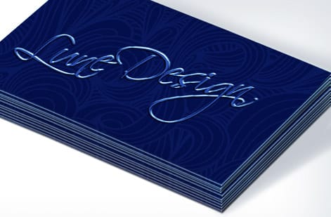
The printed equivalents are all better than they sound. A blind emboss presses the shape into the card with no ink, so it is felt before it is seen. A spot gloss mark on an uncoated or soft touch surface only appears when the card is tilted to the light. A tint printed a few percent off the paper color reads as a ghost, exactly like the real thing.
Pick one and only one. The whole appeal of Allen's card is that it withholds. Two effects on a single card turns the joke back around on you, which is the outcome the scene is really warning about.
Step 6: lay it out so the paper gets the credit
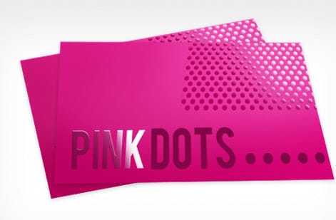
Premium cards are mostly empty. Set generous margins, keep everything off the edges, and let a single alignment run through the card so the eye has one path. A left-aligned block at the lower left with the firm name at the top is a formula that has survived a century of corporate stationery for good reason.
Technically, build the file at 3.5 by 2 inches, add bleed on all four sides, and pull live text well inside the trim so the cut never crowds it. Set solid blacks as rich black only when they are large areas, keep small type to a single ink so it stays crisp, and outline or embed fonts before export.
If you want to see how much variation the format allows before you commit to restraint, the collection of 30 amazing business card designs shows the other end of the spectrum, and it makes a strong case for how loud a card can get.
Step 7: print it, and know what it costs
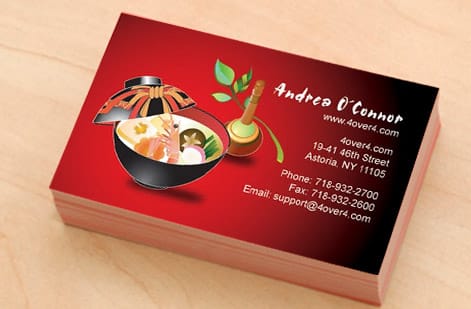
Order a small first run before you order a thousand. Paper color and surface never look on screen the way they look in the hand, and the point of the whole exercise is what happens in the hand. Check the color against a bright white sheet, flex the card, tilt it to the light, and only then commit to the full quantity.
Cost follows format and finishing rather than design complexity. Among the card formats here, business card stickers start at $10.76 and business card magnets start at $19.68, while 3D lenticular business cards start at $690.88 because the lens is manufactured, not printed. Compare against what you have paid before with our Vistaprint price comparison.
One last thing worth saying plainly. Nobody is going to hold your card up to the window looking for a watermark. They will feel the weight, notice the color, and read the name. Spend your money in that order and the card wins the room.
Wally explains the card
The paper is the argument, not the artwork
Wally has watched people lose this contest with beautiful designs on terrible paper. His rule is to spend on the sheet first. Warm off-white instead of bright white, real weight in the hand, one quiet finishing detail, and type small enough to look confident. Order a short run, hold it, and only then print the whole box.
Configure premium cards →Infographic
The anatomy of the card, at a glance
One frame, seven specifications. Save it, send it to whoever is placing the order, and use it as the checklist when you configure the job.
No single spec wins on its own. The card in the scene works because the color, the weight and the mark all agree with each other, and because nothing else on the card competes for attention.
Specs and pricing
Card specs and live pricing
When the file is ready, the rest is a configuration. Pick quantity, stock and finishing, and the price updates as you go so there is no guessing before checkout.

| Quantity | Price Per Unit | Total |
|---|---|---|
| 500 | $1.38 | $690.88 |
| 1,000 | 80.1¢ | $800.72 |
| 2,000 | 53.2¢ | $1,064.33 |
| 3,000 | 43.5¢ | $1,305.98 |
| 5,000 | 35.1¢ | $1,756.30 |
| 10,000 | 31.8¢ | $3,184.20 |
| 15,000 | 26.4¢ | $3,953.06 |
| 20,000 | 23.6¢ | $4,721.92 |
Print it
Card formats worth putting in someone's hand
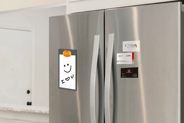

See it in use
Real card work, printed in-house








Explore more
Where to go next


By the numbers
Printing you can count on at 4OVER4.COM
Common Questions
Common questions about the Paul Allen card
What is the Paul Allen business card?
It is the card handed across the table in the boardroom scene of American Psycho, and it wins the contest because Patrick Bateman cannot argue with it. The lines he uses are the whole spec sheet: subtle off-white coloring, tasteful thickness, and a watermark. The card belongs to a rival at the same firm, printed on better paper than everyone else at the table, and that single detail is what breaks him.
How do I choose the right stock for a Paul Allen style card?
Start with color temperature, not weight. Pull a natural white, cream or ecru cover stock and hold it next to a bright white sheet in daylight, and the warmer sheet is the one that reads as expensive. Then choose an uncoated or soft touch surface so the card absorbs light instead of bouncing it. Coated gloss is the fastest way to lose the effect, because gloss reads as retail while a soft, slightly toothy sheet reads as private banking.
What font is Silian Rail?
It does not exist. Silian Rail, Romalian type and pale nimbus were invented for the film, which is part of the joke, because the men arguing over them cannot tell a typeface from a paper color. To match what is on screen, set the name in a classic serif or an engraved-style face such as Garamond, Baskerville, Bodoni or Copperplate Gothic, use small caps for the company line, and open the letterspacing.
What is the difference between bone, eggshell and off-white?
In practice, very little. All three describe a white with a warm cast rather than a blue-white brightener. Bone leans grey and dry, eggshell leans slightly yellow, and off-white is the catch-all. Printers care about the measurable version of this, which is the brightness rating of the sheet, so ask for a lower brightness natural stock.
Can you print a real watermark on a business card?
No. A true watermark is pressed into the pulp while the paper is still wet at the mill, which is why it appears on writing stock rather than cover stock. On a printed card you imitate it three ways: a blind emboss with no ink, a spot gloss shape on a matte surface that only shows at an angle, or a mark printed in a tint a few percent away from the paper color.
What does a Paul Allen style business card cost and how are prices set?
Price follows quantity, stock caliper and finishing, in that order. Ordinary quantities on standard stock stay inexpensive, and every extra process adds a pass on press or on the finishing floor. At 4OVER4 business card stickers start at $10.76, business card magnets start at $19.68, and 3D lenticular business cards start at $690.88, so the format you choose sets the floor before options are added.
What sizes, stocks and finishes are available for premium business cards?
The standard American card is 3.5 by 2 inches, and that is the size the film prop follows, so stay there unless you want the card to stand out for the wrong reason. From there you choose caliper, surface and effect. Heavier stocks and duplexed builds give you the thickness cue, uncoated and soft touch give you the hand feel, and raised or specialty finishing gives you the detail people notice second. The specs widget on this page lists the live options for the card format shown.
How long does printing and shipping take?
Turnaround is quoted in business days from the moment your file passes preflight, not from the moment you click order, so a file with correct bleed and outlined type moves faster than a rushed one. Simple cards finish quickest, and specialty stocks or added finishing steps add production time because the sheets have to pass through another machine. Live turnaround options and shipping speeds are shown on the product page when you configure quantity.
Get Started
Ready to print the card that ends the conversation?
Choose the stock, add the weight, keep the type quiet, and let 4OVER4.COM handle the press work. Order a short run first and hold it before you commit.
Legal Disclaimer
Gold Standard guarantees apply to all standard orders placed through 4over4.com. Price match requires verifiable proof of a competitor's published price for an equivalent product with matching specifications and turnaround time. Satisfaction guarantee covers manufacturing defects and print quality issues. Contact support with order number and documentation. On-time delivery rate based on tracked orders 1999 to 2026. Individual results may vary based on shipping carrier performance.
