
How to Design a School Brochure That Answers Every Parent Question


Choose the fold, plan every panel, write for one family rather than four audiences, then pick paper and finishing that match the school you are describing. This is the full admissions workflow, from first outline to a printed run that arrives before your open house.
To design a school brochure, choose the fold first, then map one admissions question to each panel. A letter tri-fold gives six panels: cover, mission, academics, student life, admissions steps and dates, and contact with a tour link. Write for a single prospective family, use real photographs of your own students, keep body copy at 10 to 11 points, and print on a text weight that folds cleanly. Order the run with a week of slack before your event date.

Start here
The whole process in one paragraph
A school brochure is an ordered answer to a family's checklist, not a highlight reel of everything the school is proud of. Decide which family you are writing for, choose the fold so the panel count fixes your outline, then assign one admissions question to each panel. Write short, use real photographs of your own students, keep type large enough to read at arm's length, and let your school colors act as accents rather than backgrounds. Proof the dates and figures with the people accountable for them, pick a paper that folds cleanly and feels considered, and order the run with enough slack that shipping is never the reason a table sits empty.
Why a school brochure still decides enrollment conversations
A family walks the campus for forty minutes, meets two teachers, and leaves with a folded piece of paper. That paper is what sits on the kitchen counter for the next three weeks while the decision gets made. Everything the tour guide said fades. What stays is the brochure, and whether it answered the question the parents were too polite to ask out loud.
That is why an admissions brochure is not a general marketing piece with a school logo on it. It is a short, ordered answer to a family's real checklist. A well-planned brochure works like a scripted tour: it opens with a reason to keep reading, walks through academics and student life, names the cost and the calendar honestly, and ends with one thing to do next. The elements of brochure design give you the vocabulary, and the infographic further down compresses this whole process into one frame you can pin above your desk.
Step 1: decide which family this brochure is for
Most weak school brochures fail before a single layout decision is made, because they try to speak to current parents, prospective parents, donors, and the board at once. Those four readers want opposite things. A donor wants outcomes and impact. A prospective parent wants to know whether their specific child will be safe, known by name, and appropriately challenged.
Pick one. For an admissions run, that is almost always the prospective parent of a child entering your lowest grade level, plus the smaller group of transfer families. Write down three sentences about that person before you design: what worries them about their current school, what they will compare you against, and what would make them book a tour this week. Everything on the six panels either serves those three sentences or gets cut.
Then decide how the brochure gets into their hands, because that changes the format. A piece handed across a fair table can be tri-fold and dense. A piece mailed to an inquiry list needs a cover that survives being seen at arm's length in a stack of mail. A piece left in a rack has to work when only the top third of the cover is visible.
Step 2: choose the fold and size that fit admissions content
The fold is not a finishing detail you pick at checkout. It is the outline of the document, and it should be settled before you open a layout file. Each fold gives you a fixed number of panels, and each panel is a fixed amount of reading, roughly 60 to 110 words with a photo, or up to about 180 words if the panel is text only.
A letter tri-fold, 8.5 x 11 flat folded to about 3.67 x 8.5, is the default for a reason. It gives six panels, fits a standard rack and a number 10 envelope, and its panel count maps neatly onto admissions content: cover, mission, academics, student life, admissions steps, and contact. A half-fold on the same sheet gives four larger panels and suits schools that want photography to dominate and copy to stay short. A Z-fold reads as a sequence, so it works when you want a family to move through a timeline such as inquiry, tour, application, decision.
Two constraints catch people out. Panels in a tri-fold are not equal width, because the inward folding panel has to be slightly narrower to tuck in cleanly, so never assume you can move a text block from one panel to another. And anything that crosses a fold line will be crossed by a crease, so keep faces, logos, and headlines away from folds. Design each panel as if it were its own small page, then check the flat spread once at the end.
Step 3: build the panel by panel content plan
Write the plan as a list before you design anything. For a tri-fold, the working structure that consistently earns tours looks like this. Front cover: school name, grades served, one photograph, one promise line. Inside left: what the school is for, in a short paragraph a parent could repeat to a spouse. Inside center: academics, with the specific things that differentiate you rather than generic claims about excellence.
Inside right: student life and support, which is where class size, counseling, arts, athletics, and special education services belong. Back inside panel: admissions steps with real dates, tuition or funding notes, and any financial aid deadline. Back cover: address, phone, email, tour booking link, and a small map or transit note. Every panel gets one heading, at most two short paragraphs, and never more than four bullets.
Resist the pull to add a head of school letter, a full faculty list, and a page of test scores. Those belong on the website or in a longer prospectus. A brochure that a parent finishes is worth more than a brochure that contains everything. If you want a model for how much to leave out, the minimalist brochure approach is a useful discipline, and real company brochure examples show how few words a confident panel actually needs.
Step 4: design a cover that earns the open

The cover has exactly one job, and it is not to summarize the school. It is to make someone unfold the piece. That means one dominant photograph, the school name and mark, the grades served, and a single line that says what you are for. Four elements. A cover carrying five photos, a mission statement, an accreditation seal, and a tagline gives the eye nowhere to land, and a parent who cannot find the entry point puts it down.
Choose the photograph for a specific reason. A wide campus shot signals facilities. A tight shot of two students working together signals attention and relationships, which is what most families are actually shopping for. Whatever you pick, use a real image from your school. Parents recognize stock photography instantly, and it costs you credibility on the first surface they see.
Keep type large and few. One headline, one supporting line, no third level. And leave real margin around the edges. Crowded covers look anxious, generous covers look established, and that impression forms before a single word is read.
Step 5: photography, type, and color that a parent can read

Book one photo session for the season and shoot everything at once: a cover candidate, three or four interior images, and a few horizontals you can crop. Shoot in daylight, get consent forms signed before you shoot rather than after, and prioritize photos where students are doing something rather than posing. One good session supplies the brochure, the flyers, and the banners you will hang for the same enrollment cycle, which is a much better use of budget than commissioning each piece separately.
For type, hold yourself to two families and three sizes. A heading face and a body face are enough. Body copy on a folded panel should sit around 10 to 11 points with generous line spacing, because parents in their forties are reading it at arm's length under fluorescent light in a gym. Anything under 9 points on an admissions piece is a decision to not be read.
Color is where school brochures most often go wrong, because school palettes are chosen for uniforms and gym floors rather than for print. Use your school colors as accents on headings, rules, and the call to action, and let white and a neutral tone carry the layout. Set the file in CMYK so the color you approve on screen is close to the color that comes off press, and check that your text color has enough contrast against any photo it sits on.
Step 6: proof it like a legal document, because it partly is

Admissions material makes claims about dates, tuition, accreditation, and program availability, and families act on them. Build a real sign-off list rather than a hallway approval: the admissions director for dates and process, the business office for tuition and aid figures, the head of school for the mission language, and one person outside the process whose only job is to read it cold and mark every sentence they do not understand.
Check the mechanical things separately from the copy. Confirm the phone number by dialing it. Open the tour link on a phone. Verify that every date includes the year, because brochures outlive the season they were printed for. Confirm any required nondiscrimination statement or licensing line your state or accrediting body expects, and place it where it is legible rather than at four points on the back panel.
Then check the file itself. Images at 300 dpi at their final printed size, a bleed on any image that runs to the edge, live text and logos held well inside the trim, and fonts embedded or outlined. Ask for a proof and read the proof rather than the file you sent, since that is the last point where a fold placed on the wrong panel is still free to fix.
Step 7: pick paper and finish that match the school you are describing

Paper is the part of the brochure a parent evaluates before reading a word. A flimsy sheet undercuts a paragraph about rigor and investment, no matter how well written it is. For folded admissions pieces, a text weight around 100 lb gives enough substance to feel deliberate while still folding without cracking. Heavier cover stocks feel excellent in the hand but need scoring before folding, so confirm that if you go that route.
Coating changes the message. Gloss saturates photography and suits schools leaning on facilities, arts, and athletics imagery. Matte and soft touch feel quieter and more academic, and they let a parent write a tour date on the back panel with a pen, which gloss does not. If you are undecided, order free paper samples and hand three options to two parents in your community. They will tell you in seconds which one feels like your school.
One practical note on budget. Per piece cost falls steeply with quantity because setup is fixed, so a run sized for the whole enrollment season usually beats reprinting after each event. Keep undated content on the panels and put the fast-moving dates in one block, so a single spring update is all the piece needs. If you are also pricing outside design help, the breakdown in brochure design pricing is a useful reality check before you approve a quote.
Step 8: print the run and give it somewhere to go
Order backward from the calendar. Fix the open house date, subtract shipping days, subtract production days, and subtract a week of slack for a preflight issue you did not anticipate. Uploading art the night before an event is how schools end up paying rush pricing for a mistake that a calendar would have prevented. If you are building the file in a word processor rather than a design tool, the walkthrough on brochure design in MS Word covers the export settings that keep the fold and the bleed intact.
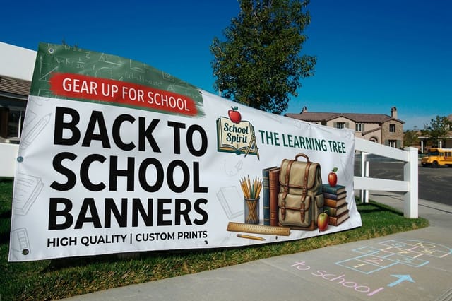
Then plan distribution alongside the print run, because brochures sitting in a supply closet convert nobody. Stock the front desk, the fair table, and the tour packet. Pair the brochure with a smaller takeaway so families leave with something for the child too: Back to School Bookmarks start at $16.48 and get kept, Back to School Flyers start at $57.11 for single event announcements, and Back to School Banners start at $79 to mark the entrance on tour days.
Finally, close the loop. Put one trackable next step on the back panel, whether that is a short URL or a QR code to the tour form, and ask at inquiry how the family heard about you. After one season you will know which panel is doing the work, and the next print run becomes an edit rather than a redesign. Schools that want the same format for a different audience can borrow the structure directly from the restaurant brochure guide or the travel brochure guide, both of which solve the same short-panel problem.
Wally explains the school brochure
Six panels, six answers, one tour booked
Wally has watched a lot of open house tables, and the pattern never changes. The brochures that get taken home are the ones where a parent can find the grade levels in two seconds and the tour link without turning the piece over twice. So he plans the panels before the pixels: one question per panel, one photo of real students per spread, and dates that include the year. Everything else goes on the website.
Design and print brochures →Infographic
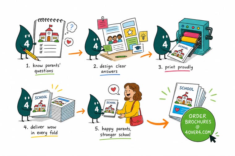
The school brochure workflow at a glance
One frame, seven steps. Save it, print it, or hand it to whoever on your admissions team owns the file this year, so the next run starts from a plan instead of a blank page.
The steps run in order for a reason. Every hour spent on the panel plan saves three on the layout, and a fold chosen after the design is drawn is the most expensive mistake on this list.
Specs and pricing
Brochure specs and live pricing
Once the panel plan is settled, the print decisions are quick. Check the flat sizes, fold options, stocks, and coatings below, then price your run at the quantity your enrollment season actually needs.

| Quantity | Price Per Unit | Total |
|---|---|---|
| 50 | $1.14 | $57.11 |
| 100 | 82.4¢ | $82.38 |
| 200 | 53.3¢ | $106.55 |
| 300 | 41.0¢ | $123.02 |
| 400 | 34.9¢ | $139.49 |
| 500 | 31.2¢ | $155.97 |
| 600 | 26.7¢ | $160.36 |
| 700 | 23.5¢ | $164.75 |
Print it
The rest of the back to school print kit


See it in use
Real brochure work, printed in-house


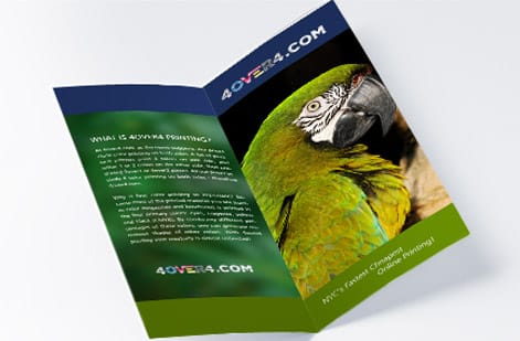
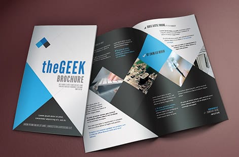
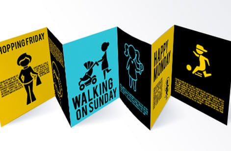
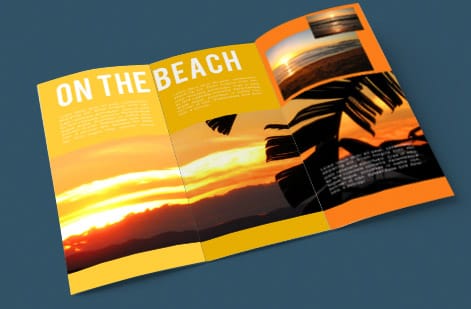
Explore more
Where to go next



By the numbers
Printing your school can count on at 4OVER4.COM
Common Questions
Common questions about school brochures
What is a school brochure?
A school brochure is a folded print piece that introduces a school to prospective families in a few panels. It usually carries the mission in plain language, the grades served, the academic and extracurricular program, admissions dates, tuition or funding notes, and one clear next step such as booking a tour. Schools hand them out at open houses, fairs, and front-desk visits, and mail them to inquiry lists.
How do I choose the right school brochure format?
Start from how much you have to say and where the piece will be handed over. A letter tri-fold fits a fair table, a rack, and a standard envelope, and gives you six panels, which is enough for mission, program, admissions steps, and a call to action. Choose a bi-fold when you want larger photos and fewer, longer sections. Move to a booklet only when curriculum detail, faculty bios, and results genuinely need more than eight panels.
What does a school brochure cost and how are prices set?
Price is driven by quantity, flat size, paper weight, whether you print one or both sides, the coating, and the fold. Cost per piece drops sharply with volume because setup is spread across the run, so 1,000 brochures often costs only modestly more than 250. Turnaround is the other lever: standard production is the cheapest, and rush options add a premium.
What sizes, stocks, and finishes are available for school brochures?
Common flat sizes are 8.5 x 11, 8.5 x 14, and 11 x 17, folded to letter tri-fold, half-fold, or Z-fold. Text weights around 100 lb gloss or matte fold cleanly and are the usual choice for admissions runs, while heavier cover stocks suit short-run prospectus pieces. Gloss makes photos of campus and students pop, matte and soft touch feel calmer and take pen notes better at a fair table.
How long does school brochure printing take to print and ship?
Production time is counted in business days after your file passes preflight, and folding adds a step beyond a flat print. Standard runs typically move through production in a few business days, with faster options available when an open house date is fixed. Shipping time sits on top of production, so work backward from the event and upload art with a week of slack.
What should go on the cover of a school brochure?
One photograph of real students on your real campus, the school name and logo, the grades served, and a short line that says what the school is for. Leave the address, the phone number, and the tour link for the back panel. A cover that tries to hold the mission statement, four photos, and an award list gives a parent nothing to focus on.
How many panels does an admissions brochure need?
Six is the practical answer for most schools, which is a letter sheet folded into a tri-fold. That gives you a cover, an inside spread of three panels for academics, student life, and support services, one panel for admissions steps and dates, and a back panel for contact details and the tour call to action. Anything beyond that usually belongs in a booklet or on your site.
Get Started
Ready to print your admissions brochure?
Bring the panel plan to 4OVER4.COM and we will handle the fold, the stock, and the run size, so your table is stocked before the first family walks in.
Legal Disclaimer
Gold Standard guarantees apply to all standard orders placed through 4over4.com. Price match requires verifiable proof of a competitor's published price for an equivalent product with matching specifications and turnaround time. Satisfaction guarantee covers manufacturing defects and print quality issues. Contact support with order number and documentation. On-time delivery rate based on tracked orders 1999 to 2026. Individual results may vary based on shipping carrier performance.
