
How to Create a Professional Letterhead That Prints Perfectly


A great letterhead is built on format, not decoration. Here is the standard size, margins, and layout every letterhead should follow, then a step-by-step for building and printing your own.
To create a letterhead, set up an 8.5 by 11 inch portrait page with one-inch margins, put your logo and business name in the top header, keep the center open for the letter, and add contact details in a light footer. Use two fonts at most, your brand colors sparingly, then export a CMYK press-ready PDF for printing.
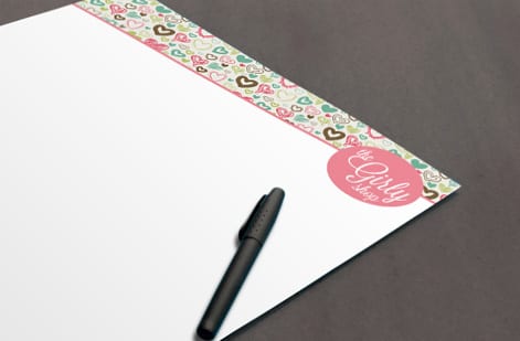
Start here
Creating a letterhead, in one paragraph
A letterhead is a branded 8.5 by 11 inch frame built around the letter that sits inside it. Put the logo, business name, and contact line in a top header, keep the large center open for the body of the letter, and add a light footer with address or website. Use one-inch margins, at most two fonts, your brand colors sparingly, and export a CMYK press-ready PDF. The layout below maps exactly where each piece belongs.
Watch it printed
See standard letterheads on the press, in 142 seconds
Why letterhead format signals professionalism
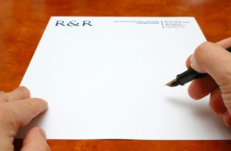
A letterhead is read before it is read. The moment a letter arrives, its header, spacing, and paper quality tell the recipient how established and careful your business is, all before they take in a single sentence. A rushed or crowded letterhead undercuts even the best-written message, while a clean, consistent one lends authority to everything printed on it.
That is why format comes first. A letterhead is not a poster to fill with graphics; it is a frame built around the letter that will sit inside it. Get the size, margins, header, and footer right and the design almost takes care of itself. This guide covers both halves: the standard format and layout every letterhead should follow, and the step-by-step of building and printing your own.
When you are ready to produce it, custom letterheads from 4OVER4.COM print on quality stocks with fast turnaround, and our full letterhead printing range covers everything from everyday text weight to premium foil. If you would rather not build the file from scratch, the free online design tool and ready-made templates give you a professional starting point.
The anatomy of a letterhead
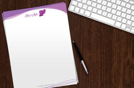
Every well-made letterhead is built from three simple zones, and understanding them is most of the battle. The header at the top carries the logo, business name, and often the primary contact line. It is the identity block and it is where the reader's eye lands first, so it should be clear and confident without swallowing the page.
The body area is the large open center, and its job is to do almost nothing. This is the space the actual letter occupies, so it stays clear of graphics, heavy watermarks, or anything that would fight with typed text. Leaving it open is a deliberate design choice, not an empty one.
The footer at the bottom balances the header. It is a natural home for the mailing address, website, phone, or a short tagline, set lightly so it grounds the page without competing for attention. When the header is bold, keep the footer quiet; when the header is minimal, the footer can carry a little more. That balance is what makes a letterhead feel designed rather than assembled.
Standard letterhead format: size, margins, and safe zones
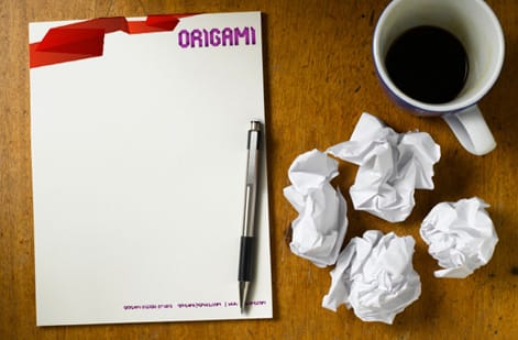
The standard US letterhead is 8.5 by 11 inches in portrait, matching common printer paper and envelopes, with A4 as the international equivalent. Set margins to one inch on all sides. That margin is not decoration: it frames the letter, keeps typed text away from the paper edge, and ensures nothing important sits where a printer or a trim could clip it.
Think in zones. Reserve roughly the top 1.5 to 2 inches for the header, keep the broad center open for the body, and give the bottom 0.75 to 1 inch to the footer. If a design element such as a color band or a side rule runs all the way to the paper edge, add 0.125 inches of bleed past the trim so it prints edge to edge with no thin white line. Anything you cannot afford to lose stays inside the one-inch safe margin.
These are the same print fundamentals behind every product we make, and our full guide to creating print-ready files covers bleed, trim, and CMYK in depth if you want the mechanics. For letterhead specifically, the layout diagram above maps exactly where each zone belongs.
The contact block order, and the second sheet
The format of the contact block follows a fixed reading order, and readers notice when it is scrambled. Business name first, then the street address on one or two lines, then phone, email and website. If the company is registered, its legal name with Inc, LLC or Ltd belongs in the block or the footer, and a licensed trade adds its license number on the same line. Keep the block to one typeface at 8 to 10 point and align it to the logo edge.
A letter that runs past one page needs a second sheet. The rule is a plain matching stock with the header removed, or the logo alone reduced to a corner, so the second page is recognizable as yours without repeating the whole block. Order both at the same time so the paper matches.
The same format also travels as a PDF. Export a version with the header and footer in place and the body empty, and staff can type or paste a letter into it for email. For the Word template route, our guide to making a custom letterhead in MS Word sets the margins to match the printed sheet from standard letterheads.
Design choices that keep it clean
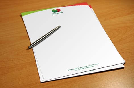
With the format set, good letterhead design is mostly about restraint. Limit yourself to two fonts at most, one for the business name and one for the smaller contact details, and let them do quiet, consistent work. Mixing too many typefaces is the fastest way to make a professional page look amateur.
Use your brand colors, but sparingly. A colored rule, a tinted logo, and one accent are plenty; the page should still read as mostly ink on paper. Whitespace is the secret ingredient, since the open, uncrowded look is exactly what reads as premium and expensive. Resist the urge to fill space just because it is there.
Keep the logo sharp by building it from vector art so it stays crisp at print size, a point our letterhead design tips guide expands on. If you are building a whole branded set with matching envelopes and cards, our guide to custom stationery printing shows how to keep every piece consistent.
Getting your letterhead print ready
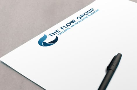
A letterhead that looks perfect on screen still has to print that way. Before you order, convert the file to CMYK so the ink color previews accurately, flatten the artwork, embed or outline your fonts, and export a press-ready PDF. If any color runs to the paper edge, include the bleed you built earlier. When you order with us, that file also runs through a free file check so a second set of eyes catches anything first.
Then it comes down to the stock. Everyday letterheads on quality uncoated text weight feel professional and take a pen cleanly for signatures. Prefer to feel the paper first? Weigh the options in the specs panel below.
From there, printing cost is easy to reason about: it scales with quantity, stock, and finish, and the configurator shows the price live as you choose. Whether you need a modest run for formal mail or a large batch for a growing team, you can dial in exactly the letterhead you want before it goes to press.
Wally frames the page, then leaves room to write
Header up top, letter in the middle, contact down low
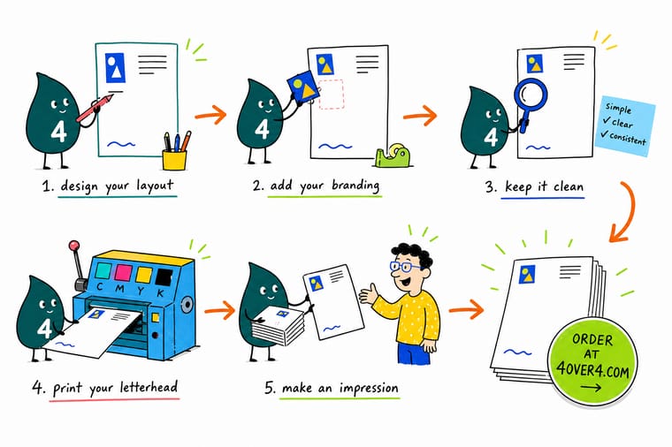
Wally builds a letterhead the smart way: logo and name in the top header, the whole center left open for the actual letter, and address and website tucked into a light footer. One-inch margins, two fonts at most, brand colors used with a light hand. Set it in CMYK, export a press-ready PDF, and 4OVER4 prints it on the stock that makes your business look established.
Print your letterhead →Quick reference
The letterhead format, at a glance
Match these settings and your letterhead is correctly formatted for printing and for everyday office use.
| Element | Standard | Why it matters |
|---|---|---|
| Trim size | 8.5 x 11 in (US letter) | Matches standard printer and envelope sizes so your letterhead works in-office and at the print shop alike. |
| Orientation | Portrait | Letters read top to bottom, so a vertical page keeps the header, body, and footer in the natural reading order. |
| Margins | 1 in on all sides | Gives the typed or printed letter a clean frame and keeps text well clear of the paper edge. |
| Header zone | Top 1.5 to 2 in | Holds the logo, business name, and primary contact line where the eye lands first. |
| Body area | Center, kept open | The large middle is left blank so a letter has room. Never fill it with graphics. |
| Footer zone | Bottom 0.75 to 1 in | A subtle place for address, website, phone, or a tagline that balances the header. |
| Color and file | CMYK, press-ready PDF | CMYK previews true ink color and a flattened PDF prints predictably at 4OVER4.COM. |
Step by step
Build a letterhead in 7 steps
- Set up an 8.5 by 11 document Start a portrait page at US letter size, pull one-inch margins on every side, and add 0.125 in of bleed if any color or band will run to the paper edge.
- Place your logo in the header Anchor the logo top-left or centered at the top. Keep it crisp and reasonably sized so it reads without dominating the page.
- Add the business name and contact block Set the business name near the logo, then a tidy contact line or block with address, phone, email, and website. Align it cleanly to the logo.
- Reserve the body area Leave the large center of the page open. This is where the actual letter goes, so resist filling it with art, watermarks that fight text, or oversized graphics.
- Choose type and color with restraint Pick at most two fonts, one for the name and one for details, and use your brand colors sparingly. Generous whitespace is what makes it look expensive.
- Balance it with a subtle footer Add a light footer with your website, address, or tagline so the bottom of the page feels intentional and mirrors the weight of the header.
- Export a print-ready PDF Convert to CMYK, flatten the artwork, embed fonts, and export a press-ready PDF, then upload it in the configurator or run it through our free file check.
Specs and pricing
Letterhead specs and live pricing
Once the file is ready, the print choices come down to stock, finish, and quantity. Here are the live specs and price-per-unit for custom letterheads at 4OVER4.COM, straight from the configurator.
| Quantity | Price Per Unit | Total |
|---|---|---|
| 50 | $2.00 | $99.95 |
| 100 | $1.05 | $105.44 |
| 200 | 58.2¢ | $116.43 |
| 300 | 43.6¢ | $130.72 |
| 400 | 34.9¢ | $139.49 |
| 500 | 29.4¢ | $147.18 |
| 600 | 25.4¢ | $152.68 |
| 700 | 22.6¢ | $158.17 |
Print it
Print your letterhead with 4OVER4
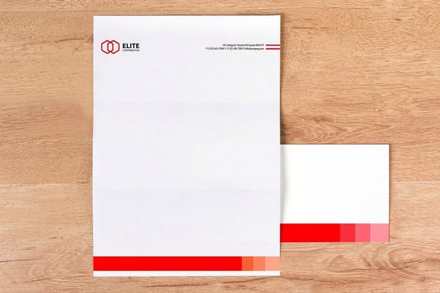
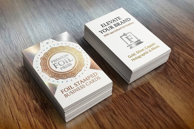

See it in use
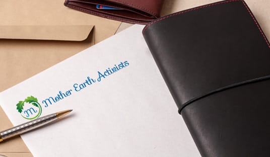
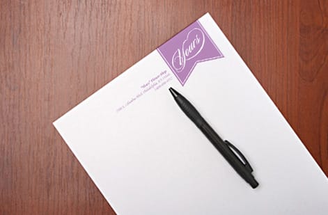
Letterhead layouts that went to press
Explore more
Where to go next


By the numbers
Sixty paper stocks a letterhead can print on
Common Questions
Common questions about creating a letterhead
How do I create my letterhead?
Open an 8.5 by 11 inch portrait page with one inch margins. Put the logo top left or centered, set the business name next to it, and add a contact block with address, phone, email and website. Leave the center open for the letter, add a light footer, and use two fonts at most. Export a CMYK press-ready PDF for printing, or build it in the free online design tool and order from there.
What is legally required on a letterhead?
In the United States there is no single federal rule for most businesses, but state corporate law usually requires a registered company to use its full legal name, including Inc or LLC, on business correspondence, and licensed trades such as contractors often have to show a license number. In the United Kingdom a limited company must print its registered name, company number and registered office address. Check your state or regulator, then put the required line in the footer.
What is the standard letterhead format and size?
In the US, letterhead prints on standard letter paper at 8.5 by 11 inches in portrait orientation, with about one inch of margin on every side. Internationally, A4 (8.27 by 11.69 inches) is the equivalent. The layout is consistent across businesses: a header zone at the top for the logo and business name, a large open body area in the middle for the letter itself, and a slim footer at the bottom for contact details or a tagline. Sticking to this format keeps your letterhead compatible with printers, envelopes, and reader expectations.
Where should the logo and contact information go on a letterhead?
The logo belongs in the header, either top-left or centered along the top edge, paired with the business name so it is the first thing a reader sees. Primary contact details can sit in the header next to the logo or be split so the address, phone, email, and website anchor the footer instead. The important rule is balance: if the header is heavy, keep the footer light, and vice versa. Whatever you choose, keep the large center of the page open for the letter.
What margins should a letterhead use?
One inch on all four sides is the standard, because it frames the letter cleanly and keeps typed text well away from the paper edge where a printer or a trim can clip it. If your design has a color band or graphic that runs to the edge, add 0.125 inches of bleed past the trim so the color prints edge to edge with no white sliver. Keep the header graphics and footer inside their zones so the one-inch working area for the letter body stays clear.
Should I make a letterhead in Word or a design tool?
Both work, and the right choice depends on how the letterhead will be used. A word processor like Microsoft Word is convenient when staff will type letters directly onto the template every day, and our guide on making a custom letterhead in MS Word walks through that path. A design tool or our free online designer gives you finer control over type, spacing, and print-ready output, which matters most when you are printing a stack of letterhead sheets. Many businesses do both: a printed letterhead for formal mail and a matching Word template for everyday correspondence.
What paper stock is best for printed letterhead?
A quality uncoated text-weight stock is the classic letterhead choice because it feels professional, takes a pen for signatures, and runs through office printers without trouble. Order free paper samples first if you want to feel the weight and finish in hand before committing to a full run.
What does it cost to print letterhead, and how are prices set?
Designing the letterhead yourself costs nothing beyond your time, and running the file through our free file check before you order is included. Print pricing then scales with a few levers: quantity, where larger runs lower the unit price, plus the paper stock and any special finish like foil. You set each option in the configurator and the price updates live as you adjust it, so you can see exactly how a heavier stock or a bigger quantity changes the total before you commit.
Get Started
Ready to print a letterhead that looks the part?
Bring your press-ready letterhead to 4OVER4.COM and print it on the stock and finish your brand deserves. Adjust every option and watch your price update live.
Legal Disclaimer
Gold Standard guarantees apply to all standard orders placed through 4over4.com. Price match requires verifiable proof of a competitor's published price for an equivalent product with matching specifications and turnaround time. Satisfaction guarantee covers manufacturing defects and print quality issues. Contact support with order number and documentation. On-time delivery rate based on tracked orders 1999 to 2026. Individual results may vary based on shipping carrier performance.
