
50 Shades of Beer: Every Style by Color


Emma is our prepress and print production voice, built from the knowledge of our production team, with over 20 years in printing.
What Actually Puts the Color in Your Glass
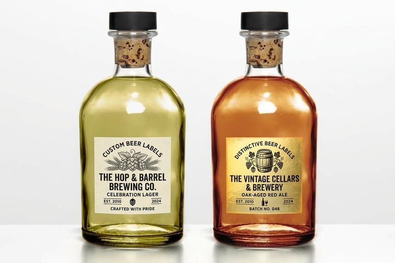
Color is the first thing anyone judges about a beer, and it is decided long before the yeast shows up. Almost every shade you see comes from malted barley and what the maltster did to it with heat and time. Hops contribute almost nothing. Yeast contributes almost nothing. The grain bill is the paint box, and the brewer mixes it the same way a designer mixes ink, which is why a brewery that knows its SRM can match the color on its custom beer labels to the beer in the glass.
Brewers put a number on that shade with SRM, the Standard Reference Method. A lab shines light through a diluted sample and measures how much of it gets absorbed. Low numbers are pale, high numbers are dark, and the scale tops out in practice around 40 where everything simply reads as black. European brewers use EBC instead, which is the same measurement scaled up by about 1.97.
That single number hides a lot of nuance, which is exactly why a visual guide beats a spreadsheet. Two beers can share an SRM of 17 and look nothing alike in the glass, because clarity, carbonation, head retention, and glassware all change what your eye reports. A hazy 6 SRM looks like lemonade. A brilliant 6 SRM looks like liquid gold.
Kilning is the first and biggest lever
Base malt dried gently at low heat stays pale and keeps the enzymes a brewer needs to convert starch. Push the kiln hotter and the Maillard reaction deepens the grain toward biscuit, toast, and caramel. A pilsner malt and a Munich malt come from the same barley. The difference is heat.
Roasted grains do the heavy lifting at the dark end
Chocolate malt, black patent, and roasted barley are used in small percentages and still swing a beer to opaque. Two or three percent of roasted barley in a pale mash drops a beer from 6 SRM to well past 30. This is why dark beers are not automatically strong. Color and alcohol are separate dials.
The boil and the process add the rest
A long boil caramelizes wort sugars and darkens the finished beer on its own, which is why a traditional Scottish ale or a decoction-mashed lager runs deeper than its grain bill predicts. Oxidation, aging, and even the kettle itself nudge the number. Filtration goes the other way and lifts the beer a shade brighter.
Shop the shelf
Beer label printing
Waterproof labels for bottles, cans, and growlers in every stock and finish.
The Beer Color Spectrum From Straw to Black
Here is the whole scale in one strip. Each block is an approximate SRM value with the style family that usually lives there. Print it, pin it above the mash tun, or hand it to whoever is designing your next label.
- 2 to 3 SRM, straw. American light lager, Berliner weisse, some modern hazy pale ales that lean pale as a design choice.
- 3 to 5 SRM, pale gold. German pilsner, kolsch, witbier, hefeweizen, and the classic session lager.
- 6 to 9 SRM, deep gold. Blonde ale, helles, saison, tripel, and most West Coast pale ales.
- 10 to 14 SRM, light amber. American IPA, ESB, and English bitter, the region where hop character and malt sit in balance.
- 14 to 20 SRM, amber to copper. Amber ale, marzen, Vienna lager, Irish red, and dark saisons.
- 20 to 28 SRM, brown and ruby. Brown ale, bock, dubbel, dunkel, and altbier held up to a bright window.
- 28 to 40 and beyond, near black. Porter, stout, schwarzbier, and imperial stout that swallows light entirely.
Charts like this one travel well because they answer a question in a single glance. If you build content for a taproom or a brand, the same principle applies across categories, and there are more layouts worth borrowing in our roundup of the best infographic examples for business.
Print picks
Three beer label formats worth a look
Live prices, ready to customize with your artwork and bottle size.
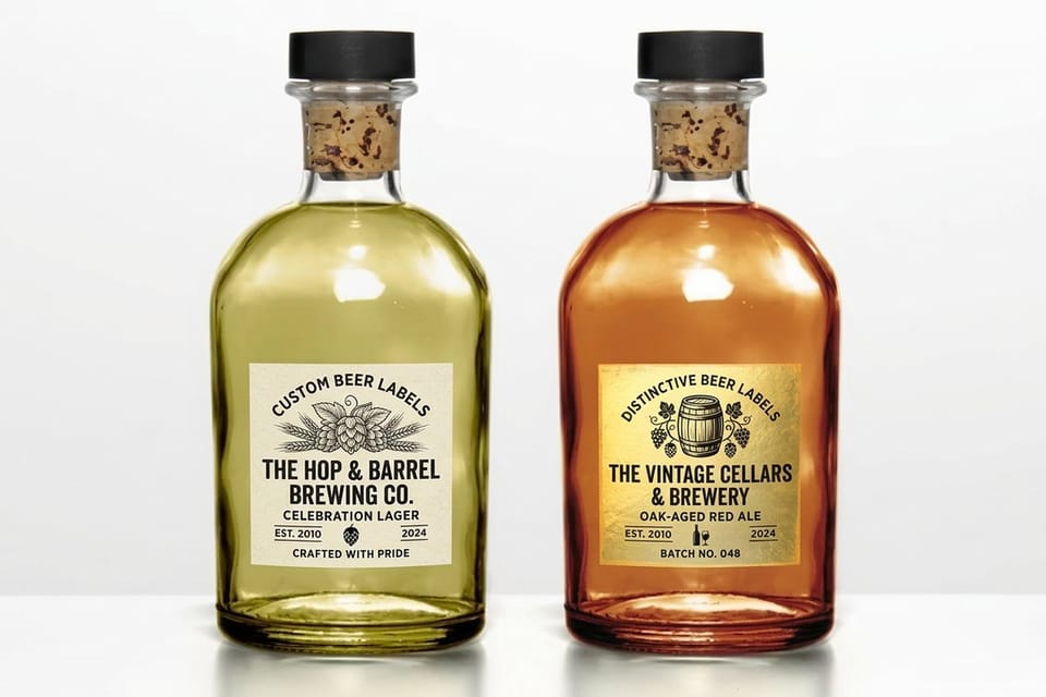
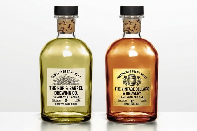 Custom Beer Labels 25 for $25 Waterproof labels for bottles and cans, cut to any shape you need.
 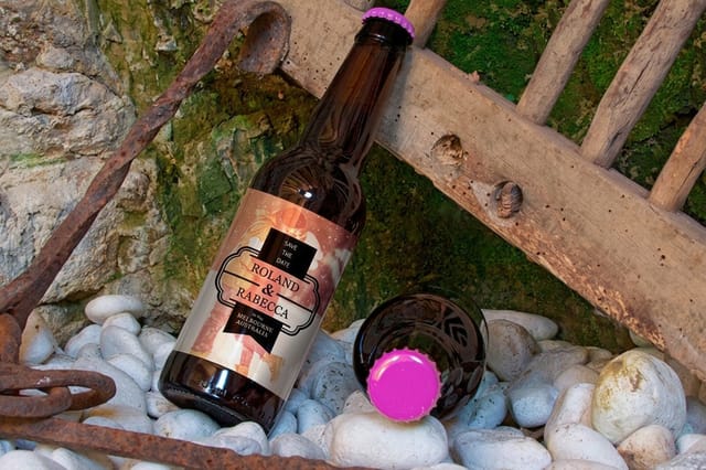 Premium Beer Labels 25 for $29.16 Heavier stocks and richer finishes for a shelf-facing flagship release.
 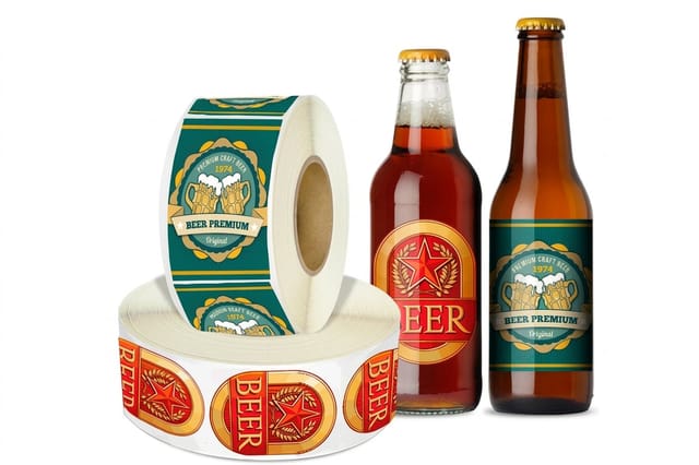 Roll Beer Labels 100 for $322.98 Rolled and wound for fast, repeatable application on a production run.
 Pale Styles and Why They Are the Hardest to Hide Behind
Anything under about 6 SRM is naked. There is no roast to cover a flaw, no caramel to mask a fermentation problem, and every speck of haze or protein shows. Brewers who take pale styles seriously tend to be fanatical about water chemistry and cold-side handling, because the beer reports on them honestly.
- American light lager, about 2 SRM. Straw pale, brilliantly clear, built for volume and consistency rather than complexity.
- German pilsner, 3 to 4 SRM. Pale gold with a dense white head, crisp bitterness, and a bready pilsner malt backbone.
- Hefeweizen, 3 to 6 SRM. Pale but cloudy, because suspended yeast scatters light and turns straw into soft cream.
- Witbier, 3 to 5 SRM. Unmalted wheat and oats add a milky opacity that reads paler than the SRM number suggests.
- Blonde ale, 5 to 8 SRM. The friendliest gold on the board and the most common gateway pour on a taproom list.
Design implication for a label at this end of the scale: the beer itself brings almost no visual weight. Clear glass plus a pale beer means your label is carrying the entire shelf presence, so contrast and legibility matter more here than anywhere else on the spectrum.
Amber and Copper, Where Malt Takes the Wheel
Between roughly 10 and 22 SRM the malt stops being a background note and becomes the point. Crystal and caramel malts land here, and they bring toffee, dried fruit, and a fuller body along with the color. Held against a light, these beers glow rather than shine, and the head takes on an off-white or tan cast that pale beers never get.
- American amber ale, 11 to 18 SRM. Caramel malt against citrus hops, the archetype of the balanced brewpub pour.
- Vienna lager, 10 to 16 SRM. Clean, toasty, and copper-clear, one of the most underrated colors on the chart.
- Marzen and Oktoberfest, 8 to 17 SRM. Deep gold to light amber depending on how traditional the brewer is feeling.
- Irish red ale, 9 to 14 SRM. A ruby flash at the edge of the glass that comes from a pinch of roasted barley.
- English bitter and ESB, 8 to 18 SRM. Amber with a nutty malt center and restrained carbonation.
Amber beers are the friendliest to photograph and the friendliest to design around. The liquid supplies a warm mid-tone, so a label can go cream, black, or deep green and still read cleanly through the glass.
Brown, Ruby, and Black at the Deep End
Past roughly 22 SRM the human eye gives up on grading. A brown ale and a stout can look identical at arm length in a dim taproom, and only a bright backlight reveals the ruby or garnet edge that separates them. Brewers use that edge as a tell. Hold a schwarzbier to a window and you will usually find deep red where a true imperial stout stays flat black.
- Brown ale, 18 to 26 SRM. Nutty and chestnut brown, clear when you light it properly.
- Dunkel and altbier, 14 to 28 SRM. Malty lagers whose color comes from Munich malt rather than roast.
- Porter, 22 to 35 SRM. Chocolate malt drives it, with a tan head and a mocha finish.
- Dry Irish stout, 25 to 40 SRM. Roasted barley gives coffee bitterness and a ruby glow at the rim.
- Imperial stout, 40 SRM and up. Fully opaque, with a head that ranges from tan to genuine brown.
Because the liquid absorbs light rather than reflecting it, dark beers make the glass look heavier and the label look brighter by contrast. Metallic and light-toned labels perform unusually well here, which is worth remembering before you commit to artwork.
Quantity and price
Beer label pricing and specs
Real configurator numbers. The more you print, the lower each label lands.
| Quantity | Price Per Unit | Total |
|---|---|---|
| 25 | $1.00 | $25.00 |
How Breweries Turn Beer Color Into Brand Identity
Walk a bottle shop and you will notice the good brands do one of two things. Either the label mirrors the beer, so a golden helles around 4 SRM wears warm yellows and a stout past 40 SRM wears near black, or the label deliberately contradicts it to create a shelf jolt, such as a pale lager on a black clear label. Both work. What fails is a palette chosen at random with no relationship to what is inside.
Mirroring is the safer play for a core lineup, because it makes a range legible at a glance and helps a regular grab the right one without reading. Contrast is the stronger play for a limited release you want people to notice. The reasoning behind both is the same reasoning that governs every other brand decision, which we unpack in the psychology of colors in business.
Once you pick a direction, lock it down as a real palette rather than a vibe. Assign a hue to each core beer, define the neutrals that hold the family together, and write down the rules for seasonals. Our walkthrough on choosing your brand colors is the same exercise breweries run before a rebrand, and it pays for itself the first time you scale from four SKUs to twelve.
Color also carries meaning that has nothing to do with malt. Designers who use it as storytelling rather than decoration get the most out of it, and there are strong examples of exactly that in this collection of must-see graphic designs.
Premium finish
Premium beer labels
Heavier stocks and finishes that hold foil and metallic accents against a dark bottle.
Designing a Label That Matches What Is In the Bottle
A beer label lives a hard life. It goes into an ice bath, it sweats through condensation, it gets grabbed with wet hands, and it has to still look sharp on a taproom table two hours later. That rules out ordinary sheet paper before the design conversation even starts. Waterproof face stock with a permanent adhesive is the baseline, not an upgrade.
Format follows your bottling reality. Hand-applying a small batch means cut singles or sheets are fine. Running a semi-automatic applicator or a co-packer line means you need Roll Beer Labels wound to a specified core, direction, and count. Getting the wind direction wrong is the single most common and most expensive mistake in a first roll order, so confirm it with whoever runs the machine before you submit artwork.
If you have been printing short runs on blank sheets from an office supply store, the jump in durability and color fidelity is dramatic. We compared the two paths directly in this Avery 5164 beer bottle label alternative breakdown.
Built for the line
Roll beer labels
Wound to your core size, direction, and count so a labeling machine can run them without a jam.
Getting Color Accuracy From Screen to Printed Label
The gap between the amber on your monitor and the amber on a printed label is where most first-time brewery projects go sideways. Screens emit light and use RGB. Presses lay down ink and use CMYK. Some of the most saturated screen colors, especially electric oranges and glowing greens, simply do not exist in a four-color process, so they shift on press whether you plan for it or not.
The fix is to design in CMYK from the start and to specify spot colors for anything that must stay exact across a whole product family. That system has a long history worth knowing, which we cover in the history behind Pantone colors. The same discipline applies to any print piece where a brand color has to repeat, including the coasters and cards that go out with it, as we show in the best colors for business cards.
- Build in CMYK. Convert early so you make your color decisions in the space the press actually prints in.
- Watch the stock. Uncoated and textured papers absorb ink and read softer and darker than the same file on gloss.
- Mind the substrate. Clear and metallic face stocks let the bottle show through, so plan a white ink layer under anything that must stay opaque.
- Order a proof. One printed sample before a full run costs less than reprinting a thousand labels in the wrong copper.
Compare finishes
Popular beer labels, side by side
Sheet labels at 25 for $23.88 next to roll labels at 100 for $322.98, on stock and turnaround.
| Custom Beer Labels | Premium Beer Labels | Roll Beer Labels | 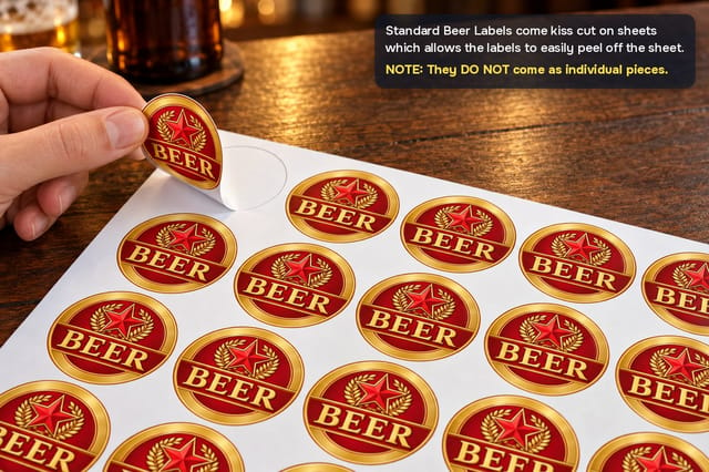 Standard Beer Labels | |
|---|---|---|---|---|
| Min price | $25.00 | $29.16 | $322.98 | $23.88 |
| Paper / stock | Uncoated Label | Uncoated Label | White Gloss (Indoor) | Standard Uncoated Label |
| Size | 2" x 3.5" | 3" x 5" | 1" x 1" | .5" Circle |
| Default qty | 25 | 25 | 100 | 25 |
| Turnaround | 3 business days | 3 business days | 6 business days | 3 business days |
| Rating | ||||
| View & customize | View & customize | View & customize | View & customize |
Preparing Label Artwork That Prints Right the First Time
Once the palette is settled, the mechanical setup decides whether it survives. Build at 300 dpi, add an eighth of an inch of bleed on every edge, and keep type and logos a safe distance inside the trim so a small shift on the die never clips a letter. Flatten transparency effects and embed or outline your fonts before you export.
Do not forget the copy the label is legally required to carry. Government warning text, net contents, alcohol content, and your producer statement all need space in the layout, and they have minimum type sizes. Reserving that block early is far easier than shoehorning it in after the artwork is approved. Start from a print-ready blank sized to your exact bottle or can, and browse the finishes on beer labels printing before you commit.
Match the finish to the beer
- Pale lagers and pilsners. High-contrast artwork on a bright white face stock so the label carries the shelf presence.
- Hazy and hoppy styles. Matte or textured stock reads as craft and photographs beautifully next to a cloudy pour.
- Amber and copper ales. Warm neutrals and cream backgrounds that pick up the glow of the liquid behind them.
- Stouts and porters. Foil, metallic accents, or spot gloss that lift off an otherwise black bottle.
Start fast
Label templates and print-ready blanks
Free layouts plus exact-size blanks so your artwork lands on the die every time.
Wally reads the color before he reads the label
From straw lager to imperial stout, and the label that goes on the bottle
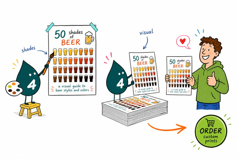
Beer color comes from malt, and brewers score it on the SRM scale from about 2 for a pale lager to 40 and beyond for a stout. Pale beers hide nothing, so the label carries the shelf presence. Dark beers absorb light, so metallic and bright artwork pops. Pick your shade, design in CMYK, then print it on waterproof stock that survives the ice bucket.
Design your beer labels →What the Color Chart Means for Your Next Release
Explore more
More on color, labels, and print for your brewery
Beer labels on sheets, rolls and premium stock, plus the psychology of colors, choosing brand colors and the history of Pantone.
Shop Beer Labels Printing Every beer label format, stock, and finish in one place. Product Custom Beer Labels Waterproof custom labels for bottles and cans from $25. Product Premium Beer Labels Heavier stocks and richer finishes for a flagship release. 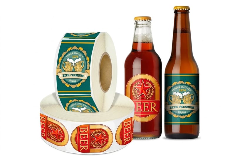 Product Roll Beer Labels Wound on rolls for hand or machine application.
  Article Best Infographic Examples Layouts worth borrowing for your next visual guide.
  Article Psychology of Colors What each hue signals before anyone reads a word.
  Article Choosing Brand Colors Build a palette that scales from four SKUs to twelve.
  Article History of Pantone Colors How spot color became the standard for exact matching.
  Article Best Colors for Business Cards Color decisions that carry across every printed piece.
  Article Must-See Graphic Designs Color used as storytelling rather than decoration.
  Alternative Avery 5164 Alternative Blank office sheets versus press-printed beer labels.
 Put your beer’s color on the bottle
Pick the shade that matches what you brewed, choose a stock that survives the cooler, and upload your artwork. Live pricing, real proofs, and labels built for cold, wet bottles.
Beer Color and Beer Label FAQ
What does a beer color chart actually measure?
A beer color chart plots the Standard Reference Method value, or SRM, which comes from measuring how much light a diluted sample of beer absorbs at a set wavelength. Low numbers near 2 are straw pale, mid numbers around 14 to 20 are amber and copper, and anything past 30 reads as black to the eye. European brewers publish the same measurement as EBC, which is roughly the SRM figure multiplied by 1.97. The number describes shade only, not strength, bitterness, or sweetness. For layout ideas if you want to publish your own version of the chart, see these infographic examples for business.
Should the label mirror the beer or fight it?
Decide first whether the label should mirror the beer or deliberately contrast with it. Mirroring keeps a core lineup legible on a shelf, so a golden helles wears warm yellows and a stout wears near black. Contrast makes a single limited release jump out of a crowded cooler. Whichever you choose, commit to it as a written palette with a defined hue per beer, shared neutrals, and a rule for seasonals, so the family still holds together when you add the next four SKUs.
What does it cost to print custom beer labels?
Beer Labels from 4OVER4.COM start at $25, Premium Beer Labels start at $29.16 for heavier stocks and richer finishes, and Roll Beer Labels start at $322.98 because they ship wound on rolls in production quantities. Price moves with size, quantity, stock, finish, and turnaround, and the per-label cost falls steeply as the run grows. Configure the exact combination on the product page to see live pricing before you order, and add a printed proof if the color has to be exact.
What sizes, stocks, and finishes work best for beer labels?
Beer labels need a waterproof face stock and a permanent adhesive, because they live in ice buckets and sweat through condensation. Standard bottle sizes cover most 12 ounce and 22 ounce formats, and custom die-cut shapes are available when the artwork calls for it. Gloss keeps colors punchy, matte and textured stocks read as craft and photograph well next to a hazy pour, and foil or spot gloss lifts artwork off a dark bottle. Clear and metallic face stocks need a white ink layer under anything that must stay opaque.
Why do roll labels take longer than cut ones?
Turnaround depends on the product, the finish, and the quantity you configure. Straightforward cut labels on standard stock move fastest, while premium finishes such as foil and specialty coatings add production time, and roll labels need extra time for winding and finishing. Each product page shows the available turnaround options with live pricing once you select your size and quantity, so you can trade speed against cost. Order a proof first if the release date is fixed and the color has to land exactly right.
