
19 Alarmingly Bad Print Ads and the Design Lessons They Teach


What Actually Makes a Print Ad Bad

A bad print ad is rarely ugly on purpose. It is usually the result of trying to say everything at once, so a reader takes one look, understands nothing, and moves on. The failures on this list repeat the same few mistakes: no single message, type nobody can read, a photo that fights the words, and no clear reason to act. Fix those four and most of the badness disappears.
The good news is that print is honest. A flyer either communicates in two seconds or it does not, and you can test it before you spend a cent on a full run. As you read through these examples, notice that the cure is almost always subtraction, not a bigger budget. When you are ready to design one that works, the online design templates studio keeps your artwork inside the cut and bleed lines automatically.
4OVER4.COM has printed 10 billion+ products across 1,000+ product types since 1999, which means we have seen every version of a print ad that missed and every version that landed. This walkthrough uses 19 kinds of bad ad to teach the one design lesson each one hides, then points you at the pieces that get it right.
Shop the range
Flyers printing
Every size and stock for a print ad that reads in two seconds and hands out anywhere.
Ads That Try to Say Everything at Once
The most common bad ad is the one crammed with five offers, three phone numbers, and a paragraph of history. It feels thorough to the person who made it and reads as noise to everyone else. A reader will not hunt for the point, so an ad that hides its message behind clutter has no message at all.
The lesson: one ad, one idea
Pick the single most important thing you want a stranger to remember and build the whole piece around it. Everything that does not serve that one idea is a distraction you can cut. If you truly have more to say, that is what a brochure is for, since a folded brochure gives each idea its own panel instead of piling them on one page. The flyer design guide walks the same discipline step by step.
Here are three formats that hold up when you keep the message tight. Live prices, ready for your own artwork.
Print picks
Three formats that land when the message is tight
Live prices, ready to customize with your headline, image, and offer.
Flyers From $57.11 One clear offer, one clear action, printed sharp enough to hand out anywhere.  Posters From $9.79 A single message big enough to read across a room, not a wall of tiny text.
  Brochures From $48.33 Room to tell the story in order instead of cramming it into one panel.
 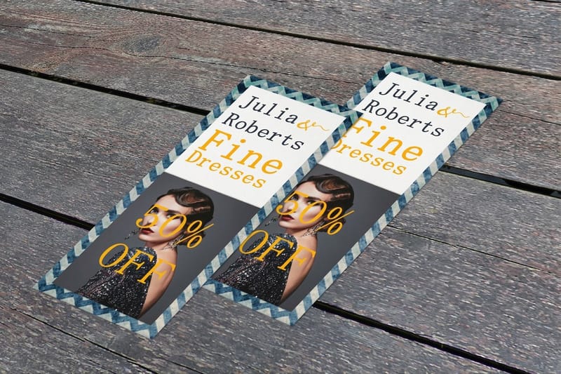 Rack Cards From $37.05 A tall, tidy ad that sits in a display and still says one thing.
 Type You Physically Cannot Read
Tiny type, low contrast, and a script font stretched over a busy photo show up on this list again and again. An ad that a passerby has to squint at is an ad that gets skipped, because reading is effort and nobody spends effort on a stranger's flyer.
The anatomy of an ad that works is boring on purpose. A big legible headline, one supporting image, a clear offer, and an obvious next step, in that order. Here is that skeleton at a glance.
Set the headline large enough to read from three feet away, keep body copy to a real reading size, and put dark text on a light field or the reverse. If you are printing large, the poster design guide covers legibility at distance, which is a different problem than a flyer in the hand.
Photos That Fight the Message
A stock photo of a random handshake, a picture so busy it hides the product, or an image that has nothing to do with the offer all pull a reader away from the point. The image is not decoration. It is the fastest part of the ad to read, so it has to say the same thing the words do.
Use one strong image that reinforces the idea, and give it room to breathe. A single clean product shot on a poster beats a collage of five every time. When the image and the headline agree, a reader understands the ad before they consciously read it, and that two-second head start is the whole game.
- Relevance. The photo must show the thing the ad is about, not a mood.
- Quality. Print at a real resolution so nothing pixelates at size.
- Focus. One subject, clear background, plenty of space around it.
- Agreement. The image and the headline point at the same idea.
No Reason to Act, No Way to Respond
Plenty of ads look fine and still fail because they never ask for anything. No offer, no deadline, no address, no next step. A reader nods and forgets, because a beautiful ad with no call to action is a billboard for a company that apparently does not want customers.
Give people a reason to move now and an obvious way to do it. A limited offer, a clear discount, a date, and a single response path, whether that is a phone number, a QR code, or an address. Adding a QR code to a flyer is the easiest way to connect a printed ad to a live page, and it lets you measure whether the ad worked at all.
Here is what real flyer pricing and specs look like, so you can plan a run against actual numbers instead of a guess.
Quantity and price
Flyer pricing and specs
Real configurator numbers. The more you order, the lower the per-flyer cost drops.
| Quantity | Price Per Unit | Total |
|---|---|---|
| 50 | 79.1¢ | $39.54 |
| 100 | 57.1¢ | $57.11 |
| 200 | 37.3¢ | $74.69 |
| 300 | 28.6¢ | $85.68 |
| 400 | 24.4¢ | $97.76 |
| 500 | 21.8¢ | $108.75 |

The Two Second Test Before You Print
Every fault on this list shows up in one cheap test, and almost nobody runs it. Print the ad at final size on whatever printer you have. Hand it to somebody who has not seen it, face down. Let them turn it over, count to two, then take it back.
Ask three questions. What is being sold, who is selling it, and what were you supposed to do next. If they cannot answer all three, the ad is not finished, and no amount of paper stock will fix it. Most failures show up as a shrug at the first question, which means the message was never decided.
Run it on three people rather than one, because a single reader can be having a good or a bad day with your layout. Then order a free proof for the real thing, since color and trim behave differently on a press than on a desktop printer.
Quantity and price
Flyer pricing and specs
Real configurator numbers. The more you order, the lower the per-flyer cost drops.
| Quantity | Price Per Unit | Total |
|---|---|---|
| 50 | 79.1¢ | $39.54 |
| 100 | 57.1¢ | $57.11 |
| 200 | 37.3¢ | $74.69 |
| 300 | 28.6¢ | $85.68 |
| 400 | 24.4¢ | $97.76 |
| 500 | 21.8¢ | $108.75 |
Cheap Printing That Undercuts a Good Design
The last kind of bad ad is the one that was designed well and printed badly. Flimsy paper, dull color, and a smudged finish tell a reader the business behind the ad is careless, and that impression rubs off on everything you sell. Print quality is part of the message whether you plan it or not.
Choose a stock and finish that match the job. A hand-to-hand flyer wants a sturdy weight that survives a pocket, and a poster wants a surface that keeps color crisp under light. A free proof catches color and layout problems before a whole run goes to press, which is exactly why free proofs exist. The paper selection guide helps you match the piece to the moment.
The workhorse of a print campaign is the flyer, and getting one printed right is cheap. Here is the format that does the most work per dollar.
The workhorse piece
Flyers, printed right
A sturdy stock and true color so a good design does not get undercut at the press.
Fixing an Ad That Has Already Printed
Sometimes the run is in the box and the fault is obvious. There are three honest options and one bad one.
Overprint it. A sticker over a wrong phone number or a dead QR code is not elegant, it is cheaper than reprinting, and nobody outside your office will ever know. Repurpose it. A flyer with a weak call to action still works as a counter handout or as filler in a mailed order. Or pull it and reprint, which is the right answer when the fault is the message rather than a detail, because distributing a confusing ad costs more than the paper did.
The bad option is distributing it anyway and hoping. A print ad is a physical impression of your business, and a careless one sits in a reader's memory longer than the offer does. Take the loss on the paper and protect the impression.
The workhorse piece
Flyers, printed right
A sturdy stock and true color so a good design does not get undercut at the press.
Compare the Formats That Actually Land
Once the design is tight, the format decides how far the message travels. A flyer works in the hand, a poster works across a room, and a brochure works when the story needs room to unfold. Picking the wrong one is its own kind of bad ad, so line the options up and choose with your eyes open.
Here are popular flyer formats compared on stock, finish, size, and from-price, so the format serves the message instead of fighting it.
Compare formats
Popular flyer formats, side by side
Stock, finish, size, quantity, turnaround, and from-price across our most ordered flyers.
 Standard Flyers | 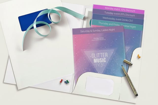 Staggered Cut Flyers | 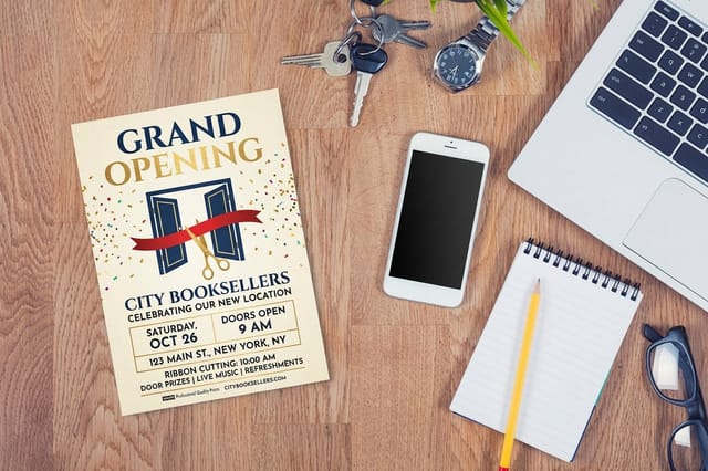 Grand Opening Flyers | 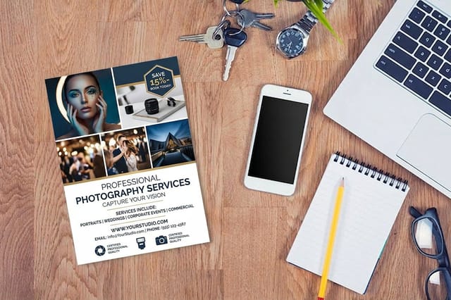 Photography Flyers | |
|---|---|---|---|---|
| Min price | $39.54 | $218.59 | $39.54 | $39.54 |
| Paper / stock | 100# Gloss Text | 100# Gloss Text | 100# Gloss Text | 100# Gloss Text |
| Finish | Standard Finish | Standard Finish | Standard Finish | Standard Finish |
| Size | 4.25" x 5.5" | 8.5" x 11" | 4.25" x 5.5" | 4.25" x 5.5" |
| Default qty | 50 | 50 | 50 | 50 |
| Turnaround | 3 business days | 5 business days | 3 business days | 3 business days |
| Rating | ||||
| View & customize | View & customize | View & customize | View & customize |
Wally turns a bad ad into a good one
One idea, big type, one image, one clear action
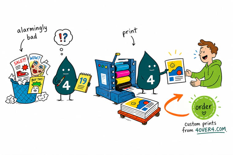
Every bad print ad on this list fails the same way: too much crammed onto one page. Wally does the opposite. Decide the single message, set a headline you can read across a room, pick one image that agrees with the words, and give people a reason to act now. 4OVER4.COM prints the result sharp, on true color, and on time, so a tight design never gets undercut at the press.
Print a flyer that works →The mistakes worth stealing lessons from
Explore more
More ways to make print advertising work
Related pages across 4OVER4.COM, one card each, so you can keep exploring flyers, posters, and design.
Collection Flyers Printing Every flyer size and stock for a print ad that lands.  Shop Posters Printing Large-format posters that read one message across a room. Product Brochures Give each idea its own panel instead of one crowded page.
  Guide How to Design Flyers The step-by-step for a flyer people actually read.
  Guides Design a Poster Eight steps to a poster that carries one clear idea.
  Article Great Large-Format Ads Print advertisements that got the big things right.
  Statistics Print Ad Effectiveness The data on why print ads still convert.
  Showcase Flyer Design Ideas A gallery of flyer layouts that read at a glance.
  Case study Signs That Won Leads How simple print beat a busy ad for a real business.
  Benefit Free Proofs Catch the mistakes on this list before the run prints.
  Service Online Design Templates Lay out an ad inside the cut and bleed lines.
 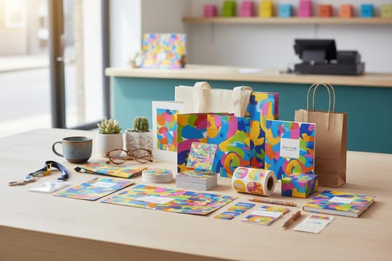 List Storefront Starter Pack A ready bundle of print that actually works together.
 Ready to print an ad people actually read?
Decide one message, keep the type big, and give people a reason to act. 4OVER4.COM prints flyers, posters, and brochures on true color and on time, as fast as same day.
Reader questions on avoiding the same traps
What do print ads mean?
A print ad is any paid or printed message placed where a reader meets it on paper, from a flyer handed over in the street to a full page in a magazine, a poster on a wall or an insert in a newspaper. What defines it is that it is physical and undistracted, so it gets a reader's full attention for a couple of seconds and has to work inside that window.
Can a bad print ad hurt a brand?
Yes, and more than a bad post does, because the paper lasts. A pixelated logo, a smudged finish or a flimsy sheet reads as carelessness, and a reader transfers that impression to the product. The damage is rarely dramatic, it is the quiet decision not to call. That is why print quality is part of the message whether you planned it or not.
Who should approve a print ad before it goes to press?
At least two people who did not write it. One reads for meaning, checking that a stranger can tell what is being sold and what to do next. One reads for detail, checking every phone number, address, date, price and link by using it rather than looking at it. On a regulated claim, add whoever owns that claim. A wrong digit on a full run is a reprint, not an edit.
What are examples of bad print ads?
The classic bad print ads fall into a few buckets: the cluttered ad that tries to sell five things at once, the ad with type so small or low-contrast that nobody can read it, the ad whose photo has nothing to do with the message, the pretty ad that never asks the reader to do anything, and the well-designed ad printed on cheap stock in dull color. Each one fails on a single fixable thing, which is why they are so useful to study. The cure is almost always to subtract until one clear idea, one strong image, and one obvious action remain. See the working version in the flyer design guide.
What usually goes wrong in a print ad?
Most print ads fail before the printer ever gets involved. The message is not decided, so the ad tries to carry three at once and communicates none. From there the common faults stack up: a headline too small to read from three feet, an image that competes with the words instead of reinforcing them, and no reason for the reader to act right now. A smaller but real problem is printing a good design on flimsy paper, which quietly tells the reader the business is careless. Decide the one message first and the rest of the ad gets easier.
How do I avoid designing a bad print ad?
Start by writing the single idea you want a stranger to remember, then design only that. Set the headline large and legible, choose one image that shows the actual thing, and give the reader a clear offer plus one way to respond, such as a phone number or a QR code. Order a free proof so you catch color and layout problems before a full run prints. If you have more to say than one page can hold, move it to a brochure where each idea gets its own panel. The online designer keeps everything inside the safe print area for you.
What does it cost to print an ad that works?
Less than most people expect. At 4OVER4.COM flyers start at $57.11 and posters start at $9.79, both ready for your own artwork, and ordering more brings the per-piece cost down quickly. Price depends on the format, the stock and finish, and the quantity, so a sturdy hand-to-hand flyer and a large-format poster sit at different points. Check the live configurator numbers on each product page, and use a free proof so the money goes toward an ad that actually communicates rather than one that repeats the mistakes on this list.
Are print ads still worth it?
Yes, when they are designed to communicate. Print puts a physical, undistracted message in a reader's hand or on a wall, and a well-made flyer or poster still earns attention that a scrollable feed cannot. The reason so many print ads underperform is not the medium, it is the execution faults on this list. Fix the message, the legibility, the image, and the call to action, print it on a proper stock, and print holds its own against any channel. The data behind that lives in the print advertising effectiveness report.
