
10 Red Dot Design Award Winners That Prove Great Design Sells


Sofia is our design and templates voice, built from the knowledge of our production team, with over 20 years in printing.
Red Dot winners are worth studying because almost all of them make the same three moves: one element wins the first look, one accent supports it, and the material is felt before the layout is read. The ten below are picked for the decision inside each one rather than for the photograph, and the last two sections turn those decisions into settings you can hand a printer. On paper each move maps to a product: the material to soft touch business cards, the accent to spot UV business cards or raised foil, and a sequence of ideas to a brochure.
Award-level finishes and where each one fails
| Finish | What it does | Where it fails | What the file needs | Product at 4OVER4 |
|---|---|---|---|---|
| Soft touch stock | Velvet surface you feel before you read | Shows fingerprints on heavy dark solids | Full-bleed art, no separate layer needed | Soft Touch Business Cards, 50 for $40.28 |
| Spot UV gloss | Wet gloss shine on a matte field | Low contrast on gloss stock, best on silk laminate | Separate vector layer, 100% K where gloss goes | Spot UV Business Cards, 500 for $76.88 |
| Raised foil | Metallic ink with height you feel | Type under about 6pt fills in and closes up | Vector art, strokes at 0.5pt or heavier | Raised Foil Business Cards, 100 for $86.78 |
| Plain 16pt uncoated | Rigidity and a clean readable surface | Nothing catches the light, so layout carries it | CMYK at 300 DPI, no special layer | Premium Business Cards, 100 for $17.57 |
| Folded brochure | Room for a sequence instead of one panel | Type crossing a fold breaks mid-letter | Half fold only, so plan two equal panels | Standard Brochures, 50 for $57.11 |
Each finish is its own product with its own stocks, so the price column shows each one at its smallest run.
What the Red Dot Award is, and what it is not
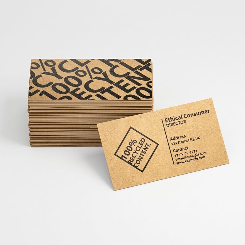
The Red Dot Award is a design competition run by Design Zentrum Nordrhein Westfalen in Essen, Germany. A jury of practicing designers judges entries across three programs, Product Design, Brands and Communication Design, and Design Concept, and the top pieces take the Red Dot, Red Dot Best of the Best, or the Design Team of the Year title.
Here is the part that changes how you read the list. Entry costs money, and a winner pays again to license the Red Dot label for packaging and advertising and to appear in the yearbook. That does not make the judging fake, and the jury verdicts are worth reading. It does mean the label tells you a jury liked an object, not that the object sold well. Treat the winners as a well curated shelf of decisions, not as a sales chart.
Read them that way and they become useful. Strip away the budget, the tooling and the material science, and each winner below reduces to two or three choices any small brand can copy on a printed piece. That is the whole point of this list, and it is why it ends on business card printing rather than on a mood board.
Why a print buyer should care at all
Industrial design and print design work under the same constraint: one surface, a short look, no chance to explain. A thermostat on a hallway wall and a card in a coat pocket both get judged before anyone reads a word. The disciplines that produce award shortlists are the disciplines that survive that short look.
The transfer is not literal. You are not copying a chair. You are copying the decision that made the chair legible in one glance, and applying it to a layout on a piece of card.
Ten Red Dot winners and the decision inside each one
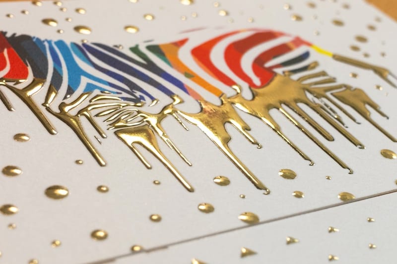
Each of these is picked for one copyable decision rather than for how it looks in a photograph. The design lesson sits at the end of every entry, and the section after this pulls out what they have in common.
Try one of them on a real piece before you commit a run: print two versions of a layout on premium business cards and hold them side by side.
One to five: form doing the explaining
1. Illan Pendant Lamp. One thin ribbon of wood veneer, cut once and coiled, becomes the whole shade. There is no frame, no second material, no fixing to hide. The lesson: a single repeated part can build a whole form, which is exactly what a repeating grid does on a page.
2. The Pot. A self watering planter that swallows its reservoir inside the pedestal instead of standing in a saucer, so the object keeps one outline. The lesson: hide the plumbing. On a card, the plumbing is the phone number, the license line and the social handles, and they belong in a quiet block, not spread across the front.
3. Ortwo Pepper Mill. You work it by twisting the top half against the bottom half, so the grip and the mechanism are the same shape. Nothing is added to tell you how to hold it. The lesson: the form should announce the action. A brochure panel that clearly wants to be turned beats an instruction telling you to turn it.
4. Nest Learning Thermostat. A ring you turn, one number, and a polished bezel that mirrors the wall it is mounted on so the device half disappears into the room. The lesson: deference. Not everything has to shout, and the thing that shows restraint next to a loud competitor is the one that reads as expensive.
5. Fiskars Norden Outdoor Cooking Collection. Birch and steel, with the grain of the handle left visible instead of coated over. The lesson: material honesty. In print that is uncoated stock left uncoated, or a soft touch stock chosen because it feels like something, not because it was on a finishes list.
Six to ten: restraint that took work
6. Masters Chair by Kartell. Philippe Starck and Eugeni Quitllet wove the silhouettes of three famous mid century chairs into one back. It quotes openly and confidently rather than pretending to be original. The lesson: borrowing a recognized form is fine when you commit to it. A half hearted homage just looks derivative.
7. Neva Light Chair. Solid wood, joints kept out of sight, and mass removed everywhere it was not carrying a load. The lesson: subtract until it would break, then stop. That is the discipline behind every layout that feels calm.
8. Harmony Cello Stand. It holds the instrument at its natural balance point, so a very small structure supports a large object safely. The lesson: solve for the one contact point that matters. On a card the contact point is the name, and everything else is scaffolding.
9. Braun BN0278 Watch. The Braun dial language, black face, plain markers, and a single bright second hand as the only color in the design. The lesson: one accent, held steady. Add a second accent and neither one is an accent any more.
10. Twist Pen. One machined body and one moving part. Every join that could have been there was designed out instead of decorated. The lesson: fewer parts, better parts. A card with three finishes on it usually looks cheaper than a card with one.
The three decisions every one of them shares
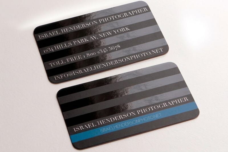
Line those ten up and the same three moves appear again and again. They are not style. They are order of operations, and they survive the jump from a lamp to a piece of card because they are about attention rather than about materials.
The diagram below shows where each of the three lands on a standard 3.5 by 2 inch business card, with the bleed, the trim and the safe margin marked.
One: hierarchy before anything else
Every winner has one element that wins the first look. On a printed piece that means setting the layout in plain black, with no finishes, and checking that a stranger can name the most important line in two seconds. If the answer is unclear at that stage, no foil will fix it.
A practical rule for a card: the dominant line should be two or three type steps above the rest, so 11pt against 7pt rather than 9pt against 8pt. Half a point of difference reads as a mistake, not as a hierarchy. Our guide to balance in graphic design covers the weighting side of the same problem.
Two: one accent, and only one
The Braun second hand works because everything else is monochrome. The moment a design carries two accents they compete, and the eye gets no instruction. In print the accent is usually a finish, and the same maths applies. Foil on the mark plus spot gloss on the frame plus a colored edge equals no accent at all.
The trade-off is real. A single accent means every other element has to earn its place on typography alone, which is harder than adding a second finish. It is also the difference between a card that looks considered and one that looks like a sample of everything the printer offers.
Three: the material is felt before the layout is read
A person feels a card before they focus on it. 16pt stock is noticeably more rigid than 14pt in the hand, and on anything larger than a business card that difference becomes obvious. Soft touch stock changes the surface into something closer to suede, and the hand notices it before the eye reads the name.
Each finish has a failure mode worth knowing before you order, and the table at the top lists them side by side. Choose the finish that suits the artwork you actually have, not the one that photographed well in someone else’s portfolio.
How to apply award-level design to your own brand
The order is what makes this work. Set the type, prove the hierarchy in plain black, choose the stock by how it should feel, and only then pick the one accent. Doing it in the other direction produces a card that depends on its foil, and a design that only works because of a finish is not a design.
Quantity and price
Business card pricing and specs
Live configurator numbers on premium stock, from 100 to 600 cards.
| Quantity | Price Per Unit | Total |
|---|---|---|
| 100 | 17.6¢ | $17.57 |
| 200 | 11.5¢ | $23.07 |
| 300 | 9.15¢ | $27.46 |
| 400 | 7.96¢ | $31.86 |
| 500 | 7.25¢ | $36.26 |
| 600 | 6.77¢ | $40.64 |

Set the file up before you pick the finish. Trim is 3.5 by 2 inches, bleed runs 0.125 inch past the trim on every side, and live type stays 0.125 inch inside; the table at the top lists what each finish adds to the file. If any of that is new, the business card stock guide explains the weights and coatings in plain terms.
Print it
Premium business cards
74 stocks from 13pt to 80pt, the plain base for testing a layout before any finish.
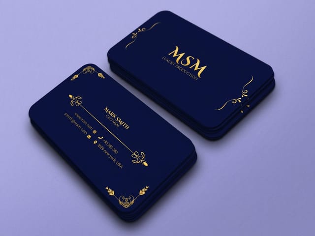
Then look at the reference material properly. Reading a shortlist teaches you less than taking one winner apart and writing down the two decisions inside it, which is the same exercise behind the six key principles of logo design. Do that with three objects and the pattern in the section above becomes something you can use rather than something you agree with.
Taking the same thinking past the business card
A card holds one idea. When the pitch needs a sequence, the hierarchy rule scales up rather than changing: one panel wins, the rest support it. On a folded brochure that means a cover with a single dominant line and interior panels that stay quieter, and it means keeping type off the half fold, the one fold the brochures take.
- Studios and freelancers. A spot UV card gives a portfolio piece one gloss detail on an otherwise quiet card.
- Architects and interior designers. Material honesty is the whole pitch. Uncoated or soft touch stock, generous margins, and nothing that shines except the mark itself.
- Product and packaging brands. Keep the one accent consistent across the box, the card and the insert, so the three pieces read as one brand.
- Restaurants and hospitality. The card is handled with wet hands and lives in a wallet. Rigidity beats decoration, so pick a heavy stock before any special finish.
- Consultancies and law firms. Deference is the Nest lesson: plain ink, and the firm name as the only large line on the card.
Blanks for a finish that needs room
If you are not starting from a blank artboard, a sized template removes the guesswork about bleed and safe margins. 4OVER4.COM cuts its blanks to the exact product spec, so the cut lines in the file match the guillotine. Pull a print ready blank from the blank template library, or start from a layout in the design template library and change the type.
Start fast
Card templates and exact size blanks
Business card templates and exact size blanks so your artwork lands inside the cut line.














Wally turns an award shelf into a print order
Three moves, one card, no guesswork
Set the hierarchy in plain black with the dominant line two or three type steps above the rest. Choose the stock by feel, 16pt for rigidity or soft touch for a velvet surface. Then add exactly one accent, foil on the mark or spot gloss on a matte field, never both. Trim at 3.5 by 2 inches, bleed 0.125 inch, type 0.125 inch inside, CMYK at 300 DPI, and 4OVER4.COM prints it.
Order premium business cards →What to remember from the winners
Explore more
More ways to print and promote
The four card finishes from the table, the brochure, and the full card range.
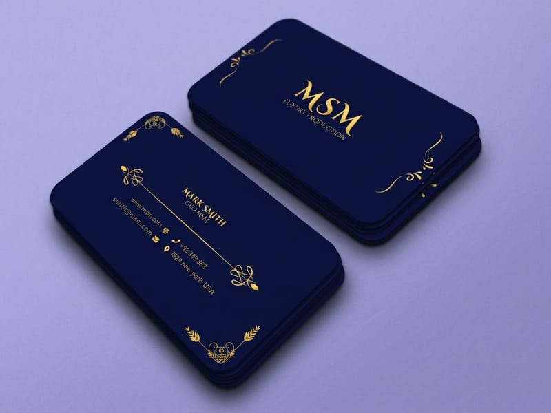 Product Premium Business Cards Run the same layout on two stocks and compare them. Product Spot UV Business Cards Gloss on a matte field, the accent that needs contrast to read. Product Raised Foil Business Cards Metallic with height, best on a mark rather than on small type.
 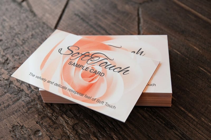 Product Soft Touch Business Cards A velvet surface you feel before you read the card.
  Product Standard Brochures Room to run a sequence when one panel is not enough.
  Category Business Card Printing Every stock, finish and size in one place.
 Keep reading: 30 business card designs worth studying and 18 creatives using spot UV well.
Ready to print the design?
Pick your stock and your one accent, and 4OVER4.COM prints the card.
Common questions about award-winning design
Does a Red Dot award mean a product sold well?
No. It is a jury verdict on design, and winners pay to license the label, so it says nothing about sales. That is still useful, because the shortlist is a well curated set of design decisions, and anyone quoting it as proof of commercial performance is stretching it.
What single change makes a business card look more expensive?
Stock weight, before any finish, because rigidity registers in the first second, before anyone reads a word. After that, soft touch changes the whole surface, while a metallic accent changes one small area. Print a plain version and a soft touch version, hand them to five people, and watch which one gets turned over.
Why did my spot UV barely show up?
Usually because it sat on a gloss surface. Spot UV works by contrast, so a wet gloss shape reads best when the field around it is matte, which is why the spot UV business cards offer a 16pt Silk Laminated Cover beside the gloss stocks. The second common cause is the art file: spot UV needs a separate vector layer with the gloss areas at 100% K, and a raster layer or a low resolution mask produces soft, uneven edges.
Can I use an award-winning design as inspiration without copying it?
Yes, and the way to do it is to copy the decision rather than the appearance. The Nest thermostat is not useful to you as a circle, it is useful as an example of deference, of one control and one number. The Braun watch is not a color scheme, it is a rule about holding a single accent. Write down the rule, apply it to your own content, and the result will not look like the original because your content is different. Copying the look gives you a derivative piece, and juries and customers both spot it.
How small can type be in raised foil?
Keep it at 6pt or above, and keep strokes at roughly 0.5pt or heavier. Raised foil sits above the surface of the stock, and at very small sizes the counters inside letters such as a, e and g fill in, so the word turns into a metallic smudge. Fine serifs and hairline rules suffer for the same reason. Use foil on the mark, a rule or a short line of display type, and set the contact details in plain ink where they will stay legible. Raised foil business cards start at $86.78 for 100, and a proof is worth requesting before the full run.
