
The Best Fonts for Signs That People Actually Read


Tobias is our voice for cutting, binding and large format, built from the knowledge of our production team, with over 20 years in printing.
What Makes a Sign Font Work at Forty Feet
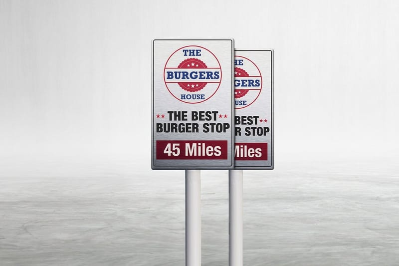
A sign is read in motion. Someone glances up from a sidewalk, a driver passes at thirty miles an hour, a visitor scans a lobby wall while walking toward the elevator. The font you choose decides whether that glance turns into a word or into nothing at all. Type that looks lovely at arm's length on a laptop can collapse into mush the moment it is three feet tall and forty feet away. The same rules apply whether you print a coroplast yard sign, an aluminum A-frame with 24 x 36 inch panels, an aluminum sign from $36 or an acrylic sign from $152.72 for a lobby.
That is why sign typography is judged by different rules than book or web typography. Stroke weight, counter size, letter spacing and contrast against the background matter more than personality. A sign font earns its place by staying legible under bad light, bad angles and short attention, and only then by looking good.
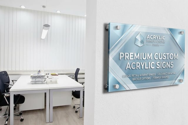
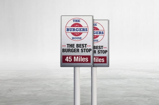
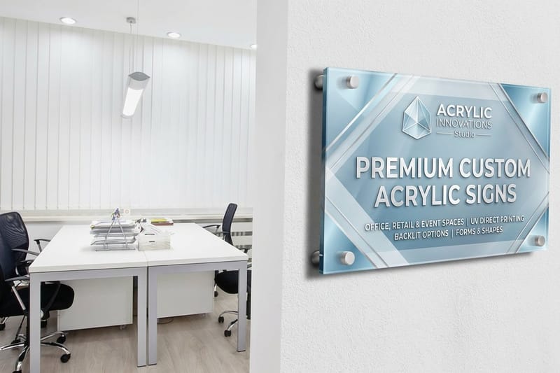
Printers see the same mistakes over and over. Type set too light, too tight, too italic, or too decorative. The fix is almost never a rare typeface. It is a familiar one, set larger, spaced wider and printed on the right material. Aluminum Signs at 4OVER4.COM start at $36 and hold that sharpness outdoors, while Acrylic Signs from $152.72 give indoor lettering a cleaner, more refined surface to sit on.
Size the letters before you pick the face
Start with the reading distance, not the typeface menu. The long standing rule of thumb in sign work is roughly one inch of capital letter height for every ten feet a viewer needs to read from. At forty feet that means four inch letters. Choose the height first, then find a font that survives it.
Contrast beats cleverness
Dark type on a light field or light type on a dark field will outperform any tonal, low contrast pairing. Yellow on white and mid gray on mid blue lose their edges outdoors. If you cannot see the shape of each letter from across a parking lot, the typeface is not the problem, the contrast is.
Fewer words, bigger type
The strongest lever is editing. Cut a nine word headline to four and the same sign can carry letters twice as tall. Most yard signs and A frame boards fail because the copy was written for a brochure and then squeezed into a board someone reads in two seconds.
Shop the format
A-frame signs printing
Sidewalk boards built for one bold headline and one clean supporting line.
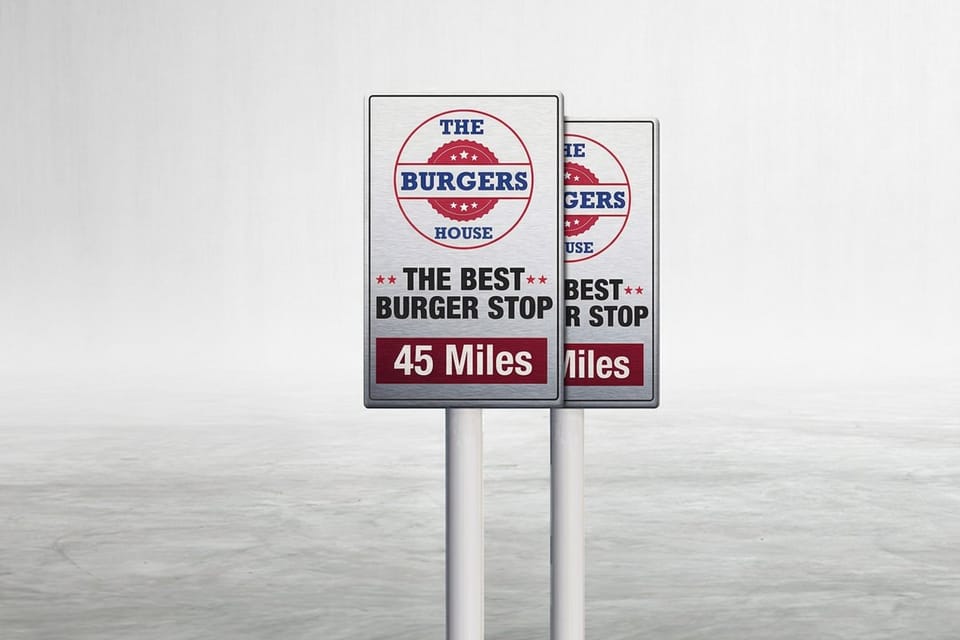
Readability Comes First on Every Sign
Readability on a sign is mechanical. Open counters, the enclosed white shapes inside letters like a, e and o, keep characters from filling in at a distance. Even stroke weight keeps letters from thinning out under glare. Distinct letterforms stop the classic confusions, capital I against lowercase l, the numeral 1 against both, and a rounded 5 against an S.
Grotesque and neo grotesque sans serifs win here for a reason. Helvetica, Arial, Roboto, Inter, Open Sans and Source Sans all keep wide apertures and steady weight when scaled up. Highway style faces such as Clearview and the DIN family were drawn for exactly this job, which is why they read so easily on road and wayfinding signage.
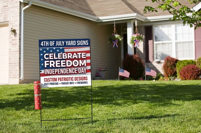
Test the way people will actually see it. Print your layout small, tape it to a wall and walk back until it goes fuzzy, then compare candidates at that distance. Cheap yard signs make good field tests, and 4th of July Yard Signs from $25, shown in our 4th of July yard signs story, let you put two or three type treatments outside before committing to a permanent panel. Our guide on how to get cheap signs fast covers the quickest ways to run that test.
- Set caps and lowercase, not all caps. Mixed case gives words a recognizable outline that readers catch faster.
- Add letterspacing as size grows. Type spaced for a paragraph looks cramped when the letters are four inches tall.
- Keep line spacing generous. Two lines that touch read as one gray block from the street.
- Skip light and thin weights outdoors. Sunlight and glare eat thin strokes long before they reach the eye.
- Avoid long italic runs. Slanted type slows recognition and fights the horizontal scan people use on signs.
Print picks
Three sign formats to test your type on
Live prices, ready to customize with your headline and supporting lines.
Eye-Catching Display Fonts and Where They Belong
Not every sign needs to behave. A bakery sandwich board, a festival banner, a barber shop window and a wedding welcome panel all trade some raw legibility for character, and they should. The trick is to spend that personality in one place only, the largest line, and keep everything under it plain. Our Bakery Signs and Wedding Banners stories show that one-line rule on real work.
Display faces that hold up at sign scale share a trait. They keep weight and openness even while adding style. Condensed slabs, geometric display sans, bold script logotypes and vintage sign painter faces such as brush scripts and western slabs all work if the words are short and the size is generous.
What fails is decoration at small size. A script set at two inch cap height on a directions line, an outlined face for a phone number, a distressed texture on an address. Save texture and flourish for the headline that people will read from far away, and let the practical information stay in a clean sans.
- Brush and sign painter scripts. Great for one or two words on a cafe or salon board, never for details.
- Condensed slabs. Strong for punchy headlines where the board is narrow and the message is short.
- Geometric display sans. Modern and clean, but watch for a lowercase a and o that look nearly identical.
- Heavy grotesques. The safest way to look loud without losing a single letter at distance.
- Wide western slabs. Full of character on event and retail signs, and unreadable once the copy runs long.
Let Your Brand Shine Without Losing Legibility
Most businesses arrive with a brand font already chosen, usually one picked for a website or a logo. Keep that font and give it a role, sized by the rule of one inch of letter height per ten feet of reading distance: the name read from 40 feet needs letters about 4 inches tall, and hours read from 10 feet need 1 inch. Brand type belongs on the name and the logo lockup. Wayfinding, hours, prices, directions and disclaimers belong in the most readable companion you can find.
A practical split looks like this. Logo and business name in the brand face, headline in the brand face if it is bold enough, and every supporting line in a neutral sans at a heavier weight than you would use in print. Nobody notices the second font. Everybody notices when the address is unreadable.
Color carries brand faster than typeface anyway. A recognizable field of company color with clean white lettering reads as your brand from farther away than a stylized typeface ever will. Keep the palette, simplify the letters, and the sign still feels like you.
When the brand font simply will not scale
Some brand fonts are drawn for screens at fourteen pixels and fall apart at four inches. If the strokes go spindly, the counters close up or the letters start colliding, use the brand face only in the logo art and set the rest in a related sans with similar proportions. Readers see continuity, not a substitution.
Quantity and price
Aluminum sign pricing and specs
Real configurator numbers. The more panels you run, the lower each one lands.
| Quantity | Price Per Unit | Total |
|---|---|---|
| 1 | $36.00 | $36.00 |

The Best Professional Sans Serif Fonts for Signs
If you want one list to work from, start here. These are the faces sign shops reach for because they behave predictably at every size, on every material, in every light. Each one is available widely, pairs easily and keeps its shape when a printer rasterizes it at large scale.
- Helvetica and Arial. Neutral, dense and endlessly tested. The default for a reason, especially in bold and black weights.
- Futura. Geometric and confident, superb for short headlines, though its wide letters eat horizontal space quickly.
- DIN and DIN Next. Drawn for German engineering signage, compact and exceptionally clear on directional and safety panels.
- Gotham and Montserrat. Broad, friendly geometric sans faces that feel current and stay legible in heavy weights.
- Roboto, Inter and Open Sans. Free, well built, huge weight ranges, and reliable for the smaller supporting lines.
- Franklin Gothic and Trade Gothic. American workhorses with condensed cuts that fit long words on narrow boards.
Weight choice matters as much as the family. On outdoor panels, medium is the floor and bold is usually the right answer. Reserve regular weights for indoor signs read from a few feet away, where Acrylic Signs can carry the finer detail that a weathered outdoor board cannot.
Indoor clarity
Acrylic signs
A smooth, rigid surface that holds finer weights and tighter letterspacing for close reading.
Classic Serif and Slab Fonts That Still Read Clean
Serifs are not banned from signage. They carry authority, history and a sense of permanence that law offices, universities, museums, churches and heritage retail all want. The rule is simply to choose serifs with sturdy brackets and moderate contrast, not delicate high contrast display faces.
- Garamond and Caslon. Warm and traditional, best indoors or on large panels where the thin strokes still hold.
- Baskerville and Times New Roman. Formal and familiar, dependable for plaques, directories and institutional lettering.
- Clarendon and Rockwell. Slab serifs with thick, even strokes that survive outdoor viewing far better than fine serifs.
- Trajan. Roman capitals with real gravity, ideal for a single line on a monument or entrance sign.
- Bodoni and Didot. Elegant but risky, because their hairlines disappear at distance and under glare.
If you love a fine serif, put it on a surface that protects the detail. Interior panels, framed directories and lobby lettering keep the viewer close and the light controlled, which is exactly where those thin strokes still look like the typeface you fell for.
Test before you commit
Yard signs as a type proof
Print two or three headline treatments on cheap boards, stand them outside, and let real viewing distance pick the winner for you.
Font Pairings That Work and Pairings to Avoid
Pairing is where good sign type is won. The reliable formula is contrast in role, not contrast in decoration. One face leads, one face supports, and the difference between them is obvious from across the street: on an 18 x 24 inch yard sign, the leading face takes the top line at about 4 inches and the supporting face stays at 1 inch or more. Two similar sans faces look like a mistake. Two loud display faces look like a fight.
Pairings that hold up at sign scale
- Futura Bold headline with Roboto supporting lines. Geometric confidence on top, quiet clarity underneath.
- Clarendon headline with Open Sans details. Slab weight grabs the eye, the sans keeps hours and addresses clean.
- Brush script name with Montserrat Medium information. Character on the name, zero ambiguity on the practical lines.
- Trajan headline with Garamond subtext. A formal, institutional voice that still reads at plaque distance.
- Franklin Gothic Condensed headline with Inter details. Fits long business names without shrinking the type.
Pairings to leave alone
- Two scripts together. Nothing leads, the eye has no entry point, and the sign reads as texture.
- Arial with Helvetica. Close enough to look accidental, different enough to look sloppy.
- Any outlined face with a shadowed face. Two effects competing means twice the noise and half the legibility.
- Thin geometric sans with a hairline serif. Both vanish outdoors, and the sign looks empty from the road.
- Novelty display for both lines. Personality with no anchor, which readers give up on quickly.
Compare formats
Popular signs, side by side
Material, size, quantity, turnaround, and price laid out for a straight comparison.
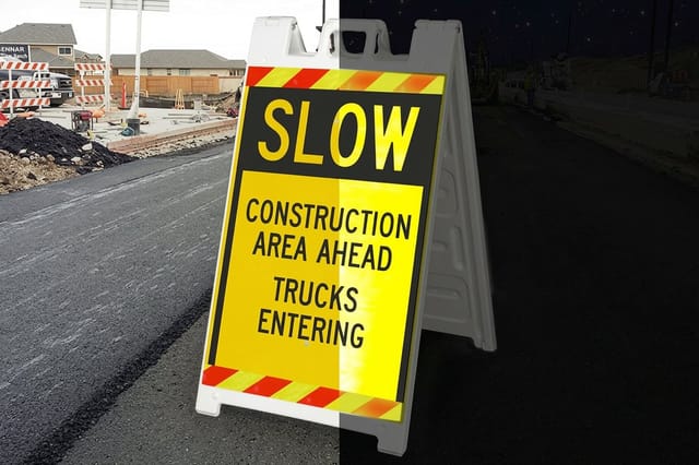 Reflective Signicade a Frame | 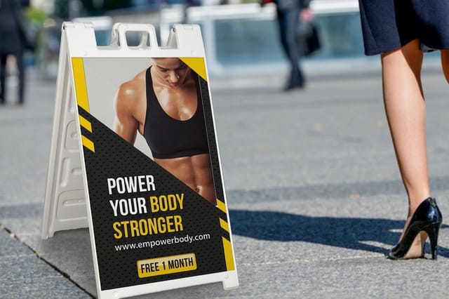 Signicade A-Frames | 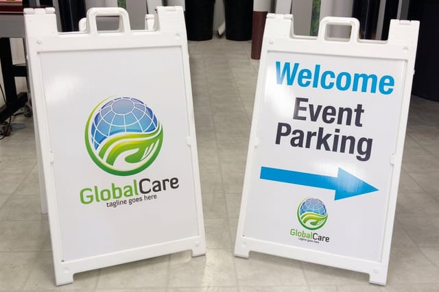 Signicade Deluxe A-Frames | 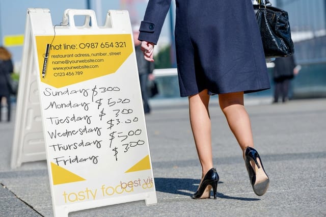 Dry Erase Signicade | |
|---|---|---|---|---|
| Min price | $163.67 | $182.32 | $196.60 | $185.63 |
| Paper / stock | Adhesive Vinyl | 4mm (3/16") Corrugated Plastic | 4mm (3/16") Corrugated Plastic | Adhesive Vinyl |
| Finish | Reflective Film | - | - | Dry Erase Lamination |
| Size | 25" x 45" | 25" x 45" | 27" x 46.125" | 25" x 45" |
| Default qty | 1 | 1 | 1 | 1 |
| Turnaround | 4 business days | 4 business days | 4 business days | 4 business days |
| Rating | ||||
| View & customize | View & customize | View & customize | View & customize |
Setting Type for the Material You Print On
The same font behaves differently on coroplast, aluminum, acrylic and vinyl. Matte substrates hold edges softly and forgive tight spacing. Glossy surfaces throw reflections that can swallow thin strokes at certain angles. Outdoor panels face sun, dirt and rain, all of which reduce effective contrast over time.
Build for the worst viewing condition, not the best. On Aluminum Signs and roadside boards, go one weight heavier and one size larger than the layout looks like it needs on screen. On indoor panels, you can pull back and let a lighter weight breathe.
Match the type treatment to the sign
- Yard and coroplast signs. Four words or fewer, bold sans, one accent color, maximum contrast.
- A frame sidewalk boards. Big headline, one supporting line, and space for a changeable message area.
- Aluminum outdoor panels. Heavier weights, wider spacing, no hairlines, and dark on light for daytime reading.
- Acrylic indoor signs. Refined weights are welcome, and letterspacing can go tighter because viewers stand close.
Set up your artwork at full size with fonts converted to outlines, keep live text away from trim edges and give the layout a real quiet zone. A sign that is one third empty space almost always reads faster than one that is full.
Start fast
Sign templates and print-ready blanks
Free layouts plus exact-size blanks so your type lands inside the safe area on the first try.
Wally helps you pick a font that carries
Readable first, memorable second, printed on the right material
Fix your reading distance, size the capital letters for it, then choose a face with open counters and even strokes. Give the personality to one line only and set the details in a plain sans. Print a test board, walk backward until it blurs, and keep whichever version survives longest. Then order the real panel on aluminum for outdoors or acrylic for indoors.
Order custom signs →Type Choices Worth Remembering
Explore more
More ways to get your signage right
A-frame signs, aluminum signs from $36, acrylic signs from $152.72, $25 yard signs, and how 4OVER4 compares with other sign printers.
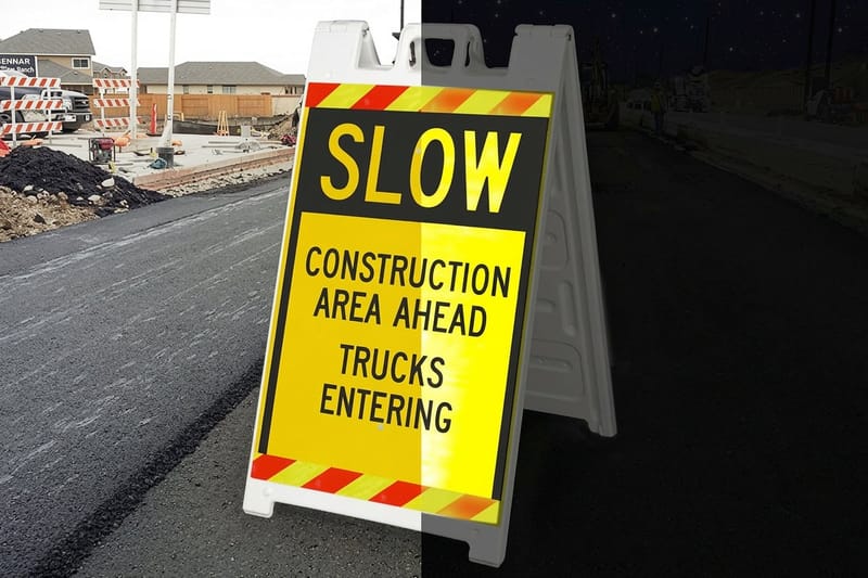 Shop A-Frame Signs Printing Sidewalk boards built for one big headline and one clean line. Product Aluminum Signs Outdoor lettering that stays sharp through weather and glare. Product Acrylic Signs Indoor panels where finer weights and tighter spacing still read.
 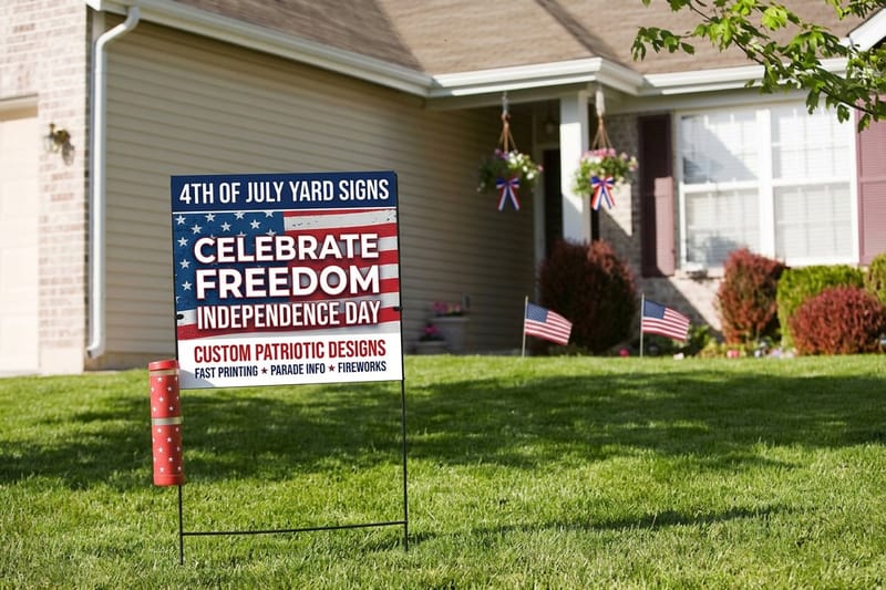 Product 4th of July Yard Signs Cheap, fast boards that make ideal real world type tests.
  Alternative 4OVER4 vs Signs How the two compare for custom sign printing and turnaround.
  Alternative Signs.com Coupon Alternative What you get without hunting for a discount code. Alternative Printmoz Alternative Custom sign printing compared side by side with 4OVER4.
  Alternative Vistaprint Metal Signs Alternative Aluminum signs and metal prints, compared on stock and price.
  Alternative Vistaprint Tabletop Signs Alternative Counter cards and table tents where type is read up close.
 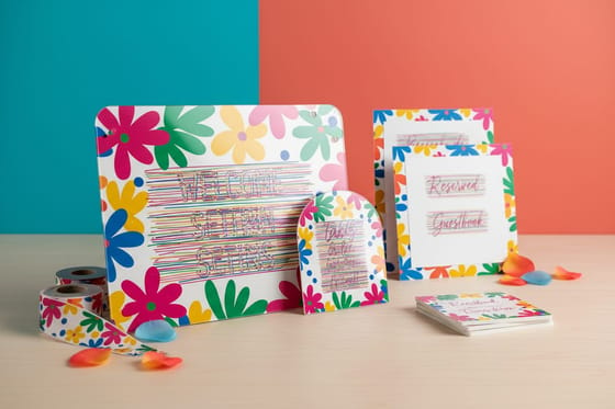 Alternative Vistaprint Wedding Signs Alternative Welcome and ceremony signs where script lettering earns its place.
 Test the font on a $25 yard sign, then print the permanent panel
Choose the face, set the letters large enough for the distance, and print on the material that fits the room or the roadside. Live pricing, real specs, and templates that keep your type in the safe area.
Sign Font Questions, Answered
What is the best font for signs?
There is no single winner, but the safest choices are heavy grotesque sans serifs such as Helvetica Bold, Arial Bold, DIN, Franklin Gothic and Roboto. They keep open counters and even stroke weight when scaled up, which is what keeps letters distinct at distance. For outdoor boards read from a car, go bold or black weight. For indoor panels read from a few feet away, a medium weight in the same families gives a calmer look without losing clarity. Pick the letter height first, then pick the face.
What is the best font for yard signs?
Yard signs are read in two seconds from a moving car, so a bold condensed or bold regular sans serif is the right call. Franklin Gothic Condensed, Helvetica Bold, Montserrat Bold and DIN all work well. Keep the headline to four words or fewer so the letters can be large, set dark type on a light field or the reverse for maximum contrast, and leave real empty space around the words. Yard signs are also the cheapest way to test type in the field before committing to a permanent panel.
How do I choose the right font for a sign?
Work backward from how the sign is read. Fix the viewing distance, use the rule of thumb of about one inch of capital height for every ten feet, then shortlist faces with open counters, even strokes and clearly different letterforms. Check that capital I, lowercase l and the numeral 1 cannot be confused. Assign your brand face to the name and a neutral sans to the details. Then print the layout, tape it up and walk backward until it blurs. Whichever candidate stays readable longest is your font.
What does custom sign printing cost and how are prices set?
Price depends on the material, the size, the quantity and the turnaround you choose. At 4OVER4.COM, 4th of July Yard Signs start at $25, Aluminum Signs start at $36 and Acrylic Signs start at $152.72. Larger runs bring the unit price down sharply, because setup is spread across more pieces. Rush turnaround adds cost, while standard production keeps it lowest. Every configurator shows live pricing as you change size, quantity and options, so you can see exactly what each choice adds before you order.
What sizes, stocks and finishes are available for signs?
Sign options run from lightweight coroplast yard signs and A frame inserts through rigid aluminum panels and thick cast acrylic. Standard sizes cover common yard, sidewalk and wall formats, and custom dimensions are available on most substrates. Finishes include matte and gloss surfaces, single or double sided printing, rounded corners, drilled mounting holes, grommets and stand or stake hardware. Matte tends to read better outdoors because it cuts glare, while gloss gives indoor acrylic panels a sharper edge.
