
Pride Month Advertising That Works and the Campaigns That Prove It


Marcus is our print marketing voice, built from the knowledge of our production team, with over 20 years in printing.
Pride month advertising works when the brand can name where the money goes, show that its own policies match the poster, and point to work it did outside June. The campaigns below all gave up something real, shelf space, convenience or revenue, which is why they still hold up years later while a logo swap does not. Pride billboard advertising follows the same checks, and for a billboard-size message at street level you can print vinyl banners up to 8 by 20 feet on 13oz outdoor vinyl from $79 in 3 business days, with window posters, event stickers from $29.16 and event flyers from $57.11 around it.
Six Pride campaigns and the mechanic that carried them
| Brand | The campaign | The mechanic | What they actually did | Why it holds up |
|---|---|---|---|---|
| Aesop | The Queer Library | Gave the retail shelf away | Product removed, books by LGBTQ+ authors handed out free | It cost the brand selling space, not marketing budget |
| Ben and Jerry’s | One flavour per cone | Made the customer feel the point | Two scoops of the same flavour refused in Australia in 2017 | The inconvenience was the message, not a hashtag |
| Levi’s | Pride collection | Named the recipient | Net proceeds directed to OutRight International | A named partner can be checked, a vague pledge cannot |
| Dr. Martens | Pride footwear | Funded youth services | Proceeds tied to named LGBTQ+ youth charities | Repeats every year, which builds a record |
| Lush | Charity Pot grants | Funded the grassroots | Small queer and trans groups funded through the year | The money moves in November as well as June |
| Absolut | Long-run advertising | Showed up early | Advertised in The Advocate in 1981 and never stopped | Four decades of receipts beats any single campaign |
Every row in the middle column costs the brand something it would rather have kept. That is the pattern worth copying, and it is the part a competitor cannot reproduce in a week. The print half moves fast: vinyl banners in 3 business days, posters in 5, and 50 event flyers for $57.11. The artwork is the easy half, and you can have it on printed vinyl banners in days.
What separates real Pride marketing from pinkwashing

Pride month advertising works when the brand can say where the money went, who made the work, and what it does in the other eleven months. Everything else is a rainbow logo, and the audience has learned to check. Put the recipient organization and the amount on the artwork itself, along the bottom of an 18 by 24 inch poster or a 2 by 4 foot banner, where anyone standing in front of it can read them.
The check is not complicated. People look at whether the donation names an organization, whether the company’s own staff policies match the poster, whether the account with the rainbow avatar in New York carries the same avatar in Warsaw, and whether any LGBTQ+ designer, photographer or writer was paid to make the thing. A campaign that fails one of those is usually forgiven. A campaign that fails three gets a screenshot thread.
The cost of failing is asymmetric, which is the part most marketing plans miss. A quiet, small, honest Pride campaign gets a shrug from people who were never going to buy anyway. A loud one that collapses under a two-minute search becomes the example everyone links to next June. If you are not prepared to answer the four questions, print nothing and give the money quietly instead.
The four questions, in the order people ask them
Where does the money go, and is it named? "A portion of proceeds supports the LGBTQ+ community" is not a donation, it is a sentence. "Net proceeds go to OutRight International" is a donation, because someone can check the annual report.
Does the policy match the poster? Health coverage for trans employees, a non-discrimination policy that names gender identity, and political giving that does not fund the people writing the other side of the argument. This is the one that gets audited hardest, and it is the one marketing cannot fix in June. Printing posters for a march or a rally? Watch the Political Posters video first.
Is it visible outside June? A brand that posts in June and goes silent on 1 July has told the audience exactly what the campaign was for. Continuity is cheap: one piece of work in October, one in February, and the June campaign stops looking like a rental.
Who made it, and were they paid? Credit the illustrator on the poster. Name the photographer. If the campaign is about queer people and no queer person was hired, the work will look like it, and someone will say so.
The rainbow logo test that costs nothing to fail
Every year people compare a brand’s regional social accounts and screenshot the ones where the rainbow avatar does not appear. It takes about ninety seconds. If your company only flies the flag in markets where it is commercially safe, that is a defensible business decision, and it is also a decision that will be published, so make it knowingly rather than by accident.
The same applies to print. A poster in the window of the flagship store and nothing in the branch three miles away reads as a photo opportunity. If you are going to run printed posters for Pride, run them everywhere the brand has a wall, or run them nowhere.
Six campaigns that earned their audience
These six are worth studying because none of them relied on a logo change. Each one gave up something real: shelf space, convenience, revenue, or forty years of consistency. That is what made them expensive to fake.
Read them for the mechanic rather than the aesthetic. The artwork is the easy part, and a good printer can match any of these looks on printed posters or vinyl banners in a week. The structure underneath is what a competitor cannot copy by Friday.
Aesop, Ben and Jerry’s, and the cost of meaning it
Aesop, The Queer Library. Aesop took product off its shelves in selected stores and replaced it with books by LGBTQ+ authors, given away to anyone who walked in. Handing over the highest value retail real estate a brand owns, during one of the busiest retail months, is a genuine cost. It also put a physical object with a queer writer’s name on it into thousands of homes, which outlives a post.
Ben and Jerry’s, one flavour per cone. In 2017 the Australian scoop shops refused to serve two scoops of the same flavour, to make the point that people were being denied the marriage they wanted. Customers were mildly annoyed, which was the design. The campaign fitted the brand because Ben and Jerry’s had already spent years on the same argument, including its UK marriage equality work. A stunt from a brand with no record reads as a stunt. From this one it read as a continuation.
Absolut, the forty year receipt. Absolut advertised in The Advocate in 1981, when almost no mainstream brand would put its name in a gay publication, and it kept buying the space. Nothing in a single campaign competes with that. If your brand has any history here at all, the anniversary of it is better material than a new slogan.
Levi’s, Dr. Martens and Lush, where the money is traceable
Levi’s Pride collection. Levi’s has run a Pride line for years and names OutRight International as the recipient of net proceeds. Naming the partner is the whole trick. It converts a marketing claim into something a journalist can verify, and it removes the "a portion of proceeds" ambiguity that makes people suspicious.
Dr. Martens Pride. The Pride boot has become an annual fixture with proceeds tied to named LGBTQ+ youth organizations. Repetition matters more than scale here. Year four of a modest, consistent campaign is more persuasive than year one of a large one, because the audience can see it was not a reaction to a news cycle.
Lush and the Charity Pot. Lush funds small queer and trans grassroots groups through its ongoing grant program, all year rather than only in June. Grassroots groups are the hardest to fund and the least glamorous to name, which is exactly why funding them reads as sincere. If your budget is small, this is the model to copy: pick one local organization, fund it in a month that is not June, and say so in plain words on your printed event flyers.
What makes each campaign stick
Strip the six back and the same four mechanics appear. Specificity, cost, credit, and continuity. Every campaign that ages badly is missing at least two of them. Continuity is the cheapest one to print: a 12 by 18 inch yard sign on 4mm white coroplast stays up all year for the price of one sign.
Specificity means a name, a number, or a date. Cost means the brand gave up something it would rather have kept. Credit means the people the campaign is about are on the payroll and not just in the photographs. Continuity means the work exists in a month when nobody is watching.
The fourth is the one small businesses do best and large ones do worst. A local shop that sponsors the same community group for six years has something no national campaign can buy, and it takes a yard sign and a bit of consistency rather than an agency.
What none of them did
None of them made the rainbow the idea. The flag is a visual identifier, not a concept, and a campaign whose only idea is the flag has no idea. In all six cases the flag is either absent or a small part of a piece of work that would still make sense in grayscale.
None of them used the word "ally" about themselves either. Allyship is a description other people apply to you afterwards. Claiming it in your own headline is the fastest way to sound like the marketing department wrote it, because the marketing department did.
Lessons for your own brand
Start from what you are already prepared to give up, then design the campaign around it. That sequence is the opposite of how most Pride briefs are written, and it is why most of them end up as a logo with a gradient on it.
Pick one organization and one commitment you can keep for three years. Publish the amount if you can, the recipient if you cannot. Hire at least one LGBTQ+ creator and put their name on the artwork. Then check your own policies before a stranger does, because they will, and the screenshot lasts longer than the campaign.
The print budget is the last decision, not the first. Once the commitment is real, a modest run of printed stickers and a couple of banners does more than a large media buy with nothing behind it. Our guide to building a brand identity covers making the visual system consistent enough that a seasonal campaign still looks like you.
A workable plan for a small budget
Sponsor one local group with a fixed amount, agreed in writing, paid in a single installment rather than a percentage of sales. Print the group’s name and what the money funds on every piece you produce. Give the group a share of the print run to hand out themselves, which puts the material where the audience actually is.
Then keep one physical thing up all year: a window vinyl, a small poster by the till, a sticker on the door. It costs almost nothing and it answers the June question before anyone asks it. If you run an event, the promotional materials checklist for events covers what is worth printing and what usually ends up in a bin.
What to skip
Skip the limited edition product that exists only to carry the flag, unless the margin genuinely goes somewhere named. Skip the employee photo campaign unless the employees volunteered and were told where the pictures would run. Skip any headline built around the word journey.
Skip the temptation to make the campaign about the brand’s courage. The brands in the table above are notable because the work points at somebody else.
Print Pride materials with purpose
A Pride kit prices in three pieces: vinyl banners from $79 on 13oz outdoor vinyl in 23 preset sizes from 2 by 4 to 8 by 20 feet or any size, event stickers from $29.16, and 50 event flyers for $57.11. The banner is the one that scales with the stage, so the numbers below come from the live configurator for it, ready before the sponsor asks what it costs.
Quantity and price
Vinyl banner pricing and specs
Real configurator numbers on 13oz scrim vinyl, where the more you order the lower the per unit cost drops.
| Quantity | Price Per Unit | Total |
|---|---|---|
| 1 | $79.00 | $79.00 |
You can also earn coins on every order and redeem them against the next run, which helps when a community group is funding the print itself. For sizing an outdoor piece before you order, the banner material comparison explains where vinyl, mesh and fabric each stop working.
Ink, stock and the rainbow gradient problem
The flag is the hardest common artwork in print, and almost nobody warns you before the proof arrives. Saturated violet sits outside the CMYK gamut, so the blue to violet step of a rainbow blend prints duller and greyer than the screen promised. Design in CMYK from the first file and you judge the color you will actually get, instead of falling in love with one you cannot buy.
Print it
Vinyl banners, ready to hang
Hemmed and grommeted outdoor banners for stages, fences and storefronts.
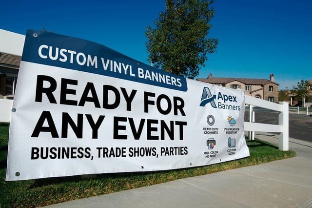
Size changes the answer too. A gradient that looks smooth on an A3 poster shows visible steps stretched across an eight foot banner, because the press has fewer ink levels to spread over more distance. At that width, flat color bands with hard edges are both cleaner and easier to read from the far side of a street. Stock matters for the same reason: gloss vinyl lifts the reds and holds up outdoors, matte fabric reads calmer indoors and kills the glare under stage lighting, and the same file on the two materials is not the same color. Ask for a proof on the material you are actually printing, and check the violet on it. For hanging and tensioning, the banner hanging guide covers what fails in wind.
What to print, by organiser type
The right kit depends on whether you are running a route, a room or a storefront.
- Local Pride organisers. Route signage, a stage banner and a sponsor board. Coroplast yard signs for the route, one large vinyl banner for the stage, and stickers for volunteers to hand out. Order the route signage in one run so the colors match across the whole march.
- Employee resource groups. Interior posters, a retractable stand for the lobby and door decals. A retractable stand travels between offices and stores flat, which suits a group with a small budget and several sites.
- Bars, venues and clubs. Event flyers, window graphics and A-frame signage. Flyers still work here because the audience is already on the street. Print the door policy on the back rather than a second promotional message.
- Nonprofits and health services. Clear, plain information printed large. Service hours, what is confidential, and how to reach a person. This is the material people photograph and send to a friend, so keep the phone number legible from three feet away.
- Retail brands with a Pride line. Shelf talkers, window posters and a printed statement of where the money goes. The statement is the piece that matters. Put the recipient organization and the amount on the artwork itself, not just on a website nobody visits.
If the campaign includes an indoor space or a booth, the retractable banner sizing guide covers which footprint suits a lobby versus a trade floor, and the trade shows and events range collects the rest of the kit in one place.
Poster blanks with the bleed already set
Starting from a correctly sized blank removes the two errors that cost a reprint: artwork built to the wrong trim, and no bleed at the edges. Poster blanks run from 11 by 17 to 22 by 28 inches and banner blanks from 2 by 4 feet, each with the bleed set. 4OVER4.COM sizes its blanks to exact product specs, so the cut line and the safe area are already marked. Pull one from the blank template library, or start from a layout in the design template library and change the colors.
Start fast
Poster blanks with the bleed already set
Poster design templates and exact size blanks so your artwork lands inside the cut line.

Wally checks the flag before the press does
Build it in CMYK, proof it on the real material, name the recipient on the artwork
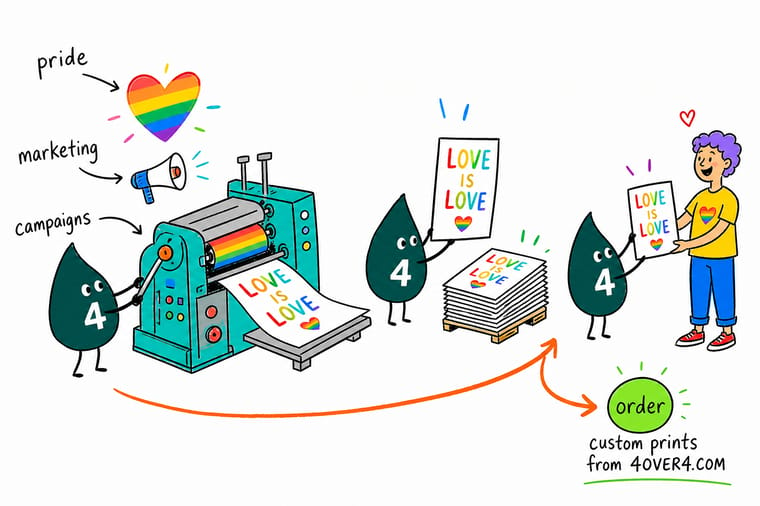
Convert the rainbow to CMYK while you are still designing, because saturated violet is outside gamut and dulls on press. Use flat color bands instead of a blend on anything wider than about four feet, keep headline type on a solid field, hold the Progress chevron two inches clear of any hem, and put the organization you are funding on the printed piece itself.
Order vinyl banners →What separates funding from decoration
Design rules for Pride print that hold up
- Build the gradient in CMYK from the start. A rainbow blend designed in RGB looks brilliant on screen and dulls at the violet end on press, because saturated violet sits outside the CMYK gamut. Build it in CMYK, judge it on a proof, and accept the violet you can actually print.
- Use flat bands at large sizes. Across an eight foot banner a continuous blend shows visible steps. Flat color bands with hard edges print cleanly at any width and read further away, which is what a banner is for.
- Keep type off the rainbow. Text set over six changing colors loses contrast somewhere. Put the headline on a solid field and let the flag sit beside it. If the type must overlap, give it a solid backing shape.
- Mind the chevron on hems and grommets. A Progress flag chevron aimed at the left edge lands exactly where the pole pocket or hem folds. Keep the point at least two inches clear of any hem line so the finishing does not eat it.
- Name the recipient on the artwork. The organization and what the money funds belong on the printed piece, in type large enough to read. A campaign that hides the detail on a landing page is telling you it does not want the detail read.
Explore more
More ways to print and promote
Vinyl banners print in 3 business days and yard signs in 5, with event flyers 50 for $57.11.
Product Vinyl Banners Outdoor banners for stages, fences and storefronts.  Product Standard Posters Window and interior posters in short or long runs. Product Promotional and Events Stickers Handouts volunteers can give away by the handful. Product Event Flyers Street level promotion for venues and one-night events.
 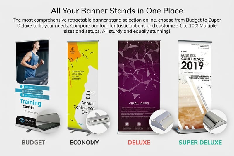 Product Retractable Banner Stands A lobby or booth display that travels flat.
 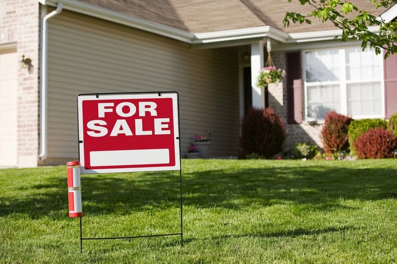 Category Yard Sign Printing Route and lawn signage in matching color across a run.
 Ready to print your Pride materials?
Pick the size, drop in your artwork or start from a free template, and 4OVER4.COM prints it sharp on the material you chose, as fast as your date needs.
Common questions about Pride marketing
What actually counts as pinkwashing?
Pinkwashing is using LGBTQ+ imagery to buy goodwill the company has not earned in its behavior. The practical test is whether the visible campaign and the invisible policy point the same way. A rainbow logo alongside health coverage that excludes gender affirming care, political donations to legislators campaigning against LGBTQ+ rights, or a supply chain in a market where the same brand quietly drops the flag, all read as pinkwashing regardless of intent. It is not about the size of the donation. A small business that gives $500 to one named local group and says so plainly is not pinkwashing. A large one that runs a global campaign and cannot name a single recipient is.
Should a small business run a Pride campaign at all?
Yes, if you are prepared to keep it up for more than one June. The risk for a small business is not that a campaign is too small, it is that it appears once and vanishes, which reads as trend chasing. Pick one local organization, commit to a fixed amount you can repeat next year, print the commitment on the material, and keep one small permanent piece visible year round such as a window decal or a poster by the till. That is a more credible position than a large one-off, and it costs less. Event flyers start at $57.11 and stickers at $29.16, so the print side is rarely the obstacle.
Why does my rainbow gradient print differently than it looks on screen?
Screens show RGB, which reaches saturated violets and electric blues that CMYK inks cannot reproduce. The blue to violet part of a rainbow blend is exactly where the two color spaces disagree most, so a gradient that glows on a monitor prints as a duller, greyer purple. Convert to CMYK while you are still designing so you judge the real colors, and at large sizes replace the continuous blend with flat color bands, because a blend stretched across eight feet shows visible steps. Ask for a proof on the actual stock before the full run. Color on gloss vinyl and color on matte fabric are not the same color.
What should we actually print for a Pride event?
For a march or a float: one large vinyl banner for the stage or the vehicle, route signage in a single run so the colors match, and stickers for volunteers to hand out. For a venue or a bar: event flyers, a window poster and something on the door. For an office or a store: a retractable banner stand that travels between sites, interior posters, and a small permanent piece for the rest of the year. Order the outdoor pieces on vinyl rather than paper, and if the site is exposed use a mesh banner so wind passes through instead of pulling at the grommets.
When should we order Pride print for June?
Order in the first half of May for a June event, and earlier if the artwork involves a proof round or a custom size. The bottleneck is almost never the press, it is the approvals: a sponsor logo arriving late, a charity signing off on how it is named, or a proof that comes back with the violet looking wrong. Large format work has the least slack because there is no reprinting a stage banner the morning of the march. If you are late, standard turnarounds on flyers and stickers are short enough to rescue the handouts even when the banners are already gone.
