
Logo Design Trends Shaping Brands in 2026


Marcus is our print marketing voice, built from the knowledge of our production team, with over 20 years in printing.
Why Logo Trends Matter More Than Most Designers Admit
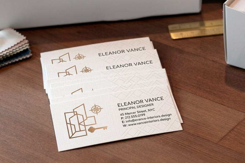
A logo is the single most reproduced asset a company owns. It sits on the 2 by 3.5 inch business card you hand over, the 2-sided banner behind you at a show, up to 4 by 10 feet, the invoice, the box, the storefront window and the phone screen, so the same mark has to read at 3.5 inches and at 10 feet. When the visual language around it moves and the mark stays still, the brand starts reading as older than it is. Trends are not fashion here. They are the shared expectations your customer brings to the first three seconds of looking at you.
The useful question is never whether a trend is good. It is whether the trend survives every surface you actually use. A gradient that glows on a phone can turn to mud on uncoated stock. A hairline monoline can vanish under a foil die. The trends worth adopting are the ones that hold their shape from a favicon to a ten foot banner.
That is the lens we use in this roundup. 4OVER4.COM has printed 10 billion+ cards and print products since 1999, which means we have watched a lot of beautiful screen work arrive as a press-ready file and land somewhere between disappointing and unusable. Every trend below is paired with the finish that makes it work on paper, board, vinyl and metal, plus the pitfall that shows up on press. If you want the wider context first, our facts about logos covers how the classics were built.
Trends tell you what the market already expects
Customers do not study identity systems, but they absorb thousands of them. When enough brands in a category move toward warmer type or softer geometry, an older mark reads as slower and less current, even to people who could not name a single thing about it. Trend awareness is really audience calibration.
The screen is not the finish line
Most identities are now approved in a slide deck on a bright display and never proofed physically before launch. That is where the expensive mistakes hide. Ink spread, stock color, coating and lighting all change the mark, and none of them show up in a PDF review.
A trend you cannot print is a trend you cannot own
Every logo eventually meets a die, a foil roll or a heat press. If the design depends on effects that only exist in a browser, you end up maintaining two brands, the real one and the printed compromise. Choose trends that translate, then let the finish do the showing off.
Proof it on paper
The cheapest test of a new logo
A short card run shows you the mark at the size where weak detail shows up first.

Ten Logo Design Trends Shaping 2026
These are the directions showing up repeatedly in new identity work across retail, hospitality, professional services and consumer products. None of them are rules. Read them as a menu, pick the one or two that match how your brand actually behaves, and ignore the rest without guilt.
Each entry notes the print finish that carries it best. If you want to see how the same shifts play out on other surfaces, our business card design trends and packaging design trends cover the card and the box.
- Refined maximalism. Dense, decorative marks with a disciplined color count. Prints best with a single foil accent so the detail reads instead of shouting.
- Responsive mark systems. One identity, three or four crops, from full lockup to a single glyph. Essential when the same logo has to work on a banner and a business card.
- Warm editorial serifs. High contrast serifs with softened terminals replacing the neutral sans wordmark. Embossing suits them because the stroke contrast catches raking light.
- Hand-drawn imperfection. Wobbly line weights and visible drawing decisions that signal a human made this. Uncoated stock is the natural home.
- Monoline geometry. Uniform stroke marks built on simple circles and arcs. Cheap to reproduce, forgiving at small sizes, and clean under raised spot UV.
- Duotone and mesh gradients. Two-color blends replacing the flat corporate palette. Needs a coated stock and a proof, because gradients band on the wrong paper.
- Kinetic-first identity. The mark is designed as a movement, and the static version is the frame you export. Print gets the strongest frame plus a foil sweep to imply the motion.
- Retro-futurist chrome. Metallic bevels and reflective type borrowed from late nineties tech. Real metallic foil beats any simulated chrome gradient on paper, every time.
- Organic and nature-forward shapes. Leaf, wave and stone forms carrying sustainability signals. Pairs naturally with kraft or recycled stock and soy-based inks.
- Custom ligature wordmarks. No symbol at all, just letterforms with one intentional connection that nobody else can copy. Embossing that single ligature is the whole brand cue.
Notice how many of them are decisions about weight, contrast and texture rather than clever imagery. That is the real 2026 shift. The mark is being asked to carry personality through craft, not through metaphor, and craft is exactly what a printing process can amplify or destroy.
Print picks
Three surfaces that test a new logo properly
Live prices, ready to customize with your refreshed mark.
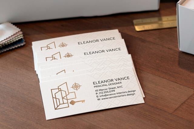 Interior Design Business Cards 100 for $17.57 The fastest, cheapest way to see a new logo on real stock before you commit.
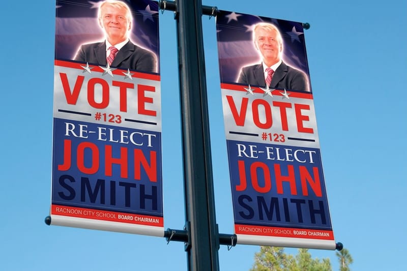
 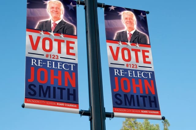 2 Sided Blockout Banners $108.75 each A blockout core keeps both logo faces clean with no bleed-through.
 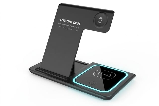 3 in 1 Foldable Wireless Charger $15.00 each A ready-made desk object people use daily, not a giveaway they bin.
 Motion First Logos and What Happens When They Stop
Plenty of new identities are now designed as animations first. The mark assembles, breathes or loops, and the still version is an export from that sequence. It looks superb in a launch video and it creates a specific problem the moment someone needs a business card.
Pick the frame deliberately instead of defaulting to the end state. The strongest still is usually the moment just before resolution, where the geometry still has tension. Lock that frame as the print master, then build a small static system around it: primary lockup, stacked version, single glyph, and a one-color version for engraving and embroidery.
The other half of the job is implying motion without faking it. A foil sweep across one edge, a raised spot UV highlight on the leading shape, or a gradient that runs along the direction of travel all read as movement in the hand. Print cannot animate, but it can suggest, and suggestion is enough when the viewer has already seen the animated version somewhere else.
Color, Gradients and the Discipline of Real Ink
Color is where the gap between screen and press is widest. Displays emit light and cover a range that ink on paper simply cannot reach. Electric cyans, hot fluorescent pinks and deep neon greens are the usual casualties, and they are exactly the colors trending palettes love. If a brand color only exists in a glowing state, it will disappoint on every printed piece for years.
Build the palette in reverse. Choose the printed version first, on the stock you will actually use, then let the digital version be the slightly brighter sibling. Define the mark in CMYK, name a spot color if the shade is central to recognition, and record how it behaves on coated and uncoated stock, because the same value can shift noticeably between the two.
Gradients need the same care. Long, subtle blends can band on absorbent stock, and mesh gradients with many color stops rarely survive at small sizes. Keep the blend short, keep the stops few, and give the gradient a solid fallback for one-color applications like stamps, engraving and embroidery. For a look at how far color effects can be pushed on a printed surface, our piece on lenticular postcards is a useful reference point.
Printing the Trend, Finish by Finish
This is the part most trend roundups skip. A visual direction is only half a decision. The other half is the process that turns it into a physical object, and the two have to be chosen together. Below is the mapping we use when a client arrives with a fresh identity and asks what to print it on.
Start small and cheap. A short run of business cards is the least expensive full-color proof of a new mark you can buy, and it tests the logo at the size where weak spots appear first. If the mark holds at card scale on real stock, it will hold nearly everywhere else.
Match the finish to the trend
- Metallic foil. Best for retro-futurist chrome, kinetic sweeps and single-accent maximalism. Real foil replaces any simulated metallic gradient and never looks gray.
- Embossing and debossing. Built for editorial serifs and custom ligatures, where the whole idea lives in stroke contrast and needs light to reveal it.
- Raised spot UV. The right call for monoline geometry and responsive glyphs, adding dimension while keeping the mark crisp and legible at tiny sizes.
- Soft touch coating. Suits organic shapes and muted palettes. The tactile mute makes a restrained mark feel considered rather than plain.
- Uncoated and kraft stock. The natural partner for hand-drawn imperfection, where slight ink spread reads as warmth rather than as a defect.
One warning worth repeating. Stack two special finishes on the same small element and they fight each other. Foil over an embossed hairline fills the detail, and spot UV over a dense gradient flattens it. One hero finish per piece, chosen for the trend you committed to, always outperforms three finishes competing for attention.
Quantity and price
Business card pricing and specs for a logo proof
Real configurator numbers. The more you print, the lower the unit cost goes.
| Quantity | Price Per Unit | Total |
|---|---|---|
| 100 | 17.6¢ | $17.57 |
| 200 | 11.5¢ | $23.07 |
| 300 | 9.15¢ | $27.46 |
| 400 | 7.96¢ | $31.86 |
| 500 | 7.25¢ | $36.26 |
| 600 | 6.77¢ | $40.64 |

Scaling a New Logo Up to Banner Size
Large format is where a trend-led logo gets its second test. At ten feet away, decoration disappears and structure is all that survives. A mark that depends on fine internal detail reads as a smudge, while a strong silhouette reads instantly. Before any event spend, print your logo at full size and stand where your visitors will stand.
Two sided banners raise a specific issue. A single-layer material lets the reverse image ghost through, and a detailed modern mark turns muddy from both sides. A blockout core solves it by putting an opaque layer between the two printed faces, so each side stays clean and the logo keeps the contrast it was designed with. That matters most for gradient-heavy and high-detail directions.
Also plan the crop. This is where a responsive mark system earns its keep, because the banner rarely wants the same lockup as the card. Use the full lockup at eye level, the stacked version where the format is narrow, and the single glyph as a repeating pattern rather than stretching one lockup to fill a shape it was never drawn for.
Large format
2 sided blockout banners
An opaque core between both printed faces, so a detailed logo stays clean from either side.

When the Logo Leaves the Page Entirely
Sooner or later the mark has to live on an object. Merchandise is the harshest environment an identity faces, because printing area is small, surfaces are curved, and the reproduction method is often a single color. Every ornamental flourish you loved on screen becomes a production question.
Prepare a one-color, single-weight version of the mark specifically for objects, with the minimum size documented. Test it at the actual print area of the item you plan to order rather than at a comfortable size on your monitor. If the glyph alone works, use the glyph. Nobody has ever complained that a logo on a desk accessory was too simple.
Choose objects people keep. A charger that lives on a desk puts the mark in front of someone every day, which is a very different outcome from a giveaway that gets used once. If you want more ways to push a new logo into daily life, our roundup of logo sticker promotion ideas is full of low-cost options.
Put the mark on an object
Branded desk hardware
A charger stays on the desk, which puts your one-color glyph in front of someone every single day.
Trends That Age Fast, and How to Spot Them Early
Some trends are directions and some are effects. Directions, like better type contrast or a simpler silhouette, tend to keep paying off. Effects, like a specific bevel style or a particular gradient recipe, are date stamps. They tie the mark to a moment, and the moment always ends. Telling one from the other before you commit is most of the skill.
A quick test that works surprisingly well. Describe your logo out loud without naming any software feature. If the description survives, the idea is structural. If you cannot explain it without mentioning a blur, a bevel, a mesh or a specific plugin, you are buying an effect and it will need replacing sooner than you would like.
- Watch the imitation curve. Once three competitors in your category use the same visual move, it has stopped differentiating you and started blending you in.
- Test the one-color version. A mark that only works in full color with effects applied is fragile. The single-color silhouette is the real logo.
- Check the smallest size. If the identity dies below a certain point, it will fail on merchandise, favicons and stamps for its entire life.
- Age it deliberately. Put the mark next to your own work from five years ago. If it feels like the same brand grew up, you are on solid ground.
- Keep the equity you already have. A color, a shape or a letterform your customers recognize is worth more than any new trend you could adopt.
Evolution beats revolution for almost every established brand. Sharpen the type, simplify the silhouette, fix the color for print, and add one finish that makes it feel considered in the hand. That path keeps recognition intact while still reading as current, and it costs a fraction of a full rebrand. For inspiration from designers who handle this well, browse these graphic design portfolio examples and designers worth following. For the wider visual language your mark sits in, read the roundup of current graphic design trends.
Compare finishes
Popular business cards, side by side
Interior design cards at 100 for $17.57 next to lenticular at 500 for $690.88.
 free business cards |  Standard Business Cards |  3D Lenticular Business Cards |  Metallic Foil Business Cards | |
|---|---|---|---|---|
| Min price | Free | $17.57 | $690.88 | $222.13 |
| Paper / stock | 14pt Gloss Cover | 14pt Gloss Cover | 31pt Lenticular Lens | 16 Point Silk Laminated |
| Finish | - | Standard Finish | - | - |
| Size | 2" x 3.5" | 2" x 3.5" | 2" x 3.5" - Vertical | 2" x 3.5" |
| Default qty | 200 | 100 | 500 | 500 |
| Turnaround | 5 business days | 3 business days | 22 business days | 7 business days |
| Rating | ||||
| View & customize | View & customize | View & customize | View & customize |
Rolling Out the New Look in Print
A logo launch fails quietly when the rollout is disorganized. Old cards keep circulating, the banner uses a stretched lockup, and three different blues appear across four pieces. Sequence the rollout and the new identity lands as one confident move instead of a slow, patchy replacement.
Start from a print-ready layout so margins, bleed and safe areas are correct on the first attempt, then order a small proof run before committing to volume. Print the everyday pieces first, cards and stationery, because they carry the mark most often. Large format and merchandise follow once the printed color is confirmed and locked in your brand sheet.
A rollout order that avoids waste
- Proof run. One small batch of cards on your chosen stock, checked in daylight and under office light before anything else is ordered.
- Everyday pieces. Cards, letterhead and thank-you notes, the items that put the mark in the most hands per dollar spent.
- Environment. Banners, signage and window graphics, sized from the responsive system rather than stretched from one file.
- Objects. Merchandise and desk items using the one-color glyph version, ordered only after the printed color is confirmed.
Keep one page of rules with the files: the exact stock, the finish, the CMYK and spot values, the minimum size and the clear space. That single page prevents most of the drift that makes a good identity look sloppy a year after launch. For a shot of visual inspiration before you start, our gallery of amazing business card designs shows what these finishes look like when the craft is right. To see the same finishes on real orders, browse 4OVER4.COM business cards with real customer designs.
Start fast
Templates and print-ready blanks for the rollout
Free layouts plus exact-size blanks, so bleed and safe areas are right on the first file you send.






Wally helps you turn a trend into a printed mark
Pick the direction, then pick the finish that carries it
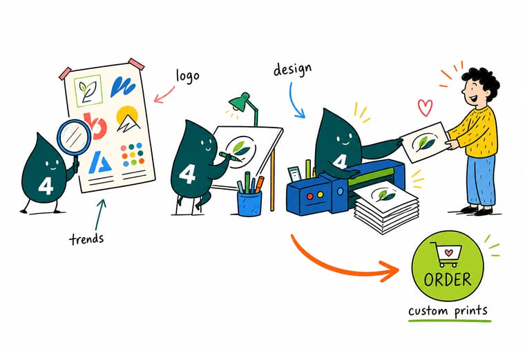
Trends are easy to admire and hard to commit to. Wally's shortcut is simple. Decide whether your logo is about craft, precision or warmth, choose the one finish that says that out loud, then order a small run of cards before anything else. Holding the mark in your hand settles arguments that a slide deck never will, and it costs less than an afternoon of debate.
Order interior design business cards →What to Carry Into Your Next Identity Decision
Explore more
More on logos, design trends and printing them well
200 free business cards on 14pt gloss or uncoated cover print in 5 business days, so a new mark can be in a pocket next week and tested before the banner order.
Product Interior Design Business Cards Proof a new logo on real stock from $17.57. Product 2 Sided Blockout Banners Your mark at event scale with no ghosting. 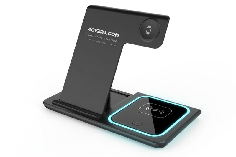 Product 3 in 1 Foldable Wireless Charger A desk object people actually keep.
 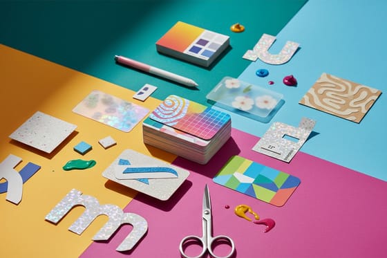 Article Business Card Design Trends How the same shifts land on a card.
  Article Packaging Design Trends Where a logo meets the box and the shelf.
  Article Facts About Logos The stories behind marks everyone knows.
  Article Amazing Business Card Designs Thirty examples where the craft is right.
  Article Graphic Design Portfolio Examples How working designers present identity work.
  Article Logo Sticker Promotion Ideas Low-cost ways to put a new mark everywhere.
  Article Lenticular Postcards How far a printed surface can be pushed.
  Article Designers Worth Following Seven artists shaping how brands look now.
 Ready to see your new logo on something real?
Choose the trend, choose the finish that carries it, then print a short run and judge the mark in your hand instead of on a screen.
Logo Design Trend Questions
What are the biggest logo design trends for 2026?
The strongest directions are refined maximalism with a tight color count, responsive mark systems that crop down to a single glyph, warm editorial serifs replacing neutral sans wordmarks, hand-drawn imperfection, monoline geometry, duotone and mesh gradients, kinetic-first identities, retro-futurist chrome, organic nature-forward shapes, and custom ligature wordmarks. Most of them are decisions about weight, contrast and texture rather than clever imagery, which is why the printing finish you choose matters as much as the drawing. See how the same shifts play out on a card in our business card design trends.
How do I choose a logo trend that actually fits my brand?
Start with how your brand behaves rather than with what looks current. A hand-drawn mark suits a business built on craft and personal service, while monoline geometry suits one built on precision and speed. Then run two tests. Describe the logo out loud without naming a software effect, and check whether it still works in one color at the smallest size you will ever use. If both hold, the idea is structural and it will age well. If either fails, you are adopting an effect that will need replacing.
What does it cost to print a new logo across your materials, and how is the price set?
Price is driven by four things: the product, the quantity, the stock and the finish. Interior Design Business Cards start at $17.57, which makes a short proof run the cheapest possible full-color test of a new mark. 2 Sided Blockout Banners start at $108.75 for event scale, and ready-made 3 in 1 Foldable Wireless Chargers start at $15.00 as a gift beside them. Browse ready-made wireless chargers for a desk gift. Unit cost drops as quantity rises, and special finishes like foil, embossing and raised spot UV add to the base price. Live pricing for every quantity is on each product page.
What sizes, stocks and finishes work best for a logo refresh?
Logo work prints on 60+ paper stocks, from uncoated and kraft through heavy premium boards. Uncoated and kraft flatter hand-drawn and organic marks. Coated stocks hold gradients and duotone blends without banding. Soft touch coating suits restrained, muted palettes. For special finishes, use metallic foil for chrome and kinetic sweeps, embossing for editorial serifs and custom ligatures, and raised spot UV for monoline geometry. One hero finish per piece always outperforms several competing for attention on the same small element.
How long does it take to print and ship new branded materials?
Turnaround depends on the product, the finish and the quantity you choose, and it is shown on each product page before you order. Standard business cards move quickly, while foil, embossing and raised spot UV add production time because they are separate passes on press. Large format banners and branded objects run on their own schedules. The practical advice is to order the small proof run first, confirm the printed color, then place the volume order with a few days of headroom before any event or launch date.
