
How Sports Logos Shape Team Identity, From The City to Golden State


Tobias is our voice for cutting, binding and large format, built from the knowledge of our production team, with over 20 years in printing.
Why a Team Mark Outlives Every Roster That Wears It
The Warriors rebrand most fans mean is the 2010 one. The franchise retired the 1997 lightning bolt and its orange palette, went back to royal blue and golden yellow, and set a span of the Bay Bridge inside a circular roundel that has barely changed since. Players are traded, coaches are fired, arenas get renamed after whichever bank bought the rights this decade, and the logo stays. A five year old and a season ticket holder of forty years can both point at it and claim it, so the people who care most read a logo change as a referendum on who the team belongs to.
The Golden State Warriors make a clean case study because the franchise has tried nearly every strategy available. It anchored itself to a city, then to a state, then to a trend, then back to a landmark, and each of those four identities gave a different answer to the same question.
That question is worth borrowing. A high school program, a rec league, a supporters club and a small business with a napkin sketch all face the same forces. The marks that hold up on a sticker, a banner, and a business card at the same time are the ones built on something real rather than something fashionable. For a club or a shop, the first printed pieces are usually shaped ones: die-cut paper shapes cut to the crest for giveaways, any shape labels for bottles and merch, and business cards cut to the logo outline.
The three jobs a logo actually has
A team mark has to be recognizable at the size of a helmet decal, reproducible in one color on a cheap tee, and meaningful enough that someone would tattoo it. In print that range runs from a 1 by 1 inch label on a bottle to an 11 by 11 inch die-cut shape handed out at the gate. Most redesigns fail because they optimize for the first job on a designer's screen and forget the other two exist.
Why fans get a vote whether you give them one or not
Fans do not own the trademark, but they own the meaning. A logo gains value after thousands of people attach memories to it, and those people notice at once when a new mark has no memories in it yet. Patience costs nothing, and it gives a new mark the years it needs to collect them.
Print the mark
Cards cut to your logo shape
The fastest way to test whether your silhouette actually works in someone's hand.
The City Logo, 1969 to 1971
From 1969 to 1971, the San Francisco Warriors wore something few franchises would dare today. The front of the jersey left the team name off. It said The City, arched over a graphic of the Golden Gate Bridge with a cable car riding across the front of it, so the team put its home on its chest and let the name go second.
It worked because it was specific. Nobody confuses that bridge with anywhere else on earth, and the cable car adds a second layer of local proof. The mark described a place where basketball happened instead of the game itself, and that turned out to be the more durable idea. Decades later, replica versions of that jersey still sell to people who were not alive to see it worn.
- Takeaway one. Geography is free equity. A landmark your audience already loves does half the branding work before you draw anything.
- Takeaway two. Confidence reads as identity. Leading with a nickname for your city instead of your own name is a bet that people already know who you are.
- Takeaway three. Illustration ages better than typography. The bridge still looks current, the letterforms around it date instantly.
- Takeaway four. A mark with a strong outline survives being cut, embroidered, and shrunk down to a lapel pin.
If you are building a local identity now, this is the era to steal from. Put the water tower, the mountain ridge, the bridge, or the mill on the mark, then print it on something people keep. Shaped stickers and cut cards hold an outline like that better than a rectangle does: cut the landmark as a 4 by 6 inch paper shape on 14pt gloss cover for handouts, then shrink the same outline to a 2 by 2 inch label for water bottles.
Print picks
Three formats built for a shaped logo
Live prices, ready for your artwork and your exact cut line.
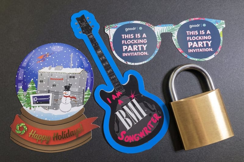
 Any Shape Size Paper Die-Cut 50 for $87.00 Cut a crest, a bridge span, or a mascot silhouette to its true outline.
 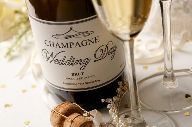 Any Shape Wine Labels 250 for $267.89 Adhesive labels shaped to your mark for bottles, cases, and merch drops.
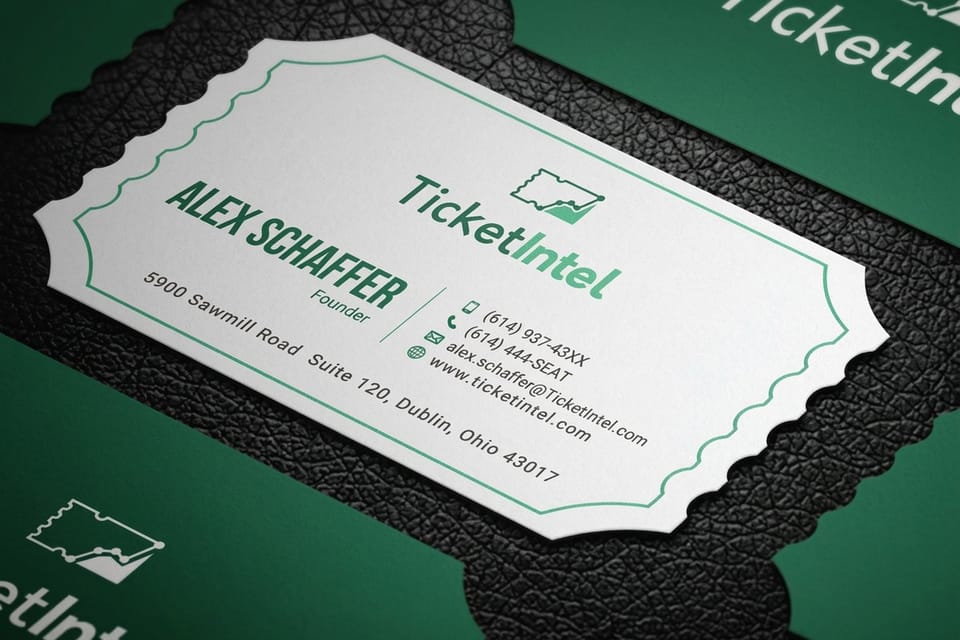
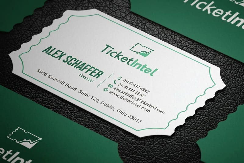
 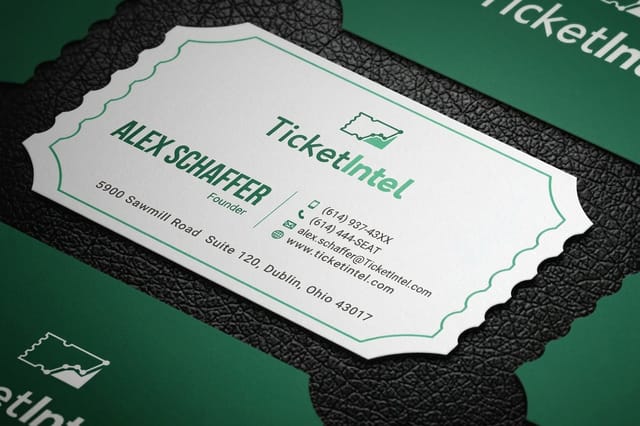 Die-Cut Any Shape Business Cards 50 for $95.56 A card cut to your logo shape, so the identity works before anyone reads it.
 The California Logo, 1971 to 1997
When the franchise moved across the bay and became the Golden State Warriors in 1971, it faced a problem most teams never have to solve. The new name belonged to no single city, so the logo could not belong to one either. The answer was the outline of California itself, with a marker set on the Bay Area and the team name riding alongside it, a mark that ran from 1971 to 1997.
It is a strange, generous piece of branding. Instead of claiming one town, the team claimed a coastline and invited everyone on it to come along. The mark stayed in service for roughly a quarter century, through jersey redesigns, color shifts, and several rebuilds of the roster, because the underlying idea never expired.
- A shape can be a name. The state silhouette says Golden State without spelling it, and silhouettes read faster than words.
- Longevity comes from vagueness done well. A mark tied to a region survives a move that a city mark would not.
- Simple outlines print cheap. One color, one contour, no gradients, and it looked the same on a program cover and a bumper sticker.
- Consistency compounds. Twenty six years of repetition is what turned an outline into a symbol worth reviving.
Regional identity is the most underused move in small business branding. If your customers are proud of where they live, a state or county outline on your packaging does more for recall than another swoosh, and it costs nothing extra to print. Run it in one ink on an 18pt kraft uncoated shape or a 3 by 3 inch label and the silhouette still reads.
Quantity and price
Die-cut paper shape pricing and specs
Real configurator numbers. Larger runs drop the unit cost quickly.
| Quantity | Price Per Unit | Total |
|---|---|---|
| 50 | $1.74 | $87.00 |
| 100 | 91.0¢ | $91.00 |
| 200 | 51.2¢ | $102.50 |
| 300 | 37.7¢ | $113.00 |
| 400 | 30.9¢ | $123.50 |
| 500 | 26.6¢ | $133.00 |

The Failed Modernity Logo, 1997 to 2010
In 1997 the Warriors did what a lot of franchises did in the late 1990s. They threw out a mark that had served since 1971, brought in a cartoon lightning bolt and a new mascot, added orange to the palette, and called it modern. The result was busy and illustrative, and it had no link to anything the team had been. It needed full four color process to read, so on a 1 inch label or a one ink tee the bolt and the mascot blurred into one shape.
It lasted a little over a decade, 1997 to 2010, which in logo terms is a short and unhappy life. The drawing was competent, and it referenced nothing. There was no bridge, no coastline, no history, just a visual style borrowed from whatever else looked energetic at the time, and a mark with no roots goes out of date with the style it copied.
How to spot a trend logo before you approve it
- It only works in full color, and collapses into mush when you print it in one ink.
- It needs an explanation. If a paragraph is required to justify the shape, the shape is not doing its job.
- It resembles four other logos launched the same year across unrelated categories.
- Nothing in it could have existed ten years earlier, which usually means nothing in it will survive ten years later.
The expensive lesson here is that a rebrand should add meaning, never replace it. Audit the old mark for the parts people are attached to, keep those, then modernize the execution around them. That single discipline is the difference between a refresh people defend and a redesign people mock.
Compare finishes
Popular card formats, side by side
Free business cards print in 5 business days and lenticular in 22, the two ends of what a mark has to survive.
 free business cards |  Standard Business Cards |  3D Lenticular Business Cards |  Metallic Foil Business Cards | |
|---|---|---|---|---|
| Min price | Free | $17.57 | $690.88 | $222.13 |
| Paper / stock | 14pt Gloss Cover | 14pt Gloss Cover | 31pt Lenticular Lens | 16 Point Silk Laminated |
| Finish | - | Standard Finish | - | - |
| Size | 2" x 3.5" | 2" x 3.5" | 2" x 3.5" - Vertical | 2" x 3.5" |
| Default qty | 200 | 100 | 500 | 500 |
| Turnaround | 5 business days | 3 business days | 22 business days | 7 business days |
| Rating | ||||
| View & customize | View & customize | View & customize | View & customize |
The Gold Standard Logo, 2010 to Present
The 2010 rebrand did the one thing the 1997 rebrand refused to do. It went back and looked. Out came the lightning bolt, back came royal blue and golden yellow, and at the center of a clean circular roundel sat a span of the Bay Bridge, the structure that physically connects the two cities the franchise has called home.
It is a quiet mark. There is no motion, no snarl, no mascot. A circle, a bridge, a wordmark, and enough negative space that it reads on a phone icon, a center court floor, and a hat. Since its launch it has stayed almost untouched, which is the highest compliment a logo can receive.
The bridge choice is the smart part. It carries the geography of The City era and the inclusiveness of the California era in one image, so the new mark inherits the affection built up by both. That is how you rebrand without asking fans to abandon anything.
- Contain the mark. A roundel gives a logo a fixed footprint, which makes every downstream application easier to lay out.
- Limit the palette. Two strong colors are easier to own than five, and far cheaper to reproduce consistently.
- Pick a symbol with history. Borrowing meaning from something real beats inventing meaning from scratch.
- Then stop touching it. The value is in the repetition, not in the annual tweak.
Shaped labels
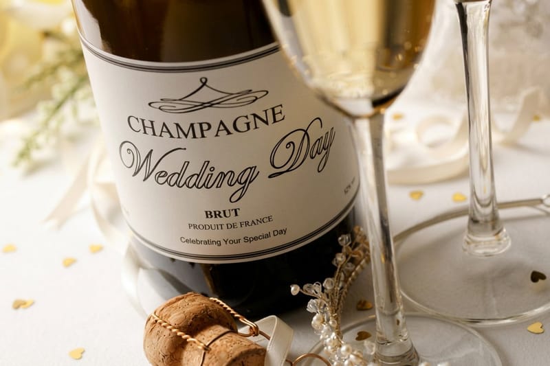
Any shape wine labels
Adhesive labels cut to your outline for bottles, cases, and merch drops.

What Sports Logos Teach About Brand Identity
Strip the basketball out and the Warriors timeline reads like a branding textbook that happens to be written in jerseys. Every era answers a question your own organization will eventually face, and the scoreboard on each answer is already public.
Anchor to something real, whether that is a place, a founding story, or a craft you are known for. Keep the shape simple enough to survive one color printing. Change the execution when it dates, never the meaning. And once you land on a mark people recognize, protect it by using it everywhere, identically, for years.
A short checklist before you commit
- Print it at one inch wide in black on plain paper. If it is unreadable, it is unfinished.
- Show it to five people who have never seen it and ask what it reminds them of. Their first answer is your real brand.
- Cut it out with scissors. If the silhouette is unrecognizable, the outline is too fussy for die-cut stickers and shaped cards.
- Sit with it for a month before rollout. Trend excitement fades fast, and a month is long enough to tell the difference.
The rollout is where most identities either land or leak away. A mark only becomes familiar through volume, so the practical work is getting it onto the physical things people hold, wear, hand over, and stick on a laptop lid.
Closest match
Die-cut paper shapes
Hand out the crest itself instead of a rectangle with the crest printed on it.
Printing an Identity Once the Design Is Locked
Once the logo is locked, the work moves to print. The teams and businesses that feel established put the same mark in more places than anyone else in their category, and each place has its own size: a 2 by 3.5 inch card, a 1 by 1 inch label, a die-cut paper shape anywhere from 2 by 2 up to 11 by 11 inches.
Start with the pieces that carry the shape best. Shaped stickers and cut cards let the outline itself do the talking, adhesive labels put the mark on bottles, boxes, and merch, and cards cut to the logo silhouette get kept instead of pocketed. Upload print-ready artwork, pick a stock such as 14pt gloss cover or 18pt kraft, choose a basic or complex die cut, and the same mark carries across every piece with matching color. Cut paper shapes and cut cards take 5 business days at the standard turnaround, shaped labels take 6.
Match the piece to the moment
- Fan giveaways. Die-cut paper shapes in the exact contour of the crest, handed out at the gate.
- Bottles, cans, and merch. Shaped adhesive labels that wrap the mark around a curved surface cleanly.
- Introductions. Business cards cut to the logo outline, so the identity registers before a word is read.
- Repeat exposure. One artwork file, one color build, used on every piece without variation.
Start fast
Templates and print-ready blanks
Free layouts plus exact-size blanks so your cut line lands where you expect.






Wally reads the logo before he reads the name
A mark people recognize, printed on things people keep
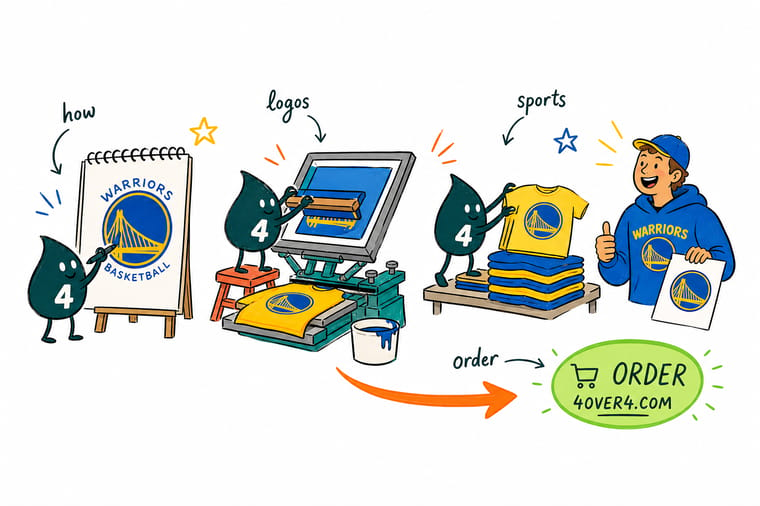
Judge your logo the way a fan does. Shrink it to one inch, print it in black on plain paper, then cut the outline with scissors. If it still reads, it is ready for the pieces that carry it furthest: die-cut shapes for giveaways, shaped labels for bottles and merch, and cards cut to the silhouette so the identity registers before anyone reads a word. Upload one artwork file and every piece matches.
Order die-cut logo cards →What the Warriors Timeline Teaches Any Brand
Keep reading
Guides for building a mark that lasts
Scale rules for a mark printed one inch wide, fifty identities worth taking apart, and ten ways to put logo stickers in front of people.
 Guide Best Practices for Logo Design The rules that keep a mark readable at every size.
  Guide Custom Logo Design for Your Brand How to brief, judge, and finish a logo you will keep.
  Guide Corporate Identity Examples Fifty identities worth studying before you redesign.
  Guide Ten Ways to Use Logo Stickers Put the finished mark in front of people, cheaply.
 Explore more
More on logos, identity, and printing them well
Die-cut any shape cards run 50 for $95.56 and any shape wine labels 250 for $267.89.
Guide Best Practices for Logo Design Scale, contrast, and simplicity rules that hold up in print. Product Any Shape Size Paper Die-Cut Cut your crest or mascot to its exact outline. Product Die-Cut Any Shape Business Cards A card shaped like the logo it carries. Product Any Shape Wine Labels Shaped adhesive labels for bottles and merch runs.  Article Fifteen Facts About Logos The stories hidden inside marks you see daily. Article Corporate Identity Examples Fifty branding systems worth taking apart. Article Custom Logo Design for Your Brand From first sketch to a print-ready mark. Article Logo Sticker Promotion Ideas Ten low cost ways to spread a finished logo.
  Article Seven Corporate Event Ideas Where branded print earns its keep in person. Alternative 4OVER4 vs Vistaprint Labels How the two compare for shaped label runs.
  Alternative 4OVER4 vs Vistaprint Shaped Cards Rounded and die-cut cards, compared honestly.
 Put your team mark on something people keep
Lock the outline, upload one print-ready file, and let the shape do the work on cards, labels, and cut paper shapes.
Golden State Warriors Logo and Team Branding FAQs
How many logos have the Golden State Warriors used?
The franchise has worn four clearly distinct primary identities since the late 1960s. The City mark put the Golden Gate Bridge and a cable car on the jersey, the California outline arrived with the move across the bay and the new Golden State name, a lightning bolt and mascot identity took over in 1997, and the current Bay Bridge roundel launched in 2010. Each one answered a different question about who the team belonged to, which is what makes the sequence so useful to study. For the design rules underneath all four, read the logo design best practices guide.
Why is the current Warriors logo considered so successful?
It is simple, it is contained inside a circle so it drops cleanly into any layout, it uses two ownable colors, and its central symbol is a real structure that connects both cities the team has called home. That last part matters most. The bridge carries the geography of the San Francisco era and the shared ownership of the Golden State era at the same time, so the mark inherited affection instead of asking fans to build new affection from nothing. It has barely changed since 2010, and that stability is a large part of its strength.
What made the 1997 lightning bolt rebrand fail?
It referenced nothing that belonged to the team. There was no landmark, no geography, and no thread back to anything fans already loved, just a busy illustrative style that happened to look current in the late 1990s. A mark built on a trend has a fixed expiration date, because when the trend ends there is nothing underneath holding it up. It also depended on full color detail, which meant it degraded badly at small sizes and in single ink printing on shirts, signage, and giveaways.
How do I turn my own team logo into printed materials?
Export the mark as print-ready vector artwork in CMYK, keep a one color version alongside the full color version, and choose formats that flatter the silhouette. Any Shape Size Paper Die-Cut starts at $87.00 and cuts paper pieces to the exact contour of your logo, Die-Cut Any Shape Business Cards start at $95.56, and Any Shape Wine Labels start at $267.89 for bottles and merch. Upload once and the same mark carries across all three with matching color.
How long does die-cut logo printing take to produce and ship?
Turnaround depends on the product, the quantity, and the finish you select, and the live estimate appears in the configurator as soon as you choose those options, before you pay. Shaped products need an extra step for the cutting die or digital cut path, so allow a little more lead time than a standard rectangular print. If a game, launch, or event has a fixed date, order the shaped pieces first and fill in the flat items afterward, since flat stock is the easiest part of the run to rush.
