
Fan-Created TV Art Poster Ideas to Spark Your Own Design


Tobias is our voice for cutting, binding and large format, built from the knowledge of our production team, with over 20 years in printing.
The fan TV posters worth printing all do the same thing: one idea on a flat field, drawn as vector shapes rather than lifted from a screenshot. Take that discipline, make the art your own, and print it on a matte sheet from $25.00 or a framed giclee from $87.86 at 4OVER4.COM poster printing.
Poster finishes for fan art at a glance
| Finish | What it does to the artwork | Best for | Product at 4OVER4 | From |
|---|---|---|---|---|
| Flat matte poster | Nothing is cropped. Flat color fields stay even and there is no glare | Bedrooms, studios, gallery walls | Matte Posters | $25.00 |
| Laminated poster | A 3 mil skin over the print takes the scuffs instead of the ink | Hallways, shared rooms, shop windows | Laminated Posters | $25.00 |
| Foam-mounted poster | Rigid board behind the sheet, so it hangs flat with no frame and no curl | Rentals, no-nail walls, pop-up displays | Mounted Posters | $39.99 |
| Gallery-wrap canvas | The outer 1.5 inches folds onto the sides and leaves the front | One big image, painterly or photographic art | Premium Canvas Prints | $59.00 |
| Framed poster | A rabbet lip of roughly a quarter inch covers the sheet edge | A finished piece, a gift, a piece you will not reprint | Framed Posters | $87.86 |
Each price above is the live starting price for that product. All five sell at any size you enter, so a 24 by 36 inch sheet costs more than an 11 by 17 inch mini, and lead time moves with the format too: a matte poster takes 2 business days and a framed poster 4, so order the frame first when a gift has a date. If you are undecided between paper and canvas, our breakdown of poster materials compares them on durability rather than price.
Why fan-made TV posters inspire great design
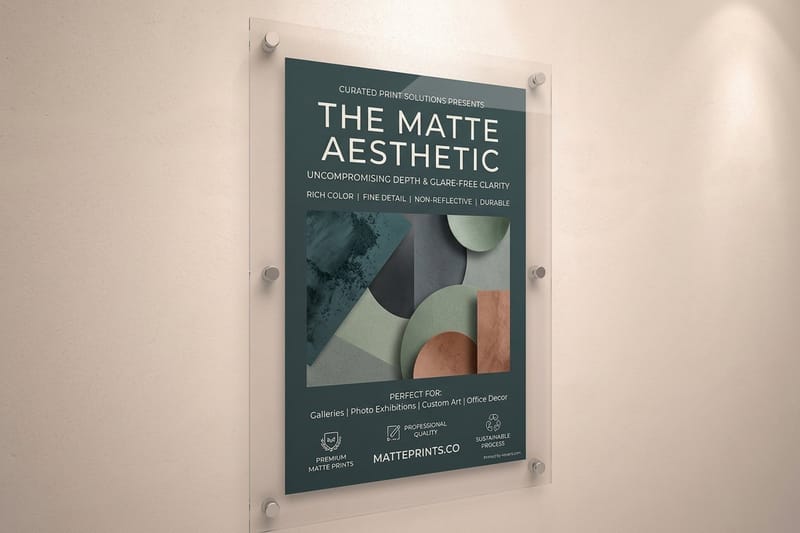
Fan posters are made without a marketing brief, and that is the whole reason they look good. Nobody has to fit six actor faces, a release date, a studio logo and a credit block onto one sheet. The person making it has watched the show, picked the one image that means something, and thrown the rest away.
Look at any collection of fan-made TV art and the same discipline keeps showing up: one idea per poster. A single object. A single line of dialogue. A silhouette a viewer either recognises in half a second or does not. That constraint is what makes the work reproduce well in print, because flat shapes and big type survive the trip from screen to paper far better than a dark, detailed composite does.
There is a second reason these posters print beautifully, and it is technical. Flat color has no gradient to band and no shadow detail to lose, so a matte sheet at 24 by 36 inches shows exactly what was on the artboard. A moody screenshot enlarged to the same size shows its compression instead. If you want more directions to work from, our roundup of creative poster ideas covers the same ground for non-fiction subjects.
What fan work borrows from the official one-sheet
The proportions, mostly. A theatrical one-sheet is 27 by 40 inches, which is why so much fan art sits at 2:3 or close to it, and why 24 by 36 inches has become the default for a wall print. Our guide to standard movie poster sizes lists the rest, including the 11 by 17 inch mini sheet that fan artists use for convention tables.
What it does not borrow is the credit block. Leave that space empty, or give it to a single line of type, and the poster immediately reads as art rather than advertising.
The trap: a screenshot is not artwork
A frame grab from a streaming service is roughly 1920 pixels wide. Blown up to 24 inches that is 80 pixels per inch, and the compression artefacts around every edge get 24 inches wide too. Upscaling software smooths them into something worse: a plastic surface with no grain.
Redraw it instead. Trace the silhouette, rebuild the type, and you end up with vector art that prints at any size with no resolution question at all. It takes an evening and it is the difference between a poster you hang and a poster you apologize for.
Minimalist and iconic-symbol styles
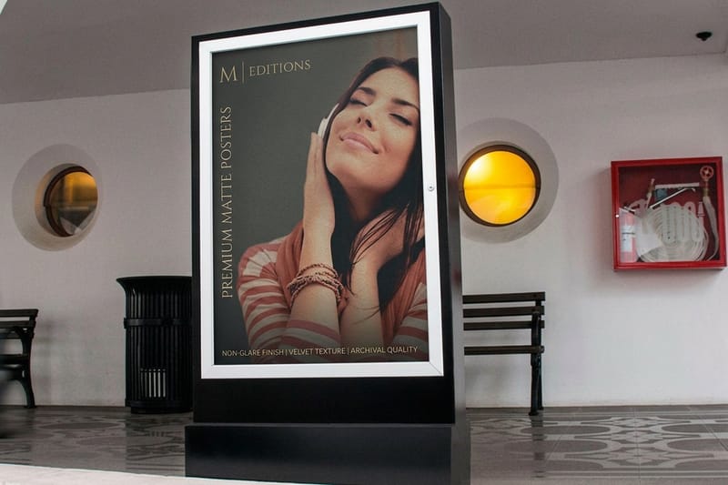
The minimalist style works on one test: cover the title and see whether a fan still names the show. If a single object carries the whole series, the poster is done. The prop, the door, the weapon, the chair, the vehicle, the piece of clothing. It rarely needs to be the main character, and it is often better when it is not.
Build it as flat vector shapes on a solid field, with no gradients and no drop shadows. That choice pays off twice, once because it reads across a room and once because it prints cleanly. On matte posters a solid field holds even ink with no glare, which is what you want for a poster hung opposite a window.
Five symbol directions that keep working
1. The single prop on a flat field. One object, centered or set on a rule of thirds, on a color taken from the show itself. The most reprinted fan posters in circulation are almost all this.
2. The negative-space silhouette. Cut the shape out of the field rather than drawing it. The eye finishes the outline, which is the whole pleasure of it.
3. The episode grid. One small mark per episode, laid out as a grid. It looks like data and reads like a season. Print it big, because the marks need room.
4. The map or floor plan. A house, a ship, a town drawn as a thin-line schematic. Line weight is the whole job here, and anything under 0.5 pt tends to break up on an uncoated sheet.
5. The object stack. Six to ten items from the series, drawn in one consistent style, arranged as a still life. It gives a fan something to keep finding, which is why it survives on a wall for years.
Where minimalism fails
It fails on shows with no visual signature. A workplace comedy with no props and no logo gives you nothing to reduce, and the honest answer is to switch to a type-led layout instead of forcing a symbol that no one will read.
It also fails at small sizes if the field is dark. A 12 by 18 inch print of a black poster shows every handling mark, and on a semi gloss stock it becomes a mirror. Go matte, or go bigger, or lighten the field.
Color and palette ideas
Most fan posters use two colors plus a neutral, and the two colors are pulled straight out of the show. Sample them from a still, then adjust rather than accept, because screen color and printed color do not agree about anything vivid.
The gap that catches people out is RGB to CMYK. A saturated screen orange, a neon green or an electric blue sits outside what four-process inks can hit, so the press prints the nearest thing it can and the poster looks flatter than the file did. You can either soften those colors yourself, where you control the result, or let the conversion do it for you, where you do not. Ordering the Free Online Proof option is the cheap way to see it before the full run. For more ways to keep poster prints cheap without losing color, see our pricing guide.
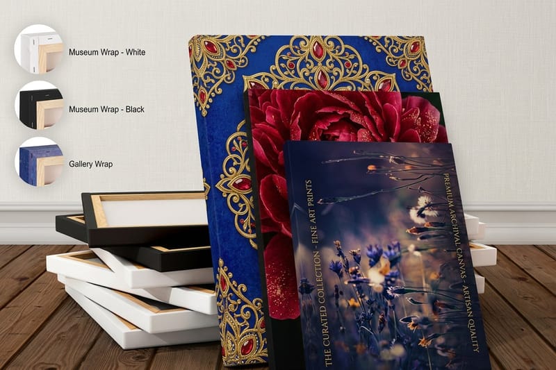
Canvas changes the maths again. A premium canvas print at $59.00 comes as a 1.5 inch gallery wrap, which means the outer inch and a half of your artwork folds onto the sides of the stretcher and leaves the front. Extend the background field into that band and keep every symbol and every letter well inside it, or hand the job to paper instead. Our canvas versus posters comparison works through when each one is the right call.
Palette systems for a series of posters
If you are making one poster per season or one per character, fix the layout and change only the color. Same margins, same type sizes, same symbol scale, a different field color each time. Hung together they read as a set, and the set is worth more than the sum of the individual prints.
Keep the neutral constant too. One paper white and one near-black across the whole series does more for the group than any individual color choice.
Duotone, and when to use it
Duotone rescues bad source material. Take a photograph that is too noisy to print large, reduce it to two inks, and the noise becomes texture rather than a fault. It is the standard trick for concert and TV art for exactly that reason.
It fails when the image needs skin tone to be readable as a person. If the face stops working, you have made an abstract poster, which may be fine, but it is a different poster from the one you set out to make.
Typography-led poster designs
When a show has no prop worth reducing, the type becomes the poster. One line of dialogue set large, the episode titles stacked as a block, a character name repeated until it turns into a texture. These print superbly, because type is vector by nature and there is no image to worry about at all.
Two rules keep type-led posters out of trouble. Set it big enough that the poster commits to the idea, which usually means larger than feels comfortable on a laptop screen, and pick one typeface with a real range of weights rather than pairing three faces that argue. If the quote is the whole poster, the kerning matters more than anything else on the page, so print a small proof and read it on the wall before you order the large one.
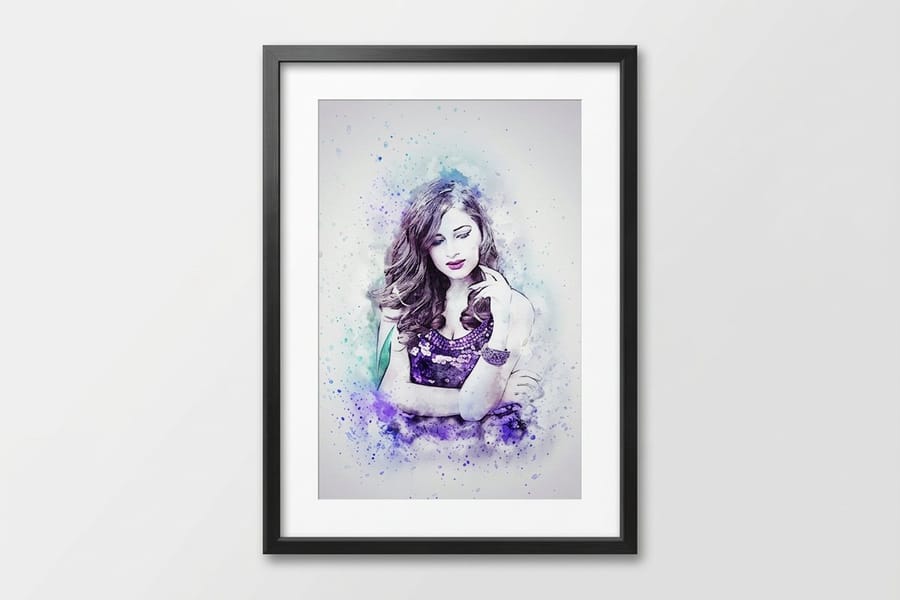
Watch the contrast on dark layouts. White type on a deep field prints heavier than it looks on screen because ink spreads slightly into the paper, so counters in letters like a, e and g can close up at small sizes. Bumping the weight down one step, or the size up two points, fixes it. This is also the moment to check what your finish will cover, since a framed poster hides roughly a quarter inch of the sheet under the frame lip and a line of type set tight to the margin can vanish into it.
Turning fan ideas into your own original art
This is the part most articles on fan posters skip, and it is the part that decides whether you can sell the work. A poster built from a show someone else owns is a derivative work. On your own wall that is a non-issue. On a market table it is a licensing question, and the rights holder is the one who answers it.
The way through is not a legal trick, it is a design move. Keep what you admired about the fan poster, which is the structure, and change what belongs to the show. Draw the object yourself instead of tracing a still. Drop the logo and the typeface the title sequence uses. Widen the subject from one series to the genre, the era or the idea, so the piece stands on its own to someone who never watched the show.
- Keep the structure. One symbol, a flat field, a single line of type at the bottom. Structure is not owned by anyone.
- Replace the asset. Your drawing of a 1970s rotary phone, not a traced frame from the title sequence.
- Drop the marks. No logo, no show title, no studio typeface. These are the parts that make a piece unmistakably someone else's property.
- Widen the subject. A poster about small-town detective fiction sells to more people than a poster about one season of one show, and it belongs to you.
Do that and you end up with something you can print in volume, sign, and put a price on. If you want to test a layout before committing, pull a correctly sized artboard from the blank template library so bleed and trim are already marked.
How to print a gallery-grade poster
Four decisions, in this order: size, stock, finish, and whether the piece arrives ready to hang. Get them in that order and nothing has to be redone.
Size first, because it sets the resolution you need. Stock second: 10mil Semi Gloss is the default on matte posters and handles both flat color and photography, 32# Bright White Uncoated gives a softer, papery result that suits line art, and 7mil weatherproof polypropylene exists for anything that will meet damp. Finish third, where lamination comes in five options from 3 mil gloss single sided to 3 mil matte double sided. Hanging last.
Quantity and price
Matte poster pricing and specs
Live configurator numbers and the real stock, lamination and proof options behind them.
| Quantity | Price Per Unit | Total |
|---|---|---|
| 1 | $25.00 | $25.00 |
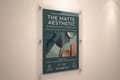
Take the Free Online Proof rather than Straight To Production on a first print. It costs you a day and it catches the color shift that a screen never shows you. You can also earn coins on the order and put them against the next one, which matters if you are printing a series.
Mounting, framing and hanging without a frame
A poster that hangs badly looks cheap regardless of how well it printed. Tape at the corners lets the sheet bow, and a bowed sheet catches light unevenly across a flat color field, which is exactly where it shows most. Order cheap custom poster printing on a stock heavy enough to hang flat.
Print it
Matte posters, any size
Ten stocks, five lamination options, and production from same day to two days.
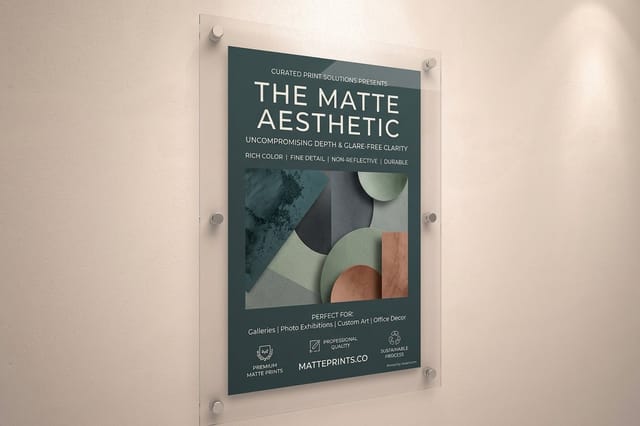
There are three ways out. A mounted poster at $39.99 bonds the print to 3/16 inch foam core in white or black, so it hangs flat straight out of the box and needs no frame. A framed poster at $87.86 arrives finished on Ultra White Giclee stock in a matte black frame, which is the right answer for a gift because nobody has to hunt for a frame that fits. A laminated poster keeps the flexibility of paper while putting a 3 mil skin between the ink and the room.
If you would rather keep it simple, our guide to hanging a poster without damage covers the methods that hold a large sheet flat on a rental wall, and poster sizes for walls helps if you are planning a group of prints rather than a single piece. For anything bigger than a standard sheet, see our guide to large-format poster sizes.
Who prints these, and what they order
The same design goes out in five different specs depending on who is ordering it.
- Fans printing for their own wall. One 18 by 24 inch or 24 by 36 inch matte print, hung flat. This is the entire job for most people, and it costs less than a takeaway.
- Illustrators building a portfolio. A series in a fixed layout with a changing palette. Print two sizes so you can see how the type holds at the smaller one.
- Convention and market sellers. Original art only. Print short runs at 11 by 17 inches, and keep a couple of large framed pieces on the table as the anchor.
- Bars, cafes and screening venues. Laminated or foam-mounted, because a poster at head height in a busy room gets touched, splashed and knocked.
- Gift buyers. A framed poster at $87.86 arrives finished. Nobody has to find a frame that fits an odd size, which is where most poster gifts stall.
Poster blanks that save a reprint
Starting from a correctly sized artboard saves a reprint. 4OVER4.COM sizes its blanks to the exact product specs, so bleed and trim are already where the press expects them and your symbol does not end up a sixteenth of an inch off center.
Start fast
Poster templates and print-ready blanks
Poster blanks at 18 by 24, 24 by 36 and the 27 by 40 cinema one-sheet size.
Wally turns a favourite scene into a poster that prints
Redraw it, flatten it, then pick the finish
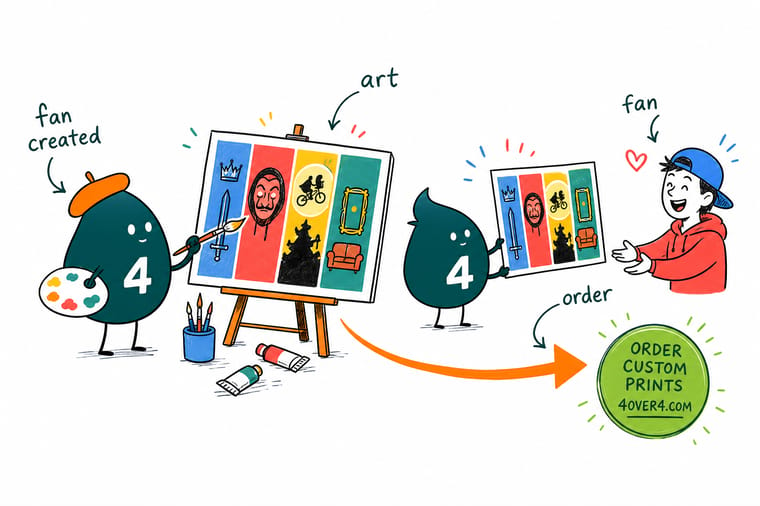
Trace the shape as vector art instead of enlarging a screenshot, keep the palette to two colors and a neutral, and build at 150 PPI or better at final size. Remember the finish crops the art: a 1.5 inch gallery wrap folds the outer band onto the sides and a frame lip covers about a quarter inch, so set your margins once you know which one you want.
Print your poster →Where fan art stops and your own work starts
Design tips that hold at any size
- Decide the finish before the margins. A gallery wrap eats 1.5 inches on every edge and a frame rabbet covers about a quarter inch. Both decisions change the artboard, and neither can be fixed after the file is built.
- Build type as vector, always. Outlined vector type prints crisp at any size. Type rasterised into a 1920 pixel image does not, and it is the first thing that gives a poster away as an enlarged screenshot.
- Test the symbol at thumbnail size. Shrink the whole poster to two inches wide. If the shape is still readable there, it will work across a room. If it turns to mud, simplify it.
- Watch line weight on uncoated stock. 32# Bright White Uncoated absorbs a little ink and thin rules gain weight. Anything below 0.5 pt is a gamble on that sheet and safe on a semi gloss.
- Leave the credit block empty. The strip at the bottom of a one-sheet is the most copied and least useful convention in poster design. One line of type, or nothing, beats fake credits every time.
Explore more
More ways to print your art
Matte and laminated posters print in 2 business days, framed and mounted posters in 4.
Product Matte Posters Flat, glare-free sheets for solid color fields. Product Premium Canvas Prints Gallery or museum wrap on a 1.5 inch stretcher.  Product Framed Posters Giclee paper in a matte black frame, ready to hang.
  Product Mounted Posters Foam-core backing so the print hangs flat without a frame.
  Product Laminated Posters A 3 mil skin over the ink for high-traffic walls.
  Category Poster Printing Every poster size, stock and finish in one place.
 Ready to print your poster?
Pick the size, drop in your artwork or a free blank template, and 4OVER4.COM prints it flat and sharp on your choice of ten stocks, framed or mounted if you want it ready to hang.
Common questions about fan art posters
Can I legally print fan art of a TV show?
Printing a piece for your own wall is a personal use that almost nobody objects to, and it is what the large majority of fan posters are made for. Selling it is a different question, because a poster built from a show someone else owns is a derivative work, and the rights holder decides what happens to derivative works. Artists who sell at conventions and online generally get there by making the piece original: their own drawing, their own composition, no logos, no lifted photography, and often no title at all. If you plan to sell, take the idea and rebuild it as your own art rather than reproducing the show, and get advice on anything you are unsure about before you commit to a run.
What size should a TV art poster be?
For a wall at home, 18 by 24 inches or 24 by 36 inches covers almost every case, and 24 by 36 is the size most fan art is built for. If you are matching the proportions of a cinema one-sheet, that is 27 by 40 inches. For a convention table or a portfolio, 11 by 17 inches is the working size, because it is cheap to print in a short run and it fits a standard sleeve. Our guide to poster sizes for walls walks through the room-by-room version of this if you are hanging several pieces together.
Matte or gloss for flat, minimalist artwork?
Matte, in most rooms. Flat color has no highlight detail for a gloss surface to lift, so gloss adds reflection without adding anything you wanted, and a large dark field on a semi gloss sheet behaves like a mirror opposite a window. Gloss earns its place when the art is photographic or when deep saturation matters more than glare, which is a real preference and not a mistake. Matte posters at 4OVER4.COM default to 10mil Semi Gloss and carry ten stocks in total, so you can move between them without changing the file.
What resolution does my file need?
For a poster viewed from a few feet away, 150 pixels per inch at the final printed size is enough, so a 24 by 36 inch print wants roughly 3600 by 5400 pixels. If people will stand close to it, work at 300 PPI. Vector artwork sidesteps the question completely, which is the strongest argument for redrawing a design rather than enlarging an image, and it is why the flat-shape style dominates this kind of poster in the first place.
Should this kind of art go on canvas?
Usually not. A gallery wrap takes the outer 1.5 inches of the artwork around the sides of the stretcher, which is fine for a painterly image and destructive for a layout where a symbol sits near an edge or type runs close to the margin. Canvas also carries a weave, and a hard vector edge printed on a weave never looks as crisp as the same edge on paper. Keep flat graphic work on paper, and save the canvas for photographic or painted source material where the texture helps. When the source suits it, compare printed canvas sizes and wraps in one place.
