
How to Make a Comp Card That Agents and Casting Directors Keep


The comp card is the one printed piece that outlives a casting call. This guide walks the whole build, from the 5.5 x 8.5 trim size and bleed setup to choosing the front headshot, laying out the back grid, writing an honest stat block and picking a stock that flatters photography.
To make a comp card, build a 5.5 x 8.5 inch portrait file with 0.125 inch bleed and a 0.25 inch safe margin. Put one strong headshot and your name on the front. Put three or four contrasting looks on the back with a stat block listing height, measurements, shoe size, hair and eye color, plus agency contact. Export a CMYK press ready PDF at 300 dpi and print on 14pt to 18pt cover stock with a matte or silk coating.

Start here
The comp card format in one paragraph
A comp card, or zed card, is a 5.5 x 8.5 inch printed sheet that a model leaves with a client. The front carries one headshot and the name. The back carries three or four contrasting images and a compact stat block with height, measurements, shoe size, hair and eye color, and the booking contact. Everything else is discipline: real numbers, quiet type, correct bleed and a stock that does not fight your photography.
What a comp card actually is and why casting still wants one on paper

A comp card is the modeling industry version of a leave behind. You walk into a casting, the client sees forty people in three hours, and the only thing left on the table at the end of the day is a stack of 5.5 x 8.5 inch cards. Yours has to survive that stack.
The format has been stable for decades because it does two jobs at once. The front proves you are recognizable: one photograph, your name, nothing else. The back proves you are castable: a spread of looks and a compact block of measurements that answers the questions a booker would otherwise have to email your agent about.
Digital portfolios have not replaced it. Agencies still file physical cards by division, and a card in a binder does not require anyone to open a laptop. If you want the online counterpart as well, our guide to how to make a digital business card covers the screen side, and the same photo selection logic applies to both.
Step 1: build the file at 5.5 x 8.5 inches with bleed
Set the document to 5.5 inches wide by 8.5 inches tall in portrait. That is a letter sheet halved, which is why it is the standard: it files, it stacks, and it costs nothing extra to cut. A5 at 5.83 x 8.27 inches is the common European variant if your mother agency asks for it.
Add 0.125 inch of bleed on every edge, so the working canvas becomes 5.75 x 8.75 inches. Any photo or color field that reaches the edge must extend into that bleed, because trimming a stack of cards always drifts by a hair and a photo that stops exactly at the trim line will show a white sliver on some cards.
Then pull a safe margin 0.25 inch inside the trim and keep your name, your measurements and your phone number inside it. Build in CMYK at 300 dpi, and export a flattened press ready PDF with fonts embedded. If you have not set a print file before, the free design templates already carry the bleed, trim and safe zones as locked guides.
Step 2: choose one front image that carries the whole card

The front is one photograph, full bleed, plus your name. Resist every impulse to add a second image, a logo, a border or a tagline. The point of the front is instant recognition: the client should look at the card and remember the person who walked in the room.
Pick a frame with clean light, neutral styling and open eyes toward camera. Avoid heavy retouching, dramatic color grades and anything that makes you look different from how you arrive in person, because the mismatch between card and callback is the fastest way to burn trust with a booker.
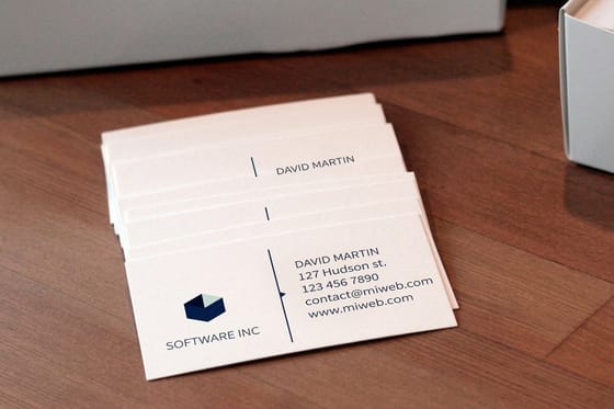
Your name goes over a quiet part of the frame, usually the lower third, set in a plain sans serif at a size you can read at arm length. That is the same discipline that makes a small card work, which our roundup of 15 stylish business card examples demonstrates on an even smaller canvas.
Step 3: lay out three or four back images that prove range

The back is where you answer the unspoken question: what else can this person be? Three or four images is the working range. A clean commercial smile, an editorial or high fashion frame, a full body shot that shows proportion, and one lifestyle or character look is a set that covers most casting briefs.
Keep the grid regular. Equal gutters, aligned edges, no tilted frames and no drop shadows. The images should differ in mood but agree in color temperature and skin tone, so the back reads as one person in four situations rather than four unrelated shoots stapled together.
Crop deliberately. A vertical portrait forced into a horizontal well loses the head, and a full body shot scaled too small becomes an unreadable smudge. If the layout fights you, drop to three images and let each one breathe, the same restraint that separates a strong multi-panel brochure from a cluttered one.
Step 4: write the stat block bookers actually read

The stat block is a short, factual panel, usually anchored to one corner of the back. Standard fields are height, bust or chest, waist, hips, dress or suit size, shoe size, hair color and eye color. Commercial and lifestyle talent often add age range instead of exact age.
Write real numbers and keep them current. A card that overstates height by an inch gets caught at the fitting, and one wrong measurement can cost a booking that was already yours. Reprint when your measurements or hair color change rather than crossing anything out by hand.
Contact comes last and must be unmissable: the agency name, division and phone, or your own booking email if you are freelance. Set it larger than the measurements. A card nobody can act on is a photo, not a marketing tool, and the same rule governs any line of copy you print, as our guide to making a card line stand out argues.
Step 5: keep the typography quiet and consistent

Two type sizes and one typeface is enough for an entire comp card. Your name is the display element, the stats sit in a small readable weight, and the contact line falls in between. Script fonts, outlines, gradients and letter spacing tricks all read as amateur to a casting director who has seen thousands of cards.
Hold the same face and the same treatment on the front and the back so the card feels designed rather than assembled. If you carry a personal mark or a small monogram, use it once, at a size that does not compete with the photography.
Personality belongs in the images, not in the lettering. If you want proof of how far a printed card can lean into character before it stops being useful, our study of the Patrick Bateman business card is a fun reminder that stock, weight and restraint carry more status than any font choice.
Step 6: pick a stock and coating that flatters photography
Weight first. 14pt cover is the practical floor for a comp card, 16pt is the comfortable standard, and 18pt gives you a card that feels closer to a portfolio page and holds up through a full casting season without curling at the corners.
Coating second. Matte and silk finishes keep skin tones natural, cut glare under studio lighting and hide fingerprints, which is why most photographers choose them. Gloss deepens blacks and lifts saturation but throws reflections and shows every touch. Uncoated takes a pen well if you want to add a note, but it softens contrast noticeably.
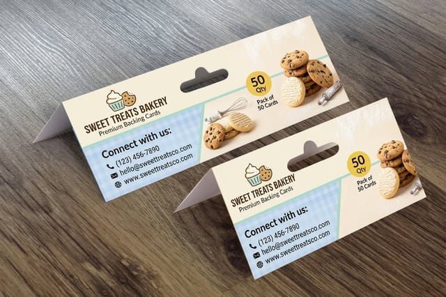
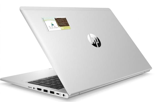
Never choose stock from a screen. Order free paper samples, hold the finish under a lamp, and check how your darkest image behaves on it. Talent who want a second format that sticks around can pair the card with business card magnets from $19.68 or business card stickers from $10.76 for follow up mailers.
Step 7: proof it, print it, and order enough to last the season

Before you upload, print one page at 100 percent on your home printer and cut it to size. Hold it. Read your name at arm length. Check that nothing important sits within a quarter inch of the trim and that the images do not go muddy when they leave the screen.
Upload the press ready PDF, review the online proof at full zoom, and confirm the trim marks match the 5.5 x 8.5 layout you built. Once a job goes to press the file is locked, so this is the last cheap moment to catch a typo in a phone number.
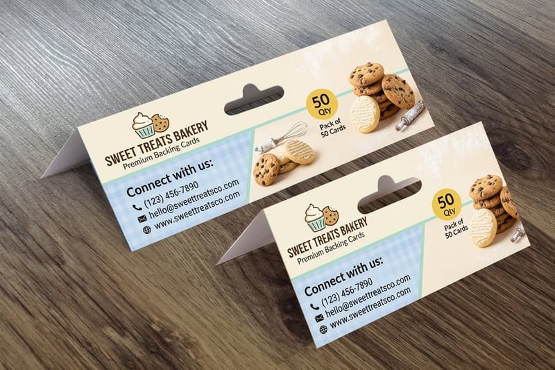
Order for the season, not for the week. Per card cost falls sharply as quantity rises, and a reprint two weeks later costs you the full setup again. Heavy backing cards start at $218.30 for a run, and if you are pricing against the usual retail options our Vistaprint price comparison shows where the savings sit at volume.
Wally explains the comp card
One card, one face, four proofs and a phone number
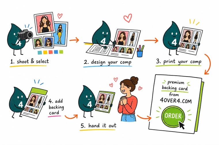
Wally treats a comp card like a tiny casting binder. The front has one job, being recognized. The back has one job, showing range without shouting. The stat block is not decoration, it is the answer sheet a booker checks before calling your agent. Get those three jobs right, print heavy, and the card keeps working long after the room clears.
Design and print your cards →Layout diagram
The comp card layout, front and back
One frame, both sides. Use it as a checklist while you build the file: what belongs on the front, what belongs on the back, and where the trim and safe margins fall.
Both sides work as a pair. The front earns recognition, the back earns the callback, and the print specs in the left column keep the file from being kicked back at preflight.
Specs and pricing
Card stock specs and live pricing
When the layout is locked, the print options decide how the card feels in hand. Check the available stocks, coatings and turnarounds, then watch pricing move as you change quantity.
| Quantity | Price Per Unit | Total |
|---|---|---|
| 1,000 | 21.8¢ | $218.30 |
| 2,500 | 13.7¢ | $341.88 |
| 5,000 | 10.4¢ | $520.36 |
| 10,000 | 10.3¢ | $1,028.35 |
Print it
Print your comp cards and the pieces that travel with them

See it in use
Real card printing, produced in-house








Explore more
Where to go next




By the numbers
Printing you can count on at 4OVER4.COM
Common Questions
Common questions about comp cards
What is a comp card?
A comp card, also called a composite card or a zed card, is a printed one-sheet that a model or performer leaves behind after a casting. The front carries a single strong headshot and the name. The back carries three or four contrasting images plus a stat block with height, measurements, shoe size, hair and eye color, and the agency or direct booking contact. It works as a physical business card scaled up to portfolio size.
What size is a comp card?
The industry standard is 5.5 x 8.5 inches, which is a letter sheet cut in half. Agencies file that size, casting directors stack it, and every portfolio sleeve is cut for it. Some European boards ask for A5, which is 5.83 x 8.27 inches and close enough that the same layout works with a small margin adjustment. Anything larger gets bent, and anything smaller gets lost in the pile.
How do I choose the right comp card template?
Pick a template built at 5.5 x 8.5 inches with bleed already set, a single full frame on the front, and a back grid of three or four image wells plus a stat panel. Make sure the photo wells match the crops you actually have, because forcing a vertical portrait into a horizontal well ruins the composition. If the template locks the type sizes, check that your name still reads clearly from an arm length away.
What does comp card printing cost and how are prices set?
Price is set by quantity, trim size, paper weight, coating and turnaround, not by how many photos you place. Short runs cost more per card because setup is spread across fewer pieces, so ordering a season of cards at once is cheaper than reprinting monthly. Listed 4OVER4 pricing on the products in this guide starts at $218.30 for backing cards, $19.68 for business card magnets and $10.76 for business card stickers, and the live price table updates as you change the options.
What sizes, stocks and finishes are available for comp cards?
Comp cards print well on 14pt or 16pt cover stock, and heavier 18pt if you want a card that feels closer to a portfolio page. Matte and silk coatings keep skin tones natural and are the safe default for photography. Gloss lifts saturation but shows fingerprints under studio lights. Uncoated stock takes pen well if you want to write a booking note, but it flattens contrast, so ask for a sample before committing a full run.
How long does comp card printing take to print and ship?
Production time depends on the turnaround you select at checkout rather than on the artwork. Faster turnarounds move your job into an earlier press window and cost more, standard turnarounds cost less and sit in the normal queue. Shipping is quoted separately by destination and service. If you are printing for a specific casting week, count backwards from the audition date and add buffer days for proofing and for a reprint if a file needs fixing.
How many photos should be on the back of a comp card?
Three or four. Each one has to earn its place by showing something the others do not: a commercial smile, an editorial look, a full body shot that proves proportion, and one lifestyle or character frame. Five or more shrinks every image to a size where nothing reads, and two makes the card look thin. Keep the crops consistent in tone so the set feels like one person, not four different shoots.
Get Started
Ready to put your comp card into print?
Upload the press ready file, pick a heavy cover stock with a matte or silk coat, and order enough cards to carry you through the whole casting season.
Legal Disclaimer
Gold Standard guarantees apply to all standard orders placed through 4over4.com. Price match requires verifiable proof of a competitor's published price for an equivalent product with matching specifications and turnaround time. Satisfaction guarantee covers manufacturing defects and print quality issues. Contact support with order number and documentation. On-time delivery rate based on tracked orders 1999 to 2026. Individual results may vary based on shipping carrier performance.
