
How to Make a Big Check for Presentations That Look Camera Ready


Standard sizes, the six fields that matter, reusable fill in panels, rigid board mounting, and the staging that keeps the amount readable in every photo. Everything you need to take an oversized check from a blank artboard to the moment of the handshake.
To make a big check for a presentation, lay out six fields on a two to one panel: payer, date, payee, amount in numerals, amount in words, and a signature line. Print it at 24 by 12, 36 by 18, or 48 by 24 inches on rigid board with a matte finish, size the numerals to be read from twice the camera distance, and leave the payee and amount areas wipeable so the same panel serves every event.

Start here
The whole method in one paragraph
A presentation check is a photo prop with a job. Pick a size from the camera distance, keep the panel to six fields, set the amount as the largest element on the board, and print it on rigid stock with a matte finish so stage lighting does not bounce off the number. Leave the payee, amount, and date areas clean enough to reuse, brief the two people holding it to tilt it slightly back, and pair the check with a folder so the recipient walks away with the paperwork as well as the picture.
Why an oversized check still wins the photo everyone shares
A wire transfer clears in seconds and nobody remembers it. A giant check handed over in front of a team gets photographed, posted, printed in the local paper, and pinned to a wall for a decade. The prop is doing communications work, not banking work, and that is exactly why the layout deserves real attention instead of a rushed word processor file.
The failure mode is always the same. Someone prints a check the size of a poster, packs the panel with sponsor logos and a paragraph of thanks, and the photo comes back with an unreadable amount. The number is the headline. Everything else on the board is supporting cast. If you take one rule from this guide, make it that the amount and the payee should still be legible when the image is cropped to a phone screen.
Treat the check as the centerpiece of a small print kit. The panel gets the photo, and the paperwork that follows the handshake carries the details. Our accounting client winning essentials kit covers the follow up materials, and a set of education presentation folders gives the recipient somewhere to put the award letter before they leave the room.
Standard big check sizes and how to pick yours

Presentation checks cluster around three sizes, and all three keep the two to one proportion that makes a rectangle read as a check instead of a banner. The small size is 24 by 12 inches, comfortable for one person to hold and right for an office handoff shot from a few feet away. The middle size, 36 by 18 inches, is the workhorse: two people can hold it, and it stays readable from the back of a room.
The large size is 48 by 24 inches. It earns its keep on a stage, at a press line, or anywhere the photo will include a backdrop, a podium, and four or five people. Above that, the panel starts fighting the humans holding it, and wind turns any outdoor handoff into a comedy. If your ceremony is outside, stay at 36 by 18 inches and have two people brace the bottom corners.
Match the size to the camera distance rather than to the room. Measure roughly where the photographer will stand, double that number in feet, and use it as a sanity check on your amount type size. The same read from a distance logic drives good name badge design at the same event, where a badge has to be readable at conversation range.
The fields every presentation check actually needs

A real check carries about a dozen elements. A presentation check needs six, and adding the rest only steals space from the ones that matter. Work from this list: the payer identity at the top left, the date at the top right, the payee on the pay to the order of line, the amount in numerals inside a boxed field, the amount written out in words on the line below, and a signature line at the bottom right.
Two optional additions earn their place. A memo line reading something like scholarship fund or annual community grant tells the story in three words and helps whoever writes the caption. A tagline or campaign name across the bottom band works if it stays short. Everything else, including long thank you paragraphs and a wall of partner logos, belongs on the flyer you hand out afterward.
Leave the MICR band decorative. Draw a light line of abstract characters where the routing numbers would sit, or leave the strip empty. Printing genuine account numbers on a panel that will be photographed and published is a security problem waiting to happen, and no reporter has ever asked for them.
Lay it out so the amount reads from twenty feet back

Set the amount first and build everything else around it. On a 36 by 18 inch panel, the numerals in the amount box should be roughly three to four inches tall, which puts them at 200 to 300 points. The payee name comes second at about half that height. The written out amount, the date, and the memo sit at a quarter of the amount height. If a line does not fit at those sizes, the line is too long, not the type too big.
Choose a typeface with real weight and open counters. A bold grotesque or a sturdy slab holds up at scale, while thin geometric faces and script faces collapse into noise once a camera compresses the image. The same selection logic behind our roundup of free fonts for business cards applies here, only the stakes are higher because there is no second glance.
Give the panel margins that look generous on screen. Two inches of clear space around the border keeps fingers, thumbs, and the edge of the board out of the important areas, because the people holding it will grip exactly where you least want them to.
Build print ready artwork at this scale without surprises
Set your document at full size whenever your software allows it. A 36 by 18 inch artboard at 150 dpi is plenty for a piece viewed from several feet away, and it keeps file sizes manageable. If you must work at half scale, build at 18 by 9 inches and 300 dpi, then let the printer scale it up cleanly. Vector logos and vector type survive that scaling. Raster logos pulled from a website do not.
Add a quarter inch of bleed on every edge and pull all live text at least half an inch inside the trim. Convert your colors to CMYK before you export so nobody is surprised when a bright screen blue lands as a duller print blue. Flatten transparency, embed or outline your fonts, and export a single page PDF with crop marks.
Proof the file at actual size on paper before you commit. Print the amount box alone on a letter sheet at one hundred percent, tape it to a wall, and walk to the back of the room. That two minute test catches more layout mistakes than any amount of zooming on a monitor.
Rigid board, thickness, and the finish that beats camera flash
The substrate decides whether your check photographs as a crisp rectangle or a sagging curve. Foam centered rigid board around three sixteenths of an inch thick is the sweet spot: stiff enough to span three or four feet without bowing, light enough that a child can hold one end for a full minute of photos. Thicker composite panels are more durable if the check will travel to a dozen events, and they weigh accordingly.
Finish matters more than most people expect. Matte or satin lamination absorbs the venue lighting and the flash. High gloss mirrors both, and the reflection lands right across the amount box more often than chance would suggest. Lamination also protects the surface from the fingerprints and scuffs that accumulate every time the panel goes in and out of a car.
Specialty finishes deserve a narrow role here. A raised varnish on a logo can look excellent in the hand and terrible under stage lights, which is the tradeoff explored in our look at creatives who use spot UV designs. If you want that effect, put it on the folders and flyers, not on the check panel.
Fill in fields that let one panel serve a whole season

If your organization presents more than one check a year, design for reuse from the start. Print the header, logo, payer line, memo label, and signature permanently. Then leave three areas as clean, light, untextured panels: the payee line, the amount box, and the date. Those are the only parts that change between events.
For the variable parts you have three good options. A dry erase marker on a laminated surface is instant and wipes clean, though it looks handwritten in the photo. A printed vinyl strip cut to size and applied over the box looks typeset and peels off afterward. A slim printed insert card taped behind a die cut window is the most polished and takes the longest to prepare.
Whichever you pick, test the removal method on a corner of the panel before an event, not after one. Some marker inks ghost on satin lamination if they sit for a week, and discovering that the night before a ceremony is not the moment for experiments. The same handmade personalization thinking shows up in our guide to DIY scratch off print and cut cards.
Mounting, easels, and holding it steady on stage
Most presentation checks are held rather than mounted, and that changes how you brief the people in the photo. Two holders, one at each end, hands at the lower corners, arms slightly bent, panel tilted about ten degrees back from vertical. That tilt kills the overhead light reflection and stops the top edge from catching a shadow. Tell them before the photographer arrives, because nobody adjusts mid shot.
When the check needs to stand alone, an A frame easel rated for the panel width does the job. For a 48 by 24 inch board, use an easel with a lower lip deep enough to seat a rigid panel, and put a sandbag on the rear leg if there is any breeze. Taping the check to a podium front is the fallback, and gaffer tape on the back corners removes cleanly from laminated board.
Plan the transport too. A cardboard sleeve or a foam corner set keeps the edges from crushing in a trunk, and crushed corners are the single most common damage on an oversized panel. Bring a second set of corners if the check is traveling to more than one venue.
Stage the handoff so the check is the subject

Composition beats decoration. Put the check across the front of the group at roughly chest height, keep the number of people to four or fewer, and place the tallest person in the middle so the top edge of the panel stays level. Shoot from slightly above the check rather than below it, since a low angle makes the panel lean away and compresses the numerals.
Backgrounds do the rest. A plain wall, a step and repeat, or the front of a building all work. Avoid glass doors and mirrors, which put a reflected photographer directly onto the check face. If the event runs outside, shoot with the sun behind the camera or find open shade, because harsh side light turns the amount box into a half lit rectangle.
Take the group shot and then take a tight shot of the check alone. The tight one is what ends up in the newsletter and the social post, and it is the frame where every layout decision you made either pays off or does not. A short, quotable line across the bottom band helps here for the same reason a sharp tagline works on paper, as our look at memorable slogans explains.
What to order, what it costs, and how to time it
Order the check and the materials that follow it in one pass. The panel gets the photo, and the recipient still leaves with paperwork, so pair the check with a folder that holds the award letter, the terms, and a business card. Education presentation folders start at $844.54 and suit scholarship and grant handoffs.
Build a week of slack into the calendar. One proof round, one shipping window, and one inspection at the receiving end is the realistic minimum, and ceremony dates rarely move. Send the artwork with the exact finished dimensions in the file name so nothing gets guessed at during preflight.
Then get the small things right. Confirm who signs the check panel and get them to do it in permanent marker the day before, not thirty seconds before the photo. Print the recipient name twice if the spelling is unusual, once on the panel and once on a spare strip. Small redundancies are cheap compared to a reprint. Design ideas from other formats, like the shaped cards in our piece on leaf shaped business cards or the storytelling in college brochures that stand out, are worth borrowing for the rest of the kit.
Wally explains the big check
One number, held flat, photographed once
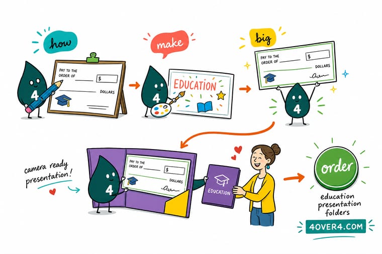
Wally has stood at the end of a lot of oversized checks, and he says the whole thing comes down to three habits. Make the amount the biggest object on the board. Print it on something rigid enough that it never bows in the middle of a photo. And leave the payee and the amount wipeable, because the next award is always closer than it looks. Everything else is decoration competing with the picture you actually want.
Print the folders that go with it →Template
The big check layout, field by field
One frame with every field labeled and sized. Use it as a starting artboard, then scale the whole thing to 24 by 12, 36 by 18, or 48 by 24 inches without changing the proportions.
Numbered fields map to the six essentials: payer, date, payee, amount in numerals, amount in words, and signature. The memo line is optional and the MICR band stays decorative.
Specs and pricing
Presentation folder specs and live pricing
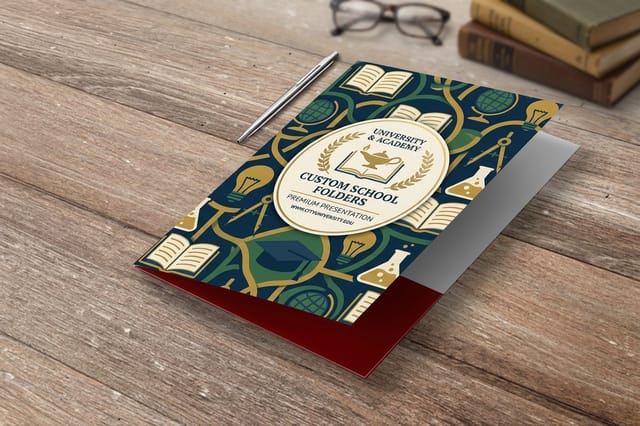
The check gets photographed, the folder goes home with the recipient. Here are the live specs and quantity pricing for the folder most award and scholarship handoffs pair with the panel.
| Quantity | Price Per Unit | Total |
|---|---|---|
| 250 | $3.38 | $844.54 |
| 300 | $3.09 | $925.50 |
| 400 | $2.52 | $1,006.44 |
| 500 | $2.17 | $1,086.18 |
| 600 | $1.93 | $1,158.67 |
| 700 | $1.76 | $1,231.16 |
| 800 | $1.63 | $1,303.65 |
| 900 | $1.53 | $1,376.15 |
Print it
Round out the presentation kit at 4OVER4
See it in use
Real presentation materials, printed in-house

Explore more
Where to go next
By the numbers
Printing you can count on at 4OVER4.COM
Common Questions
Common questions about presentation checks
What is a big check for a presentation?
A big check is an oversized replica of a bank check, printed on a rigid panel and held up for photographs when money changes hands. It is a prop, not a negotiable instrument, so it never gets deposited. Charities use them for donation handoffs, schools use them for scholarship awards, and sponsors use them at tournaments and grand openings. The real payment moves by transfer or a normal check while the big one carries the story and the logo into every photo taken that day.
How do I choose the right big check size for my event?
Work backward from where the camera will stand. For a small office handoff photographed from six or eight feet, 24 by 12 inches is enough. For a stage, a gymnasium, or a press line where photographers shoot from fifteen feet or more, go to 36 by 18 inches. Anything held by two adults in front of a step and repeat banner tends to look right at 48 by 24 inches. Keep the classic two to one proportion so the panel still reads as a check rather than a poster.
What does a big check cost and how are prices set?
Price follows four things: the printed area, the rigidity of the substrate, the finish, and how fast you need it. A single oversized panel is a short run, so setup is a bigger share of the total than it is on a thousand flyers. Adding a second side, a wipeable amount panel, or same day turnaround raises it. Ordering the leave behind materials for the same event in one job usually costs less than two separate orders.
What sizes, stocks, and finishes work best for presentation checks?
The three sizes that cover almost every event are 24 by 12, 36 by 18, and 48 by 24 inches. For stock, rigid board in the three sixteenths of an inch range holds its own weight without flexing while staying light enough to lift over a shoulder. Matte or satin lamination is the right call because it kills glare. Skip high gloss and skip anything with a heavy texture, since both fight the camera rather than help it.
How long does a big check take to print and ship?
Artwork approval is usually the slow part, not production. Once the file passes preflight, an oversized rigid panel typically runs the same production window as other large format work, and expedited options exist when a ceremony date will not move. Order at least a week ahead so you have room for one proof round, and ship it to the venue only if someone will physically sign for it. Otherwise send it to an office where a person can inspect the corners before the event.
Can I reuse the same big check for more than one presentation?
Yes, and most organizations should. Print the header, logo, payer line, and signature block permanently, then leave the payee, amount, and date areas as clean light panels. A dry erase marker or a printed strip taped into the box handles the variable parts. One panel then covers a whole year of chapter donations without a new print job each time.
Does a big check need a real signature and routing numbers?
It needs a signature line and a handwritten signature for the photo, because an unsigned check looks unfinished in print. It does not need real routing or account numbers, and it should not carry them. Use a decorative micro line or a generic placeholder string where the MICR band would sit. Never reproduce your actual account details on a panel that will be photographed and published.
Get Started
Ready to print the kit around your big moment?
Bring your artwork to 4OVER4.COM and get the folders, handouts, and leave behind materials that turn one photo op into a relationship the recipient keeps.
Legal Disclaimer
Gold Standard guarantees apply to all standard orders placed through 4over4.com. Price match requires verifiable proof of a competitor's published price for an equivalent product with matching specifications and turnaround time. Satisfaction guarantee covers manufacturing defects and print quality issues. Contact support with order number and documentation. On-time delivery rate based on tracked orders 1999 to 2026. Individual results may vary based on shipping carrier performance.
