
How to Design a Wall Calendar That People Keep All Year


Tobias is our voice for cutting, binding and large format, built from the knowledge of our production team, with over 20 years in printing.
To design a wall calendar people keep all year, work through the year plan, trim size, date grid, images, type, binding, hanging, bleed, stock, and proofing, in the order a printer would work through them. Everything you need to take a wall calendar from a blank page to a file that presses clean and hangs flat for twelve months.
To design a wall calendar, plan the year first, then the page. Fix the start month and leaf count, pick a trim size from the reading distance at the wall, build a seven column date grid with numerals in a fixed corner and clear writing room in every cell, add 300 dpi images sized to the final image area, set the top margin around your binding and hanging method, extend bleed an eighth of an inch past trim, and proof one printed month on the real wall before ordering.

Start here
Grid, leaf, binding, in that order
A wall calendar is a dated series, so it is designed as a system rather than as twelve separate posters. You settle the start month, the leaf count, and the reader, then choose a trim size from how far away the calendar will be read. One master month grid gets built and tested against a leap year February and a long month starting on a weekend, then repeated. Images come in at 300 dpi at final size and get sequenced against the seasons. Binding and hanging set the top margin, bleed protects every edge, and one printed month taped to the real wall catches what the screen hides. To keep the calendar looking fresh through the year, print the leaves on 100 lb coated text so they hang flat instead of curling, give the cover a heavier stock than the interior so the top leaf protects the set, run the grain along the binding edge, and choose matte or silk on the leaves if people write on the dates.
Why a wall calendar is the rarest thing in print, a page people keep
Almost everything you print gets one look and a decision. A wall calendar gets three hundred and sixty five. It hangs at eye level in a kitchen, a break room, or a workshop, and every person in that room reads it several times a day for a full year. No other printed piece buys that much attention for that little money.
That is also the trap. Because the piece lives on a wall for twelve months, every weak decision stays visible for twelve months too. A cramped date grid, a photo that went soft at print size, a top margin that got eaten by the binding wire, all of it becomes a daily irritation. Our custom photo calendar printing guide covers image sourcing in depth, and this guide covers the structure that carries those images.
The method below moves in the order a printer would use it, from the year plan down to the trim marks. Work it in that order and the file that reaches press is already correct instead of being repaired at the last minute.
Plan the year before you open the design file

Decide four things on paper first. Which month the calendar starts in, how many leaves it has, whether the back of each leaf prints or stays blank, and who the reader is. An academic year calendar starting in August and a January to December gift calendar look identical in a mockup and behave completely differently in production.
Leaf count is the number that moves cost the most. Twelve months plus a cover is thirteen leaves. Some designs pair two months per leaf to halve the count, others add a planning spread at the front or a notes page at the back. Every leaf you add multiplies across the entire run, so settle the count before anyone starts art.
Write the reader down in one sentence. A calendar for a construction crew that gets marked up in pencil needs enormous open date boxes. A calendar sent to design clients can give the image three quarters of the leaf. You cannot serve both readers on the same grid, so pick one.
Pick size and orientation from the wall, not from the screen

Stand where the calendar will actually be read and measure that distance. In a home kitchen it is around six feet. In an open office or a shop floor it can be twenty. Date numerals need roughly one inch of height for every ten feet of comfortable reading distance, and that single rule sets your minimum trim size faster than any style discussion will.
Portrait suits the classic image over grid layout, because the photograph gets the top half and the seven column grid sits underneath at full width. Landscape suits wide panoramic images and gives each date box more horizontal room to write in, which matters for scheduling calendars. Square formats split the difference and photograph beautifully, but they waste grid width.
Check the finished dimensions against the wall furniture around it too. A calendar that overlaps a light switch or a cabinet edge gets moved, and a moved calendar usually ends up in a drawer. The guide to standard calendar sizes lists the common trims so you can match a stock size instead of paying for a custom cut.
Build the date grid so it survives real handwriting
Set the grid before the decoration. Seven columns of equal width, five or six rows depending on the month, a weekday header band, and consistent gutters. Build one master month, verify it against February in a leap year and against a thirty one day month that starts on a Saturday, then duplicate. Those two edge cases break more calendar files than anything else.
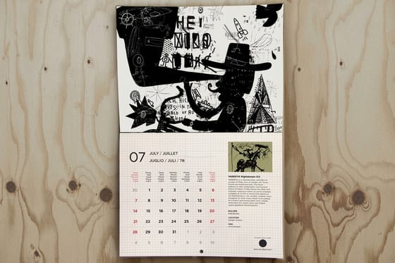
Place the numeral in a fixed corner of every box, usually top left, at a weight heavy enough to read instantly but small enough to leave the rest of the cell empty. The empty part of the cell is not wasted space, it is the writing area, and it is the whole reason someone chose a wall calendar over a phone reminder. Aim for a quarter inch of clear height minimum.
Gray out or lighten the leading and trailing days that belong to adjacent months so nobody writes an appointment in the wrong week. Mark holidays and observances in a second color rather than a second typeface, and confirm every date against an authoritative source for the specific year you are printing, because holiday dates shift and a wrong one is visible for a month.
Choose and prepare images that hold up at full print size

Pick twelve images that belong to one family. A calendar is a series, so the strongest sets share a palette, a subject, or a light quality that carries the reader from January through December. Twelve unrelated favorites look like a folder dump on a wall, and the difference is obvious the moment the leaves hang together.
Every image needs 300 dpi at the final image area size, measured in real captured pixels. A ten by twelve inch image area wants roughly 3000 by 3600 pixels. Crop into a larger original rather than enlarging a small one, and keep the crop generous enough that the picture can bleed past the trim on the sides where you want it to run off the edge.
Sequence the images against their months on purpose. Cool tones and open landscapes read as winter, dense warm color reads as autumn, and a mismatch registers as a mistake even when the reader cannot name why. Portfolio thinking helps here, and the layout ideas in these portfolio examples transfer directly to the image half of a leaf.
Set type and color for a piece read from across the room

Use two typefaces at most. One for the month name and numerals, one for the small supporting text like holiday labels and notes. Numerals do the hardest work, so choose a face with clearly distinct 6, 8, and 9 shapes and generous counters, then test it printed at size rather than zoomed on a monitor where everything looks fine.
Contrast beats color. Dark numerals on a light cell will always outperform a clever tinted grid, especially under the mixed lighting of a real room. Reserve color for one job, usually holidays or your brand accent, and let the rest of the grid stay quiet. Seasonal accent palettes are useful for themed sets, and the color pairings in these seasonal poster and flyer ideas show how far a single accent can go.
Build the file in CMYK and keep rich blacks out of small type, since four color small text is where registration shifts become visible. If you are placing a logo, keep it to one clean lockup per leaf. Light branding is what keeps a promotional calendar on the wall, and the same restraint applies to every branded piece, including the logo sticker ideas that often ship alongside a calendar campaign.
Decide binding and hanging before you set the top margin

Binding eats space at the top of the leaf, and how much it eats depends on the method. Wire binding needs punch clearance plus the wire itself, saddle stitching folds the sheet so your spread has to account for creep, and a simple glued or stapled top edge needs the least clearance but holds fewer leaves. Confirm the method first, then set your top margin around it.
Hanging is the other half of the same decision. A punched hole in the wire, a metal hanger strip, a grommet in a heavier stock, or a simple mounted top edge all behave differently. Heavier calendars need a hanger rated for the weight or they tear out by spring, and anything hanging from a single point needs the leaf to be balanced left to right or it sits permanently crooked.
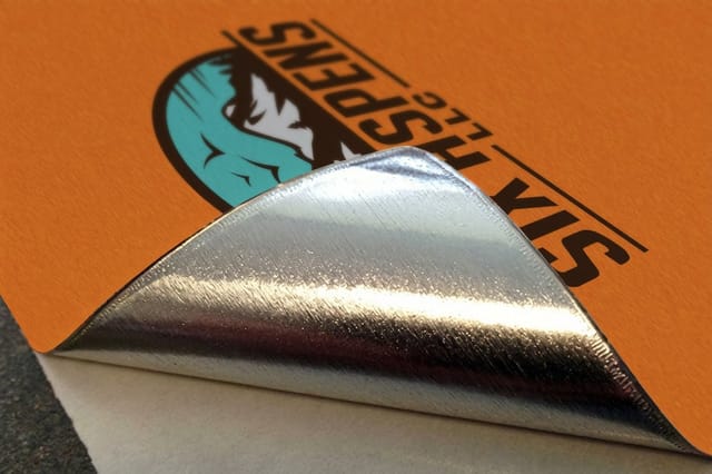
For year at a glance planners and oversized wall pieces, skip binding entirely and mount the sheet. Adhesive wall fabric starts at $25 and peels off cleanly at the end of the year, which is exactly what a twelve month planner in a shared office needs. Aluminum wall graphics start at $29 when the piece has to survive a workshop or a warehouse wall.
Set bleed, trim, and safe zones so nothing important gets cut
Extend every background and every image that touches an edge a full one eighth of an inch past the trim line on all four sides. Cutting happens in stacks and stacks move, so a design built exactly to the trim line will show a white sliver on some pieces in the run. Bleed is not optional insurance, it is the standard.
Then pull everything that must survive inward. Keep numerals, month names, logos, and contact details at least a quarter inch inside the trim, and give the bound edge more clearance than the other three because punching and binding tolerances stack on top of cutting tolerances. Anything sitting in that band is a gamble.
Export the file as a print ready PDF with fonts embedded, images at full resolution, and CMYK color, then open the exported PDF and read it as if you had never seen the design. Half of all last minute calendar problems are visible in that one pass, and finding them there costs nothing.
Choose stock and finish for how the calendar will be used

Weight controls how the calendar hangs. Light text stock curls and ripples on a wall, which is why 100 lb coated text is the common floor for hanging leaves. Give the cover a heavier stock than the interior so the top leaf protects the set through a year of flipping, and match the grain direction to the fold or punch edge so leaves turn flat instead of fighting back.
Coating is a use decision, not a taste decision. Gloss makes photographs snap and resists kitchen grease, but it repels ballpoint ink. Matte and silk take pen and pencil, which is what a working calendar actually needs. A common compromise is a gloss cover with an uncoated or matte interior, so the piece sells on the shelf and still works on the wall.
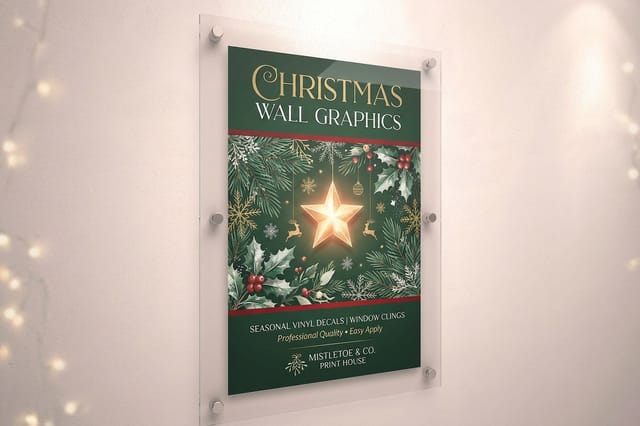
For anything hanging in a humid or high traffic space, move to a substrate built for it rather than pushing paper past its limits. Seasonal themed wall pieces like Christmas wall graphics start at $25 and hold color under display lighting. The material and finish thinking in current packaging design trends translates straight across to printed wall goods, and the retail wall graphics video overview shows those materials in use.
Proof one month, then order the full year
Print one month at full size on plain paper, tape it to the wall it will live on, and stand where the reader will stand. You will find the real problems in ninety seconds. Numerals too small, holiday color invisible under warm light, the grid sitting too low behind a cabinet. None of that shows on a monitor at any zoom level.
Read every date twice against a source you trust, once forward and once backward. Verify the year on the cover, the day of week alignment for the first of each month, and the spelling of every month name. A typo in body copy is embarrassing, a wrong weekday column makes the entire run unusable, and there is no fixing it after binding.
Then order with a little headroom. Reprints on a dated product are painful, because a calendar has a hard expiry and a short reorder window in the final quarter. If you want a second opinion on the file before it goes to press, our free online designer and pro design help can check it, and the custom photo wall calendar comparison lays out how the options stack up on stock and price.
Wally explains the calendar grid
Twelve leaves, one system
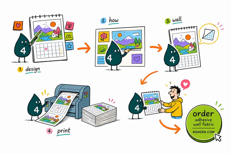
Wally builds one month, not twelve. He sets the seven columns, drops a numeral into the same corner of every cell, leaves real writing room underneath, and only then decides where the photo sits. Once that master leaf reads clearly from across the room, the other eleven are just new images and new dates poured into a grid that already works.
Print your wall calendar →
Infographic
The anatomy of a wall calendar leaf
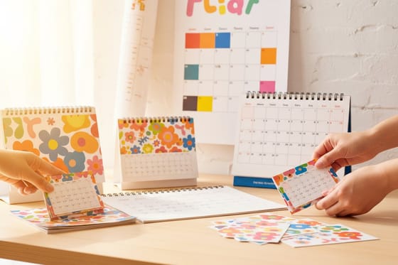
One frame, seven parts: the image panel, the month title, the weekday header, the date grid, the holiday marks, the binding edge and the hanging point. Keep it beside you while you build the master month, then check each finished leaf against it before the file goes to press.
No part of a calendar leaf works alone. The image sets the mood, the grid does the work, and the binding and hanging decide whether either one is still readable in December.
Specs and pricing
Wall print specs and live pricing
When the calendar file is ready, the next questions are size, material, and quantity. Here are the live specs and pricing for adhesive wall fabric, the flexible mounted format for oversized year planners.

| Quantity | Price Per Unit | Total |
|---|---|---|
| 1 | $25.00 | $25.00 |
Print it
Put your calendar design on the wall


Explore more
Where to go next



By the numbers
Paper types available for a calendar that hangs all year
Common Questions
Common questions about designing a wall calendar
What is a wall calendar?
A wall calendar is a printed set of dated pages built to hang flat against a vertical surface, usually one leaf per month plus a cover. Each leaf pairs a large image area with a date grid sized to be read from several feet away. Unlike a desk or pocket format, it is designed for shared visibility, so a whole household, classroom, or office reads the same dates at the same time.
How much writing room does each date box need?
Start with the reader. If people write on it, give every date box at least a quarter inch of clear writing height and keep the numeral in one corner. If it is mostly decorative or promotional, let the image take two thirds of the leaf and keep the grid tight and quiet underneath. Then check the layout at real size by printing one month and taping it to the actual wall before you commit to twelve.
What does printing a wall calendar cost and how are prices set?
Price is driven by trim size, page count, paper weight, coating, binding method, and quantity. Every added leaf multiplies across the run, so a thirteen leaf calendar costs far more per unit than a single sheet year at a glance poster. Short runs carry the setup cost across fewer pieces, so unit price drops sharply as quantity climbs. Large format wall printing at 4OVER4 starts at $25 for adhesive wall fabric.
What sizes, stocks, and finishes work best for wall calendars?
Common finished sizes run from 8.5 by 11 inches up to 12 by 18 inches for hanging leaf calendars, and larger for single sheet year planners. Text weight coated stock around 100 lb keeps leaves flat and takes photographic images cleanly. Gloss coating makes images pop, matte or silk keeps handwriting legible in pen or pencil, and a heavier cover stock protects the top leaf through a year of flipping.
How long does wall calendar printing take to produce and ship?
Turnaround depends on binding and finishing more than on printing. Flat single sheet formats move fastest because they skip collation and binding. Wire bound multi leaf calendars need collating, punching, and binding time after press. Plan your file approval for early autumn if the calendar is a year end gift, since finishing capacity tightens across the whole industry in the final quarter.
What resolution do wall calendar photos need?
Build every image at 300 dpi at final print size, not at screen size. A 12 by 12 inch image area needs roughly 3600 by 3600 pixels of real captured detail. Upscaling a small file will not add detail, it only softens edges and smears skin tones. Shoot or source wide, crop into the frame, and leave extra pixels beyond the trim so the image can bleed off all four sides.
Should a business calendar carry heavy branding?
Keep it light. A calendar earns its place on a wall because it is useful, and a leaf covered in logos gets replaced by January. One clean logo lockup, a single contact line, and consistent brand color across the twelve leaves does more for recall than aggressive branding, because the piece stays up and stays seen for the whole year.
Get Started
Print one month at real size and tape it to the wall
Bring the finished file to 4OVER4.COM and print it on stock built to hang flat, hold color, and stay readable from across the room for the whole year.
Legal Disclaimer
Gold Standard guarantees apply to all standard orders placed through 4over4.com. Price match requires verifiable proof of a competitor's published price for an equivalent product with matching specifications and turnaround time. Satisfaction guarantee covers manufacturing defects and print quality issues. Contact support with order number and documentation.
