
What Goes on the Front and Back of a Baseball Card


A photo and four labels on the front, a numbered record on the back, and one 2.5 by 3.5 inch trim holding both. Here is what goes where, and where custom cards usually go wrong.
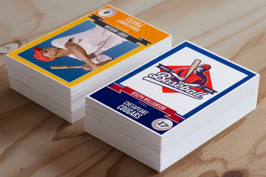
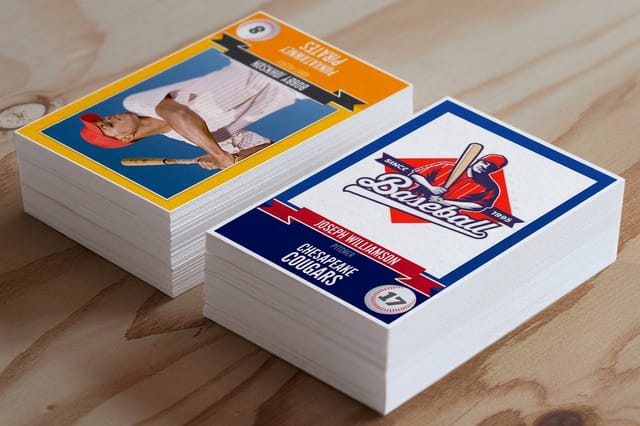
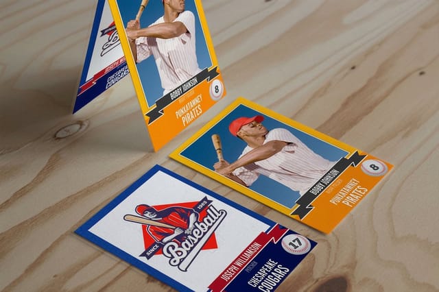
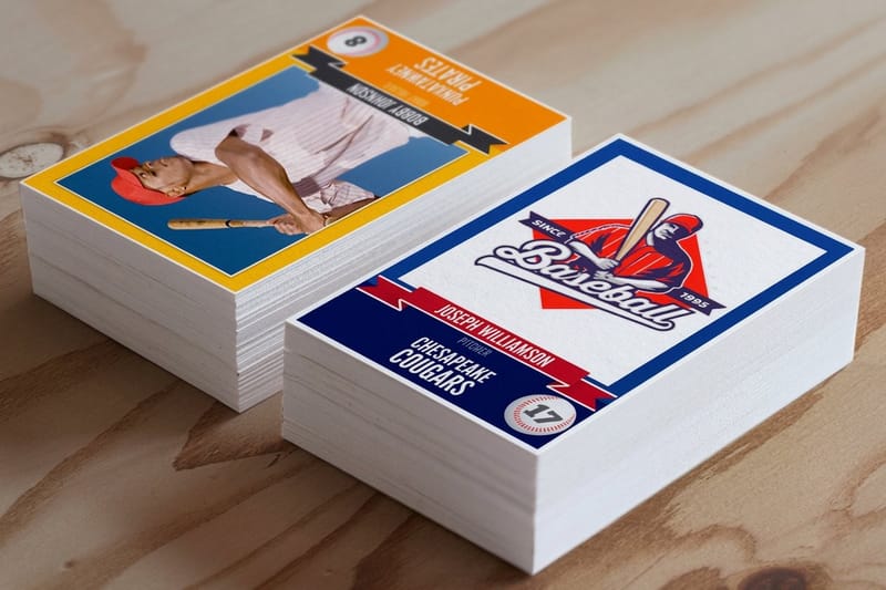
The front of a baseball card carries the player photo, the name, the jersey number, the position, and the team or season. The back carries the card number, a one-line bio, the stat grid, a league or sponsor logo, and a copyright line. Both faces print on the same 2.5 by 3.5 inch card, so the file is built at 2.75 by 3.75 inches to carry a 1/8 inch bleed, every word stays 1/8 inch inside the cut, and the whole thing exports at 825 by 1125 pixels for 300 dpi.
Quick answer
Photo side, record side, one trim
Front: photo, name, number, position, team or season. Back: card number, bio line, stat grid, logo block, copyright line. The front is a picture with four labels and nothing else, the back is a numbered record that turns a pile of cards into a set. Both live inside 2.5 by 3.5 inches, so the argument is always about what to leave out. The diagram below marks the bleed, the trim and the safety line on both faces.
What Belongs on the Front
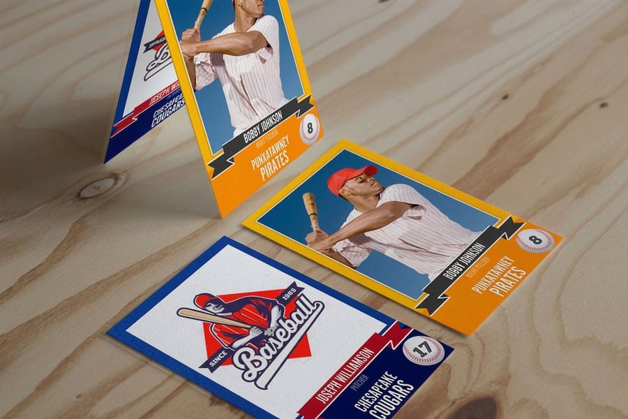
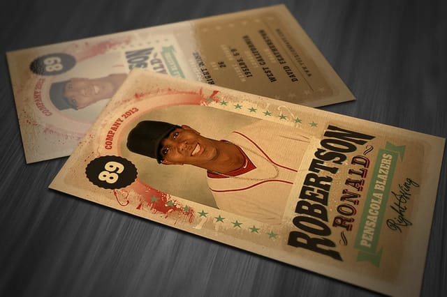
The front is one photograph and four labels. Player name, jersey number, position, and the team or the season. That is the whole list, and every card that reads well keeps to it.
Give the photo the full card. A picture that runs edge to edge has to extend 1/8 inch past the trim on all four sides, so frame with room to spare: a head cropped tight to the top of the frame loses the cap in the cut. Portrait orientation suits a batting stance or a posed shot. Landscape suits action and team photos, and it is worth committing to one orientation for the whole set so the cards read as a group in a binder.
Set the name in the biggest type on the card and put it in the bottom third, over a solid band or a dark gradient. White letters dropped straight onto a bright uniform vanish the moment the sun moves. The jersey number can sit opposite the name in an accent color, the position and team go underneath at roughly half the size, and the season year belongs in a small chip in a top corner where it does not compete.
Resolution is the part people get wrong. A 2.5 by 3.5 inch card at 300 dpi needs 750 by 1050 pixels, and 825 by 1125 once you add the bleed. A phone shot from behind the backstop and then cropped down to a head and shoulders often lands far below that, and no amount of sharpening fixes it. Walk closer instead of cropping harder. If you are working from an older file, our guide on enlarging a photo for printing covers what upscaling can and cannot recover, and changing dpi in Photoshop shows how to check the real number before you upload. Start from a correctly sized layout in the blank template library and the bleed is already drawn for you.
What Belongs on the Back, Line by Line
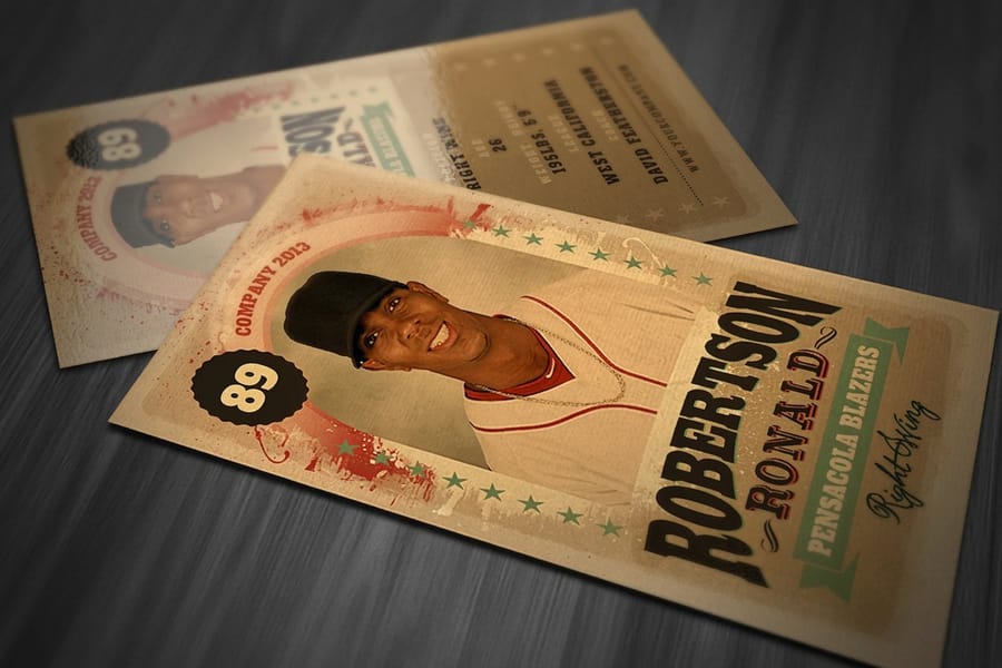
The back is where a card stops being a photo and becomes a record. Work down it in this order.
- Card number, top left. Number the set 1 through however many players you have. Without numbers there is no checklist, no way to say which card is missing, and half the reason to trade disappears.
- Name again. Backs get read on their own in a binder page. Repeating the name costs one line and saves confusion.
- Bio line. Bats and throws, height, grade or age, hometown. One line, not a paragraph.
- Stat grid. Year, games, at-bats, runs, hits, home runs, runs batted in, average for a hitter. Wins, losses, earned run average, innings, strikeouts, walks for a pitcher. Two seasons and a career row.
- Logo and sponsor block. Your league mark, and the sponsor who paid for the run. One line for the sponsor, not five.
- Copyright line. The year and your organization, set at 6 point along the bottom.
The grid is where cards fall apart. Eight columns fit on this size at 6 point in a condensed sans. A ninth column forces you under 6 point, and at that size the counters in an 8 or an a fill with ink and a batting average turns into a smudge. Cut a column instead. Nobody has ever asked for triples on a 12U card.
Watch the background too. A photo watermarked behind the stat grid looks great on screen and destroys legibility on paper, because the numbers now sit on a field that shifts value under every row. Keep the grid on a flat light panel and put the second photo somewhere else. If you want people to sign the cards, an uncoated back is the only version that takes a ballpoint reliably, which is the practical argument for kraft trading cards on an 18pt uncoated recycled stock. A laminated back beads the ink and smears.
One limit worth naming before you design anything: club names, team logos and pro player likenesses are licensed. Print your own league mark and your own photographs, name your organization in the copyright line, and get a parent release before a set of minors leaves the family. That is a rule about the artwork you supply, and it applies whoever prints it.
Size, Bleed, Safety and Corners
Every card here is 2.5 by 3.5 inches finished, the format that has been standard since the late 1950s and the reason your cards fit sleeves and binder pages people already own. Three measurements do the rest of the work.
| Measurement | Size | At 300 dpi | What it protects |
|---|---|---|---|
| Bleed size | 2.75 x 3.75 in | 825 x 1125 px | The photo keeps covering the card even if the cut drifts. |
| Trim size | 2.5 x 3.5 in | 750 x 1050 px | The finished card, and the sleeve it has to fit. |
| Safety area | 2.25 x 3.25 in | 675 x 975 px | Names, numbers and stat rows never get shaved. |
Cutting is mechanical and stacks shift, so plan for roughly a sixteenth of an inch of movement. That tolerance is invisible on a full bleed photo and brutal on a stat grid ruled right out to the edge, which is why the grid stops at the safety line and the photo does not. Our guide to bleed and trim walks through the same three boxes on other products, and card sizes covers what changes when you step outside the trading card format.
Corners are a real decision, not a garnish. Square corners cost nothing and look like a photograph. A 1/8 inch radius is the modern collectible look, it takes shuffling and pocket wear without going furry at the tips, and it is what most people picture when they say rounded. A 3/8 inch radius is a big sweep that reads more like a gift card, and it eats enough of each corner to swallow a card number sitting there, so move the number inboard before you commit to it. Trading cards offer square or either radius; the laminated lines run square only.
The Finish That Reads Best on Both Sides
Finish is the one choice that pulls the front and the back in opposite directions. Gloss makes a photograph deeper and a stat grid harder to read under a lamp. Matte does the reverse. Pick for whichever side matters more to you, and know what you are giving up.
| Option | Front photo | Back readability | Starting price |
|---|---|---|---|
| Trading Cards | Good, and better with the High Gloss UV coating. | Best on an uncoated stock; the UV coating adds glare. | $11.25 for 25 |
| Gloss Laminated | Richest. Color and contrast read strongest here. | Legible, but it throws glare under direct light. | $94.74 for 250 |
| Silk Laminated | Slightly quieter, still deep on dark photos. | Best of the laminated set. No glare on the grid. | $94.74 for 250 |
| Suede | Softest look, and it hides fingerprints. | Very good, matte through and through. | $94.74 for 250 |
| Kraft Uncoated | Warm and muted; brown paper shifts every color. | Excellent, and it is the only one you can sign. | $48.61 for 100 |
The base trading cards line is the flexible one: 18 stocks including gloss covers up to a thick 24pt, uncoated, 30 percent and 100 percent recycled, white linen, metallic pearl, synthetic plastic and rigid vinyl, plus square or rounded corners and an optional High Gloss UV coating. Sets start at 25, so you can print one card, hold it, and change your mind before ordering a roster. Standard turnaround is 3 business days with 2-day, next-day and same-day rush available.
The laminated lines trade that choice for a specific feel. Each one is a single 16pt stock sealed on both faces, which is why there is nothing to configure beyond ink coverage and quantity, and why they start at 250 rather than 25. Silk laminated trading cards are the safest pick for a card with a working back, since the soft matte film keeps the stat grid readable and still holds dark photography. Gloss laminated trading cards win when the photo is the whole point and the back is a name and a date. Kraft is a different argument entirely: 100 percent post-consumer fiber, a CMYK plus white ink option so light artwork still reads on brown, and a surface a ten-year-old can sign at the end of a season. Compare the full range on trading card printing, or read how to make custom baseball cards for the steps before the file even reaches us.
Wally lays out both sides
A photo and four labels, then a numbered record
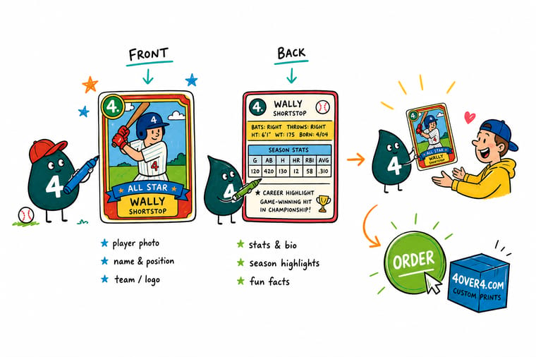
Wally puts the photograph across the whole front, runs it 1/8 inch past the cut so nothing shows white, and drops the name into a dark band at the bottom where it stays readable over any uniform. Then he flips the card. Number at the top left so the set has a checklist, one bio line, eight stat columns at 6 point, the league logo, and the copyright line. Anything that will not fit gets cut, because a ninth column is how a batting average turns into a smudge.
Order custom trading cards →Specs and pricing
Stocks, finishes and starting prices
Configure the card the way you would order it, with live stock, corner, ink and quantity choices and starting prices straight from the 4OVER4.COM configurator.

Print it
Print a set worth keeping
Explore more
Where to go next

By the numbers
Card printing you can count on at 4OVER4
Common Questions
Your baseball card questions, answered
What size is a baseball card, front and back?
Both faces are the same 2.5 by 3.5 inches, the standard trading card format, which is why custom cards drop straight into off-the-shelf sleeves, top loaders and nine-pocket binder pages. For print you build the file 1/8 inch larger on every edge, so the document is 2.75 by 3.75 inches, and at 300 dpi that is 825 by 1125 pixels. Keep the name, the card number and every stat line at least 1/8 inch inside the trim, because a stack of cards cut on a guillotine drifts by roughly a sixteenth of an inch and type sitting on the edge is the first thing that gets shaved.
What stats go on the back of a baseball card?
For a hitter the usual line is year, games, at-bats, runs, hits, home runs, runs batted in and batting average, with doubles, triples and stolen bases added if the space allows. For a pitcher it is wins, losses, earned run average, innings pitched, strikeouts and walks. Eight columns is the working ceiling on a card this size. Two season rows plus a career row is plenty, and if the player only has one season, use the space for a hometown line or a single fact rather than padding the grid with zeros.
Can I put MLB team logos or a pro player photo on a custom card?
No. Club names, logos, uniform marks and player likenesses are licensed property, and printing them on cards you sell or hand out at a fundraiser is the fastest way to get a takedown letter. Use your own league or team mark, your own photography, and a copyright line that names your organization. If the set includes minors and the cards leave the family, get a signed photo release from a parent first. This applies to the artwork you supply us, not to the printing itself.
Should the back print in full color or one color?
It depends on whether the back is doing real work. A stat grid, a small headshot and a sponsor logo want full color on both sides, which printers write as 4/4. A keepsake card where the back only carries a name, a date and a signature line reads fine as 4/1, full color front with a flat black back, and it costs less per set. On base trading cards you can also choose a blank back, which suits a card people are meant to sign.
How small can the type on the back get before it stops printing?
Six point is the floor, and only in a condensed sans with open counters. Below that the ink spreads slightly into the sheet and the middle of an 8 or an a fills in, so a batting average reads as a smudge. Reversed type, meaning white letters knocked out of a dark panel, needs a point more than positive type at the same size because the surrounding ink closes in on the letterform. If your grid will not fit at 6 point, drop a column.
What is the cheapest way to print a small team set?
Base trading cards start at $11.25 for a set of 25 and the per-card price keeps dropping across 41 quantity tiers up to 100,000, so a single-player test card before you commit to a whole roster is genuinely cheap. The laminated lines start at 250 cards for $94.74, which works out near 38 cents a card and slides toward 7 cents at the top of the range. For a 15-player squad printing 20 of each, that is 300 cards, and the laminated price break is already in reach.
Get Started
Ready to print the roster?
Pick a stock, choose square or rounded corners, set the ink for one side or both, and we print cards that fit the sleeves and binders collectors already own.
Legal Disclaimer
Gold Standard guarantees apply to all standard orders placed through 4over4.com. Price match requires verifiable proof of a competitor's published price for an equivalent product with matching specifications and turnaround time. Satisfaction guarantee covers manufacturing defects and print quality issues. Contact support with order number and documentation. On-time delivery rate based on tracked orders 1999 to 2026. Individual results may vary based on shipping carrier performance.
