
Unique Wedding Logo Ideas for Every Wedding Style


Sofia is our design and templates voice, built from the knowledge of our production team, with over 20 years in printing.
What a Wedding Logo Actually Does for Your Day
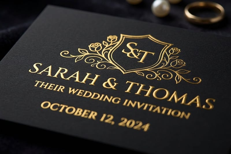
A wedding logo is the one small mark that ties everything together. It might be two initials locked into a monogram, a hand-drawn sprig, a tiny crest with your wedding date underneath, or a wordmark of both names in a single typeface. Whatever form it takes, its job is repetition. It shows up on the save the date, the invitation suite, the welcome sign, the menu, the favor stickers, and the thank you cards. In print terms that means one file sent to wedding save the date cards, the invitations, wedding menus and wedding signs for the day, and wedding thank you cards afterward, so order the pieces from the same artwork and they match.
That repetition is what makes a wedding feel designed rather than assembled. Guests will not consciously notice that the same mark appeared six times across the weekend, but they will notice the day looked considered. A logo also removes a hundred small decisions later, because every new piece already knows what it should look like.
Practically, a wedding logo has to survive extremes. It gets blind embossed at half an inch on a napkin and blown up to three feet on a welcome sign or one of the Wedding Banners at the reception. 4OVER4.COM has printed 10 billion+ cards and print products since 1999, and the marks that reproduce well at both ends are always the simple ones. Two clean shapes, generous spacing, and no hairline strokes thinner than the paper can hold. Design for the smallest use first and the big applications take care of themselves.
Decide what the mark has to carry
Most couples try to fit initials, full names, the date, the venue, and a floral border into one mark. Pick two of those. Initials plus date is the classic pairing. Everything else lives in the surrounding layout, not inside the logo.
Choose one voice for the whole suite
A calligraphic monogram next to a geometric sans wordmark reads as two weddings. Settle on one voice, formal, modern, or hand-drawn, and let the paper stock and the finish add the contrast instead.
Test it in one ink before you fall in love
Print your favorite version in flat black on plain paper. If it still looks like your wedding without gold foil, blush ink, or a photo behind it, the mark is genuinely good. Foil should be an upgrade, never life support.
Lock the file sizes early
Save a vector master, a one-color version, a reversed white version for dark stock, and a stacked version for narrow spaces. Those four files will cover every printed piece from stickers to signage without a single late-night redraw.
Shop the day
Wedding printing collection
Invitations, save the dates, signage, and favors that all carry the same mark.

Wedding Logo Ideas by Style, from Monogram to Modern
Before you sketch anything, pick a lane. Almost every wedding logo that works belongs to one of five families, and the family you choose should match the venue and the dress code more than it matches a Pinterest board. A ballroom wedding and a barn wedding can use the same two initials and still need different treatments: a crest pressed into a 5 by 7 embossed invitation for the ballroom, a hand-drawn sprig printed flat on 14pt cover for the barn. Whichever family you pick, draw it to hold at half an inch on a napkin and at three feet on a banner.
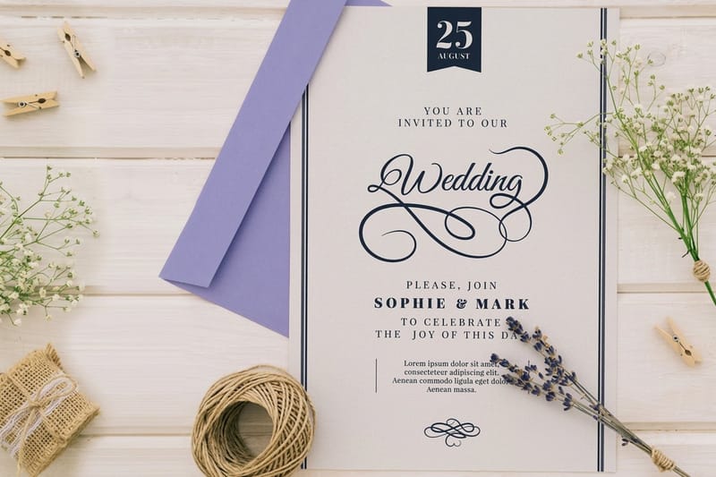
Once the style is settled, the printing method follows naturally. Fine script and traditional crests belong on Embossed Wedding Invitations where the debossed line does the work, while high-contrast modern marks look their best in metallic on Foil Wedding Invitations. If you want the same logo on ten different pieces without stretching the budget, Flat Wedding Invitations keep the base cost low.
- Monogram. Two initials interlocked or separated by a slim rule, the safest choice for a formal wedding.
- Modern minimal. A single-weight line drawing or a lowercase wordmark with wide letter spacing and lots of air.
- Rustic and botanical. Hand-drawn eucalyptus, wheat, or wildflowers wrapped loosely around the initials.
- Themed and destination. A landmark, a coastline, a mountain ridge, or a citrus branch that names the place without words.
- Vintage crest. A shield or laurel frame holding initials, the date, and sometimes a short motto or the town name.
A useful test before committing: describe the mark out loud in one sentence. If it takes more than a sentence, it is a small illustration, not a logo, and it will fall apart the first time somebody prints it at stamp size on a favor sticker.
Print picks
Three invitation formats for your wedding logo
Live prices, ready to customize with your monogram and date.
 Embossed Wedding Invitations 100 for $220.20 Press your monogram into the paper so guests feel the mark before they read it.
  Flat Wedding Invitations 25 for $19.77 The budget-friendly canvas for a logo you plan to repeat on every other piece.
  Foil Wedding Invitations 500 for $421.91 Metallic monograms that shift with the light and read as instantly formal.
 Monogram Wedding Logo Ideas That Still Feel Personal
The monogram is the oldest wedding mark there is, and it is popular for a reason. Two letters carry both names, both families, and the whole idea of a partnership in one shape. The trick is avoiding the version that looks like a hotel towel. Small structural decisions separate a monogram that feels like yours from a monogram that feels like stationery clip art.
- Interlocking initials. Overlap the letters so the counters share space, then thin one stroke where they cross so the joint reads cleanly.
- Split rule. Two capitals separated by a thin vertical line, with the wedding date set small and wide beneath them.
- Circle lockup. Initials centered inside a hairline ring, with both surnames curved along the bottom of the circle.
- Ampersand as hero. Let an oversized ampersand carry the personality and keep the two initials quiet on either side.
- Shared stem. When the letters allow it, such as a T and an H, build one vertical stroke that both letters use.
Pay attention to letter order. Alphabetical is the neutral default, and shorter-to-taller usually looks better than the reverse. If one initial is a wide letter like W or M, give it the outside position so the lockup does not lean. Print two or three finalists at actual size and pin them to a wall for a day before you decide, because monograms look different at arm's length than they do at full screen.
Modern and Minimal Wedding Logos for a Clean Suite
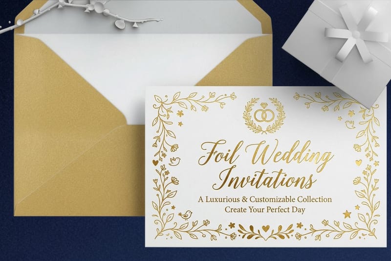
Modern wedding logos win on restraint. One typeface, one weight, and a lot of empty space around the mark. These marks suit city venues, gallery spaces, and rooftop receptions, and they photograph beautifully because there is nothing competing for attention in the frame.
Because the shapes are so simple, the material has to carry the luxury. That is where finish choice matters most. A minimal wordmark in matte white on heavy uncoated stock reads as quiet and expensive, and the same wordmark in rose gold foil reads as glamorous. Same drawing, two completely different weddings, no redesign needed.
- Wide-set wordmark. Both first names in lowercase with exaggerated letter spacing, nothing else on the panel.
- Single line drawing. A continuous unbroken stroke forming two initials, drawn as if it never left the paper.
- Stacked names. First names on two lines, flush left, with the date set tiny in the corner as a counterweight.
- Negative space initials. Letters knocked out of a solid block of color so the paper itself becomes the letterform.
- Geometric arch. A half circle or arch above the initials, echoing the ceremony backdrop and the signage.
One caution with minimal marks: they expose bad spacing instantly. Kern the letters by eye rather than trusting the defaults, and check the mark reversed out of a dark background, since thin strokes tend to thicken visually when they sit on black or deep green.
Rustic, Botanical, and Hand-Drawn Wedding Logo Ideas
Barn weddings, garden receptions, and vineyard ceremonies call for a softer mark. Hand-drawn wedding logos borrow from the venue itself, a sprig of the flowers in your bouquet, the shape of an olive branch, a sketch of the farmhouse where you are getting ready. The warmth comes from the imperfection, so resist smoothing every curve into symmetry.
Botanical marks do have a printing catch. Thin leaf veins and fine stems can disappear when the piece runs small or gets embossed, so build a simplified version of the same drawing for anything under two inches. Keep the detailed version for the invitation and signage, and use the simplified one on stickers, tags, and napkins.
- Wreath frame. A loose ring of greenery around the initials, open at the top so the shape breathes.
- Half-wreath sweep. Foliage on one side only, which balances better on a narrow menu or a program.
- Sketched venue. A simple line drawing of the barn, chapel, or tree you are marrying under, reduced to its outline.
- Pressed flower silhouette. A single stem in solid ink, no interior detail, so it holds at any size.
- Handwritten names. Real handwriting scanned and traced, imperfections kept, paired with a quiet serif for the date.
Quantity and price
Flat wedding invitation pricing and specs
Real configurator numbers. The more you print in one run, the less each card costs.
| Quantity | Price Per Unit | Total |
|---|---|---|
| 25 | 79.1¢ | $19.77 |
| 50 | 50.5¢ | $25.27 |
| 100 | 42.8¢ | $42.84 |
| 200 | 25.8¢ | $51.62 |
| 300 | 20.1¢ | $60.42 |
| 400 | 17.3¢ | $69.20 |
Themed and Destination Wedding Logos with a Sense of Place
If people are getting on a plane for you, the logo can do some of the storytelling before they pack. Destination marks turn a place into a shape: a coastline, a mountain profile, a lemon branch for the Amalfi coast, a saguaro for the desert. Guests see the mark on the save the date and immediately understand the dress code and the mood.
The same thinking applies to themed weddings that never leave town. A literary wedding might use a small open book, a music-industry couple might use a simple soundwave, and a couple who met hiking might use a two-peak ridge line. The rule stays the same. One idea, drawn simply, no more than two visual elements competing.
- Landmark silhouette. The outline of a lighthouse, dome, or bridge with initials tucked underneath.
- Coordinates line. Latitude and longitude of the venue set in small caps below the monogram.
- Local flora. Palm fronds, agave, olive, or citrus, chosen from what actually grows where you are marrying.
- Passport stamp. A circular frame with the city and date around the edge, deliberately slightly imperfect.
- Ridge and sun. A mountain line under a half circle, which scales down to a favor sticker without losing the idea.
Destination suites also travel further and go through more mail handling, so give the mark a heavier stock and a durable finish. Metallic foil holds up better than a delicate ink wash when an envelope crosses an ocean, and you can reuse the same artwork on luggage tags and welcome bag labels once you arrive.
Premium finish
Foil wedding invitations
A metallic monogram that catches the light and travels well in the mail.
Vintage Crests and Heritage Wedding Marks
Feel the mark
Embossed wedding invitations
Press a crest or monogram into the sheet so the logo reads by touch as well as by sight.
A crest is the most formal option on this list, and it carries the most meaning when it is built from something real. Pull elements from both families: a flower from one grandmother's garden, an animal from a family farm, the founding year of the town where a great-grandparent arrived. A crest assembled from stock heraldry looks borrowed, while a crest assembled from your two histories looks earned.
Keep the structure simple even when the story is rich. A shield or laurel frame, initials in the center, the date on a ribbon or set beneath, and at most one small symbol from each family. Anything more and the mark stops working the moment somebody prints it on a place card. If you want the full ornamental version somewhere, save it for the ceremony program cover or a large welcome sign.
- Laurel and initials. Two curved branches meeting under the letters, a version that suits both formal and garden weddings.
- Divided shield. One half for each family, a symbol in each, split by a single vertical line.
- Ribbon motto. A short phrase or the wedding date on a banner curling beneath the frame.
- Wax seal look. A round crest drawn as if pressed into wax, which prints beautifully as a single-color sticker.
- Heritage type. An old-style serif with real ink traps, which gives a new crest an inherited feeling immediately.
Where to Use Your Wedding Logo Across the Day
The value of a wedding logo compounds every time it appears. Once the mark exists, every piece of print gets faster and cheaper to design, because the hardest creative decision is already made. Plan the full list of placements before you finalize the artwork, since a mark that works on an invitation but breaks on a round sticker will cause trouble for months.
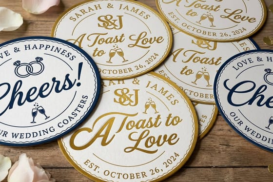
Start with the paper suite: save the dates, invitations, response cards, and details cards. Then move outward to the day itself, menus, programs, escort cards, table numbers, and the welcome sign. Finally, the small stuff, where the logo earns its keep. Favor stickers, napkin corners, envelope seals, and thank you cards all take the same file. Our guide to using logo stickers covers the small-format tricks, and the same instincts apply to save the date ideas when you want the mark to make its first appearance early.
- Save the date. The first sighting of the mark, usually at its simplest, one color on a single card.
- Invitation suite. The full expression, where embossing or foil justifies the cost because guests keep this piece.
- Day-of paper. Menus, programs, and place cards, where the logo appears small and quiet at the top or bottom.
- Signage. Welcome boards and seating charts, where the mark scales up and needs clean vector edges.
- Favors and packaging. Stickers, tags, and boxes, which is where a simplified one-color version does the work.
- Thank you cards. The last appearance, closing the loop weeks after the wedding with the same mark that opened it.
Couples who host a rehearsal dinner or a welcome party often extend the same mark to those pieces with a small variation, such as a different ink color for each event. The idea travels well beyond weddings too, which is why the same discipline shows up in corporate event planning and in custom packaging design.
Compare finishes
Popular wedding formats, side by side
Flat invitations run 25 for $19.77 in 3 business days and folded 25 for $38.22 in 5.
| Flat Wedding Invitations | 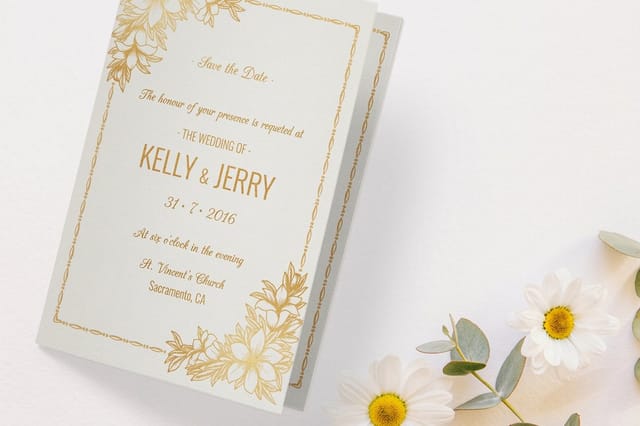 Folded Wedding Invitations | 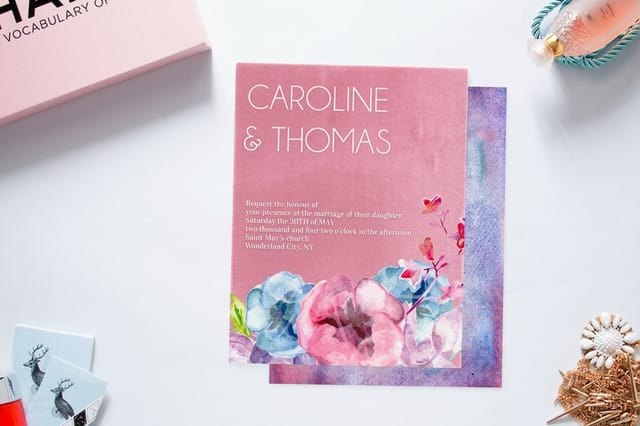 Velvet Wedding Invitations | 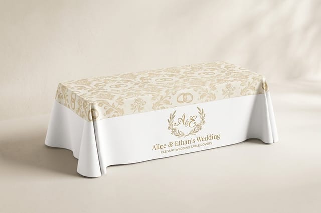 Wedding Table Covers | |
|---|---|---|---|---|
| Min price | $19.77 | $38.22 | $251.36 | $225.00 |
| Paper / stock | 14pt Gloss Cover | 14pt Gloss Cover | 16 Point Soft Velvet Laminated | 9oz Premium Polyester |
| Finish | Standard Finish | Standard Finish | - | - |
| Size | 4.25" x 5.5" | 8.5" x 5.5" fold to 4.25" x 5.5" | 4.25" x 5.5" | 84" x 126.5" (6ft Table) |
| Default qty | 25 | 25 | 500 | 1 |
| Turnaround | 3 business days | 5 business days | 7 business days | 4 business days |
| Rating | ||||
| View & customize | View & customize | View & customize | View & customize |
How to Make Your Own Wedding Logo Step by Step
You do not need a design degree to build a mark you will be proud of. You need constraints, a few rounds of sketching, and a willingness to throw away the first idea. Here is the sequence that works, whether you are drawing it yourself or briefing a designer.
Begin with a print-ready layout from the design templates library so your artboard is already the right size with the correct bleed. Sketch on paper first, twenty small thumbnails in ten minutes, no erasing. Pick three, rebuild them cleanly in vector, then set them in one ink at final size. Order a small quantity of Flat Wedding Invitations as a physical proof before you commit the full run to embossing or foil, because paper always tells you something the screen hides.
The five decisions that shape the mark
- Format. Monogram, wordmark, crest, or illustration, chosen to match the venue and the dress code.
- Typeface. One family, two weights maximum, with real character in the letterforms rather than a novelty script.
- Proportion. Draw at the smallest real size first, then confirm it still holds when you scale to a signage width.
- Color. One ink for the core mark, with foil, embossing, or spot gloss treated as an upgrade rather than a requirement.
- Files. Vector master, one-color version, reversed white version, and a stacked variant for narrow spaces.
When you brief a designer, bring the venue photos, the dress code, and two marks you like with a sentence on why. That short brief saves more revision rounds than any mood board. Finish treatments are worth studying before you decide, and the work in these spot UV designs shows how much a finish can change a simple mark.
Start fast
Invitation templates and print-ready blanks
Free layouts plus exact-size blanks so your logo lands inside the safe area on the first try.
Wally helps you build one mark for the whole wedding
Sketch it small, print it once, repeat it everywhere
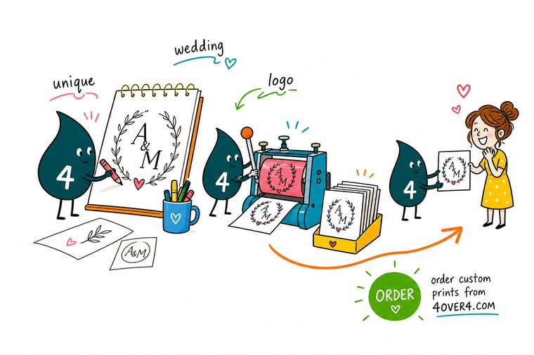
Not sure where to start? Write both initials, the date, and one detail from your venue on a card, then sketch twenty tiny versions in ten minutes without erasing. Pick three, clean them up in vector, and print them in flat black at real size. Whichever one still looks like your wedding on plain paper is the mark to send to foil or embossing.
Design your wedding invitations →The Short Version of Wedding Logo Design
Explore more
More ways to carry your wedding logo into print
Save the date ideas, logo sticker tricks for favors and seals, and the flat, embossed and foil invitations that carry the mark, starting from a 25 card flat proof run.
 Article 5 Wedding Favor Ideas for Small and Socially Distanced Celebrations Five wedding favor ideas built for small, distanced celebrations, from sealed treat boxes to printed thank you
  Collection Wedding Printing Collection Invitations, save the dates, signage, and favors in one place. Product Embossed Wedding Invitations A monogram pressed into the sheet that guests can feel. Product Flat Wedding Invitations The affordable base for a logo you plan to repeat everywhere. Product Foil Wedding Invitations Metallic monograms that shift with candlelight at the reception.
  Article Cool Save the Date Ideas Where your new wedding logo makes its first appearance.
  Article Fun Ways to Use Logo Stickers Small-format tricks that work perfectly for favors and seals.
 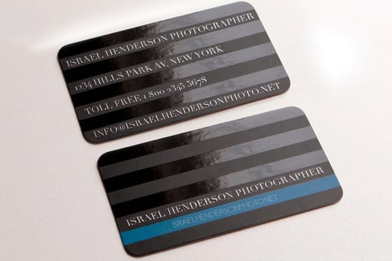 Article Spot UV Designs That Shine How a finish changes the way a simple mark reads.
  Article Personalized Gift Ideas Favor and gift ideas that carry your monogram beautifully.
  Article Unique Custom Packaging Put the mark on welcome boxes and favor packaging.
 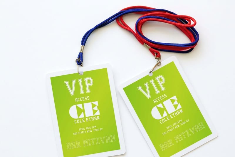 Article Name Badge Design Ideas Layout thinking that transfers straight to escort cards. Article Unique Corporate Event Ideas Event branding lessons that apply to a wedding weekend.
 See your monogram on real paper before the full run
Pick the mark, choose a stock and a finish, and print a short proof run before the full guest count goes out.
Wedding Logo Questions, Answered
Where should you use a wedding logo?
Use it anywhere your names already appear. Start with the save the date and the invitation suite, then carry it onto menus, programs, escort cards, table numbers, and the welcome sign. The small pieces are where it pays off most: envelope seals, favor stickers, napkin corners, welcome bag tags, and the thank you cards you send weeks later. Keep a simplified one-color version for anything under two inches so the mark never turns muddy. If you want ideas for the small-format pieces, see our guide to logo stickers.
What are the best wedding logo design ideas?
The five that consistently work are the interlocking monogram, the wide-set lowercase wordmark, the half-wreath botanical, the destination silhouette, and the family crest. Within those, the strongest versions share one habit: they use two visual elements at most. Two initials and a rule. A silhouette and a date. A wreath and letters. The moment a third element joins, the mark stops scaling and starts looking like a small illustration that only works on the invitation.
What makes a wedding logo unique rather than generic?
Specificity. A monogram in a popular script font is a template, but the same initials sharing a stem, or wrapped in the exact flower from your bouquet, or set beside the coordinates of the venue, belongs to one couple only. Pull details from your actual story: the town, the flowers, the building, a family symbol, the year two families arrived somewhere. Then draw it plainly. Unique comes from the source material, not from adding ornament on top of a stock shape.
How do I choose the right wedding logo for our wedding?
Match the mark to the venue and the dress code before you match it to your taste. Black tie in a ballroom wants a monogram or a crest. A garden or barn wedding wants something hand-drawn. A city loft wants minimal type with plenty of space around it. Then apply two tests: print your finalists in flat black at actual size and look at them on paper for a day, and check whether the mark still reads at half an inch. Anything that fails either test will cause problems across the suite.
What does a wedding logo cost and how are prices set?
The mark itself can cost nothing if you design it yourself from a template, or a few hundred dollars through a designer. The bigger number is printing it. Prices at 4OVER4.COM are driven by quantity, stock, size, and finish, and the unit cost drops sharply as quantity rises. Flat Wedding Invitations start at $19.77, Embossed Wedding Invitations start at $220.20, and Foil Wedding Invitations start at $421.91. Order the full guest count in one run rather than reprinting later, since a second short run always costs more per piece.
