
The Power of the Catalog: 10 Real-World Examples


Emma is our prepress and print production voice, built from the knowledge of our production team, with over 20 years in printing.
Why a Printed Catalog Still Outsells the Scroll

Catalog merchants such as Sears, L.L.Bean and Argos built whole businesses on a printed book, because a catalog is the only piece of marketing a customer will voluntarily carry from the mailbox to the kitchen table. Nothing on a screen earns that trip. Once it is on the table it stays there, gets flipped through twice, and gets handed to someone else in the household. A 16 page book with a 14pt gloss cover over 100# gloss text pages holds up through all of that handling. That is the whole argument for print, and every catalog example below is a variation on it.
The catalogs that work are not the ones with the most products. They are the ones that make a decision easy. A good catalog picks an order for the merchandise, gives the reader a reason to keep turning, and puts the way to buy on every spread instead of burying it at the back.
4OVER4.COM has printed more than 10 billion cards and print products since 1999, and the catalogs that come back for reprints share a short list of habits. Strong cover, honest photography, page counts that respect the four page signature, and a binding chosen for how long the book needs to survive. Study the ten examples here, borrow the habit rather than the look, and you will avoid the two failures that kill most first catalogs: too many pages saying too little, and a beautiful book nobody can order from.
What counts as a catalog
A catalog is any bound or folded book that presents a range of things a reader can act on. Retail merchandise, industrial parts, property listings, a course schedule, a seasonal gift range. If it has more than one offer and a sequence, it behaves like a catalog and the same design rules apply.
See it in print
Custom catalog printing options
Bindings, page counts, and finishes shown on real configurations you can order.

Catalog Merchant Examples and What They Printed
A catalog merchant sells mainly through a printed book the customer orders from. Sears, Roebuck ran the best known American example, a general catalog that reached farm households across the country for about a century before it closed in 1993. L.L.Bean and Lands’ End built their clothing businesses on mailed catalogs, and in the UK Argos ran its stores as catalog shops, where you browsed the book and wrote the item number on a slip at the counter.
Each of them did on paper what the ten examples below do: a fixed item code, a price and a way to order on every spread. For a small business the working version is a saddle stitched booklet of 8 to 60 pages at 5.5 by 8.5, 8.5 by 11 or 11 by 11 inches, with 100# gloss text inside and a 14pt gloss cover. A first run of 25 books costs $240.55 and prints in 7 business days. A range under a dozen items fits a half fold brochure instead, from $57.11 for 50.
10 Catalog Examples That Earn Their Print Run
These are the catalogs people actually reference when they brief a designer. Each one solves a different problem, and the lesson underneath each is portable to a business of any size. Read the takeaway, not the aesthetic.
- The IKEA catalog. Room sets, not product shots. Every item appeared inside a finished space so the reader saw the outcome first and the price second. IKEA retired the print edition in 2020, but the room set remains the single most copied idea in retail catalogs. Show the thing in use.
- Patagonia field catalog. Reader submitted photography and long essays sit beside the gear, so the book reads like a magazine you would keep. The lesson is that editorial content buys you permission to sell on the facing page.
- REI gear catalog. Dense spec blocks, weight, capacity, and side by side comparisons on one spread. When your buyer is comparing on numbers, give them the numbers in print rather than sending them back to a screen to find them.
- Restoration Hardware Source Books. Oversized trim, heavy uncoated stock, and a deliberate lack of clutter. The physical weight does the positioning work before a single price is read. Expensive, and only worth it when the product supports it.
- McMaster-Carr industrial catalog. Thousands of parts organized so ruthlessly that engineers still reach for it. Thumb tabs, a real index, and consistent part number formatting. Findability is a design feature, not an afterthought.
- The toy wish book. Seasonal toy catalogs survive because children circle items with a pen. Any catalog that invites a mark, a fold, or a tear out turns a passive reader into a buyer with a shortlist.
- J. Peterman. Illustrated products and story driven descriptions instead of studio photography. Proof that voice can replace budget when your photography cannot compete.
- Seasonal home and garden lookbooks. Terrain and similar brands build the book around a season rather than a category, which gives them a reason to mail it and a reason for the reader to open it now.
- Beauty sample books. Bound in swatches, scent strips, and tear out samples turn the page into a trial. When a product must be touched or smelled, the catalog can carry the sample.
- The property portfolio. Luxury listing catalogs pair one property per spread with a floor plan, a location note, and a single agent contact. Our clients print these as commercial real estate brochures, and the format transfers directly to any business selling a small number of high value items.
Notice what is missing from that list. None of them are page after page of product on white with a price underneath. Every one gives the reader a reason to turn the page that is separate from the merchandise itself.
Print picks
Three catalog formats worth a look
Live prices, ready to configure with your own page count and stock.
 Commercial Real Estate Brochures 50 for $57.11 Heavy stock and full bleed photography for portfolios that sit on a desk for weeks.
  Real Estate a Frame $65.90 each Puts your catalog cover at eye level on the sidewalk where the browsing starts.
  Real Estate Brochures 50 for $57.11 Folded multi page layouts for listings, product lines, and seasonal collections.
 What the Strongest Catalog Designs Share
Strip the ten examples down and five decisions repeat. Get these right and the design work becomes much smaller, because most layout arguments are really arguments about one of these five.
- A cover that promises one thing. One hero image, one line of type, no product grid. The cover sells the opening, not the catalog.
- A spread as the unit of design. Readers see two pages at once. Design left and right together or the gutter will cut your best photograph in half.
- A repeating grid. Two, three, or four columns held across the whole book. Breaking the grid once is a feature. Breaking it every spread is noise.
- Ordering information on every spread. Item code, price, and how to buy, in the same position each time. The reader should never have to hunt.
- A back cover that works alone. On a mailed catalog the back cover is seen as often as the front. Put a bestseller and the offer there.
Photography is where most budgets go and where most catalogs still lose. Consistent lighting across every product beats one hero shot and forty mismatched images. If you are shooting in batches, lock the setup and finish the whole range before you move the lights. The same discipline applies to print advertising in general, which our print advertising guide covers format by format.
Page Counts, Signatures, and the Rule of Four

Every printed catalog page count is a multiple of four. One sheet of paper folded once gives you four pages, so 8, 12, 16, 20, 24 and up are natural. A 14 page catalog does not exist. If your content lands at 14, you either cut to 12 or fill to 16, and filling with weak pages is how good catalogs get diluted.
Plan the page count before you design. Write the spread list first, one line per spread, then count. Most small business catalogs work best at 16 or 20 pages: enough room for a cover, an opening statement, six to eight product spreads, and an ordering page. Go past 32 pages only when the range genuinely needs it, because paper and postage both scale with every sheet you add.
A workable 16 page plan
- Pages 1 and 2: cover, then a short opening letter or brand statement.
- Pages 3 to 12: five product spreads, grouped by use case rather than by SKU number.
- Pages 13 and 14: bestsellers, bundles, or a comparison spread for buyers who are deciding on specs.
- Pages 15 and 16: ordering information, terms, and a back cover carrying one hero product and the offer.
Quantity and price
Catalog brochure pricing and specs
Real configurator numbers. The more you print, the lower the cost per book.
| Quantity | Price Per Unit | Total |
|---|---|---|
| 50 | $1.14 | $57.11 |
| 100 | 82.4¢ | $82.38 |
| 200 | 53.3¢ | $106.55 |
| 300 | 41.0¢ | $123.02 |
| 400 | 34.9¢ | $139.49 |
| 500 | 31.2¢ | $155.97 |

Binding Options and the Catalog Each One Suits
Binding decides how the book opens, how long it lasts, and what it costs to mail. Choose it early, because it changes the margins your designer needs and the page count you are allowed to hit.
- Saddle stitch. Stapled through the fold. The default for catalogs up to roughly 60 to 80 pages depending on stock. Lies reasonably flat, cheapest to produce, lightest to mail.
- Perfect binding. A glued square spine. Takes over on thicker books, gives you a printable spine for shelf storage, and reads as a reference volume rather than a mailer.
- Wire or coil. Lies completely flat and folds back on itself. Right for catalogs used on a counter, a job site, or a trade show table where hands are busy.
- Folded brochure formats. Under 12 pages, a folded piece often beats a bound one. Cheaper, faster, and it slips into a folder or a mailing envelope without extra handling.
Whichever you pick, add creep allowance on saddle stitched books. The inner pages push outward as the spine thickens, so keep critical type and page numbers well inside the trim on the middle spreads.
Format detail
Real estate brochures
Folded multi page layouts with the sizes, stocks, and folds spelled out.

Paper Stock and Finish Change How a Catalog Feels
Two catalogs with identical layouts can land completely differently depending on the stock. Weight signals value, coating controls how photographs read, and the cover finish is the first thing a reader judges before they have processed a single word.
- Gloss coated text. Sharpest color and deepest blacks. Best for product photography and food. Harder to write on and reflective under showroom lighting.
- Matte or silk coated text. Rich color with no glare, easy on long reading. The safe default for a mixed catalog with copy and images.
- Uncoated text. Warm, tactile, slightly muted photography. Suits craft, apparel, and anything positioning itself as handmade or considered.
- Heavier cover stock. A cover two or three times the text weight makes the book feel finished and survives repeat handling and mailing.
Finish is the cheapest upgrade with the biggest first impression. Soft touch lamination on the cover changes the whole read of the book, and spot gloss over a matte cover makes a single product or logo lift off the page. Print the range on real estate brochures stock and hold the two options side by side before you commit the full run.
Put it in front of people
Sidewalk display for your catalog
A printed catalog only works where people can reach it, so give the cover a place to stand.
Writing Catalog Copy That Sells Without Shouting
Catalog copy has a hard job: it has to answer a question the reader has not asked out loud yet, in about thirty words, next to a photograph that is already doing half the work. Lead with what the product is for, then the detail that removes the objection, then the specification.
Write a headline for the spread, not for every item. One line at the top of the spread that frames the group, then short item blocks underneath. That structure is what makes dense pages readable, and it is exactly how the gear and industrial catalogs above handle hundreds of items without exhausting the reader.
- Name the use case in the first four words. Readers scan openings, not endings.
- Give one number that matters. A dimension, a capacity, a run length. Vague copy reads as a weak product.
- Keep item blocks the same length. Ragged blocks make a well built grid look broken.
- Repeat the price and the item code in the same spot on every spread.
- Close each spread with an instruction. Order online, call the number, scan the code.
The same discipline works on shorter formats. If you want to see how a single card carries an offer with almost no room to work in, look at these postcard examples for small businesses.
Compare formats
Popular brochure and catalog formats, side by side
Stock, finish, size, quantity, turnaround, and price in one table.
 Standard Brochures | 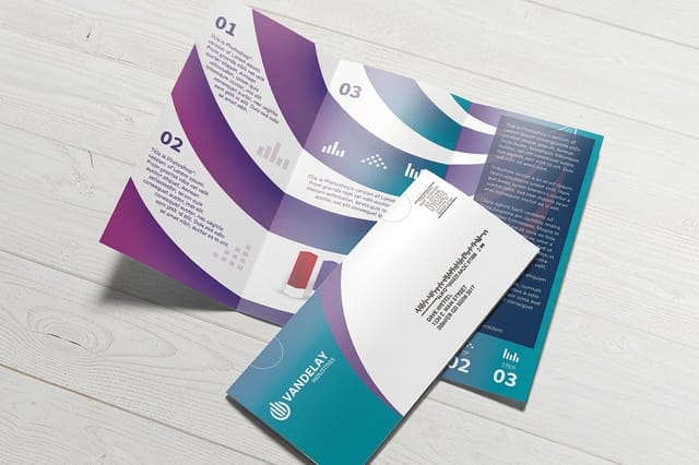 Direct Mail Brochures |  Medical Brochures | 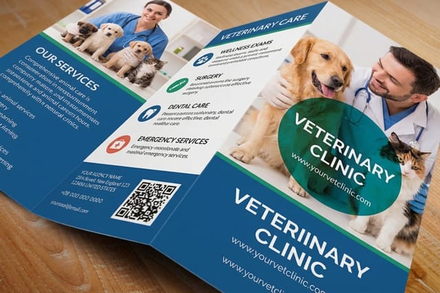 Veterinary Brochures | |
|---|---|---|---|---|
| Min price | $57.11 | $238.73 | $57.11 | $57.11 |
| Paper / stock | 100# Gloss Text | 100# Gloss Text | 100# Gloss Text | 100# Gloss Text |
| Finish | Standard Finish | Standard Finish | Standard Finish | Standard Finish |
| Size | 5.5" x 8.5" | 8.5" x 11" | 5.5" x 8.5" | 5.5" x 8.5" |
| Default qty | 50 | 500 | 50 | 50 |
| Turnaround | 3 business days | 6 business days | 3 business days | 3 business days |
| Rating | ||||
| View & customize | View & customize | View & customize | View & customize |
Getting Your Catalog Print Ready
The design can be finished and the file can still fail. Most catalog reprints are caused by four preventable problems: images placed at screen resolution, type sitting too close to the trim, a page count that is not a multiple of four, and spreads exported as spreads instead of single pages.
The checklist before you upload
- Single pages, in order. Export as single pages including the cover, not reader spreads.
- Bleed and safety. Extend backgrounds past the trim and hold live type well inside it, more on the inner spreads of a saddle stitched book.
- Image resolution. Effective 300 dpi at final placed size. Check the scaled percentage, not the original file.
- Color and blacks. Convert to CMYK and use a rich black build for large solid areas so they do not print washed out.
- Fonts and transparency. Embed everything and flatten effects before export so nothing reflows on our end.
Start from a print ready layout rather than a blank document. Our templates carry the trim, bleed, and safety marks already positioned, so the file lines up the first time. If you want to see finished examples of what is possible before you begin, the custom catalog printing showcase walks through real configurations.
Start fast
Catalog templates and print-ready blanks
Free layouts plus exact-size blanks so trim, bleed, and safety are already correct.

By the numbers
Printing catalogs at 4OVER4.COM
What sits behind every catalog run that leaves our presses.
Wally breaks down what makes a catalog work
Ten examples, then the print decisions behind them
A catalog wins on three decisions made before the design starts. Pick the mechanism that earns the page turn, whether that is a room set, an essay, or a spec table. Set the page count in multiples of four so no sheet is wasted. Choose the binding for how the book will be handled, saddle stitch for mailers, perfect binding for reference volumes, coil for counters. Get those right and layout becomes the easy part.
Configure your catalog printing →Catalog Guides Worth Reading Next
Keep going
Format, design, and print advertising reading
Catalog bindings and finishes shown in print, every print ad format, ten postcard offers that convert, and how PrintRunner handles bound runs.
Guide Print Advertising Guide Every print format, what it costs, and when it beats digital. Guide Custom Catalog Printing Real catalog configurations, bindings, and finishes in print. Guide 10 Best Postcard Examples How a single card carries an offer with almost no space. Guide 4OVER4 vs PrintRunner How the two compare on multi page and bound print runs. Explore more
More ways to put your range in print
Catalog brochures from $57.11 for 50, a sidewalk A frame from $65.90, and the guides and comparisons behind a catalog run.
 Guide Print Advertising Guide Types, benefits, and worked examples across every format.
 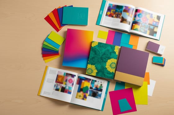 Showcase Custom Catalog Printing Binding, page count, and finish options shown in print. Product Commercial Real Estate Brochures Heavy stock portfolios for high value listings and ranges. Product Real Estate Brochures Folded multi page layouts for listings and collections.
  Product Real Estate a Frame Sidewalk display that puts your cover at eye level.
  Article 10 Best Postcard Examples Short format offers that still convert for small business. Alternative 4OVER4 vs MOO Postcards How the two compare on card stock, sizes, and run lengths.
  Alternative 4OVER4 vs MOO Support Ordering help, proofing, and reprints compared.
  Alternative 4OVER4 vs PrintRunner Multi page and bound printing side by side. Alternative 4OVER4 vs UPrinting Support What help looks like when a catalog file needs fixing.
  Alternative 4OVER4 vs Vistaprint Design Free online designer and pro design help compared.
  Articles All Printing Articles Design, format, and marketing reading across every product.
 Ready to print a catalog people keep on the table?
Pick the page count, choose a binding and a stock, upload your file, and see the price before you order. Our team checks every catalog file before it goes to press.
Catalog Printing Questions, Answered
What makes a catalog example worth copying?
Look past the aesthetic and find the mechanism. The room set catalog sells the outcome before the item. The field catalog buys attention with editorial before it asks for a sale. The industrial catalog wins on findability through tabs, indexing, and consistent part numbers. Any one of those mechanisms transfers to a business of any size, while the photography style and typeface almost never do. When you brief a designer, name the mechanism you want rather than the brand you admire, and see how professionals frame print offers in our print advertising guide.
How do I choose the right catalog format for my business?
Start with the range and the reading situation. Under a dozen items and a folded brochure format usually beats a bound book on both cost and speed. Twenty to eighty items and a 16 to 24 page saddle stitched catalog is the sweet spot. A large reference range needs perfect binding, a printable spine, and a real index. If the catalog lives on a counter or a job site rather than in a mailbox, choose a binding that lies flat and a cover stock heavy enough to survive months of handling.
What does catalog printing cost and how is the price set?
Price is driven by four things: page count, quantity, paper stock, and binding. Every additional four pages adds a sheet, and the per unit cost falls sharply as quantity rises because setup is spread across the run. At 4OVER4.COM the configurator prices each combination live, so you can compare a 16 page and a 20 page version before you commit. Commercial Real Estate Brochures start at $57.11 and Real Estate Brochures start at $57.11, both fully configurable for stock, size, and quantity.
How many pages should a catalog be?
Always a multiple of four, because one folded sheet produces four printed pages. There is no such thing as a 14 page catalog. Most small business catalogs work best at 16 or 20 pages, which leaves room for a cover, an opening statement, five to eight product spreads, and a proper ordering page. Write the spread list before you design, count it, then cut to the nearest multiple of four rather than padding with weak pages that dilute the strong ones.
How do I set up a catalog file so it prints correctly the first time?
Export single pages in reading order including the cover, never reader spreads. Extend every background past the trim for bleed and keep live type well inside the safety margin, with extra room on the inner spreads of a saddle stitched book where creep pushes pages outward. Place images at an effective 300 dpi at final size, convert everything to CMYK, use a rich black build for large solid areas, and embed all fonts. Starting from one of our print ready templates removes most of these risks before you begin.
