
How to Design a Product Label in a Q+A With an Art Director


Jordan is our labels, packaging and sustainability voice, built from the knowledge of our production team, with over 20 years in printing.
We sat down with a 4OVER4.COM art director to answer the questions brand owners actually ask: what belongs on a label, how the design gets made, and how to pick between waterproof, clear, matte, and vinyl finishes.
To design a product label, rank before you style: make the brand name, the product name, one supporting detail, and the required copy read in that order. Design to the dieline with bleed and a safe zone, then match the material to the shelf, waterproof film for bottles, clear stock for a no-label look, matte or kraft for artisan brands, and vinyl for durability. Proof on the real stock before the full run.
Quick tips
An art director's quick take on label design
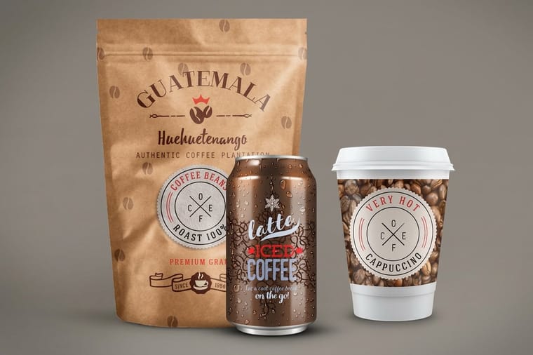
Rank your elements before you style them. Make the brand and product name lead, keep required copy inside a safe margin, and design to the real dieline with bleed. Match the material to the shelf: waterproof film for bottles, clear stock for a no-label look, matte or kraft for artisan brands, and vinyl for durability. Use one bold finish, not four. Then proof on the actual stock before the full run. 4OVER4.COM prints every one of these options to your exact art.
What are the essential elements of a label?
Q: Where do you start when you look at a blank label?
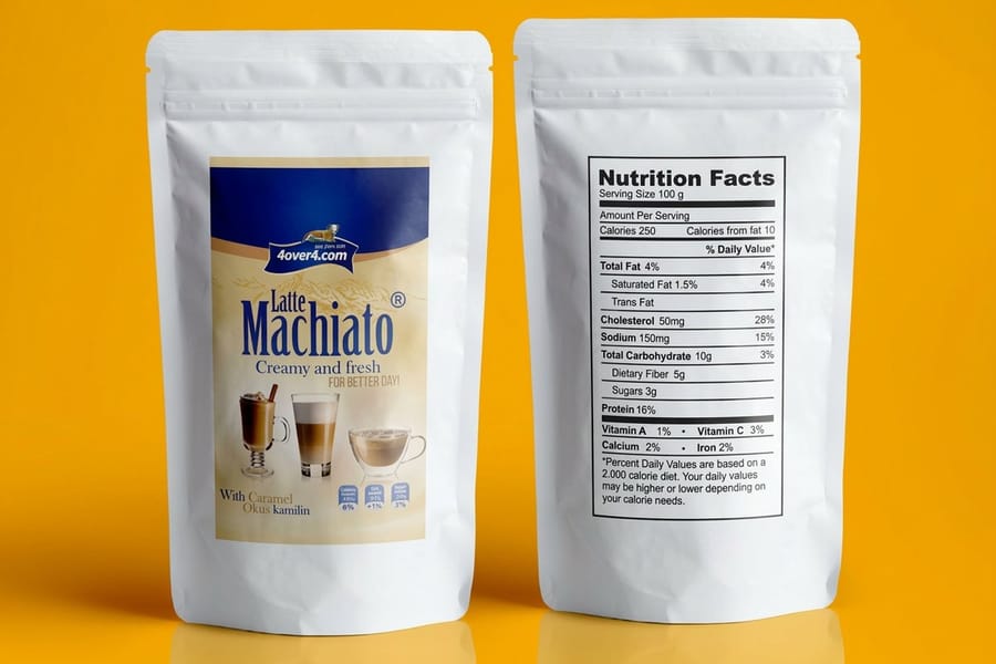
"With a ranking, not a rectangle. Before I place anything, I decide what a shopper reads first, second, and third. On almost every product label that order is brand, then product name, then one supporting detail, then the required legal copy. If those four are clear, the label works. If they fight each other, no amount of color fixes it."
Think of the surface as three stacked zones. The top carries the brand mark and sets the tone. The middle is the loudest line, usually the product name, and it earns the most space. The base holds the quiet but mandatory copy: net weight, ingredients, warnings, and the barcode. Keep the required items inside a safe margin so the trim never clips them, and if you are unsure what a term like bleed or dieline means, our printing terms glossary spells it out.
That hierarchy is the same whether you are labeling a bottle, a jar, or a coffee bag. Get the ranking right first, and the styling that follows has something solid to sit on. If you want a running start, our design templates and the logo design best practices guide both help you nail that top zone.
Where do most first labels go wrong?
Q: What is the single most common mistake you see?
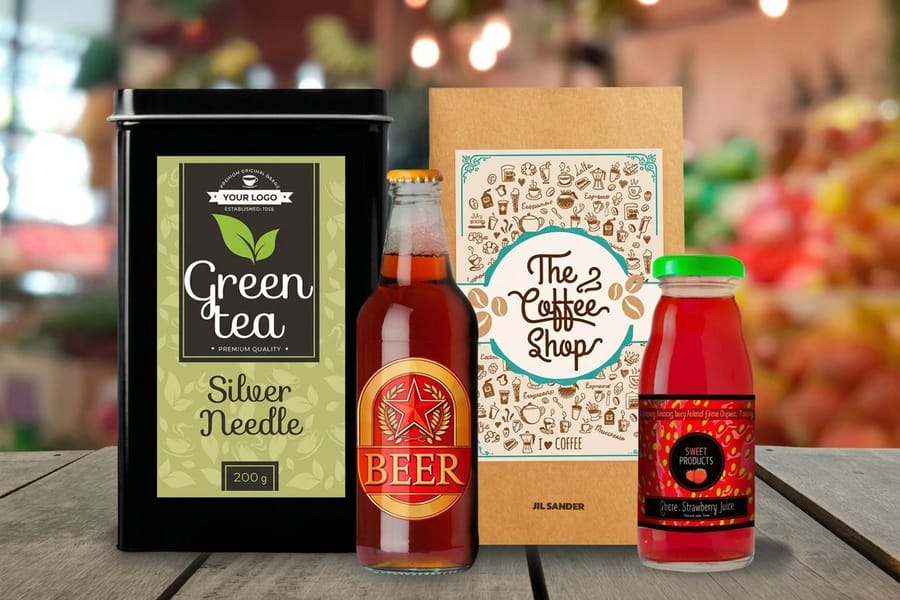
"Fear of empty space. A first-time designer treats the label like a bulletin board and tries to say everything at full volume. Every word ends up the same size, so nothing leads. The fix is almost always subtraction. I take the busiest label, cut the type sizes down to two or three, and let one element win."
The other frequent miss is contrast. Pale gray text on a soft cream background looks tasteful on a bright monitor and vanishes under warehouse lighting. Push your figure-to-ground contrast further than feels comfortable on screen, because the shelf is never as kind as your studio. A quick way to test it is to shrink your design to thumbnail size: if the product name still reads, the hierarchy is honest.
Building your first few labels inside a proper canvas helps you avoid both traps. The 4OVER4.COM online designer gives you a correctly sized artboard with the trim and safe zone already marked, so you are designing to the real label instead of a guess. If you would rather start from a proven layout, browse the free design templates and adapt one to your brand.
What is the best label you have seen on a shelf?

Q: When a label really stops you, what is it usually doing?
"Restraint plus one bold move. The labels I remember are mostly quiet, then they do a single dramatic thing. A matte black bottle with one word in gold foil. A clear label on colored glass so the liquid becomes the design. A tiny spot of gloss on an otherwise flat surface that you only notice when the light hits it. The drama works because everything around it is calm."
Finish is the art director's secret weapon here, because it adds a physical, tactile layer that flat ink cannot fake. If you are weighing that choice, the what is foil stamping guide walks through where it pays off, and the metallic printing collection shows the range.
The warning is the same one as always: pick one hero effect. Foil, metallic, gloss, and a loud color all competing on the same 3-inch label cancel each other out. Choose the move that fits the brand, commit to it, and let the rest of the design stay out of its way.
Walk me through your creative process, concept to final

Q: How does a label actually get made on your desk?
"It is less mysterious than people think. I work through the same steps every time, and the order matters."
- Brief and shelf research. I look at where the product will sit and what it sits next to, so the label can stand apart instead of blending in.
- Hierarchy sketch. Rough thumbnails, pen on paper, deciding what reads first, second, and third before any type is set.
- Type and color system. One display face, one support face, and a palette anchored by the brand color. Small system, big discipline.
- Layout to the dieline. Everything goes on the real trim shape with bleed and safe margins, not a placeholder box.
- Material and finish call. I choose the stock and any foil or gloss now, because it changes how color and contrast behave.
- Proof and revise. A printed proof on the actual stock, checked in real light, then one clean round of edits.
That flow keeps decisions from piling up at the end. You can run the same steps yourself: rough the hierarchy, then build it in the online designer, and study finished work in our label design showcase to see how other brands solved the same problems. When the file is ready, the specs and price table further down tell you exactly what your run will cost.
Choosing material and finish: waterproof and bottle labels
Q: How do you match a finish to a real product?
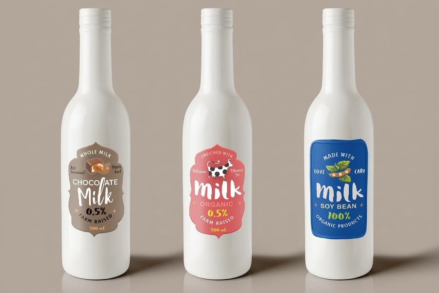
"I ask one question first: is it going to get wet? A beverage bottle sweats in a cooler, a shampoo bottle lives in a shower, and a sauce jar goes through a dishwasher-warm rinse. Paper labels pucker and lift in all three. That is a waterproof film job, no debate."
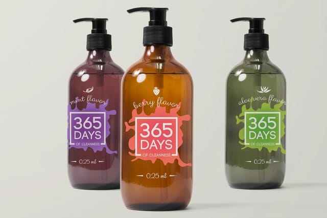
For those products, reach for premium waterproof labels or the purpose-built bottle labels, both printed on a durable BOPP-style film that shrugs off moisture, condensation, and handling. If you are labeling a curved bottle, size and wrap matter as much as the art, and the wine bottle label dimensions guide is a useful reference even for non-wine bottles. You can see the full range under waterproof labels printing.
It is not a theoretical concern, either. When a food brand needed labels that held up through cold storage and still looked sharp on the shelf, the material choice did the heavy lifting, which is exactly the story in how a food brand stood out with custom labels. Design and durability are the same decision.
Choosing material and finish: the clear, no-label look
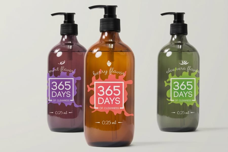
Q: When does a clear label make sense?
"Whenever the container is part of the pitch. Craft spirits, cold-pressed juice, cosmetics, and premium sauces all sell partly on what is inside. A clear label lets the product show through and gives that clean, printed-straight-on-the-glass look that reads high-end without a heavy price tag."
The catch with transparent stock is that ink is translucent, so light colors and whites can disappear against a dark liquid. The move an art director makes here is to print a white underbase behind the artwork so your logo stays crisp, or to lean into the transparency and design with bold, saturated color that holds up on its own. Our premium clear labels handle both approaches, and the wider clear labels printing category shows the options.
Clear is also a design language beyond labels. If you like the effect, the clear printing collection extends it across other products, so your packaging and your promotional pieces can share the same see-through aesthetic. Consistency across touchpoints is what makes a small brand feel considered.
Choosing material and finish: kraft, matte, and vinyl
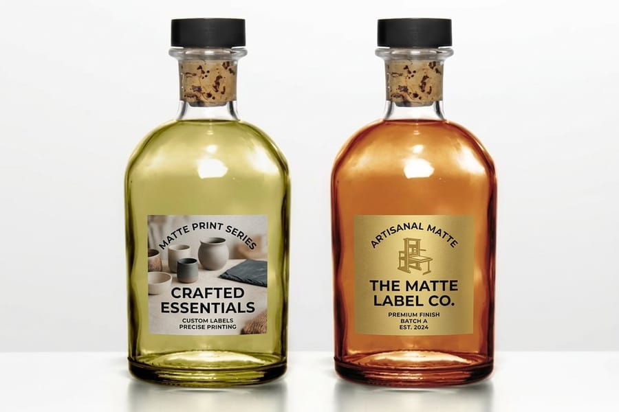
Q: What about brands that want to feel handmade or rugged?
"Then I steer away from high gloss. Gloss shouts new and mass-produced, which is the opposite of what a small-batch roaster or a natural soap maker wants to say. A matte or kraft-style uncoated stock feels warm and tactile, and it photographs beautifully for the little product shots everyone posts now. Matte is the quiet luxury of labels."
For that warm, artisan read, matte labels give you a soft, non-reflective surface that makes earthy palettes and hand-drawn type sing. When durability outranks softness, such as garden products, tools, or anything that lives outdoors, premium vinyl labels resist scuffs, sun, and weather. Browse the full run of vinyl labels printing to compare.
Vinyl is versatile enough to jump off the product entirely. Plenty of brands turn the same durable stock into decals and wraps, and the vinyl sticker wrap guide shows just how far the material stretches. Choosing kraft, matte, or vinyl is really choosing the personality the label projects.
Does shape matter? Die-cut and custom outlines
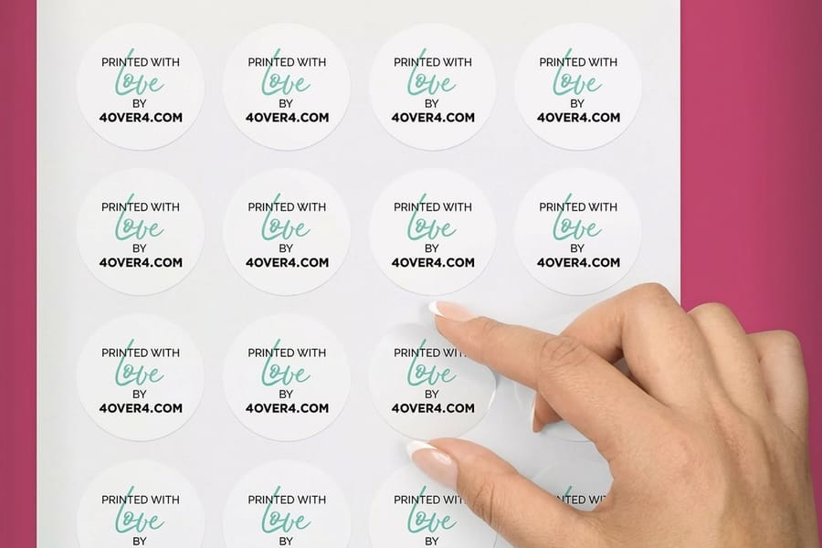
Q: How much does the outline of the label matter?
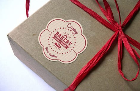
"More than people expect. A circle reads friendlier than a rectangle. A shape that echoes the product, a leaf for a tea brand, a drop for an oil, turns the label itself into a piece of the logo. When budget allows, a custom die-cut outline is one of the cheapest ways to look distinctive, because most competitors are still in plain rectangles."
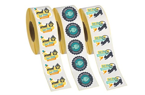
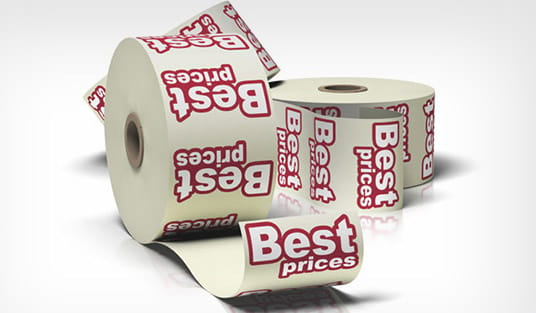
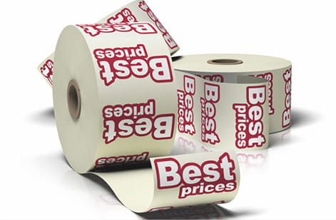
To break out of the box, look at custom die-cut labels, which cut to any outline you supply, or custom shaped roll labels when you need those shapes fed off a roll for high-volume application; the custom shaped roll labels story shows finished rolls. Rounds and ovals are a gentle first step, and the Roll Oval Labels video shows the oval on a roll. Browse everything by silhouette under shop by shape. The mechanics of cutting to a shape are shared with stickers, so the what are die-cut stickers guide is worth a read.
One art-director caution: a bold shape needs a clean dieline and a little breathing room inside it, or the trim will clip your art. Keep critical copy well within the cut path. If labels and stickers both fit your plan, the sticker and label printing hub keeps them in one place.
Final tips: getting your label file production-ready
Q: What separates a file that prints clean from one that comes back wrong?
"Boring discipline at the finish line. The design can be brilliant, but if the bleed is missing or the images are 72 dpi, it will not print the way you pictured it. I run the same short checklist on every file before it goes to press."
- Bleed and safe zone. Extend background color past the trim and keep text and logos comfortably inside the safe margin.
- Resolution. Raster art at 300 dpi at final size, so nothing turns soft or pixelated on close inspection.
- Color mode. Build in CMYK, not RGB, and specify a Pantone if a brand color must match exactly across runs.
- Proof it real. Order a printed proof or free samples on the actual stock and check it in daylight and store light.
When your file clears that checklist, request free samples to confirm the feel, skim the printing FAQs for anything last-minute, and if stickers are on the same project the how to make stickers guide covers the crossover. Then configure your product labels and send it to print.
Wally explains label hierarchy
Rank it before you style it
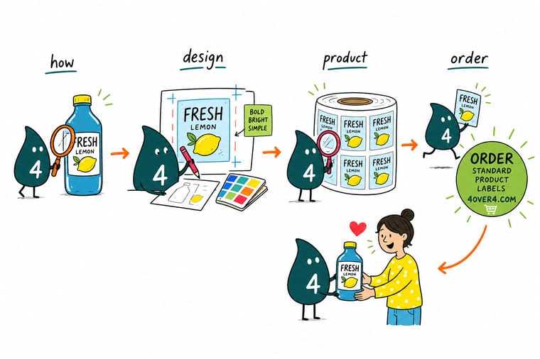
Wally treats a product label like a tiny billboard: a shopper only reads it for a second, so one element has to win. Put the brand and product name at the top of the order, keep the legal copy and barcode tidy at the base, and let the material do the rest, waterproof film for bottles, clear for a no-label look, matte or kraft for artisan brands. Rank first, style second, proof on the real stock, then print.
Order product labels →
Specs and pricing
Product label specs and live pricing
Once your art is ready, here is what a made-to-order product label gives you at 4OVER4.COM, with live specs and price-per-unit pulled straight from the configurator: circles from 0.5 to 4.5 inches, rectangles from 0.375 x 1 inch up, on uncoated, semi-gloss, hi-gloss, white vinyl or clear label stock, from 25 labels with 3 business days of standard production. Watch the per-unit price drop as your quantity climbs.
| Quantity | Price Per Unit | Total |
|---|---|---|
| 25 | 95.5¢ | $23.88 |
| 50 | 72.9¢ | $36.44 |
| 100 | 42.7¢ | $42.72 |
| 150 | 32.7¢ | $49.01 |
| 200 | 27.6¢ | $55.29 |
| 250 | 24.6¢ | $61.57 |
| 300 | 22.0¢ | $65.97 |
| 400 | 17.6¢ | $70.36 |
Print it
Order product labels at 4OVER4
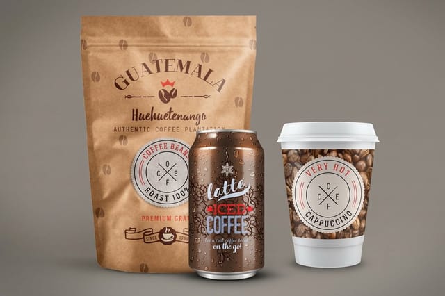
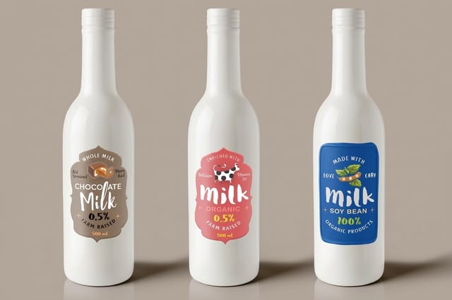
Premium product and bottle labels from 25 in 3 x 5 to 5 x 7 inches or any size up to 7 by 6, on paper, white vinyl or clear stock, and premium clear labels with an optional white ink base for glass.
See it in use
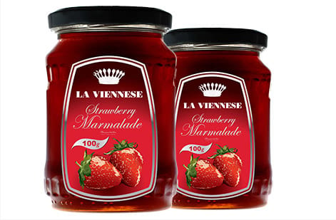
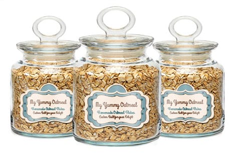
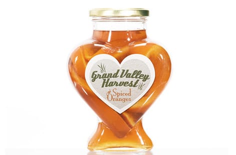
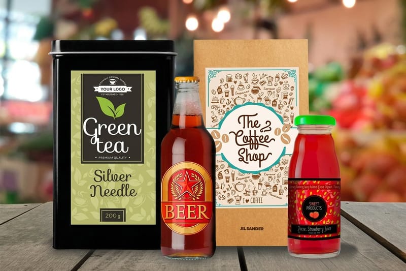
Labels we printed for bottles and jars

Explore more
Where to go next
By the numbers
White Gloss and White BOPP on the roll press
Common Questions
Common questions about designing product labels
What are the most essential elements of a product label?
Four things carry every label: the brand mark, the product name, one supporting detail such as a variant or scent, and the required copy like net weight, ingredients, or a barcode. An art director builds a clear hierarchy so the eye lands on the brand first, then the product, then the fine print. Everything past those four elements is decoration, and decoration is where labels usually get muddy. Keep the count low and the contrast high.
Does my label meet water, sun or a freezer?
Start with where the label lives. A bottle that sweats in a fridge or a soap bar in a wet shower needs a waterproof film like BOPP, so look at premium waterproof labels or bottle labels. A spirit or cosmetic jar that wants the contents to show off calls for clear labels. A coffee bag, candle, or small-batch food brand often reads better on a matte or kraft-style uncoated stock. Vinyl handles outdoor and industrial jobs. Order free samples so you can feel the finish before you print thousands.
How do I design a product label from scratch?
Sketch the hierarchy before you open any software: what should a shopper read first, second, and third. Build a small system of one display typeface and one clean supporting face, pick a palette anchored by your brand color, then place everything against the actual dieline with bleed and a safe margin. Our free online designer and label templates give you a correctly sized canvas so you are not guessing at trim. Proof it on the real stock, then order the run.
What makes a label readable on a crowded shelf?
Contrast and confidence. The labels that stop people use a strong figure-to-ground relationship, a single hero element, and enough empty space that the design can breathe. A finish helps when it earns its place: a metallic accent, a foil word, or a spot of gloss on a matte background adds a tactile hit that flat printing cannot. The trap is adding all of it at once. Pick one move and commit to it.
What does it cost to print product labels, and how is pricing set?
Label pricing at 4OVER4.COM is driven by four levers: quantity, size, material, and any special finish. Standard product labels start around $23.88 for a small run, and the per-unit price drops sharply as quantity climbs, which is why the live price table on this page is worth a look before you order. Roll labels, waterproof film, clear stock, and foil each carry their own rate. Configure your exact size and quantity to see the real number.
Should product labels be printed on rolls or sheets?
It depends on how you apply them. Hand-applied short runs and variety packs work fine on cut sheets. If you run a bottling line or apply hundreds of the same label by machine, roll labels feed an applicator and save real time. Custom shaped roll labels also let you break out of the rectangle without hand-trimming. For most growing brands, sheets get you started and rolls take over once volume climbs.
Get Started
Order 250 shaped roll labels from $300.05 once the art is settled
Pick your size and material, drop in your art, and we print crisp, durable labels that look sharp from the first bottle to the last.
Legal Disclaimer
Gold Standard guarantees apply to all standard orders placed through 4over4.com. Price match requires verifiable proof of a competitor's published price for an equivalent product with matching specifications and turnaround time. Satisfaction guarantee covers manufacturing defects and print quality issues. Contact support with order number and documentation.
