
20 Free Fonts That Make Business Cards Look Expensive


Emma is our prepress and print production voice, built from the knowledge of our production team, with over 20 years in printing.
The Font Is Half the Card
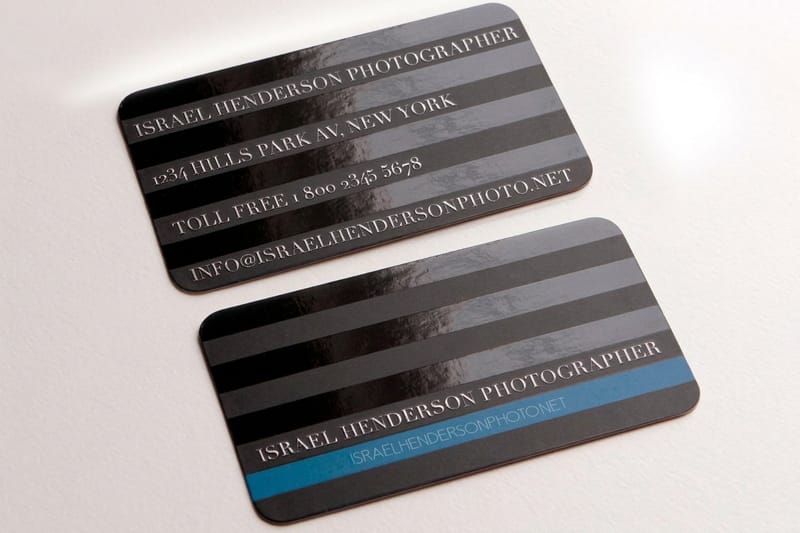
A business card is mostly type: a logo, a name, and four or five contact lines on a 2 x 3.5 in rectangle, Choose the right typeface and a plain card looks expensive. Choose the wrong one, or three at once, and even a great logo looks amateur.
The 20 fonts below are grouped by the personality they project. Skim for the mood that fits your brand, then jump to the pairing rules that make any of them look considered.
For sizing ground rules first, the card font size guide keeps your text legible, and the styles and finishes gallery shows how type looks with real finishes.
Print your type on a real card
Business cards printing
Every stock and finish to show a free font off like a paid one.
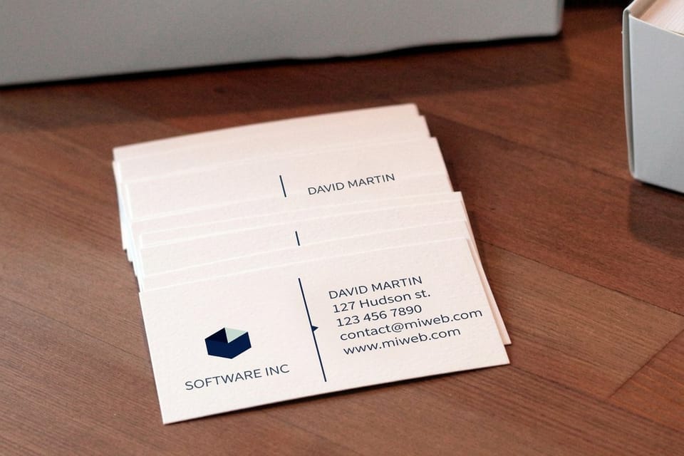
How to Choose Fonts for a Business Card
Before the list, the one rule that matters most: restraint. The cards that look the most expensive almost always use the fewest fonts. Get these basics right and any font on this page will work for you.
- Use two fonts, maximum. One display face for your name, one clean face for the details. A third almost always reads as a mistake.
- Match the mood to the brand. A serif says heritage and trust, a geometric sans says modern and clean, a bold display says confident.
- Prioritize legibility. Your phone number and email are read at a glance. If a font blurs at small sizes, it fails the only job that matters.
- Mind the weights. A family with several weights lets you build hierarchy, name, title, details, without adding a second typeface.
With the rules set, here are the 20, grouped by personality so you can jump straight to your lane.
The 20 Free Fonts by Personality
Modern and clean
Geometric and neo-grotesque sans faces that read as contemporary, confident, and uncluttered, and that stay legible at 7 points for a phone number. Set the name in a medium or semibold weight and the details in regular. They suit tech, consulting, and any brand that wants to feel current.
- Inter
- Montserrat
- Poppins
- Work Sans
- Space Grotesk
- Archivo
Elegant and serif
Refined serifs that carry heritage, luxury, and trust. These shine for law, finance, wellness, weddings, and premium brands, especially with a foil or letterpress finish.
- Playfair Display
- Cormorant Garamond
- EB Garamond
- Libre Baskerville
- Fraunces
- Spectral
Bold and display
High-impact faces for a name that should be the first thing anyone reads. Use these for the name only, and pair with a quiet sans for the details.
- Bebas Neue
- Oswald
- Abril Fatface
- DM Serif Display
Friendly and approachable
Warm, rounded, and open faces that feel welcoming without losing polish. Great for service businesses, creatives, and anyone who leads with personality.
- Lato
- Raleway
- Josefin Sans
- Nunito
Here is what real card pricing and specs look like, so you can plan a run that shows your chosen type off on quality stock.
Quantity and price
Business card pricing and specs
Real configurator numbers. The more you order, the lower the per-card cost drops.
| Quantity | Price Per Unit | Total |
|---|---|---|
| 100 | 17.6¢ | $17.57 |
| 200 | 11.5¢ | $23.07 |
| 300 | 9.15¢ | $27.46 |
| 400 | 7.96¢ | $31.86 |
| 500 | 7.25¢ | $36.26 |
| 600 | 6.77¢ | $40.64 |

Pairing and Print Legibility
A great pairing is a contrast that still feels like a family. The reliable formula is one distinctive display or serif face for the name, paired with one clean, highly legible sans for everything else. That contrast creates hierarchy, and the shared restraint keeps it elegant.
- Serif name, sans details. Playfair Display or Fraunces for the name, Inter or Work Sans for the contact block. A timeless, premium pairing.
- Bold display name, quiet sans details. Bebas Neue or Oswald up top, Lato or Nunito below. Loud and clear without shouting.
- All-sans, two weights. Montserrat Bold for the name and Montserrat Regular for details. The simplest safe choice.
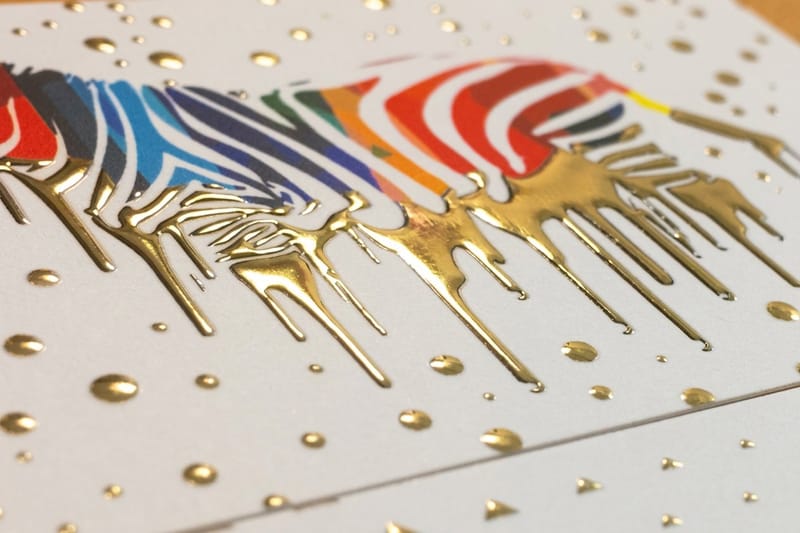
Where free fonts become premium is the finish. A crisp typeface set in raised foil, spot UV, or letterpress gains texture and light that no screen can match. Suddenly a free font looks like a bespoke one, because the print, not the license, carries the luxury.
The table below compares popular cards from the business cards printing range on stock, finish and turnaround.
Compare finishes
Popular business cards, side by side
Stock, finish, size, quantity, turnaround, and from-price across the cards that show type off best.
 free business cards |  Standard Business Cards |  3D Lenticular Business Cards |  Metallic Foil Business Cards | |
|---|---|---|---|---|
| Min price | Free | $17.57 | $690.88 | $222.13 |
| Paper / stock | 14pt Gloss Cover | 14pt Gloss Cover | 31pt Lenticular Lens | 16 Point Silk Laminated |
| Finish | - | Standard Finish | - | - |
| Size | 2" x 3.5" | 2" x 3.5" | 2" x 3.5" - Vertical | 2" x 3.5" |
| Default qty | 200 | 100 | 500 | 500 |
| Turnaround | 5 business days | 3 business days | 22 business days | 7 business days |
| Rating | ||||
| View & customize | View & customize | View & customize | View & customize |
Print Your Type on a Card That Deserves It
A free font gets you most of the way, and the card stock decides whether it reads as cheap or considered. The same typeface looks flat on thin, glossy stock and far richer on 16pt Uncoated with Soft Touch or 18pt Premium White Linen. Raised foil suits a serif name such as Playfair Display. Match the font to a finish that flatters it and the whole thing reads as expensive.
- Elegant serifs. Pair with letterpress or foil on a heavy stock so the letterforms gain depth and shine.
- Modern sans. A clean matte or soft-touch stock keeps them crisp and contemporary.
- Bold display names. Spot UV or raised foil on the name makes it catch the light and lead the card.
Set your two-font layout in the free online designer, then choose the finish that flatters your fonts.
Print picks
Three finishes that make type sing
Live prices, ready to customize with your two-font layout.
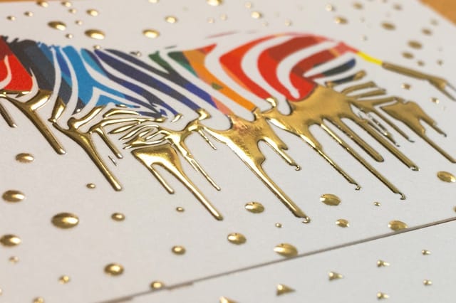 Raised Foil Business Cards 100 for $86.78 Set an elegant serif in raised foil and a free font reads as bespoke.
 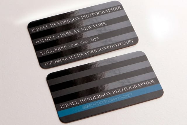 Spot UV Business Cards 500 for $76.88 Glossy spot UV on a bold name makes your type catch the light.
 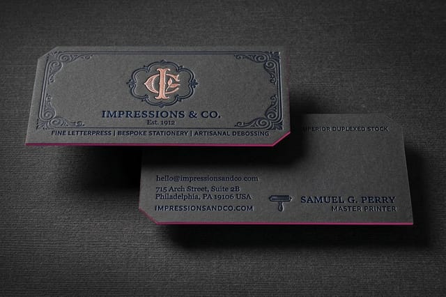 Letterpress Business Cards 250 for $251.36 Pressed type gains depth and craft that no screen can match.
 Wally sets the type
Two free fonts plus the right finish equals an expensive card
A card is mostly type, and the best card fonts are free. Pick two, one display face for the name and one clean face for the details, and match the mood to your brand. Then let the finish carry the luxury: raised foil, spot UV, and letterpress turn a free font into a bespoke card. 4OVER4 carries all 20 fonts in its designer and prints them crisp on premium stock.
Print your business cards →Choosing a card font you will not regret
Explore more
More ways to make your card look expensive
The card styles gallery, the card font size guide, logo best practices, and card templates.
 Category Business Cards Printing Every stock and finish to show your type off well. Product Raised Foil Business Cards The finish that turns a free serif into a bespoke one.
  Showcase Card Styles Gallery See type with real finishes before you print.
  Article Card Font Size The sizes that keep card type legible.
  Guides All Printing Guides How-tos for type, finishes, and card design.
  Guide Logo Design Best Practices Type and mark that work together on a card.
  Templates Card Design Templates Card layouts you can open and edit online.
  Benefit Same Day Printing Print your typeset card fast when timing counts.
 Great type deserves a great card.
Set two free fonts on the card and print them in a finish that flatters them.
Font questions before you hit print
Can I use these fonts on cards for my business?
Yes. All twenty are on Google Fonts under the SIL Open Font License, which allows commercial print, embedding in a PDF and changes to the letterforms. The one thing it forbids is selling the font file itself.
Which of these fonts get lost at 7 points?
The display faces. Abril Fatface, DM Serif Display and the light weights of Cormorant Garamond have hairline strokes that thin out at contact line sizes, and Bebas Neue has no lowercase, so a long email address in it runs wide. Keep them for the name and set the phone number and email in a sans such as Inter, Lato or Work Sans.
Which finishes does 4OVER4.COM offer for a type-led card?
Raised foil cards come in gold, silver or holographic foil on 16pt velvet laminated cover. Spot UV cards put gloss on 14pt or 16pt gloss or 16pt silk laminated stock. Letterpress cards add foil stamping, embossing, debossing, raised spot UV and edge painting as options, with a 15 business day turnaround.
What do these business cards cost, and how are prices set?
At 4OVER4.COM, standard business cards start at $17.57 for 100, spot UV cards at $76.88 for 500, raised foil at $86.78 for 100, and letterpress at $251.36 for 250. Price depends on the stock, the finish, and the quantity, and ordering more brings the per-card cost down.
