Table of Contents
- Home
- content hub
- A Guide to Standard Yard Sign Size and Dimensions
A Guide to Standard Yard Sign Size and Dimensions
Mar 14, 20268 views
Mar 14, 20268 views
When you think of a yard sign, the classic 18"x24" is probably what comes to mind. It’s the industry workhorse for a reason—perfect for real estate listings, political campaigns, and local service ads. But for grabbing eyes on a busier road, you’ll want to size up to something like a 24"x36", which basically works as a mini-billboard.
A Quick Guide to Choosing the Right Yard Sign Size
Picking the right yard sign size is a lot like choosing the right tool for a job. You wouldn't use a tiny screwdriver on a massive bolt, right? In the same way, the "best" sign size comes down to what you’re trying to accomplish, where people will see it, and the message you need to get across.
A small 12"x18" sign might be perfect for pointing people toward your booth at a farmers market, but it’ll be totally invisible to cars zipping by on a main street. This is where you have to think about the relationship between a sign's size, its viewing distance, and the impact you want to make.
Matching Size to Your Marketing Goal
First things first, what’s your primary goal? Are you trying to flag down fast-moving cars, or are you talking to pedestrians strolling past your shop? Each one calls for a different strategy.
- For High-Speed Traffic: You absolutely need bigger formats like 24"x36" or even a landscape 36"x24". Think of these as quick, roadside announcements designed to be understood in a three-second glance.
- For Residential Streets: The classic 18"x24" is king here. It’s big enough for drivers on a neighborhood street to see clearly, but it won’t look obnoxious or out of place in someone’s front yard.
- For Pedestrian Areas: Smaller signs are great for walkways, event check-in lines, or storefronts where people are up close and moving slowly.
Understanding the Impact of Viewing Distance
How well your sign works is directly tied to how far away your audience is. A bigger sign gives you more room for larger text and graphics, which is critical for making sure people can actually read it from a distance.
A simple but effective rule to follow is to have at least one inch of text height for every 10 feet of viewing distance. So, if you want a headline to be readable from 100 feet away, your letters need to be at least 10 inches tall.
This is exactly why a one-size-fits-all approach just doesn't cut it. The size of your sign determines the canvas you have to work with, and that impacts everything from your font choice to how simple or complex your message can be.
To make this decision a little easier, we’ve put together a quick comparison of the most common sign sizes and where they shine.
Standard Yard Sign Sizes and Their Best Uses
This table breaks down the most popular yard sign dimensions, their effective viewing distances, and the ideal marketing scenarios for each. It’s a great starting point to help you quickly figure out which option fits your business needs.
| Sign Size (Inches) | Optimal Viewing Distance | Primary Use Cases | Best For |
|---|---|---|---|
| 18" x 24" | 50 - 150 feet | Real Estate, Political Campaigns, Contractor Services | All-purpose marketing in residential or moderate-traffic areas. |
| 24" x 36" | 100 - 250 feet | Major Event Promotions, Roadside Ads, Grand Openings | High-impact announcements on busy roads and intersections. |
| 12" x 18" | 10 - 50 feet | Directional Signs, Event Wayfinding, Small Promotions | Guiding foot traffic and point-of-sale advertising. |
| Custom Shapes | Varies | Brand Building, Unique Promotions, Special Events | Creating a memorable and eye-catching visual identity. |
Ultimately, choosing the right size is the first step toward creating a sign that actually gets results. If you’re looking for options that are both durable and vibrant, you can learn more about the Coroplast sign collection and see how well it works for all kinds of outdoor advertising.
The Most Popular Yard Sign Sizes and When to Use Them
Picking the right yard sign size is about more than just what fits on a patch of grass. It's a strategic choice that directly affects how many people see—and remember—your message. Think of it like this: you wouldn't whisper a big announcement in a crowded room. You need the right volume for the space. The same goes for your signs.
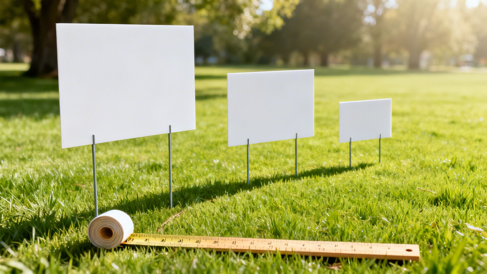
Let's walk through the most common sizes, from the small, up-close signs to the big, can't-miss roadside options, so you can choose the perfect fit for your campaign.
The Compact Contender: 12x18 Inches
Sometimes, you need to speak directly to the person standing right in front of you. That's the job of a 12"x18" sign. It’s small, personal, and perfect for situations where people are moving slowly and have a moment to take in the details.
This little powerhouse is great for very specific jobs:
- Directional Guidance: Got an event? Use these with arrows to point guests toward parking, guide shoppers to a market stall, or show the way to the main entrance.
- Point of Sale: Placed near a checkout or storefront, they're perfect for announcing a daily special, promoting a new item, or sharing a QR code for your loyalty program.
- Quick Info: They work wonders for short, simple messages like "Please Keep Off The Grass" or "Restrooms This Way."
Because they're so compact, they're not meant to be seen from a moving car. Their real strength is in close-range communication with foot traffic.
The Industry Standard: 18x24 Inches
When you picture a classic yard sign, chances are you're thinking of the 18"x24" size. This landscape-oriented sign is the undisputed workhorse of local advertising, and for good reason. It nails the perfect balance of visibility, message space, and cost.
It’s big enough for drivers on residential streets to read easily, but still small enough that it won't overwhelm a front lawn. This makes it the go-to for everything from real estate open houses to political campaigns and local contractor ads.
This infographic shows how the two most popular yard sign sizes stack up for business marketing.

As you can see, the 18"x24" is the versatile foundation, while the 24"x36" is what you use when you need to scale up for maximum roadside impact.
The 18"x24" sign is so effective that 71% of sellers using yard signs report faster sales, with this optimal size being readable from up to 150 feet away. Its balance of cost and performance is why it's a cornerstone for real estate agents and local campaigns.
For real estate pros wanting to make a serious impression, it pays to look through a dedicated real estate sign collection to find designs that truly pop.
The Roadside Billboard: 24x36 Inches
If the 18"x24" is your reliable sedan, the 24"x36" is your heavy-duty truck. It’s built for one thing: grabbing attention from a distance, even at higher speeds. Think of it as a mini-billboard for your lawn or business front.
That extra real estate gives you all the room you need for huge, bold text and graphics that a driver can understand in just a few seconds.
Go with this size when you're dealing with:
- High-Traffic Roads: Place it along busy streets, at intersections, or near highways where smaller signs would just disappear.
- Grand Openings and Big Events: When you're announcing a huge sale, a festival, or a new business launch, you need a sign that matches the scale of the event.
- Maximum Visibility: In a cluttered visual environment, sometimes the only way to get noticed is to be the biggest sign on the block. Bigger really is better here.
Yard signs are still a vital tool for local marketing, especially for small businesses. Research shows that standard sizes like 18x24 and 24x36 inches are the most effective for being seen from moving cars. During events like the 2020 US elections, over 100 million signs were used, contributing to a 15% increase in voter turnout in areas with high sign density.
How Visibility and Placement Affect Your Sign Size

Choosing the perfect yard sign size is just the start. A stunning, well-designed sign stuck in the wrong spot is like shouting into the wind—the message just gets lost. It's the strategic placement that transforms your sign from a piece of plastic into a powerful marketing tool.
Think of it this way: the environment where you put your sign should drive all your other decisions. A sign for drivers zipping down a 45-mph road requires a totally different game plan than one for people strolling along a quiet sidewalk. It's all about matching the sign to its audience and their surroundings.
Factoring in Sightlines and Speed
Visibility isn’t just about how big the sign is. It’s about how readable it is from a certain distance and at a specific speed. The faster your audience moves, the less time they have to absorb what you’re saying. This means you’ll need larger text and a much simpler design.
There's a great rule of thumb we use in the sign business: the "1 inch per 10 feet" principle. For every 10 feet of viewing distance, your main text needs to be at least one inch tall to be legible. This simple formula is a game-changer when you're deciding on your sign’s size and layout.
To make it even clearer, here’s a quick guide based on that very principle:
| Intended Viewing Distance | Minimum Letter Height | Suggested Sign Size |
|---|---|---|
| 30 feet (Foot traffic) | 3 inches | 12" x 18" |
| 70 feet (Slow traffic) | 7 inches | 18" x 24" |
| 100 feet (Moderate traffic) | 10 inches | 24" x 36" |
| 150 feet+ (Fast traffic) | 15+ inches | Large Format Signs |
As the table shows, putting a small sign on a high-speed road is basically throwing money away. The letters will be a blur to drivers, making the entire sign completely useless.
Getting the Most Exposure While Avoiding Clutter
Now that we've covered the link between distance and text size, let's talk about where to physically place your sign for the biggest impact. The goal is to find a spot with high visibility and as few distractions as possible.
Here are a few practical tips to get it right:
- Look for Obstructions: Before you even think about pushing that H-stake into the ground, take a look around. Is your sign going to be hidden by a parked car, a big bush, or a fire hydrant? Step back and view the spot from the street to make sure there's a clear line of sight.
- Avoid "Sign Soup": If an intersection is already drowning in dozens of other signs, yours is likely to get lost in the noise. Sometimes a less crowded spot just a few feet down the road is far more effective than a prime corner that's oversaturated.
- Angle for Readability: Don't just point your sign straight ahead. Try angling it slightly toward the flow of oncoming traffic. This tiny adjustment can make a huge difference in how much time drivers have to see and read your message.
Remember, the best spot for a yard sign isn't just visible—it's unmissable. It should grab attention without having to fight for it, delivering a clear message to the right people at the right moment.
Using the right hardware is just as important. Standard H-stakes are fine for most 18"x24" signs, but if you're using a larger 24"x36" sign, you’ll want a sturdier frame or even two stakes to keep it from bending or blowing away. For even more heavy-duty options, you might explore other ground-level ads, which we cover in our guide to sidewalk signs and their benefits. By thinking strategically about both the yard sign size and its final home, you can make sure your message is seen, read, and remembered.
Designing Your Sign for Maximum Impact

So, you've figured out the perfect size and the best spot for your yard sign. But if the design itself is a cluttered, blurry mess, all that work is for nothing. Great design is what makes sure your message actually gets read—and understood—in the few seconds you have to grab someone's attention.
Think of your sign's design as its voice. A jumbled, weak voice gets ignored, but a clear and confident one makes people stop and listen. Let's walk through the essential design rules to make sure your sign speaks loud and clear, turning it from just another sign into a real marketing powerhouse.
Mastering the Technicals for a Flawless Print
Before you even start picking out colors and fonts, you have to get the technical stuff right. These foundational steps are what prevent common printing disasters, like pixelated logos or colors that look completely different in person. Get this right, and what you see on your screen is what you'll get in your hands.
Here are the non-negotiables for any print-ready file:
- High-Resolution Images: Your images must be 300 DPI (dots per inch) at their final print size. If you pull a low-resolution image off a website, it’s going to look blurry and unprofessional. No exceptions.
- CMYK Color Mode: Your computer screen uses RGB (Red, Green, Blue) light, but professional printers use CMYK (Cyan, Magenta, Yellow, Black) ink. Always design in CMYK from the get-go to ensure your colors come out exactly as you planned.
- Correct File Format: Save your final design as a high-quality PDF, AI, or EPS. These are vector formats, meaning they keep text and lines perfectly sharp no matter how big you scale them. JPEGs just can't do that.
Embracing the "Less Is More" Philosophy
When it comes to yard signs, simplicity is your superpower. A driver flying by only has about three to five seconds to read your sign. If your message is buried in a wall of text, you've already lost them. Clarity always wins over cramming in more information.
The dominance of specific sizes like the 24x36 inch sign in major markets isn't an accident; it's the sweet spot for visibility and portability. In fact, studies show that while 85% of consumers notice yard signs every day, larger formats like the 24x36 inch can generate a 20% higher recall rate than smaller signs. It’s also why eco-friendly, soy-based inks are becoming so popular—their vibrant colors are perfect for grabbing attention on these widely used sizes.
A clean design has one clear goal. What’s the single most important thing you want someone to do? Call a number? Visit a website? Show up to an event? Make that the star of the show. Your sign is just one piece of the puzzle; it's meant to enhance the overall first impression and curb appeal of your property, not tell the whole story.
A crowded sign is an ignored sign. The goal isn't to provide all the information; it's to spark enough curiosity for the viewer to take the next step. Let your website or a phone call do the heavy lifting.
Creating a Visually Arresting Design
Once you've simplified your message, it's time to make it pop. This really comes down to two things: your font choice and your color contrast.
Font Readability: Your font needs to be bold, clean, and easy to read from a distance. Steer clear of scripts, thin letters, or anything overly decorative.
- Good Choices: Helvetica, Arial, Franklin Gothic
- Poor Choices: Brush Script, Papyrus, Times New Roman (too thin for viewing at a distance)
High-Contrast Colors: The color of your text has to stand out sharply against the background. This contrast is what makes your sign readable to someone in a moving car.
| High-Contrast Combos | Low-Contrast Combos (Avoid) |
|---|---|
| Black on Yellow | Yellow on White |
| White on Blue | Red on Green |
| Black on White | Blue on Purple |
By combining a simple message with strong fonts and high-contrast colors, you create a design that’s almost impossible to ignore. For a little inspiration, check out the wide range of professional signs and banners to see these principles in action.
Navigating Local Rules and Regulations for Yard Signs
Alright, you've nailed down the perfect yard sign size, your design is brilliant, and you've found just the right spot. But hold on. Before you plant that sign, there's one last, critical step you can't afford to skip: checking your local sign ordinances.
Ignoring these rules is one of the quickest ways to watch your marketing investment get pulled up and tossed in a truck. Even worse, you could get hit with a fine.
Think of it this way: every town has its own rulebook for what can be put up in public spaces. These rules aren't there to stop you from advertising. They’re in place to keep things safe, prevent clutter, and make sure everyone gets a fair shot. Knowing the rules isn't just a suggestion—it's a core part of any successful sign campaign.
Where to Find Local Sign Rules
So, where do you even start looking for this information? Your first stop should always be the official website for your city, town, or county. The exact department name can change, but you'll usually find what you need under one of these headings:
- Planning and Zoning Department: This office is typically in charge of land use, which includes the rules on where and what kinds of signs are allowed.
- Code Enforcement: These are the folks who enforce the rules. Their website often has a handy summary of the most common violations to avoid.
- City Clerk or Municipal Clerk: As the official record-keepers, they can always point you to the right ordinance documents.
A quick search like "yard sign rules [Your City Name]" will often get you right where you need to be. Just look for a PDF or a webpage that lays out the local sign code.
Common Rules That Affect Yard Sign Size and Placement
While every town is different, most local rules tend to focus on a handful of key areas. These regulations will directly impact the yard sign size you can legally use and exactly where you can place it.
You can typically expect restrictions on:
- Size Limits: Many cities put a cap on the maximum dimensions for temporary signs. For example, a residential area might limit signs to 6 square feet (like a 2'x3' sign), while commercial zones might permit larger formats.
- Setback Requirements: This rule dictates how far your sign needs to be from property lines, sidewalks, or the street. A very common one is that signs can't be in the public right-of-way—that strip of grass between the sidewalk and the street.
- Height Restrictions: Ordinances will often limit how tall your sign can stand. For most temporary yard signs, this is usually kept to around 3 to 4 feet off the ground.
- Duration Limits: Signs for temporary events or sales are usually only allowed for a specific window of time, like 30 days before an event and a few days after.
The fact that 18x24 and 24x36 inch yard signs are so popular is no accident; it’s partly a reaction to these very rules. These sizes are so effective that industry surveys show 66% of small businesses attribute sales increases of 10-20% to them. Retailers, making up 38% of the signage market, often discover that sizes like 24x36 inches are perfectly scaled for storefronts while staying compliant. You can dig deeper into these trends by checking out insights on the printed signage market.
Don't think of these regulations as a pain. See them as the blueprint for a compliant and effective campaign. Knowing the rules ahead of time protects your investment and makes sure your message stays up.
For political campaigns, the rules can get even more specific, with strict guidelines on how early signs can go up before an election and how quickly they must come down. If you're running a campaign, looking into a specialized political sign collection can help you find options designed to meet common size and material requirements. A little bit of homework upfront ensures your signs work for you without any interruptions.
Putting It All Together: Choosing the Right Sign
Choosing the perfect yard sign shouldn’t feel like a shot in the dark. As we've seen, the most effective signs are the result of a few smart decisions that connect your goal to the sign's environment. It really just comes down to where your sign will live and what you need it to accomplish.
The first question you should always ask is: who am I trying to reach? Your answer will point you in the right direction. For drivers zipping down a busy road, you’ll need the visibility of a large 24"x36" sign. But for grabbing the attention of people on foot in a quiet neighborhood, the classic 18"x24" is usually the perfect fit.
A Final Checklist for Success
With your main goal in mind, take a moment to run through these final checks. Think of this as protecting your investment and making sure your sign can actually do its job out in the real world.
- Scout the Location: Look at the viewing distance and all the visual noise around your spot. Are there other signs, bushes, or distractions? Your text height and color contrast need to be bold enough to cut through the clutter.
- Keep the Design Simple: When it comes to signs, less is almost always more. A clean design with a straightforward message, big fonts, and high-contrast colors will beat a busy, complicated one every single time.
- Double-Check Local Rules: Don't skip this step. A quick search on your city or county’s website can save you a lot of headaches. Look up the local ordinances for sign size, placement, and height to avoid fines or having your sign taken down.
Finding the Right Printing Partner
Going through these steps is a whole lot easier with a good printer in your corner. A great printing partner does more than just throw ink on Coroplast—they give you the tools and expertise to get your project done right, without any surprises.
Think of your printing partner as an extension of your marketing team. You want someone who offers a solid range of sizes, easy-to-use design tools, clear upfront pricing, and quick turnarounds to keep your campaign moving.
This kind of support system lets you create with confidence. Now that you know what to look for and have a reliable partner to back you up, you’re ready to design a yard sign that not only looks professional but also gets real results. You’ve got this—go create your next successful campaign.
Frequently Asked Questions About Yard Sign Size
Even with a good grasp of the basics, a few questions always pop up when it's time to finalize your yard sign order. Let's tackle some of the most common ones we hear to make sure you can move forward with total confidence.
What Is the Best Yard Sign Size for a Real Estate Open House?
For most residential real estate, the 18"x24" yard sign is the gold standard for a reason. It’s the perfect all-around choice, offering great visibility for passing cars without overwhelming a front lawn or running into trouble with local sign rules.
This size gives you enough room for the essentials: "Open House," a directional arrow, your name, and contact info, all while keeping the text large and readable from the street. Of course, if the property is on a high-speed road or has a massive front yard, bumping up to a 24"x36" sign is a smart move to grab attention from further away.
How Do I Know if My Design's Text Is Large Enough?
A great rule of thumb to follow is the "1 inch per 10 feet" principle. This simply means your text needs to be at least 1 inch tall for every 10 feet of viewing distance to stay legible.
So, if you want your sign to be readable from 50 feet away, your main headline letters should be at least 5 inches high. Before you hit "order," do a quick reality check. Print a full-size paper mockup of your design and look at it from the distance you expect people to see it. This simple step can save you from the expensive mistake of printing a sign nobody can read.
What Is the Difference Between Coroplast and Other Materials?
Coroplast is the go-to for almost every temporary yard sign you see out in the wild. It’s a brand name for corrugated plastic—that familiar, ridged material used for political and real estate signs. It's lightweight, waterproof, and incredibly cost-effective for short-to-medium-term outdoor campaigns.
Coroplast hits the sweet spot between durability and affordability for most marketing campaigns. While other materials like aluminum or PVC are more rigid and durable for permanent signage, they come at a significantly higher cost.
For temporary promotions, event announcements, or campaign season, Coroplast is the ideal solution. It’s tough enough to handle the weather for weeks or months but affordable enough to be used at scale.
Can I Get a Custom-Shaped Yard Sign?
Absolutely! Modern printing allows for custom die-cutting, which means you can create signs in unique shapes that make your brand impossible to forget. It’s a fantastic way to cut through the noise of all the standard rectangles out there.
Just imagine the possibilities:
- A coffee shop could have a sign shaped like a steaming coffee cup.
- A roofing company might use a sign cut into the silhouette of a house.
- A pet groomer could opt for a fun shape like a dog bone or a paw print.
While custom shapes do cost more than standard ones, they give you a powerful advantage in grabbing attention and making your brand memorable. If making a big impact is your main goal, the extra investment is often well worth it.
Ready to create a yard sign that gets noticed? 4OVER4 offers a huge selection of sizes, materials, and custom options to bring your vision to life. Explore our collection and start designing your perfect sign today at https://4over4.com.
More from

15
When you’re ready to invest in an A-frame sign, the first question you'll ask is, "What size do I need?" It usually comes down
![]() Emma Davis
Emma Davis
Mar 13, 2026

150
The real secret to mastering your direct mail budget isn't complicated. It comes down to one simple fact: a standard 4" x 6&q
![]() Emma Davis
Emma Davis
Mar 12, 2026

69
Tear-off flyers are a classic for a reason. They’re a tangible marketing tool, designed with perforated, removable tabs at the bottom. Each
![]() Emma Davis
Emma Davis
Mar 11, 2026

120
Printing stickers at home is a seriously fun and rewarding project. It boils down to four main parts: designing your image, picking the right
![]() Emma Davis
Emma Davis
Mar 10, 2026

105
Ever seen a logo that seems to float right on the glass of a jar or bottle? That’s the work of transparent label stickers.
![]() Emma Davis
Emma Davis
Mar 9, 2026

62
Picture this: your product’s beautiful label gets smudged and runny during shipping, or a gorgeous event banner fades to nothing after just
![]() Emma Davis
Emma Davis
Mar 8, 2026

60
In a sea of options, your product's packaging and labeling are its first, and often only, chance to make a real connectio
![]() Emma Davis
Emma Davis
Mar 7, 2026

90
Ever tried to print a hundred high-quality flyers on your home office printer? You probably ran out of ink, dealt with paper jams, and ended u
![]() Emma Davis
Emma Davis
Mar 6, 2026