Table of Contents
- Home
- content hub
- Tear off Flyers: How to Use tear off flyers for local results
Tear off Flyers: How to Use tear off flyers for local results
Mar 11, 20266 views
Mar 11, 20266 views
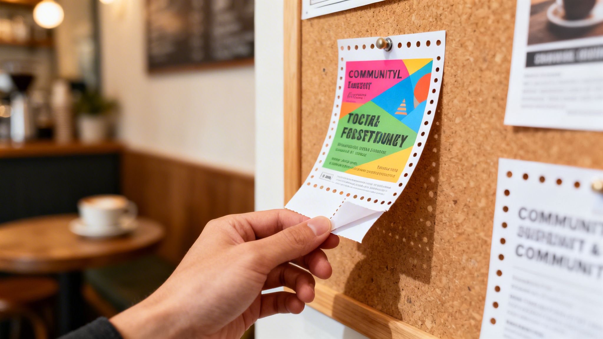
Tear-off flyers are a classic for a reason. They’re a tangible marketing tool, designed with perforated, removable tabs at the bottom. Each tab holds your key contact details, so interested folks can easily take your info with them—no pen or phone camera needed. This simple, brilliant format turns a passive ad into an interactive invitation.
Why Tear Off Flyers Are Still a Local Marketing Powerhouse
In an era flooded with digital noise, the good old-fashioned tear-off flyer cuts through the clutter with surprising power. It's second nature to scroll past a social media ad or trash a promotional email, but a physical flyer posted in a high-traffic community spot creates a real, tangible connection. This physical presence is a welcome antidote to the "digital fatigue" so many of us feel, offering a refreshing and trustworthy break from online pop-ups.
Put yourself in your customer’s shoes. They’re waiting in line at their favorite coffee shop, hanging around a community center, or walking their dog past a bulletin board. Your well-designed flyer catches their eye. It’s not some algorithm serving them an ad; it's a real-world discovery. That chance encounter feels far more authentic and less intrusive, building a small but crucial bit of trust right from the start.
Building Local Authority and Trust
For any local business, establishing a community presence is everything. Tear-off flyers are inherently local—they exist in the same physical spaces your customers do. This immediately signals that you're a part of their neighborhood, not some faceless online entity. It builds a sense of familiarity and reliability that digital-only campaigns often struggle to achieve.
When someone spots your flyer for dog walking services at the local vet or your ad for guitar lessons at the community music store, it forges an instant, relevant connection. This local touchpoint is a huge advantage. It proves you're invested in the community, not just targeting it from a faraway server. That physical evidence of your business boosts brand recall and credibility, making potential customers much more likely to choose you.
A Powerful Tool for Discovery and Action
Don't just take my word for it; the data shows just how effective this tangible approach can be. Flyers remain a critical discovery tool for local businesses, and their impact goes far beyond simple awareness.
Let's look at the numbers.
Tear Off Flyer Performance At a Glance
| Metric | Statistic | What This Means for Your Business |
|---|---|---|
| New Business Discovery | 34% of consumers find new local businesses through flyers. | Flyers put your brand directly in the path of people actively looking for local services and products. |
| Purchase Influence | 59% of consumers have purchased after receiving a printed flyer. | This isn't just about brand awareness; flyers directly drive sales and convert interest into action. |
| Business Owner Confidence | 71% of small business owners see physical marketing as vital. | Your peers know it works because they see the results in building genuine customer relationships. |
The sustained confidence from business owners isn't just nostalgia—it's a smart, strategic response to how people actually behave.
The numbers are clear: 71% of small business owners believe physical marketing is important for fostering genuine customer connections.
The very design of a tear-off flyer is engineered for immediate action. Those perforated tabs remove all the friction. A potential customer doesn't have to remember a web address or fumble to type a phone number. They simply tear off a tab and stick it in their pocket.
That simple, satisfying action transforms a fleeting moment of interest into a solid lead. It's a micro-commitment that makes them far more likely to follow up. You can explore our full range of marketing materials to see how different printed products can work in tandem to amplify your brand's reach.
The Anatomy of a High-Performing Tear-Off Flyer
Ever wondered what separates a tear-off flyer that gets ignored from one that’s completely stripped of its tabs? It’s not luck. It’s smart design. A great flyer is a tiny, powerful marketing machine where every piece has a job, from the headline right down to the perforation.
Think of your flyer as having two distinct zones: the main display and the tear-off tabs. The top part grabs attention, and the bottom part drives action. Let's break down how to nail both.
Crafting the Main Display Area
The top portion of your flyer is your billboard. You’ve got maybe three seconds to hook someone walking by. This space needs to be visually arresting and instantly communicate what’s in it for them.
Your headline is the single most important element here. It needs to be bold, clear, and focused on a benefit. A generic "Dog Walking Services" is forgettable. Try something that hits an emotional chord and solves a problem, like "Guilty You’re at Work? We’ll Walk Your Dog!" That headline connects and offers an immediate solution.
Visuals are just as critical. A high-quality photo or a clean, professional graphic that backs up your message is non-negotiable. For a local cafe, a mouth-watering shot of a signature latte will always beat a generic stock photo of coffee beans. The image has to make your product or service feel real and desirable.
Finally, keep your main text brief and scannable. Nobody’s going to read a wall of text on a community bulletin board. Use bullet points to hammer home your key selling points.
- Fully Insured & Bonded
- GPS-Tracked Walks
- Daily Photo Updates
These quick hits build trust and spell out your value in seconds.
This simple flow shows how a physical flyer can guide someone from a casual glance to a final purchase.

As the diagram shows, the physical nature of a flyer is what starts the journey, moving a potential customer from just seeing your ad to actually doing something about it.
Engineering the Perfect Tear-Off Tabs
The tear-off tabs are where interest becomes a real lead. If the main display is the "why," the tabs are the "how." A poorly designed tab section can tank an otherwise brilliant flyer. The goal is simple: make it absolutely effortless for someone to take your info with them.
Each tab should contain the most critical contact details. Don’t just put a phone number and call it a day. The more ways they can reach you, the better.
Essential Information for Each Tab:
- Business Name: To reinforce who you are.
- Primary Contact: A phone number is direct and a classic for a reason.
- Website: Your digital home. Use a short, memorable URL if you can.
- Call to Action (CTA): Even a tiny prompt like "Call for a free quote!" or an offer code ("Code: FLYER10") can make a huge difference.
I also recommend adding a QR code on one or two of the tabs. This is a fantastic way to bridge the physical-digital gap, letting someone visit your website or social media with a quick scan of their phone. If you're looking for ideas on how these flyers, also known as ripcards, can be printed for maximum impact, you might want to explore custom ripcards printing options.
A common mistake I see is making the tabs too small. Aim for a width of at least 1 inch and a height of 1.5 to 2 inches. This gives you enough room for readable text and makes the tab substantial enough that it won't get lost in a pocket or wallet.
The perforation is a small detail that speaks volumes. A clean, easy tear feels professional. A messy rip is frustrating and can make your brand look cheap. Insist on a standard micro-perforation to ensure the tabs pop off cleanly without wrecking the flyer.
Imagine a local cafe promoting a new loyalty program. The main display would have that amazing latte photo with a headline: "Your 5th Coffee is On Us!" The body copy would explain the program in three quick bullet points. Below, each of the 8-10 tear-off tabs would have the cafe's name, phone, website, and the simple phrase: "Ask about our new loyalty card!" That’s a complete marketing tool, all on a single sheet of paper.
A Practical Guide to Designing Your Flyer

Once you've nailed down the basic structure, it's time for the fun part: bringing your flyer to life with great design. This is where you blend creativity with the technical rules of print. Your goal is to make something that looks fantastic and prints perfectly without any nasty surprises.
First things first, what's your brand's vibe? Are you a sleek, modern tech company or a cozy, rustic cafe? Your flyer needs to reflect that personality instantly. This single decision will guide everything else, from the colors you choose to the fonts you pair.
Choosing Your Fonts and Colors
Typography isn't just about picking a font you like; it's a powerful tool for grabbing attention and setting a tone. When it comes to a tear-off flyer, readability is king. Imagine someone walking past a busy community bulletin board—they need to be able to grasp your message in a split second.
- Headlines: Go for something bold, clean, and impossible to ignore. A solid sans-serif font like Helvetica, Montserrat, or Arial is almost always a safe and effective bet.
- Body Text: Here, you need clarity in smaller sizes. Pick something simple and legible, and whatever you do, don't make your body copy smaller than 10-point text.
- Tear-Off Tabs: This is make-or-break. The text on the tabs has to be crystal clear. Stick with a basic, bolded sans-serif font to ensure every phone number or website is easy to read.
Color is your secret weapon for evoking emotion and drawing the eye. You can use a little color psychology here. Blue often signals trust and professionalism, which is perfect for a financial service. Green is a natural fit for health, wellness, or eco-friendly brands. Reds and oranges create a sense of urgency, making them ideal for sales or limited-time offers.
Keep your color palette simple—two or three complementary colors will look much more professional than a chaotic rainbow. Most importantly, make sure your text has high contrast with the background. There's a reason black text on a yellow background is a classic combo: it just works.
Using Design Tools and Prepping for Print
You don’t have to be a seasoned graphic designer to create a beautiful flyer. Plenty of user-friendly online tools offer drag-and-drop interfaces and ready-made templates that you can easily customize.
But here’s a pro tip: once the design looks perfect on your screen, you absolutely must prep the file correctly for a commercial printer. This is where so many people go wrong, leading to frustrating and expensive mistakes. Your final file should be a print-ready PDF, but there are a few technical details to get right.
Key Takeaway: The three most common reasons for disappointing print results are incorrect bleed, low resolution, and the wrong color mode. Get these right, and you're 90% of the way to a perfect print job.
Here’s a quick rundown of what you need to check:
- Bleed: This is a small extra margin—typically 0.125 inches (or 1/8")—of your background design that extends past the final trim line. It prevents any ugly white slivers from appearing at the edges after the flyers are cut.
- Resolution: Your file must be set to 300 DPI (Dots Per Inch). Images pulled from the web are usually 72 DPI, and they will look blurry and pixelated if you print them. Always start your design in a 300 DPI document and use high-resolution photos.
- Color Mode: Professional printers use CMYK (Cyan, Magenta, Yellow, Key/Black), while your screen displays colors in RGB (Red, Green, Blue). If you design in RGB, the colors will shift noticeably during printing. Make sure your file is in CMYK mode.
Getting these prepress steps right ensures a professional outcome. And if you're thinking of going beyond a simple rectangle, exploring how custom die cutting services can elevate your design can open up a world of creative possibilities.
Choosing the Right Paper and Finish

The moment someone picks up your flyer, they’re making a snap judgment. It’s not just about the design—the paper itself sends a powerful, unspoken message about your brand’s quality. A flimsy, see-through flyer feels cheap and disposable, while a substantial, well-finished piece communicates value and credibility before a single word is read.
Think of it as the handshake of your print marketing. Is it firm and confident, or is it weak and forgettable? Getting the material right ensures your tear-off flyers don’t just look good, but feel like something worth holding onto.
Understanding Paper Weight and Why It Matters
Paper weight isn't just about how heavy a sheet is; it’s a measure of its thickness and sturdiness. It’s usually shown in pounds (lb.) for text stocks or points (pt.) for cardstocks. The higher the number, the thicker and more rigid the paper.
80 lb. Text: This is a lightweight, common choice that’s a bit thicker than your standard office paper. It’s flexible and easy on the wallet, making it a great option for massive distributions where cost is the main concern, like a flyer for a community block party.
100 lb. Text: You'll immediately notice the step up in quality here. 100 lb. text is more substantial and less transparent. It feels more professional and holds up way better on a crowded bulletin board. Honestly, this is my go-to for most tear-off flyer projects because it hits that perfect sweet spot between quality and cost.
14 pt. Cardstock: Now we’re talking thick and rigid, similar to a high-quality postcard. Choosing cardstock for a tear-off flyer makes a bold statement. It’s perfect for high-end brands like luxury salons, real estate agents, or creative pros who need their marketing to ooze confidence and durability.
The right weight ensures your flyer can take a little wear and tear, and more importantly, that the tear-off tabs don't feel fragile. A flimsy tab can get lost or crumpled in a wallet, but a sturdy one feels more like a keeper.
My Personal Tip: For 9 out of 10 tear off flyer projects, 100 lb. text is the perfect balance. It provides a quality feel without the higher cost and rigidity of a full cardstock, which can sometimes be more difficult to tear cleanly if not perforated perfectly.
Selecting a Finish to Match Your Brand
The finish is the coating applied after printing, and it completely changes the final look and feel. Each one has its own personality, so you’ll want to pick one that aligns with your brand and campaign goals.
To make the choice easier, here's a quick comparison of the most common options for tear-off flyers.
Paper Stock and Finish Comparison for Tear Off Flyers
| Paper/Finish Type | Best For | Feel & Appearance | Cost Level |
|---|---|---|---|
| Glossy Finish | Photo-heavy designs, events, promotions | Shiny, vibrant, and reflective. Makes colors pop. | $$ |
| Matte Finish | Text-heavy designs, professional services | Smooth, non-reflective, and sophisticated. Modern feel. | $$ |
| Uncoated Stock | Eco-conscious or artisanal brands, coupons | Natural, porous texture. Easy to write on. | $ |
Choosing the right finish isn't just about aesthetics; it's about function and brand alignment.
Glossy Finish A high-gloss finish creates a shiny surface that makes colors look incredibly vibrant and saturated. It's fantastic for designs loaded with photos, as it makes images jump off the page. This finish is perfect for businesses wanting to project energy and excitement—think concert promotions, restaurant menus, or flyers for kids' events.
Matte Finish A matte finish offers a smooth, non-reflective surface that feels both modern and sophisticated. It diffuses light, which gives colors a more subdued, elegant tone. Because it cuts down on glare, matte is a great choice for designs with a lot of text. It’s ideal for professional services, art galleries, or any brand aiming for an upscale, contemporary vibe.
Uncoated Stock Uncoated paper has no extra coating at all, leaving it with a natural, porous texture. It’s super easy to write on and gives off an organic, rustic feel. This is the perfect option for brands that want to seem down-to-earth, eco-friendly, or artisanal. Think of flyers for a local farmer's market, a yoga studio, or a craft fair.
Diving into different coatings can really elevate a design from good to great. You can learn more about how protective coatings like laminating can add durability and style to all sorts of print projects.
Smart Distribution Strategies to Maximize Your Reach
So you’ve printed a brilliant stack of tear-off flyers. That’s a great first step, but they aren't going to generate a single lead sitting on your desk. The real magic happens when you get them in front of the right people, in the right places.
This is where strategy comes in. It’s about moving beyond just tacking a flyer on any random bulletin board and creating a distribution plan that actually gets you a return on your investment. The goal is simple: place your flyer in the natural path of your ideal customer so it feels like a helpful discovery, not an interruption.
Finding Your High-Traffic Hotspots
Think about where your target customer actually spends their time. This takes a little bit of local knowledge and putting yourself in their shoes. If you're a pet sitter, your ideal client isn't just any pet owner—they're probably busy, they visit the local vet, they shop at premium pet food stores, and they definitely hit up the dog park.
When you start thinking this way, you can build a list of prime locations that go way beyond the obvious.
High-Potential Distribution Spots:
- Community Centers & Libraries: These are local information hubs where people are actively looking for events, classes, and services.
- Coffee Shops & Cafes: A captive audience. People waiting for their latte or relaxing at a table are prime for spotting a community board.
- College Campuses: Student unions, dorm lobbies, and department boards are perfect for targeting students with services like tutoring, moving help, or food delivery.
- Veterinarian Offices & Pet Stores: If your business is pet-related, this is a must. A flyer here carries an implied endorsement.
- Gyms & Fitness Centers: Perfect for promoting personal training, meal prep services, or wellness workshops.
Once you have your list, the next part is crucial: always get permission. Just walking into a business and slapping up a flyer is the fastest way to get it torn down. A quick, polite conversation with a manager or owner goes a surprisingly long way.
Build Partnerships for Cross-Promotion
One of the most powerful—and most overlooked—strategies is to partner up with other local businesses that aren't your competition but share your customer base. This creates a win-win where you both get valuable exposure.
For example, a new yoga studio could team up with a nearby health food store. The studio leaves flyers near the checkout counter, and the health food store puts its own promos in the studio’s lobby. It's essentially a warm introduction from a trusted source.
Pro Tip: Don't just ask to post a flyer. Frame it as a true partnership. Offer to promote their business on your social media, or even design a joint flyer where you both share the space and the cost. This approach builds genuine community relationships that pay off.
This simple shift turns your distribution from a solo mission into a team effort. You effectively double your reach by tapping into another business’s established customer base.
Get Direct with Your Distribution
While public boards are great for passive views, sometimes you need a more direct approach to hit specific neighborhoods or demographics. This is where door-to-door distribution and event marketing shine.
If you’re a landscaper or run a home cleaning service, a targeted flyer drop in a particular neighborhood can be incredibly effective. Instead of blanketing an entire zip code, focus on areas with the types of homes that match your ideal client. If you want to dive deeper into this kind of hyper-local marketing, our guide on Every Door Direct Mail can offer valuable insights.
Leveraging local events is another fantastic tactic. Are you a musician offering lessons? Get permission to leave a stack of your tear off flyers on the welcome table at a local school’s band concert. A local baker? Ask to include a flyer in the goodie bags for a charity 5K.
These placements put your message directly into the hands of an engaged and highly relevant audience. By combining these different strategies, you ensure your message doesn't just reach a wide audience, but the right one.
Your Top Tear Off Flyer Questions, Answered
When you’re putting together a tear-off flyer campaign, you’ll naturally have a few questions. I’ve seen the same ones come up again and again over the years. Getting these details right is what separates a flyer that gets ignored from one that consistently pulls in new business.
Let’s get straight to the point with answers to the most common questions I hear.
How Many Tear-Off Tabs Should My Flyer Have?
The perfect number of tabs really comes down to a balancing act between the flyer's size and where it will live. For a standard 8.5" x 11" flyer, you can easily fit 8 to 10 vertical tabs. That’s usually the sweet spot.
A good rule of thumb is to make each tab about one inch wide. This gives you enough space to clearly print your contact info without anything feeling cramped. This many tabs also offers plenty of chances for people to grab your details. If you're working with a smaller flyer or a horizontal layout, you might want to scale back to 4 or 5 wider tabs to keep everything readable.
Key Takeaway: Always go for clarity over quantity. A few easy-to-read, cleanly tearing tabs will always beat a dozen tiny, unreadable ones. The goal is to make it effortless for someone to take your info.
What Is the Best Way to Track My Flyer Campaign?
You absolutely have to track your campaign's performance—it's the only real way to know if your money and effort are paying off. The most effective ways to do this involve creating a unique and measurable call to action.
One of the smartest modern approaches is to use a unique QR code on the flyer. Make sure this code points to a specific landing page on your site, not just the homepage. This lets you use simple web analytics to see exactly how much traffic is coming straight from your flyers.
Here are a few other methods that have always worked well:
- Exclusive Discount Codes: Create a special promo code that only appears on the flyer, like "FLYER20" or "NEIGHBOR15." When a customer uses that code, you know exactly where they came from.
- Dedicated Phone Numbers: If you’re a service business that relies on phone calls, you can set up a unique, trackable phone number. These services forward to your main business line and give you precise data on how many calls your flyers are generating.
Are Tear-Off Flyers Still Effective for Online Businesses?
Absolutely. For online businesses, freelancers, and digital service providers, tear-off flyers are a fantastic way to bridge the gap between the physical and digital worlds. They give your online brand a tangible presence in the local community.
Think about it: a web designer can post flyers in co-working spaces, a freelance writer can hit up local coffee shops, and an Etsy shop owner can get in front of customers at craft markets. The flyer becomes a physical beacon, driving local interest to your online storefront.
The key is making the journey from the tab to your site completely seamless. This is where a QR code isn't just a nice-to-have; it's practically essential. A quick scan should take a potential customer directly to your portfolio, online store, or social media profile, turning that street-level curiosity into real digital engagement.
What Are the Biggest Design Mistakes to Avoid?
The mistakes I see most often are almost always the ones that kill readability and make the flyer hard to use. A clean, simple design with one clear message will always outperform a cluttered, confusing one.
Here are the top five design pitfalls you need to sidestep:
- Overcrowding the Design: You have to resist the temptation to fill every last inch of paper. Too much text or too many images just create visual noise that makes people tune out.
- Poor Font Choices: Using fonts that are too small, overly decorative, or just plain hard to read from a distance is a fatal error. This is especially true for the all-important tear-off tabs.
- Forgetting a Clear Call to Action: You must tell people exactly what you want them to do. "Call Today for a Free Quote" is infinitely better than just a phone number with no context.
- Low Text-to-Background Contrast: If people have to squint to read your message, they simply won't. Make sure your text pops against whatever background you choose.
- Ignoring the "Safe Zone": Don't place critical information too close to the edge of the flyer. It risks getting trimmed off during the printing process. Keep your text and logos comfortably away from the margins.
Ready to create tear-off flyers that grab attention and drive results? At 4OVER4, we offer a huge range of paper stocks, finishes, and customization options to bring your vision to life. Design your perfect flyers with us today!
More from

21
Printing stickers at home is a seriously fun and rewarding project. It boils down to four main parts: designing your image, picking the right
![]() Emma Davis
Emma Davis
Mar 10, 2026

42
Ever seen a logo that seems to float right on the glass of a jar or bottle? That’s the work of transparent label stickers.
![]() Emma Davis
Emma Davis
Mar 9, 2026

43
Picture this: your product’s beautiful label gets smudged and runny during shipping, or a gorgeous event banner fades to nothing after just
![]() Emma Davis
Emma Davis
Mar 8, 2026

49
In a sea of options, your product's packaging and labeling are its first, and often only, chance to make a real connectio
![]() Emma Davis
Emma Davis
Mar 7, 2026

75
Ever tried to print a hundred high-quality flyers on your home office printer? You probably ran out of ink, dealt with paper jams, and ended u
![]() Emma Davis
Emma Davis
Mar 6, 2026

70
So, what exactly is typography in graphic design? Put simply, it’s the art of arranging letters and text in a way that is clear, legible, an
![]() Emma Davis
Emma Davis
Mar 5, 2026

753
The fundamental difference between traditional and digital marketing really boils down to one thing: traditional marketing casts a wid
![]() Emma Davis
Emma Davis
Mar 4, 2026

64
Business loyalty cards are a classic for a reason. They're more than just a marketing gimmick; they're a powerful way to reward repeat
![]() Emma Davis
Emma Davis
Mar 3, 2026