Table of Contents
- Home
- content hub
- What is White Space in Design? Essential Tips to Enhance Your Layout
What is White Space in Design? Essential Tips to Enhance Your Layout
Sep 19, 20253038 views
Sep 19, 20253038 views

When you hear the term white space, you might picture the blank margins on a page. That's a good start, but in design, it’s so much more than that. Also called negative space, it's the unmarked area between all the elements on your page—the images, the text blocks, the headlines.
Think of it as intentional breathing room. It’s not just empty background; it’s an active player that guides the eye, makes text easier to read, and gives the whole design a sense of focus and elegance.
The Power of Nothing in Design

It’s tempting to see empty areas as wasted potential. Why not fill that spot with more information, another graphic, or a call to action? But that mindset misses the point entirely. Much like the pauses in a speech or the silence between notes in a song, white space is what gives meaning and punch to the elements that are there.
When used deliberately, white space becomes one of a designer’s most powerful tools. It can transform a cluttered, confusing layout into one that feels clean, professional, and dead simple to navigate. By giving your content room to breathe, you’re making it far more approachable and digestible for your audience. This principle is a game-changer in everything from web design to print.
Why White Space Matters
This intentional emptiness isn't just about looking good—it has a direct impact on user experience and how well people understand your message. A confident design uses white space thoughtfully.
- It guides the user’s eye. White space creates invisible pathways, leading a viewer from one element to the next in a logical, intuitive order.
- It improves legibility. Good spacing between lines and paragraphs of text makes it dramatically easier to read and absorb information. No one likes a wall of text.
- It creates focus. By surrounding a key element—like a button or a headline—with empty space, you’re essentially putting a spotlight on it. It naturally draws attention.
- It conveys sophistication. Luxury brands are masters of this. They use generous amounts of white space to create a feeling of elegance and premium quality.
Take marketing materials, for example. The strategic use of white space on custom business cards can make a simple design feel impactful and memorable, leaving a much stronger impression.
Understanding Macro and Micro White Space
To really get a handle on white space, you need to look at it from two different perspectives: the big picture and the tiny details. We call these macro and micro white space, and they have to work together to create a design that feels balanced and just plain works. Think of them as two different tools in your designer toolkit, each with a specific job.
Macro white space is all about the large, open areas between your major layout elements. This is the space in the margins, the gap between a sidebar and your main content, or the breathing room you leave between paragraphs. It’s a bit like the different rooms in a house; macro space defines the overall structure and guides people from one section to the next, preventing the whole design from feeling cramped and chaotic.
The Finer Details Matter
On the flip side, micro white space deals with the smaller, more subtle gaps that directly impact how easy your content is to read up close. We’re talking about the space between individual letters (kerning), between lines of text (leading), and between items in a list or menu. This is the fine-tuning that makes text feel inviting rather than like a dense, intimidating wall.
You can have a great overall layout, but if the micro spacing is off, the design will still fall flat. A reader might not consciously register that the line height in a paragraph is perfect, but they’ll definitely feel it when it’s wrong—reading will suddenly feel like a chore. Paying attention to these details is what separates amateur from professional-looking designs, especially in print materials like well-designed brochures for your business.
Good design is like a clear window; the user doesn't notice the window itself, only what's on the other side. Effective micro and macro white space create that invisible clarity.
Take Google's homepage, for example. It's a masterclass in using macro white space. All that emptiness around the search bar immediately directs your focus and tells you exactly what to do. Then, when you get to the search results, the micro spacing between each link makes scanning for the right information a breeze.
To give you a clearer idea, here's a quick comparison of how these two types of white space function.
Macro vs Micro White Space at a Glance
| Attribute | Macro White Space | Micro White Space |
|---|---|---|
| Purpose | Guides the user's eye, creates structure, and separates content blocks. | Improves readability, legibility, and visual hierarchy at a detailed level. |
| Use Cases | Margins, padding, gutters, space between paragraphs and major UI elements. | Line height (leading), letter spacing (kerning/tracking), space between words. |
| Impact | Creates a clean, uncluttered, and organized feel. Prevents cognitive overload. | Makes text easier to scan and read. Adds a polished, professional touch. |
Ultimately, both macro and micro white space are essential. Macro space provides the clean canvas and structure, while micro space ensures the content on that canvas is a pleasure to engage with.
The infographic below really drives home the benefits you get when both types of white space are used effectively.
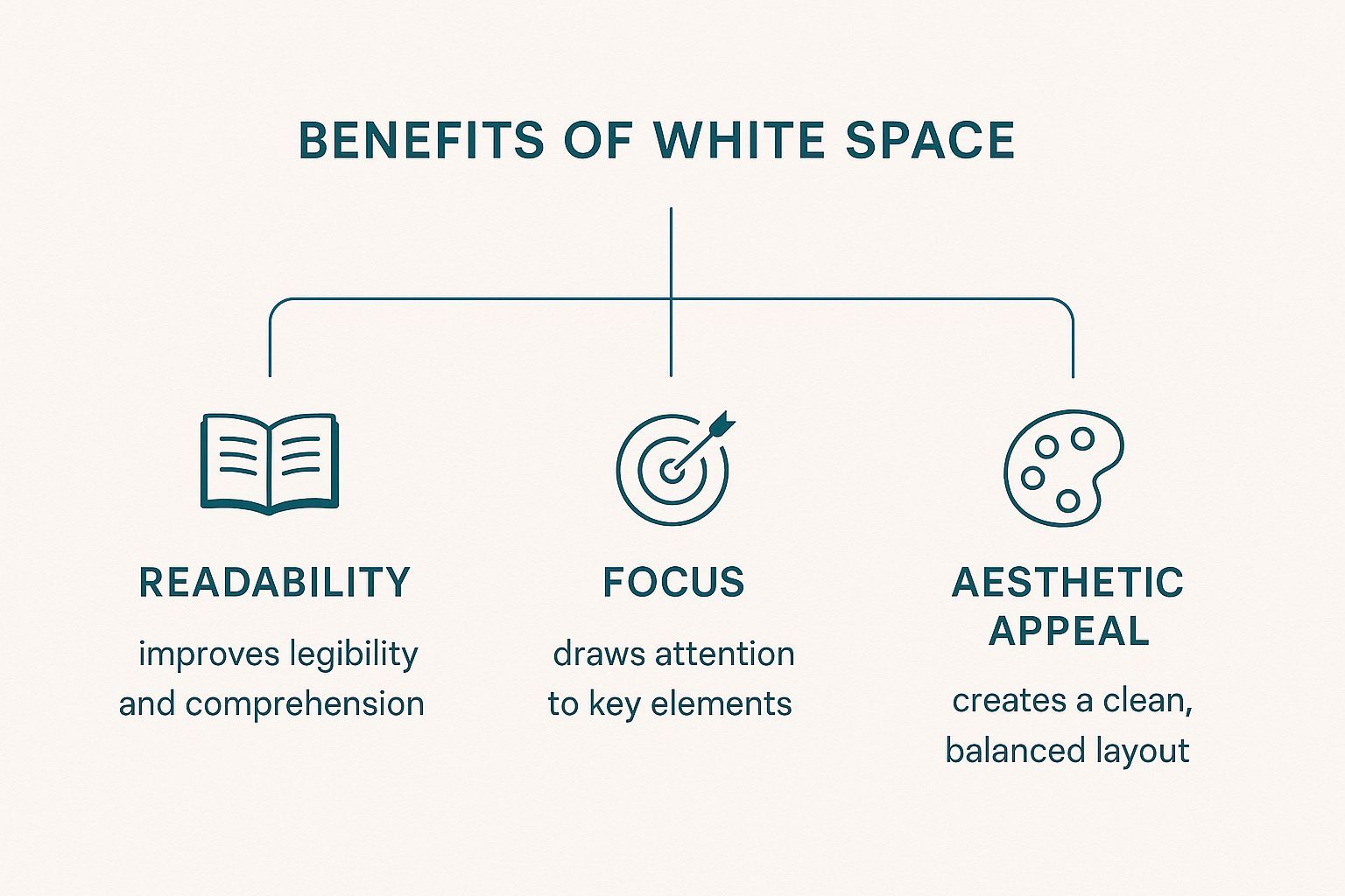
As you can see, this isn't just about making things look "pretty." Intentional spacing has a direct and powerful impact on readability, user focus, and the overall quality of your design.
How White Space Shaped Modern Design
It's funny to think about, but the appreciation for white space didn't just happen overnight. Its journey from being seen as costly, wasted space to a hallmark of elegance marks a massive shift in how we think about design.
Early on, especially in print media like newspapers, every single inch of paper was valuable real estate. The main goal was to cram as much information as possible onto a page. This led to those dense, cluttered layouts that can feel pretty overwhelming to look at now.
Back then, empty space was just a missed opportunity, not a strategic design tool. All those unmarked areas—like margins and the gaps between columns—were kept as small as possible. The name "white space" actually comes from this print tradition, where the paper itself was the white background. You can dive deeper into its print origins on Wikipedia) to see how far we've come.
The Rise of Minimalism
Everything started to change with the arrival of modernist design movements, especially Swiss Design. The pioneers behind this style were all about minimalism and clarity. They were the ones who really showed the world that what you leave out is just as critical as what you put in.
They proved that giving elements room to breathe with ample white space could guide the viewer's eye, create a clear hierarchy, and make information so much easier to digest. This new philosophy completely flipped visual communication on its head. Suddenly, white space wasn't just empty—it was an active element that could send a powerful message all on its own.
White space transitioned from being a simple background to an intentional statement of confidence and focus. It signals that the content is so important, it deserves its own stage.
Today, this principle is absolutely everywhere. Think about luxury brands; they use generous negative space to communicate a feeling of premium quality and sophistication. Clean, modern websites feel intuitive because strategic spacing guides you through the interface without you even noticing.
This powerful legacy is visible in everything from high-end magazines to large-format designs, like stunning custom wall graphics that can completely transform a room. Understanding this evolution makes one thing clear: using white space isn't just a trend, it's a timeless strategy for effective, beautiful communication.
What You Actually Gain From Using White Space
Knowing what white space is doesn't really capture its power. The real magic is in what it does. When you learn to wield it effectively, white space stops being just "empty" and becomes one of your most powerful design tools. It's the silent partner that makes everything else on the page work better.
The most obvious win is a huge boost in readability and comprehension. Nobody wants to read a wall of text. It's intimidating and exhausting. Strategic spacing gives our brains room to breathe, making information easier to process. It’s not just a feeling, either—the data backs it up. Research shows that simply increasing the space between lines of text can improve reading speed by up to 20% and make the content easier to understand. You can dig into the specifics in the Interaction Design Foundation's research.
Creating Focus and a Touch of Class
Beyond just making things readable, white space is a master of directing the eye. It works like a spotlight, creating a strong visual hierarchy without needing flashy graphics or loud colors. By surrounding a key element—like a call-to-action button or a critical piece of information—with negative space, you’re basically screaming, "Look here!"
White space gives your most important elements the stage they deserve. It tells the user, "Pay attention. This part matters."
Finally, generous white space adds an instant feeling of sophistication and professionalism. An uncluttered design feels calm, intentional, and confident, which subconsciously signals quality and builds trust with your audience. It’s no accident that premium brands lean heavily on minimalist layouts. This high-end feel can be applied to anything, from websites to professionally printed flyers that capture attention for your business. Pairing this with other foundational website design best practices creates a truly polished and effective user experience.
How to Implement White Space in Your Designs
Putting white space into practice isn't about mastering complex tools—it's about a shift in mindset. Instead of seeing empty areas as a void to fill, you need to view them as an active way to guide your audience's eye.
The first step is often the hardest: resist the urge to fill every single pixel. You have to trust that the empty space is working just as hard as your content is.
A great place to start is with your typography. Small tweaks to micro white space can dramatically improve how scannable your text is. Think about increasing the line height (leading) between lines of text and ensuring there’s enough space between your paragraphs. These simple changes stop text from feeling like a dense, intimidating wall.
Practical Steps for a Cleaner Layout
Once you’ve tackled your text, you can zoom out and focus on the larger structural elements, or macro white space. These adjustments are what define your layout’s rhythm and flow, telling users where to look and what to interact with next.
Here are a few actionable techniques to get you started:
- Increase Padding and Margins: Give elements like buttons, images, and content blocks generous breathing room. This makes each one feel distinct and easier to focus on.
- Use Grids and Gutters: Laying out your design on a consistent grid system is a game-changer. The empty space between columns, known as gutters, creates a balanced and professional look almost automatically.
- Apply the Law of Proximity: Group related items closer together and use empty space to separate them from unrelated items. This simple principle creates intuitive visual relationships for the user without you having to say a word.
The goal isn't just emptiness; it's clarity. White space is the silent organizer that brings order to your design, making the user's journey effortless and intuitive.
In digital design, this clarity has a measurable impact. One recent study found that web pages with strategic white space around call-to-action buttons saw a 25% increase in click-through rates. The same research noted that users stay on well-spaced pages 15-30% longer, proving that thoughtful spacing directly influences engagement.
These principles aren't just for screens, either. They apply just as much to physical designs. For a tangible example of how strategic spacing can grab attention in a physical setting, check out some of these captivating window display ideas.
Likewise, when you're designing for print, generous spacing on custom online posters can make your message pop from a distance, capturing attention in a busy environment. A few small spacing adjustments can truly transform a cluttered design into a clear and effective one.
Answering Your Questions About White Space
As you start getting comfortable with negative space, a few questions always seem to come up. Let's tackle them head-on, so you can start using white space with a lot more confidence and a clear purpose.
One of the biggest worries I hear is, "Can you have too much white space?" The short answer is yes, but it’s all about context. If the empty space pushes elements so far apart that they lose their relationship, or if the page just feels empty and unfinished, you’ve probably gone too far. It's a balancing act. You're aiming for a design that feels intentional, not just empty for the sake of it.
The right amount of white space makes a design feel intentional and focused. Too much can make it feel disconnected and empty. The goal is always clarity, not emptiness.
Another common point of confusion is the name itself. Does white space actually have to be, well, white? Not a chance.
It’s Not Always White
The name is really just a throwback to the old days of print design, when pretty much every page was white paper. In any modern design—digital or print—white space (or negative space) is simply any unmarked area. It doesn't matter what color it is, if it has a texture, or even if it's part of a background image. It's the breathing room between your design elements.
- Color Backgrounds: Think of a solid blue background with a single, crisp line of text. All that blue area? That's your white space.
- Textured Surfaces: A design on a textured canvas or a digital background with a faint pattern still has negative space—it's all the empty parts that give the main elements room to shine.
- Photography: In a photograph, the soft, blurry background or the clear sky behind a person is also functioning as white space. It’s what pushes your eye directly to the subject.
White Space on Mobile Is a Game-Changer
Finally, what happens when we move to smaller screens? White space doesn't just matter on mobile; it becomes absolutely critical. On a phone, every single pixel counts. You don't have the luxury of wasted space, so smart spacing is what separates a clean, touch-friendly interface from a cluttered mess.
Good negative space around buttons and links is what prevents those frustrating accidental taps. It also helps break up text and images into chunks that are easy to scan and digest, keeping the user from feeling overwhelmed. Without enough breathing room, a mobile design turns into a usability nightmare, fast.
Ready to bring your perfectly spaced designs to life? At 4OVER4, we offer high-quality printing for everything from business cards to large-format banners, ensuring your thoughtful layout makes a powerful impression. Explore our printing services at https://4over4.com.
More from

10
When you think of a yard sign, the classic 18"x24" is probably what comes to mind. It’s the industry workhorse fo
![]() Emma Davis
Emma Davis
Mar 14, 2026

16
When you’re ready to invest in an A-frame sign, the first question you'll ask is, "What size do I need?" It usually comes down
![]() Emma Davis
Emma Davis
Mar 13, 2026

171
The real secret to mastering your direct mail budget isn't complicated. It comes down to one simple fact: a standard 4" x 6&q
![]() Emma Davis
Emma Davis
Mar 12, 2026

70
Tear-off flyers are a classic for a reason. They’re a tangible marketing tool, designed with perforated, removable tabs at the bottom. Each
![]() Emma Davis
Emma Davis
Mar 11, 2026

120
Printing stickers at home is a seriously fun and rewarding project. It boils down to four main parts: designing your image, picking the right
![]() Emma Davis
Emma Davis
Mar 10, 2026

106
Ever seen a logo that seems to float right on the glass of a jar or bottle? That’s the work of transparent label stickers.
![]() Emma Davis
Emma Davis
Mar 9, 2026

62
Picture this: your product’s beautiful label gets smudged and runny during shipping, or a gorgeous event banner fades to nothing after just
![]() Emma Davis
Emma Davis
Mar 8, 2026

61
In a sea of options, your product's packaging and labeling are its first, and often only, chance to make a real connectio
![]() Emma Davis
Emma Davis
Mar 7, 2026