TABLE OF CONTENTS
- Home
- content hub
- What Is Typography in Graphic Design: A Beginner's Guide
What Is Typography in Graphic Design: A Beginner's Guide
Mar 5, 20266 views
Mar 5, 20266 views
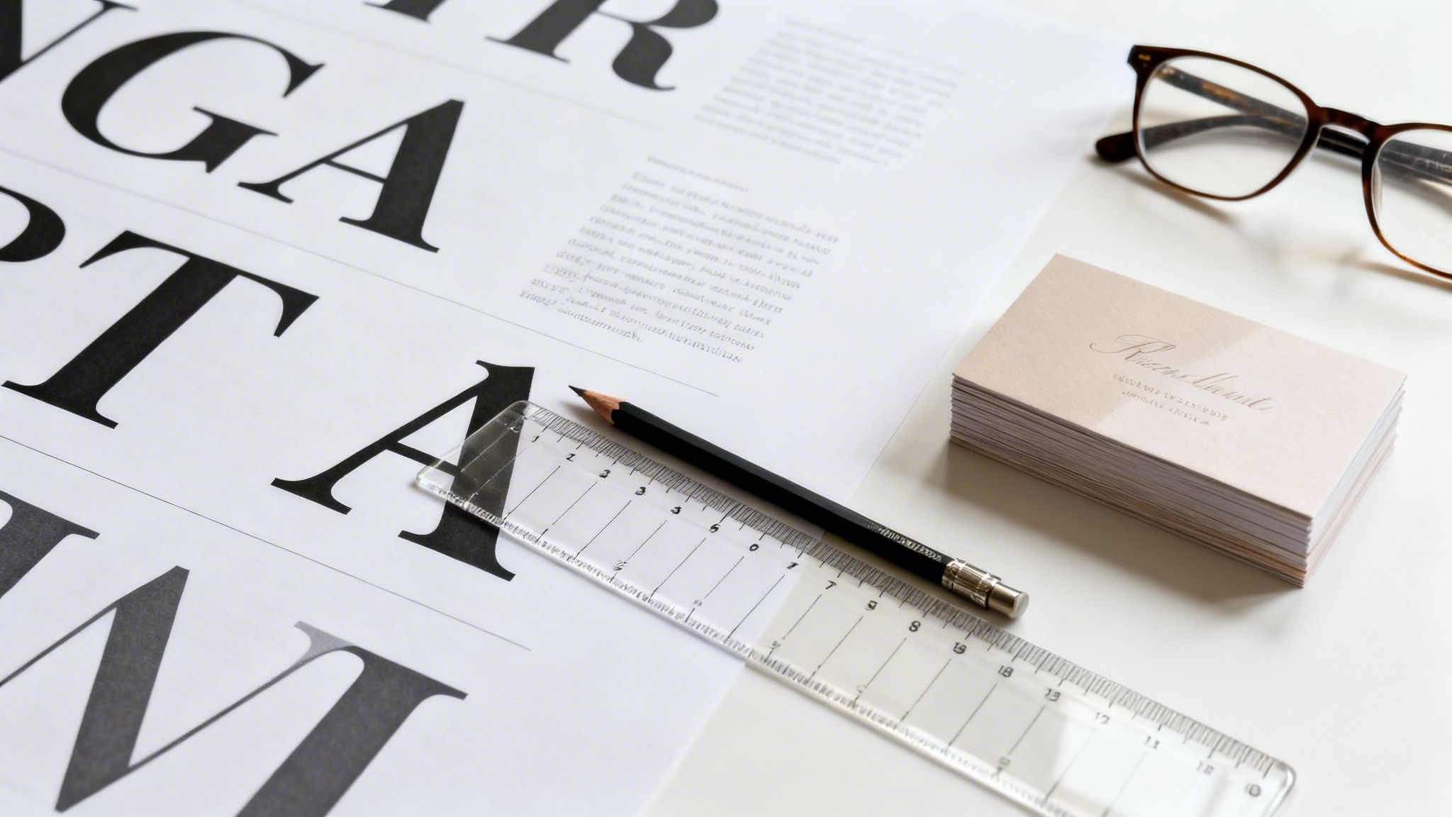
So, what exactly is typography in graphic design? Put simply, it’s the art of arranging letters and text in a way that is clear, legible, and visually compelling. It’s about much more than just picking a font you like—it’s about treating text as a crucial design element to deliver a message, stir emotion, and build a distinctive brand voice.
The Art of Communicating Without Words
Think about an actor delivering a line. The words are only part of the story. It's their tone, volume, and rhythm—whether they whisper, shout, or speak with a steady cadence—that truly injects meaning and emotion.
Typography does the very same thing for your written message. It’s the "voice" of your brand before anyone even reads a single word. This practice of arranging type is a true cornerstone of graphic design, going far beyond a quick selection from a dropdown menu. Getting it right involves a deliberate process where every detail of how text appears is carefully considered.
More Than Just Picking a Font
Great typography is a balancing act between aesthetics and function. It ensures your audience can absorb information without friction while also feeling the intended tone of your message. This is all done through the thoughtful manipulation of a few core elements.
At its heart, typography is about making strategic choices that guide the reader's experience. Let's break down the essential components that every designer works with.
Core Components of Typography
This table gives a quick look at the fundamental building blocks of typography and why each one matters.
| Component | Description | Impact on Design |
|---|---|---|
| Font Choice | Selecting a typeface that reflects the brand’s personality—be it professional, modern, elegant, or playful. | Sets the overall mood and tone. A formal serif says something very different from a casual script. |
| Hierarchy | Using variations in size, weight (boldness), and style to direct the reader's eye through the content. | Tells the audience what's most important, guiding them from headlines to subheadings to body text. |
| Spacing | Adjusting the space between letters (kerning), words (tracking), and lines of text (leading). | Improves readability and gives the design a clean, polished, and professional feel. Poor spacing looks amateur. |
| Layout & Alignment | How text is positioned on the page to create structure, balance, and a clear visual path for the reader. | Creates a sense of order and makes the content easy to follow, preventing visual chaos. |
Each of these components works together to create a cohesive and effective design. Mastering them is key to transforming simple text into a powerful communication tool.
Think of it like building with letters instead of blocks. Every choice, from the subtle curve of a "g" to the empty space between paragraphs, adds to the final structure. A bold, tightly-spaced headline on a flyer feels urgent and impactful. A soft, generously-spaced script font on an invitation feels warm and elegant. To really get a handle on this, it's worth learning how to create a typography system for consistency across your designs.
Typography is the craft of endowing human language with a durable visual form. This means that every choice, from typeface to layout, transforms simple words into a visual experience that can inform, persuade, and connect with an audience on an emotional level.
Ultimately, a solid grasp of typography is non-negotiable for creating effective marketing materials. It’s the invisible force that makes a business card feel premium, a brochure easy to navigate, and a brand instantly recognizable. When you master its principles, you gain the power to control your message with incredible precision and purpose.
Understanding the Anatomy of a Typeface
To really get a handle on typography, we need to speak the language of letters. Think of it like this: an architect knows the difference between a load-bearing wall and a decorative pillar. In the same way, a sharp designer understands the building blocks of a typeface. This knowledge is what separates just picking a font from making a deliberate, professional design choice.
Every letter sits on an invisible line that anchors the entire text—this is the baseline. It's the ground floor, creating a consistent foundation that keeps your words from looking like they’re floating away.
The Core Structural Elements
From that baseline, different parts of each letter will stretch up or dip down, giving the font its distinct rhythm. These are the details that make some typefaces feel airy and open, while others feel dense and compact.
- Ascenders: These are the parts of lowercase letters that reach for the sky, like the tall strokes on ‘b’, ‘d’, or ‘h’. Long ascenders can lend a typeface a very elegant and graceful feeling.
- Descenders: On the flip side, descenders are the parts that drop below the baseline, like in ‘g’, ‘p’, or ‘y’. You have to be careful with long descenders, as they can sometimes crash into the line of text below if your spacing isn't right.
- X-Height: This is simply the height of the main body of a lowercase letter, perfectly demonstrated by the letter ‘x’. A generous x-height is a designer's best friend for legibility, especially on small-print items like business cards or product labels.
This diagram helps visualize how these elements come together to shape how an audience perceives a brand.

As you can see, the choices we make in typography have a direct line to readability, audience engagement, and the overall voice of a brand.
Details That Define Character
Beyond the basic framework, it’s the smaller features that inject personality into a font. Think of these as the unique architectural flourishes that make a building memorable.
The anatomy of a typeface isn't just technical jargon; it's the vocabulary of visual personality. The curve of a bowl or the sharpness of a serif is what makes a font feel friendly, authoritative, traditional, or futuristic.
One of the most obvious differentiators is the serif—those little "feet" you see at the end of strokes in fonts like Times New Roman. Whether a font has them or not is a major fork in the road. Sans-serif fonts (like Arial) lack these feet, which gives them a much cleaner, more modern vibe.
Other little details to look for include:
- Bowl: The curved stroke that creates a closed-off shape, like in the letters ‘o’ and ‘b’.
- Counter: This is the negative space inside a letterform, like the hole in an ‘o’ or the loop of an ‘a’. Open, clear counters are key for good legibility.
This deep focus on typographic detail has a rich history. The Industrial Revolution turned type into a commercial weapon. As 19th-century steam presses ramped up production 10-fold to 5,000 sheets per hour, type had to get bigger and bolder to grab attention on posters, boosting visibility by an estimated 40% in big cities. Flash forward to the 1980s, and the digital age—with software like Adobe PageMaker—put design tools in everyone's hands, slashing project timelines by up to 70%. This shift made it possible for any business to experiment with fonts and paved the way for the incredible speeds we see today, like 4OVER4’s same-day shipping options. You can explore more of this history in the evolutionary journey of typography on PrintMag.com.
By learning to spot these anatomical parts, you can look at any font and instantly get a feel for its character. This empowers you to choose type that not only looks great but also works flawlessly for your project, ensuring your message is clear on everything from a small postcard to a massive banner.
The Unbreakable Rules of Effective Typography
Alright, so you’ve got a handle on the anatomy of a typeface. But knowing what a serif or an ascender is doesn't automatically translate into a clean, compelling design. Now, we’re bridging the gap from theory to practice.
These are the core principles that truly separate amateur-hour layouts from polished, professional work. Think of them less as "rules" and more as the fundamental grammar of visual communication. Get them right, and your message won't just be seen—it will be understood.

The image above says it all. One side is a tangled mess of thought, while the other is ordered, clear, and easy to follow. That's the power of applying these foundational ideas.
Establish a Clear Visual Hierarchy
If you take only one thing away from this guide, let it be visual hierarchy. This is the single most important principle in typography. It’s how you tell the reader what to look at first, second, and third, creating a clear path through your content.
Without hierarchy, every element on the page screams for attention at the same time. The result? Chaos. Your reader doesn't know where to start, so they often don't start at all.
You can build a strong hierarchy with a few simple typographic tools:
- Size: The most important element—your headline—should be the largest. Subheadings get smaller, and body text is smaller still.
- Weight: Using a bold or semi-bold font weight instantly makes a headline or key phrase pop out from the surrounding text.
- Color: A strategic splash of color can draw the eye directly to a call to action, a special offer, or a crucial piece of information.
Create Strong and Purposeful Contrast
Contrast is what injects life and energy into a design, preventing it from feeling flat and monotonous. It’s all about creating noticeable differences between typographic elements to add visual flair and emphasize key information.
But here’s the key: contrast has to be purposeful. Too little is boring; too much is just a visual train wreck.
Contrast is not just about making things different; it's about making them different with a clear purpose. It guides the eye, creates emphasis, and adds a layer of visual energy that makes a design feel alive and engaging.
Think beyond just light and dark. You can create powerful contrast through:
- Font Pairing: Try combining a bold, modern sans-serif for your headline with a classic, elegant serif for your body copy.
- Style Variation: Use italics to set off a quote or highlight a specific term within a block of regular text.
- Scale: Placing a massive typographic element next to a much smaller one creates instant drama and an undeniable focal point.
Prioritize Legibility and Readability
These two terms are often thrown around interchangeably, but they mean very different things. Nailing both legibility and readability is absolutely critical to making sure your audience can absorb your message without any friction.
Legibility is all about the design of the typeface itself. Can you easily tell the difference between one letter and another? A font with clearly defined characters, a generous x-height, and open letterforms is considered highly legible. It’s an inherent quality of the font.
Readability, on the other hand, is all about how you arrange those legible letters into blocks of text. This is where your design choices come in—things like line length, leading (the space between lines), and text alignment. You can take the most legible font in the world and make it unreadable with poor layout choices.
The rise of digital tools made typography accessible to everyone, powering innovations in print from basic stickers to complex lenticular designs. When Apple and Microsoft launched TrueType fonts in 1991, it was a game-changer. These fonts could be scaled infinitely without losing quality, and by 1995, they were used in 95% of software. This progress highlighted just how much clear type matters. For small businesses, studies showed that simply using well-executed typography on materials like custom business cards could boost perceived professionalism by up to 40%.
Key Moments That Shaped Modern Typography
Ever wonder why some fonts feel classic and others feel cutting-edge? Every typeface on your computer has a story, and to really get what typography is all about in graphic design, we have to look back at the innovations that shaped the letters we use every single day.
This isn’t just a history lesson. Understanding this evolution gives context to why certain styles feel traditional, modern, or even futuristic, helping you make more intentional choices in your own work.
The story really kicks off in the 15th century. Before then, books were copied by hand—a slow, expensive process that made them luxury items. That all changed around 1440 when Johannes Gutenberg invented the movable type printing press, a machine that could churn out 3,600 pages per day. This single invention crashed book prices by over 80% in just a few decades and ignited a communication revolution. You can dive deeper into how graphic design evolved in the 20th century on Britannica.com.
From Ornate to Functional
For centuries, typography followed the artistic trends of the day. Think of the Victorian era, known for its incredibly ornate and decorative typefaces. These fonts were all about projecting wealth and sophistication, but they often chose flair over clarity.
A huge shift happened in the early 20th century with movements like the Bauhaus school in Germany. Designers started stripping away all the extra fluff, guided by a new principle: "form follows function." They embraced clean, geometric, and highly functional typefaces, believing that typography’s main job was to be clear and easy to read.
This ideological pivot from decorative to functional was monumental. It recast typography from a purely artistic flourish into a powerful tool for clear, universal communication, setting the stage for modern graphic design as we know it.
The Swiss Style and Digital Freedom
This focus on clarity and order hit its stride with the International Typographic Style, or Swiss Style, in the mid-20th century. Its pioneers championed sans-serif fonts, asymmetrical layouts, and rigid grid systems to create incredibly organized, legible designs. The emphasis on structure was so influential that by the 1960s, over 70% of multinational corporations had adopted its principles for their branding. These same principles are vital for large-scale jobs like professional offset printing, where consistency is non-negotiable.
Then came the digital age, which basically threw out the rulebook. Desktop publishing handed designers an incredible amount of freedom to experiment with fonts, spacing, and layouts like never before. This digital explosion created the diverse, dynamic typographic world we see today. Knowing this journey—from metal type to pixels—gives every font choice you make a much deeper meaning.
Putting Typography to Work in Your Print Projects

Knowing the principles of typography is one thing, but making them work on a physical, printed piece is where the real test begins. The leap from screen to paper introduces a whole new set of rules that can either elevate or completely undermine your design.
This is where we get practical. Let's move past the theory and build a print-ready checklist to ensure what you see on your monitor is exactly what you get in your hands.
Match Font Size to the Medium
It's a classic rookie mistake: assuming a font size that looks great on your screen will work for everything. Context is king. A font that’s perfectly readable on a business card held a few inches from your face will be an unreadable smudge on a banner seen from 30 feet away.
You have to tailor your font sizes to the viewing distance and the physical scale of the final product. A little planning goes a long way.
For a quick reference, here's a table to guide your font size choices for common print materials, helping you ensure every word is legible and effective.
Recommended Font Sizes for Common Print Products
| Print Product | Primary Headline Size (Points) | Subheading Size (Points) | Body Text / Contact Info Size (Points) |
|---|---|---|---|
| Business Cards, Labels | 14-22 pt | 10-12 pt | 7-8 pt (minimum) |
| Flyers, Postcards | 24-48 pt | 16-20 pt | 9-12 pt |
| Brochures, Catalogs | 30-60 pt | 18-24 pt | 10-12 pt |
| Posters (Standard) | 72-150 pt | 36-60 pt | 18-24 pt |
| Banners, Large Displays | 100-300 pt+ | 60-120 pt | 36-48 pt (minimum) |
These are solid starting points. Always consider the specific font you're using and the environment where your print will be displayed to make the final call.
Master Spacing for a Polished Look
What separates a decent design from a truly professional one often comes down to the tiny, invisible details. Mastering the spacing—kerning, tracking, and leading—is what gives your text that clean, intentional, and balanced look.
Kerning is the art of adjusting the space between just two letters. Your software's default settings do a pretty good job, but for logos and headlines, you'll need to jump in and manually fix awkward gaps, like the classic void between a 'W' and an 'a'.
Tracking (or letter-spacing) adjusts the spacing uniformly across a whole word or block of text. A touch of extra tracking can work wonders for the readability of small, all-caps text, giving the letters room to breathe.
Leading (or line-spacing) handles the vertical space between lines of text. Too little leading and your paragraphs feel cramped and suffocating. A bit more, and the layout becomes airy, relaxed, and much easier on the eyes. For text-heavy work, the principles of professional book design and layout offer a masterclass in how powerful leading can be.
Before you even think about sending a file to print, do this one thing: convert all your text to outlines. This simple step is your best defense against the most common and frustrating printing disasters. It locks your design in place, period.
The Most Important Pre-Print Step: Convert to Outlines
This final check is absolutely non-negotiable if you're serious about getting professional results. Here’s the scenario: you send your beautiful design to a print shop, but their computer doesn't have the specific font file you used. What happens? The system "helpfully" substitutes it with a default font like Arial or Times New Roman, and your entire layout is destroyed.
To stop this nightmare from happening, you must convert your fonts to outlines (or "create outlines" in Adobe Illustrator). This process turns your editable text into fixed vector shapes.
Why is this so critical?
- It locks in your design. Your typography will look exactly how you designed it, no matter who opens the file or what fonts they have.
- It prevents font substitution errors. This is the number one cause of print jobs going wrong.
- It ensures perfect consistency. Your logo, headlines, and everything in between will render flawlessly every single time.
By adjusting your font sizes, refining your spacing, and—most importantly—always converting text to outlines, you can send your files to the printer with complete confidence. You'll sidestep costly mistakes and ensure the final product is a perfect match for the hard work you put in.
Common Typography Mistakes and How to Avoid Them
Even the most brilliant design concept can fall apart with bad typography. It’s the kind of thing that instantly makes a project look cheap, rushed, or just plain unprofessional, completely tanking the credibility you worked so hard to build. Think of this as your final quality check before anything goes to print.
Knowing what to look for can make all the difference. Let’s walk through the most common mistakes I see and, more importantly, how to fix them.
Too Many Fonts Create Chaos
One of the fastest ways to make a design look like a mess is by throwing in too many fonts. When every line of text is fighting for attention with a different typeface, you don’t get creativity—you get chaos. The reader's eye has no idea where to land, and the whole piece feels disconnected.
As a solid rule of thumb, stick to no more than two or three fonts for any single design. A tried-and-true strategy is pairing a strong, eye-catching font for your headlines with a clean, easy-to-read font for the body text. This gives you both a clear hierarchy and a cohesive feel.
A design with too many fonts is like a room where everyone is shouting at once. To create a clear and effective message, you need a few distinct voices that work together in harmony, not a crowd of competing ones.
Poor Contrast and Legibility
What's the point of a message if nobody can read it? A classic design blunder is picking text and background colors that are too similar. Think light gray text on a white background or dark blue on black. It forces people to squint, and honestly, most won't even bother trying.
Your text has to pop against its background—no excuses. This is absolutely critical for print materials like business cards or company letterheads, where even the smallest text needs to be perfectly sharp.
Quick Contrast Checks:
- Go High Contrast: It’s simple. Use dark text on a light background or light text on a dark one.
- Try the Squint Test: Take a few steps back from your monitor and squint your eyes. Does the text blend into the background? If so, your contrast is too low.
- Watch for Vibrating Colors: Pairing highly saturated, opposite colors (like bright red on bright green) can create a jarring, fuzzy effect that’s physically uncomfortable to read.
Ignoring Spacing and Alignment
This one is more subtle, but awkward spacing and sloppy alignment can kill a design. They create an unbalanced, amateur look that screams "unintentional." One of the worst offenders is the "river" of white space—those weird gaps that meander down a block of justified text, tripping up the reader’s eye.
Fixing this is all about attention to detail:
- Stick to Left Alignment: For blocks of body text, left-aligned (or flush-left) is almost always your best bet. It gives the eye a consistent anchor point for every new line, making it much easier to read.
- Mind the Gaps: Get in there and manually tweak your tracking and kerning to fix weird spacing, especially in headlines. A little adjustment goes a long way.
- Never Stretch a Font: Ever. Don't squash or stretch a font just to make it fit. It destroys the original design of the typeface. If it doesn't fit, find a new font or just change the size.
Frequently Asked Questions About Typography
Now that we’ve covered the fundamentals, let's tackle some of the practical questions that pop up when you're actually putting these typography principles to work. Here are a few common hurdles we see business owners and designers face, with straightforward answers to help you finalize your print projects with confidence.
What Is the Best Font for My Business?
There's no single "best" font out there—the right one is always a direct reflection of your brand's personality and what you want to communicate. A law firm, for example, will build trust with a classic, authoritative serif like Garamond. On the other hand, a fresh tech startup might go for a clean, forward-thinking sans-serif like Montserrat to look innovative and approachable.
The real key is to match your typeface to your message. Start by asking yourself: do I want my brand to feel elegant, friendly, powerful, or playful? That question alone will narrow your options and help you find a font that tells your story visually.
How Many Fonts Should I Use in One Design?
When it comes to fonts, less is almost always more. One of the most common mistakes we see is using too many typefaces, which instantly makes a design feel cluttered, amateurish, and hard to read.
Stick to a maximum of two or three fonts per project. A tried-and-true strategy is to pick one distinctive font for your main headlines and pair it with a clean, super-legible font for your body text. This simple approach builds a clear hierarchy and guarantees your design looks cohesive and professional.
Why Does My Text Look Blurry or Bad When Printed?
This is a frustratingly common issue, but it usually comes down to one of two culprits: low resolution or improper font handling. First, always double-check that your design file is set to a high resolution. For professional print quality, at least 300 DPI (dots per inch) is the non-negotiable standard. A file might look sharp on your screen, but it will turn into a pixelated, blurry mess on paper if the DPI is too low.
Second, as we mentioned earlier, you have to convert your text to outlines before sending the file off to print. If you skip this step and the print shop doesn't have your specific font installed on their system, their computers will automatically substitute it with a default font. This almost always wrecks your carefully planned layout. Converting to outlines locks your text in as a vector shape, ensuring it prints exactly as you designed it.
Ready to put your typography knowledge to the test? With over 10,000 customizable templates and state-of-the-art printing technology, 4OVER4 makes it easy to create stunning, professional-quality marketing materials. Start designing today at 4over4.com and bring your brand’s voice to life.
More from

15
The fundamental difference between traditional and digital marketing really boils down to one thing: traditional marketing casts a wid
![]() Emma Davis
Emma Davis
Mar 4, 2026

23
Business loyalty cards are a classic for a reason. They're more than just a marketing gimmick; they're a powerful way to reward repeat
![]() Emma Davis
Emma Davis
Mar 3, 2026

131
The best business cards for a construction company nail three things: they feel durable, just like your work; they’re
![]() Emma Davis
Emma Davis
Mar 2, 2026

71
Placing bulk sticker orders is one of the smartest investments a growing business can make. It’s a move that dramatically c
![]() Emma Davis
Emma Davis
Mar 1, 2026

38
Your car wash business cards aren't just little rectangles with your phone number on them. Think of them as a physical ha
![]() Emma Davis
Emma Davis
Feb 28, 2026

145
Let's get straight to it. The standard A7 envelope comes in at 5.25 x 7.25 inches, which translates to 133.35 x 1
![]() Emma Davis
Emma Davis
Feb 27, 2026

82
When you're trying to figure out the right door hanger size, the classic 4.25" x 11" is pretty
![]() Emma Davis
Emma Davis
Feb 25, 2026

54
When it comes to table tents, the industry workhorses are the 4" x 6" and 5" x 7" sizes.
![]() Emma Davis
Emma Davis
Feb 24, 2026