Table of Contents
- Home
- content hub
- Matte Vs Glossy Prints Deciding Your Perfect Finish
Matte Vs Glossy Prints Deciding Your Perfect Finish
Oct 31, 2025541 views
Oct 31, 2025541 views
The core difference is simple: glossy prints are vibrant and reflective, making colors pop, while matte prints are non-reflective and subtle, offering a more artistic, glare-free finish. Your choice depends entirely on whether you prioritize eye-catching impact or sophisticated viewability.
Breaking Down Matte Vs Glossy Prints
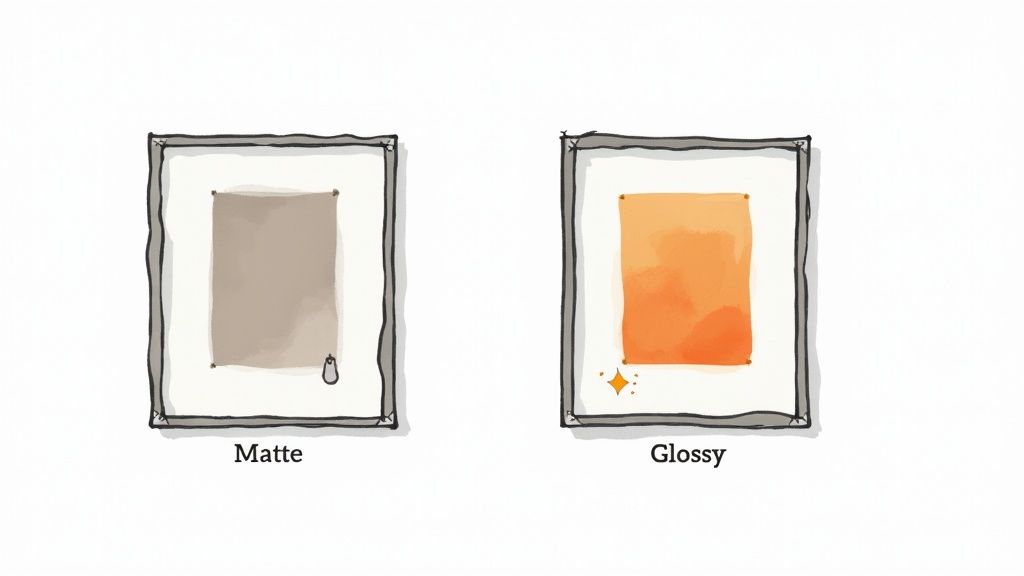
Choosing a finish can feel like a small detail, but it dramatically alters how an image is perceived. Glossy prints are coated to reflect as much light as possible, which cranks up the color saturation and creates sharp, high-contrast visuals. This makes them perfect for vibrant photography, promotional materials, and any image that needs to command attention.
On the other hand, matte prints feature a non-reflective surface that diffuses light instead of bouncing it back. This quality completely eliminates glare and makes them highly resistant to fingerprints and smudges. Matte is often the preferred choice for fine art, black-and-white photos, and any print that will be framed behind glass or displayed in a brightly lit room.
Sometimes, seeing the difference in a real-world setting makes the choice obvious. Looking through examples like these New Orleans Artwork Prints for Your Home can give you valuable context on how each finish behaves in a space.
Matte Vs Glossy A Quick Comparison
To simplify things, it helps to see the key traits side-by-side. This table breaks down the main differences to help you make a quick, informed decision.
| Characteristic | Glossy Finish | Matte Finish |
|---|---|---|
| Surface | Shiny, reflective, and smooth | Non-reflective, textured, and soft |
| Color Vibrancy | High saturation and deep contrast | Muted, subtle, and natural tones |
| Fingerprints | Prone to smudges and fingerprints | Resistant to fingerprints and smudging |
| Best For | Vibrant photos, marketing, albums | Framed art, brightly lit rooms, portfolios |
Ultimately, this table is a cheat sheet. Use it to quickly match a finish to your specific project, whether you need the punch of a glossy photo or the understated elegance of a matte print.
Why Glossy Prints Are Still King
When you picture a classic photograph, odds are you’re thinking of a glossy print. That vibrant, high-impact look isn't a fluke; it's the product of a special coating that creates a perfectly smooth, reflective surface. This finish is engineered to make colors feel deeper and details pop with incredible sharpness, giving any image a dynamic, professional edge.
This visual punch is exactly why glossy remains the undisputed champ for so many projects. From family photo albums filled with vivid vacation shots to commercial headshots designed to command attention, that sleek, polished look delivers immediate impact. The coating doesn’t just boost color—it also deepens blacks, which kicks up the contrast and makes the entire image come alive.
The Science Behind the Shine
The real magic of a glossy finish is all about how it handles light. The paper is coated with a layer that fills in every tiny imperfection of its natural texture, leaving it perfectly smooth. When light hits this surface, it bounces back uniformly, minimizing any scattering and maximizing the intensity of the colors your eyes see.
Think of it like this: a calm lake gives you a crystal-clear reflection of the sky, but choppy water breaks that reflection into a million pieces. The smooth surface of glossy paper is that calm lake, giving you a flawless representation of an image's true colors and details.
Key Takeaway: A glossy finish is basically a visual amplifier. By creating a smooth, reflective surface, it cranks up color saturation, deepens contrast, and sharpens details, making images feel more energetic and impactful.
The numbers back this up. The global photo paper market leans heavily toward glossy, which commands a massive 48% of the market share. This dominance is fueled by its knack for producing the kind of crisp, vibrant images that everyone—from home users to professional photographers—loves for studio portraits and commercial ads alike.
Commercial and Personal Appeal
In the world of commercial printing, a glossy finish is a powerhouse. Think about promotional flyers, brochures, and posters—all materials that need to grab someone's attention in a split second. For these jobs, the rich colors and sharp look of glossy prints are priceless. Businesses often turn to high-quality gloss laminated printed products to make sure their marketing materials look polished and professional.
That same appeal crosses over into personal photography. When you're printing photos from a wedding or a big birthday party, you want the images to feel as lively and colorful as the memories themselves. A glossy finish delivers that rich, celebratory vibe, making it a staple in photo labs and online printing services everywhere. For most people looking for pure vibrancy, the matte vs glossy prints debate often ends right here.
The Understated Appeal of Matte Prints
While glossy prints demand attention with their high-impact shine, matte prints offer a different kind of power—one that’s all about sophistication and subtlety. Their defining feature is a non-reflective surface that diffuses light instead of bouncing it back at you. This one characteristic completely changes how you see and experience an image.
Instead of bright, punchy colors, a matte finish renders tones in a more muted and natural way. The result is a softer, almost painterly feel that many artists and photographers lean towards for fine art reproductions. Best of all, the lack of reflection means the print looks great from any angle and in any lighting condition, free from distracting glare.
Built for Handling and Display
One of the biggest practical wins for matte paper is its remarkable resistance to fingerprints and smudges. The slightly textured surface doesn't easily show oils from hands, which makes it the perfect choice for prints that will be handled often, like in a professional portfolio or at a gallery showing.
This durability is a huge factor in the ongoing matte vs glossy prints debate, especially when it comes to functional pieces. If you're after a print with a truly velvety, premium feel, you might also want to look into options like soft touch printing, which gives you a similar tactile elegance with even more resilience.
A matte finish puts the viewing experience above everything else. By getting rid of glare and resisting fingerprints, it makes sure the image itself stays the star of the show, without any distracting imperfections.
The Growing Market for Subtlety
The preference for matte isn't just an artistic choice; it’s a major market trend. The global matte photo paper market was recently valued at around USD 1.2 billion, and North America holds a commanding share of about 35%. That's largely thanks to its mature printing industry and strong demand for high-quality, professional prints. As digital photography continues to expand worldwide, the demand for this sophisticated finish is only expected to keep growing.
This growth points to a clear shift in taste. For interior design, fine art, and professional displays, the understated and timeless quality of matte is becoming the new standard. It really shines in brightly lit rooms and behind glass frames, where a glossy finish would just create a frustrating double glare. For anyone looking for a refined, glare-free presentation, matte is simply the better option.
Comparing Key Differences In Detail
Once you get past first impressions, the real choice between matte and glossy comes down to how they perform side-by-side. Each finish interacts with light, color, and texture in totally different ways, which affects not just the look but also the feel and lifespan of your prints. Let's dive into those details so you can see what I mean.
Color Vibrancy And Contrast
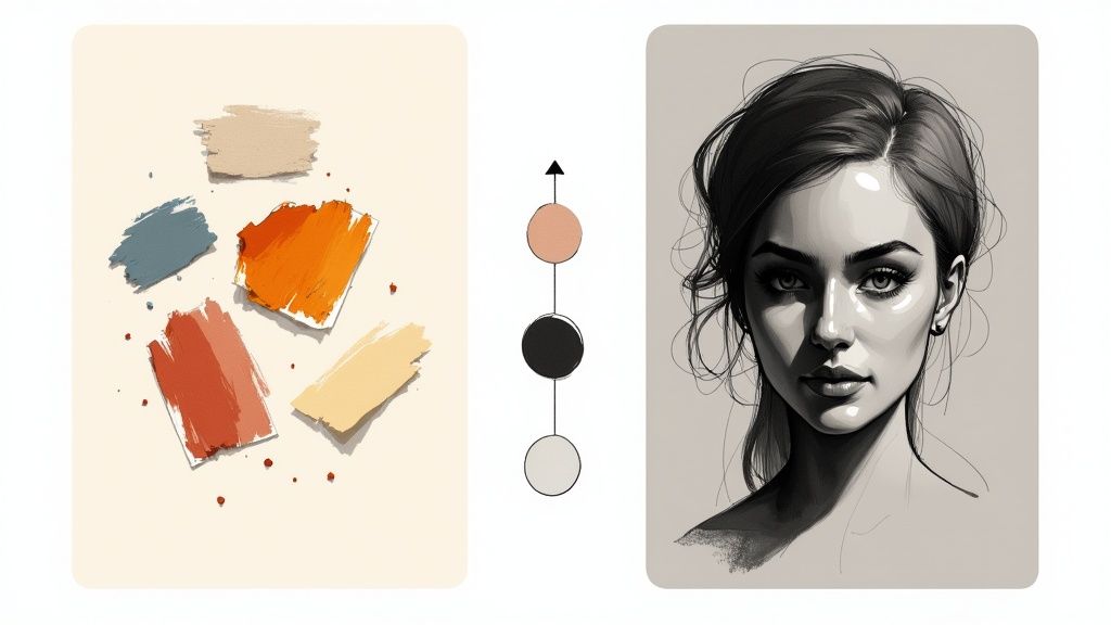
The heart of the matte vs glossy prints debate almost always starts with color. A glossy finish basically acts like a visual amplifier, pushing color saturation and making blacks look incredibly deep. Picture a photo of a vibrant tropical sunset—on a glossy print, those oranges and reds will pop with an almost electric intensity. This happens because its super-smooth surface reflects light cleanly, maximizing color depth and contrast.
On the flip side, a matte finish diffuses light, giving you softer, more understated colors. That’s not a bad thing; it’s an artistic choice. For a dramatic black-and-white portrait, a matte finish can bring out subtle gray tones and textures with a sophisticated, almost velvety quality that a glossy print would just wash out with harsh reflections.
Image Sharpness And Detail Perception
When it comes to pure sharpness, most people would say glossy prints have the edge. That ultra-smooth surface lets every tiny detail stand out, making high-resolution images look razor-sharp. It's a fantastic choice for things like architectural photography or product shots, where every little line and texture needs to be crystal clear.
But don't count matte out. By getting rid of glare, it lets you focus on the image’s composition and texture without any distractions. Think about a photo of a rustic wooden barn or a close-up of a flower petal. A matte finish hangs onto that natural texture, creating a much more organic and tactile experience for the viewer.
Handling Glare And Reflections
The most practical difference between these two is how they handle light. Glossy prints are basically mirrors. Stick one in a brightly lit room or across from a window, and you'll spend more time looking at your own reflection than at the image itself. That glare can be a real dealbreaker.
This is where matte prints absolutely shine—by not shining at all. Their non-reflective surface soaks up light, making sure your image is perfectly visible from any angle and in any lighting.
Key Differentiator: If you're planning to frame your print behind glass or hang it in a room with direct sunlight, matte is almost always the way to go. A glossy print behind glass creates a frustrating "double glare" effect that makes it nearly impossible to see the image clearly.
Durability And Handling Considerations
How a print stands up to being touched is another huge factor. Glossy surfaces are fingerprint magnets, and a few smudges can instantly ruin their clean look. Their coating is also more prone to picking up fine scratches over time.
Matte prints are far more forgiving. Their slightly textured, non-reflective surface is highly resistant to fingerprints and smudging, which makes them the perfect choice for anything that's going to be handled a lot.
Just think about these real-world uses:
- Portfolios: Matte is the industry standard here because it can be passed around and viewed without getting covered in fingerprints.
- Photo Albums: Glossy often gets the nod because the pages are handled carefully, and that vibrant pop really makes memories come to life.
- Business Handouts: Durability is key. For an extra layer of protection on either finish, professional laminating options can add a tough shield against everyday wear and tear.
To make the decision even clearer, I've put together a table that breaks down how each finish stacks up across the most important features.
Matte Vs Glossy A Detailed Feature Analysis
This table offers a direct comparison of matte and glossy prints, helping you pinpoint the best finish for your specific project by looking at key technical and aesthetic qualities.
| Feature | Glossy Prints Analysis | Matte Prints Analysis | Best For |
|---|---|---|---|
| Color Reproduction | Delivers vibrant, highly saturated colors with deep blacks and high contrast. | Produces subdued, softer colors with a more natural, muted feel. | High-impact photos, commercial advertising, vibrant landscapes. |
| Sharpness & Detail | Appears exceptionally sharp and crisp, highlighting fine details. | Shows excellent detail without reflective distractions; texture is more apparent. | High-resolution product photography, architectural images. |
| Glare & Reflections | Highly reflective; creates significant glare in direct light. | Non-reflective surface absorbs light, eliminating glare from all viewing angles. | Prints framed behind glass, displays in brightly lit rooms. |
| Fingerprint Resistance | Shows fingerprints and smudges very easily due to its smooth surface. | Highly resistant to fingerprints and smudging, making it easy to handle. | Portfolios, art prints, frequently handled documents. |
| Durability | The surface can be prone to fine scratches and scuffs over time. | More durable and less susceptible to minor scratches and handling wear. | Menus, business cards, prints that will be handled often. |
Ultimately, the best choice really depends on the specific job. By weighing these distinct characteristics, you can make sure your final print looks exactly the way you envisioned it.
Choosing the Right Finish for Your Project
The perfect finish isn’t about which one is universally “better”—it’s all about context. Making the right call in the matte vs glossy prints debate means matching the finish to the specific job at hand. Your decision should really boil down to three simple questions: Where will it be seen? Who will handle it? And what feeling do you want to evoke?
Answering these questions helps you move past the technical specs and think about real-world application, ensuring your final print looks exactly the way you imagined it would.
When to Go with Glossy Prints
A glossy finish is your go-to when you need visuals to grab attention immediately. Its ability to produce deep, vibrant colors makes it the undisputed champion for certain applications where "pop" is the name of the game.
Consider these ideal scenarios for glossy:
- Vibrant Vacation Photos: That stunning photo of a tropical beach or a bustling city market will come alive with the high color saturation and contrast that only a glossy finish can deliver.
- Promotional Flyers: When you need marketing materials to stand out in a crowded space, the reflective sheen and sharp details of a glossy print will absolutely catch the eye.
- Professional Headshots: For actors or corporate professionals, a glossy headshot conveys a polished, high-impact look that commands attention.
When Matte Prints Are the Smarter Choice
A matte finish brings a certain sophistication and practicality to the table, especially when glare or handling are major concerns. It offers a subtle, non-reflective elegance that lets the image content shine without distraction.
Here’s where matte is clearly the superior option:
- Fine Art Reproductions: For gallery displays or high-quality art prints, a matte surface provides a glare-free viewing experience that honors the original artwork’s texture and tone. For larger pieces, you might even consider exploring high-quality canvas prints, which offer a similar non-reflective quality.
- Framed Prints in Bright Rooms: If you’re framing a print behind glass, especially in a room with a lot of natural light, matte is essential. A glossy print will create a distracting double glare from the print surface and the glass, making the image difficult to see.
- Professional Portfolios: Since portfolios are meant to be handled frequently, a matte finish is the industry standard. It’s highly resistant to fingerprints and smudges, ensuring your work always looks clean and professional.
This same logic applies to other printed media, too. For instance, when designing a book, thinking about what makes a good book cover often involves a similar decision, as the finish heavily influences its tactile feel and visual appeal on a shelf.
Pro Tip: Your print’s environment is the most critical factor. A glossy print might look amazing on its own, but it can become unviewable behind a frame or under direct light, making matte the safer and more versatile choice for displayed art.
Making Your Final Decision with Confidence
Navigating the choice between matte and glossy prints really comes down to your project's specific purpose and where it will live. To cut through the noise, just ask yourself a few key questions. Is this print a personal keepsake for an album, or is it a professional piece destined for a gallery wall? Answering that one question alone will tell you whether you're after vibrant impact or subtle sophistication.
Next up, think about the viewing location. Will it hang in a room flooded with natural light, or is it meant for a space with controlled, softer lighting? This will immediately point you toward either a glare-free matte or a more dynamic glossy finish. Finally, what’s the aesthetic you’re chasing—punchy and modern, or artistic and timeless?
To help you visualize the right path, this decision tree walks you through those exact questions.
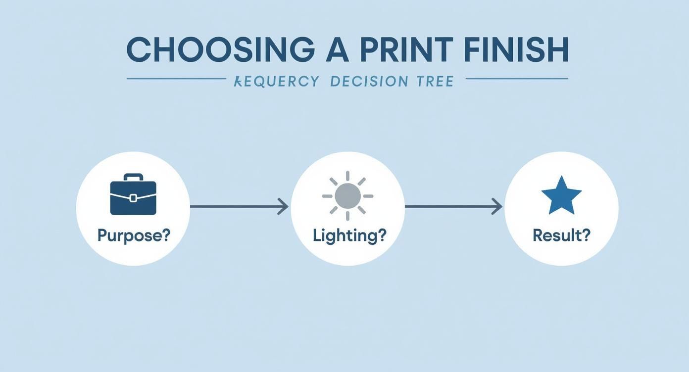
As the infographic reinforces, high-traffic, brightly lit areas are almost always best suited for matte. On the other hand, glossy is perfect for high-impact, personal displays where you control the environment.
By putting these factors together, you can move forward with certainty. Each finish has its own unique strengths, and picking the right one is what ensures your images look their absolute best. If you want to dive even deeper into more specialized options, exploring these fantastic finishes can unlock even more creative possibilities for your next project.
Frequently Asked Questions
Even after a side-by-side comparison, you probably still have a few questions rolling around. Let's tackle some of the most common ones that come up when people are trying to decide between matte and glossy for their prints.
Which Finish Is Better for Black and White Photos?
This really comes down to the mood you're after. A glossy finish will give you incredibly deep, rich blacks and crisp, high-contrast whites. The result is a modern, dramatic feel that really pops and grabs your attention. It’s all about sharpness and impact.
On the other hand, many fine art photographers lean toward a matte finish. Why? Because it renders all those subtle gray tones and textures beautifully, without any distracting glare getting in the way. Matte gives black and white photos a timeless, sophisticated feel.
Our Recommendation: For maximum contrast and a contemporary punch, go with glossy. For classic, textured images where subtle tones are the star of the show, matte is the way to go.
Do Matte or Glossy Prints Last Longer?
When it comes to pure archival quality, the paper and inks used matter far more than the finish. That said, for everyday durability and handling, matte prints are the clear winner.
Their non-reflective surface is naturally resistant to fingerprints, smudges, and the minor scuffs that can easily ruin a glossy print. While a glossy finish shows every little imperfection, matte does a fantastic job of hiding minor wear and tear.
- For frequently handled items like portfolios or prints you pass around, matte offers much better longevity.
- For prints framed behind protective glass, both finishes will hold up equally well, assuming they were made with archival-grade materials.
Can I Write on Matte or Glossy Photo Paper?
You can, but one is a dream to work with while the other is a nightmare. Matte paper is absolutely ideal for writing. Its slightly porous, uncoated feel accepts ink from most pens and pencils without a hint of smudging. This makes it perfect for signed prints, postcards, or photo guest books.
Trying to write on glossy paper, however, is notoriously difficult. The slick, coated surface causes most inks to just bead up or smudge, even long after you think it's dry. You'd need a specific type of permanent marker and plenty of patience for it to dry completely. If you plan on writing on your print, always choose a matte finish for clean, permanent results.
More from

13
When you’re ready to invest in an A-frame sign, the first question you'll ask is, "What size do I need?" It usually comes down
![]() Emma Davis
Emma Davis
Mar 13, 2026

114
The real secret to mastering your direct mail budget isn't complicated. It comes down to one simple fact: a standard 4" x 6&q
![]() Emma Davis
Emma Davis
Mar 12, 2026

64
Tear-off flyers are a classic for a reason. They’re a tangible marketing tool, designed with perforated, removable tabs at the bottom. Each
![]() Emma Davis
Emma Davis
Mar 11, 2026

116
Printing stickers at home is a seriously fun and rewarding project. It boils down to four main parts: designing your image, picking the right
![]() Emma Davis
Emma Davis
Mar 10, 2026

104
Ever seen a logo that seems to float right on the glass of a jar or bottle? That’s the work of transparent label stickers.
![]() Emma Davis
Emma Davis
Mar 9, 2026

61
Picture this: your product’s beautiful label gets smudged and runny during shipping, or a gorgeous event banner fades to nothing after just
![]() Emma Davis
Emma Davis
Mar 8, 2026

58
In a sea of options, your product's packaging and labeling are its first, and often only, chance to make a real connectio
![]() Emma Davis
Emma Davis
Mar 7, 2026

89
Ever tried to print a hundred high-quality flyers on your home office printer? You probably ran out of ink, dealt with paper jams, and ended u
![]() Emma Davis
Emma Davis
Mar 6, 2026