Table of Contents
- Home
- content hub
- Design Your Best greeting card template word 2026
Design Your Best greeting card template word 2026
Apr 7, 20267 views
Apr 7, 20267 views
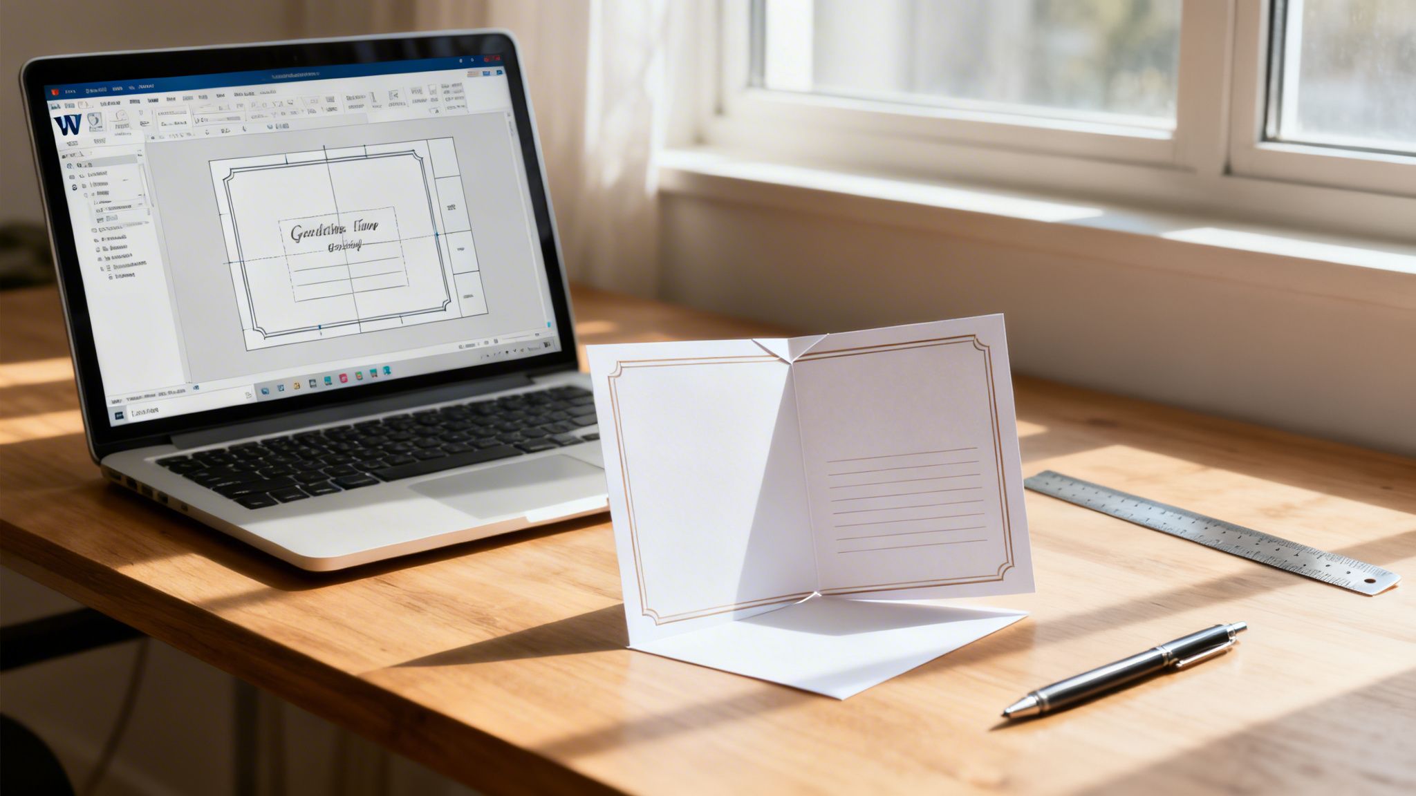
You need a card by today. Maybe it is a client thank-you, a holiday insert for outgoing orders, or a simple folded handout for an event table. You already have Microsoft Word open, and that matters more than most design purists want to admit.
Word is not a layout application in the professional sense. It was not built for bleeds, color-managed output, or precise panel planning. But it is familiar, fast, and available to almost everyone. That is why so many small teams start there.
The problem is not designing in Word. The problem is stopping at the usual Word tutorial. Most walkthroughs show how to type on a template, swap a photo, and press print. They skip the part that decides whether your card looks clean and intentional or looks like an office flyer folded in half.
A workable greeting card template word workflow starts with accepting the trade-off. Word is good for structure, speed, and basic personalization. It is weak at print production details. If you know where those weak spots are, you can still get a card into professional shape and avoid the errors that waste paper, time, and reprint money.
Why Use Word for a Greeting Card Template
The appeal is simple. Word is already installed in many offices, people know how to use it, and Microsoft has offered greeting card templates since at least Word 2016 through the File > New search workflow, with more free customizable card templates also available through Word for the web (Dummies coverage of Word 2016 greeting cards).
That matters because urgency changes your tool choice. When a marketing coordinator needs a quick folded insert or a founder needs a branded note card before an event, speed beats software purity.
Where Word earns its place
Word works well when you need:
- Fast drafts: You can get from blank page to usable layout quickly.
- Simple edits by non-designers: Anyone on the team can change names, dates, offers, or signatures.
- Low-friction collaboration: A .docx file is easier for many offices to review than a native design file.
- Template reuse: Saving your setup as a .dotx file makes repeat jobs easier.
This is one reason Word templates have stayed relevant inside a much larger market. Globally, over 7 billion greeting cards are purchased annually, with 80% of DIY designs in major markets like the US and UK created with tools like Word templates, in a $7.5 billion industry where digital templates drive 30% year-over-year growth in customizable print-on-demand (Dummies article on printing your own greeting cards in Word 2016).
Where Word starts to fail
Word gets shaky when the card moves from desktop mockup to press-ready file.
The weak points are predictable:
- panel alignment after folding
- edge-to-edge backgrounds
- image quality
- color accuracy
- PDF export choices
- specialty finishing considerations
Practical rule: Use Word to build the message and structure. Use print production discipline to make it look professional.
If your job is a short-run thank-you piece, a Word-built card can absolutely work. If you want to explore folded formats for branded appreciation mailers, thank-you card printing options show the kinds of finished products Word can help you prototype before production.
Word is not the wrong tool. It is just an incomplete one unless you handle setup, export, and printing correctly.
Laying the Foundation with Correct Page Setup
Most bad cards fail before the first font choice. They start with the wrong page size, the wrong orientation, or no panel structure at all.
If you want a greeting card template word file to fold cleanly, build the document like a printer would think about it.
Start with standard sizes
Professional printers such as UPrinting and GotPrint provide free greeting card templates in common sizes like 5x10 inches folded to 5x5 and 6x8.5 inches folded, and using established standards matters because 90% of small businesses use free templates to slash design costs by 40-60% according to the Printing Industries of America data cited by UPrinting (UPrinting greeting card templates).
That tells you two things. First, standard sizes simplify production. Second, there is no prize for inventing an odd page dimension in Word.
Here is a practical setup table you can mirror inside Word.
| Final Folded Card Size | Fold Type | Required Word Page Size (Width x Height) | Orientation |
|---|---|---|---|
| 5 x 5 | Half fold from 5 x 10 flat | 10 x 5 | Horizontal |
| 6 x 8.5 folded format | Half fold | 8.5 x 12 approximate flat planning based on printer template family | Horizontal |
| Quarter-fold card on letter sheet | Quarter fold | 8.5 x 11 | Horizontal |
The exact flat size depends on the final product you intend to print. If you are ordering commercially, always match the printer’s template first.
A good place to compare folded formats before you build your Word document is this folded card and folded print category.
Use horizontal and set margins first
The most reliable quarter-fold method uses:
- A blank document
- Horizontal orientation
- Margins of 0.5 inch top and bottom
- Margins of 0.75 inch left and right
Those settings create a workable canvas on standard office paper and reduce surprises when you fold a printed proof.
Why horizontal? Because you are planning panels, not writing a letter. A horizontal layout lets you think in spreads and quadrants.
Build a 2x2 table for panel control
This is the simplest workaround for Word’s biggest weakness. It gives you fixed panel zones.
Use a 2 row x 2 column table with fixed column widths of 3.5 inches when building a quarter-fold layout on letter size. That structure maps the four card panels so you can place front, back, and inside content consistently.
A clean panel map looks like this:
- Top right cell: front cover
- Bottom right cell: back panel
- Bottom left cell: inside left
- Top left cell: inside right
If you place content freehand with text boxes and loose images, Word lets tiny shifts accumulate. The table method prevents that drift.
Tip: Keep table borders visible while designing. Hide them only after your layout is locked.
Add fold guides without clutter
Word does not have a true fold-preview environment. You can fake one.
Two common methods work:
- Temporary table borders: Best for structure.
- Thin guide lines made with shapes: Useful for visualizing fold direction.
Do not leave decorative guide lines in the final export unless they are meant to print. They are for planning, not production.
Save the setup as a template
Once your page size, margins, orientation, and table are correct, save the file as a Word Template (.dotx).
That one step turns a one-off document into a repeatable system. For seasonal cards, customer notes, event invites, and staff appreciation pieces, that matters more than people realize.
The right setup feels boring. It should. Boring setup produces clean folds.
Designing for Print Bleed Resolution and Color
The biggest misconception in Word card design is that the screen preview is close enough to the printed result. It is not.
A file can look polished on your monitor and still print with white slivers at the edge, fuzzy photos, and color shifts that make the card feel cheap. Such issues often derail most DIY jobs.
Data from printing forums in 2025 shows that 68% of small business users report needing reprints due to improper Word exports that lack bleed and use low-resolution images. Professional templates reduce these errors by 40% according to benchmarks from PrintNinja (discussion summarized here).

Bleed is not optional
A bleed is extra image or background area that extends past the trim edge. Printers trim stacks of paper. Trimming is precise, but not magical. If your background stops exactly at the page edge in Word, even a slight shift can leave a thin white line.
Word does not provide proper bleed controls. That is one of its core limitations.
The workaround is manual:
- increase the page size slightly to account for bleed
- extend backgrounds and full-bleed images beyond the intended trim area
- keep important text and logos away from the outer edge
The production idea is simple. Backgrounds go outward. Important content stays inward.
Safe zone matters just as much
People obsess over bleed and ignore the safe zone. That is the inner buffer where your type and logos should live.
When someone places a headline too close to the edge, the problem is not just trimming. Folded cards also need breathing room around panel edges and folds. A card can be technically printable and still feel cramped.
A useful habit is to create an inner no-go area with guides or a second invisible planning table. Keep greetings, names, QR codes, and contact details inside that area.
Key takeaway: Bleed protects the background. Safe zone protects the message.
Resolution decides whether your card looks cheap
Word will happily accept weak images. That does not mean the printer should.
For commercial output, use 300 DPI images. Lower-resolution web graphics may look acceptable on screen, but they often break apart when printed, especially in photos, logos with soft edges, or textured artwork.
Common trouble spots:
- screenshots copied from websites
- social media images
- logos pulled from email signatures
- old JPEGs saved and resaved too many times
If you zoom in and the image looks soft in Word, it will not improve in print.
A practical test is to place the image at the size it will print. A small logo may survive. A full-front photo probably will not if it came from the web.
RGB on screen, CMYK in print
This color adjustment presents the hardest challenge for non-designers because Word does not give you a proper color-managed print workflow.
Screens display RGB light. Printers reproduce color with CMYK inks. Those are different systems. Bright blues, vivid greens, and neon-like tones often lose intensity in print.
Word users run into two recurring issues:
- they trust screen brightness too much
- they choose colors without considering paper and ink behavior
You cannot fully solve color management inside Word. You can reduce surprises by doing three things:
- Avoid ultra-saturated colors when exact brand matching matters.
- Print a local proof on a decent office printer to catch obvious imbalances.
- Export a high-quality PDF and review it carefully before ordering.
If your job involves critical brand color, Word becomes more of a drafting tool than a final production environment. At that point, a printer’s downloadable template or a digital print workflow is the safer route. For example, digital printing services are built around the kind of PDF handoff Word users need to get right.
What works and what does not
A few blunt truths help here.
What works
- solid-color backgrounds that extend beyond trim
- clean typography with room around the fold
- high-resolution photos used at intended size
- restrained color choices
What does not
- edge-hugging text
- web images stretched large
- assuming Word’s page edge is the trim edge
- expecting screen color to match paper exactly
Word can still produce a strong card. It just will not protect you from print mistakes on its own.
Creative Customization Typography and Layout
Once the file is structurally sound, design decisions matter more than software limitations. Most Word cards look amateur for one reason. The layout tries to do too much.
The strongest cards I see from non-designers are usually simple. One clear front message. One supporting image style. One inside hierarchy. Clean panel spacing.

Treat each panel like it has a job
Do not start by decorating. Start by assigning purpose.
A reliable four-panel card structure looks like this:
- Front cover: headline, short message, hero image
- Inside spread: primary message and supporting visual
- Back panel: logo, signoff, URL, or nothing at all
Word gets messy when every panel competes for attention. Keep one dominant idea per panel.
Use fewer fonts than you want to use
Word makes font switching easy, which is exactly why many card layouts get noisy.
A practical pairing is:
- one display face for the cover
- one readable body font for the inside message
That is enough for most business and event cards.
If the front cover already has an illustration or photo doing heavy visual work, the typography should calm down. If the front is typographic, then spacing and font weight become the design.
WordArt works when it is controlled
WordArt has a bad reputation because people use every effect at once. Glow, bevel, shadow, gradient, and stretched perspective usually push a card into clip-art territory.
Used sparingly, WordArt is still useful for short front-cover headlines.
Keep it disciplined:
- use a flat fill
- skip novelty outlines
- avoid excessive shadow
- keep the message short
The inside-back panel needs extra care. A precise table-driven approach ensures 100% alignment accuracy when folded, and for text on the inside-back panel you must rotate the WordArt object 180° so it reads upright after folding, a step that prevents 40% of rejections in professional print workflows (Microsoft community guidance).
That rotation detail sounds minor. It is not. It is one of the classic folded-card mistakes in Word.
Tip: Print a black-and-white draft on plain paper and fold it before you refine spacing. Fold logic is easier to fix before styling is final.
Balance image weight across the spread
A common Word mistake is dropping one large image into a panel and then trying to fit text around it.
Better options:
- crop the image intentionally so it fills the panel
- reduce the image and give it white space
- carry the same visual style across front and inside
Consistency matters more than complexity. Two average images with matching treatment usually look better than four unrelated visuals.
If your design depends on custom contours, unusual shapes, or cut-through windows, Word is the wrong place to fake it. That is where production techniques such as die cutting become part of the print plan rather than the Word layout itself.
A clean card usually follows these rules
- One focal point on the cover.
- Plenty of margin inside each panel.
- Body text sized for reading, not squeezing.
- Decorative elements repeated, not improvised.
- Back panel treated as quiet space.
The greeting card template word files that print well are rarely the busiest ones. They are the ones with enough restraint to survive folding, trimming, and paper.
Exporting a Print-Ready PDF from Word
A finished design is not ready for production until it leaves Word properly. Sending the native Word file is risky because fonts can substitute, image positions can shift, and printer-side software may interpret your layout differently.
The safest handoff is a print-ready PDF.

The export path that causes fewer problems
In Word, use one of these routes:
- File > Save As > PDF
- File > Export > Create PDF/XPS
Then choose a print-oriented quality setting, not a minimum-size web setting.
If your version of Word gives you options, look for language such as:
- High Quality Print
- Standard publishing and printing
- Press-quality style output, if available in your environment
The exact wording varies by version, but the principle does not. Choose output meant for print.
What to check before saving
Run through this short checklist:
- Fonts are final: Do not assume you can tweak type after export.
- Images are embedded and sharp: Zoom in before you save.
- Guide lines are removed: Temporary planning lines should be gone.
- Page order is correct: Front, back, and inside panels need to match your fold logic.
- Margins and bleed workaround are intact: Do not accidentally “fit to page” anything.
If Word offers options that downsample images or optimize for online viewing, avoid them for print files.
Proof the PDF, not the Word file
Many users stop too early at this stage. They inspect the .docx, export the PDF, then upload it without checking the actual PDF at full size.
Open the PDF and verify:
- text is crisp
- no image shifted during export
- panel content is in the correct orientation
- backgrounds still extend far enough
- nothing sits too close to trim or fold lines
Practical rule: The PDF is the product. The Word file is only the workspace.
Save a reusable master
Keep two files:
- your editable .dotx or .docx master
- your final PDF for print
That separation prevents accidental edits to the production file and makes future revisions cleaner.
Word can create a dependable output file, but only if you treat export as a production step rather than an afterthought.
Uploading Your Design to 4OVER4 for Printing
Once your PDF is solid, the printing platform matters more than the software you designed in. Word can only take you to the handoff point. Paper choice, finishing, trimming, and proof review determine the final impression.
At this stage, many small businesses make a smart shift. They stop asking, “Can Word do this?” and start asking, “What should the printer do from here?”
Match your file to the product
Before you upload anything, compare your PDF to the product specs:
- folded size
- flat size
- orientation
- paper stock
- finish
- quantity
- turnaround
This step sounds administrative, but it prevents one of the most common ordering mistakes. A file built for one fold format can look fine on screen and still be wrong for the selected product.
Use proofing tools seriously
Most online printers provide an upload review or proofing step. Use it slowly.
Look for:
- edge cropping that reveals weak bleed
- text too close to folds
- unexpected panel order
- low-resolution warnings
- orientation errors
Do not rush because the file already looked right in Word. The printer preview is the closest thing you have to production reality before press.
Know what Word cannot add
Word can help you design the artwork. It does not create the tactile part of the job.
Once you upload, you can make print decisions that shape the finished piece:
- uncoated or coated stock
- matte or gloss feel
- heavier cardstock
- foil or dimensional effects
- specialty folded formats
That is why a printer workflow matters even when the design starts in Word. A straightforward route for this handoff is custom greeting card printing, where the file you built can be matched to production options Word does not control.
When professional printing is the better call
If the card is customer-facing, brand-sensitive, or part of a campaign, professional printing usually pays for itself in consistency.
That is especially true when the design includes:
- dark full-bleed backgrounds
- photo-heavy covers
- bulk mailing quantities
- event distribution
- premium paper expectations
For single copies or office-only use, desktop output may be enough. For anything representing your brand in public, a professionally printed result is usually the more reliable finish.
Word is a reasonable starting point. Printing is where the card becomes credible.
Frequently Asked Questions About Word Greeting Cards
Can I make a greeting card in Word that still feels professional
Yes, if the design is simple and the production prep is disciplined.
Word handles structure and editable text well. It struggles with press-level controls. Clean panel setup, high-quality images, careful export, and professional printing close most of that gap.
Can I add a QR code to make the card interactive
Yes. That is a smart move for event cards, thank-you inserts, and campaign pieces that need a digital follow-up.
The idea fits current behavior. Hybrid cards that combine print with a QR-linked digital experience have seen a 35% year-over-year rise, and accessible digital versions matter too, with high-contrast text at a 4.5:1 ratio per WCAG 2.2 and alt text for images playing an important role as 25% of eCommerce brands use accessible cards for email and social media marketing (Adobe Express card template page cited in the verified data set).
If you add a QR code, keep it inside the safe zone and test it from a printed proof, not just from the screen.
Can Word handle accessibility for digital sharing
Partly.
Word is not a full accessibility production environment for polished digital campaigns, but you can still make smarter choices:
- use strong text contrast
- avoid tiny type
- keep message hierarchy clear
- add alt text where your digital export format supports it
If you plan to share the card as a PDF as well as print it, readability matters just as much as visual style.
Should I print directly from Word or always export a PDF
Export the PDF.
Direct printing from Word is acceptable for rough proofs. For any final handoff to a commercial printer, PDF is the safer file because it locks the layout more reliably.
Can I create specialty finishes like foil in Word
No. You can design with those finishes in mind, but the effect itself is a print-production choice, not a Word formatting feature.
The practical approach is to keep your layout clean, identify the elements you want highlighted, and then match the file to a print product that supports that finish.
If you already have a greeting card concept in Word, do the smart part next. Tighten the page setup, export a clean PDF, and move it into production through 4OVER4 for a finished card that looks intentional on paper, not just acceptable on screen.
More from

70
In a world of fleeting digital ads, a physical brochure can make a lasting impression. But getting that perfect, professional fold isn’t as
![]() Emma Davis
Emma Davis
Apr 6, 2026

39
Walk into any stationery store, and you'll see it: the classic 5" x 7" greeting card. It’s the undisputed cha
![]() Emma Davis
Emma Davis
Apr 5, 2026

44
Think of your company car or van for what it really is: a billboard on wheels. Every time it hits the road, it's advertising your business
![]() Emma Davis
Emma Davis
Apr 4, 2026

60
In a world buzzing with digital property listings and endless social media ads, it’s easy to think the classic 'For sale' sign has g
![]() Emma Davis
Emma Davis
Apr 3, 2026

138
Picture this: you need a massive, eye-catching banner for your grand opening next week. Not too long ago, that meant several trips to a local
![]() Emma Davis
Emma Davis
Apr 2, 2026

92
At its core, 10 pt cardstock is a versatile, lightweight paper perfect for a huge range of professional printing projects. Th
![]() Emma Davis
Emma Davis
Apr 1, 2026

108
Picking the right type of paper can feel like a secret language, full of strange terms like GSM, cover, and coated. It's
![]() Emma Davis
Emma Davis
Mar 31, 2026

200
A printing cost calculator is an online tool that gives you instant, real-time price quotes for custom print jobs. It takes all the guesswork
![]() Emma Davis
Emma Davis
Mar 30, 2026