Table of Contents
- Home
- content hub
- A Guide to Standard Greeting Card Size
A Guide to Standard Greeting Card Size
Apr 5, 202611 views
Apr 5, 202611 views
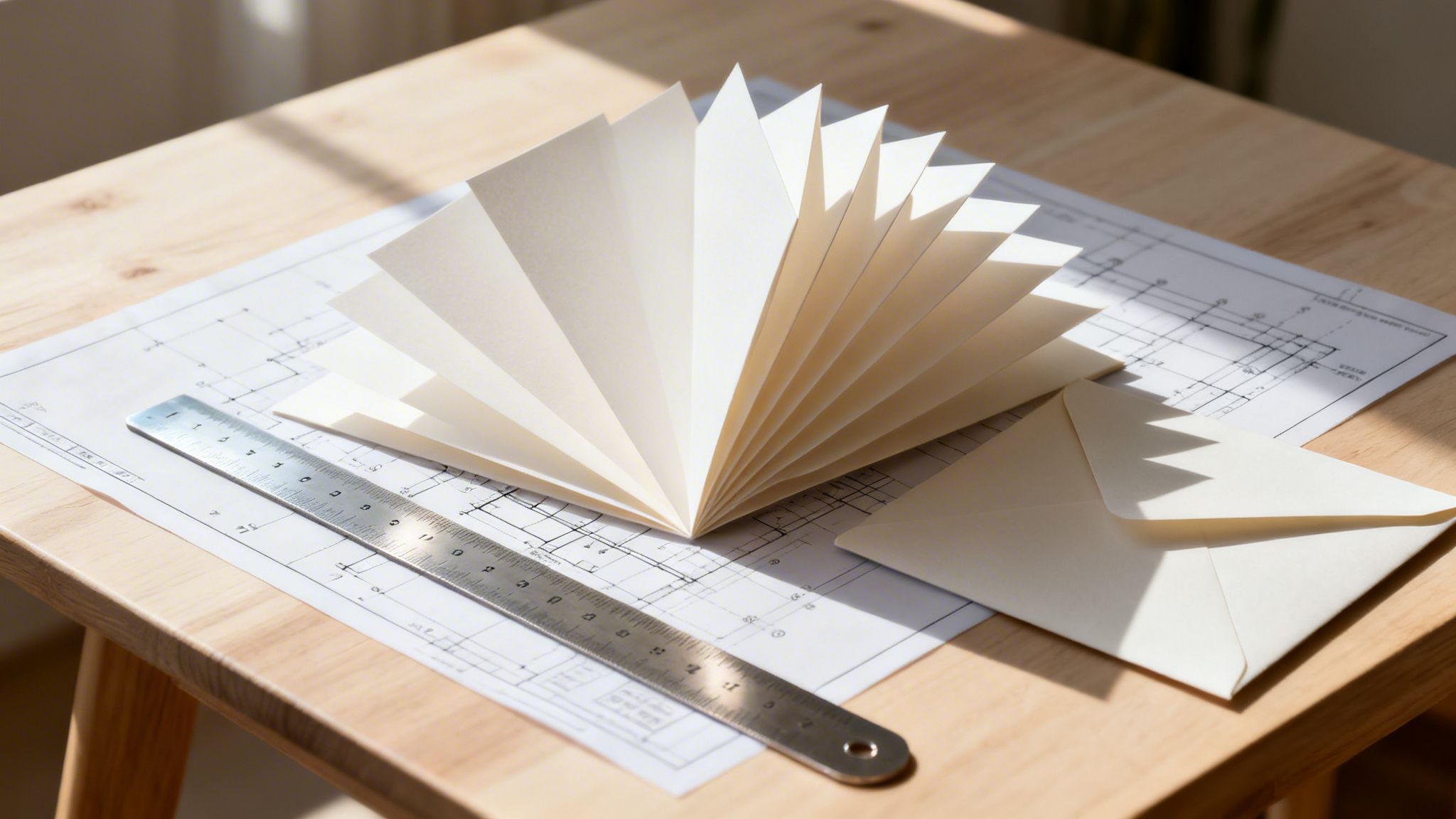
Walk into any stationery store, and you'll see it: the classic 5" x 7" greeting card. It’s the undisputed champion of the card world, fitting perfectly into a standard A7 envelope. This size is popular for a reason—it gives you plenty of room for a splashy design and a heartfelt message, all without needing extra postage.
Finding The Right Greeting Card Size
Choosing the right size for your greeting card is a lot like picking an outfit. The best choice really depends on the occasion. Are you sending a quick, casual thank-you, or is this a grand holiday greeting for your most important clients? Every message has a perfect format, and getting the dimensions right is your first step to making a real impact.
This chart lays out the most common greeting card sizes, showing how the standard US sizes stack up against their international counterparts.

It’s a great visual guide to see how the international A-series sizes relate to the US standards, which is incredibly helpful if you're planning a campaign with a global audience.
A Quick Look At Standard Dimensions
To make things even easier, we put together a simple reference table. Think of it as your cheat sheet for matching a card’s purpose to its size—and, just as importantly, to its envelope. Nothing undermines a beautiful card faster than an envelope that's too tight or too loose.
Getting this pairing right from the start saves a lot of headaches later. For example, a small and budget-friendly 4.25" x 5.5" (A2) card is perfect for slipping into product shipments or for mass mail-outs. On the other hand, the larger 5" x 7" (A7) feels more substantial and special, making it ideal for invitations or high-end client appreciation.
The size of your greeting card is more than a measurement; it's part of the message. It sets the tone, affects your budget, and shapes how people see your brand before they even read a single word.
Below is a handy comparison of the most common greeting card sizes you'll encounter.
Standard Greeting Card Sizes at a Glance
This table breaks down the popular US card sizes and their international (A-series) equivalents, so you can see the dimensions and common uses side-by-side.
| Card Name / Code | Folded Dimensions (Inches) | Folded Dimensions (mm) | Common Uses | Corresponding Envelope |
|---|---|---|---|---|
| A7 Card | 5" x 7" | 127 x 177.8 mm | Holiday Cards, Invitations, Announcements | A7 (5.25" x 7.25") |
| A6 Card | 4.5" x 6.25" | 114.3 x 158.75 mm | Thank You Notes, General Greetings | A6 (4.75" x 6.5") |
| A2 Card | 4.25" x 5.5" | 108 x 139.7 mm | RSVP Cards, Note Cards, Promotions | A2 (4.375" x 5.75") |
| A1 Card | 3.5" x 4.875" | 89 x 123.8 mm | Gift Enclosures, Small Notes | A1 (3.625" x 5.125") |
| Intl. A6 | 4.1" x 5.8" | 105 x 148 mm | Postcards, International Mail | C6 (4.5" x 6.4") |
With these basics down, you’re ready to pick a size that fits your creative vision and practical needs. If you’re ready to see what’s possible, we offer a huge range of custom greeting cards that fit these sizes and beyond. Now, let’s talk about how these choices play into your budget and printing setup.
How Card Size Impacts Your Budget and Brand
Picking a greeting card size feels like a creative choice, but it’s one of the most important strategic decisions you’ll make. It has real-world consequences for your budget and how people see your brand. Think of it this way: choosing the right size from the start is like planning a road trip with the right car—it ensures a smooth ride and prevents you from running out of gas (or money) halfway there.
A unique, non-standard card might seem like a clever way to capture attention, but it can backfire. Custom dimensions often demand special envelopes and can even trigger extra postage fees, sometimes doubling your mailing costs. This is exactly why it pays to understand the relationship between size, cost, and brand perception.
The Economics of Card Dimensions
The size of your card directly hits your wallet in two ways: printing and mailing. It’s pretty straightforward that larger cards use more paper and ink, bumping up the price per card. But the real cost-saver is in the manufacturing process. Standard sizes are printed together in huge batches on massive sheets of paper, a method that drastically cuts down on waste and, therefore, cost.
When you go for a custom size, your project can't be bundled with others. This means less efficient paper use and a higher price tag. It's simple economics, and it's why standard sizes like A7 and A2 are so dominant. For a startup on a tight budget or a business running a massive holiday campaign, sticking to these common sizes can unlock some serious savings.
A greeting card is a physical representation of your brand. A flimsy, awkwardly sized card can signal a lack of attention to detail, while a substantial, well-proportioned card conveys quality and professionalism.
The numbers don't lie. The greeting card industry is a multi-billion-dollar machine built on efficiency. A staggering 94% of purchases still happen in physical stores, partly because standard sizes are so easy to display and handle. In the US alone, households buy about 30 cards a year, fueling a $7.5 billion market. For businesses, simply choosing proven, standard sizes can slash production costs by up to 20% by allowing for more efficient cutting.
Aligning Size with Brand Perception
Beyond your budget, your card's dimensions send a quiet but powerful message. The physical feel of a card—its weight, its size, its presence in someone's hands—directly shapes how they perceive its value and, by extension, your brand.
Let’s look at a few real-world examples:
- The Premium Brand: A luxury hotel sending holiday wishes to VIP guests would likely opt for a larger 5" x 7" card. Printed on a thick, 16pt cardstock, the substantial size and weight feel exclusive and important, perfectly matching the brand’s high-end image.
- The Agile Startup: A tech company announcing a new app might use a smaller, sleeker 4.25" x 5.5" card. This size feels efficient, modern, and to the point, mirroring the company's nimble, no-fuss culture.
- The Personal Touch: A small online boutique including a thank-you note with each order would do well with a compact A1 or A2 card. Its small footprint feels personal and intimate, almost like a handwritten note from a friend.
The goal is to match the card's physical form to the feeling you want to create. An oversized, goofy card from a serious law firm would feel jarring. Likewise, a tiny, understated invitation to a massive grand opening could easily get lost or feel underwhelming. When you thoughtfully select your dimensions, you ensure your physical marketing materials speak the same language as the rest of your brand.
The Story Behind Modern Card Dimensions
Ever found yourself wondering why greeting cards come in such specific, standard sizes? It's no accident. The dimensions we all take for granted are the product of over a century of evolution, driven by the powerful forces of postal regulations and printing technology.
The whole story really starts with the humble postcard. As mail systems around the world got more organized, a need for standard sizes quickly emerged. Efficiency was the name of the game, and having uniform dimensions made sorting, handling, and delivering mail so much faster and cheaper. This basic idea—that size has to be practical for mailing—has shaped the greeting card industry ever since.
The Foundation of Postal Standards
The real turning point was a series of international agreements designed to make global mail flow smoothly. A major milestone was the Universal Postal Union treaty, which on June 1, 1878, helped set the standards that would eventually affect everything you can put a stamp on. This is why the classic 3.5" x 5.5" postcard became an early 20th-century staple, creating a blueprint for efficient, standardized formats. You can find some fascinating details about these old postcard rules over on the Smithsonian's website.
This focus on mailability is the simple reason most greeting cards slip perfectly into standard envelopes without needing extra postage. The sizes are engineered to move through the postal system with the least amount of friction and cost, a practical consideration that's still incredibly important today.
Of course, rules are also made to be tested. The history of greeting cards is peppered with some truly creative outliers that pushed the boundaries of what was considered "mailable."
Back in 1924, a gigantic 21 by 33-inch Christmas card was delivered to President Calvin Coolidge, a world away from the tiny notes common at the time. On the other end of the scale, a greeting inscribed on a single grain of rice was sent to the Prince of Wales in 1929, proving that making a big impact isn't always about size.
From Printing Press to Modern Efficiency
Right alongside postal rules, the mechanics of the printing press played a huge part in defining standard greeting card sizes. Early presses worked with massive parent sheets of paper, and to keep waste to a minimum, cards were designed to be cut from these sheets with almost nothing left over. A size like 5" x 7" became popular precisely because you could lay out multiple cards on one big sheet with near-perfect efficiency.
This principle of maximizing every inch of paper is still alive and well, even with today's advanced printing technology. Choosing a standard size allows printers to group tons of different jobs together on a single press run, a process known as gang-run printing.
This smart approach dramatically cuts down on waste and lowers costs for everybody involved. When you choose from a standard collection of print products, you’re tapping into a long legacy of production efficiency. It just goes to show that the balance between creativity and practicality has always been at the heart of greeting card design.
Choosing the Right Paper and Finish
Now that you've picked the perfect size for your greeting card, it’s time to talk about something just as important: the feel. The paper and finish you choose are what bring your design to life, defining how the card feels in your recipient’s hands and how your colors look in person.
Think of it this way—the paper stock is your card's "body language." A flimsy, thin paper can feel like a weak handshake, underwhelming and easily forgotten. But a thick, sturdy cardstock? That feels like a confident introduction, conveying quality before a single word is read.

Understanding Paper Weight and Thickness
Paper weight is measured in points (pt), where a single point is just one-thousandth of an inch. While it sounds a bit technical, the idea is simple: the bigger the point number, the thicker and stiffer the paper. For greeting cards, you'll generally find yourself choosing between 14pt and 16pt cardstock.
It’s the difference between a throwaway flyer and a high-end business card. One is light and flexible, the other feels substantial and built to last. That's exactly the kind of impression you're deciding on.
- 14pt Cardstock: This is a fantastic, professional-grade choice. It has a solid rigidity and quality feel, making it our most popular and budget-friendly option for everything from holiday cards to marketing mailers.
- 16pt Cardstock: If you want to dial up the luxury, this is the way to go. The extra thickness gives it a more premium, durable feel. It’s perfect for upscale invitations, thank you cards for important clients, or any time you really want to leave a lasting impression.
Opting for a heavier stock like 16pt sends a subtle message that you care about quality, which instantly boosts how your brand and message are perceived.
Selecting the Perfect Finish
The finish is the coating applied to your card after printing, and it has a huge say in the final look, feel, and even function of your card. The right finish can make your photos sing, add a touch of understated class, or make it easy for someone to jot down a personal note.
The finish you choose should directly support what you want the card to do. Are you showing off a brilliant photograph or hoping for a handwritten reply? That single question will point you to the perfect coating.
Here’s a look at the most common finishes and what they do best:
Glossy UV This is a high-shine, liquid coating that’s hardened with UV light, resulting in a slick, highly reflective surface.
- Best For: Designs packed with photos, bold graphics, and anything that needs to grab attention. The gloss makes colors feel deeper and more vibrant.
- Keep in Mind: It’s nearly impossible to write on with a typical pen, so avoid it if you plan to have people write on the glossy side.
Matte A matte finish gives you a smooth, non-reflective surface that feels modern and sophisticated. It scatters light, giving your colors a softer, more subtle appearance.
- Best For: Elegant designs, text-heavy cards, and anything where you want a clean, classic look. The lack of glare is easy on the eyes.
- Keep in Mind: Darker colors on a matte finish can sometimes show fingerprints more easily.
Uncoated Just like it sounds, this paper has no extra coating at all. It has that natural, slightly porous paper feel that’s incredibly easy to write on.
- Best For: Thank you notes, RSVP cards, and any greeting card meant for a personal, handwritten message. It soaks up ink perfectly without smearing.
- Keep in Mind: Because the ink soaks into the paper fibers, colors might look a little less punchy than they would on a coated stock.
If you're after something truly special, you can explore even more textures and visual effects. You can learn more about our fantastic finishes, which include options like velvety soft-touch or brilliant raised foil. When you carefully pair your paper weight and finish with your design, you create a powerful, cohesive piece that really connects with your audience.
How Businesses Use Different Card Sizes
Knowing the technical specs of a greeting card is one thing, but seeing how different sizes work in the real world is where strategy really comes to life. A greeting card isn't just paper; it’s a specific tool businesses use to hit marketing goals. From a simple thank you to a big holiday campaign, the size you pick directly influences how your message lands.
Think of it like choosing the right box for a gift. A delicate necklace gets a small, elegant box, while a larger gift set needs something more substantial. In the same way, your greeting card's size should perfectly match the intent and scale of your message.
Small Sizes for Personal Connections
Smaller card sizes, like the A1 (3.5" x 4.875") and A2 (4.25" x 5.5"), are perfect for creating intimate, personal touchpoints. Their compact size feels less like a corporate broadcast and more like a one-on-one chat.
This makes them the ideal choice for moments where sincerity and gratitude are front and center.
- Boutique Retailers: An online shop can slip a small A2 thank you note into every order. It's just the right size for a quick, handwritten message that makes customers feel seen and builds real loyalty.
- Trade Show Leave-Behinds: A startup can design a card just a bit bigger than a business card to hand out at events. It’s far more memorable and has enough space for a key benefit or a QR code linking to a demo.
- Coffee Shops & Cafes: A local coffee shop might use small A1 cards for a loyalty program, tucking them into a wallet-sized holder. The size is convenient for customers to carry around and use every day.
These smaller formats are easy on the budget for mass distribution but pack a surprisingly powerful, personal punch when used the right way.
Standard Sizes for Broad Appeal
The 5" x 7" (A7) is the undisputed workhorse of the business world, and for good reason. Its generous size gives you plenty of real estate for professional branding, strong images, and a thoughtful message, making it the go-to for major campaigns.
A larger card size conveys importance and commands attention. When a 5" x 7" card arrives in the mail, its weight and presence signal that the contents are worth opening and reading, making it perfect for high-stakes communications.
This is the size businesses grab when they really need to make a statement.
- B2B Holiday Greetings: A financial services firm sending holiday cards to its top clients will almost always go with a 5" x 7" format. It looks and feels premium, reinforcing the firm's professional image and the value they place on that client relationship.
- Event Invitations: A real estate agency hosting a grand opening for a new development will use this size to create a sense of occasion. The larger canvas allows for beautiful property photos and all the event details without feeling cramped.
- Non-Profit Fundraising: Charities often use 5" x 7" cards for their year-end donation appeals. The space allows them to tell a compelling story, include powerful images, and even add a detachable response form.
Recent industry data shows just how strategic businesses are with these sizes. For small and medium firms, 35.8% send between 1-49 cards annually, often using compact formats like 4" x 6" to keep costs down. As their needs grow, 37% send 50-199 cards, while 20.6% send 200-999 cards, frequently standardizing on the popular 5" x 7" for major holidays. As you can find out in more detail, this careful selection helps optimize postage and material costs, showing a clear link between card size and smart business operations.
Preparing a Flawless Print-Ready Design File
A great greeting card design is one thing, but making sure it prints perfectly is what separates the pros from the amateurs. Getting your digital file set up correctly from the start is the secret to avoiding those frustrating and costly mistakes—think blurry images, weird white edges, or text getting lopped off.
Think of it like this: your file is the blueprint for the printer. If the blueprint has flaws, the final product will too. We’ll walk through the technical side of print design, breaking down the must-know concepts like bleed, trim, and the safe zone so your cards come out looking flawless every single time.

Understanding Bleed, Trim, and Safe Zone
These three terms are the absolute bedrock of a print-ready file. Once you get them, you’ll never have to worry about your design getting mangled by the cutting machine again. Let's use a picture frame to make this super clear.
Trim Line: This is the exact, final edge of your cut greeting card. In our analogy, it’s the inside edge of the picture frame, right where the photo meets the wood.
Bleed Area: This is a small buffer of your background design that extends 0.125 inches (1/8") past the trim line on every side. This extra bit of art gets trimmed away. It’s a safety net, ensuring that even a tiny shift during cutting doesn’t leave an ugly, unprinted white sliver on the edge. It’s like using a photo that’s slightly bigger than the frame opening.
Safe Zone: This is an inner margin, also typically 0.125 inches, located inside the trim line. All your important stuff—your message, your logo, a person’s face—has to stay within this area. It's the "can't-miss" part of your picture, safely away from the frame’s edge, guaranteeing nothing critical gets cut off.
Keep your text and logos tucked inside the safe zone to protect them. Then, stretch your background image or color all the way to the edge of the bleed area for that clean, professional, edge-to-edge finish.
Setting the Right Resolution and Color Mode
With your layout safely "framed," the next step is a quick technical check-up. Two settings are non-negotiable for professional printing: resolution and color mode.
First, resolution. Your design file must be 300 DPI (dots per inch). DPI is the measure of print clarity—more dots mean a sharper image. A 72 DPI file looks fine on a screen, but it will come out of the printer looking fuzzy and pixelated. You have to start your project at 300 DPI; you can't just change it at the end.
Second, color mode. Your file must be set to CMYK (Cyan, Magenta, Yellow, Key/Black). This is the four-color language every professional printer speaks. Your computer screen uses RGB (Red, Green, Blue), which can display a much wider, brighter spectrum of colors. If you design in RGB, those vibrant colors will look muted and dull when printed in CMYK. Always convert to CMYK to get a more accurate preview of the final printed colors. While this guide is for cards, many of these core concepts are universal in printing, which you'll also see in guides explaining how to print your own kids book.
The best way to nail these specs is to use a pre-made template. It comes with all the guides for bleed, trim, and safe zones already marked out, saving you the guesswork. Of course, if you're thinking beyond a simple rectangle, you might need special cuts. You can explore how those unique shapes are created with our guide to custom die cutting.
Here's a quick checklist to make sure your greeting card file is ready to go.
Print-Ready File Checklist
This table summarizes the essential technical specs you need for a flawless greeting card print job.
| Specification | Requirement | Why It Matters |
|---|---|---|
| Bleed | 0.125" (1/8") on all sides | Prevents white edges on your final card after trimming. |
| Safe Zone | 0.125" (1/8") inside the trim line | Protects your text and important images from being cut off. |
| Resolution | 300 DPI | Ensures your images and text print sharp and clear, not pixelated. |
| Color Mode | CMYK | Matches the colors used by professional printers for accurate color output. |
| File Format | PDF, AI, PSD, JPG, or TIF | These are standard formats that preserve quality and print data. |
Following this checklist is your best defense against common print errors. It ensures that the design you worked so hard on looks just as incredible on paper as it does on your screen.
Your Greeting Card Questions, Answered
When you're finalizing a greeting card design, a few last-minute questions always seem to surface. Getting these details right is the final check before you hit "print," ensuring your project turns out exactly as you imagined.
We get these questions all the time from designers and businesses, so we’ve put together some quick, straightforward answers. This should help you avoid any common mix-ups and place your order with total confidence.
What Is the Most Common Greeting Card Size?
The go-to size for almost any occasion is the 5" x 7" card. It’s the industry favorite for good reason—it feels substantial in hand, gives you plenty of room for your design and a personal message, and slides perfectly into a standard A7 envelope. Best of all, it mails without needing extra postage.
This perfect blend of presence and practicality makes it the top choice for everything from company holiday cards to formal event invitations.
Can I Write on a Glossy Greeting Card?
Writing on a high-gloss card is a recipe for smudges. The slick, non-porous surface just isn't friendly to most ballpoint and gel pens.
If you know you’ll be adding a handwritten note, you should definitely go with an uncoated stock. A matte finish can also work in a pinch, but an uncoated paper is specifically made to absorb ink, giving you a clean, smear-free writing experience every time.
Do Smaller Cards Feel Less Premium?
Not at all. A card’s perceived value comes from its quality and feel, not its size. A compact A2 (4.25" x 5.5") card printed on a thick, sturdy 16pt cardstock can feel much more luxurious than a bigger card on flimsy paper.
Special finishes like soft-touch laminate or elegant raised foil can also make a smaller card feel incredibly high-end. It all comes down to the materials you choose and your attention to detail.
A well-crafted card, regardless of its greeting card size, signals quality. The right paper and finish can make even the most compact card feel special and thoughtfully designed.
Which Size Is Best for Direct Mail Marketing?
For mass mailings, the 4.25" x 5.5" card is a smart and effective option. It’s more affordable to produce and mail in bulk, but because it arrives in an envelope, it carries more weight and feels more personal than a typical postcard.
This size hits that sweet spot between making a real impact and staying within your marketing budget. It’s a powerful tool in a world that still values tangible messages.
In fact, the global greeting card market, valued at over $19 billion, is projected to climb past $22 billion by 2033. This growth shows just how much people still appreciate a physical card that works seamlessly with postal systems worldwide. You can dive deeper into these market trends over at Grand View Research.
With these common questions cleared up, you’re all set to create a card that nails your vision and fits your budget. Here at 4OVER4, we have all the sizes, paper stocks, and finishes you need to bring your design to life. Check out our huge range of custom printing options and get your project started today.
More from

18
Think of your company car or van for what it really is: a billboard on wheels. Every time it hits the road, it's advertising your business
![]() Emma Davis
Emma Davis
Apr 4, 2026

35
In a world buzzing with digital property listings and endless social media ads, it’s easy to think the classic 'For sale' sign has g
![]() Emma Davis
Emma Davis
Apr 3, 2026

69
Picture this: you need a massive, eye-catching banner for your grand opening next week. Not too long ago, that meant several trips to a local
![]() Emma Davis
Emma Davis
Apr 2, 2026

71
At its core, 10 pt cardstock is a versatile, lightweight paper perfect for a huge range of professional printing projects. Th
![]() Emma Davis
Emma Davis
Apr 1, 2026

88
Picking the right type of paper can feel like a secret language, full of strange terms like GSM, cover, and coated. It's
![]() Emma Davis
Emma Davis
Mar 31, 2026

152
A printing cost calculator is an online tool that gives you instant, real-time price quotes for custom print jobs. It takes all the guesswork
![]() Emma Davis
Emma Davis
Mar 30, 2026

400
Getting your flyer design from a digital concept into a customer's hands involves a few key stages. You’ll need to nail the design with
![]() Emma Davis
Emma Davis
Mar 29, 2026

89
A quick free label template download is often the single fastest way to get professional-looking packaging without needing to
![]() Emma Davis
Emma Davis
Mar 28, 2026