Table of Contents
- Home
- content hub
- How to Print Flyers That Actually Work a 2026 Guide
How to Print Flyers That Actually Work a 2026 Guide
Mar 29, 202612 views
Mar 29, 202612 views
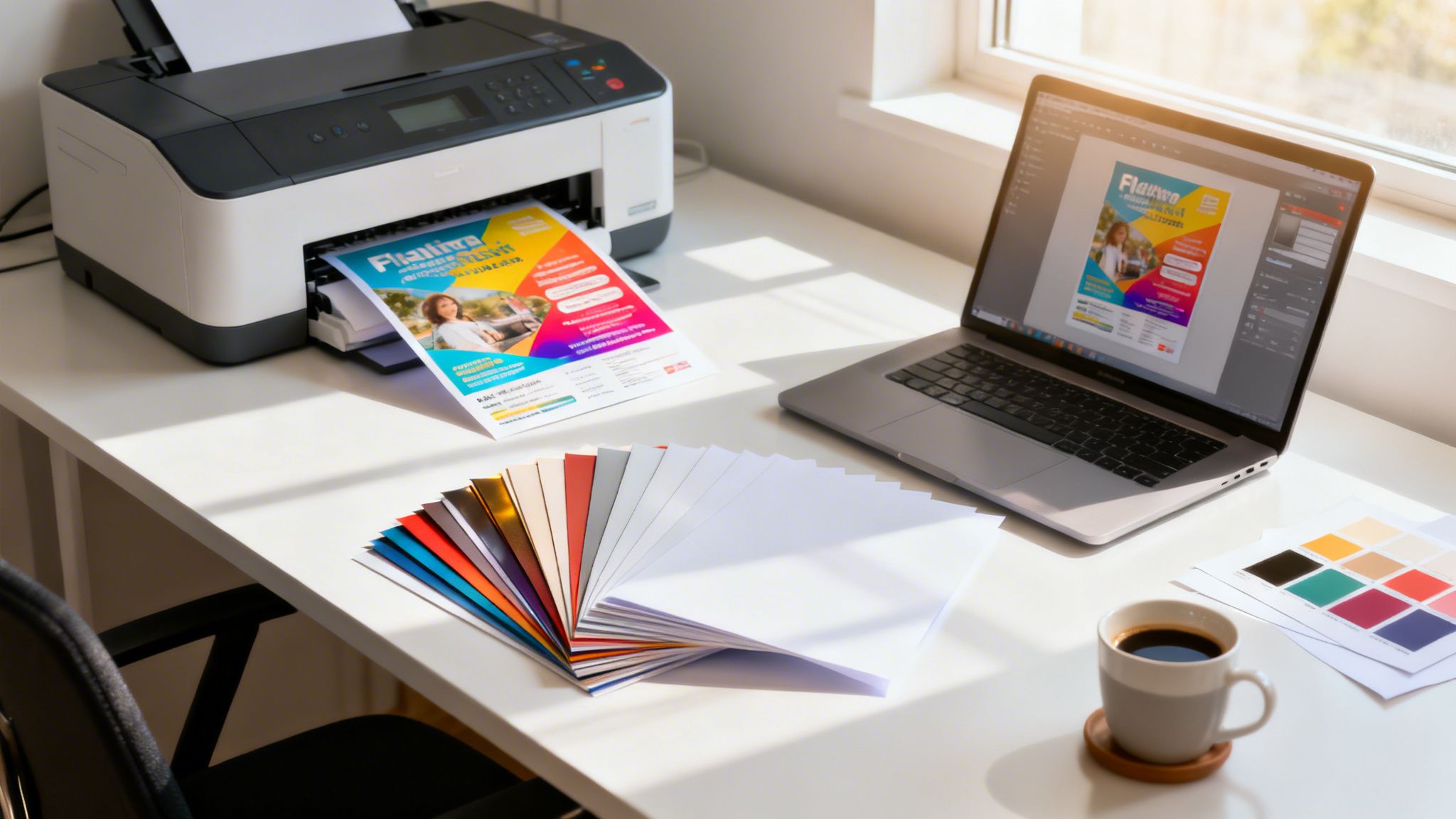
Getting your flyer design from a digital concept into a customer's hands involves a few key stages. You’ll need to nail the design with the right print specs, pick the perfect paper, prep a print-ready file, and then send it off to a printer you can trust. It’s this process that turns your idea into a powerful physical marketing tool.
Why Well-Printed Flyers Still Win

In a world of fleeting digital ads, you might wonder if a simple paper flyer can still make an impact. The answer is a resounding yes—but only when it’s done right. A high-quality flyer is a tangible piece of your brand that people can hold onto. It cuts through the digital noise and forges a real, physical connection.
For businesses trying to grow their local footprint, effective local marketing for small business is a must. A professionally printed flyer is often the most direct and indispensable tool for getting your message out there.
The Proven Power of Print
The data doesn't lie; this classic marketing method still delivers. A solid 71% of small business owners say physical marketing like flyers is vital for reaching local customers.
Even better, 34% of consumers have found a new small business directly because of a flyer, proving its power to drive real foot traffic. And the bottom line? A whopping 59% of consumers have bought something after getting a printed flyer. That’s paper turning directly into revenue.
This highlights a simple truth: flyers aren't just paper. They're direct-response sales tools that work because they are:
- Targeted: You can hand them out in specific neighborhoods, reaching the exact people you want to attract.
- Tangible: Unlike a digital ad that vanishes with a click, a physical flyer has staying power.
- Cost-Effective: When you print in bulk, the cost per impression is often much lower than you’d pay for many digital ads.
- Action-Oriented: A great design with a clear call-to-action gets people to act right away.
A flyer does more than just inform—it starts a conversation. It’s an invitation to an event, an offer for a new product, or a guide to a local service, placed directly into the hands of a potential customer.
Thankfully, the whole process of how to print flyers has become incredibly straightforward. Services like 4OVER4 give you access to professional templates, instant pricing, and a huge variety of marketing materials, taking the complexity out of the equation. This guide will walk you through everything, making sure your next flyer not only looks fantastic but also hits your business goals.
Designing a Flyer That People Actually Read

A fantastic flyer starts with a design that grabs attention for all the right reasons. Before you even think about paper stocks or print settings, you need a layout that instinctively guides a reader's eye from your main message straight to your call-to-action.
Without a strong visual game plan, even the most beautifully printed flyer will end up in the bin. This isn't about creating a museum-worthy masterpiece; it's about creating a tool that actually works.
Establish a Clear Visual Hierarchy
Picture a flyer for a new café. The address is buried in a tiny font, the grand opening special is an afterthought, and a grainy photo of a coffee cup dominates the page. Your eye doesn't know where to land first, and after a few seconds of confusion, you give up. That’s a failure of visual hierarchy.
A successful flyer design takes control, telling the reader exactly what to look at and in what order. Think of it as creating a roadmap for their attention.
- The Headline: This has to be the biggest, boldest text on the page. It’s your hook—make it impossible to ignore.
- The Offer or Key Info: This is the next stop on your roadmap. It might be a discount code, an event date, or a standout benefit.
- Supporting Details: This is the "what, where, and when." Keep it concise and use smaller, clean fonts.
- Call-to-Action (CTA): This is the final destination. Make it pop with a contrasting color, a button-like shape, or bold text.
A clean design with a clear path respects your reader's time and makes your message dead simple to absorb in just a few seconds.
Choose Powerful Images and Typography
Your images and text are doing the heavy lifting, communicating your brand's personality and the value of your offer. A poor choice here can instantly sabotage your message.
When it comes to images, what looks "good enough" on your screen is almost never good enough for print. You absolutely must use high-resolution images—at least 300 DPI (dots per inch) at the final print size—to avoid that blurry, pixelated mess we’ve all seen. Your photo should do more than fill space; it should spark an emotion or showcase your product clearly.
Think of your typography as a silent partner to your message, not the main event. Stick to a maximum of two or three fonts: one for headlines, one for the body text, and maybe an accent font. The goal here is readability, not a font-tasting party.
Leverage the Psychology of Color
Color isn't just decoration; it's a powerful psychological shortcut. The colors you choose can directly influence how people feel about your offer and whether they decide to take action.
A luxury spa, for instance, might lean on muted earth tones and deep blues to create a feeling of calm and sophistication. On the flip side, a flyer for a kids' summer camp would use bright, energetic yellows and reds to scream fun and excitement. Always make sure your color palette lines up with your brand and the specific feeling you want your flyer to evoke.
Getting started can be tough, but drawing inspiration from professionally designed examples like these sample real estate flyers is a great way to see these principles in action.
Use Templates for a Professional Head Start
You don't have to stare at a blank page. Kicking things off with a professionally designed template gives you a solid framework that already has good hierarchy, spacing, and font pairings baked right in.
Services like 4OVER4 offer a huge library of templates you can quickly customize with your own text, logo, and images. This approach saves a ton of time and ensures your final design is built on a foundation that’s already proven to work.
You can even think beyond the standard rectangle. If your brand is playful or creative, exploring options like custom die-cutting can help your flyer literally stand out from the stack. It’s an easy way to make a much more memorable first impression.
So you’ve crafted a stunning design on-screen, but getting it to look just as good on a physical flyer? That’s where a little technical prep comes in. This is the part of the process where tiny mistakes can unfortunately lead to big disappointments, like chopped-off logos or colors that just look… sad.
Let's pull back the curtain on the print jargon. Once you nail these few concepts, you'll be setting up your files like a seasoned pro, saving yourself the headache and expense of a disappointing print run.
Master the 'Big Three': Bleed, Trim, and Safe Zone
Ever seen a flyer with an awkward white sliver along the edge where the background color should have been? That’s a bleed issue. To avoid it, you need to understand how paper is physically cut.
Printers don't print on single flyers; they print on massive sheets that are then trimmed down in huge stacks. No matter how precise the cutting machine is, there can be a microscopic shift. The bleed is your design's insurance policy against this.
It's an extra border of your background image or color that extends beyond the final cut size of the flyer, typically 1/8th of an inch (0.125") on all four sides. This way, when the blade comes down, it cuts through the extra color, ensuring your design goes right to the very edge.
Here’s how it all fits together:
- Trim Line: This is where the paper will actually be cut to its final size (e.g., an 8.5" x 11" flyer). It's the intended edge of your finished product.
- Safe Zone: Think of this as the "don't cross" line for your important content. It's an inner margin—usually another 0.125" inside the trim line—where you should keep all your text, logos, and critical information. This guarantees nothing gets accidentally clipped during trimming.
Think of it this way: The bleed is your design's safety net, and the safe zone is the protected playground for your most important content. Getting this wrong is the number one rookie mistake in print design.
Why Your Screen and Your Printer Speak Different Languages (RGB vs. CMYK)
Have you ever printed a photo that looked breathtaking on your phone, only for it to come out of the printer looking dull and muddy? That’s almost always a color mode problem. Digital screens and commercial printers create color in completely different ways.
Screens use RGB (Red, Green, and Blue) light. It’s an additive model, meaning it adds light together to create colors. When all three are at full brightness, they make pure white. This is perfect for glowing displays but totally useless for putting ink on paper.
Printers use CMYK (Cyan, Magenta, Yellow, and Key/Black) ink. This is a subtractive model that works by absorbing light. Ink is layered onto paper, and the colors you see are the light waves that aren't absorbed.
If you design in RGB and send it to a CMYK printer, the file has to be converted. This automatic conversion can cause a major color shift, often making vibrant, electric colors look much less saturated. The fix is simple: always set your design software’s color mode to CMYK from the very start. This gives you a much more accurate preview of the final printed colors. If you’re curious about the tech behind it, you can learn more about how modern digital printing masterfully handles these conversions to produce gorgeous results.
The Magic Number for Print Resolution: 300 DPI
The last piece of this technical puzzle is resolution, measured in DPI (dots per inch). This tells you how much detail the printer has to work with. For a sharp, professional print that doesn't look like it was made in 1998, 300 DPI is the industry-wide standard.
Using a low-resolution image, like a 72 DPI graphic you saved from a website, is a recipe for a blurry, pixelated mess. The printer just doesn't have enough data points to create a smooth, crisp image.
Most design tools, from Adobe Photoshop to Canva, let you set the document resolution when you create a new file. Make sure it's set to 300 DPI. If you're using photos, always start with the largest, highest-quality files you can find. You can't magically add detail to a small image, so starting with a high-res source is non-negotiable.
Print-Ready File Checklist
Feeling a bit overwhelmed? Don't be. Use this quick table as your final check before you send anything off to print. Getting these three things right will solve 99% of common print file issues.
| Setting | Recommended Specification | Why It Matters |
|---|---|---|
| Resolution | 300 DPI | Ensures your images and graphics print sharp and clear, not blurry or pixelated. |
| Color Mode | CMYK | Guarantees the colors you see on screen are as close as possible to the final print. |
| Bleed | 0.125" (1/8") on all sides | Prevents ugly white edges on your final product after it's trimmed to size. |
Once you get in the habit of checking for resolution, color mode, and bleed, it becomes second nature. You'll be sending off flawless, print-ready files every single time.
Choosing Paper and Finishes That Make an Impact
The way a flyer feels in someone's hand says a lot about your brand, often before they even read a single word. Picking the right paper and finish isn't just a minor detail—it's a choice that can either strengthen your message or completely undermine it.
Think about it. A high-end spa hands out a flimsy, see-through flyer promoting a luxury package. The paper itself clashes with the promise of quality and indulgence. Now, picture that same spa using a thick, velvety 16pt cardstock with a smooth matte finish. The flyer instantly feels substantial and premium, perfectly matching the brand's image.
That's the power of tactile marketing. The physical character of your flyer is a huge part of its persuasive appeal.
Of course, a great feel needs a great look. Getting the technical side of your design file right is the foundation for any professional print job.

By nailing the bleed, color modes, and resolution, you guarantee that the beautiful paper and finish you choose will have a flawless design to show off.
Understanding Paper Weight and Thickness
Paper weight is usually described in two ways: by "pounds" (lb) for text-weight paper or by "points" (pt) for thicker cardstocks. It can get confusing because a higher number on one scale doesn't directly translate to the other.
Here’s a practical breakdown of what we see most often:
- 100lb Gloss Text: This is a common, flexible paper weight. It’s noticeably thicker than standard office paper and has a nice sheen, making it perfect for vibrant, high-volume handouts at events, festivals, or for store promotions. It feels professional but is still light enough for mass distribution.
- 14pt or 16pt Cardstock: This is where you get into premium territory. These stocks are much thicker and more rigid, immediately signaling durability and quality. They don’t bend or crease easily, making them ideal for high-end real estate listings, exclusive event invitations, or restaurant menus that need to last.
The choice you make sends a subconscious signal. A lightweight paper says "information for many," while a heavyweight cardstock says "an important message for you."
Selecting a Finish to Match Your Vibe
The finish is the coating applied to the paper after printing, and it dramatically changes both the look and feel of your flyer. Each one has its own purpose and personality.
Glossy UV This high-shine, reflective coating makes colors pop with incredible vibrancy. It’s perfect for flyers that are heavy on photography, like a travel agency showing off exotic destinations or a car dealership displaying its latest models. The slick surface also adds a layer of protection against moisture and fading.
Matte Finish A matte finish gives you a non-reflective, satin-like surface that feels smooth and sophisticated. It’s fantastic for text-heavy designs because it cuts down on glare and improves readability. This finish screams modern elegance, making it a go-to for art galleries, design agencies, and fashion boutiques.
Uncoated Stock This paper has no extra coating, leaving it with a natural, raw texture. It’s super easy to write on, which is perfect for flyers that double as appointment reminders or sign-up forms. An uncoated finish gives off an organic, down-to-earth vibe, making it a favorite for eco-conscious brands, artisanal coffee shops, and wellness studios.
Ultimately, your decision on paper and finish should directly support your brand's identity and the goal of your flyer. You can explore a variety of these premium options by checking out our guide on fantastic finishes for your print projects.
Flyer demand is a big part of why the global print market is projected to hit $834.3 billion by 2026. In fact, US commercial printing revenue is on track to reach $517.4 billion in the same year, largely driven by the need for customizable collateral.
Alright, you’ve wrestled with the design and fine-tuned your file like a pro. Now comes the best part: turning that digital concept into a stack of actual, high-impact flyers. Placing a print order might seem like the final boss, but it’s really just a series of simple choices that bring your whole project to the finish line.
Let's walk through the ordering process on 4OVER4. I'll break it down so you can see how straightforward it is, turning what could be a confusing step into a clear path forward.
Playing with the Options on the Flyer Product Page
Everything starts on the flyer product page. Think of this as your command center for customizing your order. The most powerful feature here is the instant price calculator, and honestly, this is where the magic happens.
As you click through different options—paper stock, quantity, turnaround speed—you'll see the price update right before your eyes. This lets you play "what if" with your budget. For instance, you can see exactly how much it costs to upgrade from a standard 100lb Gloss Text to a beefier 16pt Cardstock. Or you can see how ordering 5,000 flyers instead of 1,000 dramatically lowers your cost per piece.
This immediate feedback is your best friend for finding that sweet spot between the flyer you want and the budget you have.
Locking in Your Flyer Specs
Once you've experimented with the calculator, it’s time to dial in the final details. Every single choice you make here will shape the look and feel of your final product.
Here are the key dials you'll be turning:
- Size: Will it be a full 8.5" x 11" sheet packed with info, or a pocket-sized 4" x 6" postcard for a quick handout? Your choice depends entirely on your goal.
- Paper Stock: This is all about brand feel. Are you going for a lightweight text stock, or do you need a heavy, durable cardstock that feels premium in someone's hand?
- Finish: Do you want a super-vibrant Glossy UV coating that makes colors pop, a sophisticated Matte finish, or an Uncoated surface that’s easy to write on?
- Quantity: The calculator will show you the price breaks. Larger orders almost always mean a much lower per-flyer cost.
- Turnaround Time: This one’s a biggie. If you’re up against a wall, 4OVER4 offers options as fast as same-day turnaround. But if you have some breathing room, a longer turnaround can save you a good chunk of change.
Think of the order page as a strategic dashboard. Each setting you adjust is a lever you can pull to optimize your flyer for impact, budget, and speed. It puts you in complete control of the final outcome.
Getting Your Artwork Printed
With your specs locked in, it’s time to handle the artwork. You have two main options here. If you’ve already prepared a perfect, print-ready PDF with all the right bleeds and color modes, you can simply upload your file. This is the quickest route if you know your file is good to go.
Don't have a design? No problem. You can jump into the Free Online Designer or pick from thousands of professional templates. This is a lifesaver if you need a great-looking flyer without the expense of hiring a designer.
Whichever path you take, the next step is non-negotiable: request a free online proof. This is your last line of defense against typos, misplaced images, or any other mistakes. The proof shows you exactly what we'll print, trim lines and all. Review it carefully, and once you approve it, your job is officially sent to the press.
After proof approval, you’ll head to checkout to pick your shipping method. Whether you need flyers overnighted for a last-minute event or are fine with standard ground shipping, the choice is yours. And if you’re planning on mailing these out, you can even integrate our direct mail services to handle the entire distribution process from one place.
Alright, let's tackle some of the most common questions we get about printing flyers. Getting these final details right can be the difference between a successful campaign and a pile of wasted paper, so we'll clear up any lingering doubts you might have.
Think of this as the final check-in before you hit "print," making sure you’re set up for a project that delivers real results.
What Is the Most Effective Flyer Size?
This is a classic question, but the "best" size really comes down to how you plan to use the flyer and how much you need to say. There's no one-size-fits-all answer, but different formats are definitely better for certain jobs.
- Standard Letter (8.5" x 11"): This is the versatile workhorse of the flyer world. You get plenty of room for detailed information, big images, and a clear call-to-action. It's perfect for things like company announcements, event posters, or even takeout menus.
- Half Page (5.5" x 8.5"): A more modern and compact choice, this size is a great compromise. It's portable enough to hand out easily but still gives you enough space for your message. We see this used a lot for trade show handouts or promoting a specific sale.
- Postcard Sizes (4" x 6" or 5" x 7"): These smaller, punchy sizes are fantastic for direct mail campaigns or as simple bag stuffers. Their small footprint forces you to keep your message concise, which can actually make it more powerful.
Before you decide, picture how someone will actually get this flyer. If you're handing them out on a busy street, something small they can pocket is best. If it's going on a community bulletin board, a larger size will grab more eyeballs.
Expert Tip: Let your distribution plan guide your size choice. For mailings, stick to standard postcard sizes to keep postage costs down. For in-store displays or counter takeaways, a skinny rack card (like a 4" x 9") is a great, space-saving option.
How Many Flyers Should I Print?
Figuring out the right quantity is a common hurdle. It’s always a balance between your budget, how you'll distribute them, and the simple economics of bulk printing.
For a very targeted local campaign, like dropping flyers in a few specific neighborhoods, a good starting point is usually between 500 and 1,000 pieces. This is enough to make an impact without a massive upfront cost.
If you’re planning for a larger event, a product launch, or a grand opening, you'll want to cast a wider net. In that case, think about printing 2,500 to 5,000 flyers. The cost per flyer drops dramatically as the quantity goes up, so it's often cheaper in the long run to order a little more than you think you need.
Can I Get Good Results From a Canva or Word File?
Yes, you absolutely can, but you have to be careful with the technical side of things. Professional tools like Adobe InDesign are built from the ground up for print, but design apps like Canva or even Microsoft Word can work if you know what to look for.
Here’s a quick checklist to make sure your file is print-ready:
- Set Your Dimensions Correctly: Before you add a single element, set your document size to the final trim size plus the 0.125" bleed on every side. So, for an 8.5" x 11" flyer, your file should actually be 8.75" x 11.25".
- Use High-Resolution Images: This is non-negotiable. Only use photos and logos that are 300 DPI at the size they'll appear in print. Anything less will look blurry and pixelated.
- Export as a Print-Ready PDF: When you're finished, don't just "Save As." Look for an option to export as a "PDF: Print" or "High-Quality Print." This setting preserves your image quality and embeds the fonts so nothing looks strange on our end.
Honestly, the safest bet is to use a pre-made, print-ready template from your printer. It already has the bleed, trim, and safe zones perfectly configured for you.
What Are the Most Common Printing Mistakes to Avoid?
Over the years, we've seen it all. Even the most beautiful designs can be ruined by a few simple, avoidable technical mistakes.
Here are the issues that pop up most often:
- Low-Resolution Images: Using images saved from a website (usually 72 DPI) is the #1 reason for blurry, unprofessional-looking flyers.
- Forgetting the Bleed: If your background color or image doesn't extend past the trim line, you risk getting thin, unappealing white slivers along the edges of your finished flyers.
- Skipping the Proofread: A single typo can completely tank your credibility. Always, always get a second (or third) pair of eyes on your copy before you submit the file.
- No Clear Call-to-Action: A flyer can be gorgeous, but if it doesn’t tell people what to do next (Call now! Visit our site! Scan this code!), it's just a pretty piece of paper.
Ready to turn your design into a stack of high-quality, impactful flyers? At 4OVER4, we make it easy with instant pricing, fast turnarounds, and expert support whenever you need it. Start your flyer order today!
More from

28
A quick free label template download is often the single fastest way to get professional-looking packaging without needing to
![]() Emma Davis
Emma Davis
Mar 28, 2026

37
Eco-friendly packaging isn't some fringe trend anymore. It’s a core part of how smart businesses build their brand and earn customer loy
![]() Emma Davis
Emma Davis
Mar 27, 2026

39
So you need a custom banner printed. The first question that pops into your head is probably, "Where do I even go for this?" You’v
![]() Emma Davis
Emma Davis
Mar 26, 2026

88
Ever wondered what are carbonless forms and how they create perfect copies without that messy blue paper? Think of them as th
![]() Emma Davis
Emma Davis
Mar 25, 2026

89
To design your own flyers effectively, you need to focus on a few key things: a strong visual hierarchy, a call-to-action that people can'
![]() Emma Davis
Emma Davis
Mar 24, 2026

174
Let’s get one thing straight about CMYK and RGB: one is for screens, the other is for print. Your monitor mixes red, green,
![]() Emma Davis
Emma Davis
Mar 23, 2026

60
Printing a high-quality business envelope is simpler than you might think. It all starts with a solid design file using CMYK color settings, y
![]() Emma Davis
Emma Davis
Mar 22, 2026

151
You might think sending an email or a text is all that matters these days, but don't underestimate the power of physical mail. It carries
![]() Emma Davis
Emma Davis
Mar 21, 2026