Table of Contents
- Home
- content hub
- Graphic Design Fundamentals for Stunning Visuals
 Share and earn
Graphic Design Fundamentals for Stunning Visuals
Sep 13, 2025802 views
Sep 13, 2025802 views
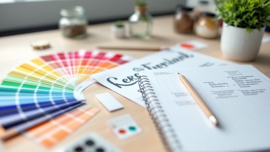
Graphic design fundamentals are the bedrock of visual communication. Think of them less as rigid rules and more as a shared language that allows you to arrange elements on a page and tell a compelling story. They’re what guide your hand in everything from choosing a color to setting up a page layout. Getting a handle on these concepts is the first real step toward creating designs that don't just look good, but actually work.
Building Your Visual Toolkit
Imagine a chef in their kitchen. They don't just toss ingredients into a pan hoping for the best. They have a deep understanding of how salt brings out flavor, how acidity cuts through richness, and how heat can completely transform a dish. Graphic design fundamentals are your ingredients. They’re the core tools you'll learn to combine with skill and intuition to create something balanced, flavorful, and satisfying for the eye.
This understanding is what separates professional, polished work from something that just feels… off. It’s the invisible framework that makes a poster easy to read at a glance instead of a confusing mess. We’ll walk through each of these core components one by one, building your knowledge from the ground up.
The Pillars of Effective Design
Before we get into the nitty-gritty, let's do a quick flyover of the key ideas we'll be covering. Each of these principles plays a unique role, contributing to both the beauty and the function of a design.
Here’s what you’ll be adding to your toolkit:
- Color Theory: We'll look at how different colors make people feel and how to build palettes that connect with your audience.
- Typography: This is about giving your words a voice by choosing and pairing fonts that are easy to read and match the message's tone.
- Layout and Composition: You’ll learn to arrange elements on a page to create a sense of order and guide the viewer’s eye.
- Visual Hierarchy: This is the art of showing people what’s most important, telling them where to look first, second, and third.
When you learn how these elements work together, you stop just decorating a page and start architecting a visual experience. You're building a clear path for the viewer's attention, and that skill is the backbone of any successful design.
The real-world importance of these skills is undeniable. Even with economic ups and downs, the global graphic design market was valued at $43.4 billion in 2025, which shows just how essential it is to businesses everywhere. Strong design is absolutely critical for building solid brand awareness and creating effective marketing materials.
Understanding the Power of Color Psychology
Color isn't just a decoration; it's a silent communicator. Long before someone reads a single word on your design, the colors you’ve chosen have already set a mood, conveyed a feeling, and started telling a story. It’s a powerful tool that builds brand identity and can even nudge people toward making a decision.
Think about it. There's a reason so many banks and tech companies lean heavily on the color blue. It’s not just a coincidence—blue has deep associations with trust, stability, and professionalism. On the flip side, you'll see fast-food chains splashing red and yellow everywhere. Those warm colors are known to spark feelings of hunger, excitement, and even a little bit of urgency.
How to Think About Color Like a Designer
To really get a handle on color, you need to know its three core ingredients: hue, saturation, and value. Don't worry about the jargon; these concepts are actually pretty simple when you break them down.
- Hue: This is the easy one. It’s just the pure color itself—red, green, blue, you name it. Think of it as the tube of paint you’re starting with.
- Saturation: Picture taking that pure, vibrant color and slowly mixing in gray paint. High saturation is the bright, intense version, while low saturation is muted and dull. The more gray you add, the less saturated it gets.
- Value: Imagine you have a dimmer switch for your color. Turning it up adds white, making the color lighter (this is called a tint). Turning it down adds black, making it darker (a shade). Value is all about the lightness or darkness of your hue.
This infographic gives a great visual breakdown of how designers weigh different principles to create visuals that really work.
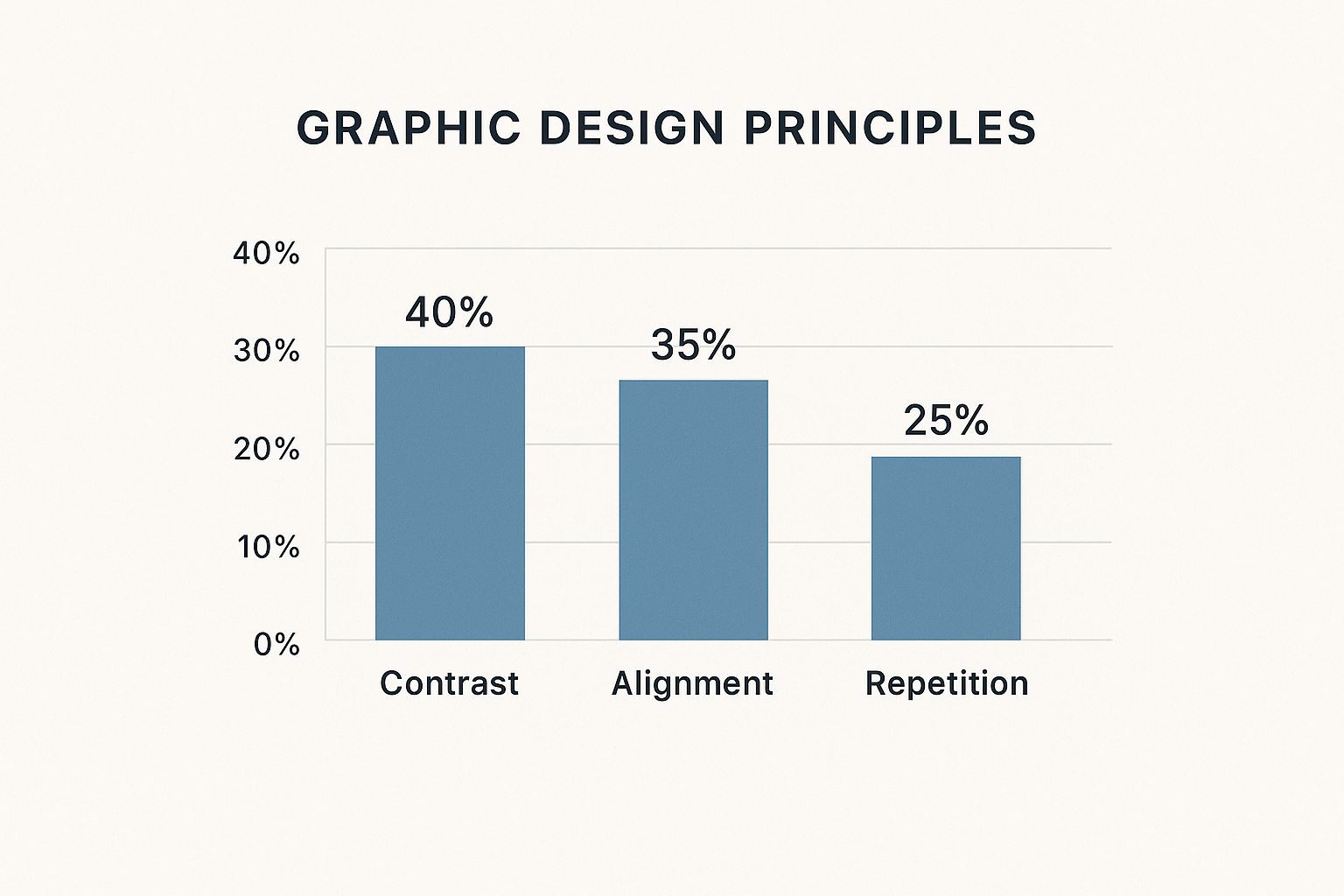
As the chart shows, while lots of things are important, creating strong contrast is often the top priority for grabbing a viewer's eye and guiding them through a design.
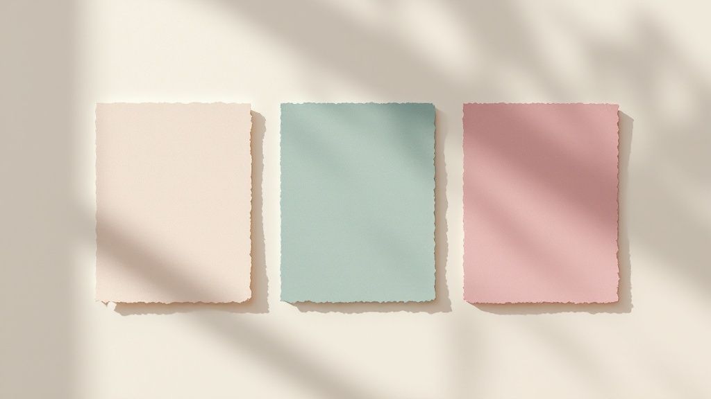
Building Color Palettes with a Purpose
Once you've got those basics down, you can start building color schemes that feel intentional and harmonious. Instead of just grabbing colors that look nice, using established color models gives you a solid foundation for creating palettes that just work.
A well-chosen color palette does more than just decorate a page; it tells a story. It guides the eye, creates a specific mood, and reinforces the core message of your design without saying a word.
For example, a complementary scheme is perfect for a call-to-action button because it creates high-energy contrast that’s hard to ignore. An analogous scheme, on the other hand, feels much calmer and is great for backgrounds or branding elements that need to feel unified. The demand for professional design is on the rise, with small and medium businesses now making up over 57% of market revenue. This is a big reason the global graphic design market is expected to hit $81.3 billion by 2030.
Color plays a huge role in how brands connect with their audience. Here's a quick look at some common emotional connections tied to different colors in Western cultures.
Emotional Associations of Common Colors in Branding
| Color | Common Psychological Association | Brand Example |
|---|---|---|
| Red | Excitement, Passion, Urgency, Danger | Coca-Cola |
| Blue | Trust, Stability, Calm, Professionalism | |
| Green | Nature, Health, Growth, Wealth | Whole Foods |
| Yellow | Optimism, Happiness, Warmth, Clarity | McDonald's |
| Orange | Friendliness, Confidence, Creativity | Nickelodeon |
| Purple | Royalty, Luxury, Wisdom, Imagination | Cadbury |
| Black | Power, Elegance, Sophistication | Chanel |
| White | Purity, Simplicity, Cleanliness | Apple |
Of course, these associations can vary across cultures, but they serve as a fantastic starting point for thinking about the non-verbal message your colors are sending.
Common Color Schemes Explained
Here are a few classic formulas that every designer keeps in their back pocket. They are the building blocks for creating visual harmony.
- Complementary: These are colors sitting directly across from each other on the color wheel (like red and green). This duo creates the strongest possible contrast, making it perfect for elements you want to make pop.
- Analogous: This involves picking three colors that are right next to each other on the color wheel (like yellow, yellow-green, and green). You see this all the time in nature, and it creates a really serene and comfortable vibe.
- Triadic: This scheme uses three colors that are evenly spaced out on the color wheel (like the primary colors: red, yellow, and blue). Triadic palettes are naturally vibrant and dynamic, giving you strong contrast while still feeling balanced.
Getting comfortable with these combinations allows you to design with intention. Whether you're laying out a brochure or creating stunning custom canvas prints, the colors you choose will directly shape how your audience feels and reacts. When you move beyond just "what looks good" and start thinking strategically, your visuals become exponentially more powerful.
Making Typography Speak Your Message
If color sets the mood, then typography is what gives your design a voice. It’s far more than just picking a font you like; it’s the craft of arranging letters and words to make the entire message clear, engaging, and easy to read. Done right, typography turns plain text into a powerful communication tool.
Think of a font as an outfit for your words. You wouldn’t show up to a black-tie gala in sweatpants, and you wouldn't send a formal wedding invitation in a playful, bubbly font. Making the right choice is one of the most critical graphic design fundamentals.
Understanding Font Personalities
At a high level, fonts fall into a few major families, each with its own vibe and purpose. Getting to know these is the first step toward choosing fonts that actually support your message instead of clashing with it.
You'll run into these three most often:
- Serif Fonts: These are the classics, the ones with tiny decorative strokes (called serifs) at the ends of the letters. Think Times New Roman. Those little feet help guide the eye, making serifs incredibly readable for long blocks of text in print, like in books or magazines. They tend to feel traditional, trustworthy, and elegant.
- Sans-Serif Fonts: "Sans" is just French for "without," so these are the fonts without the little feet. Fonts like Helvetica and Arial are clean, modern, and straight to the point. Their simplicity makes them incredibly versatile and a go-to for headlines, digital content, and minimalist designs.
- Script Fonts: These fonts look like they were written by hand, mimicking everything from formal calligraphy to casual handwriting. Because they’re so decorative, script fonts work best in small doses for adding emphasis—like on a logo, a special invitation, or a pull quote. Using them for long paragraphs is a recipe for an illegible mess.
A well-chosen typeface does more than just present information; it conveys a feeling. It can make a brand feel trustworthy, a headline feel urgent, or a quote feel inspirational before the reader has even processed the words themselves.
The Art of Font Pairing
Just like you’d pair colors to create a palette, you combine fonts to create visual interest and hierarchy. The trick to good font pairing is creating contrast that feels intentional, not chaotic. One of the most common and effective strategies is to pair a bold, modern sans-serif for your headline with a clean, highly readable serif for the body text.
This contrast does the heavy lifting for you, telling the viewer’s eye exactly where to look first. The one thing you want to avoid is pairing two fonts that are too similar—it just creates a subtle, awkward conflict that makes a design feel amateurish. As a rule of thumb, stick to two or three fonts per design to keep things clean and cohesive.
Mastering the Space Between Letters
Beyond the font itself, the spacing around your letters and lines is what separates good typography from truly professional work. It’s a bit like managing personal space in a conversation; too close feels crowded and uncomfortable, while too far feels disconnected.
Three key concepts control this spacing:
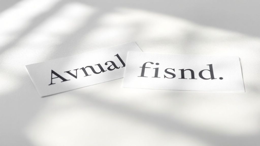
- Kerning: This is all about adjusting the space between individual pairs of letters. Some letter combinations, like "AV" or "To," naturally create awkward gaps. Good kerning tucks them in for a smoother, more balanced look.
- Tracking: While kerning is surgical, tracking adjusts the spacing uniformly across an entire word or block of text. Loosening the tracking can give text an airy, sophisticated feel, while tightening it makes it feel more compact and urgent.
- Leading: Pronounced "ledding" (like the metal), this is simply the vertical space between lines of text. Getting the leading right is absolutely essential for readability, making it easy for the reader’s eye to jump from the end of one line to the start of the next.
Nailing these subtle adjustments is what takes a design to the next level. It's a crucial skill for creating everything from posters to premium business cards printing, where every detail shapes the final impression. When the spacing is right, the message just flows.
Building a Strong Foundation with Layout and Composition
A great layout is the invisible skeleton holding your design together. It’s a core piece of graphic design fundamentals, acting as a silent guide that tells your audience's eyes exactly where to go. Without a strong composition, even the most beautiful colors and fonts can end up feeling like a chaotic mess.
Think about arranging a living room. You wouldn't just toss furniture around at random. You'd group the sofa and coffee table, align chairs to create cozy conversation spots, and leave clear paths for walking. Layout and composition work the same way—it’s all about arranging visual elements for clarity and impact.
Arranging Elements with Purpose
Four key principles are the backbone of nearly every effective layout: proximity, alignment, repetition, and contrast. Get a handle on these, and your designs will instantly look more polished and intentional.
Proximity: This is all about grouping related things together. When elements are close to each other, our brains automatically assume they're connected. Putting a caption right next to its photo, for instance, creates an immediate visual link.
Alignment: This creates a clean, organized look by making sure nothing on the page feels like it was placed by accident. When you align text and images along a shared line—left, right, or center—you get a sharp, visually connected design.
These aren't just digital rules; they are absolutely essential for print. A well-organized layout is critical when designing effective marketing pieces, from simple flyers to multi-page booklets. A solid grasp of layout helps create professional brochures printing that guides readers through the information without them even noticing.
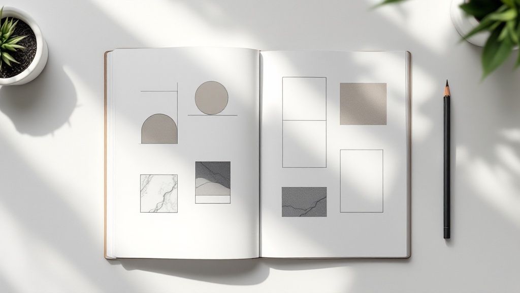
Using Grids as Your Blueprint
Think of a grid as the architectural blueprint for your design. It's an underlying structure of intersecting lines—typically columns and rows—that helps you organize and align everything with precision. The grid itself is invisible in the final product, but its influence is obvious in the design's balance and consistency.
Using a grid takes the guesswork out of placing elements. It helps you keep margins consistent, create balanced compositions, and give every element a logical home. Whether you're working on a single poster or a thick catalog, a grid provides the framework you need for a professional and cohesive result.
The best layouts don't scream for attention; they work quietly in the background, making the content easy to scan and understand. A grid is the secret tool that makes this effortless organization possible.
The Power of White Space
One of the most misunderstood yet powerful tools in any designer's kit is white space, sometimes called negative space. It's just the empty area around and between the elements in your design. A common mistake beginners make is trying to fill every single inch of the page, but that just leads to visual clutter.
White space isn't wasted space. It’s an active element that does a few critical jobs:
- Improves Readability: Giving text some room to breathe makes it much easier to read and less intimidating to the eye.
- Creates Focus: By surrounding an important element—like a headline or a call-to-action—with empty space, you immediately draw the viewer’s attention right to it.
- Adds Sophistication: A generous use of white space often signals a high-end, modern look. It conveys a sense of confidence and elegance, suggesting the content is important enough to stand on its own.
Think of it like a pause in a song. The silence is just as important as the notes, creating rhythm and adding emphasis. In design, the empty spaces are what give the other elements meaning and punch. By strategically arranging elements using alignment and proximity and then giving them breathing room with white space, you build a composition that is both beautiful and functional. This is the foundational skill that lets you create visuals that communicate with absolute clarity.
Creating a Clear Visual Hierarchy
If your layout is the skeleton, then visual hierarchy is the brain telling the body what to do. It’s the art of directing your audience’s eyes, telling them precisely what to look at first, then second, and so on. Without a clear hierarchy, your message dissolves into visual noise, leaving people confused and likely to just look away.
Think about the front page of a newspaper. You don’t just randomly scan it; your eyes are expertly guided. The enormous headline grabs your attention first, followed by a slightly smaller sub-headline, then a prominent image, and finally, the columns of text. That's a masterclass in visual hierarchy and a cornerstone of graphic design fundamentals.
This deliberate arrangement isn't just for looks—it's about function. It ensures the most critical information gets across in a split second. A strong hierarchy doesn't just make a design look better; it makes it work better by controlling the flow of information and making it effortless to understand.
Directing Attention with Size and Scale
The simplest, most effective way to build hierarchy is with size. It’s instinct. Our brains are hardwired to notice bigger things first. By making one element larger than everything else, you’re essentially shouting, “Look at me!”
This is exactly why headlines are always bigger than body copy and why a "Buy Now" button often takes up more real estate on a webpage. Scale creates immediate contrast and tells the viewer, without a doubt, what the most important part of your message is.
But it’s not just about making one thing huge. It’s about creating a clear relationship between elements of different sizes. A good design will have an obvious primary element (the biggest), secondary elements (medium-sized), and tertiary elements (the smallest), which creates a logical path for the eye to follow.
Visual hierarchy is the silent conversation you have with your audience. It's the non-verbal cue that tells them, "This is the most important thing you need to know, this is the next thing, and here are the details if you're still interested."
Leveraging Color and Contrast
Beyond pure size, color and contrast are your best friends for creating focal points. A bright, bold color will always pop against a more muted background. This is a simple but incredibly powerful way to pull attention exactly where you want it.
Picture a design that’s mostly black and white. If you drop in a single splash of vibrant color—like a red "Sign Up" button—it becomes an unmissable target for the eye. Contrast works in a few different ways to build hierarchy:
- Color Contrast: Pairing a bright, saturated color with a dark or neutral one.
- Value Contrast: Using light and dark shades of the same color to separate elements.
- Typographic Contrast: Combining a bold, heavy font with a light, thin one.
These techniques help you separate and prioritize information without just making everything bigger. A well-placed highlight can guide a user just as effectively as a massive headline. In fact, studies show a design's visual appeal is assessed in as little as 50 milliseconds, making these instant cues absolutely critical.
Strategic Placement and Spacing
Where you put things matters. A lot. People in Western cultures naturally read from top-to-bottom and left-to-right, often in a "Z" pattern across the page. Placing your most critical information along this natural reading path is an easy win to ensure it gets seen first.
This is why logos are so often placed in the top-left corner—it’s where the eye naturally begins its journey. Just as important is the space around your elements. Surrounding something with plenty of white space (or negative space) makes it stand out, giving it room to breathe. This isolation signals to the viewer that this element is important and deserves their full attention.
Bringing the Fundamentals Together in a Real Project
Understanding these principles one by one is a great start, but the real magic happens when you see them working in concert. Let's walk through a practical example to see how these concepts click together.
Imagine you've been asked to design a promotional flyer for a local "Summer Music Fest." Where do you even begin?
First up: color. The event is all about high energy and good vibes, so a warm, analogous palette of orange, yellow, and a touch of red feels perfect. That choice alone instantly sets a vibrant, exciting mood. To make sure key details pop, we can bring in a deep, contrasting blue.
From Blank Page to Balanced Layout
Next, let's talk typography. For the headline, "Summer Music Fest," a bold yet friendly sans-serif font will capture that modern, approachable feel we're going for. But for the smaller text—listing bands, times, and other details—we need something clean and super legible. A crisp serif font is a great choice here, creating a classic font pairing that immediately signals a clear visual hierarchy.
Now, we need to organize all this on the page. We'll use a simple three-column grid to give the layout an invisible backbone. This structure ensures everything from the headline to the band list feels aligned and intentional, not just randomly placed. The most important details, like the date, time, and location, will live in the central column, using proximity to group them logically.
A flyer is the perfect training ground for mastering design fundamentals. It forces you to make deliberate choices about hierarchy, color, and spacing to get a clear message across—fast.
To guide the viewer's eye, we lean on hierarchy. The event title gets top billing; it's the biggest thing on the page. The date and headlining band are the next most important, followed by the supporting acts and venue details in smaller text. We'll also be generous with white space around the edges and between sections. This breathing room is crucial for preventing a cluttered, overwhelming feel and makes everything easier to read.
This step-by-step process shows how each principle builds on the others to create something cohesive and effective. These same fundamentals scale up to more complex projects, too, from multi-page brochures to custom packaging. In fact, a strong grid and clear hierarchy are absolutely essential when designing things like well-structured custom box printing, ensuring the final product isn't just beautiful but also functional.
Your Top Questions About Design Fundamentals, Answered
Even after you get the hang of the core concepts, a few questions always seem to pop up when you start putting them into practice. Let's tackle some of the most common ones that designers run into on their creative journey.
How Many Fonts Should I Actually Use In A Design?
There’s no hard-and-fast law here, but a solid professional guideline is to stick to two or three fonts, tops. Any more than that, and you risk creating visual chaos that confuses the eye.
A classic, effective strategy is to pair a bold sans-serif for your headlines with a clean, easy-to-read serif for the body text. This contrast is intentional—it tells the viewer’s eye exactly where to look first and what to read next. Too many fonts just makes a design feel scattered and amateurish, completely undermining your message.
If I Can Only Master One Thing First, What Should It Be?
If you had to pick just one principle to nail down from the start, visual hierarchy is the undisputed champion. Think of it as the master principle that wrangles all the others—like size, color, and contrast—to guide the viewer's eye and control how they absorb information.
Without a clear hierarchy, even the most beautiful design elements become a confusing mess.
By mastering how to tell an audience what to look at first, second, and third, you ensure your design is not just pretty but also functional. It's the skill that makes visual communication click.
Is It Ever Okay To Break The Rules Of Graphic Design?
Absolutely—but only after you truly understand them. The fundamentals of graphic design aren't rigid laws; they're more like time-tested guidelines that help create clarity and visual harmony. Learning them gives you the power to make choices with purpose.
Breaking a rule without knowing why it exists usually results in a sloppy, ineffective design. But breaking a rule intentionally—to create a specific mood, grab attention, or make a bold statement—is the mark of a confident, experienced designer. It's like learning your scales before you can improvise a killer jazz solo.
How Do I Know If My Design Has Good White Space?
Using white space (or negative space) well is all about creating balance and making your content easy to read. Here's a quick trick: squint your eyes while looking at your design. If the main elements all blur together into one big blob, you probably need to add more breathing room.
Your design should feel open and uncluttered, giving your key elements the space they need to stand out. White space isn't just "empty" space; it's an active ingredient that sharpens focus, adds a touch of sophistication, and makes everything easier to digest. If your text feels cramped or your visuals look crowded, adding a little more space is almost always the solution.
Ready to see your designs come to life with professional-grade printing? 4OVER4 has a massive selection of high-quality products, from business cards to banners, to make your vision a reality. Explore our printing services today!
More from

14
When you’re ready to invest in an A-frame sign, the first question you'll ask is, "What size do I need?" It usually comes down
 Emma Davis
Mar 13, 2026

126
The real secret to mastering your direct mail budget isn't complicated. It comes down to one simple fact: a standard 4" x 6&q
Emma Davis
Mar 12, 2026

64
Tear-off flyers are a classic for a reason. They’re a tangible marketing tool, designed with perforated, removable tabs at the bottom. Each
Emma Davis
Mar 11, 2026

117
Printing stickers at home is a seriously fun and rewarding project. It boils down to four main parts: designing your image, picking the right
Emma Davis
Mar 10, 2026

104
Ever seen a logo that seems to float right on the glass of a jar or bottle? That’s the work of transparent label stickers.
Emma Davis
Mar 9, 2026

61
Picture this: your product’s beautiful label gets smudged and runny during shipping, or a gorgeous event banner fades to nothing after just
Emma Davis
Mar 8, 2026

58
In a sea of options, your product's packaging and labeling are its first, and often only, chance to make a real connectio
Emma Davis
Mar 7, 2026

89
Ever tried to print a hundred high-quality flyers on your home office printer? You probably ran out of ink, dealt with paper jams, and ended u
Emma Davis
Mar 6, 2026