Table of Contents
- Home
- content hub
- Master the elements of design: Key Principles for Visuals
Master the elements of design: Key Principles for Visuals
Oct 30, 2025494 views
Oct 30, 2025494 views
When you look at any design—a sleek business card, a vibrant flyer, a clean website—you’re seeing a collection of individual parts working together. These parts are the elements of design, and they are the absolute fundamentals of all visual work. Think of them as the ingredients for a recipe: line, shape, color, texture, space, form, typography, and size.
By learning how to handle these core components, any designer can start crafting visuals that are not just beautiful, but powerful and effective.
Deconstructing the Visual Language of Design
Every single piece of media you see is built from this same basic toolkit. These aren't just stuffy, academic terms; they're the practical tools designers reach for every day to give a layout structure, create a specific mood, or gently guide your eyes across the page. Getting a handle on them is the first real step toward creating work that truly connects with people.
It’s a bit like learning the alphabet. Before you can write a compelling story, you have to know what the letters are and how they sound. Each design element has its own personality and job, but they really shine when they collaborate to deliver a clear message or feeling. Understanding how they all fit together is what separates placing things on a page from creating a genuine visual experience.
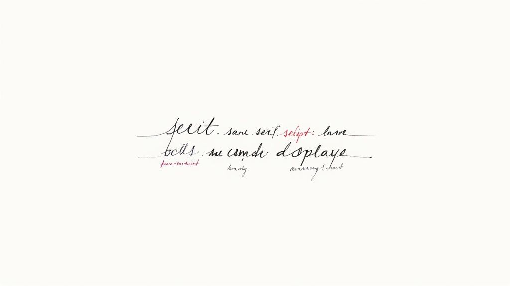
This infographic does a great job of showing how some of these core elements relate to each other.
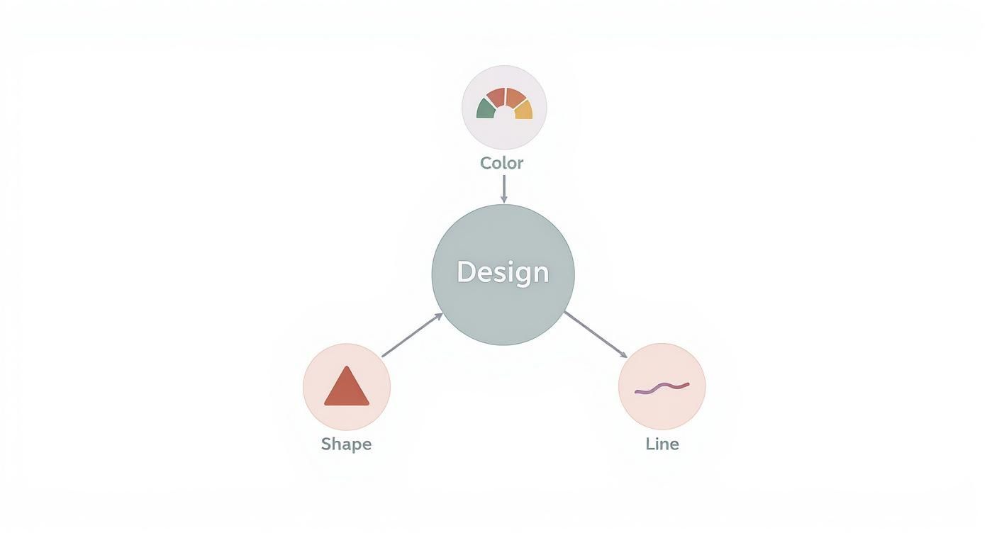
As you can see, foundational elements like line, shape, and color act as the main pillars. Once you have those in place, you can build more complex, interesting, and effective compositions.
Why These Elements Matter
When you really get these concepts, you start making choices with purpose. No more guessing which font looks "right" or what color might work. Instead, you can make informed decisions based on proven principles that shape how people perceive your design. This is the moment design stops being a subjective art form and becomes a strategic tool for communication.
For any business, that shift is huge. The way you use these elements has a direct line to how customers feel about your brand.
Great design is not just about making things look good. It's about creating clarity, building trust, and solving problems. Each element is a decision that either supports or detracts from your overall message.
By using these building blocks deliberately, you make sure every piece of your brand—from business cards to trade show banners—is telling the same story. If you want to see how these principles come to life in the real world, check out the huge variety of professionally designed marketing materials that put these very elements into practice.
Now, let’s break down each element one by one.
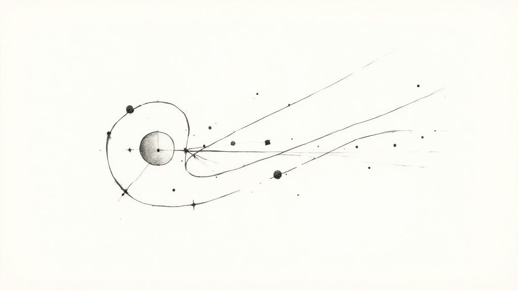
Using Line and Shape to Guide the Eye
At the absolute core of every visual design, you’ll find two rock-solid elements: line and shape. Think of a line as the path your eye wants to follow. It isn’t just a simple divider; it’s a director, subtly telling you where to look, what matters most, and even how you should feel about it.
Straight, crisp lines often bring a sense of order, structure, and professionalism. You see this all the time in sharp corporate logos and formal invitations. On the flip side, soft, curved lines feel more organic, gentle, and calming, which makes them a perfect fit for wellness or comfort-focused brands. A strong diagonal line? That injects instant energy and movement, and it’s why they’re so powerful on posters for concerts and sporting events.
Building Recognition with Shape
When you connect lines, they create shapes—the true building blocks of recognition. Our brains are hardwired to identify shapes in a split second, which is why they are so vital for creating logos and icons that stick. Shapes generally fall into two camps:
- Geometric Shapes: These are your familiar circles, squares, and triangles. They feel structured, stable, and reliable. A logo built around a solid square, for instance, practically screams strength and dependability.
- Organic Shapes: Think of the irregular, free-form shapes you see in nature, like leaves, puddles, or clouds. They give off a feeling of spontaneity and approachability, helping a brand feel more human and less corporate.
By weaving different lines and shapes together, you can tell a powerful visual story without saying a word. The sharp angles of a custom die-cut sticker can give it a modern, edgy feel, while the rounded corners on a business card might come across as friendlier and more inviting.
A design’s underlying structure is built on the silent conversation between line and shape. They work together to create hierarchy, draw focus to key information, and establish the overall tone before a single word is even read.
This principle is absolutely essential for large-format designs. Imagine you’re designing custom wall graphics for an office. You could use bold, leading lines to guide visitors through the space, almost like a path. At the same time, large, simple shapes could define different zones without needing actual walls. When you get a handle on these foundational elements, you gain real control over how your audience interacts with and understands your design.
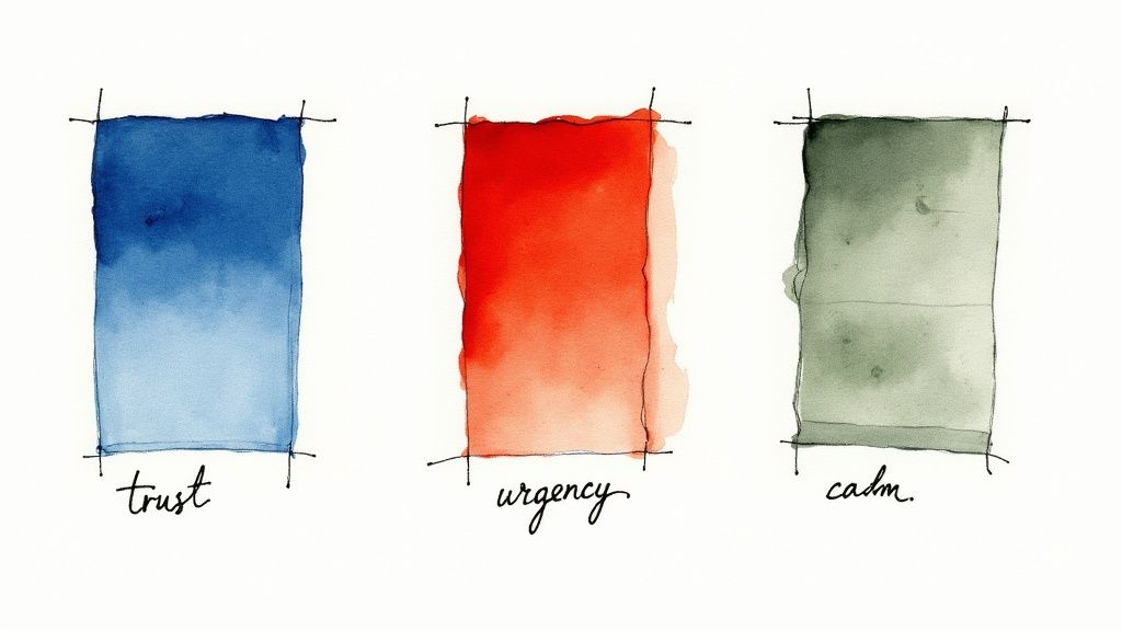
Applying Color and Texture to Create Mood
If line and shape are the skeleton of a design, then color and texture are its heart and soul. These are the elements that breathe life, emotion, and personality into your work. They have the power to turn a simple layout into a memorable experience, connecting with your audience on a gut level long before they read a single word.
Color is far more than just a decorative touch; it's a silent language. Think about it: a tech startup often leans on blue to signal trust and stability. A fast-food joint splashes red everywhere to stir up feelings of excitement and urgency. These aren't just random shots in the dark—they're strategic decisions rooted in powerful psychological associations.
Getting a handle on the psychology of color choices is a game-changer. It’s what separates good design from truly great design.
Weaving Emotion with Palettes and Textures
Picking one color is just the starting point. The real magic unfolds when you build a color palette. For instance, a monochromatic scheme—using various shades and tints of a single color—creates a polished, sophisticated vibe. On the flip side, a complementary palette, which uses colors from opposite sides of the wheel, dials up the contrast and energy.
Texture, which is all about an object's surface quality, brings in another layer of sensory detail. It can be literal, something you can actually feel, or implied, something you just see. The roughness of a recycled business card is a literal texture. A grainy filter on a digital photo, however, creates an implied rustic texture on a smooth screen.
Color and texture are a team. They work together to shape a design’s personality. A bright, glossy color paired with a smooth texture feels modern and sleek. Muted earth tones combined with a rough, natural texture feel grounded and authentic.
Bringing Your Designs to Life
This interplay between color and texture can define an entire brand identity. Picture a brochure for a high-end spa. It probably uses a calming, monochromatic palette of soft greens and whites, paired with the implied texture of smooth stones or gentle water ripples. That combination instantly says "tranquility and luxury."
This synergy is especially powerful in print. A grainy, tactile paper stock can make a photograph feel nostalgic and warm. You can see this effect come to life in custom canvas prints, where the material's texture transforms a simple picture into a piece of art with tangible depth. Mastering the dance between the right color palette and the perfect texture is a cornerstone of great design.
Using Space and Form to Guide the Eye
Space and form are the dynamic duo of design, working together to lead your audience through a layout and create a clear sense of focus. Space, which you’ll often hear called whitespace or negative space, is anything but empty. It's an active ingredient that gives every other element room to breathe, boosting clarity and adding a touch of elegance.
Think of it like a spotlight on a stage. It’s the darkness surrounding the performer (negative space) that makes them (positive space) the undeniable center of attention. In design, putting generous space around your logo or a key headline does the exact same thing. It tells the viewer, "Pay attention. This part is important."
Giving Your Designs Real-World Depth
While space helps organize your design on a flat surface, form is what gives it a sense of three-dimensional reality. Form is the magic that makes a simple, flat shape feel like it has actual weight and volume. Designers pull off this illusion by playing with light, shadow, and perspective, making objects feel tangible enough to touch.
A perfect example is turning a simple circle into a sphere just by adding a soft gradient and a subtle drop shadow. That jump from a flat shape to a believable form adds a layer of realism and depth, making the entire design more engaging. When used together, space and form build a rock-solid visual hierarchy.
By mastering the relationship between an object and the space around it, you control the narrative of your design. You decide what the viewer sees first, second, and third, creating a seamless and intuitive user experience.
Lessons from Design History
This structured approach is nothing new; it has deep roots in some of the most influential design movements. The Swiss Style of the 1950s and ‘60s was all about clarity, using grid-based layouts and a strong visual hierarchy to direct the viewer’s eye. This movement showed that well-structured design could improve reader comprehension by up to 40%—a principle that’s still fundamental today.
These principles are absolutely critical in print. When you’re designing something like full-color presentation folders, a clean layout with plenty of whitespace around your logo and key text instantly screams professionalism. Adding a subtle form through embossing can also give the folder a premium, tactile quality that leaves a lasting impression.
Making Typography Your Most Powerful Tool
Typography is so much more than just the words on a page; it's the visual voice of your message. Before anyone even reads the first word, the fonts you choose are already hard at work, setting the tone and shaping perceptions. Think of it this way: every typeface has its own personality and carries a unique psychological weight, making font selection a critical strategic move.
For instance, a traditional law firm looking to project authority and trustworthiness will almost certainly lean towards a classic serif font—those little finishing strokes convey a sense of history and reliability. A cutting-edge tech startup, on the other hand, wants to appear innovative and approachable, making a clean, modern sans-serif font the obvious choice. The font itself reinforces the brand's identity at a glance.
The Nuances of Professional Type
But great typography goes beyond just picking a font family. The real magic lies in the details—the subtle adjustments that separate polished, professional work from something that just looks "off." Getting these right ensures your text is not just readable but also visually balanced and a pleasure to look at.
These key principles are your best friends:
- Kerning: This is all about adjusting the space between individual pairs of letters. Think "AV" or "To." Without good kerning, you get awkward gaps or collisions that disrupt the flow.
- Tracking: This adjusts the spacing across an entire word or block of text. It helps control the overall density and can make text feel airy and open or tight and impactful.
- Leading (pronounced "ledding"): This is the vertical space between lines of text. Getting it right is crucial for preventing text from feeling cramped and making long paragraphs easy to follow.
Even tiny tweaks to these settings can make a world of difference, giving your designs a clean, professional finish. This level of detail is absolutely essential for creating high-quality, memorable business cards that build trust.
"Typography is the voice of your design. The right typeface can whisper, shout, or sing, but the wrong one can mumble incoherently, undermining your entire message."
Choosing the Right Typeface for Your Project
Selecting the right font family is the first step in harnessing the power of typography. Each category has a distinct personality and is suited for different purposes. This table breaks down the most common typeface categories to help guide your decision.
| Typeface Category | Conveys Mood Of | Common Use Cases | 4OVER4 Print Example |
|---|---|---|---|
| Serif | Tradition, authority, reliability, elegance | Books, newspapers, formal invitations, professional services branding | High-end real estate brochures, law firm letterhead |
| Sans-Serif | Modernity, clarity, approachability, minimalism | Websites, digital ads, corporate branding, signage | Tech startup business cards, event posters |
| Script | Elegance, creativity, personality, luxury | Wedding invitations, boutique branding, high-end packaging | Custom thank-you cards, luxury product labels |
| Display | Boldness, uniqueness, attention-grabbing, fun | Headlines, logos, posters, promotional flyers | Music festival flyers, retail sale banners |
By matching the typeface to your project's goals, you create a cohesive message that resonates with your audience from the very first impression.
From Handcraft to Mass Production
The power of typography and other design elements truly exploded during the Industrial Revolution (1760–1840). Before this, design was a handcrafted art. But with inventions like lithography and the steam-powered press, it suddenly became a tool for mass communication.
Literacy rates were soaring—reaching around 70–80% in Western Europe by 1850—and a huge new audience for printed materials like posters and packaging was born. This was the moment graphic design became a profession, driven by the need to speak to a growing consumer culture. To dig deeper into these historical shifts, check out Shutterstock's blog on graphic design movements. This history shows how typography evolved into a formidable tool for shaping public perception on a massive scale—a role it continues to play in every effective design today.
How to Combine the Elements Effectively
Knowing the individual elements of design is like learning the notes on a piano. But true artistry comes when you combine those notes to create a melody. Great design isn't about cramming every element you know into one project; it's about choosing the right ones so they work together to tell a single, cohesive story.
This is where the magic happens. It’s what turns a random collection of shapes and colors into a powerful piece of communication. Every choice you make should reinforce the others. The crisp lines in your layout should feel like they belong with the clean, sans-serif font you've picked out. The vibrant color palette should amplify the energetic mood you're going for.
Think about an event poster that really grabs you. It doesn't just list information—it creates an entire vibe. Bold typography might shout for your attention, while sharp, diagonal lines inject a sense of movement and urgency. A high-contrast color scheme adds a jolt of excitement, and smart use of space makes sure the most important details are impossible to miss. Every single decision works toward one unified goal.
From Theory to Action
Applying these ideas really just means paying attention to how the elements interact out in the wild. One of the best ways to learn is to simply deconstruct designs you admire. Notice how a minimalist app uses tons of negative space and a simple color palette to feel clean and intuitive. Or look at how a luxury brand uses elegant script fonts and subtle textures on its packaging to whisper "quality."
If you want to see how this plays out in a commercial setting, these essential visual merchandising guidelines offer a great look at how these elements drive customer engagement in retail spaces.
The most powerful designs are the ones where the elements are so perfectly blended that you don't even notice them individually. Instead, you just feel the intended message—be it clarity, urgency, trust, or joy.
At the end of the day, combining the elements of design effectively boils down to being intentional. Before you start your next project, take a moment to consciously think through each component. Ask yourself:
- Does my use of line guide the viewer's eye exactly where I want it to go?
- Is the color palette I chose actually reinforcing the mood I'm trying to create?
- Does the typography have the right personality for this message?
When you start orchestrating these components with a clear purpose, you stop just decorating a page and start crafting powerful, memorable visual experiences.
Frequently Asked Questions About Design Elements
Getting into design can feel like you're trying to learn a whole new language. As you start digging into the fundamental elements of design, it's totally normal to have a few questions. This section is all about giving you clear, simple answers to the stuff people ask most, so you can build a solid foundation and start creating with more confidence.
Once these concepts click, you'll go from just putting things on a page to creating smart, effective visual communication. Let's clear up a few key points.
Which Design Element Is Most Important?
That's a classic question, but it’s kind of like asking what the most important ingredient in a cake is—it really depends on the cake you’re baking! There isn’t a single “most important” element. Their value is all about the specific goals of your project.
For a minimalist logo, for instance, shape and space might be the heroes, working together to make a clean, memorable mark. But if you're designing a vibrant poster for a music festival, color and typography will probably steal the show to build energy and demand attention. The best designers know the elements are a team, and the real skill is knowing which players to put forward to get the job done.
The most effective designs don't rely on a single star element. Instead, they create a powerful synergy where line, color, shape, and typography all work together to support a unified message.
What Is the Difference Between Shape and Form?
This one trips up a lot of beginners, but it's simpler than it sounds. The easiest way to remember it is that shape is two-dimensional (2D), while form is three-dimensional (3D). A shape, like a circle or a square you draw on a piece of paper, only has height and width.
Form, on the other hand, has height, width, and depth. It's what gives an object a sense of volume, making it feel like it takes up real space. Designers create the illusion of form on a flat surface using tricks like shading, perspective, and highlights. For example, adding a simple gradient and a soft shadow can instantly turn a flat circle (a shape) into a sphere (a form). This is key for making products on flyers or brochures look tangible and real.
Can You Use All Design Elements in One Project?
Technically, you could—but it's almost never a good idea. Trying to cram every single design element into one piece is the fastest way to create a cluttered, confusing mess. Great design is about making intentional choices, and that often means holding back.
Think of it like conducting an orchestra. Even though every instrument is available, a composer doesn't have them all blasting at full volume at the same time. The magic comes from a thoughtful arrangement where some elements take the lead and others offer quiet support in the background. Your job is to pick only the elements that truly serve your message and use them with purpose to create something clear and powerful.
Ready to see how these elements come to life in high-quality print? At 4OVER4, we specialize in turning your well-crafted designs into tangible marketing materials that make an impact. Explore our wide range of professional printing solutions at https://4over4.com.
More from

13
When you’re ready to invest in an A-frame sign, the first question you'll ask is, "What size do I need?" It usually comes down
![]() Emma Davis
Emma Davis
Mar 13, 2026

113
The real secret to mastering your direct mail budget isn't complicated. It comes down to one simple fact: a standard 4" x 6&q
![]() Emma Davis
Emma Davis
Mar 12, 2026

64
Tear-off flyers are a classic for a reason. They’re a tangible marketing tool, designed with perforated, removable tabs at the bottom. Each
![]() Emma Davis
Emma Davis
Mar 11, 2026

112
Printing stickers at home is a seriously fun and rewarding project. It boils down to four main parts: designing your image, picking the right
![]() Emma Davis
Emma Davis
Mar 10, 2026

103
Ever seen a logo that seems to float right on the glass of a jar or bottle? That’s the work of transparent label stickers.
![]() Emma Davis
Emma Davis
Mar 9, 2026

60
Picture this: your product’s beautiful label gets smudged and runny during shipping, or a gorgeous event banner fades to nothing after just
![]() Emma Davis
Emma Davis
Mar 8, 2026

58
In a sea of options, your product's packaging and labeling are its first, and often only, chance to make a real connectio
![]() Emma Davis
Emma Davis
Mar 7, 2026

89
Ever tried to print a hundred high-quality flyers on your home office printer? You probably ran out of ink, dealt with paper jams, and ended u
![]() Emma Davis
Emma Davis
Mar 6, 2026