Table of Contents
- Home
- content hub
- Master Visual Hierarchy in Design for Better UX
 Share and earn
Master Visual Hierarchy in Design for Better UX
Aug 9, 20251908 views
Aug 9, 20251908 views
Ever had a design just click? You knew exactly where to look, what to read first, and what to do next without even thinking about it. That's visual hierarchy at work. It's the silent director of your design, subtly telling your audience's eyes where to go and in what order.
This principle is what transforms a jumbled mess of text and images into a clear, intuitive, and genuinely effective experience.
What Is Visual Hierarchy and Why It Matters
Imagine walking into a library where every single book has an identical, plain gray cover. Same font, same size, same color. Finding the one you need would be a nightmare. That's exactly how people feel when they land on a website or look at a flyer that lacks a clear visual hierarchy. It's the invisible force that brings order out of chaos, creating a path of least resistance for our brains.
At its heart, visual hierarchy in design is all about communication. It uses simple visual cues—like size, color, contrast, and placement—to signal importance. A big, bold headline basically screams, "Read me first!" while smaller, lighter-colored text whispers, "I’m just extra details if you're interested." This isn't just about making things pretty; it's a core part of the user experience that directly shapes how well people understand and connect with your message.
The Purpose of a Clear Structure
A well-crafted hierarchy does more than just organize your content; it makes it work. Its main job is to create a frictionless journey for the user, slashing their cognitive load and making information incredibly easy to digest. When people can find what they’re looking for in seconds, they stick around, they engage, and they're far more likely to take action.
Think of it this way: visual hierarchy arranges your design's information from most to least important. It establishes order, letting users navigate effortlessly to find exactly what they need.
This all ties back to the bigger picture of why design matters in the first place. You can see this reflected in conversations about the importance of web design for business growth. A strong hierarchy is a non-negotiable ingredient for building a professional, trustworthy brand, whether it's on your homepage or a simple business card.
The table below really breaks down how the goals of hierarchy deliver tangible benefits, showing just how critical this concept is for any successful design.
Core Functions of Visual Hierarchy
This table illustrates how specific visual hierarchy goals translate into measurable user experience benefits.
| Goal of Hierarchy | Key Principle Applied | Resulting User Benefit |
|---|---|---|
| Establish a Focal Point | Using a large, high-contrast element (e.g., a bold headline). | The user immediately knows where to start, reducing confusion. |
| Create Information Flow | Guiding the eye with alignment and proximity. | The user can easily scan and understand content in a logical sequence. |
| Highlight Key Actions | Making a call-to-action button visually distinct with color. | The user knows exactly what action to take next, improving conversion rates. |
| Improve Readability | Using typographic scale (headings, subheadings, body text). | The content is scannable and less intimidating to read. |
By mastering these functions, you move from simply placing elements on a page to strategically guiding your audience through a compelling visual story.
The Building Blocks of Visual Hierarchy
To really get a handle on visual hierarchy in design, you need to know the tools you're working with. I like to think of these core principles as ingredients in a recipe. Each one brings its own unique flavor, but they're most powerful when you combine them just right to create something truly satisfying. A great designer uses these building blocks to arrange content, guiding a person's eye from the most important message down to the supporting details in a way that feels totally effortless.
So, let's break down these foundational elements. You'll see how simple tweaks to things like size, color, and spacing can turn a jumbled mess into a clear and compelling visual story. Nailing these principles is the key to creating designs that don't just look pretty, but communicate with razor-sharp clarity.
This infographic gives you a great overview of the main categories and how they all lock together to form a solid design strategy.
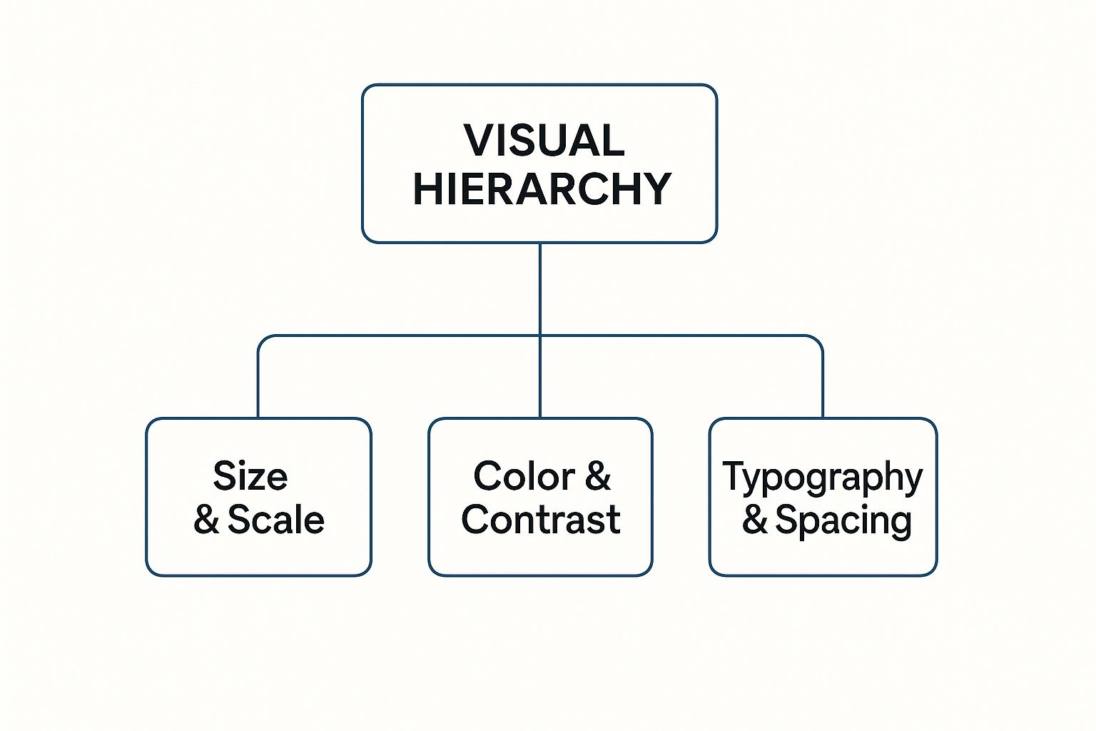
As the diagram shows, a strong visual hierarchy is built on three pillars: how you handle the scale of different elements, your use of color and contrast, and the smart organization of your text and space.
Size and Scale Command Attention
Of all the tools in your kit, size is the most direct and powerful. It’s a primal cue our brains are wired to notice. Big things feel important; small things fade into the background. It’s that simple.
Think about designing a concert poster. The band's name is almost always the biggest thing on the page. Why? Because it’s the most critical piece of info. The date and venue come next in size, followed by smaller details like the ticket price. That's size and scale creating an instant order of importance, no explanation needed.
By making an element larger, you're boosting its visual weight—the force it uses to pull the eye in. This is the simplest way to set up a main focal point.
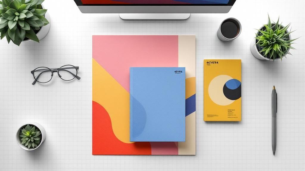
This idea translates directly to print materials from 4OVER4. On a business card, your name and logo should be noticeably bigger than your email or phone number. The recipient instantly knows who you are and what company you're with.
Color and Contrast Create Focus
Color is so much more than decoration. It’s a powerful tool for creating contrast and stirring up emotion. Bright, bold colors seem to jump right off the page, demanding your attention, while muted, neutral tones make for a quiet, steady backdrop.
Picture a webpage showing dozens of products. If every "Add to Cart" button were a bland gray, they’d get lost in the noise. But make them a vibrant, contrasting color—like a punchy orange against a blue background—and they instantly become beacons, showing the user exactly what to do next. It's no secret that a high-contrast call-to-action can dramatically increase engagement.
Here’s how color and contrast play together:
- High Contrast: Putting light elements on dark backgrounds (or vice-versa) creates a strong separation. This makes text easier to read and helps key elements pop.
- Color Temperature: Warm colors like red and orange feel energetic and tend to advance toward you. Cool colors like blue and green are calming and tend to recede.
- Saturation: In a design full of muted tones, a single, highly saturated color will immediately grab the eye. This makes it perfect for highlighting a key statistic on a flyer or a special offer on a postcard.
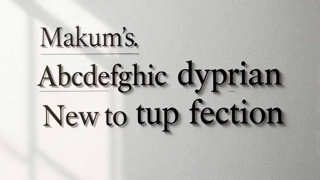
Typography Guides the Reader
Typography isn't just about picking a cool font. It's the art of arranging type to make your words legible, readable, and appealing. For any design that relies on text, a well-defined typographic hierarchy is absolutely essential.
It works by using different font sizes, weights (like bold, regular, or light), and styles (like italics or all caps) to sort your content into clear levels.
- Primary Level (Headlines): This is your biggest, boldest text. It's there to grab attention and give a quick summary of what’s to come.
- Secondary Level (Subheadings): These break up longer chunks of text, making the whole thing easier to scan and digest. They're smaller than headlines but bigger than the main text.
- Tertiary Level (Body Copy): This is your main content. The goal here is a clean, legible font at a size that’s comfortable to read.
Proximity and White Space Create Relationships
The principle of proximity is simple: we see things that are placed close together as a related group. When you see a caption right next to a photo, your brain instantly assumes they belong together. Designers use this trick all the time to organize information without needing clunky boxes or lines. On an event invitation, for example, the date, time, and location are all grouped together because they form one cohesive block of information.
Then there’s white space (or negative space)—the empty area around your design elements. It's anything but "wasted" space. In fact, it's an active and crucial part of your design.
Generous white space gives your content room to breathe. It cuts down on clutter and can make your focal points feel much more impactful. It guides the eye by creating separation and emphasis.
Think about a high-end art gallery. The paintings aren't all crammed onto the wall. They’re given plenty of space so you can appreciate each one individually. The same logic applies to your designs. Whether you're working on a brochure or a massive banner, giving your elements enough breathing room makes your message clearer and more professional.
Where Design Hierarchy Comes From

This whole idea of intentionally guiding a person’s eye isn't some new-fangled concept cooked up for the internet. The principles of visual hierarchy have deep roots, stretching back through centuries of art, typography, and good old-fashioned communication theory. What we now do on screens is really just an evolution of ideas that solved the same problems on paper a long, long time ago.
If you want to get a real feel for visual hierarchy in design, it helps to look back at the game-changing movements of the 20th century. These weren't just passing artistic trends; they were very intentional efforts to bring order and clarity to an increasingly noisy world.
The Rise of Modernist Principles
The DNA of today’s visual hierarchy can be traced directly to movements that put function squarely before flourish. It started with the German Bauhaus school back in 1919, which championed the whole 'form follows function' philosophy. They stripped things back to simple geometric shapes and clean, uncluttered layouts, all in the name of clarity.
This paved the way for the Swiss Design movement (also known as the International Typographic Style) that took hold in the 1950s. Designers from this era were all about grid systems, crisp sans-serif fonts, and asymmetrical layouts to create designs that were objective and incredibly easy to read.
These pioneers weren't just picking what looked cool. They were diving into human perception, figuring out how people see and process information, and then systematically arranging things to make posters, books, and ads more intuitive.
"The grid system is an aid, not a guarantee. It permits a number of possible uses and each designer can look for a solution appropriate to his personal style. But one must learn how to use the grid; it is an art that requires practice."
– Josef Müller-Brockmann, a pioneer of the Swiss Style
This methodical, almost scientific approach to arranging elements was a direct forerunner to the user experience (UX) design we obsess over today. The goal has always been the same: lead your audience through the content in a way that feels natural and makes sense.
From Print to Pixels
When design made the big leap from printed pages to digital screens, these foundational principles didn't just vanish—they adapted. The challenges were new, sure, with things like interactivity and different reading habits to consider. But the core solutions? Remarkably consistent.
Think about it: the structured, grid-based thinking of Swiss Design is the direct ancestor of the frameworks we use to build websites. That clean, organized layout you see on most sites didn't come out of nowhere. It’s a legacy handed down from print designers who were chasing clarity and order.
This historical backbone led straight to our modern understanding of how people scan digital content. Thanks to eye-tracking studies, we’ve uncovered some common behaviors that smart designers now use to their advantage.
Common Digital Scanning Patterns
By watching where people’s eyes actually go on a webpage, researchers found a few predictable paths that crop up again and again. Two of the most famous are:
The F-Pattern: On pages with a lot of text, like a blog post or search results, people tend to scan in a shape that looks like the letter "F." They’ll read the headline across the top, then their eyes will drift down the left side, occasionally darting back into the content on a lower horizontal line. This is why we put our most important stuff—headlines, subheadings, and key points—along that natural path.
The Z-Pattern: For simpler layouts with less text, like a landing page, the eye often moves in a "Z" shape. It goes from the top-left to the top-right, then cuts diagonally down to the bottom-left, and finishes by shooting across to the bottom-right. This makes the four corners of your design prime real estate for your logo, key message, and that all-important call-to-action button.
These patterns are proof that effective visual hierarchy isn't just guesswork. It's about designing in harmony with how people are already wired to see the world—a timeless tradition that connects a vintage Bauhaus poster to the sleekest modern app.
Here’s the rewritten section, designed to sound completely human-written and natural, as if from an experienced expert.
How Visual Hierarchy Speaks to the Brain
Ever wonder why your eyes jump straight to one part of a design, almost ignoring everything else? It’s not a random fluke. It’s psychology in action. The way our brains interpret visual information is hardwired, and a smart visual hierarchy taps directly into those instincts to make a design feel effortless.
When a layout just feels right, it’s usually because the designer has done the heavy lifting for us. Instead of forcing your brain to decode a jumble of information, the design guides you. Think of it as a quiet conversation between the page and your mind, with the principles of visual hierarchy acting as the perfect translator.
The Brain Craves Order
At our core, we are pattern-seeking creatures. When faced with chaos, our brains immediately start trying to group things and create structure. This isn't just a quirk; it's explained by the Gestalt Principles, a fascinating set of ideas from psychology that reveal how we see whole patterns instead of just a bunch of separate parts.
By understanding how the brain naturally organizes what it sees, designers can arrange elements in a way that feels intuitive. It’s less about artistic whim and more about aligning with deep-seated human psychology.
Imagine walking into a messy, cluttered room. Your mind struggles to make sense of it all. Now picture a tidy, organized room where you can instantly spot the bed, the desk, and the closet. A good design is that tidy room—it makes sense at a glance.
This image is a perfect example of a few Gestalt principles at work, showing how our brains naturally cluster dots based on how close they are, how similar they look, or if they’re connected.
What you’re seeing is your brain automatically creating relationships. The dots grouped closely together feel like a single unit (Proximity), while the red dots stand out from the black ones as a distinct group (Similarity).
Cognitive Shortcuts That Guide the Eye
Designers use these psychological shortcuts to build a clear visual hierarchy in design. Here’s how some of those key Gestalt principles play out in the real world:
- Proximity: We see things placed close together as a related group. It’s why you’ll always find a photo caption snuggled up right next to its image, or why contact details are clustered together on a business card.
- Similarity: We naturally group things that look alike. By using the same font, color, or size for all your H2 headings, you’re sending a clear signal: "These all have the same level of importance."
- Figure-Ground: Our brains are masters at separating a focal point (the figure) from its background (the ground). High contrast is a powerful tool to make your key message the undeniable "figure."
- Focal Point: The brain is always drawn to what’s different. A pop of bright color in an otherwise muted design, or one giant photo among several smaller ones, creates an instant focal point that pulls the viewer in.
When you apply these principles, you’re creating a visual language that people understand instinctively. You’re not just pushing pixels around; you’re speaking directly to the viewer’s subconscious.
Data-Backed Design for Our Short Attention Spans
In a world where attention is the ultimate currency, this psychological approach isn’t just a nice-to-have—it’s essential. Studies repeatedly show how vital a clear hierarchy is for keeping people engaged. Designs that follow natural scanning patterns, like the Z-pattern or F-pattern, don’t just feel easier to read; they can lead to a 25% increase in task efficiency. You can dig into more data on how visual hierarchy drives user interaction on Number Analytics.
This proves that a strong visual hierarchy isn’t just about making things look pretty. It’s a science-backed method for making complex information digestible, compelling, and effective. It's the secret to grabbing attention and making sure your message isn’t just seen, but actually understood.
Putting Visual Hierarchy into Practice
Knowing the theory is one thing, but actually putting visual hierarchy in design to work is where the magic really happens. This is the moment you stop talking about abstract principles and start creating tangible results—whether that’s a business card people actually keep or a website that turns casual visitors into loyal customers. It all comes down to making deliberate, thoughtful choices.
Let’s get practical. Say you're designing a flyer for a local concert. Your main goal? Get people to show up. A solid hierarchy makes this happen by grabbing their attention with a big, bold headline—the band's name. From there, you guide their eyes to the next crucial details, like the date and time, before they land on the smaller print with the venue address. Every choice, from the font size to the color, serves that single, clear purpose.
The same logic works just as well in the digital world. Think about a landing page. The hero image and main headline are huge for a reason: they have seconds to hook you. The call-to-action button is almost always the brightest, most contrasting element on the page, making it an unmissable target for your cursor.
From Static Print to Interactive Screens
While the core ideas are the same, how you apply them shifts a bit when you move between print and digital. A printed piece, like a stunning brochure from 4OVER4, is static. Once it’s printed, the user’s journey is locked in by your layout. A digital interface, on the other hand, is alive and interactive.
This difference is critical. With print, you get one shot to make your point. On a website, the hierarchy has to guide people through multiple steps, clicks, and actions. Mastering this is key, especially as new technologies like AI art generator tools give us even more ways to experiment with visual influence.
The data backs this up, too. Eye-tracking studies have shown that size is king, with larger elements grabbing 65% more initial attention. Bright colors can boost focus by around 30% compared to muted ones. On the flip side, getting it wrong is costly; 75% of users admit they’ll bounce from a site if they can’t quickly find what they’re looking for.
Visual Hierarchy Application Print vs Digital
To truly make smart design choices, it helps to see how these principles adapt to different mediums. This table breaks down how the same core concepts are applied differently in print and on a screen.
| Principle | Application in Print Design (e.g., Brochures, Posters) | Application in Digital Design (e.g., Websites, Apps) |
|---|---|---|
| Size & Scale | A massive headline and a powerful image create one focal point that grabs attention, even from across a room. | Hero banners and key value propositions are made large, while interactive elements like buttons are sized for easy clicking or tapping. |
| Color & Contrast | High contrast is your best friend for making key details—like dates or special offers—pop instantly off the page. | Color is used to signal interactivity. A button changing color on hover, for example, gives the user immediate feedback. |
| Typography | A clear typographic scale (headings, subheadings, body text) walks the reader through a fixed story on the page. | Typography must be readable on different screen sizes. Styles need to clearly distinguish between clickable links and static text. |
| Spacing | White space is used to group related info (like event details) and separate different sections to avoid a cluttered mess. | Spacing not only groups content but also defines clickable areas and creates a breathable, scannable layout that prevents user fatigue. |
Seeing them side-by-side makes the distinction clear. In print, your hierarchy builds a path for the eyes. In digital, it must also build a path for action.
Ultimately, putting visual hierarchy into practice means becoming a thoughtful decision-maker. It’s about asking "why" for every single element you place on the page or screen. Why is this headline so big? Why is this button bright red? Why is this text clustered together?
When every choice has a clear purpose, you create designs that aren't just beautiful—they're powerfully effective, no matter where they live.
Alright, let's tackle some of the lingering questions that pop up when you start moving visual hierarchy from theory to practice. It’s one thing to understand the principles, but it’s another thing entirely to know if your design is actually working in the wild.
This is where the rubber meets the road. Getting these details right can be the difference between a design that feels intuitive and one that just falls flat. Let's dig into a few of the most common questions designers face.
How Do I Know If My Visual Hierarchy Is Effective?
The quickest way to see if you’ve nailed your hierarchy is to test it. You don't need fancy software for this, either. One of the oldest tricks in the book is the simple "squint test."
Just take a step back from your screen or printed proof and squint your eyes until everything gets blurry. What jumps out? The shapes and elements that still pop are sitting at the top of your visual food chain. If those are your headline and main call-to-action, congratulations—you're on the right track.
Another brilliant, low-tech method is the 5-second test. Grab a colleague or friend, show them your design for just five seconds, and then hide it. Ask them what they remember. Their gut reaction is a pure, unfiltered look at what your hierarchy is communicating. Did they catch the main offer and the "Buy Now" button? Fantastic. Did they get lost looking at a decorative swoosh? Time for a tweak.
An effective visual hierarchy doesn't force someone to think. It's a silent guide, effortlessly leading the eye from the most important message down to the details without any friction.
For digital work, you can get even more granular.
- Heatmaps are fantastic for this. They give you undeniable proof of where people are actually looking and clicking, showing you your design’s true focal points.
- A/B Testing is the ultimate tie-breaker. You can pit two layouts against each other and let the data tell you which hierarchy drives more clicks or conversions.
At the end of the day, if people can instantly grasp what your design is for and find what they need, your hierarchy is doing its job.
What Are the Most Common Mistakes in Visual Hierarchy?
It's surprisingly easy to get visual hierarchy wrong, but most confusing layouts suffer from the same few slip-ups. The number one offender is having no clear focal point. When every element is yelling for attention, nothing gets heard. It’s a classic case of "design by committee" that just results in visual chaos.
Another all-too-common problem is neglecting whitespace. Designs that are crammed and crowded feel claustrophobic and are a nightmare to scan. You have to remember that the empty space around your elements is just as crucial as the elements themselves. It gives your content room to breathe.
Inconsistent styling is another major culprit. Using three different colors for your subheadings or four different button styles breaks the visual patterns you’re trying to establish. It confuses the user and makes your design feel untrustworthy and unprofessional.
And finally, a surprisingly frequent mistake is just plain ignoring how people read. We've been trained since childhood to scan pages in predictable ways. Think of the F-Pattern for text-heavy content or the Z-Pattern for simpler, image-focused layouts. Fighting against these natural eye movements makes your design feel awkward and clunky.
Can a Minimalist Design Still Have a Strong Hierarchy?
Absolutely. In fact, minimalist designs often feature some of the most powerful and deliberate visual hierarchies you'll ever see. There’s a common myth that you need a whole toolkit of colors, fonts, and graphics to build a strong hierarchy. The truth is, sometimes less is so much more.
When you have fewer elements to work with, every single choice carries more weight. Minimalism is all about precision. A design might be built around a single, striking piece of typography. Surrounded by a generous amount of whitespace, that one headline or quote becomes incredibly powerful and immediately draws the eye.
Contrast becomes your best friend in minimalism.
- A single pop of bold color in an otherwise black-and-white layout is a massive hierarchical statement.
- It's an incredibly efficient way to point the user directly to a call-to-action or the single most important piece of information on the page.
Minimalism proves that a strong hierarchy isn't about how much you throw on the page, but about the intentionality behind every element. It’s the art of subtraction, where each piece that remains has a crystal-clear job to do.
Ready to put these principles into action? At 4OVER4, we’re experts at translating thoughtful digital designs into high-quality printed materials that bring your visual hierarchy to life. From business cards that command attention to brochures that guide readers seamlessly, we’ve got the tools to make your work shine.
Explore our printing services and see how a powerful design translates into real-world impact.
More from

13
When you’re ready to invest in an A-frame sign, the first question you'll ask is, "What size do I need?" It usually comes down
 Emma Davis
Mar 13, 2026

113
The real secret to mastering your direct mail budget isn't complicated. It comes down to one simple fact: a standard 4" x 6&q
Emma Davis
Mar 12, 2026

62
Tear-off flyers are a classic for a reason. They’re a tangible marketing tool, designed with perforated, removable tabs at the bottom. Each
Emma Davis
Mar 11, 2026

110
Printing stickers at home is a seriously fun and rewarding project. It boils down to four main parts: designing your image, picking the right
Emma Davis
Mar 10, 2026

103
Ever seen a logo that seems to float right on the glass of a jar or bottle? That’s the work of transparent label stickers.
Emma Davis
Mar 9, 2026

59
Picture this: your product’s beautiful label gets smudged and runny during shipping, or a gorgeous event banner fades to nothing after just
Emma Davis
Mar 8, 2026

58
In a sea of options, your product's packaging and labeling are its first, and often only, chance to make a real connectio
Emma Davis
Mar 7, 2026

89
Ever tried to print a hundred high-quality flyers on your home office printer? You probably ran out of ink, dealt with paper jams, and ended u
Emma Davis
Mar 6, 2026