Table of Contents
- Home
- content hub
- Top Tips for Designing Business Cards That Impress
Top Tips for Designing Business Cards That Impress
Oct 17, 2025322 views
Oct 17, 2025322 views
In an increasingly online world, a well-designed business card remains a powerful branding tool, a conversation starter, and a tangible representation of your professional identity. While digital networking has its place, the physical exchange of a card creates a memorable, personal connection. However, a flimsy, cluttered, or poorly designed card can do more harm than good, signaling a lack of attention to detail and undermining your credibility before a conversation even begins.
The key to success lies in treating your card as a micro-marketing campaign, a strategic asset designed for maximum impact. A great card doesn’t just share your contact details; it communicates your brand’s value and personality in a split second.
This guide provides eight crucial tips for designing business cards that not only look stunning but also function effectively to build your network and grow your brand. We will move beyond the basics, offering actionable insights into typography, material choices, color psychology, and technical print preparation. Following these steps will ensure your card stands out, gets remembered, and ultimately, drives results for your business.
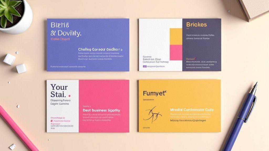
1. Keep It Simple and Uncluttered
In the world of business card design, clarity is king. The primary goal of a business card is to quickly and effectively convey who you are and how to contact you. An uncluttered design, centered around essential information, eliminates distractions and projects an image of professionalism and confidence. This approach treats whitespace, or negative space, not as an empty area but as an active design element that guides the viewer's eye and enhances readability.
Think of it this way: your business card has about five seconds to make an impression. A cluttered card creates cognitive friction, forcing the recipient to search for the information they need. A simple, clean layout respects their time and makes the information effortlessly accessible. This aligns with fundamental user centered design principles, which prioritize making a product (in this case, your card) functional and easy for the end-user to understand. The result is a design that is not just aesthetically pleasing but also highly effective.
How to Implement Simplicity
Achieving a powerful, minimalist design requires intentional choices. This is one of the most crucial tips for designing business cards that leave a lasting, positive impression.
- Prioritize Essential Information: Limit the text to only what is absolutely necessary. This typically includes your name, title, company name, phone number, email address, and website. Resist the urge to add every social media handle or a long list of services.
- Embrace Whitespace: Don’t be afraid of empty space. Aim for 30-40% of your card to be free of text or graphics. This negative space frames your contact details, making them stand out and appear more significant.
- Limit Your Fonts: Stick to a maximum of two complementary typefaces. Use one for your name or logo to create a focal point, and a clean, legible font for the smaller contact information.
- Test for Legibility: Once you have a draft, hold it at arm's length. Can you easily read the most important details? If not, the font may be too small or the layout too crowded.
2. Choose the Right Typography
Typography is more than just text; it's the voice of your brand. The fonts you select for your business card directly influence how your professionalism and personality are perceived, while also determining how easily a potential client can read your contact details. Effective typography involves choosing the right typefaces, sizes, weights, and spacing to create a harmonious and legible design, especially at a small scale.
The right font can instantly communicate your industry and brand ethos. For example, a modern tech company might use a clean sans-serif like Helvetica or Futura, while a traditional law firm might opt for a classic serif like Garamond to convey authority and heritage. This careful selection ensures your card not only looks good but also aligns perfectly with your brand identity. To truly master this, you might find further insights into typography useful.
How to Implement Strong Typography
Choosing the right fonts is one of the most impactful tips for designing business cards that resonate with your audience. Here is how to apply typographic principles effectively.
- Limit Your Font Families: Stick to a maximum of two complementary font families. A common and effective pairing is a serif with a sans-serif. This creates visual interest and a clear hierarchy.
- Establish a Visual Hierarchy: Make your name the most prominent element, typically between 10-14pt. Your title and company name should be slightly smaller, and contact details should be the smallest but still perfectly legible, usually around 7-8pt.
- Prioritize Readability: Avoid decorative or script fonts for critical information like email addresses and phone numbers, as they can be difficult to read. Save these for a logo or your name if it fits your brand.
- Test at Actual Size: Before sending your design to print, always print a sample at 100% scale. This allows you to check if the font sizes are legible and the overall composition feels balanced in its physical form.
3. Use High-Quality, Appropriate Materials
The physical quality of your business card communicates brand value before a single word is read. The choice of paper weight, texture, and finish creates a tactile experience that can leave a powerful and lasting impression. A flimsy, generic card can suggest a lack of attention to detail, while a premium, substantial card conveys professionalism, quality, and confidence. This is one of the most impactful tips for designing business cards because it directly engages the sense of touch, making your brand more memorable.
The material you choose should be a deliberate extension of your brand identity. For instance, a luxury real estate agent might opt for an ultra-thick 32pt silk-laminated card to project exclusivity, while an eco-conscious brand could use recycled or seed-embedded paper to demonstrate its commitment to sustainability. The right material doesn't just hold your information; it tells a story about your business and its values, ensuring your branding is consistent across all touchpoints. For those looking to extend this tactile branding to other marketing collateral, exploring custom notepads with similar high-quality paper can create a cohesive experience.
How to Implement High-Quality Materials
Selecting the right substrate requires balancing brand identity, budget, and practicality. It's a key decision that elevates your design from good to unforgettable.
- Align Material with Brand Values: Match the material to your brand's personality. A tech startup might use a sleek plastic card with NFC capabilities, whereas a high-end restaurant could choose a classic letterpress on thick cotton stock.
- Request Sample Packs: Before committing to a large order, always request a sample pack from your printer. Feeling the different weights, textures, and finishes in your hand is the only way to make an informed decision.
- Consider Practicality: Think about how the card will be used. A matte or uncoated finish is ideal if you want recipients to be able to write notes on it. For industries like construction, a more durable, tear-resistant stock might be necessary.
- Don't Default to Standard: While 16pt cardstock is a solid professional standard, explore thicker options (18-32pt) or unique substrates like wood, metal, or kraft paper to truly stand out.
4. Incorporate Strategic Color Psychology
Color is far more than an aesthetic choice; it's a powerful psychological tool that communicates emotion, builds brand identity, and influences perception instantly. Strategic color selection on a business card can reinforce your brand’s core message before a single word is read. It works by tapping into established emotional and cultural associations, helping you convey trust, creativity, or sophistication without saying anything at all.
Think about major brands and their color palettes. Financial institutions like Chase often use navy blue to project stability and trust, while wellness companies use green to suggest health and nature. Your business card is a key piece of your marketing toolkit, and using color intentionally ensures it aligns with your broader branding, similar to how you would design matching full color presentation folders. A well-chosen color scheme makes your card memorable and reinforces the specific qualities you want associated with your brand.
How to Implement Color Psychology
Choosing the right colors is one of the most impactful tips for designing business cards that resonate with your target audience. This requires a blend of brand strategy and practical design knowledge.
- Align Colors with Your Industry: Select colors that match the expectations and values of your sector. Blue often works for corporate and tech firms (reliability), black and gold for luxury brands (sophistication), and bright, energetic colors like orange or yellow for creative agencies.
- Prioritize Readability and Contrast: Ensure there is sufficient contrast between your text and the background. The Web Content Accessibility Guidelines (WCAG) recommend a contrast ratio of at least 4.5:1. This makes your contact details easy to read for everyone.
- Use a Pantone Color System (PMS): For brand-critical colors, use the Pantone Matching System. This ensures your specific shade of blue or green prints exactly the same across all materials, from cards to banners, maintaining brand consistency.
- Consider Print and Paper: Always request a printed proof to see how your chosen colors appear on your selected paper stock. Colors can look dramatically different on glossy versus matte or textured paper.
5. Optimize Size and Orientation
The physical dimensions of a business card are a fundamental part of its design, influencing both its first impression and its long-term utility. While the standard North American size (3.5" x 2") is designed for practicality, fitting perfectly into wallets and cardholders, a deliberate choice of size and orientation can make your card instantly memorable. This choice is about balancing creative distinction with functional convenience.
Thinking beyond the standard rectangle can be a powerful branding statement. For example, a square card can project an image of balance and modernity, while a vertical orientation can feel fresh and dynamic. These subtle shifts break expectations and can make a recipient pause and take a closer look. However, the key is purpose. A unique size should complement your brand identity, not just be different for its own sake, ensuring the card remains a useful tool rather than a novelty that gets discarded.
How to Implement Size and Orientation Effectively
Choosing the right format is one of the most impactful tips for designing business cards that align with your brand's unique personality.
- Stick to Standard (Unless It Makes Sense): The 3.5" x 2" horizontal card is the safe and practical choice. Deviate only if the non-standard size or shape reinforces a key brand attribute, such as a house-shaped card for a realtor.
- Consider Vertical Orientation: A vertical layout can make your card stand out in a stack of traditional horizontal cards. It works especially well for brands in creative fields like photography or fashion, but ensure all text remains horizontal for easy reading.
- Explore Custom Shapes: Die-cutting allows for unique shapes that can directly reflect your business, like a camera for a videographer. This creates a highly memorable and tactile experience for the recipient.
- Test for Practicality: Before committing to a print run, create a paper mock-up of your custom-sized card. Test if it fits comfortably into a standard wallet or card holder. If it's too big or an awkward shape, it may be inconvenient for people to keep.
- Add Subtle Refinements: If a non-standard size feels too risky, consider adding rounded corners to a standard card. This small change adds a premium, modern feel without sacrificing practicality.
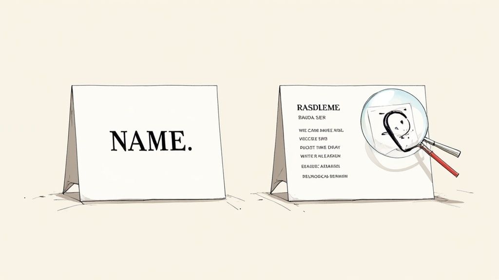
6. Include Essential Information Only
A business card's effectiveness is defined by its ability to communicate vital information at a glance. Information hierarchy is paramount; including too much creates clutter and overwhelms the recipient, while including too little fails to provide the necessary avenues for connection. The core purpose is to be a bridge, not a brochure. Focusing only on essential contact details ensures your card is scannable, memorable, and ultimately, functional.
Think of your card's real estate as a valuable, limited resource. Every element must justify its place. For instance, a modern web designer might strategically omit a physical address and phone number, directing all traffic to their portfolio website and email. Conversely, a real estate agent must include their license number to comply with industry regulations. This strategic curation of information is one of the most practical tips for designing business cards that respect the recipient's time and attention, making your details easy to absorb and act upon.
How to Prioritize Information
Mastering information hierarchy involves a deliberate process of selection and exclusion. The goal is to facilitate a connection, not to list every possible communication channel.
- Stick to the Core Essentials: Always include your full name, job title, company name, one primary phone number, one professional email address, and your website. This forms the foundation of your professional identity.
- Be Selective with Social Media: Only include social media handles that are professionally curated and actively maintained for business purposes. LinkedIn is often a safe bet, while a personal Instagram account may be inappropriate.
- Rethink the Physical Address: Unless your business relies on foot traffic or local meetings, consider replacing a full street address with just a city and state or omitting it entirely. This saves space and modernizes the card's feel.
- Use QR Codes Strategically: If you have extensive information to share, like a full vCard or a portfolio link, use a QR code. This keeps the physical design clean while offering a gateway to more comprehensive details.
7. Make It Memorable with Unique Design Elements
In a stack of standard business cards, a unique design element can be the difference between being remembered and being forgotten. The goal isn't just to be different for the sake of it, but to thoughtfully incorporate distinctive touches that capture your brand's personality and create a lasting impression. This approach transforms your card from a simple information slip into a memorable brand experience that recipients are reluctant to discard.
A unique design can be a powerful conversation starter, immediately conveying creativity and attention to detail. For example, a personal trainer's card that folds into a miniature figure doing a squat is far more memorable than a generic one. Similarly, a DJ's card designed like a tiny vinyl record or a locksmith's card die-cut to resemble a lock pick instantly communicates their profession in a clever, tangible way. These creative choices make your brand story interactive and engaging.
How to Implement Unique Elements
Injecting personality into your card requires a balance of creativity and brand alignment. This is one of the most effective tips for designing business cards that not only inform but also delight your audience.
- Align Uniqueness with Your Brand: Ensure any creative element serves a purpose and reinforces what you do. A divorce lawyer’s card with a perforated line down the middle is bold and memorable because it directly relates to their service.
- Utilize Special Finishes: Subtle touches can have a major impact. Consider spot UV to make your logo glossy, letterpress for an elegant indented feel, or colored edges for a surprising pop of brand color.
- Explore Unconventional Materials: Move beyond standard cardstock. Options like wood, metal, plastic, or even recycled materials can make your card feel substantial and unique, reflecting a brand's commitment to quality or sustainability.
- Add Functional Value: Make your card a tool. A web designer could include a screen pixel density chart, a writer could feature common proofreading marks, or a general contractor could add a small ruler along the edge. You can explore more options for business cards printing on 4over4.com to find the perfect fit.
- Incorporate Interactive Features: Use die-cuts, folds, or pop-up elements that encourage the recipient to engage with the card physically. Just ensure any interactive component is sturdy and works flawlessly.
8. Ensure Proper Print Specifications and Digital Optimization
A brilliant design can fall flat if it doesn't translate perfectly from your screen to the final printed product. The technical setup of your file is just as crucial as the creative elements. Properly preparing your design for print ensures colors are accurate, cuts are clean, and text is sharp, preventing costly and frustrating reprints. This process bridges the gap between digital concept and tangible reality, safeguarding your brand's professional image.
Furthermore, in today's digital-first world, your business card often lives a second life online. It might be photographed, scanned by an app, or attached to an email. A design that is not optimized for digital viewing can become illegible or distorted, undermining its purpose. Considering both print specifications and digital optimization from the start is one of the most practical tips for designing business cards that work effectively in every context, ensuring consistency whether held in hand or viewed on a screen.
How to Implement Technical Precision
Mastering the technical side of card design guarantees that what you see on your screen is what you get from the printer. This attention to detail is a hallmark of professional design.
- Set Up Your File Correctly: Begin with the right foundation. Create your document in CMYK color mode, not RGB, to match printing processes. Set the canvas to the standard business card size (e.g., 3.5" x 2") and ensure your resolution is at least 300 DPI to avoid pixelation.
- Use Bleeds and Safe Zones: Add a 1/8" (or 3mm) bleed around your entire design. This is an extra margin for any background colors or images that extend to the edge, preventing white slivers after cutting. Conversely, keep all critical text and logos at least 1/8" inside the trim line to create a "safe zone" so they don't get accidentally clipped.
- Optimize for Digital Use: After finalizing the print version, save a separate high-resolution PNG or JPG copy. This version is perfect for email signatures, social media profiles, or sending via text. Also, test any QR codes at their actual printed size with multiple devices to confirm they scan reliably.
- Finalize for the Printer: Before exporting, convert all text to outlines or paths. This turns the text into a vector shape, preventing font issues at the print shop. Export your final file as a print-ready PDF, such as a PDF/X-1a, to lock in all specifications. For specialized finishes, understanding options like lamination on 4over4.com can help you communicate your needs to the printer.
8 Key Tips Comparison Guide
| Aspect | Keep It Simple and Uncluttered | Choose the Right Typography | Use High-Quality, Appropriate Materials | Incorporate Strategic Color Psychology | Optimize Size and Orientation | Make It Memorable with Unique Design Elements | Ensure Proper Print Specifications and Digital Optimization |
|---|---|---|---|---|---|---|---|
| Implementation Complexity 🔄 | Low - Focus on minimal elements and whitespace | Medium - Requires careful font selection and testing | Medium - Choosing and sourcing materials can be complex | Medium - Requires color theory knowledge and print testing | Medium - Balancing uniqueness with practicality | High - Involves innovative, often custom design techniques | High - Demands technical knowledge of print/digital standards |
| Resource Requirements ⚡ | Low - Basic printing, simple design tools | Medium - Access to quality fonts and design software | High - Premium materials and specialty finishes increase cost | Medium - Color proofs and matching add time and cost | Medium - Custom sizes/shapes may increase print and die-cutting costs | High - Special finishes, die-cuts, interactive elements cost more | Medium to High - Requires professional design software and proofs |
| Expected Outcomes 📊 | Clear, professional, timeless business cards | Enhanced readability and brand identity | Strong tactile impression and perceived quality | Improved brand recognition and emotional impact | Functionality with memorable aesthetics | Memorable, conversation-starting cards that reflect brand | Accurate, high-quality prints and optimized digital usability |
| Ideal Use Cases 💡 | Corporate, professional industries prioritizing clarity | Brands emphasizing professionalism and readability | Luxury brands, eco-conscious companies, tech startups | Brands leveraging emotional brand messaging | Those wanting to stand out with functional uniqueness | Creative professionals, marketers wanting standout cards | Any business needing consistent, error-free print and digital cards |
| Key Advantages ⭐ | Cost-effective, easy to read, timeless style | Strong brand voice, natural hierarchy, legibility | Durability, unique tactile experience, premium perception | Emotional connection, increased memorability | Fits standard storage or stands out with unique shapes | Higher retention, brand personality, social sharing potential | Avoids print errors, ensures brand consistency, digital friendly |
| Key Challenges 🔄 | May appear plain or lack personality | Risk of poor printing if fonts not embedded/licensed | Increased cost and potential print delays | Higher print costs, cultural color variations | Risk of cards not fitting wallets or being discarded | Higher cost, possible loss of functionality, complexity | Requires technical skills; variable printer specs |
Your Next Handshake, Perfected
At its core, a business card is far more than a simple piece of paper with contact details. It's a physical extension of your brand identity, a tangible reminder of a personal connection, and a powerful marketing tool that continues to work long after a conversation has ended. Throughout this guide, we've explored the critical tips for designing business cards that leave a lasting, professional impression. By moving beyond generic templates and applying thoughtful design principles, you can create a card that doesn't just inform, but also captivates.
Synthesizing Strategy into a Small-Scale Masterpiece
The journey from a blank canvas to a compelling business card involves a series of strategic decisions. Remember the foundational principle we discussed: simplicity is your ally. An uncluttered layout ensures your essential information is digestible at a glance, preventing cognitive overload and conveying confidence. This clarity is amplified by your choice of typography, which should be legible, on-brand, and thoughtfully scaled to create a clear visual hierarchy. These elements work together to build a foundation of professionalism.
The true impact, however, often lies in the details that engage the senses. The tactile experience of a high-quality, substantial cardstock communicates a commitment to quality before a single word is even read. When you pair this with a strategic color palette rooted in psychology, you begin to evoke specific emotions and reinforce your brand's personality, whether it's the trustworthy calm of blue or the energetic passion of red. These are the subtle yet powerful cues that transform a standard card into a memorable artifact.
From Concept to Conversation Starter
The ultimate goal is to create a card that not only avoids the recycling bin but actively sparks interest. This is where unique design elements come into play. A clever die-cut, an elegant foil stamp, or a minimalist QR code that links to an impressive portfolio can make your card a talking point. Yet, this creativity must be balanced with practicality. Only include the most crucial contact information, and ensure your design is technically sound for printing with proper bleed, resolution, and color modes.
Ultimately, mastering these tips for designing business cards is about creating a cohesive brand experience. Each choice, from the paper's weight to the font's kerning, contributes to the story you are telling. You are not just handing someone your phone number; you are handing them a representation of your professional standards, your attention to detail, and your brand’s unique value. A well-designed card validates your credibility and ensures that your first impression is one of excellence, opening doors to future opportunities and solidifying your place in a new contact’s professional network.
Ready to transform these insights into a tangible, high-quality business card? Bring your perfected design to life with 4OVER4. With an extensive selection of premium papers, specialty finishes like spot UV and metallic foils, and a commitment to print perfection, 4OVER4 provides all the tools you need to create a business card that truly stands out.
More from

6
When you think of a yard sign, the classic 18"x24" is probably what comes to mind. It’s the industry workhorse fo
![]() Emma Davis
Emma Davis
Mar 14, 2026

15
When you’re ready to invest in an A-frame sign, the first question you'll ask is, "What size do I need?" It usually comes down
![]() Emma Davis
Emma Davis
Mar 13, 2026

146
The real secret to mastering your direct mail budget isn't complicated. It comes down to one simple fact: a standard 4" x 6&q
![]() Emma Davis
Emma Davis
Mar 12, 2026

69
Tear-off flyers are a classic for a reason. They’re a tangible marketing tool, designed with perforated, removable tabs at the bottom. Each
![]() Emma Davis
Emma Davis
Mar 11, 2026

120
Printing stickers at home is a seriously fun and rewarding project. It boils down to four main parts: designing your image, picking the right
![]() Emma Davis
Emma Davis
Mar 10, 2026

105
Ever seen a logo that seems to float right on the glass of a jar or bottle? That’s the work of transparent label stickers.
![]() Emma Davis
Emma Davis
Mar 9, 2026

61
Picture this: your product’s beautiful label gets smudged and runny during shipping, or a gorgeous event banner fades to nothing after just
![]() Emma Davis
Emma Davis
Mar 8, 2026

58
In a sea of options, your product's packaging and labeling are its first, and often only, chance to make a real connectio
![]() Emma Davis
Emma Davis
Mar 7, 2026